
Chapter 6. Layout Tables
Tables and their associated tags are HTML’s tools for presenting information in tabular format, such as spreadsheets, timetables, and reports. To fully describe tabular information, the TABLE tag comes with associated elements and attributes, including the TH element to indicate column and row headings, the CAPTION element to provide a title, and the SUMMARY attribute to provide a short description of a table’s purpose and structure.
In the early days of the Web, lacking more suitable options, designers adopted tables as a tool for page layout. By setting the table border value to zero (<table border="0">), the resulting “invisible” tables could be used for multiple layout tasks, such as creating columns and indents, controlling spacing, and limiting line length (Figure 6.1, next page). In fact, layout tables are so commonplace that most Web authoring tools generate tables to produce layouts.
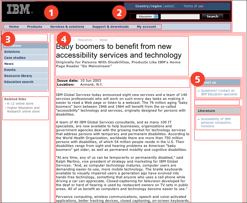
FIGURE 6.1 This IBM page uses layout tables (outlined in red) to divide the page into sections: banner (1), search (2), navigation links (3), content (4), and sidebar (5).
As browser support moves more in compliance with Web standards, workarounds like layout tables become unnecessary. Presentation tags like FONT, B, and I went out the window once styles could be used for Web typography. Layout tables will suffer the same fate once CSS can be used reliably for page layout.
In the meantime, layout tables may sometimes prove necessary. Tables are more stable than styles for layout, particularly on older browsers with poor or no support for style sheet positioning. When a design requires consistency across operating systems and browsers, and compatibility with older browsers, a layout table may be a designer’s only recourse.
For the most part, visual users are unaffected by layout tables, though complex layouts using nested tables take longer to load and are easily broken by one errant tag. Layouts that rely on fixed-width tables are another potential problem. When table cells are set to specific widths, pages do not adapt to different display devices.
But for nonvisual users, layout tables can present problems. Software cannot easily distinguish between layout tables and data tables. When page content is contained within a table, software will attempt to make sense of it within a table context, particularly if structural elements—such as column or row headings—are used. In addition, tables can cause content fragmentation. Software reads Web content in the order that it appears in the code. If related content is divided between table elements, or among tables within tables, it may lack coherence when read in sequence.
In general, page layout is best handled using CSS. When layout tables are required, simple layout tables with only the most basic table tags are the least obtrusive.
6.1. Basic Principles
6.1.1. Use tables for layout only when necessary
Before the advent of style sheets, tables were a Web designer’s only means for page layout. Without tables, only the simplest page layouts were possible. Elements could not be placed in different locations on the page, only displayed in a vertical sequence down the page.
In casting about for options, designers discovered that the structural element TABLE could be used for layout by setting its BORDER attribute to zero (<table border="0">), thereby rendering the table invisible. By putting page content into different table cells, pages could be divided into sections with elements positioned on different areas of the page. Table layout changed the basic character of the Web; in fact, this workaround proved so successful that most Web sites are designed using tables (Figure 6.2, next page).
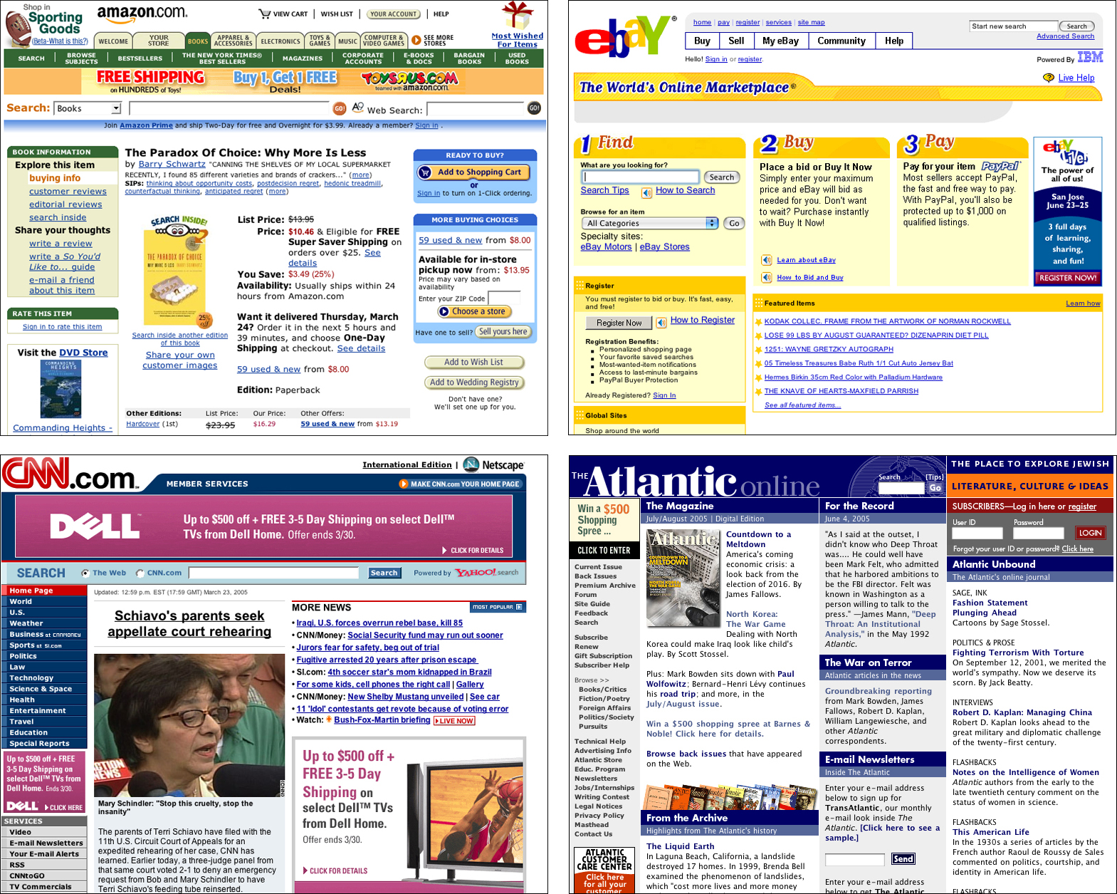
FIGURE 6.2 On today’s Web, table layout is the most common method for designing Web pages. Indeed, most popular Web sites use tables for layout.
However, when structural elements are used incorrectly, the utility of the Web is compromised. While the visual aspects of the Web tend to take center stage, much of its utility lies in what goes on behind the curtain. The Web is a web because its documents are structured—they are not simply text, but rather text with meaning applied through HTML markup. Structured documents can be read and their meaning derived by software. The most obvious benefit of structured documents is their ability to be indexed—and consequently discovered—using search engine software. However, this benefit is undermined when documents do not contain structural markup, or contain structural markup that is applied incorrectly.
When tables are used for page layout, software that reads Web pages encounters table markup and attempts to interpret the page within a table context. In the case of a screen reader, the software announces the presence of a table on the page and describes its attributes, which might sound something like “table with four columns and two rows.” The software has no way of knowing that the table is not really a table—that its purpose is visual layout, not data presentation—and is largely irrelevant to the nonvisual user.
Broadly speaking, whenever markup is used improperly on Web pages, the Web is weakened. Since structured documents are its basis, the Web is less robust—less effective—when structures are misused. On the other hand, pages that are coded properly strengthen the Web. The Web is at its best when structural markup is used to mark up page elements and CSS is used to position the elements on the page.
Implementing a layout using CSS can be difficult, particularly for complex, multicolumn designs. CSS support is inconsistent across browsers, so a layout that works perfectly in one browser may look a mess in another. Older browsers do not offer sufficient CSS support to accurately reproduce CSS layouts. To use CSS for page layout, designers must create designs that can withstand a degree of variation among browsers and accept that pages will look unstyled in older browsers (Figure 6.3).

FIGURE 6.3 Layouts designed using style sheets do not always fare well in older browsers. Here, the Wired page displays without styling on Netscape 4.7 on the Macintosh. In some cases, CSS-based designs break when viewed in older browsers.
It may be that project requirements do not allow for the level of compromise that comes with CSS layout. For example, if a large percentage of the audience uses older, noncompliant browsers, CSS layout may not be an option. When consistency and backward compatibility are required, layout tables may be the only remedy. In these cases, minimize the affect of table layout by following the guidelines below.
In a nutshell. Table markup is designed to describe tabular data and not for laying out pages. Use style sheets for page layout whenever possible; fall back on table layout only as a last resort.
6.1.2. Use simple layout tables
A basic layout table with two or three columns is a mild but not insurmountable barrier to access. While screen reader software may announce the presence of the table and describe its attributes, the table is not likely to prevent a user from working with the page. On the other hand, a complex layout table with nested tables and multiple rows and columns will likely cause problems for screen reader users (Figure 6.4).
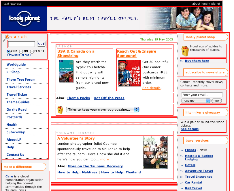
FIGURE 6.4 The multi-column layout on the Lonely Planet home page is accomplished using multiple layout tables, outlined here in red. Complex layouts with multiple rows, columns, and nested tables can cause usability problems, particularly for screen reader users.
Users viewing a rendered page in the browser are not likely to notice complex tables, except at page-loading time; pages with complex layout tables take longer to display. However, nonvisual users cannot ignore complex tables. These users are not working with the rendered page but with the underlying code. When content is contained within multiple cells of a layout table, or within multiple nested tables, the software needs to account for all of the tables since table markup, when applied to tabular elements, is necessary for nonvisual users to access tabular information. It may be difficult for nonvisual users to distinguish tables that are relevant from those that are not. Additionally, confusion may arise when content that belongs together does not appear together in the code. Since page content is read in sequence by software, connections between related content may be lost if content is scattered among different table cells.
When using layout tables, avoid unnecessary complexity. Distill designs down to the simplest table possible (Figure 6.5). If a design calls for multiple table elements, nested tables, or spanned columns or rows, go back to the drawing board. Simplify the design so it can be built using a single-row, two- or three-column layout table.
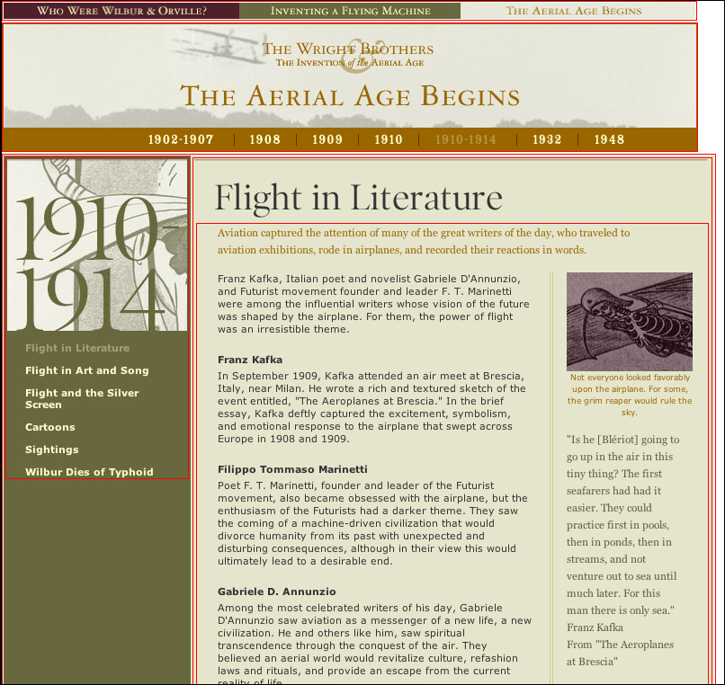
FIGURE 6.5 The online Wright Brothers exhibition from the National Air and Space Museum is designed using simple layout tables (outlined in red).
In a nutshell. Layout tables can be disorienting for nonvisual users when related elements are spread across table rows and nested tables. Design simple layouts using simple layout tables.
6.2. Markup
6.2.1. Use only basic table tags
Part of the problem with layout tables is that nonvisual users cannot ignore them. Since tables are a structural element, they must be accounted for when they appear on the page. Table markup is important when working with tabular information, particularly for nonvisual users. The tags and attributes associated with the table element allow nonvisual users to understand and navigate information presented in tabular format. With one element (TABLE) used for two quite distinct purposes (layout and data), and with no markup to distinguish between the two, nonvisual users have little choice but to pay attention to each table. Since layout tables are so prevalent, some screen reader software manufacturers have programmed their software to differentiate between layout tables and data tables. For example, software may decide a table is for layout if it has only one row, or is without row or column headings. When software identifies a layout table, it can ignore the table attributes and read the contents of the table in the order it appears in the code.
Layout tables should only make use of the most basic row and cell markup (TR and TD). Headings, captions, summary—all the elements that describe a data table—are meaningless in the layout context. If these elements are present, software that reads Web pages may try to make logical sense of the layout table by, for example, associating cells with headings.
In a nutshell. Screen reader software cannot distinguish between “real” tables and layout tables, making table markup difficult for nonvisual users to ignore. Make layout tables as unobtrusive as possible, using only basic table tags, such as TR and TD.
6.2.2. Design layout tables for linear access
Since nonvisual users access Web pages via the underlying code, the order in which elements appear in the code greatly influences these users’ experience of Web pages. Software that reads Web pages linearizes tables—it begins reading the content in row one, column one, and moves through the table in sequence. Layout tables can cause problems when related content is broken into different rows and cells, or put into tables within tables, such as when column headings are in one row and the content they describe in another. When the table is rendered for visual display, the related content comes together on the page. When the page is read aloud, the content is fragmented and does not make sense. The headings are read together instead of with their associated content.
Since both visual and nonvisual users read Web pages, we need to design code as well as visual display. Pay close attention to the sequence of content as it appears in the code. The order and grouping of elements should mirror the order and grouping of elements on the rendered page. When using layout tables, keep related elements in the same row and cell so they are together in the code (Figure 6.6, previous page).

FIGURE 6.6 Software reads Web page elements in the sequence that they appear in the code. Simple layout tables, such as those used on the National Park Service pages, read well because elements are grouped in the code and follow a logical sequence. Here, the sequence is banner (1), content (2), photos (3), related links (4), and footer (not shown).
In a nutshell. Software reads page elements in the sequence that they appear in the code. Make certain the logical information flow of the rendered page—banner, navigation, content, and footer—is reflected in the code.
6.2.3. Use flexible cell widths
In concept, Web pages are flexible documents that adapt to fit whatever method or device is used to access them. Type size is flexible: Users can adjust text to a comfortable size. Colors are adaptable: Users can define colors according to their needs and preferences. Page layouts are intended to be flexible so they expand or collapse to fit the users’ display.
In practice, many of these flexible elements are nailed into place using various coding strategies. One of these strategies is to use fixed measurements to define layout dimensions. Using pixels to define table and cell widths results in pages that will not reflow to fit different displays. This method gives designers control over aspects such as positioning, line length, and line wrapping. Unfortunately, fixed layouts constrain the power of the Web by producing documents that are designed for only one view. With so many different ways to access Web pages and possible adaptations that can be made, a single view of a Web page is simply not possible. Web pages must be flexible to accommodate different access methods.
With flexible layouts, designers have less control over page elements. For example, control over line length is less reliable in a flexible layout. Flexible pages viewed on a large display may have wide columns of text that are difficult to read, whereas a fixed-width layout allows designers to set line length at a comfortable measure.
One rationale for a fixed-width page comes from print design, where factors such as optimal line length are important. With a printed document, readers cannot adjust column width, which leaves it up to the designer to provide a text size and measure that is comfortable for “normal” readers (generally thought to be between 45 and 75 characters per line). Since the medium is fixed, however, the inevitable result is that readers who do not fit the norm will be unable to read the document.
On the Web, print conventions can get in the way. With a fixed-width column, a 60-character line could become a 20-character line when a user enlarges text. Additionally, fixed-width pages are not adaptable. A fixed-width page on a large monitor makes use of only a portion of the available display area; on a small display, users may have to scroll horizontally to see the full contents of the page (Figure 6.7).
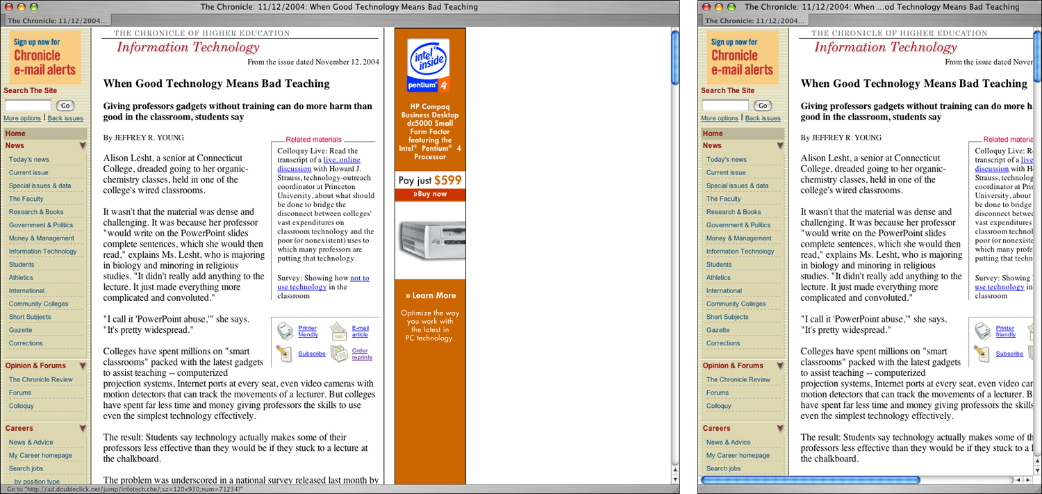
FIGURE 6.7 Fixed-width tables have the benefit of controlling aspects of the design, such as line length. However, fixed pages do not adapt to different window widths. Here, The Chronicle of Higher Education uses a fixed-width layout table for its pages. On a large display, a significant portion of the screen goes unused. On a small display, users must use the horizontal scroll to read the articles.
Flexibility is a fundamental attribute of Web pages and is necessary for universal access. Web pages must be flexible to work with different software and hardware, and to accommodate a range of user needs. Don’t try to restrain the inherent flexibility of Web pages through fixed layouts. Instead, use flexible layouts to build pages that adapt to different viewing conditions (Figure 6.8).
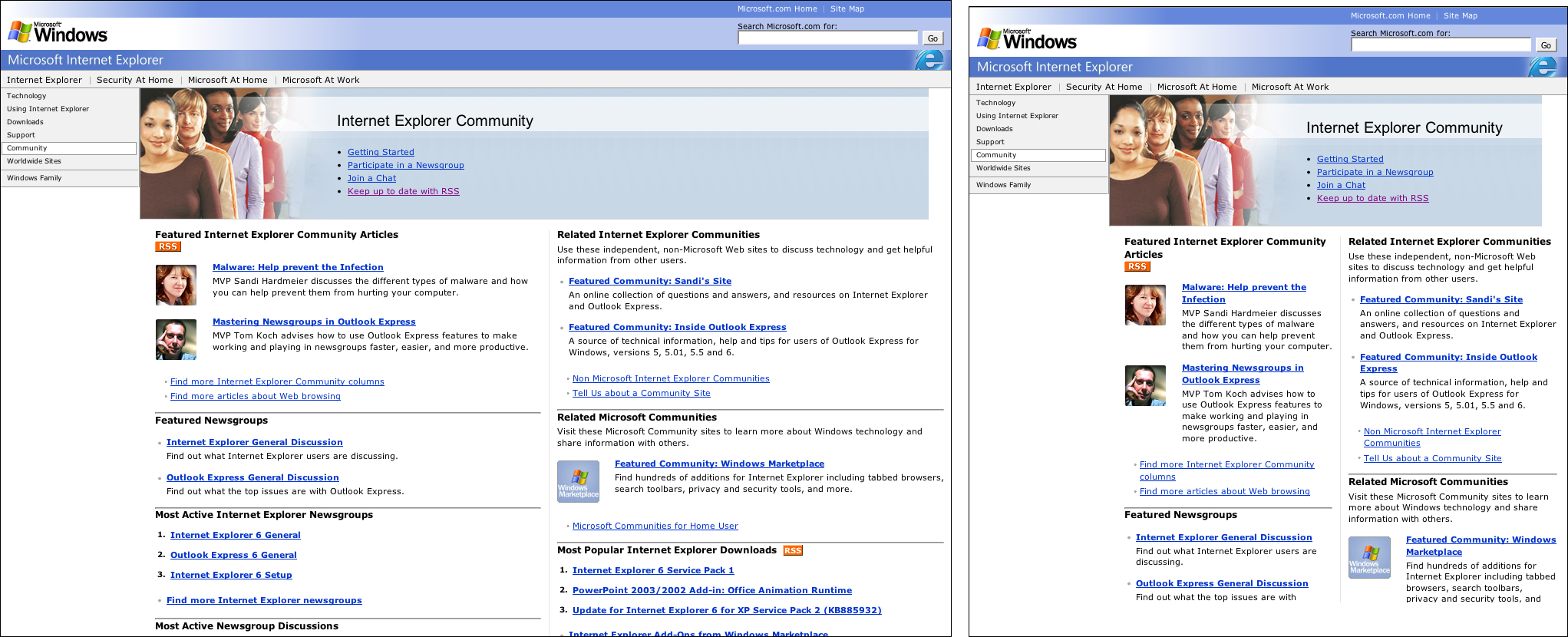
FIGURE 6.8 Microsoft uses flexible layout tables on some of its pages. The pages expand and collapse to fill the browser window.
To create a flexible layout table, use relative measurements to define cell widths. Relative measurements, such as percentages, will cause pages to adapt to different window widths. Assign cell widths using CSS, not HTML. Not only does this practice separate content and presentation, assigning table attributes in style sheets paves the way for a later conversion from table layout to CSS layout.
In a nutshell. Flexible layouts adapt to different viewing conditions. Use flexible measurements—such as percentages—to specify the width of table cells so pages will adapt to accommodate different displays and text sizes.