Hour 20. Creating Print-Friendly Web Pages
What You’ll Learn in This Hour:
![]() What makes a print-friendly page
What makes a print-friendly page
![]() How to apply a media-specific stylesheet
How to apply a media-specific stylesheet
![]() How to create a stylesheet for print pages
How to create a stylesheet for print pages
![]() How to view your web page in Print Preview mode
How to view your web page in Print Preview mode
If you’ve ever used an online map application such as MapQuest or Google Maps before taking a trip into an area with no connectivity for your smartphone, you’ve no doubt experienced the need to print a web page. Similarly, the proliferation of coupons offered only online, purchase receipts for items from online resellers, and web-based flight check-in and the capability to print boarding passes from your home computer have increased the need for print-friendly pages. It’s true, not all web pages are designed entirely for viewing on the screen!
You might not realize this, but it’s possible to specifically design and offer print-friendly versions of your pages for users who want to print a copy for offline reading—something that Google Maps offers after showing you the onscreen version of content. I’m a big fan of all things paperless, but some people just prefer to have hard-copy backups of some documents (and directions). Using CSS, it is easy to create web pages that change appearance based on how they are viewed. In this hour, you learn how to create such pages.
What Makes a Page Print-Friendly?
It’s important to point out that some web pages are print-friendly already. If your pages use white backgrounds with dark contrasting text and few images, you might not even need to concern yourself with a special print-friendly version. On the other hand, pages with dark backgrounds, dynamic links, and several images might prove to be unwieldy for the average printer (or just annoying for readers).
The main things to keep in mind as you consider what it takes to make your pages more print-friendly are the limitations imposed by the medium. In other words, what is it about a printed page that makes it uniquely different from a computer screen? The obvious difference is size—a printed page is at a fixed size, typically 8 1/2 by 11 inches in the United States, whereas the size of screens can vary greatly. Printed pages also have color limitations (even on color printers). Very few users want to waste the ink required to print a full-color background when they really just want to print the text on the page.
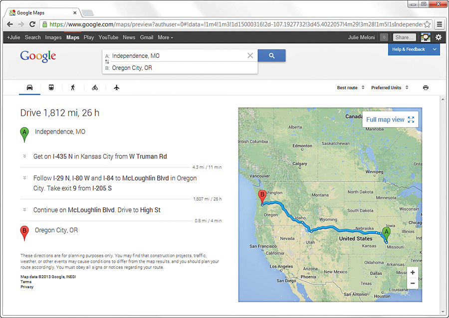
Most users also aren’t interested in printing more than the text that serves as the focus on the page. For example, Figure 20.1 shows a travel route mapped out from Independence, Missouri, to Oregon City, Oregon (an approximation of the historic Oregon Trail).

FIGURE 20.1 This page isn’t very print-friendly because of the form inputs and the large image with its own display controls.
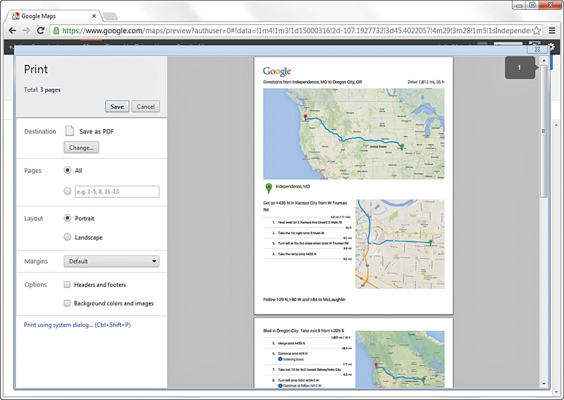
The page in Figure 20.1 contains form input fields, a large image that can itself be controlled (moved, zoomed), and other ancillary items that you come to expect in web content. Google has done a little magic (which you’ll learn how to do as well) to ensure that when this page is printed, some of those ancillary items go away, and more information currently hidden in the online display is actually shown. Without that little bit of magic—the inclusion of a print-friendly stylesheet—you would be left thinking that there are only two turns on that 1,800-mile trip instead of the multitude of directions you see when the page is printed. If you click the Print link in the body of the page, or use the print function of your web browser, your web browser displays a page (see Figure 20.2) that Google has formatted specifically to be printed.

FIGURE 20.2 The preview of the print-friendly version of the page includes all the driving instructions, even if they’re not showing on your screen, and removes other page elements.
As the figure shows, the print-friendly version of this page represents an improvement over the original, at least from the perspective of a printer. All the form inputs were removed, the navigational elements of the website itself were removed, and all directions were made visible. One could argue that an even more print-friendly version would have all the images removed.
Note
If the font of printer-specific pages is sans serif, some web designers recommend changing the font to serif, which is considered easier to read in print. If you use a sans-serif font on your pages, it’s up to you to decide whether you want to maintain the core look of a page when it’s printed—which means you don’t change the font to serif.
In the spirit of giving you a better grasp on what, specifically, to consider as you move toward creating print-friendly pages, the following is a list of changes you want to at least consider:
![]() Remove the background of the page, if you have one, to give the printed page a white background. Some browsers will take care of this automatically, but there’s no reason you can’t be explicit about it to accommodate older browsers that don’t remove backgrounds automatically.
Remove the background of the page, if you have one, to give the printed page a white background. Some browsers will take care of this automatically, but there’s no reason you can’t be explicit about it to accommodate older browsers that don’t remove backgrounds automatically.
![]() Change text colors to black; it’s okay to have some color in the text, but black is preferred.
Change text colors to black; it’s okay to have some color in the text, but black is preferred.
![]() Make sure that the font size is large enough that the page can be easily read when printed. You might have to test some different sizes.
Make sure that the font size is large enough that the page can be easily read when printed. You might have to test some different sizes.
![]() Remove link formatting, or simply revert to a basic underlined link. Some designers like to retain an underline just so that a visitor knows that a link exists in the original page.
Remove link formatting, or simply revert to a basic underlined link. Some designers like to retain an underline just so that a visitor knows that a link exists in the original page.
![]() Remove any and all nonessential images. This typically includes any images that aren’t critical to conveying the content in the page, such as navigation buttons, advertisements, and animated images (which certainly won’t animate on a printed page).
Remove any and all nonessential images. This typically includes any images that aren’t critical to conveying the content in the page, such as navigation buttons, advertisements, and animated images (which certainly won’t animate on a printed page).
In addition to these suggestions, you might find it useful to add a byline with information about the author of the page, along with a URL for the page and copyright information. This is information that could potentially get lost when the user leaves your website and has only the printed version of the page in hand.
You probably don’t need to make these changes to your pages just yet. The idea here is to plant the seed of what constitutes a print-friendly page so that you can do a better job of creating a printer-specific stylesheet. That’s right: It’s possible to create a stylesheet that is applied to pages only when they are printed—you learn about that in the next section.
Applying a Media-Specific Stylesheet
Figure 20.1 showed how one company (although Google is not alone in this practice) uses a small printer icon linked to a print-friendly page to enable users to preview and then print a page better suited for printing than online reading. This feature is helpful for users because they might not want to hassle with printing a page and wasting paper and ink on the graphics and ads that accompany the content they want to read. Although the printer icon and link approach is intuitive and works great, there is an option that does not require creating separate print-friendly content.
This second option involves using a print-specific stylesheet that is automatically applied to a page when the user elects to print the page. As you learned briefly in Hour 15, “Creating Fixed or Liquid Layouts,” CSS supports the concept of media-specific style sheets, which are stylesheets or stylesheet entries that target a particular medium, such as the screen or printer. CSS doesn’t stop with those two forms of media, however. Check out the following list of specific media types that CSS enables you to support with a unique stylesheet:
![]()
aural—For speech synthesizers
![]()
braille—For Braille tactile feedback devices
![]()
embossed—For paged Braille printers
![]()
handheld—For handheld devices with limited screen size and bandwidth
![]()
print—For printed material and documents viewed on screen in Print Preview mode
![]()
projection—For projected presentations
![]()
screen—For color computer screens
![]()
tty—For devices that use a fixed-pitch character grid (such as terminal, teletype, or handheld devices with limited displays)
![]()
tv—For television-type devices, which are typically low resolution and color, with a limited capability to scroll
Perhaps the most interesting of these media is the aural type, for web pages that can be read aloud or otherwise listened to. Clearly, the architects of CSS envision a web with a much broader reach most people currently think of when designing pages primarily for computer screens. Although you probably don’t need to worry too much about aural web page design just yet, it serves as a good heads-up for what you might need to accommodate if you choose a career in web design.
The good news about stylesheets as applied to other media is that they don’t require you to learn anything new. Okay, maybe in the case of aural web pages you’ll need to learn a few new tricks, but for now, you can use the same style properties you’ve already learned to create print-specific stylesheets. The trick is knowing how to apply a stylesheet for a particular medium.
As you recall, the <link /> tag is used to link an external stylesheet to a web page. This tag supports an attribute named media that specifies the name of the medium to which the stylesheet applies. By default, this attribute is set to all, which means that an external stylesheet will be used for all media if you don’t specify otherwise. The other acceptable attribute values correspond to the list of media provided in the previous list.
Establishing a print-specific stylesheet for a web page involves using two <link /> tags, one for the printer and one for each remaining medium. The following code handles this task:
<link rel="stylesheet" type="text/css" href="standard.css" media="all" />
<link rel="stylesheet" type="text/css" href="for_print.css" media="print"
/>
Note
You can also use the @import command to link media-specific stylesheets. For example, the following code works just like the previous <link /> code:
@import url(standard.css) all;
@import url(for_print.css) print;
In this example, two stylesheets are linked into a web page. The first sheet targets all media by setting the media attribute to all. If you did nothing else, the standard.css stylesheet would apply to all media. However, the presence of the second stylesheet results in the for_print.css stylesheet being used to print the page.
Caution
You might have been tempted to specify media="screen" in the first linked stylesheet in the previous code. Although this would work for viewing the page in a normal web browser, it would cause problems if a user viewed the page using a handheld browser or any of the other types of media. In other words, a stylesheet applies only to the specific media types mentioned in the media attribute, nothing more.
You can specify multiple media types in a single <link /> tag by separating the types with a comma, like this:
<link rel="stylesheet" type="text/css" href="for_pp.css"
media="print, projector" />
This code results in the for_pp.css stylesheet applying solely to the print and projector media types, nothing else.
Designing a Stylesheet for Print Pages
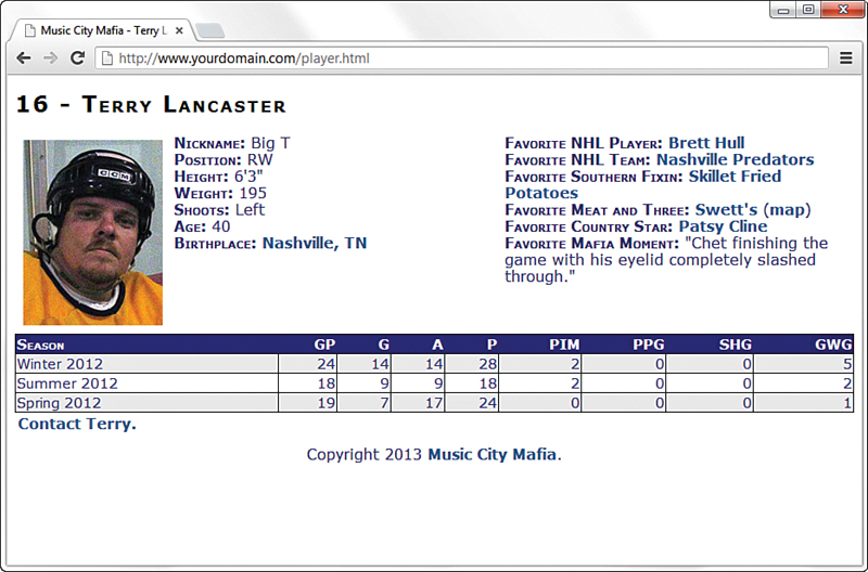
Using the recommended list of modifications required for a print-friendly web page, it’s time to take a stab at creating a print-friendly stylesheet. Let’s first look at a page that is displayed using a normal (screen) stylesheet (see Figure 20.3).
This figure reveals how the page looks in a normal web browser. In reality, this page isn’t too far from being print-ready, but it could still benefit from some improvements.
The following changes can help make this web page more print-friendly:
![]() Change the color of all text to black.
Change the color of all text to black.
![]() Remove link formatting (bold and color).
Remove link formatting (bold and color).
![]() Stack the two player information sections vertically because they are unlikely to fit horizontally on the printed page.
Stack the two player information sections vertically because they are unlikely to fit horizontally on the printed page.
![]() Remove the contact link entirely.
Remove the contact link entirely.
The first two changes to the normal stylesheet are straightforward; they primarily involve changing or undoing existing styles. The third change, however, requires a bit of thought. Because you know that printed pages are a fixed size, you should use absolute positioning for all the elements on the printed page. This makes placing the content sections exactly where you want them much easier. Finally, the last item on the list is very easy to accommodate: Simply set the display style property of the contact element to none.
Tip
You can specify a media type for your stylesheets even if you aren’t linking to external versions. The <style> tag also uses the same media attribute as the <link /> tag.
Listing 20.1 shows the CSS code for the player_print.css stylesheet, which incorporates these changes into a stylesheet that is perfectly suited for printing hockey player pages.
Caution
Although absolute positioning works for the hockey player sample page, it’s not always a good idea for styling print-specific pages. More specifically, if you have a page that contains more than a printed page worth of content, you’re better off using relative positioning and letting content flow onto multiple pages.
LISTING 20.1 CSS Code for the Print-Specific Hockey Player Stylesheet
body {
font-family:Verdana, Arial;
font-size:12pt;
color: #000000;
}
h1 {
font-size:18pt;
font-weight:bold;
font-variant:small-caps;
letter-spacing:2px;
position:absolute;
left:0in;
top:0in;
}
img {
position:absolute;
left:0in;
top:0.5in;
}
footer {
position:absolute;
text-align:left;
left:0in;
top:9in;
}
a, a:link, a:visited {
color: #000000;
font-weight:normal;
text-decoration:none;
}
div {
padding:3px;
}
div.player_info {
position:absolute;
left:1.75in;
top:0.5in;
}
div.player_favorites {
position:absolute;
left:1.75in;
top:2in;
}
div.contact {
display:none;
}
.label {
font-weight:bold;
font-variant:small-caps;
}
table, tr, td {
border: 1px solid black;
border-collapse: collapse;
}
table.stats {
width:100%;
text-align:right;
font-size:11pt;
border: 1px solid black;
border-collapse: collapse;
position:absolute;
left:0in;
top:4in;
}
thead {
font-variant:small-caps;
background-color: #000000;
color:white;
}
tr.light {
background-color: #ffffff;
}
tr.dark {
background-color: #eeeeee;
}
th.season, td.season {
text-align:left;
}
Probably the biggest difference in this code is how it uses inches (in) as the unit of measure for all the absolute positioning that takes place via CSS. This makes sense when you consider that we think of printed pages in terms of inches, not pixels. If you study the code carefully, you’ll notice that the text is all black, all special style formatting has been removed from the links, and content sections are now absolutely positioned (so that they appear exactly where you want them to appear on the single sheet of paper).
Note
In Listing 20.1, a left margin of 0in is used in some instances. You might find that your browser needs some margin; otherwise, it will cut off the content. If that is the case, just adjust it to 0.1in or 0.25in or some other value—you should still get the point of the placement.
Viewing a Web Page in Print Preview
Figure 20.4 shows the print-friendly version of a hockey player page as it appears in a browser’s Print Preview window.

FIGURE 20.4 You can use Print Preview to view the print-friendly version of a web page before you print it.
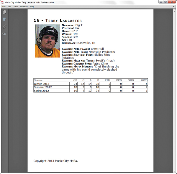
Just for good measure, Figure 20.5 shows the full printed page (as a PDF); the print preview was accurate!
Note
Adobe’s virtual printer can be used to “print” the hockey player web page to a PDF document. You might also find PDF converters such as DoPDF (www.dopdf.com) that work for you at a lower cost than the Adobe Acrobat software. Printing to a PDF effectively creates a version of the print-friendly web page in a format that can be easily shared electronically for printing.
To learn more about Acrobat, visit http://www.adobe.com/products/acrobat.html.

FIGURE 20.5 The hockey player page was converted to a PDF document by printing it (saving it) as an Adobe PDF.
Summary
This chapter focused on a practical application of CSS that solves a common need: printing web pages. You began the chapter by learning what exactly constitutes a print-friendly web page. From there, you learned about the mechanism built into CSS that allows a page to distinguish between the media in which it is being rendered, and then you learned how to select a stylesheet accordingly.
Finally, you created a print-specific stylesheet that was used to style a page just for printing. Although most users prefer to view a page on a large computer screen instead of reading it on paper, sometimes a printed web page is a necessity. Be sure to give your web page visitors the utmost in flexibility by offering print-friendly pages.
Q&A
Q. Can I use the media attribute of the <link /> tag to create a stylesheet specifically for viewing a web page on a handheld device?
A. Yes. By setting the media attribute of the <link /> tag to handheld, you specifically target handheld devices with a stylesheet. However, some devices do not interpret this appropriately or consistently, which is why many designers use the screen attribute with additional queries to determine the width and thus layout.
Q. Do I still need to provide printer icons on my pages so that they can be printed?
A. No, that is a handy visual cue, but not a required one. The linked stylesheet technique you learned about in this hour allows you to support print-friendly web pages without any special links on the page. However, if you want to enable the user to view a print-friendly version of a page in a browser, you can link to another version of the page that uses the print-specific stylesheet as its main (browser) stylesheet. Or you can provide some “fine print” on the page that instructs the user to use the browser’s Print Preview feature to view the print-friendly version of the page.
Workshop
The Workshop contains quiz questions and activities to help you solidify your understanding of the material covered. Try to answer all questions before looking at the “Answers” section that follows.
Quiz
1. Does having a button to a print-friendly page mean the page is actually print-friendly?
2. What happens to an external stylesheet that is linked to a page without any media attribute specified?
3. How do you link a stylesheet named freestyle.css to a page so that it applies only when the page is viewed on a television?
Answers
1. No—you still have to link to a page with a specific stylesheet applied to the content so that it appears print-friendly.
2. The media attribute assumes its default value of all, which causes the stylesheet to target all media types.
3. Use the following in the <head> section of your HTML:
<link rel="stylesheet" type="text/css" href="freestyle.css"
media="tv" />
Exercises
![]() Create a print-friendly stylesheet for a page that has a fair number of colors and images. Be sure to add an extra
Create a print-friendly stylesheet for a page that has a fair number of colors and images. Be sure to add an extra <link /> tag to the page that links in the print-specific stylesheet.
![]() If you’re feeling really ambitious, try using the
If you’re feeling really ambitious, try using the handheld value of the <link /> tag’s media attribute to create a handheld-specific version of one of your web pages. The concept is the same as when creating a print-friendly page, except that, in this case, you’re dealing with an extremely constrained screen size instead of a printed page. You can test the page by publishing it and then opening it on a mobile phone or handheld browser.

