
15. CSS Best Practices
It’s not enough to write CSS that makes your pages look pretty: to create the best Web pages, you must also write clean code that’s easy to read, easy to maintain, and loads quickly.
To manage your style sheets you need to know how to create well-organized code, work with CSS libraries and frameworks, optimize the linking of style sheets, validate your CSS, and compress the code by minifying it.
This chapter helps you realize all these goals and finishes with a review of the best practices I’ve presented throughout the book.
Create Readable Style Sheets
Although the computer interprets the CSS code to render a Web page, you and other humans have to create and edit it. During development, your code will probably get pretty messy, which makes it hard to track down rule interactions, determine the cascade order, or even locate rules that need changing.
Keeping your code organized while you work can actually save you time. Follow these simple suggestions to keep your code as readable as possible during development, and then double-check and clean up your code before you deploy.
Include an introduction and TOC
Place an introduction at the top of your CSS that includes basic information such as the title, site name, version, change date, usage, and other notes (Code 15.1). Additionally, some developers like to insert a rough table of contents, outlining the organizational structure of the style sheets.
• Blueprint—Provides a solid layout grid, typographic styles, and a style sheet for printing pages  .
.
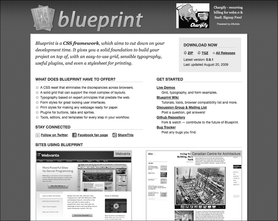
The home page of Blueprint, one of the more popular CSS frameworks.
Visit www.blueprintcss.org.
• Emastic—Uses ems to create elastic layouts.
Visit code.google.com/p/emastic.
• Intuit CSS—Uses 12- and 16-column grids at 960px wide and typographic style rules to create a strong vertical rhythm.
Visit csswizardry.com/inuitcss.
• YUI Grids—Yahoo!’s CSS Grids framework provides fixed and fluid layouts.
Visit yuilibrary.com/yui/docs/cssgrids.
Code 15.1. An example of an introduction and TOC for an external CSS file. Notice that the hierarchy of the file shown in the TOC is based on page structure.
/*------------------------------------------------------------------
# Default Stylesheet
Filename: default.css
Site: speakinginstyles.com
Version: 1.1
Last change: 09/11/12 [added gallery view, jct]
Author: Jason Cranford Teague (jct)
Desciption: Default styles to be applied to all pages in the site
## TOC
* HTML Selectors (Defaults)
** Headers
** Body
** Lists
** Forms
** Tables
* Navigation
** Menu
** Breadcrumb
** Footer
* Content
** Aside
*** Right
*** Left
** Article
*** Blockquotes
*** Paragraphs
*** Lists
*** Tables
** Comments
* Footer
-------------------------------------------------------------------*/
Define colors, fonts, and other constants
It’s sometimes difficult to keep track of all the values that you are using in your design. It’s unlikely that CSS will ever include constants, so it will help to keep notes in an easy-to-reference location in your document. Creating a glossary of colors and types leads to more consistent and attractive designs (Code 15.2).
Use section headers
Although section headers and dividers really aren’t anything more than CSS comments, they do help organize your CSS and allow you to quickly scan your code to locate particular CSS rule groups. If you have established a TOC, I recommend reflecting that organization here. In this example (Code 15.3), I’m using asterisks to indicate a section level.
The @ rules go at the top
All of the CSS rules starting with @ (@media, @font-face, @import) must be placed above any other CSS in the external style or embedded style sheet. In addition to making these rules easier to find, many of them won’t work unless they’re placed at the top.
Choose an organization scheme
You should choose a consistent organization pattern and stick to it. I’m not going to tell you how to organize your style sheets—that depends on what works for you—but here are a few ideas to consider:
• Organize by selector type. Start with HTML selectors, then IDs, and then classes.
• Organize based on page structure. Group rules based on their parent tags. This works even better with HTML5 because page structure is stronger. The downside occurs when the same rules need to be applied at different places in the page. You don’t want redundant code, so it’s best to separate those rules out into their own section.
• Organize based on purpose. Group rules based on which element you’re applying a style to. Instead of being grouped according to where the element is in the page, the styles are grouped based on their content, module, functionality, or other specific use (such as headings, typography, ads, article, asides, layout grid, and so on.)
• Organize alphabetically. Literally list the selectors in alphabetical order. No, really. I’ve never used this method, but I’ve heard several developers swear by it. To me, it seems like a lot of work to maintain this organization scheme. Plus, what if you need to override a style later in the cascade, but it doesn’t fit alphabetically?
You can use one of these methods, a combination of these methods, or a method you make up yourself. The key is to be consistent.
Code 15.2. Constant values such as colors and font stacks can be defined at the top of the page as a handy reference.
/*------------------------------------------------------------------
## Color Glossary
dark gray: rgb(51, 51, 85)
red: rgb(255, 15, 34)
white: rgb(235,235,355)
blue: rgb(0, 0, 102)
## Font Glossary
header: diavlo, "gill sans", helvetica, arial, sans-serif
body: baskerville, georgia, times, "times new roman", serif
aside: "gill sans", helvetica, arial, sans-serif
-------------------------------------------------------------------*/
Code 15.3. Section dividers used to organize the CSS file. Notice that they mimic the TOC.
/* HTML Selectors
-------------------------------------------------------------------*/
/** HTML Selectors | Headers
-------------------------------------------------------------------*/
/* Content
-------------------------------------------------------------------*/
/** Content | Aside
-------------------------------------------------------------------*/
/*** Content | Aside | Right
-------------------------------------------------------------------*/
/*** Content | Aside | Left
-------------------------------------------------------------------*/
/** Content | Article
-------------------------------------------------------------------*/
Use specificity for hierarchy
Regardless of the overall organization scheme you choose, specificity (explained in Chapter 4) provides a natural organizational hierarchy for CSS rules (Code 15.4). Simply organizing your CSS rules using the selector specificity can make it a lot easier to find rules and track down problems.
Code 15.4. CSS rules ordered by specificity hierarchy. This makes them easier to follow.
article {,...}
article .intro {,...}
article .intro figure {,...}
article .intro figure figcaption {,...}
article .intro p {,...}
article .intro p em {,...}
article .intro p:firstline {,...}
Have a Style Sheet Strategy
Once your libraries, frameworks, and site-wide CSS are ready to go live, you need to pick the best strategy for deployment. It is always recommended that you place all your styles in one or more external style sheets, and then use either the <link> or @import code to apply them to a Web document.
At this juncture, you have two competing priorities:
• Keep the file size as small as possible. The larger the file size, the longer it takes to download. Of course, because it’s text, your files have to be pretty large for this to be a problem, but it happens.
• Keep the number of links and imports as low as possible. The more links and imports you have to external CSS files, the more server calls you make, and the slower the page will load.
You can reduce file size by splitting style sheets into multiple external files and then linking only to the ones you need, but this means more links. You can have a single, all-inclusive CSS file, but such a file can grow quite large. Your job will be to balance these two issues. Here are a few methods for doing so.
The One for All method
The One for All method includes all your styles in a single master style sheet. With this method, creating well-organized and readable style sheets with a TOC is critical because you may be poring through hundreds or even thousands of lines of code .
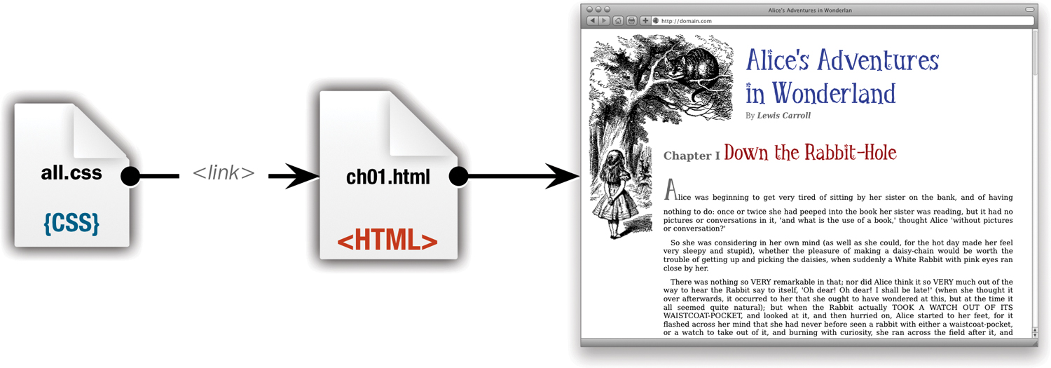
The One for All method uses only a single gargantuan CSS file linked to the HTML document.
Pros—One download is faster than multiple downloads, and the file is then cached for use on other pages. In addition, with all of your code in one place, you don’t have to worry about whether a page has access to the right styles.
Cons—This method may lead to large file sizes that can slow down the page loading time and take longer to render. Additionally, these files are harder to manage and edit.
The Divide and Conquer method
The Divide and Conquer method uses multiple links to multiple style sheets on an as-needed basis per page. Start with a link to a file with global styles used by all pages, and then add links to styles used for that page only. For example, if you use a special carousel module only on the main page, it would not go into the global file, but would exist as a separate CSS file for the home page or as part of a CSS file of general components  .
.
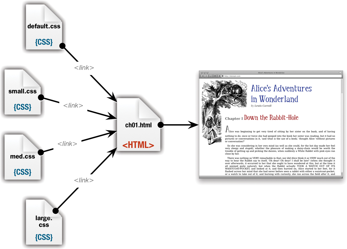
The Divide and Conquer method splits the CSS into multiple files, which are then applied only if they are relevant to the page.
Pros—Mix and match style sheets from your library to load only the styles you need and reduce bloated file sizes. Plus, as long as you keep your files organized, these are generally easier to edit.
Cons—Multiple files mean multiple server calls, which slows downloads. Plus, multiple files can be hard to keep up with, and their cascade order can conflict in unpredictable ways.
The Aggregate method
The Aggregate method uses @import to collect all the relevant CSS files from your library. The HTML document then has to link to only a single external file  .
.
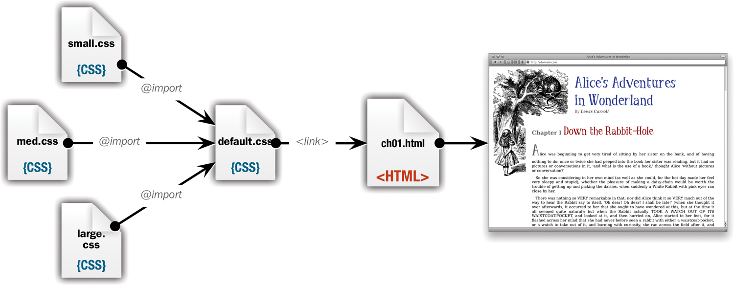
The Aggregate method uses the @import rule to bundle the style sheets into a single file that is linked to the HTML document.
Pros—Similar to the Divide and Conquer method, but by using only a single link, it’s easier to add or remove styles as needed because they are in a single CSS file rather than spread out across multiple HTML files.
Cons—Similar to the Divide and Conquer method, but worse. This used to be a very popular CSS strategy until someone discovered that using @import often prevents external style sheets from loading simultaneously. Instead, they must load one after another, which slows things down. Additionally, since the linked parent style sheet has to load before the imported style sheets are seen by the browser, this method can lead to the page re-rendering as new styles become available.
The Dynamic method
The Dynamic method relies not on your skills as a CSS coder, but on your skills writing server-side code. It is possible to write server scripts that take an aggregated CSS file full of @imports and combine them on the server into a single file for deployment  .
.
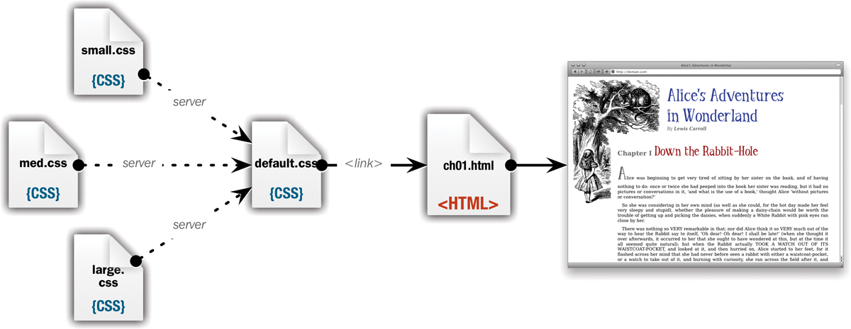
The Dynamic method relies on the server to dynamically bundle the relevant CSS for an HTML document into a single CSS file.
Pros—Combines the ease of use and lean file size of the Aggregate method with the speed of the One for All method.
Cons—Requires knowledge of server-side coding that is beyond the scope of this book. Talk to your server admin or developer for more details.
Troubleshoot Your CSS Code
All too often, you carefully set up your style sheet rules, go to your browser, and see...nothing. Or the page is displayed as an ugly mishmash of content. Don’t worry; this happens to everyone. Before you panic and throw your expensive laptop out the window, read through these suggestions.
Ask these questions
Many things could be preventing your style sheet rules from working properly; most of them are easily spotted. points out some common problems you may encounter:
• Are you missing any semicolons? A missing semicolon at the end of a declaration will cause the entire rule to fail.
• Did you remember to set the link relation? If you leave out the rel property, many browsers will not load the external style sheet.
• Did you open and close the declaration block with curly brackets? If not, there’s no telling what will happen.
• Did you remember to close all your multiline comment tags? If not, the rest of the CSS is treated as a comment. (See “Adding Comments to CSS” in Chapter 3.)
• Does your selector contain typos? If you forget the opening period or number sign (#) for classes and IDs, they won’t work.
• Did you mix up a class with an ID or vice versa? I often think I’ve set up a selector as an ID, but it was actually a class.
• Do the properties contain typos? Typos in one property can cause the entire rule to fail.
• Are the values you’re using permitted for that property? Using improper values may cause a definition to fail or behave unpredictably.
• Does this property work on the browser you are testing on? This is especially a problem if you are using new CSS3 properties. See Appendix A to make sure a property works on the browser you are using.
• If your rules are in the head, did you use the <style> tag correctly? Typos in the <style> tag mean that none of the definitions are used. In addition, if you set the media type, the styles will affect only the output to that medium. So setting the media type to print will prevent those styles from affecting content displayed on the screen. (See “Embedded: Adding Styles to a Web Page” in Chapter 3.)
• If you are linking or importing style sheets, are you retrieving the correct file? Check the exact path for the file. Also, remember that you should not include the <style> tag or any other non-CSS code in an external CSS file. (See “External: Adding Styles to a Web Site” in Chapter 3.)
• Do you have multiple, conflicting rules for the same tag? Check your cascade order. (See “Determining the Cascade Order” in Chapter 4.)
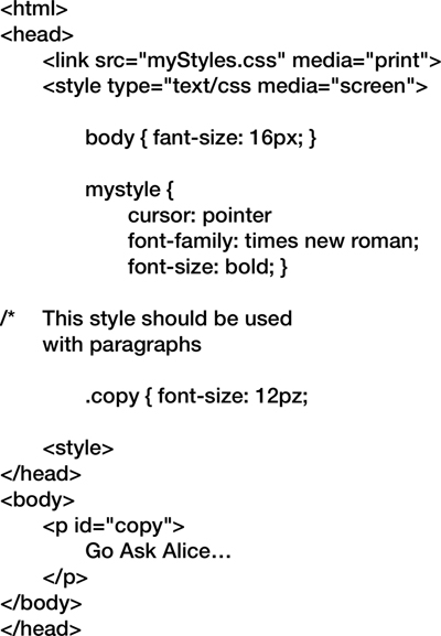
Errors are inevitable, but don’t let them ruin your day. How many can you find? Flip the page to see the answers .
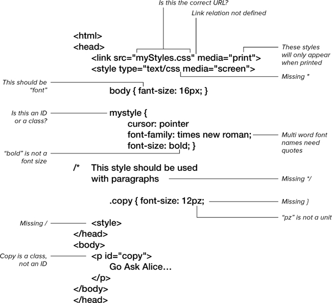
I think I caught all the errors in this code.
If all else fails, try these ideas
If you’ve looked for the preceding errors and still can’t get your code to work, here are a few more things to try:
• Make the declaration !important. Often, your declarations will conflict with each other, and it may be hard to track down where the conflict is. Adding !important to the declaration (see “Making a Declaration !important” in Chapter 4) will ensure that if it is working, it is applied to the page.
• Delete the rules and retype them. When you can’t see what’s wrong, retyping code from scratch sometimes fixes the problem.
• Test the same code on another browser and/or operating system. It’s possible that a property is buggy and doesn’t work correctly in your browser. It’s even possible that the browser doesn’t allow that property to work with that tag.
• Give up and walk away. Just joking—although you might want to take a 15-minute break before looking at the problem again.
• If nothing else works... Try a different solution for your design.
View CSS in Firebug or Web Inspector
Most Web designers work in Firefox, Safari, or Chrome while they are developing because all three have excellent add-ons and built-in tools for analyzing and editing code. For Firefox, this functionality is provided by the Firebug add on, while both Safari and Chrome use the Web Inspector provided with Webkit.
Both tools allow on-the-fly editing of the CSS and HTML of the Web page you are viewing, which allows you to modify and debug your code on your local computer without affecting the live version. Although each tool has many unique features, both share several key capabilities for working with CSS:
• Highlight elements. As you roll over elements in the screen, they are highlighted in the HTML code or vice-versa.
• View all rules applied to an element. As elements are selected, the applied CSS code is displayed, showing declarations that have been overridden or crossed out.
• Turn declarations on and off. You can selectively enable and disable declarations to see how they affect the design.
• Edit declaration properties and values. In addition to switching declarations on and off, you can directly edit or add them to a rule.
• View errors. Display any HTML or CSS errors encountered.
Firebug for Firefox (Win/Mac)
The Firebug plug-in tool for Firefox has become the de facto standard for Web designers everywhere . You can get it from the Firefox add-ons Web site or directly from the Firebug Web site, getfirebug.com.
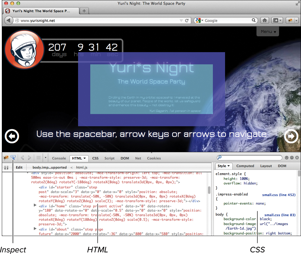
Firebug in Firefox.
Getting started with Firebug
1. Open the Firebug panel. Navigate to the Web page you want to look at and then click the Firebug icon in the lower right of the browser window or choose View > Firebug.
2. View the CSS. You can view the CSS by itself by clicking the CSS tab, or view it side by side with the HTML by clicking the HTML tab. I generally work in side-by-side mode.
3. Inspect an element. Click the Inspect button and then click the element in the screen you want to inspect. As you hover over an element, its box will be outlined with color-coded margins and padding. Firebug also highlights the element in the HTML code and displays all of the CSS being applied. Declarations are crossed out if they have been overridden by other declarations and are not being applied. Click to select an element for editing.
4. Turn off a declaration. Hover to the left of the property name in the declaration, and a not symbol ( ) appears. Click it to turn off the property, and click it again to turn on the property. In the viewport, you immediately see the effect of turning the property on and off.
5. Edit a declaration. Double-click the property name or value and you can type a new one. The effects of any changes will be visible almost immediately as you type.
6. Add a new declaration. Double-click the empty space to the right of the declaration you want to precede your new declaration, type the property name, press Tab, and then type the property value. Do not type the closing semicolon (;). Changes appear instantly as you type.
Web Inspector in Safari (Win/Mac) and Chrome (Win/Mac)
Both Safari and Chrome have this built-in Web developer tool, which allows you to quickly analyze and edit your CSS and HTML . Both Safari and Chrome are available for Windows and Mac OS X:
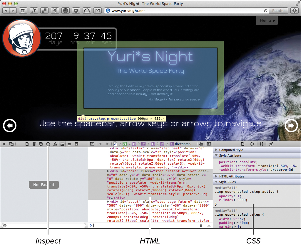
The Web Inspector in Safari. It looks pretty much the same in Chrome.
Getting Started with Web Inspector
1. Turn on the Developer menu in Safari. Open the Preferences panel for the browser, click the Advanced tab, and select “Developer menu in menu bar.”
2. Open the Web Inspector panel. Navigate to the Web page you want to look at and in Safari choose Develop > Show Web Inspector, or in Chrome choose View > Developer > Developer Tools.
3. View the CSS. You can view the CSS side by side with the HTML by clicking the Elements tab.
4. Inspect an element. Click the Inspect icon (magnifying class) and then click the element in the screen you want to inspect. As you hover over an element, its box will be outlined, along with color-coded margins and padding. Firebug also highlights the element in the HTML code and displays all of the CSS being applied. Declarations are crossed out to indicate that they have been overridden by other declarations and are not being applied. Click to select an element for editing.
5. Turn off a declaration. Hover over the declarations in the CSS, and a check box will appear next to each on the right side. Deselect the check box to turn off the declaration. Select the check box to turn it on. In the viewport, you immediately see the effect of turning the declaration on and off.
6. Edit a declaration. Double-click the declaration you want to change and edit it as necessary. The effects of any changes will be visible almost immediately as you type.
7. Add a new declaration. Double-click the empty space to the right of the declaration you want to precede your new declaration, type the property name, and then type the property value. Do not type the closing semicolon (;). Press Return to make the changes appear.
There is a “lite” version of Firebug available for Chrome and Safari. It’s not as powerful, though, and I would recommend sticking with Web Inspector on those browsers.
Validate Your CSS Code
The W3C provides a Web site called the CSS Validator that lets you check your CSS code to confirm that it meets the requirements set in the W3C standards.
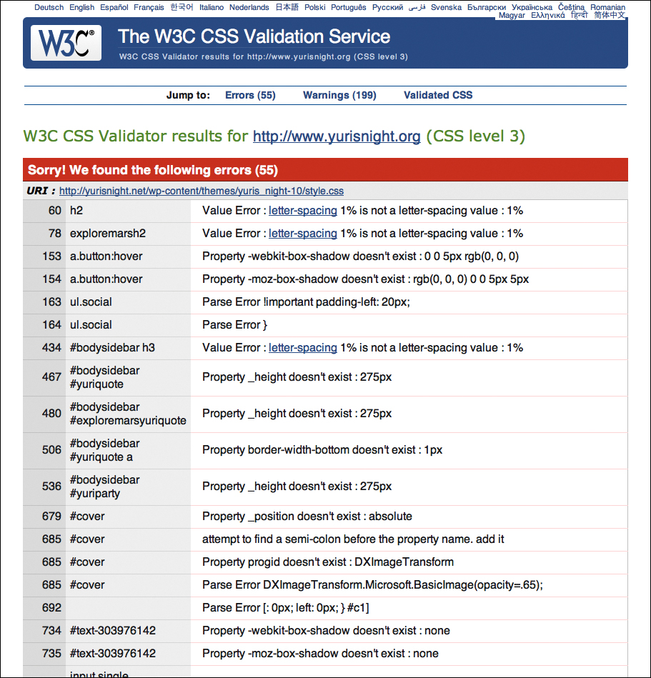
The W3C’s Validator.
To use the W3C’s CSS Validator
1. To go to the W3C validator Web site, point your Web browser to jigsaw.w3.org/css-validator.
2. Choose the method to validate your CSS. You can enter a URL (by URI), enter the CSS code directly in a form (with a text area), or upload your files (by file upload). In this example, you’ll submit a URL.
3. Enter the URL of your Web site or style sheet. I recommend entering the exact URL of the style sheet.
4. Wait. The validation takes only a few seconds. You’re given a report of errors and other possible problems with your CSS.
Although you don’t need valid CSS for a browser to display your code, the validation process often helps locate code errors.
Minify Your CSS
Although creating readable CSS is great for editing and maintaining your code, all of those comments, spaces, and returns end up adding a lot of overhead to your file size. Additionally, although I’m sure you are a fine coder, there is always more room to sort and merge selectors for optimization.
If you want to cut down on your file size, before you deploy your site to the Web, create a minified version of your CSS code. Depending on the size of your CSS file, this can go far to reduce file size.
Don’t delete the readable version. You need to keep that version around to make changes.
Minifying your own code is possible but can lead to numerous errors. Fortunately, several online tools are available to help you. My favorite is Minify CSS’s CSS Compressor & Minifier .
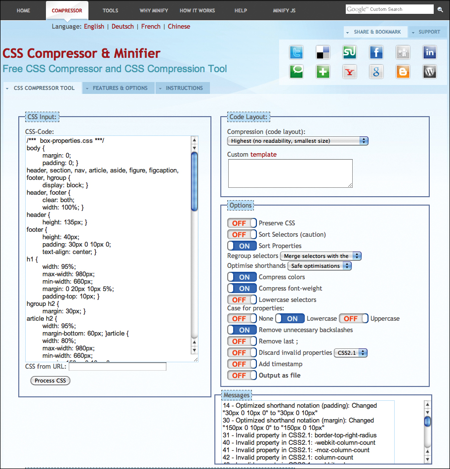
The Minify CSS Compressor page at www.minifycss.com/css-compressor.
Code 15.5. My CSS code before being minified.
/*** box-properties.css ***/
body {
margin: 0;
padding: 0; }
header, section, nav, article, aside, figure, figcaption, footer, hgroup {
display: block; }
header, footer {
clear: both;
width: 100%; }
header {
height: 135px; }
footer {
height: 40px;
padding: 30px 0 10px 0;
text-align: center; }
h1 {
width: 95%;
max-width: 980px;
min-width: 660px;
margin: 0 20px 10px 5%;
padding-top: 10px; }
hgroup h2 {
margin: 30px; }
article h2 {
width: 95%;
margin-bottom: 60px; }article {
width: 80%;
max-width: 980px;
min-width: 660px;
margin: 150px 0 10px 0;
border-top-right-radius: 20px;
border-top: 10px transparent solid;
border-right: 10px transparent solid;
padding: 80px; }
article p {
margin: 0; }
article h2 + p {
margin-bottom: 1em;
padding-bottom: 1em;
-webkit-column-count: 2;
-moz-column-count: 2;
column-count: 2;
-webkit-column-gap: 4em;
-moz-column-gap: 4em;
column-gap: 4em;
-webkit-column-rule: 2px groove rgba(0,0,0,.5);
-moz-column-rule: 2px groove rgba(0,0,0,.5);
column-rule: 2px groove rgba(0,0,0,.5); }
article h2 + p:first-letter {
float: left;
display: block;
margin: .35em .2em .2em 0;
padding: 0; }
aside {
width: 200px;
height: 400px;
overflow: auto;
border-radius: 20px/40px;
padding: 20px; }
footer nav a {
margin: 0 1em; }
footer nav a:hover {
outline: rgba(135,127,107,.65) 10px double;
}
figure {
border: 6px double rgba(142, 137, 129,.5);
clear: both; }
figure img {
margin: 0; }
figure.cl-illo {
border-radius: 10px; }
figure.bw-illo {
border: 1em double rgba(142, 137, 129,.5);
-webkit-border-image: url('../images/chrome/border-02.png') 27 round;
-moz-border-image: url('../images/chrome/border-02.png') 27 round;
-o-border-image: url('../images/chrome/border-02.png') 27 round;
border-image: url('../images/chrome/border-02.png') 27 round; }
figcaption {
border-top: 2px solid rgba(142, 137, 129,.5);
padding: 10px; }
.floatleft {
float:left;
margin: 1em 2em 1em 0; }
.floatright {
float:right;
margin: 1em 0 1em 2em; }
.floatcenter {
margin: 1em auto ; }
To minify your CSS
1. Visit Minify CSS. Once you have finished your CSS code and are ready to go live on the Web, point your browser to www.minifycss.com/css-compressor.
2. Load your CSS code. You can either paste it directly into the form field or enter a URL from which to grab the CSS (Code 15.5). I pulled this code from Chapter 10.
3. Choose your options. Experiment to get the desired effect, but remember that your goal is to reduce your code file size as much as possible. You can also choose whether to output the code for you to copy or as a separate CSS file.
4. Process CSS. Click the Process CSS button under the field where you added your code. After a few seconds, a list of messages will appear showing the invalid properties discovered. Under that is your code to download or copy (Code 15.6).
If you are using CSS3, you can expect to see several invalid properties, since the Minifier does not include those yet.
5. TEST, TEST, TEST! Depending on how much you compressed your code, it may have changed a little or a lot. Regardless, it’s different and may behave differently. If you encounter problems with the new CSS code, try minifying it again using different settings.
Code 15.6. The same CSS code after being minified.
body{margin:0;padding:0;}header,section,nav,
article,aside,figure,figcaption,footer,
hgroup{display:block;}header,footer{clear:
both;width:100%;}header{height:135px;}
footer{height:40px;padding:30px 0 10px;
text-align:center;}h1{margin:0 20px 10px
5%;max-width:980px;min-width:660px;padding-
top:10px;width:95%;}hgroup h2{margin:30px;}
article h2{margin-bottom:60px;width:95%;}
article{border-right:10px transparent
solid;border-top:10px transparent
solid;border-top-right-radius:20px;margin:
150px 0 10px;max-width:980px;min-width
:660px;padding:80px;width:80%;}article
h2 + p{-moz-column-count:2;-moz-column-
gap:4em;-moz-column-rule:2px groove
rgba(0,0,0,.5);-webkit-column-count:2;-webkit-
column-gap:4em;-webkit-column-rule:2px
groove rgba(0,0,0,.5);column-count:2;column-
gap:4em;column-rule:2px groove
rgba(0,0,0,.5);margin-bottom:1em;padding-
bottom:1em;}article h2 + p:first-letter{dis
play:block;float:left;margin:.35em .2em .2em
0;padding:0;}aside{border-radius:20px;height:
400px;overflow:auto;padding:20px;width:200px;}
footer nav a{margin:0 1em;}footer nav a:hov
er{outline:rgba(135,127,107,.65) 10px double;}
figure{border:6px double rgba(142,137,129,.5);
clear:both;}figure.cl-illo{border-radius:10px;}
figure.bw-illo{-moz-border-image:url(../images/
chrome/border-02.png) 27 round;-o-border-
image:url(../images/chrome/border-02.png)
27 round;-webkit-border-image:url(../images/
chrome/border-02.png) 27 round;border:1em
double rgba(142,137,129,.5);border-image:
url(../images/chrome/border-02.png) 27 round;}
figcaption{border-top:2px solid rgba(142,137,
129,.5);padding:10px;}.floatleft{float:left;
margin:1em 2em 1em 0;}.floatright{float:right;
margin:1em 0 1em 2em;}.floatcenter{margin:1em
auto;}article p,figure img{margin:0;}
33 CSS Best Practices
Throughout the pages of this book, I’ve offered numerous tips, recommendations, and suggestions. I’ve tried to follow my own advice in all of the code I’m presenting, but the necessities of creating useful examples had to be balanced against the needs of best practices for coding. So, to clear up any confusion, here are the 33 most important best practices for CSS, along with cross-references showing where you can find additional information.
1. Always specify units for values except when the value is 0. It’s a simple equation:
0px = 0in = 0em = 0cm = 0% = 0mm = 0
Zero is always zero, and you don’t need to define what kind of 0 it is.
See “Values and Units Used in This Book” in the Introduction.
2. Structure first, then presentation. Some designers want to start designing pages without first placing the HTML structure, but this is like trying to put siding on a house that hasn’t been framed yet.
See “How Does HTML5 Structure Work?” in Chapter 2.
3. Specify a doctype. These days, using a DTD should go without saying, but an HTML document without a doctype is like a book without a cover. Not only do you not know what’s in it, but the whole thing tends to fall apart.
See “How Does HTML5 Structure Work?” in Chapter 2.
4. All styles should be external. To keep the Web site as easy to change as possible, the final styles should always be located in external files and never be embedded in the head or inline. Embedded or inline styles are acceptable during development but should all be moved into an external style sheet before deployment.
See “External: Adding Styles to a Web Site” in Chapter 3.
5. Keep the number of external style sheets to a minimum. This may seem to contradict the previous statement, but every external style sheet is a call to the Web server, and every call slows down Web page loading. This is true whether you are using <link> or @import.
See “External: Adding Styles to a Web Site” in Chapter 3.
6. Place style links in the <head>, never in the <body>. Styles placed in the <body> of an HTML document will not be applied to the page until after the Web page has displayed, causing the entire document to briefly flash as it re-renders the page with the styles. This is annoying and unattractive.
See “External: Adding Styles to a Web Site” in Chapter 3.
7. Use link to add styles to an HTML document and @import to add styles to other style sheets. Older versions of Internet Explorer will load styles in the <head> as if they were in the <body>, causing the annoying flash as the page re-renders.
See “External: Adding Styles to a Web Site” in Chapter 3.
8. Include default styles for HTML elements. Don’t design by default. Use a CSS override to reset some values, but always define the default style for as many HTML elements as you will be using in your designs.
See “(Re)defining HTML Tags” in Chapter 3.
9. Use generic class names. Classes are reused throughout a page, often combined with different elements, and are subject to change. If the name is based on a value, changing the value can make the class name confusing.
See “Defining Reusable Classes” in Chapter 3.
10. Use specific ID names. IDs should be used only once per HTML document, so the name needs to specify what it is or what it’s for.
See “Defining Unique IDs” in Chapter 3.
11. Add a unique class name or ID to the body tag of every page. This gives every page its own unique identification, which you can then leverage to style the page separately from other pages.
You can also add classes for the page’s section or other designations that distinguish it in the site. This can help you reduce the number of external style sheets because it allows you to add styles for selective pages all in the same external file.
See “Defining Reusable Classes” and “Defining Unique IDs” in Chapter 3.
12. Mix and match classes. You can apply multiple classes to a single element simply by placing the class names in the same class property in the tag, separated by spaces. This allows you to combine classes rather than creating new ones to meet a specific need.
See “Defining Reusable Classes” in Chapter 3.
13. Combine rules into selector lists. Elements that have the same CSS properties and values can be combined into a single CSS rule.
See “Grouping: Defining Elements That Are Using the Same Styles” in Chapter 3.
14. Use dynamic styles for form elements, buttons, and other interface elements. Many elements, such as form fields and form buttons, can have multiple dynamic states that can provide visual feedback for hover and also when a button is clicked or a form field is selected. Don’t forget to style these, too.
See “Working with Pseudo-Classes” in Chapter 4.
15. Use @media rules and media queries to tailor the page to the device. Although not available to all browsers, media queries allow you to distinguish many mobile browsers, such as the iPhone, so that you can deliver a custom experience.
See “Querying the Media” in Chapter 4.
16. Favor specificity over classes and IDs, but only be as specific as necessary. Specificity allows you to selectively style an element without explicitly identifying it with a class or ID. Although classes and IDs can be useful, they will often limit the versatility of the page structure. Before adding a new class or ID to an element, see if you can use contextual styles.
On the other hand, don’t make styles so specific that they apply only to very specific cases, when they may need to apply more broadly.
See “Defining Styles Based on Context” in Chapter 4.
17. Avoid !important. The !important value is a blunt weapon. It turns styles on and overrides the cascade order. This also means that it can be very tricky to override. If you do use !important during development, try to take it out before your site goes live.
See “Making a Declaration !important” in Chapter 4.
18. Avoid unnecessary and repetitive repetition. Style sheets can quickly become cluttered with redundant properties and values that do not actually change the value of whatever is already set. Remember that once a property value is set, it will cascade down to child elements.
For example, if you set the font size for the body, you will never need to set it again unless a specific element uses a different size. All too often I see the same font size set for element after element. Remember to check whether a style has already been set for a parent element before you set it.
See “Determining the Cascade Order” in Chapter 4.
19. Use relative sizes for font size. Although it is sometimes easier to use sizes such as pixels, using relative sizes such as ems allows you to scale text sizes on the page uniformly and keep better typographic rhythm.
See “Setting the Font Size” in Chapter 5.
20. Prefer shorthand properties. The shorthand properties, such as font, allow you to set multiple values with a single property. This not only cuts down on the amount of code, it also keeps similar property values together, making editing easier.
See “Setting Multiple Font Values at the Same Time” in Chapter 5.
21. Use RGB for color. You may see hex color values more often than RGB, but there is no really good reason to use one over the other from a code standpoint. Because RGB values are easier for mere mortals to understand and you can now set transparent colors using RGBA, I recommend always using RGB.
See “Choosing Color Values” in Chapter 7.
22. Use background images or other styles for interface chrome. The <img> tag should be used for images that are content: photographs, figures, or illustrations. Chrome constitutes the visual elements of the interface such as backgrounds, buttons, and other controls.
Instead of using the <img> tag to add these, interface chrome should be added using background images. This makes it easier to make changes or to completely rework the design without touching the HTML code.
See “Setting Background Images” in Chapter 7.
23. Use CSS sprites. Use sprites to add images to different dynamic states with only a single file that changes position to reveal each state. CSS sprites are faster to load than multiple images and do not flash as the states change.
See “Using CSS Sprites” in Chapter 13.
24. Use CSS for simple background gradients. Simple gradients are supported in most browsers now and can be used in backgrounds. Rather than slowing things down with images, use CSS gradients.
See “Creating Color Gradients” in Chapter 7.
25. Start with a clean slate. CSS resets allow you to set a level playing field, making it easier to design across multiple browsers.
See “Resetting Browser Default Styles” in Chapter 14.
26. Favor margin over padding. Due to problems with Internet Explorer and the box model, padding can cause problems with elements that have a defined width or height. If you have a choice, use margin.
See “Adjusting CSS for Internet Explorer” in Chapter 14.
27. Test your code in Firefox, Chrome, and/or Safari while building, and then fix it for Internet Explorer. Although IE still has the lion’s share of the browser market, it’s easiest to build a site to Web standards, and then accommodate for IE’s idiosyncrasies rather than the other way around.
See “Adjusting CSS for Internet Explorer” in Chapter 14.
28. Style all link states. Many designers will style only the default link state and maybe the hover state. However, you can also style visited and active states, which provide visual feedback to the user when clicking a link.
See “Styling Links vs. Navigation” in Chapter 13.
29. Use comments to keep notes and organize your code, especially for constant values. Notes are helpful for recording information about your design, especially in color or font values that you will be using consistently throughout your design. Notes can also be used to create section dividers in your code to help organize and make scanning for particular parts easier.
See “Create Readable Style Sheets” earlier in this chapter.
30. Use specificity to organize your code. Specificity is not just a great idea for styling; you can use it to create an outline-like format for your code, making it easier to scan and find related elements.
See “Create Readable Style Sheets” earlier in this chapter.
31. Favor <link> over @import. Although both can be used to bring style sheets into Web documents, tests have shown that most browsers will download linked style sheets faster than imported ones. This is true even if the @import is in an external style sheet because the parent external style sheet has to be loaded before its children are considered.
See “Have a Style Sheet Strategy” earlier in this chapter.
32. Minify your CSS before you launch. Mean and lean code leads to faster download speeds, which always make for a better user experience. While you are developing your site, your code should be as readable as possible. But when you launch the site, you can remove all spaces, returns, and notes from your code.
See “Minify Your CSS” earlier in this chapter.
33. Use fonts for icons. With web fonts now a fact of life, we can rely on them for a variety of purposes that would have been unthinkable just a few years ago—most notably using them for icons instead of images. Images are limited by their sizes and styles, while fonts can be resized and restyled at will. This is especially important for responsive design, where sizes need to change depending on the display device in use.
See “Using Web Fonts” in Chapter 5.