
Hour 10. Binding Data to Our Apps
What You’ll Learn This Hour:
• Binding data to WinJS and HTML intrinsic controls
• Performing one-time data binding
• Performing one-way data binding
• Creating a converter function
• Creating templates
• Exploring the ListView control
• Binding data to a custom collection and the ListView control
• Displaying data in groups
• Seeing how the CSS grid works
• Implementing semantic zoom
Writing a meaningful app is almost impossible without having some sort of data binding in place. We start by binding data to simple HTML controls and then binding them to WinJS controls. We also look at one-time binding as well as one-way binding, and we discuss the differences between them.
In addition, we spend some time working with the ListView control. We explore how to bind data to the control. We look at creating templates that the control can use to style the items. We examine how to group items to display group headers. The CSS grid is flexible, and we take a look at how it works. Finally, we implement semantic zoom during this hour.
Introducing Data Binding
Data binding is the process of taking data from a source and then applying the data to a control. This could be a single piece of data being bound to a single control, like a label, or it could be a collection of data being bound to many controls. When an app knows up front exactly what data it will need, data binding isn’t needed; we simply write the static values into the markup, JavaScript, or even CSS (with the content property). However, the majority of the time, we need to load data dynamically. This is where data binding comes in. We can retrieve data dynamically and then bind that data to the controls on the page.
Some third-party JavaScript libraries provide data binding. One such library is Knockout.js. However, for this book, we stick to what is available out of the box. Using a third-party library for data binding is perfectly acceptable, but here we use the data-win-bind HTML5 custom data attribute that WinJS provides. The WinJS.Binding namespace has a processAll function (which actually calls declarativeBind inside the base.js of WinJS) which takes in a rootElement, dataContext, skipRoot, and bindingCache parameters. If no root element is passed in, the body element is used. This function binds data for the element and all children of the element. The dataContext parameter is the actual data. This is where we pass in the view model of our object. The skipRoot Boolean parameter is used for templating. If it is true, the rootElement itself is skipped and only the children elements are processed. Finally, the bindingCache parameter handles internal WinJS caching of the data.
By adding in the WinJS.Binding.processAll(); call, we tell WinJS to bind the data it finds for all elements under the body element. We do this after the WinJS.UI.processAll() call so that when we create WinJS UI controls, they are instantiated as expected and when we bind data to those controls, they show up.
The WinJS.Binding.processAll function is not the same as the WinJS.UI.processAll function. The WinJS.UI.processAll function instantiates the WinJS controls declared in the data-win-control custom attributes. The WinJS.Binding.processAll processes the bindings declared in the data-win-bind custom attributes.
To demonstrate, this let’s add a new WinJS ToggleSwitch control to the default.html file:
<div data-win-control="WinJS.UI.ToggleSwitch"
data-win-options="{labelOn: 'Yes', labelOff: 'No', title: 'Autosave'}">
</div>
If we run the app, the toggle switch is displayed in the off state with the title of Autosave. To add data binding properties to a WinJS control, we still use the data-win-bind custom data attribute, but we need to take an extra step: We need to remember that the WinJS control itself is accessible from the winControl property of the element.
If we want to bind some data to this toggle switch control, we need to be sure to bind to the winControl property of the element. Let’s replace the existing toggle switch with this new version that includes the data binding attribute data-win-bind:
<div data-win-control="WinJS.UI.ToggleSwitch"
data-win-options="{labelOn: 'Yes', labelOff: 'No', title: 'Autosave'}"
data-win-bind="winControl.title: source; winControl.checked: chk">
</div>
Instead of just setting the title of the control, we actually set the winControl.title. We do the same for the checked attribute by using winControl.checked. We need to actually create that chk variable we are binding to the checked property. Let’s add the following global variable under the source variable inside of default.js:
var chk = true;
Now when we run the project, we see that winControl.title has been set to the same value as the h1 element, and the toggle switch is now on instead of off.
To demonstrate the importance of the placement of the WinJS.Binding.processAll function, let’s move it from below the WinJS.UI.processAll call to above it. When we run the app now, the h1 element has the source value applied, but the ToggleSwitch control does not. This is because we need to bind the data after WinJS has created the objects. Otherwise, there is no winControl to bind to! We can move the WinJS.Binding.processAll call to its original spot to get the data binding to work again.
With these very simple examples, why we want to do data binding might not be apparent. Based on what we just saw, we are merely setting values at the beginning, and we haven’t gained any functionality. We have been setting values to elements and WinJS controls through JavaScript throughout the book so far without the need for data binding. During this hour, we examine the benefit as we look into what functionality data binding provides for our apps.
Exploring One-Time Data Binding
In one-time binding, we initialize a target a single time. This is the process we have seen so far of binding source data to initialize the target element. The benefit of data binding is less code involved. We simply have our source object in code, and through the markup, we declaratively bind the source object to the target element by setting the data-win-bind attribute. Data binding is really that simple.
Let’s take a side trail for a moment to learn a new way to make sure our content is loaded before executing our code. Most of the sample code has illustrated the use of the DOMContentLoaded event handler. This is definitely available to use. If we weren’t creating so many small Blank App projects, we would actually have real WinJS page controls to navigate to. These page controls have the ready event, which gets executed immediately after the DOMContentLoaded event. Another option is to put the code in the onactivated event immediately before or after the call to WinJS.UI.processAll. We discuss the application life cycle and when the onactivated event gets called during Hour 15, “Handling Our App Life Cycle Events.”
Fortunately, WinJS also provides a utility class so that, even if we aren’t using a page control, we can tie into the ready event. This ready event fires after the onactivated event. We can add the following code under the call at the end of the default.js file after the self-executing anonymous function is closed:
WinJS.Utilities.ready(function () {
});
Whenever we make Blank App projects, we use the WinJS.Utilities.ready function instead of the DOMContentLoaded event handler as we did in the past. The benefit of using this ready function is that it is a promise. If we want to do extra processing after the code inside the ready event handler completes, we can simply chain some then functions and/or a done function to the promise.
After that bit of housekeeping, we can look at something else that is really wrong with the examples so far. We have been setting our objects in global space, but we don’t want to pollute the global space so that we can modify the existing code to use a namespace for our source data. To start, we can remove the two global variables we created: source and chk. Next, we can replace the ready function call with the following code:
WinJS.Utilities.ready(function () {
WinJS.Namespace.define("STYWin.OneTime", {
source: "Source Data",
chk: true
});
});
We covered how to define namespaces during Hour 4, “Creating WinJS Namespaces, Classes, and Custom Controls.” We are creating the STYWin.OneTime namespace with the source and chk properties values set. Now we can modify the markup to actually use the source data from the namespace by replacing the contents of body element with the following code:
<h1 id="target" data-win-bind="innerText: STYWin.OneTime.source"></h1>
<div data-win-control="WinJS.UI.ToggleSwitch"
data-win-options="{labelOn: 'Yes', labelOff: 'No', title: 'Autosave'}"
data-win-bind="winControl.title: STYWin.OneTime.source;
winControl.checked: STYWin.OneTime.chk">
</div>
Creating Converter Functions
Sometimes we need to format the data we are binding. We can only bind properties, so we can’t bind a function and pass a property to it. The following code is not valid:
data-win-bind="innerText: notValid(STYWin.OneTime.source)"
If we have a value that we want to format as currency, we use a converter to be run against the property. A converter takes in a property value and returns the value to be bound. In the ToggleSwitch control example, we showed how to bind multiple properties on the same control by separating them with a semicolon:
data-win-bind="winControl.title: source; winControl.checked: chk"
The syntax so far is target: source; target: source; .... However, we can add an optional converter function to the mix. So the complete valid syntax is this:
target: source converterFunc [; target_n: source_n converterFunc_n]
To test this, let’s add a new source property called funds with a value of 45.2 to the STYWin.OneTime namespace. Then we can create a new div element to be the target of this new data source:
<div data-win-bind="innerText: STYWin.OneTime.funds"></div>
When we run the app, we should see the value of 45.2 displayed on the screen. We want that to be formatted as currency, so we need to create a converter function for this data source. Let’s add the following code somewhere inside the ready function:
WinJS.Namespace.define("STYWin.Utility", {
formatCurrency: WinJS.Binding.converter(function (num) {
// Determine the current user's default currency.
var userCurrency = Windows.System.UserProfile
.GlobalizationPreferences.currencies;
var currencyFormat = new Windows.Globalization
.NumberFormatting.CurrencyFormatter(userCurrency);
currencyFormat.isGrouped = true;
return currencyFormat.format(num);
})
});
The converter function we are creating is called formatCurrency. We place it inside the STYWin.Utility namespace. This function takes in a number and returns the formatted number. It uses the user’s currency from the profile globalization preferences, which is obtained through WinRT. The isGrouped flag adds the separator character on the integer amount (it adds commas to the dollar amount). We format it and pass the value back to the calling function, which happens to be the WinJS.Binding.converter function. To turn a function into a converter function, we must pass it into the WinJS.Binding.converter function. When we have the JavaScript added, we can modify the div to use the converter function:
<div data-win-bind=
"innerText: STYWin.OneTime.funds STYWin.Utility.formatCurrency"></div>
We have the funds in the STYWin.OneTime namespace and the formatCurrency converter function in the STYWin.Utility namespace. If we need to set another property, we simply add a semicolon after the formatCurrency and start the next target: source converterFunc pattern.
Exploring One-Way Data Binding
The power of data binding comes when, instead of doing one-time binding, we do one-way binding. One-way binding enables us to set the target, but whenever the source changes, the target also changes automatically. A third type of data binding exists as well, but WinJS does not currently support it. The third type of data binding is two-way, and as the name suggests, it handles changes of the source data by updating the target element as in one-way binding, but it also allows changes made to the target element (think input box) to be updated back to the source data.
Because WinJS does not currently support two-way binding, we focus only on how one-way binding works. Effectively, one-way binding is simply the one-time binding model getting executed each time the source data changes. To make this one-way binding happen, we need to create observable objects. By utilizing the WinJS.Binding.as function, we can turn any object into an observable object. Observable objects are simply objects that can publish events. This allows other parts of the app (WinJS, in this case) to listen to the object and execute code when the object changes.
Two-way binding is simple enough to create by adding an event to the UI element we want to monitor and then update the back-end property appropriately.
To demonstrate how one-way binding works with observable objects let’s add the following markup to the default.html file:
<div data-win-bind="innerText: STYWin.ViewModel.currentDate"></div>
<div data-win-bind="innerText: STYWin.ViewModel.currentTime"></div>
The corresponding JavaScript follows:
WinJS.Namespace.define("STYWin", {
ViewModel: WinJS.Binding.as({
currentTime: new Date(),
currentDate: new Date()
})
});
setInterval(function () {
STYWin.ViewModel.currentTime = new Date();
}, 500);
setInterval(function () {
STYWin.ViewModel.currentDate = new Date();
}, 5000);
We set up a ViewModel namespace and bind both currentTime and currentDate. These both will get and display the same value, even though they have names that suggest differently. The difference lies in how often they update. currentTime is updated every half-second (500 milliseconds), whereas currentDate is updated every 5 seconds (5,000 milliseconds). The WinJS.Binding.as function takes an object as its parameter, not a single property. The object we are passing in has two properties: currentTime and currentDate. When we run the project, we see that the values are being updated continually because the timeout functions are kicking off the event to modify the value every so often. This is one-way binding in action. When we run the app, we see the results in Figure 10.1.
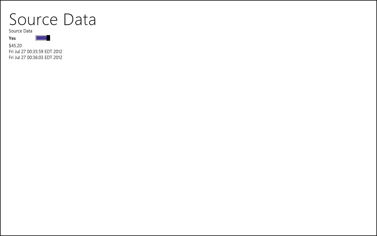
Figure 10.1. One-way binding updates the target element as the source property’s value is modified.
Using Templates
Sometimes we want to bind a group of objects to our apps. We can do this easily by using templates. If we have a list of people we want to display as a collection in which each item (person info) looks identical in our view (the HTML page), we can use templates to create general markup that can be applied to each item in the collection.
To begin, we can create a div on the page to actually display the list. This is simply a placeholder where the data will be put shortly:
<div id="renderTarget"></div>
Next, we can create the template. The template markup can be positioned anywhere in the HTML file:
<div id="templateDiv" data-win-control="WinJS.Binding.Template">
<div class="templateItem" data-win-bind="style.borderColor: color">
<ul>
<li><span>Name: </span>
<span data-win-bind="textContent: name"></span></li>
<li><span>Birthday: </span>
<span data-win-bind="textContent: birthday"></span></li>
<li><span>Available Funds: </span>
<span data-win-bind=
"textContent: funds STYWin.Utility.formatCurrency">
</span></li>
<li><div data-win-bind="style.background: color"></div></li>
</ul>
</div>
</div>
We start by creating the WinJS.Binding.Template control. As the name implies, it is a template that enables us to reuse the markup within as we bind our collection of objects to it. The first child of the template control is a div with the templateItem class associated to it. Now’s a good time to look at the CSS we need. Add the following to the default.css file:
.templateItem {
border: 2px dashed black;
border-radius: 25px;
width: 400px;
}
.templateItem li div {
width: 200px;
height: 40px;
}
So the first div of the template uses the templateItem class, which styles it with a border and sets the width to 400 pixels. The second CSS rule styles the very last div in the list items. This simply makes the div 200×40 pixels. The entire markup in between is simply binding data to different span elements. The funds data source gets the formatCurrency converter function applied to it before binding it to the textContent attribute.
Now let’s take a look at the JavaScript needed to actually populate a collection of data and bind it to this template. The following code could go into the main default.js file, but let’s split this out into a new file called person.js that needs to be placed in the /js folder:
WinJS.Namespace.define("STYWin.Data", {
Person: WinJS.Binding.define({
name: "",
color: "",
birthday: "",
funds: ""
})
});
The person.js file contains a Person object associated to the STYWin.Data namespace. The properties of the Person object are wrapped in the WinJS.Binding.define function. WinJS.Binding.as returns an object, and WinJS.Binding.define returns a function. Both set the objects passed to them as observable.
We can include the person.js script to our main default.html page by adding the following line above the reference to default.js:
<script src="/js/person.js"></script>
Next, we want to emulate getting date from a server somewhere. So we are going to create a file called data.js. This file will contain JSON data of several person objects:
[{ "name": "Bill", "color": "green", "birthday": "9/5/1981", "funds": 100 },
{ "name": "Clark", "color": "yellow", "birthday": "8/27/1971", "funds": 23.7 },
{ "name": "Doug", "color": "blue", "birthday": "1/12/1996", "funds": 12 },
{ "name": "Elissa", "color": "pink", "birthday": "12/31/1999", "funds": 99.99 },
{ "name": "Jill", "color": "orange", "birthday": "2/19/1990", "funds": 45.5 },
{ "name": "Adam", "color": "blue", "birthday": "5/1/1945", "funds": 1009.4 },
{ "name": "Frank", "color": "orange", "birthday": "4/1/1950", "funds": 402.95 },
{ "name": "David", "color": "linen", "birthday": "3/2/1984", "funds": 103.42 },
{ "name": "Brian", "color": "green", "birthday": "7/1/1971", "funds": 69.49 },
{ "name": "Jacob", "color": "black", "birthday": "6/14/1999", "funds": 559.7 },
{ "name": "Andrew", "color": "brown", "birthday": "10/16/1967", "funds": 99.99 }]
Finally, we can add the following JavaScript to the ready event inside the default.js file:
//pull in data from source (web, local, wherever)
//for us it is just in data.js (extension could be anything)
//but this could easily be a web service that returns JSON data
WinJS.xhr({ url: "/js/data.js" }).done(function (peeps) {
WinJS.Namespace.define("STYWin.Data", {
people: JSON.parse(peeps.responseText)
});
var templateElement = document.getElementById("templateDiv");
var target = document.getElementById("renderTarget");
target.innerHTML = "";
WinJS.UI.process(templateElement).then(function (templateControl) {
for (var i = 0; i < STYWin.Data.people.length; i++) {
templateControl.render(STYWin.Data.people[i], target);
}
});
});
The WinJS.xhr function simply wraps the standard XMLHttpRequest function. However, xhr returns a helpful promise. The function takes in the url parameter of the data we are reaching out to get. In this case, the data is included in the app package. We simply point to our local file. We can easily connect to an external web service or web API to pull down JSON data; Hour 12, “Using Remote Data,” covers this.
The technique of loading a local resource using WinJS.xhr enables us to prototype with static data until we are ready to connect to a real web service to obtain real information.
We chained the done function to the xhr promise. We got the data from the resource that was just retrieved. We created the parameter of peeps to store the collection of persons that was read in from the data.js file. We declare a people object on the STYWin.Data namespace. This people object gets the responseText from the peeps object after it has been parsed by the JSON object. Remember from Hour 7, “Debugging, Securing, and Measuring Our App’s Performance,” that we want to use JSON.parse and not eval, for security reasons. When our STYWin.Data.people object has an array of persons, we want to pass it into the template we declared in the HTML file. To start, we get the actual template element along with the target where we will be rendering all these people.
By calling WinJS.UI.process, we are applying control binding to the templateElement being passed in. This promise returns the WinJS.Binding.Template control that is attached to the element (templateControl). After the promise returns the control we want to render, we loop through each person in our people collection, call the render function of the WinJS.Binding.Template control, and pass in the person and the actual container element we are rendering the template into (<div id="renderTarget"></div>).
Figure 10.2 shows the results of running the project. In just a few pages, we have shown how to do simplistic binding on complex objects that will update the display when their value changes.
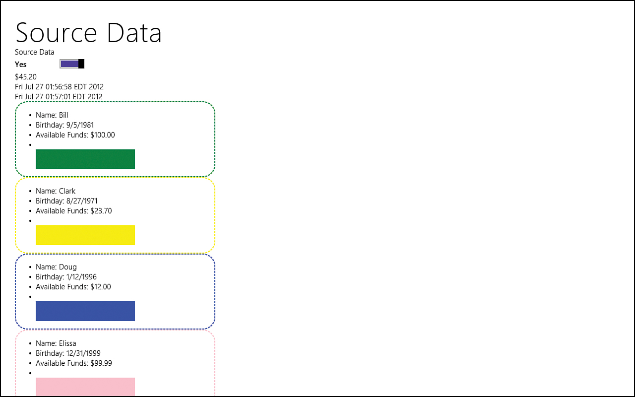
Figure 10.2. We can bind each person to a template and have each template render itself on the page.
Understanding the ListView Control
The WinJS.UI.ListView control is a powerful control that enables us to view collection data in different ways. The ListView control is built for large collections, but it performs well for smaller collections, too. This control is the only collection view control WinJS provides. However, it does have two different view modes: List and Grid.
The Windows Library of JavaScript includes an interface called WinJS.UI.IListDataSource that provides access to a data source that enables us to add, delete, update, and move items in the data source. It also enables us to bind items in the data source. IListDataSource exposes the statuschanged event, which is fired when the status changes. The status of a data source can be ready, waiting, or failure. Many methods are a part of this interface, and they include tasks such as editing, inserting, moving, removing, and finding. The actual list of methods that handle these tasks can be found at http://msdn.microsoft.com/en-us/library/windows/apps/br211786.
Another interface, WinJS.UI.IListDataAdapter, obtains data for the IListDataSource. IListDataSource connects the ListView control to the IListDataAdapter. IListDataSource and IListDataAdapter work together to provide the underlying functionality that the ListView control provides. We could create our own control by creating an object that implements the IListDataAdapter interface and mapping it to the control using the IListDataSource, but that is beyond the scope of this book. For our needs, we will be using the built-in ListView control, but it is important to know that we can roll our own if the situation arises. When possible, though, the ListView control should be used because it can handle large sets of data in a fast and fluid way.
The ListView control displays data from an IListDataSource in a list or grid that is customizable. Different types of WinJS objects implement the IListDataSource interface. These include WinJS.Binding.List, for storing an array of data, and StorageDataSource, which accesses file and directory information. If we want to create our own custom data source that connects to a different data provider, we can do so. This utilizes WinJS.UI.VirtualizedDataSource, which implements the IListDataSource interface. Our custom data source inherits from this base VirtualizedDataSource class. Again, we don’t discuss that in this book, but there is a great article, “How to Create a Custom Data Source,” in the Microsoft documentation: http://msdn.microsoft.com/en-us/library/windows/apps/hh770849.
WinJS.Binding.List implements the IListDataSource interface, and this enables us to utilize it when populating the list data in the ListView control. Just as we did data binding on the HTML intrinsic controls and the other WinJS controls, we can use data binding on a collection of objects by using the WinJS.Binding.List object.
Creating a Simple ListView Control
Let’s create a simple ListView control by creating a new Blank App project called ListViewExample. Let’s copy over the person.js and data.js files we created from the DataBindingExample project we just created. After the JavaScript files are placed in the js folder, let’s modify the default.html page by adding in the person.js file:
<script src="/js/person.js"></script>
We can also add the actual ListView control to the HTML page by replacing the body element with the following:
<body>
<div id="simpleListView"
data-win-control="WinJS.UI.ListView">
</div>
</body>
Of course, if we run the project, nothing is displayed because we haven’t actually bound the data to our list. Let’s do that now by modifying the default.js file. We replace the following line
args.setPromise(WinJS.UI.processAll());
with this new code fragment:
args.setPromise(
WinJS.UI.processAll().done(function () {
WinJS.Binding.processAll();
})
);
In the DataBindingExample, we simply placed the WinJS.Binding.processAll call after the WinJS.UI.processAll call, but it is best to put it in the done function of the promise, to ensure that all the WinJS controls have actually been loaded.
Next, let’s add a portion of the same code we wrote in the DataBindingExample. We can add the call to WinJS.Utilities.ready immediately after the app.start call:
WinJS.Utilities.ready(function () {
WinJS.Namespace.define("STYWin.Utility", {
formatCurrency: WinJS.Binding.converter(function (num) {
// Determine the current user's default currency.
var userCurrency = Windows.System.UserProfile
.GlobalizationPreferences.currencies;
var currencyFormat = new Windows.Globalization
.NumberFormatting.CurrencyFormatter(userCurrency);
currencyFormat.isGrouped = true;
return currencyFormat.format(num);
})
});
WinJS.xhr({ url: "/js/data.js" }).done(function (peeps) {
WinJS.Namespace.define("STYWin.Data", {
people: JSON.parse(peeps.responseText)
});
//Apply the people data list to the actual list view control
});
});
We have brought over the formatCurrency converter function we created, and we are calling out to the /js/data.js file to read in all the people, just we did before. Again, instead of a local file, this could be a service on the web that returns JSON data. We discuss scenarios like this during Hour 12. We parse the JSON data and store the list of people in our STYWin.Data.people object. We have left a placeholder for the next step.
Inside the xhr call, immediately following the comment inside the done function, we need to add the code that will actually bind our list to the ListView control:
var listView = document.getElementById("simpleListView").winControl;
listView.itemDataSource = STYWin.Data.people.dataSource;
We begin by getting the actual ListView control. We set the itemDataSource of the ListView to the dataSource of our STYWin.Data.people object. If we run the app, we don’t see anything updated on the screen because we didn’t bind our data to the ListView control.
We learned that the ListView control displays data from an object that implements the IListDataSource interface. This means that we need to make sure our people object implements the IListDataSource interface. We saw that the WinJS.Binding.List implements the needed interface. To bind our people object to the ListView, we just need to modify the people object to be a WinJS.Binding.List object. This is done with the following code:
people: new WinJS.Binding.List(JSON.parse(peeps.responseText))
After making that change in our code, we can run the app and see our data being applied to the ListView, as in Figure 10.3.

Figure 10.3. Successfully binding the data to the ListView control is only part of the story. A template also needs to be made.
Our data is being bound to the ListView control, but this is just the raw data, which isn’t what we want. To get the data to display correctly, we need to create a template as we did with the last example. Let’s add the following code to the default.html right after the opening body element:
<div id="templateDiv" data-win-control="WinJS.Binding.Template">
<div class="templateItem" data-win-bind="style.borderColor: color">
<ul>
<li><span>Name: </span>
<span data-win-bind="textContent: name"></span></li>
<li><span>Birthday: </span>
<span data-win-bind="textContent: birthday"></span></li>
<li><span>Available Funds: </span>
<span data-win-bind=
"textContent: funds STYWin.Utility.formatCurrency">
</span></li>
<li><div data-win-bind="style.background: color"></div></li>
</ul>
</div>
</div>
This is the exact same template we used in the last example. The default.css can also be updated with the following rules:
.templateItem {
border: 2px dashed black;
border-radius: 25px;
width: 400px;
}
.templateItem li div {
width: 200px;
height: 40px;
}
Finally, we need to associate the template to the ListView. We can do that on the HTML itself by adding the data-win-options attribute:
data-win-options="{ itemTemplate: select('#templateDiv') }"
For the previous declarative binding to work, the templateDiv must be physically located before the ListView control. The following also works because the select was finding it by id:
data-win-options="{ itemTemplate: templateDiv }"
Instead of declaratively setting in the HTML, we can set it in the JavaScript. So right after we set the itemDataSource of the ListView, let’s add the following code:
listView.itemTemplate = document.getElementById("templateDiv");
The default layout of the ListView is the GridLayout. However, we can override it to the ListLayout by adding this line of JavaScript immediately after setting the itemTemplate:
listView.layout = new WinJS.UI.ListLayout();
Let’s also add this final rule to the default.css so the ListView takes up the entire screen:
#simpleListView {
position: relative;
width: 100%;
height: 100%;
}
When we run the app, we can see that the items are listed down the page much as in the previous example. Figure 10.4 shows this.

Figure 10.4. With a template and CSS rules in place, the data is being displayed as expected in the ListLayout view.
The flexibility of the ListView enables us to also change the layout to a grid view instead. In fact, this is the default view mode of the ListView. We can either remove the last line of JavaScript that we added or replace it with the following code:
listView.layout = new WinJS.UI.GridLayout();
Now if we run the app, we see results similar to Figure 10.5. The ListView already provides styling for selection (purple background and check mark) and hover (gray background). Figure 10.5 also shows this. So with no additional work, we can display the content in a different way and get the styling for free.
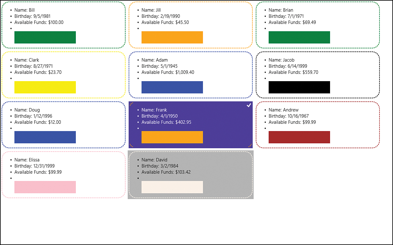
Figure 10.5. Simply changing the view to GridLayout, the ListView control changes how the items display onscreen.
The ListView control also provides built-in support for selection and hovering.
The ListView control uses multiselection by default. This can be turned off or changed to a single selection by setting the selectionMode property to either none or single. The default value is multi.
Displaying Data in Groups
Having the data displayed altogether may be okay for some data. For other data, grouping the items together makes more sense. If we group data together, we must use the grid layout view; list layout view does not support group headers.
To display a grouped list of items in a ListView control, we need to define a group data source. We also need to create a group header template. Fortunately, because we already created our list of people with the WinJS.Binding.List object, we can use the createGrouped function on that object to actually create our group data source. To do this, we need to refactor our code a little. We need to replace the following code:
WinJS.Namespace.define("STYWin.Data", {
people: new WinJS.Binding.List(JSON.parse(peeps.responseText))
});
with this new code:
var list = new WinJS.Binding.List(JSON.parse(peeps.responseText));
var groupOfPeople = list.createGrouped(
groupKeySelector, groupDataSelector, compareGroups
);
WinJS.Namespace.define("STYWin.Data", {
people: groupOfPeople
});
We have stored the list to a local variable and then used the list to create a group. We store the result in the groupOfPeople object. That object is then what we assign to the public people object.
Before we actually create the three functions that we are passing into the createGrouped function, we need to determine how we want to group the data. Based on the data we have, the people can be grouped by the first letter of their name, or by their birthday month (or year), or by their favorite color, or by a range of funds. In this example, we group them by their range of funds. To do this, we need to create a function that returns the desired grouping data:
function groupByFunds(person) {
var fundRange;
var fundValue = parseInt(person.funds);
var groupKey = 1001;
if (fundValue >= 1000) {
fundRange = "$1,000.00 and Up";
groupKey = 1001;
}
if (fundValue < 1000) {
fundRange = "$500.00 to $999.99";
groupKey = 1000;
}
if (fundValue < 500) {
fundRange = "$100.00 to $499.99";
groupKey = 500;
}
if (fundValue < 100) {
fundRange = "$50.00 to $99.99";
groupKey = 100;
}
if (fundValue < 50) {
fundRange = "Under $50.00";
groupKey = 50;
}
return {
key: groupKey,
data: {
headerTitle: fundRange
}
};
}
This function expects a person object to be passed in. From this object, it looks at the available funds and returns an appropriate group based on the funds available. We are putting each person into one of five groups, based on available funds. We set the groupKey and fundRange values based on their available fund balances. We then return an object literal containing the key and the data. The data object contains only the headerTitle property, which we are setting to the fundRange string.
The createGrouped function takes three parameters. Each parameter and the intelliSense for each are listed here:
• groupKey expects a function that accepts a single argument. The function is called for every element in the list. The function should return a string representing the group containing the element.
• groupData expects a function that accepts a single argument. The function is called on an element in the list for each group. It should return the value that should be set as the data of the .groups list element for this group.
• groupSorter expects a function that accepts two arguments. The function is called with the key of groups found in the list. It must return one of the following numeric values: negative if the first argument is less than the second, zero if the two arguments are equivalent, and positive if the first argument is greater than the second. If omitted, the groups are sorted in ascending ASCII character order.
Let’s create each function we need to pass to the createGrouped function. The first function returns a string that represents the group associated to the element passed to it:
function groupKeySelector(item) {
return groupByFunds(item).key.toString();
}
We receive the data element (the person) and are supposed to return a group key. So we call the groupByFunds, passing in the person item so that it can determine which group it goes to. We return the key as a string back to the createGrouped function.
The second function we need to create is to be passed into the groupData parameter of the createGrouped method:
function groupDataSelector(item) {
return {
headerTitle: groupByFunds(item).data.headerTitle
};
}
We call the same groupByFunds function, but this time, we obtain the data.headerTitle value. This is used as the header value of the group.
The last function we need to create is the function that will be passed to the groupSorter parameter. We need to determine the sort order of the group based on the group key:
function compareGroups(key1, key2) {
return key1 - key2;
}
Our group key was originally an integer, so JavaScript treats the string numbers as integers; we can simply subtract them to meet the requirements of the parameter by returning a negative number if key2 > key1, a positive number if key1 > key2, or 0 if they have the same value.
So we have created the grouping of our people data, but we haven’t actually told the ListView to do anything with it. We need to assign the data source to the groupDataSource property of the ListView. We can assign the groupHeaderTemplate as well. We create the template in HTML shortly. Immediately after the call where we set the listView.itemTemplate, let’s add the following code:
listView.groupDataSource = STYWin.Data.people.groups.dataSource;
listView.groupHeaderTemplate = document.getElementById("headerDiv");
The createGrouped function does what the name implies and creates the groups for our items. It creates the groups property that is applied to our list. We assign the dataSource of the groups property to the groupDataSource property of the listView.
In the default.html file, let’s create the headerDiv we are referencing:
<div id="headerDiv" data-win-control="WinJS.Binding.Template">
<h2 data-win-bind="innerText: headerTitle" ></h2>
</div>
Now when we run the app, our data is separated into groups. Figure 10.6 shows the current results of the project.
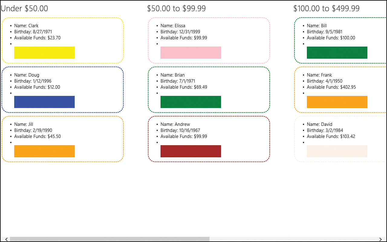
Figure 10.6. The ListView control enables us to display the items in groups.
Examining the CSS Grid (-ms-grid)
Our list view is shaping up nicely, but we still don’t have a Windows Store app. Hour 5, “Understanding Microsoft Design Style Principles,” and Hour 6, “Customizing the Style of Our Apps,” looked at the correct spacing for our Windows Store apps. Since then, we have just quickly created Blank App projects without worrying about how they look. Of course, this is fine because pages in this book are limited and we need to focus on what we are learning, but we need to spend more time on style, see how it relates to the ListView control, and explore how the -ms-grid CSS property can help.
The Grid App project template and the Split App project template both utilize the -ms-grid layout. We are going to modify our existing project to make it match more closely the hub page of the Grid App project template. To do this, we need to add the following markup to the default.html page:
<div id="page">
<header aria-label="Header content" role="banner">
<button class="win-backbutton" aria-label="Back" disabled></button>
<h1 class="titlearea win-type-ellipsis">
<span class="pagetitle">People</span>
</h1>
</header>
<div id="simpleListView"
data-win-control="WinJS.UI.ListView">
</div>
</div>
The previous code should replace the existing ListView control. The control itself did not change; we just wrapped a div with the id of page around it. We also added a header element inside this page div. Inside the header element, we added in the win-backbutton and the pagetitle. If this is unfamiliar, Hours 5 and 6 are good refreshers. Let’s add the following CSS rules to the default.css file to style the header element we added:
header[role=banner] {
display: -ms-grid;
-ms-grid-rows: 1fr;
-ms-grid-columns: 120px 1fr;
}
header[role=banner] .win-backbutton {
margin-left: 39px;
margin-top: 59px;
}
header[role=banner] .titlearea {
-ms-grid-column: 2;
margin-top: 37px;
}
header[role=banner] .titlearea .pagetitle {
width: calc(100% - 20px);
}
We see that the header is using an -ms-grid for its display. It then defines the number of columns and how they are split up. It defines the same thing for the rows. This has a single row and two columns. The -ms-grid-rows property has only a single value, so there is only one row. The value for this row is 1fr. This value signifies that it is 1 fractional value. Fractional values relate to the fraction of available space. So, if the element was covering the entire screen and it was set up to have values of 1fr 2fr, the rule would mean that the screen was split between two rows. The first row would take up 33.33 percent of the screen, and the second row could take up 66.67 percent. For our header, we have a single fractional value, so a single row takes up 100 percent of the available space. The -ms-grid-columns property has the value of 120px 1fr, which means that the header row will be split into two columns. The first column is 120 pixels; the second column is 1 fractional value, which means that it will take up the remaining space. If the value were 120px 1fr 1fr, the row would be split into three columns. The first column would be 120 pixels wide, and the two other columns would each take up 50 percent of the remaining available space.
The Back button is being placed in the appropriate spot, but our app will never see it because we don’t navigate to any other pages. The next rule, which is applied to the .titlearea, specifies the top margin but also sets a new property we haven’t seen: -ms-grid-column. By setting the value of the property to 2, this CSS rule states that the actual titlearea will be in the second column of the two columns available. The CSS rows and columns are counted starting at 1. So column 1 is the 120px column, and column 2 is the 1fr (or 100 percent of the remaining space). The titlearea is placed in the second column.
Next, we can style the page container we added to the HTML page. The CSS rule for the page container follows:
#page {
height: 100%;
width: 100%;
display: -ms-grid;
-ms-grid-rows: 128px 1fr;
-ms-grid-columns: 1fr;
}
So we are setting the entire page to be a grid. This is done by setting the width and height to 100% and specifying that the display is a -ms-grid. The grid will have two rows. The first row takes up the header position, and the second row takes up the remaining part of the screen. It has only a single column that takes up the entire screen. If we run the app now, we see the header being spaced properly, but the list items are still at the very top right of the screen and are being cut off. This is because it is being rendered in the first row by default. We can modify the #simpleListView CSS rule to add the following property and value:
-ms-grid-row: 2;
This forces the ListView to be placed in the second row. When we run the app, we are closer to having our margins set up correctly, but our ListView is still on the left side of the screen, with no margin. We need the ListView to start with the margin on the left so that it lines up nicely under the People header. But we don’t want to lose that screen real estate, either. The ListView has different parts that we can style just like the other WinJS controls. We want to modify the .win-surface on the horizontal viewport. (The “Further Exploration” section at the end of this hour has more information on styling the ListView control.) The WinJS CSS file has a pretty specific CSS rule for this class, so to get our new rule to be utilized, we need to apply the CSS rule to a specific class or id on our page. We use the #simpleListView id here. Let’s add the final piece of CSS to style this ListView to have padding when it loads but to use up all horizontal space as it scrolls:
#simpleListView .win-horizontal.win-viewport .win-surface {
margin-left: 45px;
margin-bottom: 60px;
}
Figure 10.7 shows the final result of the app.
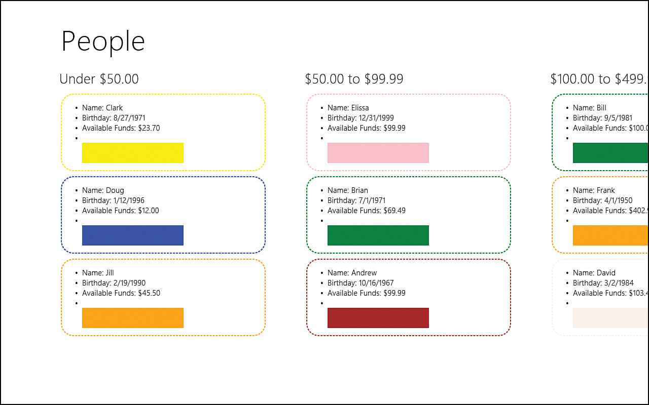
Figure 10.7. The ListViewExample app has been styled to fit in with the Microsoft design style spacing.
Implementing Semantic Zoom
SemanticZoom is its own WinJS control. It isn’t part of the ListView control, but it works well with it. The purpose of the SemanticZoom control is to enable users to quickly navigate over large collections. It is useful even over smaller collections. Most users are aware of optical zoom, which occurs when the pinching gesture transpires. The screen zooms in and out, enabling the user to see a larger or smaller portion of the screen. Semantic zoom takes this concept to an entirely different level. Just as optical zoom enables the user to see less or more information, this is the same view but at a different level. The SemanticZoom control also changes a level as it is zoomed in or out, but it can actually transform the view. For example, the groups we just set up in the ListViewExample could be semantically zoomed out, and the expectation would be that the only data we would see would be the actual group headers listed down the page. Users could then easily select whichever group (available funds range) they were interested in and immediately go to that group of items as the app zoomed back in.
To start, let’s add the zoomed out ListView control to our default.html page immediately following the simpleListView control:
<div id="zoomedOutView"
data-win-control="WinJS.UI.ListView"
data-win-options="{
selectionMode: 'none'
}"></div>
This is just like the simpleListView, except that we are declaratively stating that we do not want to allow selection to occur by setting the selectionMode to none in the data-win-options attribute. While we are in the HTML file, we can add the following template immediately after the templateDiv template:
<div id="zoomedOutDiv" data-win-control="WinJS.Binding.Template">
<div class="zoomedOutItem">
<p data-win-bind="innerText: headerTitle"></p>
</div>
</div>
Let’s style this view by adding the following CSS rules to the default.css file:
#zoomedOutView .win-horizontal.win-viewport .win-surface {
margin-left: 120px;
margin-bottom: 60px;
}
.zoomedOutItem {
text-align: center;
display: table-row;
}
.zoomedOutItem p {
background-color: cornflowerblue;
width: 250px;
height: 250px;
font-size: xx-large;
color: black;
display: table-cell;
vertical-align: middle;
}
.win-semanticzoom {
-ms-grid-row: 2;
height: 100%
}
Besides styling the view, we have a CSS rule in place to account for the newly added SemanticZoom control. We need to make sure that the zoomed-out view goes into row 2 so that it isn’t on the header row. For the view template itself, we are creating tiles with a cornflowerblue background that are 250×250. We are setting the container div to be a table-row display and the actual p element to be a table-cell display so that we can have vertical alignment.
Let’s bind the data source to this zoomed-out list view with JavaScript in default.js after we define the STYWin.Data namespace with the people object:
var zoomedOutView = document.getElementById("zoomedOutView").winControl;
zoomedOutView.itemDataSource = STYWin.Data.people.groups.dataSource;
zoomedOutView.itemTemplate = document.getElementById("zoomedOutDiv");
var gridLayoutOptions = {
maxRows: 1
};
zoomedOutView.layout = new WinJS.UI.GridLayout(gridLayoutOptions);
The main point to take notice of in the previous code is the fact that we are setting the maxRows property in the options property bag. We then pass that property bag to the GridLayout constructor. This forces the elements to be on a single row, regardless of whether they could fit more rows. We set this so that our five group items will be displayed in a single row instead of multiple rows and just a couple columns. For this small number of groups, seeing them in a single row is less jarring.
When working with semantic zoom, it is a best practice to not cause the user to scroll more than three pages of tiles when zoomed out. Excessive panning in the zoomed-out view defeats the purpose of semantic zoom. Although this demo can get by with setting the maxRows property to 1, apps that contain content with many groups do not have that luxury.
To see what the zoomed-out view looks like, we can temporarily add the following style directly to the simpleListView control:
style="display: none;"
Now when we run it, we can see the groups listed horizontally across the screen. Of course, if we tap any of them, nothing happens. We have only completed step 1—we need to complete step 2, which is to put both of these list views into a SemanticZoom control.
To start, let’s remove the inline style we just added to simpleListView. Next, we can add the SemanticZoom control to the page and have it wrap the two ListView controls:
<div id="semantic"
data-win-control="WinJS.UI.SemanticZoom">
<div id="simpleListView"
data-win-control="WinJS.UI.ListView">
</div>
<div id="zoomedOutView"
data-win-control="WinJS.UI.ListView"
data-win-options="{
selectionMode: 'none'
}"></div>
</div>
We can run the app and pinch the screen to see the semantic zoom in place. With the mouse, holding down Ctrl and scrolling the mouse wheel accomplishes the same task. With the keyboard, we can press Ctrl- to zoom out or Ctrl+ to zoom in. Figure 10.8 shows the results.
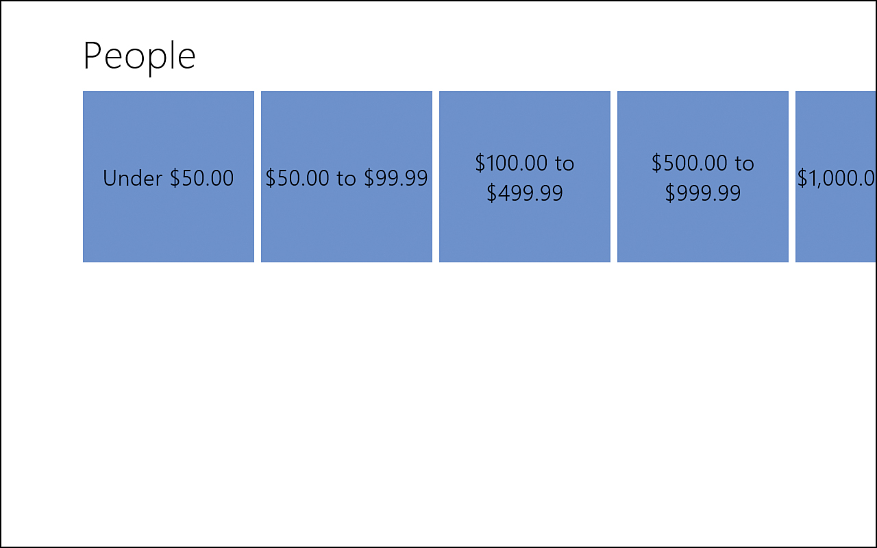
Figure 10.8. Semantic zoom is in place, and the groups are being displayed when zooming out, for easy navigation.
Further Exploration
This hour was full of information, but we really just scratched the surface of the ListView control. More information on styling the ListView control can be found at http://msdn.microsoft.com/en-us/library/windows/apps/hh850406.
Microsoft has provided templates for common views of collections. List layout item templates can be found at http://msdn.microsoft.com/en-us/library/windows/apps/hh465478.
Grid layout item templates can be found at http://msdn.microsoft.com/en-us/library/windows/apps/hh465463.
The documentation for the WinJS.UI.ListView object itself is a good place to visit. Many properties exist that we didn’t mention in this hour. The documentation is located at http://msdn.microsoft.com/en-us/library/windows/apps/br211837.
More information on the CSS grid can be found at http://dev.w3.org/csswg/css3-grid-layout/.
The Windows SDK samples of interest for this hour are
• Declarative binding sample
• HTML ListView essentials sample
• HTML ListView customizing interactivity sample
• HTML ListView grouping and SemanticZoom sample
• HTML ListView item templates sample
• HTML ListView loading behaviors sample
• HTML ListView optimizing performance sample
• HTML ListView working with data sources sample
• HTML SemanticZoom for custom controls sample
Summary
During this jam-packed hour, we discussed data binding with WinJS extensively and showed how to bind data to HTML intrinsic controls as well as WinJS controls. We spent a good deal of time on the ListView control as we continued to build functionality such as templates grouping. We looked at the CSS grid and covered how to style our controls. Finally, we discussed how to implement semantic zooming in our apps.
Q&A
Q. Can I set the items in the ListLayout to be displayed horizontally? Can I set the items in the GridLayout to be displayed vertically?
A. No to both questions. The controls were designed to scroll the way they do. List layout is meant to scroll vertically, and grid layout is meant to scroll horizontally. This is the expected behavior from users, especially for large collections.
Q. Does WinJS support two-way data binding?
A. No. WinJS supports only one-time and one-way data binding. Adding event listeners for the controls we want to do is not difficult with two-way data binding on. The key is to not get into a circular reference, and this can be avoided by not sending an event if the values are identical.
Q. What happens when a CSS rule sets an item into a nonexistent CSS grid column or row?
A. The standards body has defined how it is supposed to work, at http://dev.w3.org/csswg/css3-grid-layout/#placing-grid-items. Any items added are added to a catch-all column or row at the end of the predefined column and rows.
Q. Can I use semantic zoom with my own custom controls?
A. Yes. To use the semantic zoom control on a control other than ListView, the IZoomableView interface must be implemented. The “HTML SemanticZoom for Custom Controls” sample demonstrates how this is accomplished.
Workshop
Quiz
1. What is the difference between one-time binding and one-way binding?
2. When processing JSON data, it is best to use the JSON.parse function instead of the JavaScript eval function. True or false?
3. What would be the CSS rule to create a 3×3 CSS grid in which the middle row and column took up 50 percent of the screen and the other two rows/columns were left with 25 percent each?
4. To use the SemanticZoom control, the collection of items must have group information associated to them. True or false?
Answers
1. One-time binding initializes the target element with the source property once. One-way binding updates the target element with the value of the source property every time the source property’s value changes.
2. True. JSON.parse should always be used to parse JSON data. The eval function should never be used because it actually executes JavaScript, and that is a major security risk when working with untrusted data.
3. The rule to create the 3×3 grid in which the center row and columns are twice as large as the others is this:
#grid {
width: 100%;
height: 100%;
display: -ms-grid;
-ms-grid-columns: 1fr 2fr 1fr;
-ms-grid-rows: 1fr 2fr 1fr;
}
4. True. The SemanticZoom control requires the data to contain group information. Without the group information, there would be no high-level data to display when zooming out.
Activities
1. Create a new Grid App project template and walk through the data.js file to see how the default template does grouping and data binding.
2. Create a new Split App project template and provide your own data, but load the data from a new local file using WinJS.xhr instead of the sampleGroups and sampleItems objects loaded directly in the file.
3. Modify the last ListViewExample to group the items by the first initial of their name instead of their available funds.
4. Modify the last ListViewExample to sort each item within the group so that the funds go from smallest to largest inside each group.
5. Create a Blank App and, with the CSS grid, create a 3×3 app and style it like a tic-tac-toe board.