Hour 6. Customizing the Style of Our Apps
What You’ll Learn This Hour:
• How to work with the WinJS light and dark styles
• Ways to use Visual Studio’s DOM Explorer
• How to style apps using Blend for Visual Studio
• How to work with Microsoft’s CSS vendor-specific properties
• Steps for overriding the default styles in the WinJS controls
• Approaches for making apps accessible
• How to create CSS animations
The previous hour showed how to utilize Blend for Visual Studio to style apps. If we didn’t style our apps, not many people would want to use them. During this hour, we dig in and start using the styling tools.
Fortunately, styling Windows Store apps written in JavaScript requires nothing special. The same CSS styling that works on the web works as expected for Windows Store apps. This hour looks at the styles the Windows Library for JavaScript (WinJS) provides, as well as ways we can utilize Visual Studio and Blend for Visual Studio to style our apps. We cover how to override the default styles WinJS provides, when needed. Finally, we discuss the Windows 8 Animation Library provided inside WinJS.
Exploring the WinJS Light and Dark Style Sheets
So far, we have seen that WinJS uses two different style sheets: ui-dark.css and ui-light.css. Even if we plan to use an entirely different color scheme, we should use one of these as the base of our app. Selecting the ui-dark.css file doesn’t mean that our app needs to have white text on a dark gray background. Likewise, choosing the ui-light.css style sheet doesn’t limit us to a white background with black text. (How boring it would be if every app was either black or white!) Instead, we can use these style sheets as a guide. For example, if we want our app to be dark blue, we can use the ui-dark.css style sheet. If we want a light green app, we can use ui-light.css, for a darker font on a lighter background. The easiest way to override the background color is to modify the default.css.
Try It Yourself: Changing the Background Color of Our Windows Store App
1. Create a new JavaScript Windows Store application project from the Navigation App project template and call it OverrideCSSExample.
2. Run the app to see the Navigation App with the default dark style.
3. Switch back to Visual Studio and open default.html. Under the head section, change ui-dark.css to ui-light.css.
4. Repeat step 3 for the pageshomehome.html file (replace ui-dark with ui-light).
5. Run (or Refresh) the app to see the Navigation App with the light style.
6. Switch back to Visual Studio and open the cssdefault.css style sheet file.
7. Replace the existing CSS rules for #contenthost with the following:
#contenthost {
height: 100%;
width: 100%;
background-color: #C1FFB5;
}
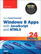
8. Height and Width were already in place. We simply added the background-color value. Run (or Refresh) the app to see our app using our new background color. Figure 6.1 shows the results.
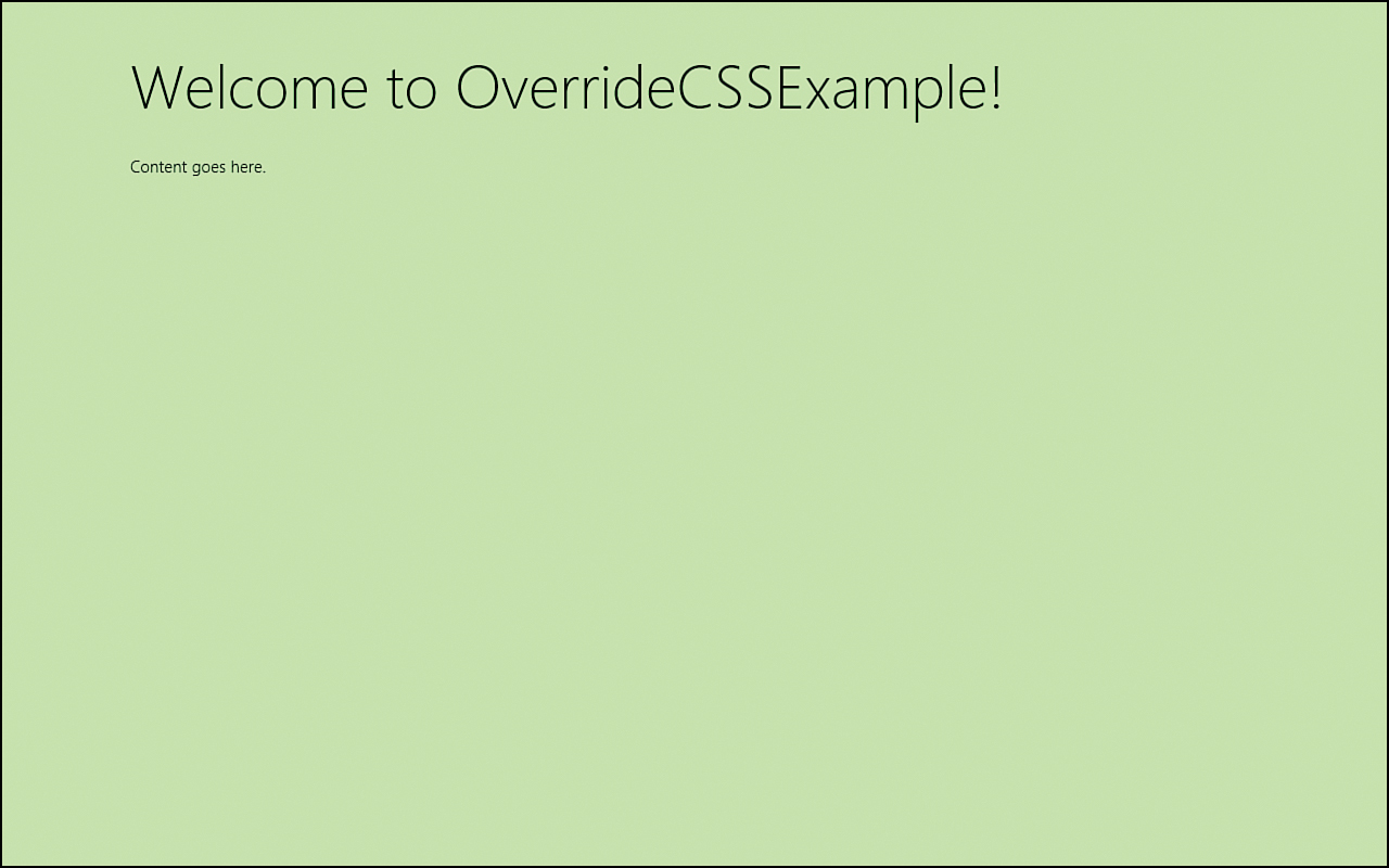
Figure 6.1. The app now has the background color we specified.
The ui-dark.css and ui-light.css style sheets define all the base styles for html, body, and iframe. They also include styles for the intrinsic HTML controls, such as button, progress, and input. In addition, the style sheets define styles for typography, for elements such as h1, p, and blockquote. But they also add classes such as win-type-small, win-type-ellipses, and win-type-xx-large. The actual UI controls in WinJS are styled using these style sheets as well. Next we examine how to change the style of these WinJS controls.
Overriding the Default Styles in the WinJS Controls
Before we jump into changing the styles of the WinJS controls themselves, let’s take a quick detour to change the styles of the intrinsic HTML controls that WinJS styles for us. Let’s create a style for the progress bar and for the textbox. We can create a simple Blank App project and call it StyleIntrinsicHTMLControlsExample.
Inside the default.html page, we can change the WinJS style sheet from ui-dark to ui-light. We can also replace the contents of the body element with the following code:
<h1>Style Intrinsic HTML Controls Example</h1>
<div id="content">
<div>
<progress value="45" max="100"></progress>
</div>
<div>
<input type="range" max="11" min="0" value="7" />
</div>
<div>
<input type="text" placeholder="enter your name" />
</div>
<div>
<progress class="win-ring"></progress>
</div>
<div>
<progress></progress>
</div>
<div>
<label>
<progress class="win-ring"></progress>
Fetching ...
</label>
</div>
<div>
<progress class="custom" value="45" max="100"></progress>
</div>
<div>
<input class="custom" type="range" max="11" min="0" value="7" />
</div>
<div>
<input class="custom" type="text" placeholder="enter your name" />
</div>
<div>
<progress class="custom win-ring"></progress>
</div>
<div>
<progress class="custom win-large"></progress>
</div>
<div>
<label class="win-type-xx-large">
<progress class="win-ring win-large"></progress>
Fetching ...
</label>
</div>
</div>
We have created a determinate progress control, a range control, a textbox, an indeterminate progress control, and two progress control rings. We created those same controls a second time on the page so we can style them differently by adding the class to custom.
A determinate progress control is used when we know all the steps of a particular process. For example, if we are loading 10 files we could have the progress control have a max value of 10 and set the actual value property as each file is loaded. This would need to be done via JavaScript. An indeterminate progress control is used when we do not know how long something will take. If the task we are doing will take longer than 2 seconds, we should display the progress bar immediately. If it may take more than 2 seconds but may be quick, the UX guidelines say we should wait 500 milliseconds before displaying the progress bar. Not showing the progress bar is better than showing it for a fraction of a second and having it produce a jarring effect. WinJS provides a style we can use, win-ring, that styles the typical HTML progress control to use a nice ring animation from Microsoft. Also, we can wrap a progress element in a label element to have text display beside the progress control.
The range control enables the user to drag the control to a particular value. We can use this for a volume control or anything that has a specific range. These go to 11.
When the app runs, the controls display twice; the only difference is that the last two progress controls are larger than their counterparts. The controls on the second half of the page have the custom class associated to them, but we haven’t applied any CSS rule to that class. However, the last two controls include predefined WinJS classes: win-large, win-ring, and win-type-xx-large. So by just decorating our progress bar with the win-large class, we get a much larger control that fits nicely with the Windows Store app UI.
Let’s start creating our own custom style for these controls. We need to replace the content of default.css with the following:
h1 {
padding-left: 120px;
margin-top: 40px;
}
#content {
margin-left: 120px;
margin-top: 40px;
}
The previous rules simply set the header element and our content off to the edge so that they line up correctly based on the style guidelines.
Styling the Range Control
Next, we can style our range control by adding the following CSS rules to default.css:
input[type=range].custom::-ms-fill-lower {
background-color: lightgreen;
}
input[type=range].custom::-ms-fill-upper {
background-color: green;
}
input[type=range].custom:hover::-ms-fill-lower {
background-color: lime ;
}
By using input[type=range], we grab all range controls. For this demo, we want to style the control with only the custom class, so we use input[type=range].custom. For the range control, we can style a few pseudo-element selectors. These are vendor specific because they aren’t finalized in the W3C specification. The following parts of the range control can be styled:
-ms-fill-lower
-ms-fill-upper
-ms-thumb
-ms-track
-ms-ticks-after
-ms-ticks-before
-ms-tooltip
We are styling only the lower and upper parts of the control here. We also style the lower part differently if the user hovers over the control.
Now we can style the textbox we created:
input[type=text].custom {
background-color: lightgreen;
color: green;
font-weight: bold;
}
input[type=text].custom:-ms-input-placeholder {
color: blue;
font-weight: normal;
}
input[type=text].custom::-ms-clear {
color: red;
}
As with the range input control, we are styling the text input controls that have the custom class associated to them. We set background-color to lightgreen and the font color to green. We also made the font bold. Beyond this, we are styling the placeholder, a standard HTML5 attribute that enables us to display text when no text is present. In our HTML markup, we set it as enter your name. Next, we set the -ms-clear part of the textbox control to have a color of red.
Styling the Progress Controls
Finally, we can style our progress controls:
progress.custom {
background-color: green;
color: lightgreen;
}
progress.custom.win-ring {
background-color: transparent;
color: green;
}
progress.custom.win-large {
color: green;
background-color: transparent;
height: 10px;
}
progress.win-large {
color: inherit;
}
To begin, we style our progress elements with a custom class by setting background-color to green and color to lightgreen. This rule styles the first progress bar (the determinate progress bar). Next, we style the ring by overriding the background color that was just set to transparent. And we change the color property from the lightgreen that was just defined to green. Next, we style the regular (linear) indeterminate progress bar, which had the WinJS win-large class applied to it inside the HTML markup, by setting color to green, background color to transparent, and height to 10px. win-large makes the progress bar span the entire width of the container it is in. The height of 10px causes each ellipse to be larger than normal. Finally, we set the style of the large ring progress bar. In this case, we want the actual ring to have the same color as the text on the page, so we set the color property to inherit.
With very little code, we are able to customize the look and feel of intrinsic HTML controls that WinJS styles for us. Figure 6.2 shows the end result.
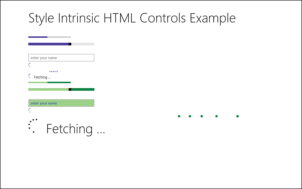
Figure 6.2. Styling HTML controls enables us to give our apps their own look.
Now we can override some of the nonstandard HTML controls that WinJS provides. Let’s start with the project we created during Hour 3, “Exploring the Windows Runtime (WinRT) and Windows Library for JavaScript (WinJS),” called WinJSCommonControls. When we run this as is, we have a couple date controls, some rating controls, and a couple buttons with a flyout control and context menu. We also created a time picker control and a toggle switch.
Styling the DatePicker Control
We can start by styling the date controls. For the first date, we want to style the background to be black and the foreground text color to be yellow. We also want the expanded part of the drop-down box to be yellow. Then just for fun, we want to add a radioactive symbol before the date.
Let’s add a class called flux to the first date control in default.html:
<div class="flux" data-win-control="WinJS.UI.DatePicker"
data-win-options='{current: "November 5, 1955" }'></div>
Now in default.css, we can create some style rules for the flux class:
.flux .win-datepicker-month,
.flux .win-datepicker-date,
.flux .win-datepicker-year {
background-color: black;
color: yellow;
}
Because we want to style only the first date this way, we created the flux class. Then we style each part of the WinJS.UI.DatePicker control identically, with a black background and yellow text. We want to also style the expanded part of each control, so we add the following rule:
.flux select.win-datepicker-month::-ms-expand,
.flux select.win-datepicker-date::-ms-expand,
.flux select.win-datepicker-year::-ms-expand {
color: yellow;
}
Using the Segoe UI Symbol Font
When we run the app, we see the date formatted the way we want. Now we want to add a radioactive symbol to the left of the date. We could find an image, create an image tag, and place it in the HTML file, but an easier way is to use a font that Windows 8 provides. The Segoe UI Symbol font provides many symbols. In fact, the back button that we have seen is from this symbol font. To see what the font offers, we can bring up the Character Map program. In Windows 8, on the Start screen, start typing to search the machine. For example, we can type “Character Map” (or just the first characters of that) to be presented with the program we can run. Figure 6.3 shows this program. The font is selected from the drop-down box; then we can scroll through the icons to see what is available. The radioactive icon is almost halfway down the list and has the Unicode value of U+2622. If we want to display that in HTML, we write this:
<p class="symbolclass">☢</p>
Figure 6.3. The Character Map program enables us to see the hexadecimal value for any symbol we want to use in our HTML or CSS.
The previous HTML assumes that we have a symbolclass CSS rule created that has a font-family of Segoe UI Symbol.
For this example, we don’t want to actually write the icon via HTML. Instead, we want to utilize CSS to accomplish this. So we need to add the following rule:
.flux::before {
content: '2622';
font-family: "Segoe UI Symbol";
font-size: 16pt;
color: black;
background-color: yellow;
vertical-align: middle;
}
The character map Unicode value is 2622. To use a value in HTML, we prefix the value with &#x and then add a semicolon to the end so that we have ☢. For CSS, we simply escape it with a backslash () so that we have 2622. We covered how to use content with the before pseudo-element selector in Hour 1, “Getting a Refresher on JavaScript, HTML5, and CSS3.” We are simply telling CSS to inject this content right before the rest of the content of the element that has the flux class assigned to it. We are setting the font family to the Segoe UI Symbol. We set the color to black and background color to yellow, and we vertically align it in the middle so that it lines up with the drop-down box.
In this case, the radioactive symbol is available in other fonts, but it isn’t required. For a list of standard Unicode Character map values, visit www.unicodemap.org/. Fonts are allowed to use “private use” characters from 0xE000 to 0xF8FF, for a total of 6,400 symbols allowed. The Segoe UI Symbol font utilizes more than 500 symbols!
Styling the DatePicker (Again)
Now we can style the second date that is generated from the JavaScript code we wrote during Hour 3. Because this is Independence Day of the United States of America, it is fitting to have the selections styled in red, white, and blue (the colors of the U.S. flag). We can add the following rules to style the date:
.win-datepicker-month {
background-color: red;
color: white;
}
.win-datepicker-date {
background-color: white;
color: blue;
}
.win-datepicker-year {
background-color: blue;
color: white;
}
The month is being styled with a red background and white text. The date is being styled with a white background and blue text, and the year is being styled with a blue background and white text. To wrap up the styles of the second date, let’s also make the expanded part match the color of the text for each element:
select.win-datepicker-year::-ms-expand,
select.win-datepicker-month::-ms-expand {
color: white;
}
select.win-datepicker-date::-ms-expand {
color: blue;
}
Styling the Button Control
Next, we can style all the buttons with a dark green/white combination. If the button is hovered over the button, it will be a light green and gray. If tapped, it will change to lime and black:
button {
background-color: darkgreen;
color: white;
}
button:hover {
background-color: lightgreen;
color: gray;
}
button:active:hover {
background-color: lime;
color: black;
}
For the Time Picker, we want to hide the AM/PM drop-down box, so we add the following rule:
#htmlFragContent select.win-timepicker-period {
display: none;
}
Styling the Rating Control
The WinJS Rating control provides many ways for us to customize the look and feel. We want the first Rating control to be red when a user has rated the item and when the user is hovering over the Rating control to rate the item. (These can definitely be styled differently, though.) Finally, we want both to be styled in pink when no user rating has been applied and only the average rating is being displayed:
.win-rating {
padding: 10px 0;
}
.win-rating .win-star.win-user.win-full {
color: red;
}
.win-rating .win-star.win-tentative.win-full {
color: red;
}
.win-rating .win-star.win-average.win-full,
.win-rating .win-star.win-average.win-full.win-disabled {
color: lightpink;
}
The first rule creates some space around all three rating controls. The second rule styles the actual user rating to red. The third rule styles the hovering action (or tentative rating value). Finally, the last rule styles the average rating pink, regardless of whether the control is disabled. Disabled controls can be styled differently, too.
So the Rating control has a .win-rating class that WinJS provides. We could have searched the ui-dark.css or ui-light.css files to find this, or we could have run the app and then, in the DOM Explorer window inside Visual Studio, see what classes were applied to the HTML elements being rendered. We also could have fired up Blend to select the control and see how the Rating control was being styled from within the great Blend toolset. So for the controls that aren’t being explicitly called out in this book, we can still easily determine how to style them by using Visual Studio or Blend.
For the second Rating control, we override the stars with a different symbol. If we look at ui-dark.css and search for win-star, we see this rule. This is what we did to create the radioactive symbol beside the November 5, 1955, date:
.win-rating .win-star:before {
content: "E082";
}
WinJS uses CSS content injection to use the star symbol from the Segoe UI Symbol font. For the second control, we replace the star symbol with another one. We use E07D here, which looks like a power on/off button. We style the Rating control that uses this symbol in different shades of green:
#rating2 {
width: 120px;
}
#rating2.win-rating .win-star.win-user.win-full,
#rating2.win-rating .win-star.win-tentative.win-full {
color: lime;
}
#rating2.win-rating .win-star.win-average.win-full,
#rating2.win-rating .win-star.win-average.win-full.win-disabled {
color: darkgreen;
}
#rating2.win-rating .win-star:before {
font-family: "Segoe UI Symbol";
content: "E07D";
}
All of the associated CSS rules are based on the control’s id of rating2. To have the correct spacing for our symbol, we set the width to 120px. Then we set the user rating value and the hovering value to the same value of lime. We set the average value to dark green, regardless of whether the control is disabled. Finally, we override the content from the star to the power button symbol (content: E07D).
Styling the Rating Control with Images
For the third Rating control, we could have handled it the same way. Here we want to change the stars to hearts. The heart is also available in the symbol font. However, this time we create images to do this. (We also could have used scalable vector graphics for this; the principle is the same.) In this case, we have six images, categorized by average rating, user rating, and disabled rating. Each rating option has two states of either empty or full. This is exactly what we saw when we styled the other two controls. These are the CSS rules for the last control that use these images:
.win-rating.heart .win-star:before {
content: "";
}
.win-rating.heart .win-star {
background-repeat: no-repeat;
background-origin: content-box;
background-position: left;
width: 30px;
height:26px;
}
.win-rating.heart .win-star.win-average.win-empty {
background-image:url("../images/controls/heart_rating_average_empty.png");
}
.win-rating.heart .win-star.win-average.win-full {
background-image:url("../images/controls/heart_rating_average_full.png");
}
.win-rating.heart .win-star.win-user.win-empty,
.win-rating.heart .win-star.win-tentative.win-empty {
background-image:url("../images/controls/heart_rating_user_empty.png");
}
.win-rating.heart .win-star.win-user.win-full,
.win-rating.heart .win-star.win-tentative.win-full {
background-image:url("../images/controls/heart_rating_user_full.png");
}
.win-rating.heart .win-star.win-disabled.win-empty {
background-image:url("../images/controls/heart_rating_disabled_empty.png");
}
.win-rating.heart .win-star.win-disabled.win-full {
background-image:url("../images/controls/heart_rating_disabled_full.png");
}
We start by removing the default content that WinJS provides: the star symbol. Then we set up our background of the win-star class so that we can manage the size and padding around our rating item (the heart, in this case). Finally, for each style we have seen before, we simply assign the appropriate background image. To apply these styles to the markup, we need to add the following class to the Rating control with the id of rating3:
<div>
<div class="heart" id="rating3" data-win-control="WinJS.UI.Rating"
data-win-options="{maxRating: 3, averageRating: 2.7, enableClear: false}">
</div>
</div>
The images are located in the Hour06WinJSCommonControlsimagescontrols folder.
Styling the Toggle Switch Control
For the toggle switch and ToolTip that goes with it, we need to make two changes to the existing markup to style it appropriately. The changes appear in bold:
<div id="toggleTooltip" data-win-control="WinJS.UI.Tooltip"
data-win-options="{innerHTML: 'Will be overwritten...',
placement: 'right', extraClass: 'autosaveTooltip'}">
<div id="toggleSwitch" data-win-control="WinJS.UI.ToggleSwitch"
data-win-options="{labelOn: 'Yes', labelOff: 'No',
title: 'Autosave '}">
</div>
</div>
We have added an extra class to the ToolTip called autosaveTooltip, and we added a symbol to be printed beside the label of the toggle switch (). The label will read Autosave, as before, but now it will also have the floppy disk image icon present. This shows how we can utilize the symbols in HTML, not just in CSS. To style the toggle switch itself, we add the following two rules, similar to the range control we styled earlier:
#toggleSwitch .win-switch::-ms-fill-lower {
background-color: yellow;
}
#toggleSwitch .win-switch::-ms-fill-upper {
background-color: lightyellow;
}
When the toggle is off, it has a light yellow background; when it is on, it has a yellow background color. The WinJS toggle switch is really just a range control, so we can style the thumb by using -ms-thumb selector.
Styling the ToolTip Control
The rule for styling the autosaveTooltip class follows:
.autosaveTooltip {
border-radius: 25px;
max-width: 140px;
padding: 10px;
border: 1px solid #333;
background-image: linear-gradient(315deg, orange, yellow);
box-shadow: 10px 12px 16px rgba(0, 0, 0, 0.4);
text-align: center;
}
We want this ToolTip to be rounded, so we use a border radius of 25 pixels. We also put a gradient from orange to yellow at a 315-degree angle to use as the background image of the ToolTip, and we create a box shadow for it.
Styling controls can achieve really interesting effects. Granted, the end result isn’t something you would actually have in a Windows Store app, but going through the process of styling this project that we created in Hour 3 shows the steps of styling an app. Figure 6.4 shows the final result.
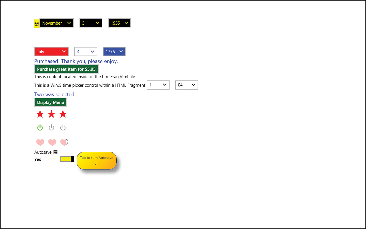
Figure 6.4. Overriding the style of the demo project achieves a drastically different end result than during Hour 3 (see Figure 3.5 to compare).
The code for this example is located in the Hour06WinJSCommonControls folder.
Using the Tools to Style Our Apps
We have already used both tools that Microsoft provides for creating Windows Store apps. Visual Studio and Blend for Visual Studio enable us to create Windows Store apps and modify the style of those apps. We spend some time during Hour 5, “Understanding Microsoft Design Style Principles,” talking about Blend for Visual Studio and how it can really help style apps and debug CSS when things don’t go as expected. Along with Blend, we can utilize Visual Studio itself to help with styling. We talk about Visual Studio here because we haven’t discussed how to use to Visual Studio for styling purposes, but the preferred way to perform styling tasks is to use Blend. The old adage is true: “If all you have is a hammer, then everything looks like a nail.” We need to have plenty of tools in our belt so we can use the right tool for the job. Visual Studio can help, but Blend really excels at this task.
Visual Studio’s DOM Explorer
When developing our apps and trying to determine what the actual HTML being generated looks like from our JavaScript or controls we are using, Visual Studio’s DOM Explorer can be useful. The DOM Explorer works just like the DOM Explorer in the web browser (typically brought up by pressing F12 in the browser). It shows a real-time representation of the DOM being displayed. This can be helpful in determining which elements we want to style or to see quickly how the padding is laid out. We can even make changes in the DOM Explorer and see what the changes do to the program while it is running. The only problem is, the changes aren’t saved, so we need to make those same changes in the actual files.
The DOM Explorer window is visible only if we are debugging our Windows Store app. If the DOM Explorer window is not visible in Visual Studio, we can get Visual Studio to display it by clicking the menu item Debug | Windows | DOM Explorer.
To see this in action, let’s run the OverrideCSSExample project we just created. In the DOM Explorer window, we can expand the elements and see the /pages/home/home.html page fragment being combined with the default.html. Hour 2, “Trying Out File | New | Project,” covered this in explaining how page controls work.
When using multiple monitors, when we move the mouse over the elements in the DOM Explorer, the elements are highlighted on the app. We can modify the contents in real time as well. For example, removing the id contenthost from the first div gets rid of the added styling because the id is no longer in the active view. Again, Visual Studio doesn’t actually save any of these changes. We are changing it on-the-fly but changing it only in memory. Blend enables us to change things in real time, and it can modify the correct style sheet.
We get the biggest benefit from the DOM Explorer when we are running with multiple monitors. By running our app in one window and having Visual Studio open in another window, we can see the changes we make immediately without having to switch back to the app. Even if we are developing on a single display system, the DOM Explorer is extremely valuable. Combining the DOM Explorer with the Simulator gives us the same workflow as if we had Visual Studio snapped on one side and the Simulator on the other.
Inside the DOM Explorer are two useful tabs. The Styles and the Trace Styles tabs enable us to see the styles applied to our app. The Styles window shows the currently applied styles, organized by style sheet. The Trace Styles window shows the currently applied styles, organized by CSS attributes. These windows show the values of each CSS rule property. Sometimes this is enough to help debug CSS issues. However, to track down CSS issues, we can use the excellent Blend for Visual Studio tool.
Blend for Visual Studio
We spent a good portion of Hour 5 discussing Blend, but here we take some time to discuss some features we skipped over earlier. In the upcoming section “Using the Windows 8 Animation Library,” we explore built-in animations and how to use them. For now, we want to use Blend to generate a couple animations.
Let’s open Blend and create a new project. We have the exact same project templates that are available in Visual Studio. For this example, let’s create a Blank App project and call it BlendAnimationExample. Figure 6.5 shows the New Project window.
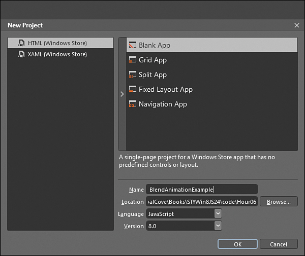
Figure 6.5. The New Project window inside Blend for Visual Studio looks very similar to the same window inside Visual Studio itself.
We can create a project inside Blend and later edit it in Visual Studio. Likewise, we can create a project inside Visual Studio and later edit it in Blend. Both tools can open the solutions or projects at the same time. If files are modified while they are opened in the other tool, the tool asks to reload the updated file.
Using Blend to Create Our Own Animations
After the project is loaded in Blend, we can expand the Live DOM tree to drill down to the <p> element. With the <p> element selected in the Live DOM, we can right-click the node and select Add New Class. Inside the dialog box, we can enter toanimate and make sure the “Create style rule targeting this class” check box is checked. This creates the new class under the default.css file and appears currently selected in the CSS window. The HTML window shows the <p> element highlighted and the newly added class="toanimate" in place. In the CSS Properties window, the .toanimate class also is added to the cascade list.
This example creates a silly animation that isn’t a good example of an animation to create in a real app, but it clearly demonstrates how to use Blend to set CSS3 animation properties. With the <p> element highlighted in the Live DOM window, we enter padding into the search properties box in the CSS Properties window. This brings back the results of Layout. Under Layout, we can set the left padding value to 0px. This is the default value, but we need to explicitly set it because we will be animating that property with the .toanimate class. After setting the padding-left property on the .toanimate class to 0px, we start to set up the transition animation. We enter transition into the search properties box in the CSS Properties window. This brings back the category of Transition. Right beside Transition List, at the top of the Transition group, is a plus sign. Clicking this Add New Row icon adds a new transition. In the drop-down list, we select padding-left because that is the property we are animating.
We could have selected All when telling the transition which property to animate. This would animate all properties we are setting but could lead to unintended results later if values were modified on the class. Usually, explicitly stating the properties to animate is best.
After selecting padding-left in the drop-down list, we specify the curve on which we want this animation to occur. For now, let’s select Linear (see Figure 6.6).
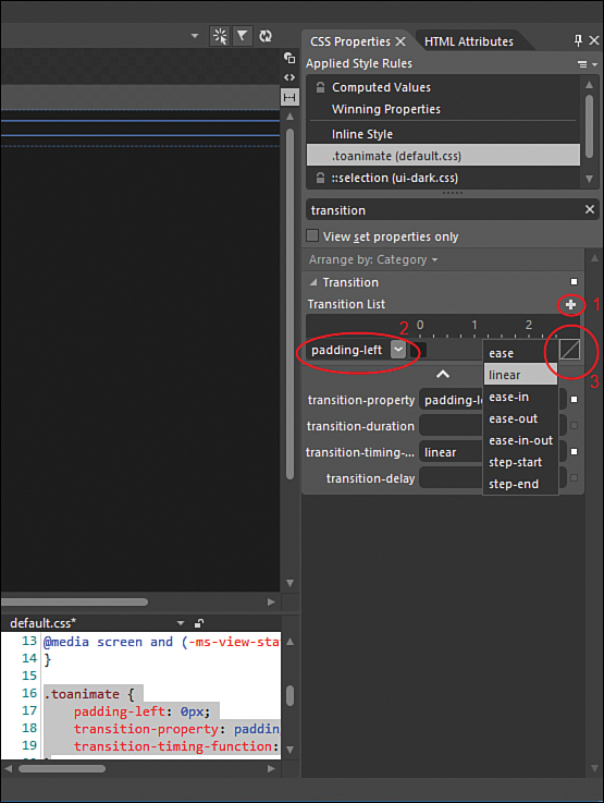
Figure 6.6. Blend enables us to easily add CSS transitions through the UI.
We also need to set the duration of the transition by dragging the range bar to .9s (.9 seconds). We can also set this value in the transition-duration box. The transition-delay can stay at 0s. Those are all the values we have to set to set up a transition animation. However, if we run the app now, we will not see any animations because we don’t have anything to kick off the transition. The value we are monitoring is padding-left. We have set the initial (at rest) value to 0px. However, nothing sets that value to another number, so no animations—that property’s value is not changing.
To make it simple, we add a hover rule to the .toanimate class. When we hover over the <p> element in the app, we want an animation to occur. We could just add the following to the default.css file:
.toanimate:hover {
padding-left: 500px;
}
However, we can also do this through Blend by clicking the plus sign icon (for “Create a new style rule”) beside the default.css item in the Style Rules window on the left side of the Blend UI. This creates a new class with the name .newStyle. We need to rename that to .toanimate:hover. After selecting that, we can search for “padding” in the CSS Properties window and enter 500px in the padding-left value.
We have set up our transition rule and a hover rule to set the padding-left value to 500px if an element with this class is hovered over. Combined with this transition rule
transition: linear padding-left 0.9s;
this states that we want a linear transition for the padding-left property to last 0.9 seconds long. (It also implicitly sets a 0-second delay in starting by not having another value after the duration value.) Let’s run the app to see what happens when we hover over the <p> element.
As expected, our CSS3 transition animation is working. The element is increasing the padding-left value from 0 to 500 over the course of .9 seconds. It is a steady transition from left to right because the easing function we set was linear. Let’s change that to a cubic Bezier curve by replacing linear in the transition-timing-function with this:
cubic-bezier(0.1, 0.9, 0.2, 1)
Now the easing curve graphic in Blend changes (on the right side inside the Transition List). It went from a straight diagonal line (linear) to something with a slow start and rapid growth over a short period of time, followed by a slow end. Figure 6.7 shows the difference between the two values.
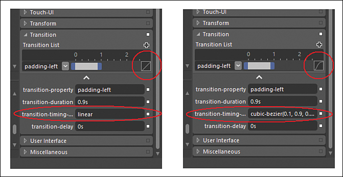
Figure 6.7. Blend shows the graphical representation of the transition-timing-function we provide.
This book does not discuss the math behind a cubic Bezier curve, so a great resource to try out different values can be found at http://cubic-bezier.com/.
By running the app again, we can see that, instead of moving at a constant rate, the content is moving along the curve.
We can select built-in easing functions. To show this and demonstrate how to animate multiple properties, let’s add another item to the Transition List. We first click the “Add new row” plus sign icon again and change the transition property to background-color. We can make the transition duration 500 milliseconds (500ms) or drag the range until we hit .5s. We can click on the easing curve and select ease-in-out. Let’s set the transition delay value for this property to be .25s. The transition delay field did have the default value of 0s, but now it has 0s, 0s. This is because, when we set multiple transitions, they are each separated by commas. We can change the value to 0s, .25s.
We need to set the initial value of the property we are transitioning, so we need to set background-color to transparent. We also need to set the value of the background color for when we hover over it. Let’s set that to darkgreen in the .toanimate:hover rule. The rules currently look like this:
.toanimate:hover {
padding-left: 500px;
background-color: darkgreen;
}
.toanimate {
padding-left: 0px;
background-color: transparent;
transition:
cubic-bezier(0.1, 0.9, 0.2, 1) padding-left 0.9s,
ease-in-out background-color 500ms 0.25s;
}
When we run our app and hover over the element, we can see that the padding-left transition occurs separately from the background color change from dark gray to dark green.
We can utilize Blend to create some CSS3 animations to our project. These aren’t the best-looking animations, and they take too long to complete for a real app, but creating the animations involves few steps. Using the Windows 8 Animation Library means even fewer steps.
Using the Windows 8 Animation Library
The Windows 8 Animation Library gives XAML and HTML developers access to the same animations that Windows 8 itself uses. Animations add beauty, energy, motion, and personality to apps. Good animations enhance the user experience by clearly directing the user’s focus. They enhance the experience by being purposeful. Thus, we do not want to create animations that are distracting. Animations enhance the experience by telling users what just happened or what is about to happen.
The Windows 8 Animation Library can help the user see how the system works as a whole. Animation completes the Microsoft design style. It isn’t an add-on piece; it is integral to the design. Our apps need to share the same personality of the Windows operating system itself. This means they need to have animations as they are being written. Adding animations at the end, only to have performance degrade because we didn’t design with animations in mind, would be unfortunate.
The Windows 8 Animation Library is part of the Windows Library for JavaScript (WinJS), located under the WinJS.UI.Animation namespace. It contains key Windows Store app animations. The animation library has the same storyboard values, the same curves, and even the same API that Windows uses. Thus, our app easily aligns to the Windows 8 personality.
Inside Control Panel, under Ease of Access | Ease of Access Center | Make my computer easier to see is the setting “Turn off unnecessary animations”. If this is off, only the important animations are displayed.
The Animation Library covers the following scenarios:
• App navigation
• Animating content within a view
• Revealing or hiding supplemental UI
• Collections
• Selection
Animating App Navigation
As we navigate from one page to another, we have access to the following APIs:

When we navigate to another page, we need to first call exitPage for the page we are on and then call enterPage when the page is loading.
Animating Content Within a View
When the page is in place, we might want to animate some content inside the page itself. The following APIs accomplish this:

These functions transition existing content on the page. To transition the entire page, the app navigation functions are used.
When using createExpandAnimation, we are making room for the new item we are introducing before that item arrives. An example of using createRepositionAnimation is moving headers from a list to the top of the grid columns. crossFade enables us to refresh the contents of a particular item in place. fadeIn and fadeOut are used when transitioning a placeholder item to the final item when the items is loaded dynamically. They can also be used to fade in controls in the app bar when some action causes a new button to be made available. In addition, they can be used to hide scrollbars after inactivity.
Revealing or Hiding Supplemental UI
Animating supplemental UI refers to the animation that occurs when context menus or flyouts are displayed and hidden. These animations occur by using the following APIs:
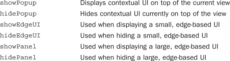
The pop-up APIs are typically used when showing and hiding a custom context menu or flyout. The edge APIs are typically used when showing and hiding a small message box or app bar that comes from the edge of the screen and is connected to the edge of the screen. The panel APIs are typically used when showing large UI that might or might not be connected to the edge of the screen, such as a custom keyboard or a task pane.
Animating Collections
When using the built-in List View control from WinJS, these animations are baked in. However, if we need to create our own collection control, we want to add the following animations:
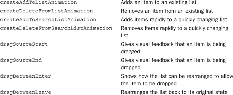
When adding or deleting a single item at a time, we use the “add to list” and “delete from list” animations. This moves existing items out of the way to make room for the new item or allows the existing items to realign after an element has been removed. When items need to be added very quickly, such as when a search is taking place, using the “add to search list” and “delete from search list” animations is best: They accomplish the same goals but are better suited for rapidly moving items into and out of a collection.
When dragging items, we need to animate the actual item being dragged and dropped with the drag source start and end animations. As we drag the item around, we need to animate the content behind it to show how it will react if we actually drop the item. We use the drag between enter and leave animations to animate the background content.
Handling Selection
When the items in the collection are selected, the following animation APIs are available:
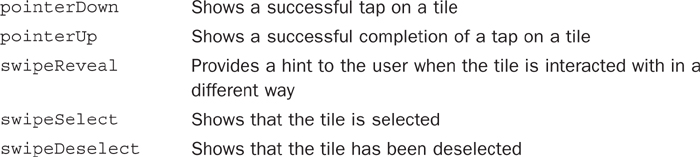
When the user taps a tile (with either a finger or the mouse), we use the pointer animations to show feedback to the user on whether each piece of the tap was successful. The swipeReveal animation is typically used when a user is unsure of how to interact with the tiles. If the user does a tap-and-hold gesture on the tile, the swipeReveal animation shows that the tile can be swiped in a downward motion. When an item is selected or deselected, we can display the appropriate swipe animation.
Animating Live Tiles
We discuss live tiles and secondary tiles in detail during Hour 17, “Using Live Tiles, Secondary Tiles, Notifications, and Toasts.” For now, it is good to know that certain animations support updating an app’s tiles on the Start screen.

When a tile isn’t large enough to show a picture and text, the peek animation allows the content to be cycled. It is also used to cycle general content, such as a set of pictures, on the tile. The badge refers to a part of the tile that displays information such as a number, as in the number of emails waiting to be read. The updateBadge animation function updates the value on the tile instead of simply overwriting the content.
The Windows 8 Animation Library enables us to quickly get animation up and running when creating our own controls. We have seen that we can create animations using CSS; now we can utilize the built-in animation library. However, many times we don’t need to do this if we stick to the built-in controls that WinRT and WinJS provide.
The next section, “Further Exploration,” offers resources to find more demos of these animations. With very little effort we can get the Navigation App project template to use app navigation animations.
Further Exploration
This hour covered a great deal of information, but it also didn’t even touch on many other topics. The rest of this book assumes familiarity with CSS and Blend for Visual Studio, so be sure to grasp the concepts presented during the last two hours. For extra CSS knowledge, the W3Schools site has some great information at http://w3schools.com/. More articles on Blend can be found at www.expressionblend.com/articles/.
We really just scratched the surface in regard to animation. The section of the MSDN documentation called “Animating Your UI,” at http://msdn.microsoft.com/en-us/library/windows/apps/hh465165, is an excellent resource. The articles that link from this overview page give examples of how to use all the calls in the Windows 8 Animation Library.
The Windows SDK samples of interest for this hour are
• Applying app theme color (theme roller)
• Common HTML controls sample
• CSS styling branding your app sample
• CSS typography JS sample
• HTML animation library sample
• HTML independent animations sample
Many of the samples called out during Hour 5 are also worth another look, for styling scenarios.
Summary
During this hour, we looked at demos to show how we can do something as simple as changing the background color of our Windows Store apps and how we can create an entirely new look and feel for an HTML intrinsic control and the built-in WinJS controls. Using an existing project from Hour 3, where we discussed many WinJS controls, we styled the project in different ways this hour. The end result isn’t anything to write home about, but the exercise illustrated which parts of WinJS controls can be styled.
We covered how to use Blend and Visual Studio for help with styling issues as we write our apps. We examined some of the underpinnings of the available CSS3 animations. We utilized Blend to help create those animations. We discussed the built-in animations from the Windows 8 Animation Library that we can use, if needed. We even created a demo project to show how to animate a page loading and unloading.
Q&A
Q. Why do the vendor prefix (-ms-) properties exist? Isn’t standards compliance valued?
A. Standards compliance is definitely valued. Everywhere the standard is well defined and actually a standard (not a working draft), Microsoft has utilized that standard. However, the standard is a moving target; for the items it does not define, we need a way to work with them. So instead of just lacking the capability to use features, the vendor prefix of -ms- is used. Writing cross-browser HTML5 and CSS3 is desirable, but we are writing native apps for the Windows Store. We can strive to get some code reuse for other platforms, but if we stick to only the standards, our apps will be lacking. A native app is different from a web app. We are fortunate enough to be able to utilize the same technology (JavaScript, HTML, and CSS) for both, but they are fundamentally different.
Q. Should I use Blend for Visual Studio or just Visual Studio?
A. Yes! For successful apps, it isn’t an either/or question. Both tools work together and should be used for their strengths. It is easy to work between the tools even at the same time. When working heavily with CSS, Blend is the right choice. When working heavily with JavaScript, Visual Studio is the right choice. When working with the HTML markup, both environments excel.
Q. Can the Windows 8 Animation Library be used for websites?
A. Not out of the box, but the JavaScript is available. It uses CSS, so the functions can be used to animate websites with some work.
Workshop
Quiz
1. The thumb control on the range control cannot be styled. True or false?
2. When trying to easily see the computed values of a style, which tool is the best to use, Blend or Visual Studio?
3. Animation is just eye candy and doesn’t affect the technical design of the functionality, so it can be done at the end of the project during the “add polish” phase. True or false?
4. The showEdgeUI and hideEdgeUI animation APIs should be used only for small content that always attaches to the edge of the screen. True or false?
Answers
1. False. The thumb control can definitely be styled. An example follows:
input[type=range]::-ms-thumb {
background-color: purple;
}
2. Whereas Visual Studio enables us to see style information in the Styles and Trace Styles tabs of the DOM Explorer, Blend gives the best insight for the computed values that the styles are actually producing. Blend shows this information under the Computed Values virtual rule in the CSS Properties window.
3. False. Animation is critical to making an app feel fast and fluid. It enables the user to focus on what is important. If we wait until the end of the development cycle to add animation, we may have to rework internal code to get it to work nicely with an animation. Animation should be added as soon in the development process as possible.
4. True. The edge APIs should be used for small content that stays connected to the edge of the screen. If the content is large or doesn’t stay connected to the edge, then the panel APIs should be used instead.
Activities
1. Create a small project that incorporates a progress control, rating control, and range control. Create an animation to ease the controls onto the page from the page’s ready event.
2. Style each control differently in the app just created.
3. Pick a symbol from the Segoe UI Symbol font and place it in the app from HTML and from CSS.
4. Starting with the AnimationLibraryExample we created during this hour, add a placeholder div. Then through JavaScript, load an image in place of the div. Instead of just having the image show up over the div, make it cross-fade with the placeholder.