Hour 14. Using the App Bar and Pickers
What You’ll Learn This Hour:
• Adding and using the app bar control to an app
• Styling the app bar commands
• Following guidelines for command placement on the app bar
• Using the file open picker to open a single file
• Using the file open picker to open multiple files
• Saving a file to the user’s library
So far, to kick off functionality, we have done it either through a gesture or by adding a button on the display area. Adding buttons to the main display area is usually not desirable; instead, we should use the app bar. During this hour, we cover how to use the app bar and organize the commands on the app bar, to provide a way for the user to invoke commands in an app.
We also look at pickers during this hour, which allow apps to interact with the user’s device in a protected way. We discuss the different pickers available within Windows 8 and look at how to invoke them and handle the results appropriately.
Adding an App Bar to an App
The app bar is a part of almost every (if not every) app. This is the main way a user can invoke commands in an app. The app bar is hidden by default, which helps provide the immersive experience to the user. When the user needs to invoke a command from the app bar, he or she simply swipes a finger from the top or bottom of the device (right-clicking with the mouse does the same). The user then can use the context menu key or press Windows+Z to bring up the app bar with the keyboard.
Design guidelines govern using the app bar. Commands that should be present throughout the entire app should be positioned on the right side of the app bar. Any commands that should be present based on some context (such as a particular item in a list view being selected or a particular page being navigated to) should be on the left side of the app bar. Commands should be on the sides of the app bar and should work their way in the middle. When someone is holding a device, reaching the sides of the device is easier than reaching the center.
To see how easy it is to add an app bar to an app, let’s create a new Grid App project template and call it AppBarExample. When we open the default.html page, we see the markup, which is commented out. If we uncomment the section and run the app, we can right-click, slide a finger from the top or bottom of the device, or press Windows+Z on the keyboard to bring up the app bar. The app bar has a single command button with a name of Placeholder. The diamond icon is simply the placeholder icon; clicking it doesn’t do anything because nothing is hooked up to the command button. The WinJS app bar control declared in HTML looks like this:
<div id="appbar" data-win-control="WinJS.UI.AppBar">
<button
data-win-control="WinJS.UI.AppBarCommand"
data-win-options="{id:'cmd', label:'Command', icon:'placeholder'}"
type="button">
</button>
</div>
It works like any other WinJS control. We simply set the type of control in the data-win-control custom attribute. The app bar control can then have multiple button and separator controls. Related buttons can have a separator markup element added to the end (or beginning) of the buttons, to separate them from other buttons. An example shows how this works:
<div id="appbar" data-win-control="WinJS.UI.AppBar">
<button
data-win-control="WinJS.UI.AppBarCommand"
data-win-options="{id:'btnAdd',label:'Add',icon:'add',
section:'global',tooltip:'Add item'}" type="button">
</button>
<button data-win-control="WinJS.UI.AppBarCommand"
data-win-options="{id:'btnClear', section: 'selection',
label:'Clear', icon:'clear'}" type="button">
</button>
<hr data-win-control="WinJS.UI.AppBarCommand"
data-win-options="{type:'separator',section:'selection'}" />
<button
data-win-control="WinJS.UI.AppBarCommand"
data-win-options="{id:'btnRemove',label:'Remove',icon:'remove',
section:'selection',tooltip:'Remove item'}" type="button">
</button>
</div>
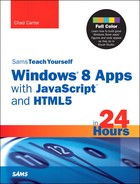
Replacing the existing app bar control with the previous code when the app is run produces what is shown in Figure 14.1. (The list view itself, inside the groupedItems.html page, was also changed to have a selectionMode of multi.)
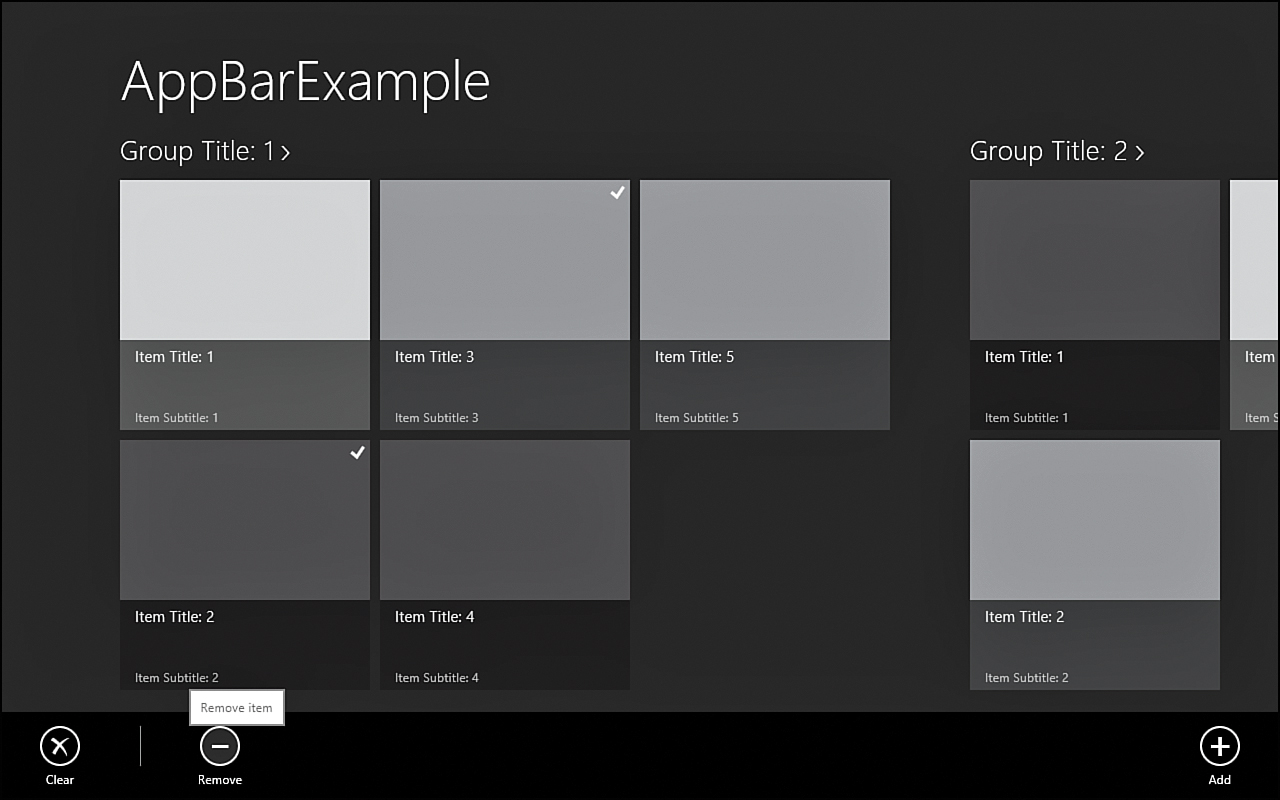
Figure 14.1. The global section places commands on the right, and the selection section places commands on the left. Buttons can be separated by the separator command type.
The code demonstrates the global section on the right, where the Add command is always visible. On the left are the selection commands. The idea is that they will be displayed on an appropriate screen or only when an item in the list is actually selected. The Clear and Remove command buttons are separated by a separator command. In the previous code, the horizontal rule (hr) element is an AppBarCommand with a type of separator instead of the default type of button. The other valid types that can be passed through the data-win-options are toggle and flyout.
Understanding Command Placement
As many actions as possible should be made available by interacting with the canvas directly. When possible, apps should utilize the charms when it makes sense. As a preview, these commands include search, share, devices, and settings. If our app can provide relevant search results to the user even when not in the app, this should be in the charms, not in the app bar or on the canvas. We discuss searching and how to use the charms in apps during Hour 16, “Using Contracts and Extensions.” App settings can be done on the charms, and there shouldn’t be any need to expose settings directly on the app canvas or app bar. Using devices such as printers should be done through the charms as well.
When commands are actually needed, they should be placed in the app bar, not directly on the canvas, if possible. When thinking about the commands that need to be in an app, it is best to think about which commands should be visible throughout the entire app versus which should be displayed only on certain pages.
When several commands can be grouped together, they should be condensed into a single command with a flyout or context menu. For example, if commands are functionally related, as with multiple buttons to filter the data in different ways, a single filter button should be provided. When tapped, it should display the context menu or flyout to show the different ways the content can be filtered.
The commands in app bars should be placed predictably. When possible, consistent interaction and command placement should be identical across all views of our app. The fewer buttons we can have on the app bar, the better our app will appear. We don’t want our app to look too complicated. We also want the commands to be on the sides of the app bar because folks who are using a tablet and touch can more easily reach the buttons on either side of the tablet than those in the center.
When selections are made and we need to have commands to handle the selection (clear, add, remove, and so on), the commands should appear on the far left and slide to the right any commands that were there. A separator command should be placed after the selection commands if other commands were there previously.
When using a new command, the command should always be on the far right. If a delete command is present, it should always be on the left of the new command. The delete command is to be used when dealing with a single item. The remove command should also be placed on the left of the new command, if it is needed. The remove command is used to remove items from a list. When the clear command is used, the command label should be explicit about what will be cleared (as in Clear Selection).
Styling the App Bar
As with all the other WinJS controls, we can style the AppBar control and all the different parts that make up the control. This isn’t too difficult; after all, the app bar is made up of other HTML elements, including button, hr, div, and input.
The color scheme we are selecting is not an eye-pleasing scheme, but it should make clear exactly which parts of the app bar control are being styled. To start, we add the following CSS rule to style the separator command to make it a cornflower blue:
.win-appbar hr.win-command {
background-color: cornflowerblue;
}
Notice how it modified the background color of the hr element just as we would style any hr element. Next, we style the actual background color of the app bar itself:
.win-appbar {
background-color: gray;
}
The background color of the app bar has been set to gray. Next, we style the labels of the command buttons in the app bar:
.win-appbar .win-label {
color: white;
}
The actual image inside the command button can also be styled. We style it red:
.win-appbar .win-commandimage {
color: red;
}
The command ring itself can be styled. In the following CSS rule, we style it purple by setting the border color:
.win-appbar .win-commandring {
border-color: purple;
}
Of course, the disabled, hover, and active states should all be styled as well, but doing so is no different than styling any button element, so we don’t show that here. The example code at Hour14AppBarExample does include the styling for the other states.
In addition to the typical styling options we have, we can set the extraClass property on any app bar command control. Then we can create a CSS rule to target the class we assigned to the extraClass property. For example, if we modified the remove command button to the following:
<button
data-win-control="WinJS.UI.AppBarCommand"
data-win-options="{id:'btnRemove',label:'Remove',icon:'remove',
section:'selection',tooltip:'Remove item', extraClass: 'warn'}"
type="button">
</button>
we could then add the following CSS rules for the warn class we associated to the button:
.win-appbar .warn .win-commandring {
border-color: red;
}
.win-appbar .warn .win-label {
color: red;
}
In this simple example, we are overriding the ring color and the label. Shortly, we show how to use that extraClass field to hide or show the element through JavaScript.
Dynamically Controlling the App Bar
After the app bar control is added to a page, it can be controlled just like any other WinJS control. The app bar itself can be hidden and displayed programmatically, as well as each command in the app bar.
Programmatically Hiding and Displaying the App Bar
Fortunately, Windows displays and hides the app bar at the appropriate times, based on what the user is doing. Sometimes, however, we want to display or hide the bar manually. To demonstrate this, let’s make sure the list view control in the pagesgroupedItemsgroupedItems.html page has the selectionMode set to multi (or single) instead of none. When we run the app, we can see that if we right-click outside an item (or swipe from top or bottom), the app bar comes up. However, if we select an item by right-clicking or cross-swiping, it does not. This could be desired functioning. Other times, it can be beneficial to bring the app bar up if an item is selected.
Programmatically Hiding and Displaying Commands Within the App Bar
Sometimes we need an app bar to be visible and need certain commands to be visible or invisible. If we want to hide the app bar separator command, we write the following:
var appBarDiv = document.getElementById("appbar");
var appBar = appBarDiv.winControl;
appBar.hideCommands(appBarDiv.querySelector("hr"));
We can even use extraClass set to hide and show:
appBar.hideCommands(appBarDiv.querySelectorAll(".warn"));
If we added the previous two code fragments into the ready function, the separator and the Remove button would both be hidden. This is the type of code we can write when we need to hide or show commands based on conditional logic.
The first activity at the end of this hour draws on knowledge from this section, and the previous one deals with hiding and displaying the selection commands, based on an item being selected. Completing that activity is important, even if some activities were skipped before now.
Displaying Flyouts and Menus from the App Bar
When we group the app bar commands together, we might need to confirm an action or obtain more data. We saw how the flyout control works during Hour 6, “Customizing the Style of Our Apps.” We can utilize a flyout control within the app bar control.
Here we add a flyout control that will be display when clicking the Remove button. The flyout will have a Confirm Remove button. We won’t actually write code to remove the item from the list, but we will hide the flyout and the app bar when the user clicks the Remove button inside the flyout.
First, we need to add the flyout to the default.html file:
<div id="confirmRemoveFlyout" data-win-control="WinJS.UI.Flyout">
<div>Remove the item from the list</div>
<button id="btnConfirmRemove" type="button">
Remove Item</button>
</div>
We do not go over the code line by line here because it is identical to what we saw during Hour 6. Inside the groupedItem.js file, in the ready function, we add the following code:
var btnRemove = document.getElementById("btnRemove");
btnRemove.onclick = showConfirmRemoveFlyout;
As expected, we can hook into the click event of a command button in the app bar just as with any other button. The code for the showConfirmRemoveFlyout function follows:
function showConfirmRemoveFlyout(evt) {
var btnRemove = document.getElementById("btnRemove");
document.getElementById("confirmRemoveFlyout")
.winControl.show(btnRemove);
var btnConfirmRemove = document.getElementById("btnConfirmRemove");
btnConfirmRemove.addEventListener("click", completeItemPurchase, false);
}
After we display the flyout at the location of the btnRemove button, we also add an event listener for the click event for the button inside the flyout that will actually confirm the removal of the item. The completeItemPurchase click handler follows:
function completeItemPurchase(evt) {
//hide flyout
document.getElementById("confirmRemoveFlyout").winControl.hide();
//hide app bar
var appBarDiv = document.getElementById("appbar");
var appBar = appBarDiv.winControl;
appBar.hide();
}
We can make our code simpler because the app bar has a command type of flyout. The code we added for the btnRemove click event:
var btnRemove = document.getElementById("btnRemove");
btnRemove.onclick = showConfirmRemoveFlyout;
can be replaced with this:
var btnConfirmRemove = document.getElementById("btnConfirmRemove");
btnConfirmRemove.addEventListener("click", completeItemPurchase, false);
Now we set the event listener on the Confirm button in the flyout, but we don’t hook up the button command to actually display the flyout. We can delete the entire showConfirmRemoveFlyout function.
To get the flyout to display, we need to modify the btnRemove command. Let’s replace it with this:
<button
data-win-control="WinJS.UI.AppBarCommand"
data-win-options="{id:'btnRemove',label:'Remove',icon:'remove',
flyout: 'confirmRemoveFlyout', type: 'flyout',
section:'selection',tooltip:'Remove item', extraClass: 'warn'}"
type="button">
</button>
The AppBarCommand control can be of type flyout, which removes the need to hook up a click event to open a flyout control from an app bar command.
We simply changed the type from the default button to a type of flyout. Then we specified the id of the flyout to be displayed. So the app bar has a way for us to easily display a flyout without us needing to actually wire it up. We obviously need to wire up any controls within the flyout, such as the Confirm Remove button. Figure 14.2 shows the flyout being displayed after clicking the Remove Command button.
Figure 14.2. The app bar enables us to easily display a flyout control declaratively.
We saw how to use a context menu during Hour 6, and a context menu is another great control we can use with an app bar command. No special menu type exists, but we can set up the code as we did originally for the flyout and as we set it up during Hour 6.
Sometimes a menu or flyout should be used instead of several buttons in the app bar. It is important to keep the app bar from becoming cluttered. Items that are logically together are a good candidate for a single button that then produces a flyout or a menu for the user to pick from different options.
Some buttons shouldn’t be in the app bar at all. In Hour 16, we see how we can tie into the search and settings charms in Windows 8. Sometimes utilizing a contract is a better approach than having a specific command button in the app bar.
App bars also can help provide navigation. When navigation is used, the app bar should be displayed on top of the screen instead of on the bottom. Having a navigation app bar on the top and a normal app bar on the bottom is acceptable. Both would become visible when the user swiped from the top or bottom, or right-clicked, or pressed Windows+Z. We don’t show any examples of actually navigating, but it is important to know that this is an option if it makes sense for a particular app. To cause the app bar to be displayed at the top, either we simply set the placement property to top in our code or we set it declaratively:
<div id="appbar" data-win-control="WinJS.UI.AppBar"
data-win-options="{ placement: 'top'}">
Customizing the Command Images in the App Bar
The last item we discuss in regard to the app bar is how to use different images for the command buttons. We initially saw that the default used the placeholder icon. Then we created three commands using add, remove, and clear. WinJS exposes almost 200 different icons we can use. The full list can be found in the WinJS ui.js file (found under References in Visual Studio). Besides this list, we can utilize any item from the Segoe UI Symbol font, as we saw during Hour 6. For example, if we wanted our Remove Command button to be a broken heart instead of the minus sign, we could replace the button with the following code:
<button
data-win-control="WinJS.UI.AppBarCommand"
data-win-options="{id:'btnRemove',label:'Remove',icon:'uE007',
flyout: 'confirmRemoveFlyout', type: 'flyout',
section:'selection',tooltip:'Remove item', extraClass: 'warn'}">
</button>
We don’t discuss what is required to create custom sprite icons for the app bar, but there is a resource in the “Further Exploration” section that discusses what is needed to create custom icons for the app bar.
Opening a Single File with the File Picker
By using a picker, an app doesn’t need direct access to the user’s file system. Instead, a file picker enables us to ask the user where they want to save a file to, or where they want to open a file from, or where they want a default save location for the app. This allows the app to load and save files without requiring permission to access the file system because the user is in full control of what is being opened or saved.
Try It Yourself: Picking an Image and Displaying It in Our App
1. Create a Blank App project and call it FilePickerExample.
2. Inside default.html, replace the content of the body element with the following markup:
<div data-win-control="WinJS.UI.ViewBox">
<img src="#" />
</div>
<div id="appbar" data-win-control="WinJS.UI.AppBar">
<button data-win-control="WinJS.UI.AppBarCommand"
data-win-options="{id:'btnOpen', label:'Open', icon:'folder'}"
type="button">
</button>
</div>
3. We are wrapping the image we will display in a ViewBox. The image then will look correct in any view state. We have created an app bar with a single open command.
4. We add the following CSS rule to style our image:
img {
max-width: 100%;
max-height: 100%;
visibility: hidden;
}
5. We are simply filling up the entire area (within the view box) with the image. We start by hiding the image.
6. Inside default.js, we replace the call to
args.setPromise(WinJS.UI.processAll());
with this:
args.setPromise(WinJS.UI.processAll().then(function () {
var btnOpen = document.getElementById("btnOpen");
btnOpen.addEventListener("click", function (evt) {
STYWin.selectFile();
}, false);
}));
7. After the WinJS controls have been created, we grab a handle to the btnOpen command and assign an anonymous function to the click event, which calls the STYWin.selectFile function.
8. We need to actually create the function now. Instead of just adding the code to default.js as we have been doing, we create another JavaScript file to contain this single file selection and image viewer code.
9. Right-click the js folder in Solution Explorer in Visual Studio and add a new JavaScript file called imageViewer.js.
10. Before editing the file, let’s be sure to include it in the default.html file. We need to add the following before we include the js/default.js script:
<script src="/js/imageViewer.js"></script>
11. Inside imageViewer.js, we can add the following code to get started:
"use strict";
(function () {
WinJS.Namespace.define("STYWin", {
selectFile: selectFile
});
})();
12. We are creating the namespace and exposing the not-yet-created selectFile function. Let’s create that function now inside the module but outside the namespace definition:
function selectFile() {
var pickers = Windows.Storage.Pickers;
var fileOpenPicker = new pickers.FileOpenPicker();
fileOpenPicker.commitButtonText = "View Photo";
fileOpenPicker.suggestedStartLocation =
pickers.PickerLocationId.picturesLibrary;
fileOpenPicker.viewMode = pickers.PickerViewMode.thumbnail;
fileOpenPicker.fileTypeFilter.replaceAll([".jpg", ".bmp", ".gif", ".png"]);
fileOpenPicker.pickSingleFileAsync().then(function (file) {
if (file) {
displayFile(file);
}
});
}
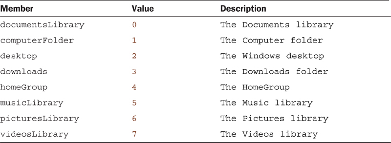
13. This is the key to what we are demonstrating in this example. We are storing the Windows.Storage.Pickers namespace to the pickers variable so that we don’t have to type as much (and so that it fits more nicely in on this formatted page). We then instantiate a new FileOpenPicker object. We can set the Commit button’s text to anything we want. By default, it just reads Open. After setting the text of the Commit button to View Photo, we also set the suggestedStartLocation to the user’s picturesLibrary. Table 14.1 shows all the possible values in the PickerLocationId enumeration. We can also set the viewMode of the FileOpenPicker. We set it to thumbnail, but the default is list. We must set the fileTypeFilter to the list of extensions we want to filter on. If we don’t want to filter, we .replaceAll(["*"]) allows all file extensions. Other functions exist besides replaceAll, including setAt, replaceAt, removeAt, getAt, and append. The full list is available at http://msdn.microsoft.com/library/windows.storage.pickers.fileextensionvector.aspx. Finally, we call the pickSingleFileAsync method, which brings up the file open picker. When the picker closes, the promise is called. If a file was picked, it is passed to the promise. If the picker was canceled, the file parameter isn’t set. This is why we make sure there is actually a file object before we pass it to the displayFile function.
Table 14.1. PickerLocationId Enumeration Values
14. Now we can display the selected image by writing the displayFile function:
function displayFile(file) {
var img = document.querySelector("img");
img.style.visibility = "hidden";
var imageBlob = URL.createObjectURL(file, { oneTimeOnly: true });
img.addEventListener("load", function () {
img.style.visibility = "visible";
}, false);
img.src = imageBlob;
}
15. The function is straightforward. We simply grab the only image in the document and set style.visibility to hidden. Then we create a oneTimeOnly use URL of the image. We set up an event handler for the load event. When that occurs, we set the style.visibility to visible. Finally, we actually load the image by assigning the URL to the img.src property.
16. If we run the app, we can see that it works as expected. We can swipe or right-click to bring up the app bar and click the open command. We are brought to the pictures library folder. When an item is selected, it displays correctly in all view states.
17. However, if we are in snapped view and we click the open command, an exception is thrown. Depending on our Visual Studio settings, it might not break. If it does break, we can just click Continue to pass the exception up the chain. The app thus does not crash, but the open file picker isn’t opened. This is because we are in snapped mode. To correct this, we need to add the following function:
function canShowPicker() {
var retVal = true;
// Verify we are currently not snapped or that we can unsnap to open picker
var currentState = Windows.UI.ViewManagement.ApplicationView.value;
if (currentState === Windows.UI.ViewManagement.ApplicationViewState.snapped &&
!Windows.UI.ViewManagement.ApplicationView.tryUnsnap()) {
// Fail silently if we can't unsnap
retVal = false;
}
return retVal;
}
18. We are returning a Boolean from this function to state whether we can actually show the picker. We have the capability to try to unsnap the app from the snapped view state by using the ApplicationView.tryUnsnap function. So if we aren’t snapped, or we were able to unsnap, we return true. Otherwise, if we could not unsnap, we return false.
19. At the very top of the selectFile function, we call the canShowPicker function:
if (!canShowPicker())
return;
We now have an app that lets the user pick a single image and displays that image. The next section looks at how to allow the user to select multiple files.
Opening Multiple Files with the File Picker
Here we create another app very similar to the first one by creating another Blank App project template called MultiFilePickerExample. This time, we let the user select multiple files. To begin, we need to replace the content of the body element with the following markup:
<div id="imageTemplate" data-win-control="WinJS.Binding.Template">
<div class="itemContainer">
<img src="#" data-win-bind="src: path; alt: displayName" />
<div class="overlay" >
<h2 class="name" data-win-bind="innerText: name"></h2>
</div>
</div>
</div>
<div data-win-control="WinJS.UI.ViewBox">
<div id="flipView"
data-win-control="WinJS.UI.FlipView"
data-win-options="{ itemTemplate : imageTemplate }">
</div>
</div>
<div id="appbar" data-win-control="WinJS.UI.AppBar">
<button data-win-control="WinJS.UI.AppBarCommand"
data-win-options="{id:'btnOpen', label:'Open', icon:'folder'}"
type="button">
</button>
</div>
FlipView flips through each image the user selects. We have created a template for each image as it is displayed. This simply binds the path to the src attribute and displayName to the alt attribute. The h2 element stores the name of the image. The FlipView control itself is inside the ViewBox control so that we can make sure our images look good in any view state. Finally, the app bar is the same as in the last example.
We place the following CSS rules inside default.css:
#flipView
{
width: 1366px;
height: 768px;
border: solid 1px gray;
}
.itemContainer
{
display: -ms-grid;
-ms-grid-columns: 1fr;
-ms-grid-rows: 1fr;
}
.itemContainer img
{
width: 100%;
height: 100%;
max-width: 1366px;
max-height: 768px;
}
.itemContainer .overlay
{
-ms-grid-row-align: end;
background-color: rgba(0,0,0,0.65);
height: 40px;
padding: 20px 15px;
overflow: hidden;
}
.itemContainer .overlay .name
{
color: rgba(255, 255, 255, 0.8);
text-align: center;
}
We set the #flipView control itself to have the width set at 1366px and the height at 768px. We also put a gray border around it. The .itemContainer class that wraps each item is set to use a 1×1 grid. The img element inside the .itemContainer has a max width and height of 1,366×768. This makes sure the images aren’t larger than the fixed viewport we have set to 1,366×768 through the flip view control. Finally, the last two rules set the color of the name to white and the background overlay to an almost transparent black. The overlay is positioned at the bottom of the grid because we used -ms-grid-row-align: end.
As in the previous example, we need to add code to hook up the btnOpen command after the processAll function has created the WinJS controls in default.js:
args.setPromise(WinJS.UI.processAll().then(function () {
var btnOpen = document.getElementById("btnOpen");
btnOpen.addEventListener("click", function (evt) {
STYWin.selectMultipleFiles();
}, false);
}));
Creating the imagesViewer.js File
Let’s create a new JavaScript file under the js folder in the Solution Explorer called imagesViewer.js. Inside the newly created JavaScript file, we add the following code:
"use strict";
(function () {
WinJS.Namespace.define("STYWin", {
selectMultipleFiles: selectMultipleFiles
});
})();
Now that we have created the shell and set up the namespace, we can add the function we are exposing:
function selectMultipleFiles(files) {
var pickers = Windows.Storage.Pickers;
if (!canShowPicker())
return;
var fileOpenPicker = new pickers.FileOpenPicker();
fileOpenPicker.commitButtonText = "View Photos";
fileOpenPicker.suggestedStartLocation =
pickers.PickerLocationId.picturesLibrary;
fileOpenPicker.viewMode = pickers.PickerViewMode.thumbnail;
fileOpenPicker.fileTypeFilter.replaceAll(
[".jpg", ".bmp", ".gif", ".png"]);
fileOpenPicker.pickMultipleFilesAsync().then(function (files) {
if (files && files.length > 0) {
loadImages(files);
}
});
}
This code is similar to the selectFile function from the last example. The main difference is that we are calling pickMultipleFilesAsync instead of pickSingleFileAsync. Then besides checking that the file has been returned, we check to see if any files are in the array; we also call loadImages, passing in the array of files we received from the pickMultipleFilesAsync function. pickMultipleFilesAsync allows the user to select multiple files when the file picker opens.
The canShowPicker function is identical to what it was before. Again, this is to try to unsnap the app if it is in snapped mode when the user tries to open the file picker:
function canShowPicker() {
var retVal = true;
// Verify we are currently not snapped or that we can unsnap to open picker
var currentState = Windows.UI.ViewManagement.ApplicationView.value;
if (currentState === Windows.UI.ViewManagement.ApplicationViewState.snapped &&
!Windows.UI.ViewManagement.ApplicationView.tryUnsnap()) {
// Fail silently if we can't unsnap
retVal = false;
}
return retVal;
}
The loadImages function, which applies the array of image files to the flip view control, follows:
function loadImages(files) {
var list = [];
var i;
for (i = 0; i < files.length; i++) {
var imageBlob = URL.createObjectURL(files[i], { oneTimeOnly: true });
list.push({
path: imageBlob,
name: files[i].name,
displayName: files[i].displayName
});
}
var dataList = new WinJS.Binding.List(list);
var flipView = document.getElementById("flipView").winControl;
flipView.itemDataSource = dataList.dataSource;
}
The core of the loadImages function is similar to the displayImage function from the last example. We are using URL.createObjectURL with a oneTimeOnly use. If we didn’t set that option, we would need to call revokeObjectURL when we were done with the image. We are creating the URL for every file in the list and pushing the URL, the name of the file, and the display name of the file to the list variable. We then convert the list array to a WinJS.Binding.List. When we get a handle on the actual flipView control, we bind the newly created list’s dataSource to the flipView.itemDataSource property so that the images are bound to the flipView.
We need to add the script file we just created to the default.html page somewhere above the inclusion of js/default.js:
<script src="/js/imagesViewer.js"></script>
When running the app, we can either swipe from the top or bottom or right-click and click the Open command to bring up the file picker, which enables us to select multiple images. After selecting the images, we can flip through each using the flip view control. We didn’t need to request any permission to the user’s file system because we used the file open picker. Figure 14.3 shows the file open picker invoked by the pickMultipleFilesAsync function.
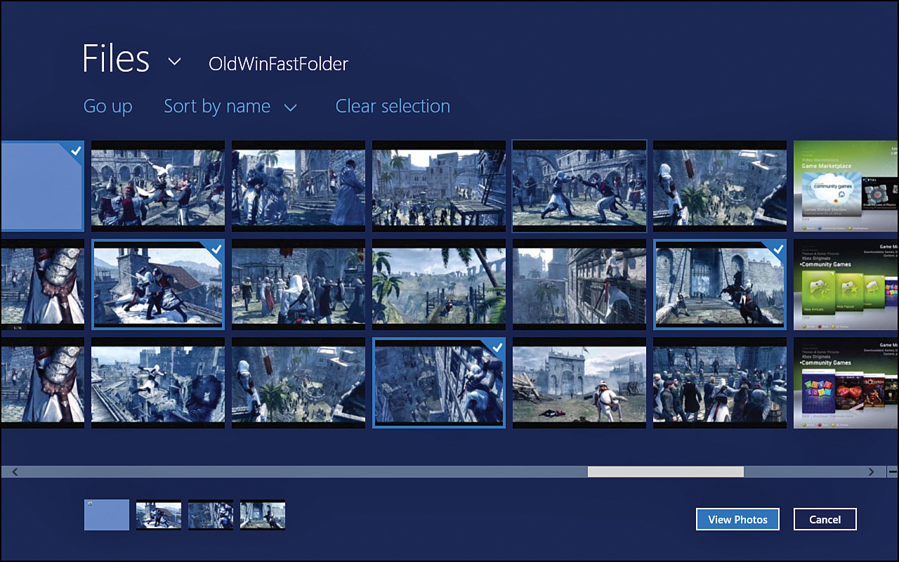
Figure 14.3. Windows provides the file open picker, which enables the user to select a single file or multiple files.
Saving a File with the File Picker
The final example app we make this hour demonstrates how to utilize the file save picker. It should be no surprise that it works similarly to the file open picker. For this example, we open the InkExampleFixed project from the last hour and modify the code so that when it is saved, we save it to the location the user desires instead of app storage.
To start, we copy the InkExampleFixed project from Hour 13, “Working with Fullscreen, Filled, Snapped, and Portrait Views.” Before we actually modify the save code, let’s add an app bar to the project and replace the Save button with a command in the app bar.
In the default.html file, we can add the following markup to create the app bar at the bottom of the body element:
<div id="appbar" data-win-control="WinJS.UI.AppBar">
<button data-win-control="WinJS.UI.AppBarCommand"
data-win-options="{id:'btnSave', label:'Save', icon:'save'}"
type="button">
</button>
</div>
We can remove the original Save button:
<button id="btnSave">Save</button>
We can also delete the #btnSave CSS rule from the default.css. While here, we can change the width of the #results to 100% because the Save button no longer is taking up space.
Next, we refactor some of the JavaScript code. We create a new file called fileSaver.js under the js folder. We can place the following code in the fileSave.js file:
"use strict";
(function () {
WinJS.Namespace.define("STYWin", {
writeOutImage: writeOutImage
});
})();
Inside default.js, we can cut the following code:
var btnSave = document.getElementById("btnSave");
btnSave.addEventListener("click", writeOutImage, false);
We can paste the cut code inside a then function attached to the processAll function. We can also make sure that we add the namespace to the beginning of the call to writeOutImage. The new code should look like this:
args.setPromise(WinJS.UI.processAll().then(function () {
var btnSave = document.getElementById("btnSave");
btnSave.addEventListener("click", STYWin.writeOutImage, false);
}));
Now we can cut the code from the top of the ready function down to but not including the declaration of the canvas variable. We are cutting the storageFile variable, the writeOutImage function, and the displayStatus function. When we have it in the Clipboard, we can go to the fileSaver.js file and paste it above the namespace definition.
Inside the done function of the writeOutImage function, we add the following code:
var appbar = document.getElementById("appbar").winControl;
appbar.hide();
This hides the app bar when a file is successfully saved. Inside the default.html file, we need to add a reference to this newly created JavaScript file. Before including the js/default.js script, we need to add this code:
<script src="/js/fileSaver.js"></script>
Now when we run the code, we should have the same functionality we did before, except that now the Save button is removed from the main area and tucked away nicely in the app bar. When we save a file, it gets the name temp.png or temp (n).png because the code is using the generateUniqueName creation collision option. If this is unfamiliar, look back at Hour 11, “Storing Data Locally,” where we wrote the save code for the first time.
Now that we have implemented the app bar in the project, we can ask the user where the file should be stored instead of just storing it in app storage where the average user would never find it. We learned that app storage was not the right place to store user data; now we can fix the code to do the right thing.
Using the file pickers does not require any capability to be set in the app package manifest. Since the user is explicitly telling the app where to open or save a file, the app does not need full permission to the user’s file system.
Inside the fileSaver.js file, let’s add the following function:
function createFile() {
if (!canShowPicker())
return;
var storageFile;
var pickers = Windows.Storage.Pickers;
var fileSavePicker = new pickers.FileSavePicker();
fileSavePicker.commitButtonText = "Save Image";
fileSavePicker.suggestedStartLocation =
pickers.PickerLocationId.picturesLibrary;
fileSavePicker.viewMode = pickers.PickerViewMode.thumbnail;
fileSavePicker.defaultFileExtension = ".png";
fileSavePicker.fileTypeChoices.insert("PNG File", [".png"]);
return fileSavePicker.pickSaveFileAsync();
}
This is the key to bringing up the file save picker. It is similar to the file open picker, except that we need to set the fileTypeChoices list. This is displayed in the drop-down list to let the user know what kind of files our app can save. We call this function inside the writeOutImage function. We need it to return a promise, so we are just returning the promise of the pickSaveFileAsync. Let’s add the well-known canShowPicker function:
function canShowPicker() {
var retVal = true;
// Verify we are currently not snapped, or we can unsnap to open the picker
var currentState = Windows.UI.ViewManagement.ApplicationView.value;
if (currentState === Windows.UI.ViewManagement.ApplicationViewState.snapped &&
!Windows.UI.ViewManagement.ApplicationView.tryUnsnap()) {
// Fail silently if we can't unsnap
retVal = false;
}
return retVal;
}
Finally, we need to modify the writeOutImage function to remove the code that writes to the app storage and instead saves the file the user selected. We can remove the storageFile variable in the module. Next, we add the following code to the top of the writeOutImage function:
var storageFile;
createFile().then(function (file) {
if (file) {
storageFile = file;
createFile returns the file the user selected. We are storing that into the storageFile variable. We could check the fileType of the file if we needed to do a different operation based on the type of the file.
We can go to the end of the function and close the then function:
});
Now inside the promise, we can clean up the code. We remove the cco, appData, and folder variables. After the variables, we continue to remove lines down to but not including the following line:
return file.openAsync(sto.FileAccessMode.readWrite);
We then replace that line and the following line with this code:
storageFile.openAsync(sto.FileAccessMode.readWrite)
.then(function (stream) {
We removed all the lines that were obtaining the folder and file we were using in app storage. We are now using storageFile, which ultimately came from the createFile function. The fully modified writeOutImage function follows:
function writeOutImage(evt) {
var storageFile;
createFile().then(function (file) {
if (file) {
storageFile = file;
var canvas = document.getElementById("canvas");
var blob = canvas.msToBlob();
var saveStream = null;
var sto = Windows.Storage;
storageFile.openAsync(sto.FileAccessMode.readWrite)
.then(function (stream) {
saveStream = stream;
return sto.Streams.RandomAccessStream.copyAsync(
blob.msDetachStream(), saveStream);
}).then(function () {
// since we return the promise, it will be executed
//before the following .done
return saveStream.flushAsync();
},
function (e) {
// errors occurred during saveAsync = catostrophic
// for us it just means we could not save the file,
//so we throw a different error.
throw new Error("saveAsync");
}).done(function (result) {
// print the size of the stream on the screen
displayStatus("File saved!", "Success");
var appbar = document.getElementById("appbar").winControl;
appbar.hide();
// output stream is IClosable interface
//and requires explicit close
saveStream.close();
},
function (e) {
displayStatus("save " + e.toString(), "Error");
// if the error occurred after the stream was opened,
//close the stream
if (saveStream) {
saveStream.close();
}
});
}
});
}
Now when we run the InkExampleFixed project, we not only have a nice app bar, but when we click the Save command, we are greeted with a file save picker. After we pick a file, it is successfully saved. Figure 14.4 shows the file save picker.
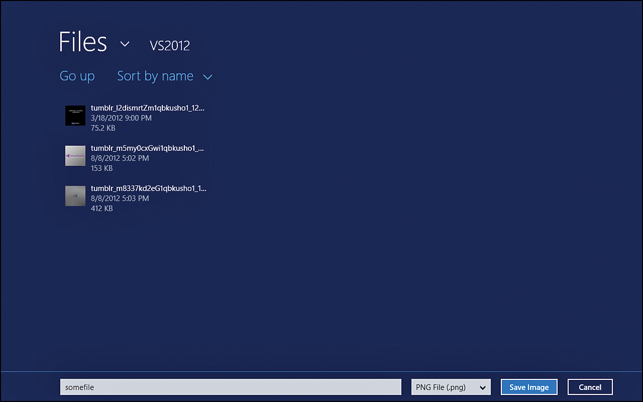
Figure 14.4. Windows provides the file save picker to enable users to save documents in a location they desire.
Further Exploration
More information on designing the app bar commands can be found at http://msdn.microsoft.com/en-us/library/windows/apps/hh761499.
The AppBar control has multiple events that will tell us before and after the app bar is being hidden or shown. These events can be found at http://msdn.microsoft.com/en-us/library/windows/apps/br229670#events.
If the predefined icons for the app bar aren’t sufficient and nothing is available in the Segoe UI Symbol font, we can create our own custom app bar sprite icons. The following blog post by a Microsoft employee has information on the steps needed to create the custom icons: http://blogs.msdn.com/b/shawnste/archive/2012/06/16/custom-appbar-sprite-icons-for-your-windows-8-metro-style-html-app.aspx.
Guidelines and checklist for file pickers can be found at http://msdn.microsoft.com/en-us/library/windows/apps/hh465182.
It may be appropriate for apps to access the same file the user opened previously. Instead of asking the user to find the file and open it again, we can store it in futureAccessList. We can then access the files later without requiring the user to find the file. Similarly, we can add mostRecentlyUsedList to keep track of recently used files. This could be beneficial by providing the user with a list of the files in some view of our app so that the user wouldn’t need to find the files again to work with them. Information on these can be found at the following links:
www.codeproject.com/Articles/437931/How-to-Track-Recently-Used-Files-and-Folders-Metro
A good quickstart in the Microsoft documentation discusses accessing files with file pickers, at http://msdn.microsoft.com/en-us/library/windows/apps/hh465199.aspx.
We didn’t discuss the folder picker, but just like the file open and file save pickers, the folder picker is available. The core code is identical to what we have seen. More documentation on the folder picker can be found at http://msdn.microsoft.com/en-us/library/windows/apps/windows.storage.pickers.folderpicker.aspx.
The Windows SDK samples of interest for this hour are:
• Access and save file using the file picker sample
• HTML AppBar control sample
• StorageDataSource and GetVirtualizedFilesVector sample
• Using a Blob to save and load content sample
Summary
During this hour, we explored how to create the app bar control. We looked at how to style the app bar and hide and show it at will. We also covered how to hide or show commands within the app bar, and we illustrated how to add a flyout command to the app bar.
In addition, we discussed the file open picker and the file save picker. We looked at how the file open picker allows the user to select a single file or multiple files that an app can then act on. We also saw how the user can select the filename and location of a file to save when we bring up the file save picker. Using these pickers enables us to work with the user’s file system without needing to request permission because the user is interacting with the app.
Q&A
Q. When should I use the delete command instead of the remove command for images and text on the app bar?
A. Delete is used when in a single item view. Remove works when the view is displaying a whole list of items. The text for the remove label should clearly specify what the remove action actually does.
Q. How do I allow the user to open files from and save files to the SkyDrive?
A. Fortunately, nothing else is needed to accomplish this task besides what we have covered this hour. We can use the file open picker, and the user can select the SkyDrive. When the file save picker is used, the SkyDrive can also be selected to save files.
Q. Can I have multiple file picker instances in my app?
A. Yes. To use multiple instances of the picker, the settingsIdentifier property can be used to identify and manage the individual instances.
Workshop
Quiz
1. App bar command buttons should be centered on the app bar. True or false?
2. What property needs to be set to make the app bar remain visible until the user dismisses it?
3. Where should global commands be located on the app bar?
4. To use the pickers, do the library capabilities need to be checked in the app package manifest file?
Answers
1. False. Commands that are global to the app should be placed on the right side of the app bar; commands based on selection or specific pages should be placed on the left side of the app bar. Command buttons should not be placed in the center because it is harder for thumbs to use on a tablet device.
2. The sticky property on the app bar keeps the app bar visible until the user dismisses it.
3. Global commands should be on the right side of the app bar. Selection commands should be on the left side of the app bar.
4. No. If the file system will be used only for app storage and through file pickers, then the capabilities do not need to be checked. On the other hand, if the app will iterate through the user’s documents, music, pictures, videos, and so on, the appropriate library capabilities need to be selected.
Activities
1. Open the AppBarExample and hook up the command buttons in place. Remove elements from memory when the item is selected. Make sure the selection commands on the left appear only when an item is actually selected. For the Add button, create a flyout control and ask for a title and a subtitle. For simplicity, add the other properties, such as like description, content, and backgroundImage, automatically by assigning the same default value as the sample data. Also, each addition can simply be associated to a hard-coded group. The main necessity is to have the list update on additions and deletions, as well has have the app bar display or hide the selection section commands appropriately.
2. Add another command to the app bar, and when it is clicked, display a context menu of four items. They can simply be hard-coded “Option X” and do not need to be tied to any code. Hour 6 shows how to create and display a context menu.
3. In the InkExampleFixed app, add a Clear button to clear the canvas as the tap-and-hold gesture does.
4. In the InkExampleFixed app, allow the user to open an image file and then write on top of the image file instead of the white canvas.