

The purpose of this chapter is to utilize all the skills you have learned so far to produce an environment. While we do this we will be introducing you to a workflow for creating an environment and dealing with elements such as budgets and deadlines. We will not cover every single step in this chapter as a lot of the modeling and texturing techniques used have already been covered. Any new techniques will be explained as we go along.
The environment creation process is usually an iterative one. In a development studio, we will constantly move back and forth between designers and artists as the environment is created. This is to facilitate both game play changes and of course esthetic appeal, with both being refined in stages. This tutorial will follow a linear workflow, but in reality, you will probably move in and out of all stages a few times during a production cycle.
The environment in this chapter uses the reference provided with the first edition of the book and that is also included in the Chapter 9 reference folder available to download from http://www.3d-for-games.com. Take a look at the introduction in this book for more detailed instructions on the download.
The photo reference is of an abandoned mental hospital in the North of England. Some example images are featured in Fig. 9.1. The goal is to create a section of the hospital grounds that includes exterior and interior sections of buildings.

FIG 9.1
For this scene, I stuck to set a deadline much as you would in the games industry.
Here is a quick overview of the workflow that I’ll be following including some tasks that will be completed during each phase. This workflow can still apply even if you decide to create a different environment.
Reference and planning
- Gather as much reference as possible to add to the existing set.
- Layout a rough 2D plan of the scene.
- Get an idea for the amount of items the environment will consist of.
Blockout
- Using the 2D plan quickly block out a basic version of the entire scene.
- Add blockout model for any objects or items that maybe needed.
- Aim to get a strong composition of objects at this early stage.
Concept
- Use the blockout to create a concept to define a final look for the scene including a pass on lighting and a first pass on composition.
- Draw up an asset list using the blockout and concept art to identify what needs to be built to define the workload involved.
- Create a texture list based on surfaces to be used in the scene.
- Create the texture sets to be used in the scene.
- Identify and create any modular assets.
- Produce all 3D assets required for the scene such as buildings.
- Populate the scene with other assets like vegetation or lamposts.
Lighting and rendering
- Set up lights in the scene to simulate and overcast day.
- Find a solution to render high-quality images quickly.
This is a step you could possibly skip if you prefer to move straight on to the blockout. Try not to jump straight into modeling without some sort of sketch though, as this step can save you a lot of time later on.
I found the creation of a 2D plan was useful to quickly set the footprints of the buildings and to organize the overall layout of the scene. Remember this step is just the first version and not necessarily the final layout, so don’t feel as if you need to stick to this 100%.
Figure 9.2 shows the final version of the 2D plan after spending about 90 minutes in Photoshop moving elements around. This could also have been done traditionally on paper. I find Photoshop quicker as you can freely move, rotate, and scale elements in the image easily to allow for quick iteration.
The plan was created by first using flat values of gray on individual layers to create the buildings, pavement, and road. The Line tool was used to define the edges of buildings.
Once this stage was complete, some photographic samples were placed beneath the flat colors to clarify the different surface types intended to be used.
Flat colors were then used as selections to cut out the shape from photo reference. For example, asphalt was copied from a photo by selecting the flat asphalt color layers icon while holding Ctrl + A.
You can then select the photo of the road and use Ctrl + J to copy the selection to a new layer. This technique makes the process of adding photo elements to the 2D plan very easy and fast.
If you wish to see how the PSD was arranged, the file is in the Chapter 9 folder available to download Chapter9CH009_conceptsenvironment_layout_ final.psd.
I put a scale reference bar in the image measuring 8 m. This will help me to match it up in 3ds Max later.

FIG 9.2
The process of blocking out an environment before jumping straight to making final assets is extremely important. I really can’t stress this enough as it can really help you to understand just how much work you’ll be getting yourself into. A lot of environments and scenes are never finished because the artist completely underestimates the amount of work involved. It’s a very easy trap to fall into!
At an early stage you can solve a lot of issues that may arise and fix them early on with less effort by understanding what you need to do from your blockout. Issues that you could encounter are scale issues, game play problems, and poor composition.
Blockouts provide a lot of information depending on how far you take it. It can range from a group of basic primitives to a low poly version of a final scene with all the assets blocked out.
It’s important to not get sucked into modeling details or accurate forms at this stage. The goal is to create a rough broad stroke of the entire scene. Get as many details blocked in as possible. If you have time, you can then create an accurate manageable asset list moving into the production phase.
The chapter folder contains 15 blockout files which we’ll go through now. Chapter9CH009_assets blockout_1-15.
The first step is to create a ground plane with the same dimensions as the 2D plan in 3ds Max, so the plan can be mapped onto it and used as a guide. The dimensions in Photoshop are in centimeters and in max are in meters.

FIG 9.3
The 2D plan was then mapped onto the plane using planar mapping.

FIG 9.4
A rectangle 8 m in length was created using the units in 3ds Max. The 2D plan was scaled up matching the scale bar on the plan to the 8 m rectangle.

FIG 9.5
Using the plan as a guide, start blocking out the buildings using slightly modified primitives. Remember, don’t add any fine details at this stage; keep to rough shapes to define height, weight, and depth.

FIG 9.6
Continue to block out the rest of the buildings. At this stage, I am referring to the photo reference to work out the rough shape of the buildings. In Fig. 9.7, you can see a rectangle with two edge loops. This was used as a measuring tool to define three storeys or floors. So, for each division, it’s one floor.
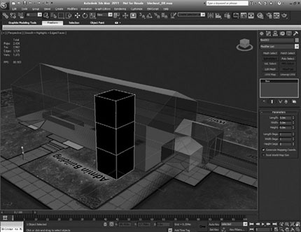
FIG 9.7
Continuing to use standard modeling techniques, the pavement has been created, and also, boxes have been placed as floating geometry over the facade of the building. This is so that I can get an idea of how many will be in the scene.
The window sizes were estimated from some of the photo reference. Depending on the style of building you are creating, I’d advise that you have a quick search online for standard or popular window sizes for the architectural style you are creating.
Even if you don’t create a 1:1 scale replica, it’s good to create something as close as you can get it. The more information you have, the more accurate the final production model will be. This can apply to any object you create.
It’s at this stage if this environment was to be used for game play, you could assess the scale of objects such as windows and doors in relation to the players perspective. You may be surprised to find that real-world scale items may not always work well in a game. I tend to scale everything slightly to “feel” right.
In Fig. 9.9, the main elements of the blockout are coming together. Some more details such as the columns and entrance area on the main building have been added.
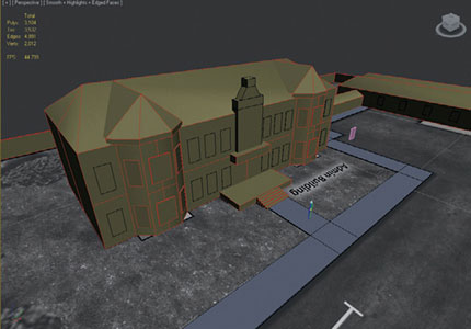
FIG 9.8
By Fig. 9.10, the blockout has all sides of all the buildings populated with basic details to give me an overall feel for the scene. At this stage, I’m starting to think that I may not be able to complete the entire environment that I have blocked out due to the deadline. It’s a good idea for me to scale back my initial design at this point to ensure I can finish the scene.
This is an extremely important point and a very important part of this book. Even the most experienced professionals “get it wrong” sometimes. It’s not important to do everything perfectly, every time—the important thing is how you plan and deal with issues as they come up.

FIG 9.9

FIG 9.10
Standard blinn shaders with the ambient color changed were applied to the models to get some color variety into the blockout. This helps to separate all the surfaces and to identify materials that may be required, such as red bricks or the black slate roof.

FIG 9.11
The last round of changes to the blockout included adding in some assets such as lamposts and a barrier on the road. Also, some roof damage was blocked into the corridor roof. The ward building had a side wall damaged and a basic interior blocked out. These adjustments can be seen in Fig. 9.12.
You could easily continue at this point and add more assets such as signs, abandoned cars, vegetation, rocks, or debris piles. What you add will be down to the type of environment you create.
The more refined the blockout is, the more it can help in making the production process easier. It will help you to identify the number of assets to create, and from this, you can jot down rough estimates on time and resources to get the scene completed.

FIG 9.12
The reason I have not gone into more detail with the blockout is that for the next stage I have decided to create a concept image using the blockout as a base. Figure 9.13 shows the camera angle I set up to paint over to create the concept.
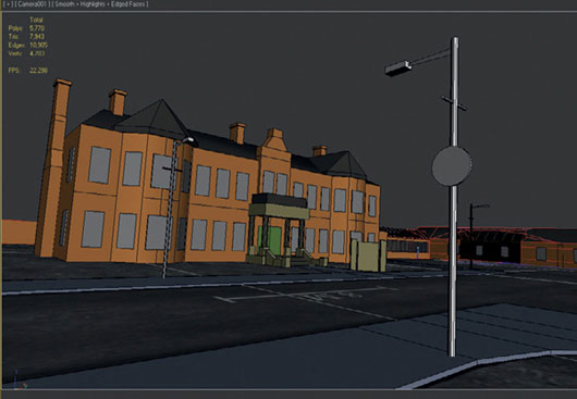
FIG 9.13
The concept sketch was completed in around six or seven hours in two sittings. It involved using photo elements and painting. Painter and Photoshop were both used. The goal of this stage is to create a “final” image to visualize the end result. Assets will be added, and the lighting within the scene will be worked out.
Concept art is very beneficial and is a great aid for artists to guide them through the production of an environment. Even though most companies will have a concept art team, it is worth gaining some experience in this area to be able to visually communicate clearly to others. After all a picture does speak a thousand words.
Starting with the blockout render in Painter, I used the artist oil brush for some colors and loose shading on a new layer on top of the render. The sky was painted on a layer beneath the render after the flat grey background was removed.

FIG 9.14
Figure 9.15 shows more painting over the render slowly tightening up the details. At this stage, I have moved back to Photoshop to take two photos of windows that were duplicated many times and manipulated into position with the Move tool and the transform mode perspective.
Although I was still in Photoshop, other photo elements were added to the image to speed up the process. These included the vegetation, bricks, fencing and rubble. Each image was passed through the Smart blur filter. Smart blur simplifies the details and gives it a more painterly look, blending everything in nicely for when I move back into painter. The results can be seen in Fig. 9.16.

FIG 9.15
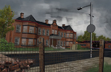
FIG 9.16
Figure 9.17 shows the image after spending some more time in painter. I worked into the photo sections to ensure they sit better within the image. A pass on shadows and lighting were also added.
The grass areas and bricks were refined and tightened up by using precise strokes and opaque brushes. The sign in front of the administration building was also rendered.

FIG 9.17
Figure 9.18 is the final concept image. Once I was happy with the level of detailing in Painter, I moved back into Photoshop to adjust the levels and colors of the image. Finally, some ivy was painted in using a brush.
A final pass on the lighting was also worked on. I choose to go with an overcast sky in the background with a break in the clouds outside of the image on the left allowing the sun to shine on the building. This will be my main light source in 3ds Max later once we get to the lighting stage.

FIG 9.18
After all that preparation we are now ready to enter the production phase and start to create the environment. The first thing I recommend doing at this stage is to draw up a work list based on all the steps we have taken so far. There will be two lists, an asset list to show all objects needed to be created and a list of all textures required for the scene.
A good thing to do at this point is to identify any textures that can be shared, or models that could be reused or created using a modular approach.
The following are the samples from the two lists used:
Asset list
- 1 x lampost
- A modular pavement set
- A modular brick wall
- A selection of windows
- A modular set of guttering
- The main building entrance
- Administration building
- Damaged corridor
- A door model
- The sign in front of the admin building
- The ward building
- Staff housing
- Reuse vegetation from Chapter 4.
Texture list
- 2 x road textures. One plain and one damaged for variety. Include normal maps.
- 1 x tiling concrete texture to be used on the concrete platforms and possibly pillars and steps.
- 1 x tiling grass texture.
- 1 x tiling dirt texture to blend with the grass texture. Include normal map.
- 1 x texture sheet containing a variety of windows possibly four types. Include normal and spec maps.
- 1 x tiling slate roof texture. Include normal map.
- 2 x pavement textures. One plain and one damaged for variety. Include normal maps
- 1 x tiling wooden post texture.
- 1 x tiling texture of a variety of wooden beams.
These sample lists are useful as work lists to keep you focused when creating an environment. They also help you to estimate the time it’s all going to take and can stop new elements creeping in later on in the production phase. Each item on these lists should be estimated so that you have a good idea of how long each task will take you.
This kind of information and organization is crucial if you have set a deadline. At any point, you will know how far off the goal you are, and how much work you need to do to achieve it. Again, this is a good point to look at whether you think you can produce all the work, or whether you need to work on a smaller, less complex scene.
All the work files can be downloaded from Chapter9CH009_assets environment.
You don’t have to create all assets in the same order as I have, feel free to complete the environment in any order you like.
As mentioned earlier, considering the amount of details to go through, I won’t be repeating any techniques covered previously, so if you are unsure of anything, flick back through the book and continue once you’re happy.
Starting with the pavement, the blockout mesh was used as a base to create a new model. The model is simple. It’s a plane with a chamfer to round off what will be the kerb, with an edge to the left to show the start of the kerb.
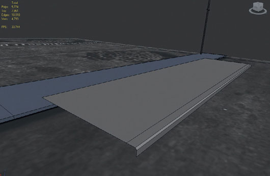
FIG 9.19
At this stage, I was intending to create a 2048 × 512 texture for the pavement. The pavement section was created to match this ration to bake the normal map from a high poly model.
Work continued with creating a simple modular set for the pavements. So, to go with the straight section, the next step was to add a corner section. This was created from a quadrant of a cylinder. It was built to match up to two straight sections including the chamfered edge. The model is shown in Fig. 9.20.
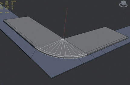
FIG 9.20
After the low poly corner and straight sections were complete, a high-resolution version of each was created to bake normal maps from. The high-resolution models were created with floating geometry and made up of a series of boxes with chamfered edges to give a rounder look to the kerbs and pavement slab edges. Both models can be seen in Fig. 9.21.

FIG 9.21
We have now come to a question that needs an answer. So far, we have not created any textures for the environment, so the texture resolution per square meter needs to be defined now before we proceed. This is to ensure that we have a consistent texture resolution throughout the scene.
To do this, I have created a texture template that will allow us to judge what size texture to use and to what scale. This template is found in Chapter9 CH009_assets uv_template_1024.

FIG 9.22
The template is made up of four different colored quarters, each consisting of 512 × 512 pixels. The red lines mark out the 256 × 256 sections. The overall texture is a 1024 × 1024 map. I use this template by placing it on a square plane the size of the chosen square meter area per 1024 pixels.
I then move this template around the scene and place it against assets to determine how big the texture needs to be compared with the template based on how much surface the asset takes up.
In this instance, I have chosen to use the 8 m scale bar from the 2D plan as my guide. That means an 8 m² area will use a 1024 × 1024 texture. This is now the set resolution for the environment. You can make this whatever you want. 512 × 512 per 4 m² or 2048 × 2048 per 10 m²—it’s up to you what you deem to be an acceptable resolution.
With this in mind, I created an 8 m × 8 m2 plane and mapped the template on to it in the scene. I can see straightaway that the road will be exactly 1024 × 1024. For now, we need to figure out the pavement. I have decided to drop the 2048 × 512 texture format as originally intended.
Now that the template is in the scene, I have decided to go with a 512 × 512 square tiling texture for the pavement. This will mean the texture will tile more, but that’s fine. A blend will be used to break it up.
The low and high poly models needed to be readjusted to fit a square format. The new models with the template are shown in Fig. 9.23. You can see that the pavement section is just larger than a 256 section on the template. As the pavement is an important texture as it’ll cover a large area of the scenes surface, I feel going with a 512 × 512 will be better. If it creates a noticeable inconsistency with the set texture resolution, it can be scaled to a 256 × 256 later on.
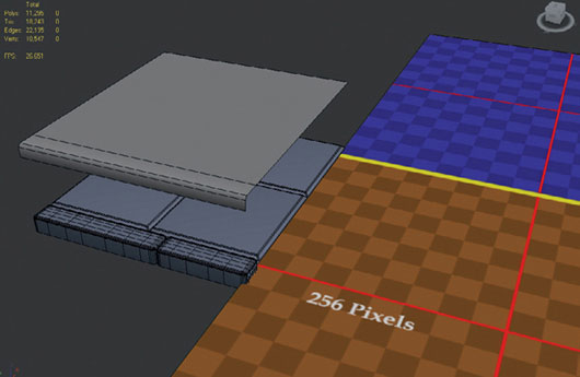
FIG 9.23
The low poly pavement section needs to be unwrapped and placed over the high poly mesh in preparation of baking the normal map. The process used to bake the map was the same as in Chapter 7, on the door model.
Jumping past this process and moving on to the final result, Fig. 9.24 shows six steps in the creation of the main pavement texture. I’ll go through these briefly now. Don’t forget you can load up any of the texture PSDs in Photoshop to have a more in depth look at how they were put together.
Step 1 This is the tangent space normal map that was baked from the high poly model. It was used as the guide for the diffuse texture.
Step 2 The diffuse map was created by sourcing photo reference of concrete online and using Photoshop’s blend modes to achieve the desired result. Matching the grooves and kerb details to what was present in the normal map.
Step 3 This shows the addition of moss added to the gaps in the paving slabs. This was achieved by placing a tiling texture of moss over the diffuse map. A layer mask was applied to the moss layer and filled with black, so it was totally transparent/invisible. Then, using a brush with the color white set to approximately 60% opacity, I painted in the areas where I wanted moss. Don’t forget to use the offset tool to tile the mask once you are finished to make sure the texture stays as a tiling one. For the pavement, we only need it to tile in the U-axis.
Step 4 This is a desaturated version of the diffuse texture with the levels adjusted to increase contrast. This is going to be put through the nvidia normal map filter plug-in.
Step 5 This is the texture after it has been converted to a tangent space normal map. This was then set to overlay above the texture in Step 1 and then flattened and normalized to create the final pavement normal map.
Step 6 This shows the final composited normal map.

FIG 9.24
Figure 9.25 shows the regular and damaged variants of the straight and corner sections of pavement. These were all created using a similar method.

FIG 9.25
Once all the pavement textures were created, I moved back into 3ds Max and mapped the original rectangular straight section and the corner piece. Both these were then duplicated numerous times and placed around the scene following the blockout to create the final pavement.
The pivot point was moved using “affect pivot only” on the hierarchy panel to a corner of each model before duplicating them, making them easier to snap together.
The blockout pavement was then deleted. For now only the undamaged pavement texture was applied to the models as the damaged version will be painted later using vertex colors and a blend shader.
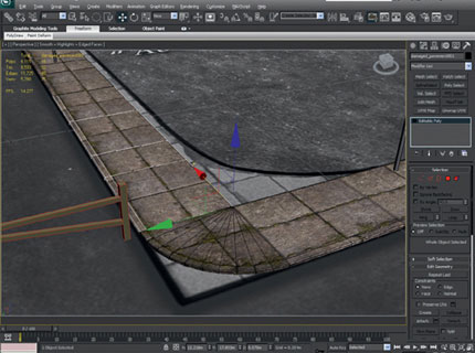
FIG 9.26
Next, I moved on to the road textures. Like the pavements, a plain version and a damaged version will be created for variety. There are 10 work in progress PSDs available in the chapter folder showing the progress of the road textures, but here are the main points.
As the roads are 8 m wide that means one 1024 texture is suitable. It only needs to tile in one direction but it never hurts to tile a texture in both directions just in case.
The texture was started with a simple asphalt base which was tiled in both the U- and V-axes. The Gradient tool was used to create darker sides for the road edges where there is less wear and tear. This layer was set to soft light at 47% opacity.
On a new layer, lighter vertical stripes were painted running along the texture in the center with the airbrush tool to create areas that have been worn down due to constant use. This layer was set to overlay at 32% and was placed over the other layers. The wip file for the texture at this stage can be downloaded from Chapter9CH009_assets extures exture_wipsenvironment_road_01.
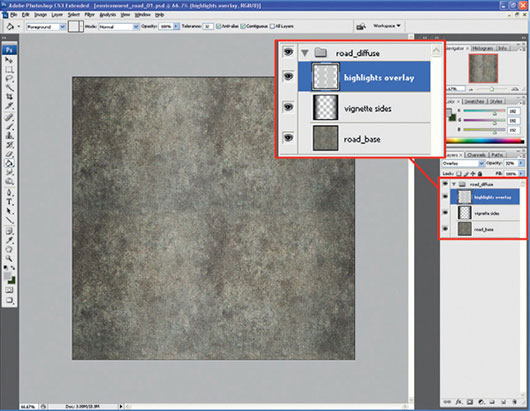
FIG 9.27
The next stage uses file environment_road_02.psd. It has a more detailed section of asphalt compared with the base that was used in step 1, which was brought in and tiled using the Offset tool. I choose this as I preferred the chunkier look of the asphalt rather than the smoother base asphalt texture. The final result is seen in Fig. 9.28.
This new layer was placed over the base layer but under the dark sides and highlights. It was set to hard light after being desaturated, so the color and detail of the base texture still comes through while keeping the chunky details.
In environment_road_03.psd, I imported the moss layer from the pavement textures. I had to duplicate it four times to fill the 1024 texture.
After checking it still tiled I moved onto environment_road_04.psd, where a layer mask was applied to the tiling moss layer. The mask was filled with black ready for painting the moss over the road by using white on the mask.

FIG 9.28
The results of the work carried out in the environment_road_04.psd can be seen in Fig. 9.29. It shows the effect of painting in the moss with the layer mask. I also started playing around with desaturated and highly contrasted crack textures. These were set to multiply to try and get a nice looking damaged surface. At the moment, this is looking weak so it needs more work.
Environment_road_05.psd to environment_road_08.psd were spent trying out different crack textures. I finally found one, I really liked and tiled it. I then set it to multiply over the base road textures. This texture is shown in Fig. 9.30.
At this point, I have created two groups in my layers to keep the file tidy. These were the base road group called road_diffuse, and the layers for creating the damaged version over the base called road_damage_ageing.
Environment_road_09.psd and environment_road_10.psd were spent finalizing the base and damaged diffuse textures. I then duplicated the groups and desaturated them in preparation for running them through the nvidia normal map filter to create the normal maps.

FIG 9.29

FIG 9.30
When desaturating all the layers before converting them to normal maps, remember to remove any lighting such as the dark sides and highlights. All you want in the normal map are the surface details.

FIG 9.31
Figure 9.31 shows the desaturated layers of the damaged variant. The mask layer of the moss was copied to a layer of flat white. This means the moss will be raised off the surface by the normal map. The cracks have been darkened and pushed back to create recesses.
When I was happy with the values making the detailing raised or pushed back in the normal map, I made several duplicates and ran each one through different filters to get more interesting shapes and details for the normal map. This group of layers was then duplicated and renamed to normal_maps, so the originals can be kept for editing.
The filters are pictured in Fig. 9.31. Smart blur and surface blur are particularly good for simplifying a busy noisy texture like this.
Each of these layers was then converted to normal maps. Each layer was set to overlay except the bottom one which was set to normal. I then adjusted the opacity of each layer to reduce the “noise” of the normal map.
When the result was satisfactory, the group was duplicated and merged to one layer. This layer was then tiled using the smudge and Clone Stamp tool. I tried to edit a normal map as little as possible.
When the normal map tiled correctly, it was normalized using the nvidia plug-ins normalize only option. It is necessary to normalize a normal map after every time you modify it to ensure the values stay within the 0–1 range.
This process was carried out to create a normal map for the base and damaged version. After the diffuse and normal maps were created, copies of the diffuse textures were reduced to 256 × 256 and then desaturated. The levels tool was used to increase the contrast of the new texture. This was then used as a specular map placed in the specular level slot of a blinn shader.
All the textures created for the road are pictured in Fig. 9.32.

FIG 9.32
These textures will be used in a blend shader where the damaged version can be painted on the surface using vertex colors. This is a common technique used in games today to add variety to surfaces and break up tiling of textures across large areas.
Most game engines have shaders that can blend between multiple textures. The technique we are using at the moment can only blend between two shaders. It is limited but it’s a good introduction to the concept. In 3ds Max, using the default shaders, we can only see the results when the scene is rendered. It is possible to find many CGFX shaders online that can be used that display the results in the viewport depending on your graphics card.
This blend shader technique was used for the pavement, brick, and grass/dirt textures. Let’s go through setting up the shader for the road textures now. The same technique can then be used on the others.
Open up the material browser. Click on the Standard button to bring up the material/map browser. Change the shader type to “blend.”
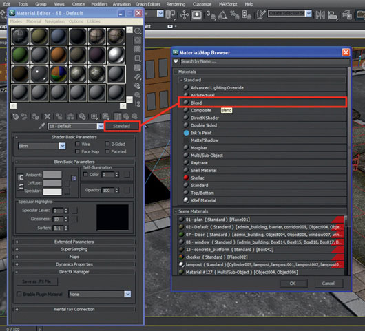
FIG 9.33
The default shader slots and options will now change to display the default blend shader options. This is shown on the left of Fig. 9.34. The three slots are material 1, material 2, and mask. The mix amount and curve settings can be adjusted to affect how the blend works based on the masking technique you use.
If you click on one of the material slots, you will be brought into a standard shader layout. This blend shader consists of two standard shaders and a mask for blending them.
Material 1 is where the primary texture will go. As you can see from the final road shader on the right of Fig. 9.34, I put the base road texture in this slot. As material 1 is a standard blinn shader, the diffuse, specular, and bump slots were used as normal with the three relevant textures.
Material 2 will be the material we paint on the surface over material 1.
I placed the damaged road textures in this material.
The mask can work a few different ways. Click on the slot to bring up the options. For the shaders in this scene, I have chosen vertex color near the bottom of the list as the mask. This gives the ability to use vertex colors painted onto the mesh to determine where material 1 and material 2 appear.
Another method you could use is to use a bitmap and place a black and white or grayscale image in the slot. This will then make the shader render both materials over each other. The greyscale image will then determine which layer is rendered on a per pixel basis. Darker pixels will be material 1 and lighter pixels will be material 2. The effects of this method are nice, but it will only place the textures over each other and not allow us to freely paint the location of the different materials.
It’s possible to toggle which material is displayed in the viewport by selecting the interactive option to the right of each slot. The material in the slot highlighted will appear in the viewport.
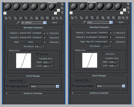
FIG 9.34
A mesh is now needed to try out the new blend shader, so create a plane between the pavement meshes to become the road.
Assign the road blend material to the new mesh. The road mesh will still need to be unwrapped before the vertex colors can be painted.
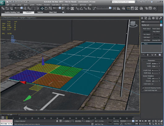
FIG 9.35
Once the road mesh is unwrapped, select the mesh and go to the utilities tab on the far right of the command panel. Click on “more” to bring up the utilities window and choose “assign vertex colors.” These steps are pictured in Fig. 9.36.
A selection of options will appear in the utilities panel relating to vertex colors. We just need to click on “assign to selected,” as all the default options will work fine.
Don’t be afraid to read up and explore the other options as they can all be very useful. These options are displayed in Fig. 9.37.
We should now have a new item called VertexPaint on the meshes modifier stack. The mesh may also change color as a vertex color has been assigned to the meshes vertices.
The VertexPaint window will now also appear every time you select a mesh with an active VertexPaint modifier. Figure 9.38 highlights the options we’ll need to use to paint material 2 onto the road surface.

FIG 9.36

FIG 9.37

FIG 9.38
Start by using the Fill/Paint Bucket tool to flood the mesh with a 100% black. This will turn the mesh a solid black color.
Next, change the color to white and use the paint brush to paint white on some of the vertices in the viewport. Areas where you paint white will reveal the base texture in the viewport as seen in Fig. 9.39.
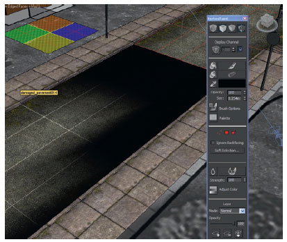
FIG 9.39
When this model is rendered, we can see the results of the blend shader. A test render is seen in Fig. 9.40.
As the mesh of the road is fairly low poly, the vertex colors painted will be large strokes that fade out across the mesh. If you want to paint more specific patches, you need to cut into the mesh or use tessellate to add extra edges/vertices. The more vertices you have to paint on, the more defined the results will be.

FIG 9.40
An example of a slightly more refined vertex painting can be seen in Fig. 9.41. It is a wall model that we’ll build later on in this chapter. It has extra geometry cut in, to vary the amount of surface each stroke covers. You could also cut more irregular edges into the mesh to get different shapes. I’ll be leaving this until the last polish stage on all the meshes.
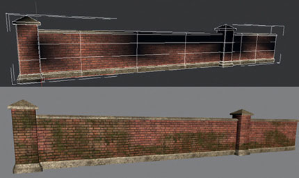
FIG 9.41
Next, more planes were created to be the grass areas of the scene. A blend shader was created and applied. Following the same procedure as before, I painted between both materials on the mesh. You can also repaint the meshes later easily if you change where you wish to have material 1 or material 2. The grass and dirt textures were created as tiling textures; they are seen in Fig. 9.42 along with the grass mesh and a small section rendered showing the blend.
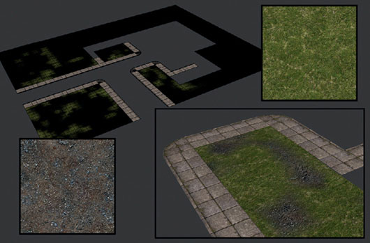
FIG 9.42
The perimeter walls and building facades are next on the list. I think it’ll be wise to use the same red brick textures for the wall as the brickwork on all the buildings. The brick texture will be created as a 1024 × 1024 with a normal map. After searching online, I found a red brick texture that suited what I had in mind very well.
The creation of the texture was straightforward; it just required a lot of work as there were a few issues with the source image that made it unsuitable as a tiling texture.
Figure 9.43 has a 1024 × 1024 cropped section of the original source image on the left and an offset version of the same image on the right. It’s hard to see in this image that in the offset version the bricks do not line up correctly along the edges leaving obvious seams in the texture. There’s also a lot of contrasting value changes in the colors which will stand out when the image is repeated.
You’ll be able to browse through the 11 wip texture files covering the production of this texture in the chapter download from here: Chapter9 CH009_assets extures exture_wips red_bricks_01-11.
The tiling issue was the first problem tackled by copying and pasting sections of the texture over the areas with the seams so that the bricks would at least be in a straight line and match up better. The Clone Stamp tool was then used to clean up the pasted elements, so they blended seamlessly back into the original image.
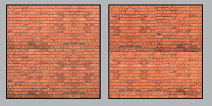
FIG 9.43
Again using the Clone Stamp tool, any bricks which stood out too much were stamped over to reduce any large jumps in value. The idea is to create a texture that is almost monotone as any contrasting details will stand out and show in the tiling.
The role of a generic tiling texture is to have no specific noticeable details that people will easily spot repeating over a surface. That is why I created another variant of this texture with a lot more visual interest to blend with this one to break up the bland surface.
After the base brick texture was sorted, another generic texture shown on the left of Fig. 9.44 was placed over the brick layer and set to overlay to add a little variety to the bricks coloring, but obviously not too much. It’s a tough balance trying to get something that looks reasonably interesting without standing out. The combined version of both layers is on the right of Fig. 9.44.

FIG 9.44
Now that the diffuse texture is out of the way a normal map will be needed. As always, the starting point will be a desaturated copy of the diffuse texture. This is on the left of Fig. 9.45. The levels were adjusted to lighten the image up to be almost white. The problem with this is, for bricks, they need to stick out from the cement between them, which will need to recede.
At the moment, the image will not work. The only solution is to darken the cement between the bricks so that it recedes in the normal map. The method I used was to create a new layer and paint the cement areas of the texture manually with the standard brush set to 100%. The finished version is on the right of Fig. 9.45.

FIG 9.45
Just like the road texture, a few duplicates of this layer were made and passed through some of the Photoshop filters to get some variety to the details. These layers were than converted to normal maps and set to overlay over each other. The first pass I created of this normal map turned out too noisy and lumpy on the surface of each brick as there were still a lot of gray values in the texture.
As I only wanted the dark cement to recede, I had another go and used the levels tool to push the contrast further leaving the brick surfaces mainly pure white. This new texture was then converted to a normal map creating an improved result. Figure 9.46 has the improved grayscale map on the left and the normal map generated from it on the right.
As a final bit of polish on the texture, I have used a technique mentioned in Chapter 3. The first lumpy normal map was desaturated and placed over the diffuse texture and set to multiply to add some ambient lighting information to the diffuse texture. The levels were adjusted to control the level of contrast.
This is a very subtle touch, but one that makes a difference. The example on the left of Fig. 9.47 is the original diffuse texture, and the sample on the right is the same sample but with the desaturated normal map set to multiply over it.

FIG 9.46

FIG 9.47
Figure 9.48 displays a move back into 3ds Max. Now that the default red brick textures have been created, the model for the perimeter wall can start. All I need to make is one pillar and one wall section. These models can then be copied and placed around the scene to create all the walls. Unique details can be added, where required later such as ivy growing on the wall or damaged sections.
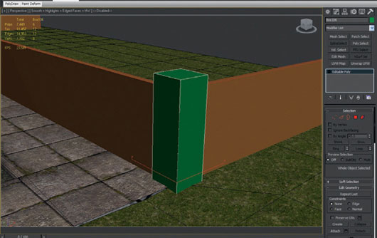
FIG 9.48
The pillar was built from a simple box with chamfered edges. The cap stone was created as floating geometry, and a new simple tiling concrete texture was applied. All unseen interior faces were deleted. The red brick texture was applied to the template plane so that all the assets in the scene will have consistent brick size by using the template as a guide.

FIG 9.49
A base was created on the pillar by using the Slice Plane tool to add in some edge loops that were scaled outwards to create a stepped base. The concrete texture from the cap stone was also applied to the base.
After the pillar was completed, a box was created in between two pillars as seen in Fig. 9.50. A trim along the bottom of the wall and a cap stone on top were also added. The pillar and wall sections were then duplicated and placed around the scene. When this was done, all the blockout walls were deleted.
The wooden door from Chapter 7 was also imported at this stage and put into replace the blockout doors.

FIG 9.50
With the walls and doors in, I started the outer walls of the buildings. The process began with duplicating the chimney model from the blockout, Fig. 9.51.
This chimney stack then had the edges chamfered, and the red brick texture applied after it was unwrapped. I only used planar mapping to unwrap all the sides one at a time. Any unseen faces on the model were deleted to reduce any overdraw keeping the model efficient.
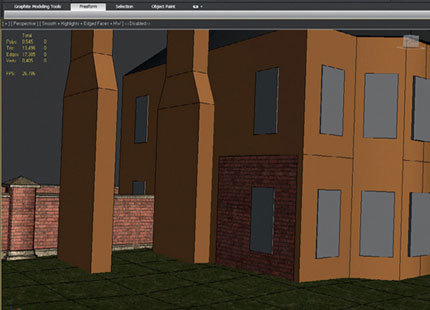
FIG 9.51
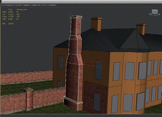
FIG 9.52
Figure 9.53 shows the first step in creating the facade of the main building. It started with a plane built over the left side of the blockout. Using the Extrude tool, the right edge of the plane was extruded around the front of the building following the contours of the blockout and continued around to the back edge on the right side.
After this was done, the Slice Plane tool was used to create four edge loops around the model. Each of these edge loops was snapped to the top and bottom of the two rows of windows on both floors of the building in the Z-axis. The shortcut for the snap tool is “S.” With this switched on and a sub object selected, you can snap it to any other vertex in the scene.

FIG 9.53
Continuing with the Slice Plane tool, vertical cuts were made to define the sides of each window in the blockout. Some extra horizontal cuts were added to the base of the building. These will be scaled out to form a plinth much like the base of the wall or pillars. You should end up with a mesh similar to Fig. 9.54.
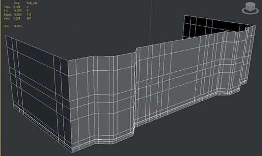
FIG 9.54
The faces where the windows will go have been deleted in Fig. 9.55. These new border edges were extruded inwards to create the recess the window models will be placed into. Before moving any further, the final windows have to be created, so the building model can be adjusted to accommodate them.
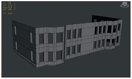
FIG 9.55
I decided to only make two types of windows at this stage as I was conscious of the time the scene was taking, but at least two varieties of each. Using the blockout windows as a guide, a simple high poly model was created for the frames of the window. This was to generate a normal map to base the rest of the texture off. This initial texture is shown in Fig. 9.56.
The texture is laid out in a way that there will be two typical windows on the right and four-paneled windows on the left. My goal is to be able to mix and match these panels in different combinations to get as much variety as possible. These paneled windows will be used the most in the scene.
The empty area on the right side and below the two normal windows will be used for space to map the window frames.

FIG 9.56
In Photoshop, the diffuse texture was created with a mixture of painting and the manipulation of photographic elements to match the layout set out by the normal map. The PSD is available in the chapter folder with the others.
The diffuse texture was desaturated as before and used to generate finer details to be set to overlay over the base normal map.
The real trick of these windows will be the use of the specular map seen in Fig. 9.58. This was created by saving off a different version of the .psd.
A hue/saturation adjustment layer was then placed on top of the layer stack. All the layers then had their brightness and contrast adjusted one by one until I got the desired look I was after.
The aim was to have the glass left in the window to be almost pure white whereas the holes in the broken panes were almost pure black. All the other elements such as dirt and rust were also adjusted to remain dark values. The cleaner areas of metal and painted wood were left somewhere near the lighter end of the scale. When all these textures are combined in max, the result should be decent.
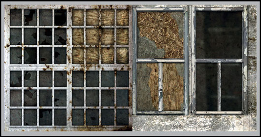
FIG 9.57
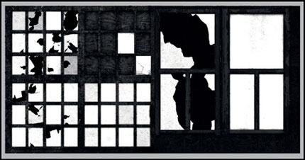
FIG 9.58
The final window models seen in Fig. 9.59 are quite simple, as most of the work is done by the textures and shader. In the end, I managed to get nine varieties of window out of the 1024 × 512 textures. I did this having two faces on each paneled window model, so I could map various combinations of the paneled windows on each one.
The window sills were textured using another generic tiling concrete texture. The UVs for each sill were placed on different areas of the texture so that there would be some variation with them also.
Now that the windows are ready they need to be placed into the recesses of the main building.
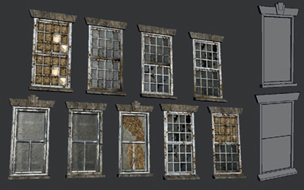
FIG 9.59
The building model had to be adjusted when the windows and sills were placed in as they did not match up exactly. In some cases, the sills had to be moved forward. The building model was also optimized by merging some vertices along the bottom of the plinth and also along the top of the model. As the sills covered the top and bottom of the recesses, all these faces were deleted.

FIG 9.60
Now that the building model is complete, the brick and concrete textures have been applied, and the model unwrapped. The UVs were laid out in one continuous strip which was then stitched together to make it seamless.
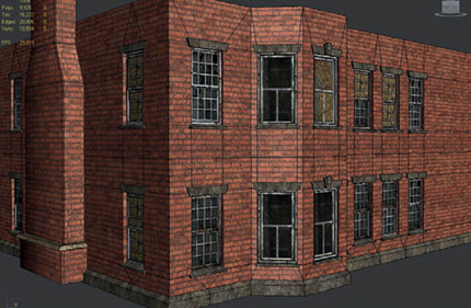
FIG 9.61
It’s worth going through the environment WIP files found in the Chapter 9 folder to inspect exactly how the UVs were laid out for all the assets.
The chimney stacks and central section above the entrance were also modeled and unwrapped. These pieces were created from a duplicate of the blockout mesh that was worked into.
While unwrapping, I found the relax tool in the edit UVWs window helpful in keeping the UV shells at the correct ratio. Go to the Menu > Tools > Relax. From the drop down list, choose “relax by face angles” and hit Apply or Start Relax. This should gradually flatten out the selected UV shell and help reduce any stretching on the model.

FIG 9.62

FIG 9.63
As you may have noticed, the number of buildings in the scene and how they are made up has been changed. This was as a result of adjusting the content to fit the time allocated. Quite often, this situation happens within the games industry and I wanted to make a point of it here so that you don’t get into the habit of not finishing work through lack of preparation or reluctance to change a plan.
I made a choice to spend the remaining time finishing the scene and only making the corridor and ward buildings, rather than spending extra time on the staff housing building. This extra time can then be used to improve what sections have been created already. It’s always better to reduce the scope of a scene if you are on a tight deadline, finish on time, and then polish, than to try to over-deliver and produce a rushed piece of work.
The ward building was built in exactly the same way as the administration building. A plane was extruded around the blockout shape. The Slice Plane tool was then used to add in edge loops where the windows will be. The faces representing the windows were deleted, and the vertical side edges were extruded inwards.
The windows were placed in the recesses, and the building walls were unwrapped. Figure 9.64 shows the production of the ward building. The door was already present from earlier, as was the concrete ramp in front of the building which can be wheelchair access.

FIG 9.64
A simple roof slate texture 512 × 512 pixels was added to the scene and applied to all the roofs. The blockout model was used as a starting point for the roof models.
The corridor involved a little more work than the ward as the paneled windows are in one long row. These needed to be arranged and attached together. There was also a damaged roof which exposed the wooden frame beneath.
This was an element I really wanted to keep from the blockout. The final version was made by creating a cross-section of the frame and unwrapping it and then duplicating it across the corridor.
I intentionally left a gap in the middle as if the roof has caved in to break up the solid look in the blockout.
Some individual boxes with the slate texture applied were placed on the edges of the solid roof of the corridor and along the beams. This was to break up the rigid look of finishing the roof with a hard edge.
Some of these loose slates were also put on the pavement in front of the corridor to add some visual interest to this section of the environment.

FIG 9.65
Figure 9.66 shows the tiling slate texture on the right which also has a normal map to accompany it. The texture on the left only tiles in the U-axis and was split into two halves. The bottom half was used for the exposed roof frame, and the top half was also used for beams. This time it was faded and aged painted red beams. This was applied to the exterior wooden beams running along the tops of all the buildings just below the roof.
These exterior beams were created by placing a box near the top of the building facade using Auto Grid to create it directly on the surface. The top, sides, and back faces were deleted leaving only the front and bottom faces. The ends of the beam were then moved to fit the building. For nonflat surfaces like the bay windows of the administration building, the ends were extruded around the top of the building following the wall surface.
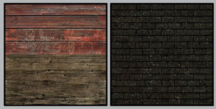
FIG 9.66
The last main modeling task is the entrance area for the admin building. I found a few reference images online which inspired this design. They were a lot more ornate, so I took the overall feel of stairs leading up to an entrance platform with a stone covering supported by columns but kept the design functional as it’s not supposed to be a decorative building.
Figure 9.67 shows the production model being produced on the left and the final textured version on the right. The Slice Plane and Extrude tools were used to create these sections from boxes. The columns were straightforward cylinders with the no end faces.
One of the tiling concrete textures, along with a new cracked concrete texture, was used to texture the entrance area. The cracked concrete texture was also used on the steps and entrance platform to the ward building.

FIG 9.67
After the ground surfaces and main buildings were created, I then started looking at creating some smaller details to break up the tiling on areas of the buildings and also to add more variety to the scene.
These details included metal railings, guttering, air vents, lamposts, and a broken sign in front of the admin building.
A modular approach was taken for creating the guttering and metal railings. These both used the same texture which also had the vent textures on it.
A modular approach involves creating all the separate sections or modules of an asset once. These elements are then assembled together to make the final object. This is an efficient approach for creating repeatable objects such as the railings as it is a lot quicker than making and unwrapping every single bar.
The only downside to a modular approach is you may end up with some repetition. This can be reduced by later adding some more unique elements on top like dents in the railings.
Figure 9.68 shows the modules used to create the guttering and railings.
Figure 9.69 has a section of the final metal railing and an example of the finished guttering on the ward building. Both were created with the modular kit.
When you are happy with the results, all these modules can be combined to be one single model.
The vents were boxes with the backfaces deleted. The vent texture was mapped onto the boxes. The vents were then placed on the ground below the guttering as a drain or under windows for ventilation.
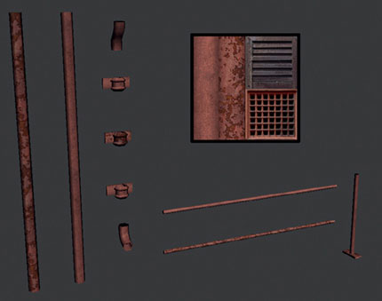
FIG 9.68

FIG 9.69
Figure 9.70 shows the current state of the scene. The core elements are all in place, and the blend shaders have been set up.
The next phase will be to import all the vegetation models created in Chapter 4 and to populate the scene with them. I just imported them directly and moved, rotated, and scaled them to get some variety.
While placing all the vegetation in the scene, I realized I still do not have any ivy models or textures. To solve this, I just popped outside and picked a few leaves of ivy and scanned them.
After these leaves were extracted from the white background, I built up the ivy texture by duplicating, rotating, and scaling the leaves.
FIG 9.70
For the texture layout itself, a bunch of ivy was created for use on a plane, and then a vertical thin strip of ivy was created to use on a long plane which can be modeled into tendrils of ivy growing across the building or over a wall.
Figure 9.71 shows the original source image of the ivy leaves. The final diffuse texture and the texture were applied to two different meshes.
It would have also been an improvement to have a separate vine texture to place beneath these ivy leaves over the surface of the building.
For now, the bricks’ secondary material which is a version of the bricks overgrown by moss will be painted underneath where the ivy will be placed. This should help it sit better over the red bricks.
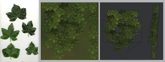
FIG 9.71
For the placement of the vegetation around the scene, this is down to your personal preference, and how detailed and overgrown you want to make this.
I stuck loosely to the concept and placed more vegetation where I felt they would look good.
I really recommend the use of reference when completing tasks like this. Have a good look online or go outside and have a look at how grass and other plants grow in built up areas. Good placement of these elements can really benefit the overall look of an environment. Never build what you “think” something looks like in a photo-real scene; always build what it actually looks like, with some artistic license of course.
The tree walls were placed at the back of the image to provide a backdrop for the scene. Figure 9.72 shows the wip file environment_54. At this stage, the environment is almost complete.

FIG 9.72
A few final touches are added to match the concept. A hemisphere with a sky texture applied is created around the scene to represent the sky, and some wooden posts and a wire mesh fence are created as they appeared in the foreground of the concept.
Six cameras were also set up to get some renders of the final scene. Some extra work was carried out to populate these areas more, making them appear fuller.
At this point, as cameras are set up, and lights are added to the scene, a lot of minor tweaks and changes are made to improve the final renders.

FIG 9.73
Lighting and Rendering the Final Scene
This part of the process was kept fairly simple. I used the default scanline renderer for the base image. An ambient occlusion pass was then rendered separately and set to multiply over the default render using Photoshop.
For the lighting itself, I used a number of omni lights to light the scene. One key light was placed in the sky over the left side of the building to match the direction of the light in the concept. This light being the main source was the only one set to cast shadows and had the highest intensity value.
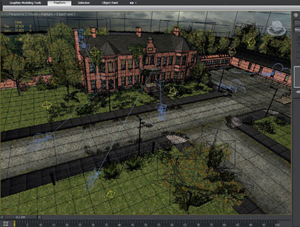
FIG 9.74
All the other lights intensity values were kept below .25. These lights were used to simulate bounce light and global illumination around the scene. Figure 9.74 shows the lights placement around the scene. This file can be downloaded from here: Chapter9CH009_assetsenvironment environment_render.
Simply put, the ambient occlusion pass is a method of shading that calculates the reduction or absence of light when it is blocked by objects. For the ambient occlusion pass, I followed this method.
You’ll first need to make mental ray the current renderer by opening the render setup options. Go to the common section and expand the assign renderer section. Click on the button to the right of production to open a pop-up window, where you need to select mental ray. This will now make mental ray the current renderer. Figure 9.75 shows these steps.
Open the material browser and select a blank material. Click on the “standard” button to open up the material browser and scroll down to find the mental ray shader.
Under the basic shaders option, open the surface option by clicking on “none.” Now, add an ambient/reflective occlusion node from the mental ray section.

FIG 9.75

FIG 9.76
The shader options will now change to the ambient/reflective occlusion parameters. Input a value for the max distance—I have put in 50.0, but this can be adjusted later. The other settings such as samples can be increased to get smoother results from the AO pass. This will also increase render times.
The settings are pictured in Fig. 9.77. A good tip is to render the AO pass a little smaller than your main render and then use Photoshop to upscale the image before compositing it.

FIG 9.77
The shader values can always be adjusted later on. For now, open the render settings options. Under processing, enable the material override option. Then, drag and drop the newly created mental ray shader in the material slot. This will now override all the materials in the scene and use the AO shader when the material override option is enabled.
Before you render, turn off final gather, global illumination, and your exposure. If you don’t do this, you will get a black rendering.
You can now hit render and see the results. The only problem with this method for this scene is that the alpha textures don’t get taken into account when the AO pass is rendered resulting in the geometry being rendered instead.
When this AO render was composited over the default render, the results were less than desirable. The result can be seen in Fig. 9.79. You can clearly see all the geometry outlines of the vegetation.

FIG 9.78

FIG 9.79
A suitable work around for this that I found useful was to use the layer manager to create a vegetation layer. I then selected and added all the vegetation to this layer. When it was time to render the AO passes for all the renders, I just used the layer to hide all the vegetation.
The results were a lot more successful as the AO pass did not include any vegetation. It did mean losing out on some occlusion from the vegetation, but I felt this was acceptable. I did have to paint out some areas of the AO pass that sat over the vegetation in Photoshop as the lines and contours of the building were being shown over the vegetation.
The final image in this chapter is the composited render of the environment from the same camera angle as the concept.
By the end of this chapter, the environment had taken more than 40 hours to get from the initial reference hunt to the final renders. The end result is heading in the right direction and is a solid base to build upon.
Feel free to continue to work into this scene by adding more assets to populate it such as abandoned vehicles or signs around the building giving more hints as to its purpose. Rubble and debris can litter the area around the buildings. Maybe some subtle sci-fi elements can be incorporated into the scene creating some mystery as to the hospital’s true purpose.
The options are endless. So, see how far you can push the concept.
I will set up a thread on the forum at http://www.3D-For-Games.com/forum to show you what I did to complete the scene—I’d love to see your submissions too. We’ll also be on hand to help you with this or any other part of this book or the others in the series.
