Photoshop has a very rich set of painting and drawing tools. These tools have been in Photoshop since its first release, yet they have evolved greatly over time. The painting and drawing tools have many uses. To name a few:
Fine artists can paint entire works into Photoshop with its realistic painting system. Using software can be an affordable alternative to traditional methods, which require more space and supplies.
Comic book colorists can use Photoshop to paint the color into the inked drawings.
FX designers can create background paintings for movie special effects work. In fact, the co-creator of Photoshop, John Knoll, is a lead visual effects supervisor at Industrial Light and Magic, the group behind the Star Wars franchise and many other well-known films.
Commercial photographers can touch up and enhance photos using digital tools instead of a traditional airbrush. Nearly every photo you see in a fashion or entertainment magazine has undergone some digital touch-up in Photoshop to paint out imperfections.
These tools appear simple at first, and in fact they are. After all, the technology behind a paintbrush is pretty straightforward. It’s the skill of the user holding the tool that determines results. A thorough understanding of the painting and drawing tools can come in handy while working in many areas of Photoshop. Whether you use Photoshop for image touch-up or to create original images from scratch, be certain to master these tools.
Working with painting and drawing tools requires you to use color. Photoshop offers several flexible ways to choose colors. You can sample a color from an open image, choose a color from a library, or mix a new color by entering numerical values. Which method you use depends on a mixture of personal choice and the job at hand. Let’s explore the different options.
The Adobe Color Picker is a consistent way to choose colors while using any Adobe software program. Both Macintosh and Windows systems have their own color pickers, but its best to stick with the standardized Adobe Color Picker because it is more full-featured and cross-platform.
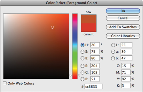
You can choose a color from a spectrum or numerically. Use the Adobe Color Picker to set the Foreground color, Background color, and text color. Additionally, you can use the colors for gradients, filters, or layer styles.
Double-click a color swatch (such as in the toolbox) to open the Color Picker. In the Adobe Color Picker, you can select colors based on:
Hue, Saturation, Brightness (HSB) color values
Red, Green, Blue (RGB) color values
Lab color values
Cyan, Magenta, Yellow, Key (or Black) (CMYK) color values
Hexadecimal color value
In some cases, designers need to access specific colors—those that come from a particular color and brand of ink. This is most often to match colors used by a specific company. For example, McDonald’s always uses the same red on all its printed materials (PMS 485). This helps create a specific look or identity by branding based on color.
A designer can keep color consistent by specifying Pantone colors. The Pantone Matching System (PMS) is the most widely accepted color standard in the printing industry (www.pantone.com). Each color is assigned a PMS number, which corresponds to specific ink or mixing standard, thus ensuring that a client will get consistent printing results. Accessing Pantone colors within Photoshop is easy:
Activate the Adobe Color Picker by clicking the Foreground or Background color swatch.
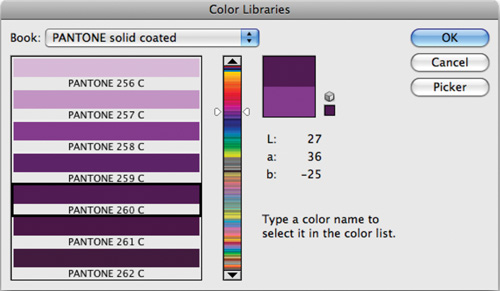
Click the Color Libraries button. The Color Libraries window opens.
Color Libraries can also be loaded as color swatches. Just click the submenu (triangle) in the upper-right corner of the Swatches panel. Choose the library you need from the pop-up menu.
From the Book menu you must choose among several options. Always ask your clients for specific color information. You can quickly jump to a specific color by typing in its number.
When you have a color selected, click OK.
Photoshop loads the closest equivalent color into your color picker. Essentially, the Pantone color will be simulated as accurately as possible by an RGB or CMYK equivalent.
If you need to have the exact color for printing, you will need to make a spot color channel (see the section “Creating spot color channels”).
With Photoshop CS4, you can now access the intuitive tools of Adobe Kuler to quickly create new color themes. Kuler began its life as a Web-hosted application for experimenting with color variations and also allows for the sharing of color themes through an online community. To view the Kuler panel, choose Window > Extensions > Kuler.
The Kuler panel is divided into three tabs.
About: Introduces you to Kuler and links to the online community. You can create a free account to store themes as well as participate in Kuler forums and rate other users’ themes.
Browse: Allows you to browse thousands of color themes created by the Kuler community. Be sure to check back often because you can view by criteria such as the newest, highest rated, and most popular themes. You can also search for themes by tag word, title, creator, or hex color value.
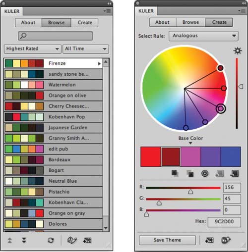
Create: Allows for the use of multiple color rules that are rooted in traditional design and is one of its best aspects. Kuler supports the following color rules: Analogous, Monochromatic, Triad, Complementary, Compound, and Shades—all are based on color theory. To use a color you create, simply double-click its swatch to load it as the Foreground color in Photoshop. Across the bottom of the Kuler panel are additional options to save a theme, store it in the Photoshop Swatches panel, or upload it to the Kuler community.
While most jobs use a four-color process to simulate colors, you may need to use a special printing technique called spot colors. Spot color channels are specialty channels used by a printer to overprint special inks on top of your image. You can create a new spot channel based on a selection.
Open the file Ch06_Postcard.tif from the Chapter 6 folder on the CD. This layered TIFF file has been mostly prepped for printing at a commercial printer (note that it’s in CMYK mode). One of the last steps is to specify the spot color ink for the type.
Select the layer Surf - PMS 8883 C.
Command/Ctrl-click on the layer mask thumbnail to create an active selection.
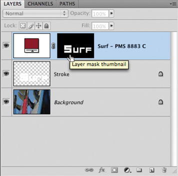
Switch to the Channels panel. Command/Ctrl-click the New Channel button in the Channels panel.
If you made a selection, that area is filled with the currently specified spot color.
Click the swatch next to the word Color.
Specify a spot color in the Color Libraries window and click OK. The Spot Channel automatically takes the name of the spot color.
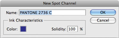
Set Solidity to 100% to simulate the spot color within your Photoshop file.
Click OK to create the spot color channel.
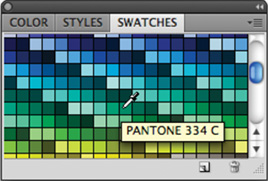
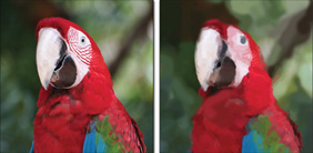
The Eyedropper tool lets you sample colors from an open document. This can be a useful way to choose colors that work well with an image. Let’s try out the tool:
Open the file Ch06_Sampler.tif from the Chapter 6 folder.
Select the Eyedropper tool from the Tools panel or press the keyboard shortcut I.
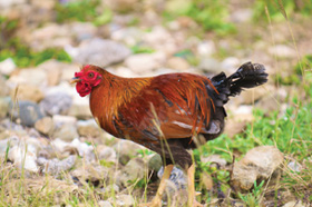
Using the Eyedropper tool, you can sample the color of the rooster’s feathers. This can be useful for painting as well as color correction. For example, you can check the color details on two different shots of a rooster. You could then adjust color to make the images match more closely. For more on adjusting color, see Chapter 10, “Color Correction and Enhancement.”
Adjust the Sample Size in the Options bar:
Point Sample: This method reads the value of a single pixel. It is very sensitive to clicking because you can have slight variations in color at the pixel level. For example, if you clicked on a blue sky, adjacent pixels could vary from each other.
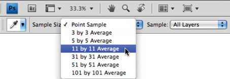
3 by 3 Average: This method reads the average value of a 3 × 3 pixel area. This is a more accurate method for selecting a color using the Eyedropper tool.
5 by 5 Average: This method reads the average value of a 5 × 5 pixel area. It creates a more representative color sample.
The remaining options simply use a larger sample area to produce an averaged color. The larger sample areas should be used on higher resolution images.
11 by 11 Average
31 by 31 Average
51 by 51 Average
101 by 101 Average
Click the red feathers to set the foreground color.
Option/Alt-click the grassy area to set the background color.
The Color panel is another way to access color without having to load the Adobe Color Picker. The Color panel shows you the values for the Foreground and Background colors. You can quickly mix or pick new colors from within the panel:
You can adjust the sliders to mix a new color. To change color models, click the panel’s submenu.
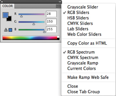
You can click the spectrum across the bottom of the panel to pick a new color.
The Color panel might display two alerts when you select a color:
An exclamation point inside a triangle means the color cannot be printed using CMYK printing.
A cube means the color is not Web-safe for color graphics viewed on a monitor set to 256 colors.
The Swatches panel holds color presets. You can quickly access frequently used colors by clicking their thumbnails. You can load preset swatches by clicking the Swatches panel submenu (top-right arrow). Additionally, Table 6.1 shows several important shortcuts when working with the Swatches panel.
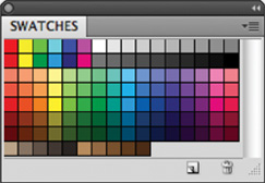
Table 6.1. Keyboard Shortcuts for the Swatches Panel
Result | Macintosh | Windows |
|---|---|---|
Create new swatch from Foreground color | Click empty area of panel | Click empty area of panel |
Select Foreground color | Click swatch | Click swatch |
Select Background color | Command-click swatch | Ctrl-click swatch |
Delete color swatch | Option-click swatch | Alt-click swatch |
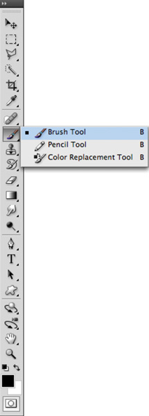
Several tools are available in Photoshop for painting. While these tools have subtle differences, they have one important component in common—the use of Photoshop’s dynamic brush engine. Before exploring the unique tools, let’s look at how to control your brushes.
The Brushes panel contains several options. Most of these will be well beyond what you’ll need to get started. I’ll briefly cover the options, but be sure to return to this panel as you increase your skills and confidence.
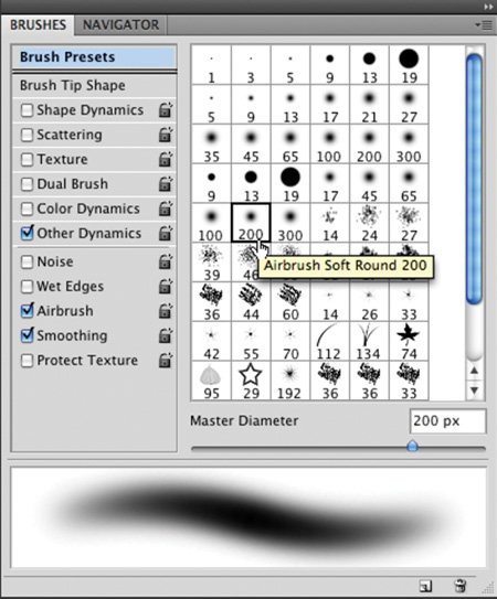
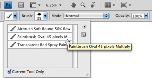
Photoshop has several brush presets to get you started right away. You access these presets from the Brushes panel; several are loaded and more are in the Photoshop Presets folder. Let’s check them out.
Create a new document. Because this exercise is just for practice and you won’t be printing the file, choose the 800 × 600 preset from the New Document dialog box.
Press D to load the default colors of black and white.
Select the standard Brush tool by pressing B.
Choose Window > Workspace > Painting to arrange the Photoshop interface so the most commonly used panels for painting tasks are visible.
Click the Brushes panel tab.
Click the words Brush Presets. Photoshop displays a list and thumbnails of several brush styles.
Scroll through the list and choose a style.
Creating Custom Sampled Brushes
You can use an image to create a custom brush. This image can be a scan that you input or a stroke that you draw using other brushes. Let’s give it a try:
Open the file Ch06_Brushes_to_Sample.tif from the Chapter 6 folder.
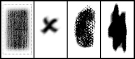
Select the first brush shape using the Rectangular Marquee tool. You can sample an image in size up to 2500 pixels × 2500 pixels.
Choose Edit > Define Brush Preset. A new box opens for naming the brush.
Name the brush and click OK. The brush is added to the set you currently have loaded in the Brushes panel.
Activate the new brush and paint in a new document to experiment with it. You might want to adjust the Spacing option to your preference.
Repeat for the other three brush shapes.
Draw a stroke in your blank document to see the brush preset in action.
Repeat using different presets and create strokes to become familiar with your options.
Click the Brushes panel submenu (the triangle in the upper-right corner) and load a new Brush library.
Experiment with these brushes.
Load additional presets and continue to become familiar with your many options.
When done, you can restore the default set of brushes. Click the panel’s submenu and choose Reset Brushes.
While the brush presets are readily available and very diverse, they won’t cover all your needs. Fortunately, Photoshop offers a flexible interface for customizing existing brushes as well as creating new ones.
Make sure you have the Brush tool selected.
Bring the Brushes panel to the forefront and make it active.
Choose a brush preset (from the thumbnail icons) that you’d like to modify. You can see the changes in the preview area or click your test canvas to try out the brush.
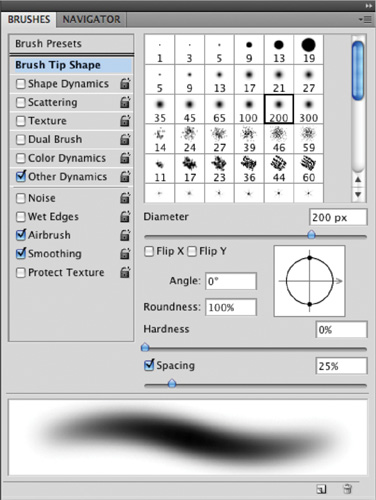
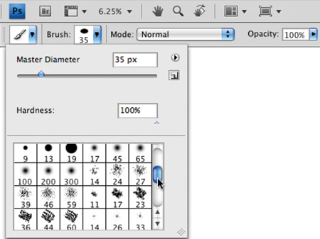
You can modify the following brush tip shape options in the Brushes panel by clicking the words Brush Tip Shape:
Diameter: Controls the size of the selected brush. You can enter a value in pixels (px) or drag the slider to a new size.
Use Sample Size: Resets the brush to its original diameter. This is only visible if the brush was created by sampling pixels (such as part of a photo or a scanned stroke).
Flip X: Changes the direction of a brush by flipping it on its X-axis (essentially making a mirrored image). This is useful if the brush is asymmetrical.
Angle: Specifies the angle of a brush. This works well for sampled or elliptical brushes. You can type in a number of degrees or visually change the angle of the brush by dragging the arrow in the brush preview interface. You can use angled brushes to create a chiseled stroke.
Roundness: Specifies the ratio between the short and long axes. A value of 100% results in a rounder brush, whereas 0% creates a linear brush. Elliptical shapes can be used to create natural-looking strokes.
Hardness: Creates brushes with soft edges. This can be useful to create more natural-looking strokes. You can adjust hardness between 0% (very soft) and 100% (no feathering). You cannot adjust hardness for sampled brushes.
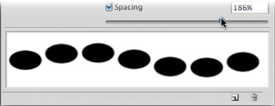
Spacing: Controls the distance between brush marks when you create a stroke. You can adjust spacing using the slider or type in a number. If you deselect the check box, the speed of your cursor will determine spacing.
To create a more natural brush, you should adjust the Shape Dynamics of the brush. This can create natural variances that make the brush more realistic. The Shape Dynamics option adjusts the currently selected brush; therefore, be sure to choose a brush from the Brush Presets or Brush Tip Shapes area.
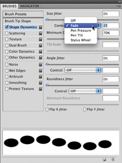
Size Jitter and Control: Specify how much variety Photoshop places in the size of the brush (trying to simulate the natural variation a real brush would produce). You can specify a total jitter size in percentage. Additionally, you can specify how to control the jitter from the Control pop-up menu:
Off: Select Off if you do not want to limit control over the size variance of brush marks. The jitter is random.
Fade: Allows the brush to taper off (like it ran out of ink or paint). The brush will get smaller based on a specified number of steps. Each step is one mark of the brush tip. If you specify 15, the brush will fade out in 15 steps.
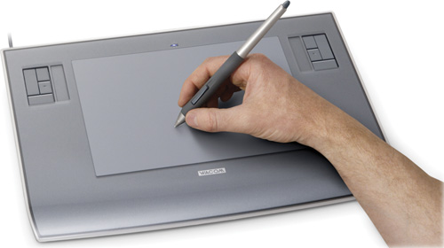
Pen Pressure, Pen Tilt, Stylus Wheel, or Rotation: Let you tie jitter to different features of a pen or stylus. Some Photoshop users unlock more features by connecting a stylus and graphics tablet. The most popular tablet manufacturer is Wacom (www.wacom.com).
Minimum Diameter: Sets a limit on how much variation in scale can be introduced in the brush. A 0% value lets the brush shrink to a diameter of 0, whereas 25% allows the brush to range from full size to a quarter of its starting width.
Tilt Scale: Ties the amount of scale to the tilt of the pen (or stylus). You must have a graphics tablet attached to utilize this feature.
Angle Jitter and Control: Specify how much variety in the angle of the brush can occur. A larger number creates more variety. The control area ties the jitter to your pen.
Roundness Jitter and Control: Introduce jitter into the roundness of the brush. Additionally, you can control the jitter with a pen.
Minimum Roundness: Limits the amount of jitter.
Enabling Scattering can add variation to the placement of strokes. This can simulate splattering or wilder strokes. There are a few options to work with:
Scatter and Control: Distribute brush strokes from the center of the click. The Both Axes option distributes strokes radially. When the option is deselected, the strokes are distributed perpendicular to the stroke path.
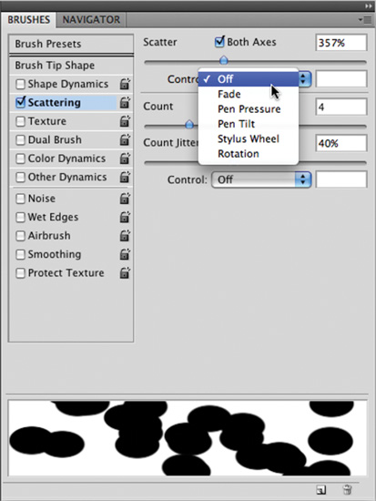
Count: Specifies the quantity of brush marks applied at each spacing interval. This option works in conjunction with the Spacing option from Brush Tip Shape.
Count Jitter and Control: Specify how much variety there is in the number of brush marks for each spacing interval. A high value will put more brush marks into the stroke. These properties are controlled in the same way as Shape jitter.
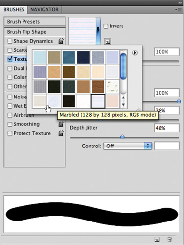
You can enable the Texture option to introduce a pattern into your strokes. This can help simulate canvas in your texture. Click the pattern sample to choose from one of the loaded patterns. Click the triangle menu to open the pattern picker to choose from the loaded textures. If you’d like to load additional textures, click the submenu in the pattern picker to load a built-in texture library. You can adjust several other options in the window and examine their effects in the preview area.
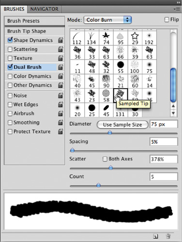
What’s better than one brush? Two, of course. By using a dual brush, you can use two brush tips to create a more dynamic brush. When selected, you’ll have the option of choosing from a thumbnail list of presets for the second brush. You’ll also see several options to modify the brush tip. You can modify the diameter of the second brush as well as specify spacing and scatter amounts.
By now you might be thinking, those brushes are pretty dynamic, what else can Photoshop change? Well, color, of course. When you select Color Dynamics, you can enable several options that will produce subtle (or dynamic) variations in color:
Foreground/Background Jitter and Control: Allow the brush to utilize both the Foreground and Background colors that you have loaded. This can create a nice variation in color by loading lighter and darker shades of one color as your Foreground and Background color swatches.
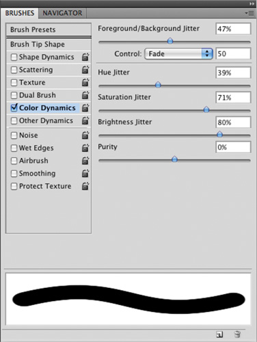
Hue Jitter: Allows you to specify how much variety of color can be introduced. Low values create a small change in color and higher values create greater variety.
Saturation Jitter: Introduces variation in the intensity of the selected color.
Brightness Jitter: Adds variety in brightness. A low value creates very little change in the brightness of the color. A higher value creates greater variations.
The Other Dynamics section offers additional styles of jitter that can be added:
Opacity Jitter and Control: Add variety to the brush so the opacity varies throughout the stroke. You can tie the opacity variation to a pen and tablet for greater control.
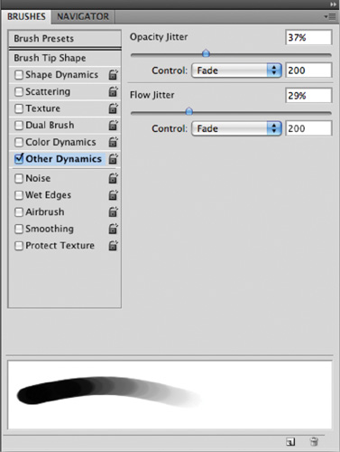
Flow Jitter and Control: Affect how paint flows through the brush. A larger number means more paint flows through. The default value is 100%, which creates even strokes. A lower value causes less ink to be applied with each stroke.
A few other options can affect your active brush. These are either enabled (selected) or disabled (deselected); they have no modifiable properties.
Noise: Places additional grain into the brush tip. It works well with soft-tip brushes.
Wet Edges: Causes the paint to appear darker at the edge of the stroke. It simulates the effect of painting with watercolors.
Airbrush: Allows you to simulate a traditional airbrush (a device that uses pressurized air to spray paint out of a nozzle). The airbrush applies gradual tones and allows the paint to build up. You can also access this option by clicking the Airbrush option in the Options bar.
Smoothing: Produces better curves in your brush strokes when painting.
Protect Texture: Is a good option to enable if you are using Texture in your brush strokes. It keeps the pattern and scale consistent when switching between textured brushes. This will make your strokes more consistent.
Table 6.2 shows the frequently used Brushes panel keyboard shortcuts.
Table 6.2. Shortcut Keys for Using the Brushes Panel
Macintosh | Windows | |
|---|---|---|
Decrease/increase brush size | [ or ] | [ or ] |
Decrease/increase brush | Shift + [ | Shift + [ softness/ |
hardness in | or Shift + ] | or Shift + ] 25% |
increments | ||
Select previous/next | , (comma) or | , (comma) or |
brush size | . (period) | . (period) |
Display precise crosshair | Caps Lock | Caps Lock for brushes |
Delete brush | Option-click brush | Alt-click brush |
Rename brush | Double-click brush | Double-click brush |
Toggle Airbrush option | Shift + Option + P | Shift + Alt + P |
After all this talk of brushes, there are still a few notable things to say about the Brush tool. Be sure to look in the Options bar for important brush controls. From left to right, these options are the most useful brush controls:
Tool Presets: Stores frequently used brush configurations for convenient access.
Brush Preset Picker: Displays a greatly reduced Brushes panel. You can access thumbnails of the loaded brushes as well as adjust diameter and hardness.
Mode: Lets you change the blending mode of your painted strokes. Blending modes attempt to simulate real-world interactions between two elements. For example, Multiply allows the strokes to build up, much like a magic marker. You’ll find much more on blending modes in Chapter 9, “Using Blending Modes.”
Opacity: Affects the opacity of your strokes.
Airbrush button: Enables the Airbrush.
Brushes panel button: Toggles visibility of the Brushes panel. Click it to open the Brushes panel, which gives you greater control over the brush shape and dynamics.
The Pencil tool is similar to the Brush tool. It shares many of the same options and controls. The fundamental difference is that it can only be used to create hard-edged strokes. While there is a Hardness setting available for some brushes, it does little to change the stroke.
There is one unique Pencil tool option: Auto Erase. Enabling it via the Options bar instructs the Pencil tool to erase previously drawn strokes if you draw over them a second time.
The Color Replacement tool can replace a selected color with a new, user-specified color. This tool was originally positioned as a way to remove “red eye” from photos. Photoshop CS2 added a new Red Eye tool specifically for that purpose, yet the Color Replacement tool remains somewhat useful. Let’s try it out:
Open the file Ch06_Color_Replacement.tif from the Chapter 6 folder.
Select the Color Replacement tool from the toolbox. It is nested within the regular Brush tool’s well.
Choose a soft brush tip from the Options bar. Leave the Blending mode set to Color.
Select one of the three Sampling options:
Continuous: Updates with each drag of the brush.
Once: Requires an initial click. Photoshop replaces the targeted color only in areas that closely match the initial click.
Background Swatch: Requires you to change the background color swatch. You can do this by choosing the Eyedropper (I) and Option/Alt-clicking on a color in your document. Photoshop then replaces only areas containing the current background color.
For this image, let’s use the Once option.
You can place additional color replacement limits using alternatives in the Options bar:
Discontiguous: Replaces the sampled color in all places that it occurs in the whole image.
Contiguous: Requires that colors are contiguous to, or touching, the color immediately under the pointer.
Find Edges: Attempts to replace color while preserving the sharpness in the detail of the edges.
For this image, let’s use the Find Edges option to get more of the colors.
Enter Tolerance as a percentage (between 0 to 100%). Lower values require the colors to be very similar to the pixels you click. Higher values have a greater tolerance and will modify more colors. For this image, let’s go toward the middle of the road with a setting of 50%.
Select the Anti-alias check box to reduce any fringe in the color-corrected regions.
Choose a Foreground color to replace the unwanted color. For this image, you’ll change the green balloon first, and then make all the balloons purple.
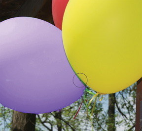
Zoom into the image near the green balloon.
Click and start to paint; be careful not to get too close to the edges.
Some spotting may occur, so you’ll need to click in the center of any spotting and paint additional strokes.
When you complete the first balloon, move on to the other balloons and paint them in as well.
The History Brush is easy to use but a little hard to understand at first. Essentially, it allows you to paint backward in time. This can be very useful because it enables you to combine the current state of an image with an earlier state. For example, you can process an image with a stylizing filter, and then restore part of the image to its original state.
The History Brush is directly tied to your History panel. This useful panel shows you each action you have taken on an image. You can then move backward through your undos by clicking them. By default you have 20 levels of undo, but you can change this setting by increasing the number of History States in your general preferences.
Let’s put the History panel and History Brush into action:
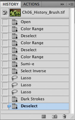
Choose Window > History to activate the History panel.
Open the file Ch06_History_Brush.tif from the Chapter 6 folder.
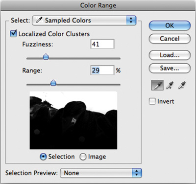
Use the Color Range command to select the wooden box.
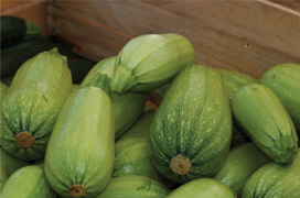
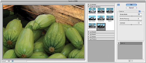
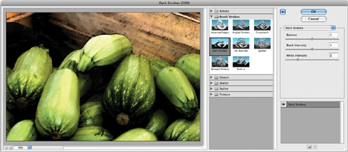
You’ll now run a Brush Stroke filter to stylize part of the image. You can use Filters to create special effects in an image. (For more on filters, see Chapter 14, “Maximizing Filters”). Choose Filter > Brush Strokes > Sumi-e. Adjust the sliders to your preference. Click OK to apply the filter.
Choose Select > Inverse to select the vegetables in the photo.
Choose Filter > Brush Strokes > Angled Strokes. The default settings are fine for this purpose (but feel free to adjust as needed). Click OK to apply the filter.
Choose Select > Deselect to clear the active selection.
Examine the image and the History panel. The image looks more like a painting at this point, but some key areas (like the ends of the squash) are too heavily stylized.
The History panel shows you all the actions you have performed on the open image.
Look at the top of the History panel to see a snapshot of the document. It was automatically created when the document was first opened. The brush icon next to it indicates that it has been set as the source for the History Brush.
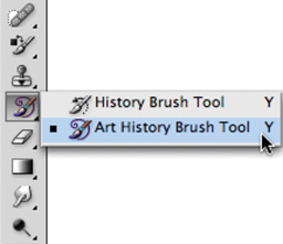
Choose the History Brush from the toolbox or press Y. Be sure to not choose the Art History Brush.
Select a soft-edged brush sized at approximately 70 pixels.
Paint in the ends and tops of the vegetables to restore the original details.
Try lowering the Opacity to 25% and paint in additional details of the original image.
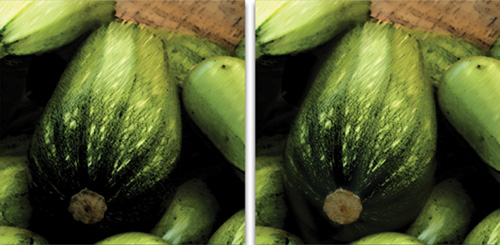
The History Brush can be very useful when either filtering an image or performing color correction tasks. It allows you to selectively paint back in time to restore lost or important details.
Officially, you can use the Art History Brush tool to create stylized paintings. Unofficially, it doesn’t work very well. The Art History Brush tool is very similar in setup to the regular History Brush. It requires you to select a snapshot to paint from. If you’d like to try this tool out:
Open the image Ch06_Art_History.tif from the Chapter 6 folder.
In the History panel, choose a Snapshot or History State to use.
Select the Art History Brush tool from the Tools panel.
Select a small, soft brush from the Brush Presets picker.
Choose a method from the Style pop-up menu. There are ten methods to choose from; those with the word tight in their name work better than those with loose in their name.
Set the area number to a low value. This reduces the number of strokes and gives you better control over the tool.
For Tolerance, enter a low value (less than 30%) to constrain the strokes to a tighter area.
What you should see could be loosely called “impressionistic.” Chances are this tool won’t become part of your regular workflow.
The Paint Bucket tool allows you to quickly fill an area of adjacent pixels with a new color. The command is fast but not extremely accurate. The Paint Bucket tool works similarly to the Magic Wand tool, but instead of creating a selection, it fills with a color. The Paint Bucket tool works well if you have an easy to select area but not well on complex images.
Let’s try it out:
Open the file Ch06_Paint_Bucket.tif from the Chapter 6 folder.
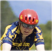
Select the Paint Bucket (G) tool from the toolbox.
Load purple as your Foreground color.
Set the Tolerance setting to 90. A high tolerance fills more pixels within a broader range on the first click.
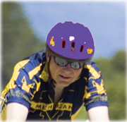
To make a smoother selection, make sure the Anti-aliased check box is selected.
Click with the Paint Bucket tool on the red helmet. The colors will change but will look flat and unnatural.
Choose Edit > Undo and go back to before using the Paint Bucket.
In the Options bar, change the Paint Bucket’s Blending mode to Color. This will paint with the color you’ve selected but blend it with the existing luminance and saturation values.
A gradient is a gradual blend between two or more colors. You can use gradients to create a photorealistic backdrop or to draw in areas like a blown-out sky. The Gradient tool is extremely flexible and offers the versatile Gradient Editor for creating custom gradients. Before you utilize the Gradient tool, let’s explore how gradients are formed.
All gradients are edited using the Gradient Editor (which becomes available when you activate the Gradient tool). To access it, click the thumbnail of the gradient in the Options bar.
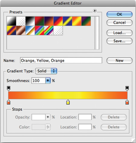
Presets: You have several preset gradients to choose from, and you can browse them by thumbnail. Additionally, you can load other gradients by clicking the panel’s submenu.
Name: Naming each gradient can make gradients easier to sort through.
Gradient Type: The two major categories of gradients are Solid and Noise. Solid gradients use color and opacity stops with gradual blends in between. Noise gradients contain randomly distributed colors within a user-specified range. Each has a unique interface.
Solid gradients blend from one color to another, providing a traditional gradient type.
Smoothness: This option controls the rate at which the colors blend. You can set it to be gradual or steep. The larger the number, the more Photoshop optimizes the appearance of the blend.
Opacity stops: A gradient can contain blends between opacity values. To add a stop, click in an empty area on the top of the gradient spectrum. To adjust a stop, click it, and then modify the Opacity field.
Color stops: A simple gradient contains only two colors. However, you might want to use a more complex gradient in your project. You can click below the gradient to add another color stop. Double-click a stop to edit its color with the Adobe Color Picker.
Stop Editor: Selected gradient stops can be adjusted numerically. You can edit the opacity, color, and location (0–100%, read left to right.)
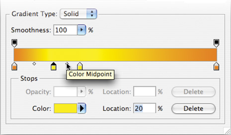
Midpoint: Between stops are midpoints. By default the midpoint is halfway between two stops. You can adjust the midpoint to shift the balance of the gradient.
Noise gradients use a specified range of color to create noise. These gradients do not blend smoothly between colors but rather create a new gradient each time you click the Randomize button.
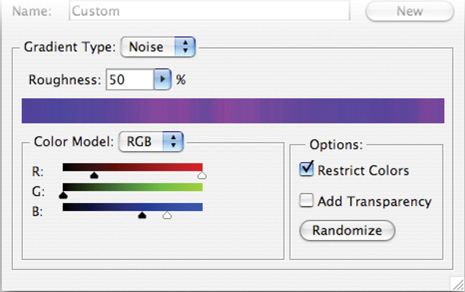
Roughness: Noise gradients use a roughness setting to determine how many different colors are used to create noise.
Color Model: You can choose between three models: Red-Green-Blue, Hue-Saturation-Brightness, or Lab.
Color Range sliders: Adjust the range of colors available to the gradient. Bring the black and white sliders closer together to limit the amount of color present in the noise gradient.
Options: You can choose to further restrict colors as well as introduce random transparency. To create a new gradient, click the Randomize button. Every time you click, a new gradient is generated.
New button: To add a gradient to the Presets window, type a name into the Name field, and then click the New button. This new gradient is not yet permanently saved but is stored temporarily in the Preferences file. You must click the Save button and navigate to your Presets folder (inside the Photoshop application folder). Be sure to append the filename with .grd to inform Photoshop that it is a gradient set.
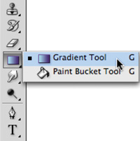
You can use the Gradient tool to manually draw a gradient on a layer. To access the Gradient tool, select it from the Tools panel or press G. The Paint Bucket shares the same well as the Gradient tool, so if you don’t find the Gradient tool, press Shift+G to cycle through your tools.
The Gradient tool can use any gradient you create in the Gradient Editor or from the Presets menu. To select a gradient, you can choose from those available in the Options bar. You can also load preset libraries or manually load gradients by accessing the panel’s submenu.
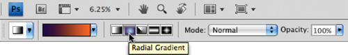
You must choose one of these five methods to build your gradient:
Linear Gradient (A): Blends from the starting point to the ending point in a straight line.

Radial Gradient (B): Blends from the starting point to the ending point in a circular pattern.
Angle Gradient (C): Blends in a counterclockwise sweep from the starting point.
Reflected Gradient (D): Blends symmetrically on both sides of the starting point.
Diamond Gradient (E): Blends in a diamond-shaped pattern outward from the starting point.
You have a few available options to further modify the gradient:
You can specify a blending mode to affect how the gradient is applied to the layer. (For more on blending modes, see Chapter 9.)
To reverse the direction of colors in the gradient, select the Reverse check box.
To create a visually smoother blend by adding noise, select the Dither check box.
To use a gradient’s built-in transparency, select the Transparency check box.
Let’s use the Gradient tool to fix a common problem, a washed out sky:
Open the file Ch06_Grad_Sky.tif from the Chapter 6 folder.
Choose Select > Color Range to create an active selection in the sky area. Adjust Fuzziness to get a gentle selection.
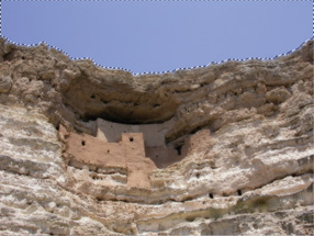
Load a dark blue as your Foreground color and a lighter blue as your Background color. You can try to select colors from the existing sky to make your gradient believable.
Select the Foreground to Background gradient from your preset list (it’s the first one).
Click at the top of the sky and drag down toward the rocks.
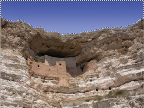
The sky should look more natural now with greater variation in colors. If your sky has a lot of texture in it, try setting the Gradient tool to Color mode before drawing.
Gradient Maps Offer Unique Color
Gradient Maps are another way to harness the power of gradients to enhance an image. The Gradient Map can be applied as an adjustment layer or image adjustment command (stick with the adjustment layer for greater flexibility). You can create a new Gradient Map by choosing Layer > New Adjustment Layer > Gradient Map.
The Gradient Map will map a new gradient to the grayscale range of an image. A two-color gradient produces a nice duotone effect. Shadows map to one of the color stops of the gradient fill; highlights map to the other. The midtones map to the gradations in between. A multicolored gradient or noise gradient can add interesting colors to an image. This is an effective technique for colorizing textures or photos.
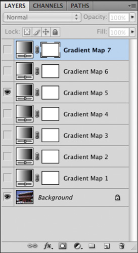
Open the file Ch06_Gradient_Map_Demo.psd to see Gradient Maps in action. Turn on each map one at a time to see the effect. By using blending modes in conjunction with the Gradient Map, you can get a more pleasant effect.
Photoshop offers three kinds of Eraser tools to complement your drawing tools. Even though these tools have a purpose, you should quickly move beyond them because they often produce crude edges in the erased area that lower the quality of your project.
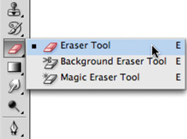
The three options include:
Eraser tool: This tool deletes pixels as you drag over them. On a layer they are replaced with transparency. On a Background, the pixels are replaced with your Background color. To use, just drag through the area you want to erase.
Background Eraser tool: This tool is designed to help erase the background from an image. The difference between foreground and background in the image must be very clear and high contrast. This tool is significantly less flexible than the technique of layer masking, which is covered in Chapter 7, “Layer Masking.”
Magic Eraser tool: This tool is most similar to the Paint Bucket tool in that it attempts to select and modify similar pixels under your click point. Instead of filling those pixels with a color, however, the Magic Eraser tool deletes them.
From years of personal experience, I strongly suggest avoiding the Eraser tools. These three tools are relatively primitive in their approach to selecting pixels for deletion. Additionally, the erasers are permanent—the discarded pixels are gone for good. It bears repeating: If you have anything beyond a basic image that you need to extract from its background, the answer is layer masking, which is covered in depth in Chapter 7.
Even though Photoshop is best known as a pixel-based (or raster) program, it does have a respectable set of vector drawing tools. Vector graphics are made up of mathematically defined lines and curves. Vector graphics are resolution-independent, because they can be scaled and repositioned with no loss of quality. Vector graphics are a good choice for creating shapes (such as rectangles, circles, or polygons) within your Photoshop document. The added benefit to using the drawing tools is that you can then scale the shapes and modify the design while still maintaining a crisp image.
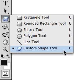
Photoshop offers six shape tools. They can be used to create vector shapes, vector paths (which can be used to make a selection), or raster shapes. The following list explains how to change how the shape tools work:
Rectangle tool: The Rectangle tool draws rectangles; if you hold down the Shift key, it draws squares.
Rounded Rectangle tool: The Rounded Rectangle tool is well suited for drawing buttons for Web sites. Adjust the Radius setting to modify the amount of curvature.
Ellipse tool: The Ellipse tool draws ellipses; if you hold down the Shift key, it draws circles.
Polygon tool: The Polygon tool creates polygons. The fewest number of sides a polygon can have is three (which is a triangle). The most complex polygon you can create is a hectagon (a 100-sided figure). Enter the number of sides in the Options bar. Additionally, the Polygon tool can be used to create stars by clicking the Geometry Options button in the Options bar.
Line tool: The Line tool draws lines. Specify a thickness in the Options bar. The line can be between 1 and 1000 pixels in width. You can also choose to add arrowheads by clicking the Geometry Options button in the Options bar.
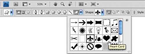
Custom Shape tool: The Custom Shape tool is very versatile. There are several shapes built into Photoshop. These can be extremely useful during the design process. To view your loaded shapes, click the drop-down Custom Shape Picker. Additional shapes can be loaded by clicking the submenu in the Custom Shape Picker. Choose from the built-in libraries or load more.
Thousands of free shapes are available to download for Photoshop. An Internet search using the keywords “Photoshop,” “Free,” and “Custom Shapes” returns plenty of great results. You can choose to load these custom shapes temporarily or add them to your preset list.
Temporary load:
From the Custom Shape Picker, click the submenu.
Choose Load Shapes.
Navigate to the desired shape library (it should end in the extension .csh).
Select the shape and click OK.
You can choose to Replace the current shapes or Append the new shapes to the end of the old list.
Load into Presets:
Navigate to your Photoshop application folder.
Open the Presets folder.
Open the Custom Shapes folder.
Copy the custom shapes files into the Custom Shapes folder. Be sure the shapes are not compressed (such as a .sit or .zip file).
Restart Photoshop; the presets will be loaded into the submenu in the Custom Shape Picker.
Using the Shape tools is very similar to using the Marquee tools. In fact, the same shortcut keys apply: Holding down the Option/Alt key after you start drawing causes the shape to draw from the center of the initial click, whereas holding down the Shift key constrains the width and height to preserve a constant ratio.
Let’s try using the Shape tools:
Create a new RGB document sized at 1024 × 768 pixels. Fill the Background Contents to Transparent. Name the document Playing Card.
Select the Rounded Rectangular Shape tool. Set the Radius to 10 pixels.
In the Options bar, choose to create a Shape Layer and set the fill to White.
Click and draw a rectangle in the shape of a playing card.
Choose the Custom Shape tool. Open the Custom Shape Picker and select the Heart shape. If it is not visible, choose Reset Shapes to load the default set.
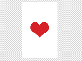
In the Options bar, set the fill color to red.
Draw a large heart in the center of the card (hold down the Shift key to constrain its proportions).
Use the Alignment tools to center the heart in the middle of the card. Select both layers in the Layers panel. Activate the Move tool and choose the Horizontal and Vertical Alignment buttons in the Options bar.
Draw a heart icon near the upper-left corner of the card. Leave room for a letter A (for Ace).
Press Command/Ctrl+J to duplicate the current heart layer. Move it to the lower-right corner. Invoke the Free Transform command and rotate the heart 180°.
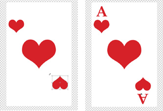
Press T to select the Type tool. In the Options bar choose a font such as New York or Palatino. Set the style to Bold, the size to 100 pt, and the color to Red.
Click in the upper-left corner and add the letter A.
Press Command/Ctrl+J to duplicate the current “A” layer. Move it to the lower-right corner. Invoke the Free Transform command and rotate the A 180°.
If you’d like to look at the completed project, open the file Ch06_Playing_Card.psd and check it out.
Three Kinds of Shapes
You can use the Shape tools to create shapes in three different ways:
SHAPE LAYERS: Creates a shape on a separate layer. A shape layer has a fill layer that defines the color and a linked vector mask that defines the shape.
PATHS: Draws a work path on the current layer. This path can then be used to make a selection. It can also be used to create a vector mask, or it can be filled or stroked. Paths appear in the Paths panel.
FILL PIXELS: Paints directly on the active layer. It makes the Shape tools perform like Paint tools. In this mode you create raster, not vector, graphics.