The primary purpose of Photoshop is to act as a digital darkroom, where images can be corrected, enhanced, and refined. How do you know an image needs touch-up? You can pretty much assume every image can look a little (or even a lot) better than how the camera captured it. Whether it’s adjusting the exposure, increasing contrast, or boosting saturation, Photoshop is the place to improve an image.
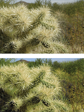
The image on the top is unretouched. The image on the bottom has been refined with three adjustment layers: one to enhance levels and two to adjust hue and saturation of the sky and vegetation. You can open the file Ch10_Desert_Enhance.psd to see the changes.
Learning how to spot problems, and then choosing the right correction technique is an essential part of mastering Photoshop. Several different tools are available, some more useful than others. By analyzing the most important tools and determining in which situations they might help you, a more thorough understanding of color correction is possible.
New users often have a hard time when color correcting or enhancing images. They generally lose sight of the goal: making the image look better and believable. Many users go “too far” in their quest to fix images. If the image starts to look fake or too altered, it will be distracting. While getting it “right” will require some practice, here’s some general advice to get you started:
Identify what’s wrong: Before you can fix a picture, be sure you have decided on what’s wrong. Is it too dark? Is the sky washed out? Has the picture faded over time? Make a list and prioritize the issues you find in each image. It’s easiest to fix one problem at a time, and if you identify those problems, you’ll know when to stop twiddling with the image.
Work with a copy of the image: Before you start to color correct an image, you should duplicate it. This way you can return to an original version if you make a mistake or go too far in your image touch-up. After opening your file, choose File > Save As and name the duplicate version that will be corrected. Color correction can be a destructive process, meaning that you cannot revert to the original state at a later time. By preserving an original version of the image or employing adjustment layers, nondestructive editing is possible. Some users also choose to duplicate the background layer at the bottom of the layer stack.
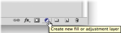
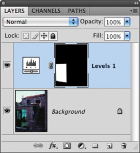
Edit with adjustment layers: Adjustment layers allow you to apply most of the image correction commands as nondestructive effects. They are added as a layer above the actual image; the adjustment layer can be blended, masked, or deleted at any time. Additionally, if you double-click the adjustment layer’s thumbnail, you can modify its properties in the Adjustments panel. The same modifications are available in both the Adjustments menu and Adjustments panel. You should work with an adjustment layer whenever possible because its flexibility will be important for future revisions.
Get a fresh opinion: It’s not a bad idea to step back and examine your work. Open the backup copy of the original image and compare it to the image you’ve been working on. This before-and-after comparison can be very useful. If you have a fresh set of eyes nearby, ask that person for his or her opinion.
Photoshop offers several image adjustments, but only a few are used most often. Commands such as Levels and Curves are used by professionals to achieve outstanding results. These professional imaging techniques may take a little time to get comfortable with, but the power they offer is worth your investment.
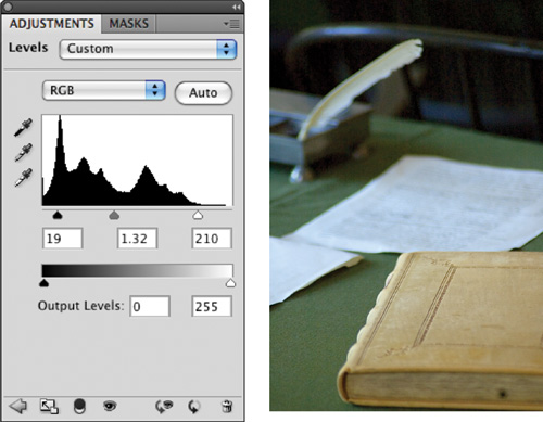
The Levels command corrects tonal ranges and color balance issues. With this command you can fix poor exposure. Additionally, you can perform color correction by manually identifying a white point and black point in the image. Nearly every image can benefit from making a Levels adjustment.
To understand Levels, it is essential to be able to read a histogram. This graph works as a visual guide for adjusting the image. The Levels adjustment has its own histogram that is visible when working in the Adjustments panel. You may also want to call up the Histogram panel (Window > Histogram) and leave it open while color correcting. You can also choose to expand the Histogram panel by clicking the submenu and choosing All Channels View. Let’s give the command a try.
Close any open files, and then open the file Ch10_Levels.tif from the Chapter 10 folder on the CD.
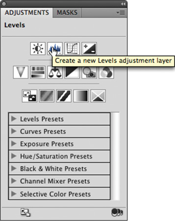
Add a Levels adjustment layer by clicking the Levels icon in the Adjustments panel. Levels is also available from the Adjustments menu (Image > Adjustments), but the adjustment layer is more flexible for future modifications. Be sure to select the Preview check box so changes update onscreen.
This photo was shot under low light, but you can reset the black and white points of the image to fix the exposure. In the Adjustments panel, move the white Input Levels slider to the left (where the histogram starts to rise). This affects the image’s white point and allows you to reassign where white should begin in the image.
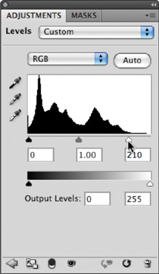
Move the black Input Levels slider to the right where the first amount of black starts to rise. The more you move the black slider to the right, the more contrast is introduced into the image.

The true power lies in the middle (gray) Input Levels slider. By moving this slider, you can modify the gamma setting. Effectively, you can use the middle Input Levels slider to change the intensity of the midtones. This adjustment can be made without making dramatic changes to the highlights and shadows, and lets you better expose an image. Move the slider to the left to add light; move the slider to the right to subtract light.
In the future if you need to edit the adjustment, simply select the adjustment layer in the Layers panel and manipulate the controls in the Adjustments panel.
Note: Levels vs Curves
A Levels adjustment does not offer as many precise adjustment points as a Curves adjustment. However, Levels adjustments can be easier to make and generally produce very effective results.
When working with the Levels adjustment layer, you may have noticed the Auto button. This command button triggers an analysis of the histogram data by Photoshop that is then used to modify the individual controls of the Levels adjustment. In many cases this results in an image that is properly adjusted for color balance and exposure issues. In others it will get you closer to a corrected image.
Close any open files, and then Open the file Ch10_Auto_Levels.tif from the Chapter 10 folder on the CD.
Add a Levels adjustment layer by clicking the Levels icon in the Adjustments panel.
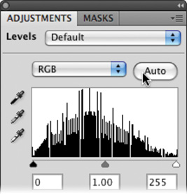
Click the Auto button to perform an automated adjustment for the image. The image’s levels and color are adjusted.
To refine how the automatic adjustment works, hold down the Option/Alt key and click the Auto button again. A new dialog box opens.
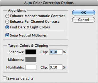
Choose Find Dark & Light Colors and Snap Neutral Midtones to create a very natural balance of colors for the image.
Click OK to close the dialog box.
In the first Levels example you made a Levels adjustment to all the channels evenly. In the Auto-Levels example, you let Photoshop adjust the levels and remove color cast using an automated algorithm. The Levels command can be further isolated to a specific channel by clicking the drop-down list in the center of the Levels dialog box. This allows you to tackle color cast issues, such as spill from a background, a bad white balance, or a photo shot under mixed or colored lighting.
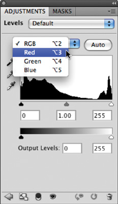
Close any open files, and then open the file Ch10_Levels_Color_Balance.tif from the Chapter 10 folder. Notice how the image has a greenish tint.
Add a Levels adjustment layer using the Adjustments panel. You will use the Levels command to fix color and exposure issues.
Select the Set White Point (white eyedropper) in the Levels dialog box. Click an area that should be pure white. For this image, click a bright area in the white pillar. If you click too dark an area, the whites in the image will overexpose. (You can click the Reset button—it looks like a circular arrow—at the bottom of the Adjustments panel if needed to reset the Levels command, if needed.) After you click, you’ll see that some of the color spill has been removed.
Select the Set Black Point (black eyedropper) in the Levels dialog box. Click an area that should be pure black. Choose an area such as a jacket or a dark shadow. This will adjust the color balance and the exposure.
The image’s color balance should now be better. Adjust the middle Input Levels slider to brighten the image.
You can also use the Levels command to correct skin tones and isolated areas in an image. The Set White Point and Set Black Point eyedroppers work well, but sometimes it can be difficult to find a pure white or black point in your image. Let’s try fixing color and exposure manually.
Close any open files, and then open the file Ch10_Levels_Isolated.tif from the Chapter 10 folder.
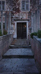
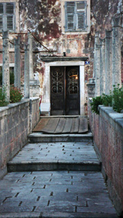
You need to fix part of the image that has dramatically different lighting than the rest of the image. Look at the bottom-left corner: The indoor lighting is throwing off the rest of the image.
Use the Polygonal Lasso tool to select the door region. After making the selection, choose Select > Feather and enter a value of 5 pixels to soften the selection. Making a selection first causes the adjustment layer to attach a mask to isolate the color correction to the selected area.
Add a Levels adjustment layer. You will make a Levels adjustment on each channel to fix color and exposure issues.
Tip: Rinse and Repeat
If you have several images from the same camera or shoot, they may need the same Levels adjustment. The Save button allows you to save a Levels adjustment (to the folder that contains the image is a good place). You can then click the Load button to apply that adjustment to another image.
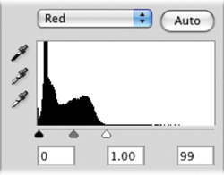
From the Channels drop-down menu in the Adjustments panel, choose red or press Option/Alt+3 to select the first channel. Notice how the histogram is skewed to the left. Move the white Input Levels slider to the outside edge of the histogram where it begins to rise. Move the middle (gray) Input Levels slider to balance the histogram data evenly on both sides.
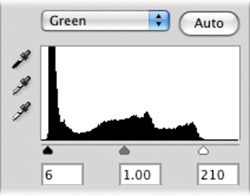
Switch to the green channel by pressing Option/Alt+4. Move the black and white Input Levels sliders to the outside edges of the histogram. Adjust the middle (gray) Input Levels slider to balance the histogram.
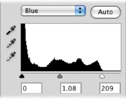
Make the same adjustment to the blue channel by pressing Option/Alt+5. The image should now appear color balanced. If needed, you can return to the individual channels to tweak color balance.
Switch back to the composite view by pressing Option/Alt+2. You can now make a standard Levels adjustment to tweak contrast and exposure until you are satisfied.

Most users will either use Curves a lot or they won’t use it at all. The Curves interface is more complex than Levels, which scares away many users. While Levels gives you three control points (highlights, midtones, and shadows), the Curves adjustment allows for up to 16 control points. This can significantly open up more options when adjusting color and exposure.
Let’s try the Curves command on a practice image.
Close any open files, and then open the file Ch10_Curves_Practice.tif from the Chapter 10 folder.
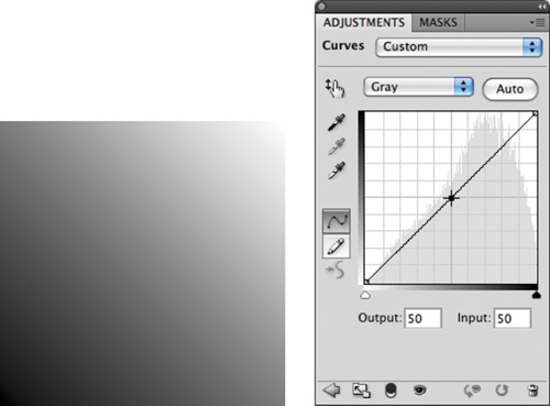
Add a Curves adjustment layer by clicking the Curves button in the Adjustments panel. When you first open the Curves interface, there are two points (one for white and one for black).
Add a single control point in the middle of the line (click at an Input Value of 50%).
Pull this new control point down to lighten the image (toward the lighter area on the Y axis). You can pull the point up to darken the image. Notice that the Input and Output values update as you drag.
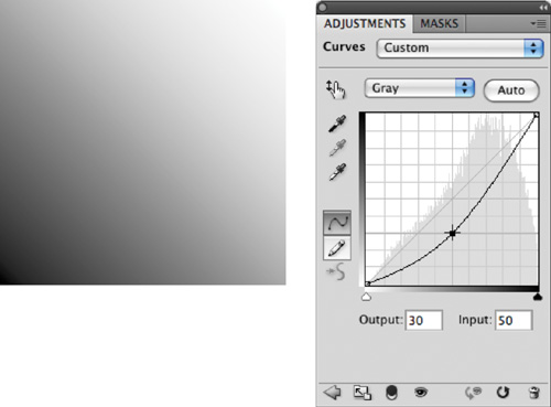
The adjustment is applied gradually throughout the entire image. Multiple points can be employed for contrast adjustments based on tonal range.
The primary advantage of Curves is that you have precise control over which points get mapped (whereas in Levels you do not). Another benefit is that Curves adjustments use a curved line (as opposed to Levels, which uses only three control points) to make adjustments. In this way, color correction can be applied in a more gradual manner (without the hard clipping that can be associated with Levels).
Note: Pay Attention to Your Axes
When working with a grayscale or CMYK file, the axes go from light to dark. When working with RGB images, the scales are reversed. This means that pulling a control point up or down may have a different effect depending on your image mode.
Close any open files, and then open the image Ch10_Curves.tif from the Chapter 10 folder.
Add a Curves adjustment layer by clicking the Curves icon in the Adjustments panel. The curve has only two points on it—one representing the black point; the other, the white point.
It’s now time to add more control points to refine the curve. To do this, you’ll use a Curves preset. Click the drop-down menu to select a Curves preset in the Adjustments panel. Choose the Strong Contrast (RGB) preset. Notice that the image now has more contrast in the shadows and highlights, and more visual “pop.”
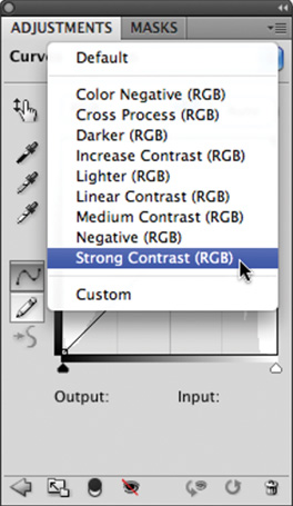
Experiment by adjusting the five control points. Try to further emphasize the shadows in the image. Continue to experiment by moving the control points (you can use the up and down arrow keys for precise control).
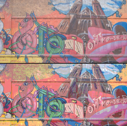
The Hue/Saturation command lets you adjust the hue, saturation, and lightness of color components in an image. Additionally, you can simultaneously adjust all the colors in an image. This command can work in two ways:
To adjust colors in an image that appears slightly out of phase or skewed toward a color, such as an image that appears to have a blue overcast.
To create stylistic changes by dramatically changing colors in an object, such as trying out different combinations of colors in a logo.
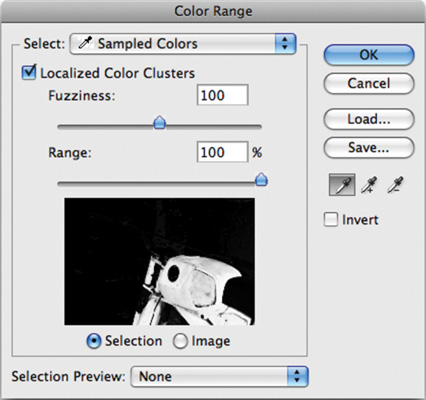
When combined with a selection command (such as Color Range), the Hue/Saturation command can be used to selectively enhance colors in an image.
Let’s give the command a try.
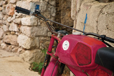
Close any open files, and then open the file Ch10_Hue_Saturation.tif from the Chapter 10 folder. You’ll subtly tweak the color in the motorcycle.
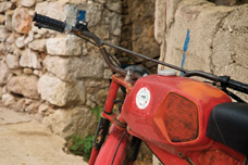
Choose Select > Color Range and click the motorcycle body to make an initial selection. Hold down the Shift key to add to the selection. Adjust the Fuzziness slider to soften the selection. Use the Localized Color Clusters to further constrain the selection. Click OK when you have a suitable selection.
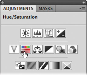
Click the Hue/Saturation button in the Adjustments panel to add an adjustment layer.
The two color bars at the bottom of the dialog box represent the colors in the color wheel. The upper bar shows the initial color; the lower bar shows the new color. Drag the Hue slider to the left until maroon appears under red.
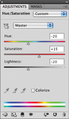
Additionally, you can adjust Saturation (which is the intensity of the color) and adjust Lightness (which adds white or black to the image). Increase Saturation to +15 and decrease Lightness to -20.
A Hue/Saturation adjustment can be a very quick way to experiment with color options. You can use it to quickly change the fill colors of an object by making a global adjustment. This works well when experimenting with different color combinations. Let’s try it out.

Close any open files, and then open the file Ch10_Logo_Adjustments.psd from the Chapter 10 folder.
Select the layer thumbnail of the Hue/ Saturation adjustment layer to access its controls in the Adjustments panel.
Adjust the Hue slider to try out different color combinations.
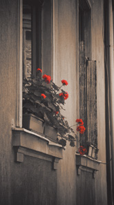
You can also use the Hue/Saturation command to tint an image. If you are working with a grayscale image, you need to convert it to an RGB image first.

Close any open files, and then open the file Ch10_Tint.tif from the Chapter 10 folder.
Add a Hue/Saturation adjustment layer.
Click the Colorize box to tint the image.
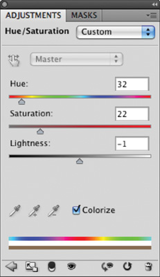
Adjust the Hue slider to try out different color combinations. Adjust Saturation and Lightness to refine the tint.
The adjustment layer automatically has a Layer Mask attached, which allows you to mask the effect.
Click the Layer Mask icon for the Hue/Saturation adjustment layer.
Select your Brush tool and press D to load the default colors of black and white.
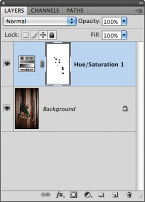
With a small black brush, paint the flowers so the original red shows through. If you make a mistake, you can press X to toggle back to white for touch-up.
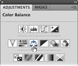
The Color Balance command is a simple but useful adjustment. By using the Color Balance command, you can change the overall mixture of colors in a particular tonal range. This can be useful for generalized color correction. For example, if the shadows look too green, you can subtract green and add some red to balance the image. Color Balance allows you to constrain an adjustment to the shadows, midtones, or highlights as specified in the dialog box.
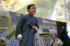
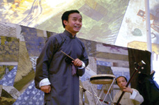
Close any open files, and then open the file Ch10_Color_Balance.tif from the Chapter 10 folder.
Add a Color Balance adjustment layer.
Work on the midtones by clicking Midtones in the Tone Balance section. Leave the Preserve Luminosity check box selected to avoid changes in exposure.
Add some red into the midtones by dragging the slider toward red. This places more red into the skin tones.
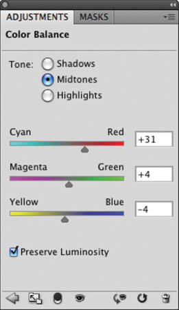
Switch to the Highlights in the Tone Balance section. Add some green and blue to the image to balance out the color of the tent.
While a Levels or Curves command can usually get the color correction job done, there are often atypical problems that require particular commands. These other commands have special purposes and should generally be reserved for the unique problems they address. Let’s take a look at the specialty commands.
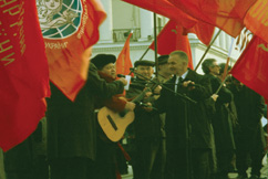
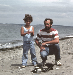
You can use the Match Color command to remove a color cast from an image. It is most useful when you have a color-accurate reference photo of a subject. That can then serve as a basis for correcting other photos of the same subject. The Match Color command adjusts the brightness, color saturation, and color balance in an image. The command enables fine control over luminance and color within the image. Let’s give it a try.
Close any open files, and then open the files Ch10_Match Color 1.tif and Ch10_Match Color 2.tif from the Chapter 10 folder.
To make it easier to see both images, choose Window > Arrange > Tile. Both photos should now be side by side.
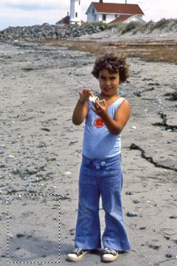
In the document Ch10_Match Color 1.tif, make a selection with the Rectangular Marquee tool in the lower-left corner (in the beach area). This will serve as a reference area for the color correction.
Select the document Ch10_Match Color 2.tif and again make a selection with the Rectangular Marquee tool. You should select the beach in the lower-left corner. This will serve as a target area for the color correction.
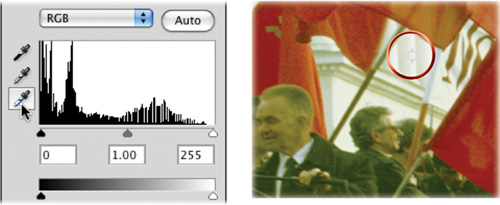
Choose Image > Adjustments > Match Color.
In the Image Statistics area, set the Source menu to Ch10_Match Color 1.tif. Select the Use Selection in Source to Calculate Colors and Use Selection in Target to Calculate Adjustment check boxes.
At the top of the dialog box, select the Ignore Selection When Applying Adjustment check box. Also, make sure the Preview box is selected so you can see your results.
Adjust the Luminance slider to better match exposure. Moving the Luminance slider to the left darkens the image, to the right brightens the image.
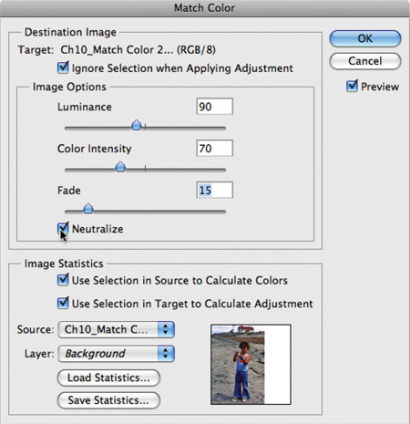
Adjust the Color Intensity slider to better match color. Moving the Color Intensity slider to the left reduces the color range, to the right increases the color range and intensifies the colors.
Adjust the Fade slider to lessen the adjustment until it is a visually close match. Moving the slider to the right reduces the amount of adjustment.
Select Neutralize to further reduce color casts in the image.
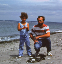
When you’re satisfied, click OK to apply the adjustment.
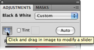
If you want to create a dramatic grayscale or duotone effect, the most effective way is to use a Black & White adjustment layer. But unlike a simple saturation adjustment, you maintain full control over how individual colors are converted. This allows you to emphasize or deemphasize specific colors and tonal ranges. Additionally, you can tint the grayscale by applying a color tone to the image (such as a sepia tone).
Close any open files, and then open the file Ch10_Black White Conversion.tif from the Chapter 10 folder.
Click the Black & White icon in the Adjustments panel.
Photoshop performs a default grayscale conversion. You’ll want to adjust the conversion using the color sliders. You can also apply an Auto conversion or use a saved custom mix.

You can adjust the color sliders to emphasize gray tones of specific colors in an image. Each image is unique, so you’ll need to find the right balance. Drag a slider to the left to darken or to the right to lighten. Be sure to select the Preview check box so you can see the results of your changes.
Tip: Black & White Auto—A Good Start
Normally, I recommend avoiding the Auto buttons, but with the Black & White adjustment layer it works well. Auto sets a grayscale mix based on the image’s color values. It attempts to maximize the distribution of gray values. The Auto mix often produces excellent results and can serve as the starting point for tweaking gray values using the color sliders.
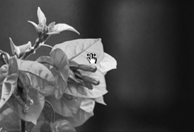
With the Black & White command window open, click the icon in the Adjustments panel that looks like a pointing finger.
You can click on the image to sample a target. The mouse pointer changes to an eyedropper if you move it over the image. Just click and hold on an image area to target the right color slider for the strongest color at that location. You can then drag to shift the color slider for that color, thus making it lighter or darker.
To create a duotone effect, select the Tint option. To change the tint color, click its swatch and use the color picker to choose a new color that matches your needs.
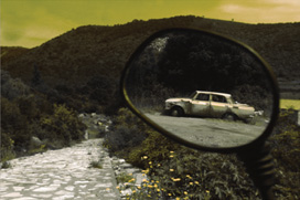
You can use the Gradient Map to dramatically or subtly stylize images. The effect works best when used as an adjustment layer. The command works by mapping the colors of a gradient to the image based on the luminance values of the source image. Let’s give the technique a try.
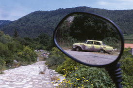
Close any open files, and then open the image Ch10_Gradient_Map.tif from the Chapter 10 folder.
Click the Gradient Map icon in the Adjustments panel.
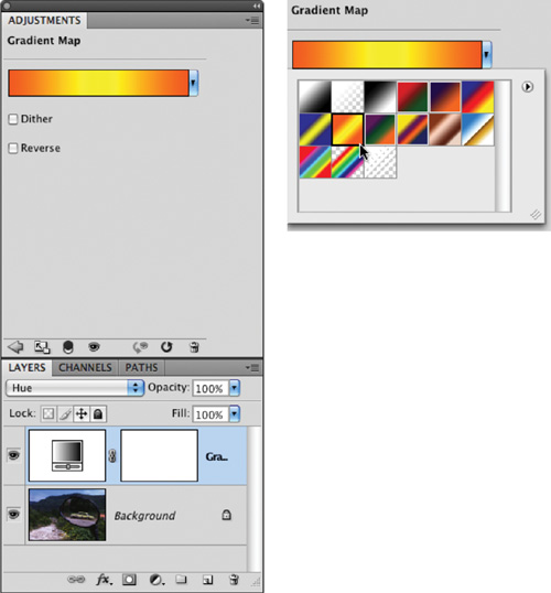
In the dialog box, click the drop-down menu and try a default gradient. For more on gradients, see Chapter 6, “Painting and Drawing Tools.” Click OK when you’re satisfied.
To soften the effect, you can change the adjustment layer’s blending mode. Setting it to Hue or Color creates a nice tint effect.
Professional photographers often place glass filters in front of the camera lens. These can be used to “cool” or “warm” a picture, or to add special effects. Since Photoshop often tries to simulate or correct for steps not taken in the field, the addition of Photo Filters was a logical evolution for Photoshop.
Adobe added to the “real-time” color correction options with the addition of 20 different adjustments. These layers simulate the traditional colored glass filters. Besides the built-in presets, you can also choose custom colors from the Photo Filter interface using the standard Color Picker.
There are three main groupings for color effects:
Warming Filter (85 and LBA) and Cooling Filter (80 and LBB): These adjustment layers are meant to even out photos that were not properly white balanced. The Cooling Filter (80 or LBB) makes images bluer to simulate cooler ambient light. The Warming Filter (85 or LBA) makes images warmer to simulate hotter ambient light.
Warming Filter (81) and Cooling Filter (82): These adjustment layers are similar to the previous filters but cast a more pronounced color. The Warming Filter (81) makes the photo more yellow, and the Cooling Filter (82) makes the photo bluer.
Individual Colors: The Photo Filter also has 14 preset colors to choose from. These can be used for two primary purposes: to add a complementary color to a scene to remove color cast or for stylistic reasons.
Let’s try applying a Photo Filter adjustment layer.
Close any open files, and then open the file Ch10_Photo_Filter.tif from the Chapter 10 folder.
Click the Photo Filter icon in the Adjustments panel.
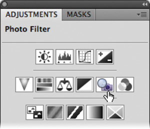
In the Filter area, choose Cooling Filter (80) to adjust the temperature of the photo. The sky and the image should be “bluer.” You can adjust the Density slider to control the intensity of the effect.
Exposure problems often plague photos. Dark shadows may make a photo seem unusable, but Photoshop offers a powerful command for fixing these problems. The image command Shadows/Highlights is very flexible for solving problems. The command can help salvage images where the subject is silhouetted from strong backlight. You can also use the command to improve subjects who have been washed out by the camera’s flash.
The Shadows/Highlights command does more than lighten or darken an image. It makes adjustments by analyzing neighboring pixels. However, when first opened, the tool is very basic. It is important to select the Show More Options check box, which adds significant control. Let’s give the command a try.
Close any open files, and then open the file Ch10_Shadows_Highlight_1.tif from the Chapter 10 folder.
The Shadow/Highlights command is not available as an adjustment layer. You can still apply it in a nondestructive manner by first converting the photo to a smart object.
Choose Layer > Smart Objects > Convert to Smart Object.
Choose Image > Adjustments > Shadows/Highlights. The image is brightened automatically because the command boosts the shadowed areas by default.
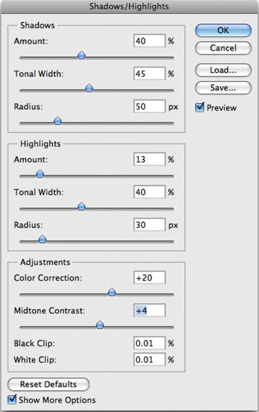
Select the Show More Options check box and be sure to select the Preview check box.
Adjust the Shadows and Highlights of the image:
Amount: Value determines how strong an adjustment is made to the image.
Tonal Width: Small values affect a reduced region; larger values include the midtones. If pushed too high, halos appear around the edges of the image.
Radius: A tolerance setting that examines neighboring pixels to determine the affected area.
Modify the image adjustments to improve image quality:
Color Correction: This slider modifies the saturation of the adjusted areas. Essentially, it can counterbalance washed out images.
Brightness: If you’re working on a grayscale image, Color Correction is replaced by a Brightness control.
Midtone Contrast: This adjustment affects the contrast in the midtones of a photo. Positive values increase contrast, whereas negative values reduce contrast.
Black Clip and White Clip: This adjustment modifies the black point of shadows and lowers the white point of highlights. This can lower the intensity of the effect.
Click Save if you’d like to store the adjustment to use on another photo. When you’re satisfied, click OK to apply the adjustment.
If you’d like extra practice, you can open the image Ch10_Shadows_Highlights_2.tif and repeat the command.
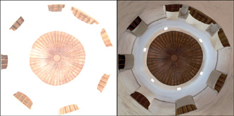
Starting with Photoshop CS2, support was added for 32-bit images. Generally referred to as high dynamic range (HDR), these images offer great flexibility in exposure. These images can better handle re-creating the wide range of exposures found in outdoor scenes or intense lighting conditions. The Exposure adjustment is usually used on images that exist in 32-bit space and is said to be a 32-bit floating point operation (often shortened to float).
Creating an HDR image is a combination of shooting techniques and a Photoshop command. It requires that the camera be secured firmly to a tripod and that you are careful when triggering or adjusting the camera to not move it (or allow anything to move in the shot either). Several photos at various exposures are taken of the same scene (a minimum of three; usually five to seven is adequate). The camera should have its auto-bracket and ISO features disabled. Each shot should be about two f-stops apart. The user then harnesses the Merge to HDR command (File > Automate > Merge to HDR) to create the 32-bit image. You’ll create an HDR image later in the book, but for now let’s jump ahead to an HDR image that’s already built.
Close any open files, and then open the file Ch10_HDR.tif. If you click in your menus, you’ll notice that several features are grayed out. Most image adjustments do not work for a 32-bit image. This image was taken in a very low-light environment, but by combining multiple exposures together into the HDR image, a much better photo was captured.
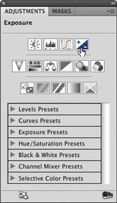
Click the Exposure icon in the Adjustments panel. This command makes tonal adjustments by performing calculations in a linear color space (Gamma 1.0) rather than the current color space. This offers extreme flexibility for future changes.
Three properties can be modified:
Exposure: Modifies the highlight end of the tonal range with little effect on the extreme shadows.
Offset: Darkens the shadows and midtones with little effect on highlights.
Gamma: Adjusts the gamma of the photo.
Additionally, three eyedroppers adjust the image’s luminance values:
Make a dramatic adjustment and click OK. Let the image blow out, because this will show you the flexibility of HDR images.
Apply a second Exposure adjustment and bring the image back into a more accurate exposure. Notice that the blown out areas are restored (this is often impossible with 8- or 16-bit images captured in a single exposure because overexposed or underexposed data is discarded).
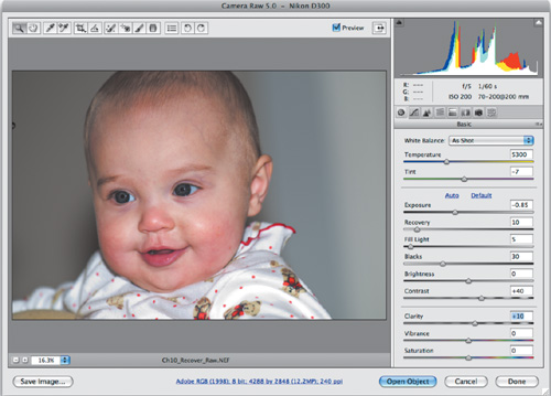
The Exposure command is also an important part of processing a raw file using Camera Raw. Even though a photo may appear overexposed, you can often properly expose it during the development stage.
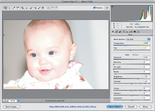
Close any open files, and then open the file Ch10_Recover_Raw.NEF from the Chapter 10 folder.
Adjust the Exposure and Recovery sliders until the image is more properly exposed.
Further refine the image using the additional sliders in the Basic tab. Be sure to adjust the Fill Light, Blacks, Contrast, and Clarity sliders to get the best image.
The flexibility offered by the various raw formats and the Camera Raw developing module are excellent reasons for upgrading your digital photography acquisition approach.
The Invert image adjustment creates an image that is a direct inverse or negative. This can be useful in a variety of situations, including inversing a Layer Mask, making a positive from a scanned negative, or switching a black background to white. When an image is inverted, the brightness of each pixel is assigned the inverse value from the 256 color-values scale. This means that a 0 value would map to 255, whereas a 35 value would map to 215.
Close any open files, and then open the file Ch10_Invert.tif from the Chapter 10 folder. This is a negative image from a scanned film negative.
Choose Image > Adjustments > Invert or press Command/Ctrl+I. The negative image changes to a positive image, which can be further refined or color corrected.
The Equalize command can restore contrast to a washed out photo. The command attempts to redistribute pixels so that they are equally balanced across the entire range of brightness values. The command works best when you sample a small area that will drive the overall adjustment. The Equalize command takes the lightest area and remaps it to pure white and takes the darkest area and remaps it to pure black. Let’s give it a try.
Close any open files, and then open the file Ch10_Equalize.tif from the Chapter 10 folder.
With the Rectangular Marquee tool, make a selection inside the largest flower.
Choose Image > Adjustments > Equalize to repair the image.
Make sure the Equalize entire image based on selected area check box is selected, and then click OK.
If the image appears overexposed, you can choose Edit > Fade to reduce the intensity of the Equalize command.
Several image adjustments can be run on your image that can cause more problems than they solve. Others (like Variations) are far less efficient than more professional alternatives. You are welcome to explore these commands, but professional users rarely use them.
Note: Scan it Right
If you are scanning negatives into a computer, be sure to set up your scanner correctly and specify that you are scanning a film negative. You can use the Invert command to creative a positive image, but you’ll need to do additional color correction.
The Brightness/Contrast command is an inferior substitute to Levels and Curves. The Brightness/Contrast command affects the overall lightness or darkness. The problem with the adjustment is that it goes too far. It is impossible to adjust the shadows without overaffecting the highlights. The usual problems with an image are in the midtones, which are better handled by a Levels or Curves adjustment. A Brightness/Contrast adjustment will often leave your image washed out. Nothing good comes from this command, so it’s best to avoid it.
The image on the left has overblown areas. When the Brightness is adjusted so the highlights are properly exposed, the shadows and midtones are too dark. Photo by James Ball
The Replace Color command creates a mask that you can use to select specific colors in an image. Once a selection is made, the colors can be manipulated via an adjustment to the hue, saturation, and lightness of the selected areas. While this command works reasonably well, you’ll see better results when you use the Color Range command (Select > Color Range), and then add a Hue/Saturation adjustment layer.
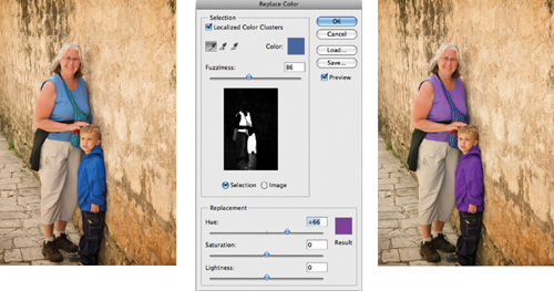
The results may look impressive, but this adjustment is a destructive edit. It’s best to use the Color Range command and a Hue/Saturation adjustment layer to allow for future changes.
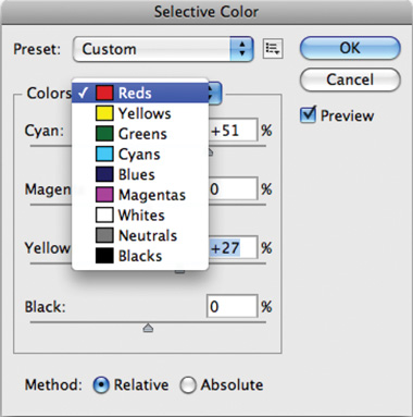
The Selective Color command is similar to the Color Balance command. However, it is not as easy to use, nor does it produce professional results that a Levels or Curves adjustment would. A better option is to use the Color Range command and add a Levels or Curves adjustment layer.
The Posterize command reduces the number of colors used in the image. This leads to a reduced color panel and creates banding in the image. While it can be used as a special effect, lowering image quality is not desirable. Be sure to use this as an adjustment layer if you just want to experiment.
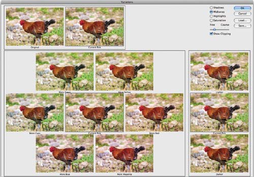
The Variations command allows you to adjust the color balance, contrast, and saturation of a photo. This is done by selecting from a variety of thumbnails of alternatives. This command only works if the image is basically close to “right” and you want to experiment with subtle variations. It only works on 8-bit images, and it is a destructive adjustment that can’t be modified. This command feels like a visit to the optometrist, and just takes way too long to generate average results. While it is attractive to a beginner, its long-term benefits are limited and there’s really no need to waste your time with it.