
Arranging files with the Solution Explorer
Adding projects, items and references to your solution
Working with the Properties tool window
Include your own properties in the Properties tool window
In Chapter 1 you briefly saw and interacted with a number of the components that make up the Visual Studio 2010 IDE. Now you get an opportunity to work with three of the most commonly used tool windows — the Solution Explorer, the Toolbox, and Properties.
Throughout this and other chapters you see references to keyboard shortcuts, such as Ctrl+S. In these cases, we assume the use of the general development settings, as shown in Chapter 1. Other profiles may have different key combinations.
Whenever you create or open an application, or for that matter just a single file, Visual Studio 2010 uses the concept of a solution to tie everything together. Typically, a solution is made up of one or more projects, each of which in turn can have multiple items associated with it. In the past these items were typically just files, but increasingly projects are made up of items that may consist of multiple files, or in some cases no files at all. Chapter 6 goes into more detail about projects, the structure of solutions, and how items are related.
The Solution Explorer tool window (Ctrl+Alt+L) provides a convenient visual representation of the solution, projects, and items, as shown in Figure 2-1. In this figure you can see three projects presented in a tree: a C# WPF application, a C# WCF service library, and a VB class library.
Each project has an icon associated with it that typically indicates the type of project and the language it is written in. There are some exceptions to this rule, such as setup projects that don't have a language.
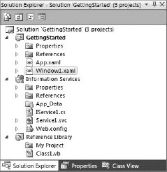
One node is particularly noticeable, because the font is boldfaced. This indicates that this project is the startup project — in other words, the project that is launched when you select Debug
Note
With certain environment settings (see "Let's Get Started" in Chapter 1), the Solution node is not visible when only a single project exists. The problem with this is that it becomes difficult to access the Solution Properties window. To get the Solution node to appear you can either add another project to the solution or check the Always Show Solution item from the Projects and Solutions node in the Options dialog, accessible via Tools
The toolbar across the top of the Solution Explorer enables you to customize the way the contents of the window appear to you, as well as giving you shortcuts to the different views for individual items. For example, the first button, Show All Files, expands the solution listing to display the additional files and folders, shown in Figure 2-2. You can see that the My Project node is actually made up of multiple files, which hold settings, resources, and information about the assembly.
In this expanded view you can see all the files and folders contained under the project structure. Unfortunately, if the file system changes, the Solution Explorer does not automatically update to reflect these changes. The second button, Refresh, can be used to make sure you are seeing the correct list of files and folders.

The Solution Explorer toolbar is contextually aware, with different buttons displayed depending on what type of node is selected. This is shown in Figure 2-2, where a folder not contained in the project (as indicated by the faded icon color) is selected and the remaining buttons from Figure 2-1 are not visible. In short, these buttons when visible can be used to view code (in this case, the Window1.xaml.cs file) or open the designer, which displays both the design and xaml views of the Window1.xaml file. Figure 2-2 also shows the Class Diagram button.
Note
If you don't already have a class diagram in your project, clicking the View Class Diagram button will insert one and automatically add all the classes. For a project with a lot of classes, this can be quite time consuming and will result in a large and unwieldy class diagram. It is generally a better idea to manually add one or more class diagrams, which gives you total control.
In addition to providing a convenient way to manage projects and items, the Solution Explorer has a dynamic context menu that gives you quick access to some of the most common tasks, such as building the solution or individual projects, accessing the build configuration manager, and opening files. Figure 2-3 shows how the context menu varies depending on which item is selected in the Solution Explorer.

The first items in the left-hand and center menus relate to building either the entire solution or the selected project. In most cases, selecting Build is the most efficient option, because it only builds projects that have changed. However, in some cases you may need to force a Rebuild, which builds all dependent projects regardless of their states. If you just want to remove all the additional files that are created during the build process, you can invoke Clean. This option can be useful if you want to package your solution in order to e-mail it to someone — you wouldn't want to include all the temporary or output files that are created by the build.
For most items in the Solution Explorer, the first section of the context menu is similar to the right-hand menu in Figure 2-3: the default Open and Open With items allow you to determine how the item will be opened. This is of particular use when you are working with XML resource files. Visual Studio 2010 opens this file type using the built-in resource editor, but this prevents you from making certain changes and doesn't support all data types you might want to include (Chapter 38 goes into how you can use your own data types in resource files), Using the Open With menu item, you can use the XML Editor instead.
Note
The context menu for the Solution, Project, and Folder nodes contains the Open Folder in Windows Explorer item. This enables you to open Windows Explorer quickly to the location of the selected item, saving you the hassle of having to navigate to where your solution is located and then find the appropriate subfolder.
The most common activities carried out in the Solution Explorer are the addition, removal, and renaming of projects and items. To add a new project to an existing solution, you select Add
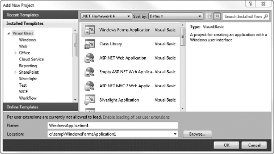
In the Installed Templates hierarchy on the left of the Add New Project dialog, the templates are primarily arranged by language and then by technology. The templates include Office project types, enabling you to build both application- and document-level add-ins for most of the Office products. Though the Office add-ins still make use of Visual Studio Tools for Office (VSTO), this is built into Visual Studio 2010 instead of being an additional installer. You'll see in Chapter 19 how you can use these project types to build add-ins for the core Office applications. There are also tabs for Recent Templates and Online Templates. The Online Templates can be sorted and searched in the same way as your Installed Templates, although the sort criteria has been extended to include creation date, ratings, and downloaded frequency.
The other thing you will notice in this dialog is the ability to select different framework versions. If you have existing projects that you don't want to have to migrate forward to the new version of the .NET Framework, you can still immediately take advantage of the new features, such as improved IntelliSense. The alternative would have been to have both Visual Studio 2010 and a previous version installed in order to build projects for earlier framework versions. The framework selection is also included in the search criteria, limiting the list of available project templates to those that are compatible with the selected .NET Framework version.
Warning
when you open your existing solutions or projects in Visual Studio 2010, they will still go through the upgrade wizard (see Chapter 44 for more information) but will essentially make only minor changes to the solution and project files. Unfortunately, these minor changes, which involve the inclusion of additional properties, will break your existing build process if you are using a previous version of MSBuild. For this reason, you will still need to migrate your entire development team across to using Visual Studio 2010.
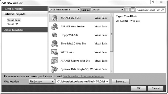
One of the worst and most poorly understood features in Visual Studio is the concept of a Web Site project. This is distinct from a Web Application project, which can be added via the aforementioned Add New Project dialog. To add a Web Site project you need to select Add
Note
It is important to note that the types of web projects listed in Figure 2-5 are the same as the types listed under the Web node in the Add New Project dialog. However, understand that they will not generate the same results, because significant differences exist between Web Site projects (created via the Add New Web Site dialog) and Web Application projects (created via the Add New Project dialog). The differences between these project types are covered in detail in Chapter 20.
Once you have a project or two, you will need to start adding items. You do this via the Add context menu item off the project node in the Solution Explorer. The first submenu, New Item, launches the Add New Item dialog, as seen in Figure 2-6.
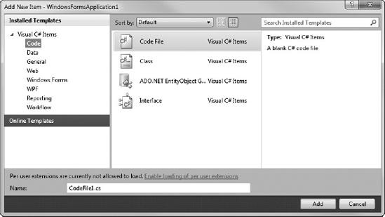
Like the New Project and New Web Site dialogs, the Add New Item dialog has also had a facelift. In addition to listing only those item templates that are relevant to the project you have selected, this dialog enables you to search the installed templates, as well as go online to look for templates generated by third parties.
Returning to the Add context menu, you will notice a number of predefined shortcuts such as User Control and Class. These do little more than bypass the stage of locating the appropriate template within the Add New Item dialog. The Add New Item dialog is still displayed, because you need to assign a name to the item being created.
Note
It is important to make the distinction that you are adding items rather than files to the project. Though a lot of the templates contain only a single file, some, like the Window or User Control, will add multiple files to your project.
Each new software development technology that is released promises better reuse, but few are able to actually deliver on this promise. One way that Visual Studio 2010 supports reusable components is via the references for a project. If you expand out any project you will observe a number of .NET Framework libraries, such as System and System.Core, that need to be referenced by a project in order to be built. Essentially, a reference enables the compiler to resolve type, property, field, and method names back to the assembly where they are defined. If you want to reuse a class from a third-party library, or even your own .NET assembly, you need to add a reference to it via the Add Reference context menu item on the project node of the Solution Explorer.
When you launch the Add Reference dialog, shown in Figure 2-7, Visual Studio 2010 interrogates the local computer, the Global Assembly Cache, and your solution in order to present a list of known libraries that can be referenced. This includes both .NET and COM references that are separated into different lists, as well as projects and recently used references. In previous versions of Visual Studio this dialog was notoriously slow to load. If the component you need to reference isn't present in the appropriate list, you can choose the Browse tab, which enables you to locate the file containing the component directly in the file system. By initially loading the list of projects within your solution and presenting that as the default tab, then lazy loading the content for the remaining tabs, this dialog now displays almost instantly.
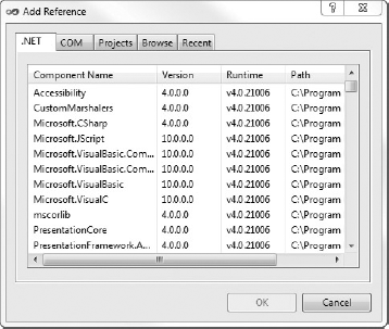
As in other project-based development environments going back as far as the first versions of VB, you can add references to projects contained in your solution, rather than adding the compiled binary components. The advantage to this model is that it's easier to debug into the referenced component and helps ensure you are running the latest version of all components, but for large solutions this may become unwieldy.
Note
When you have a solution with a large number of projects (large can be relevant to your computer but typically anything over 20), you may want to consider having multiple solutions that reference subsets of the projects. This will continue to give you a nice debugging experience throughout the entire application while improving Visual Studio performance during both loading and building of the solution. Alternatively, you may want to create different build configurations (see Chapter 45) to build a subset of the projects.
The other type of reference that the Solution Explorer caters to is service references. In previous versions of Visual Studio this was referred to as web references, but with the advent of the Windows Communication Foundation (WCF) there is now a more generic Add Service Reference menu item. This invokes the Add Service Reference dialog, which you can see in Figure 2-8. In this example the drop-down feature of the Discover button has been used to look for Services in Solution.
Unfortunately, this dialog is another case of Microsoft not understanding the usage pattern properly. Though the dialog itself is resizable, the status response message area is not, making it hard to read any errors generated. Luckily, if any errors are thrown while Visual Studio 2010 attempts to access the service information, it provides a hyperlink that opens the Add Service Reference Error dialog. This generally gives you enough information to resolve the problem.
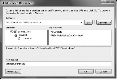
In the lower left-hand corner of Figure 2-8 is an Advanced button. The Service Reference Settings dialog that this launches enables you to customize which types are defined as part of the service reference. By default, all local system types are assumed to match those being published by the service. If this is not the case, you may want to adjust the values in the Data Type area of this dialog. There is also an Add Web Reference button in the lower left-hand corner of the Service Reference Settings dialog, which enables you to add more traditional .NET Web service references. This might be important if you have some limitations or are trying to support intersystem operability. Adding services to your application is covered in more detail in Chapter 31 on WCF.
One of the major advantages over many other IDEs that Microsoft has offered developers is true drag-and-drop placement of elements during the design of both web and rich client applications. These elements are all available in what is known as the Toolbox (Ctrl+Alt+X), a tool window accessible via the View menu, as shown in Figure 2-9.
The Toolbox window contains all of the available components for the currently active document being shown in the main workspace. These can be visual components, such as buttons and textboxes; invisible, service-oriented objects, such as timers and system event logs; or even designer elements, such as class and interface objects used in the Class Designer view.
Note
An interesting feature of the Toolbox is that you can copy snippets of code into the Toolbox by simply selecting a region and dragging it onto the Toolbox. You can rename and reorder your code snippets, making it really useful for presentations or storing chunks of code you use frequently.
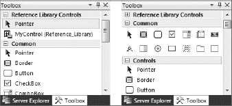
Visual Studio 2010 presents the available components in groups rather than as one big mess of components. This default grouping enables you to more easily locate the controls you need — for example, data-related components are in their own Data group.
By default, groups are presented in List view (see the left side of Figure 2-9). Each component is represented by its own icon and the name of the component. This differs from the old way of displaying the available objects, in which the Toolbox was simply a stacked list of icons that left you guessing as to what some of the more obscure components were, as shown with the Common Controls group on the right side of Figure 2-9. You can change the view of each control group individually — right-click anywhere within the group area and deselect the List View option in the context menu.
Regardless of how the components are presented, the way they are used in a program is usually the same: click and drag the desired component onto the design surface of the active document, or double-click the component's entry for Visual Studio to automatically add an instance. Visual components, such as buttons and textboxes, appear in the design area where they can be repositioned, resized, and otherwise adjusted via the property grid. Non-visual components, such as the Timer control, appear as icons, with associated labels, in a non-visual area below the design area, as shown in Figure 2-10.
At the top left-hand side of Figure 2-9 is a group called Reference Library Controls with a single component, MyControl. "Reference_Library" is actually the name of a class library that is defined in the same solution, and it contains the MyControl control. When you start to build your own components or controls, instead of your having to manually create a new tab and go through the process of adding each item, Visual Studio 2010 automatically interrogates all the projects in your solution. If any components or controls are identified (essentially any class that implements System.ComponentModel.IComponent or System.Windows.FrameworkElement for WPF), a new tab is created for that project and the appropriate items are added with a default icon and class name (in this case MyControl), as you can see on the left in Figure 2-9. For components, this is the same icon that appears in the non-visual part of the design area when you use the component.
Note
Visual Studio 2010 interrogates all projects in your solution, both at startup and after build activities. This can take a significant amount of time if you have a large number of projects. If this is the case, you should consider disabling this feature by setting the AutoToolboxPopulate property to false under the Windows Forms Designer node of the Options dialog (Tools
To customize how your items appear in the Toolbox, you need to add a 16×16 pixel bitmap to the same project as your component or control. Next, select the newly inserted bitmap in the Solution Explorer and navigate to the Properties window. Make sure the Build property is set to Embedded Resource. All you now need to do is attribute your control with the ToolboxBitmap attribute:
- VB
<ToolboxBitmap(GetType(MyControl), "MyControlIcon.bmp")>
Public Class MyControl
- C#
[ToolboxBitmap(typeof(MyControl), "MyControlIcon.bmp")]
public class MyControl
This attribute uses the type reference for MyControl to locate the appropriate assembly from which to extract the MyControlIcon.bmp embedded resource. Other overloads of this attribute can use a file path as the only argument. In this case you don't even need to add the bitmap to your project.
Note
Unfortunately, you can't customize the way the automatically generated items appear in the Toolbox. However, if you manually add an item to the Toolbox and select your components, you will see your custom icon. Alternatively, if you have a component and you drag it onto a form, you will see your icon appear in the non-visual space on the designer.
It is also worth noting that customizing the Toolbox and designer experience for Windows Presentation Foundation (WPF) controls uses the notion of a Metadata store instead of attributes. This typically results in additional assemblies that can be used to tailor the design experience in both Visual Studio 2010 and Expression Blend.
Having Toolbox items in alphabetical order is a good default because it enables you to locate items that are unfamiliar. However, if you're only using a handful of components and are frustrated by having to continuously scroll up and down, you can create your own groups of controls and move existing object types around.
Repositioning an individual component is easy. Locate it in the Toolbox and click and drag it to the new location. When you're happy with where it is, release the mouse button and the component will move to the new spot in the list. You can move it to a different group in the same way — just keep dragging the component up or down the Toolbox until you've located the right group. These actions work in both List and Icon views.
If you want to copy the component from one group to another, rather than move it, hold down the Ctrl key as you drag, and the process will duplicate the control so that it appears in both groups.
Sometimes it's nice to have your own group to host the controls and components you use the most. To create a new group in the Toolbox, right-click anywhere in the Toolbox area and select the Add Tab command. A new blank tab will be added to the bottom of the Toolbox with a prompt for you to name it. Once you have named the tab, you can then add components to it by following the steps described in this section.
When you first start Visual Studio 2010, the items within each group are arranged alphabetically. However, after moving items around, you may find that they're in a bewildering state and decide that you simply need to start again. All you have to do is right-click anywhere within the group and choose the Sort Items Alphabetically command.
By default, controls are added to the Toolbox according to their class names. This means you end up with some names that are hard to understand, particularly if you add COM controls to your Toolbox. Visual Studio 2010 enables you to modify a component's name to something more understandable.
To change the name of a component, right-click the component's entry in the Toolbox and select the Rename Item command. An edit field will appear inline in place of the original caption, enabling you to name it however you like, even with special characters.
If you've become even more confused, with components in unusual groups, and you have lost sight of where everything is, you can choose Reset Toolbox from the same right-click context menu. This restores all of the groups in the Toolbox to their original states, with components sorted alphabetically and in the groups in which they started.
Note
Remember: Selecting Reset Toolbox deletes any of your own custom-made groups of commands, so be very sure you want to perform this function!
Sometimes you'll find that a particular component you need is not present in the lists displayed in the Toolbox. Most of the main .NET components are already present, but some are not. For example, the WebClient class component is not displayed in the Toolbox by default. Managed applications can also use COM components in their design. Once added to the Toolbox, COM objects can be used in much the same way as regular .NET components, and if coded correctly you can program against them in precisely the same way, using the Properties window and referring to their methods, properties, and events in code.
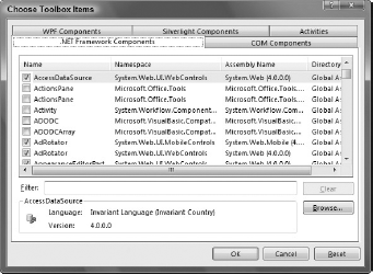
To add a component to your Toolbox layout, right-click anywhere within the group of components you want to add it to and select Choose Items. After a moment (this process can take a few seconds on a slower machine, because the machine needs to interrogate the .NET cache to determine all the possible components you can choose from), you are presented with a list of .NET Framework components, as Figure 2-11 shows.
Scroll through the list to locate the item you want to add to the Toolbox and check the corresponding checkbox. You can add multiple items at the same time by selecting each of them before clicking the OK button to apply your changes. At this time you can also remove items from the Toolbox by deselecting them from the list. Note that this removes the items from any groups to which they belong, not just from the group you are currently editing.
If you're finding it hard to locate the item you need, you can use the Filter box, which filters the list based on name, namespace, and assembly name. On rare occasions the item may not be listed at all. This can happen with nonstandard components, such as ones that you build yourself or that are not registered in the Global Assembly Cache (GAC). You can still add them by using the Browse button to locate the physical file on the computer. Once you've selected and deselected the items you need, click the OK button to save them to the Toolbox layout.
COM components, WPF components, Silverlight Components, and (Workflow) Activities can be added in the same manner. Simply switch over to the relevant tab in the dialog window to view the list of available, properly registered COM components to add. Again, you can use the Browse button to locate controls that may not appear in the list.
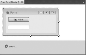
One of the most frequently used tool windows built into Visual Studio 2010 is the Properties window (F4), as shown in Figure 2-12. The Properties window is made up of a property grid and is contextually aware, displaying only relevant properties of the currently selected item, whether that item is a node in the Solution Explorer or an element in the form design area. Each line represents a property with its name and corresponding value in two columns. The right side of Figure 2-12 shows the updated property grid for WPF applications, which includes a preview icon and search capabilities.
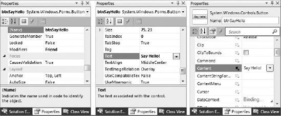
The Properties window is capable of grouping properties, or sorting them alphabetically — you can toggle this layout using the first two buttons at the top of the Properties window. It has built-in editors for a range of system types, such as colors, fonts, anchors, and docking, which are invoked when you click into the value column of the property to be changed. When a property is selected, as shown in the center of Figure 2-12, the property name is highlighted and a description is presented in the lower region of the property grid.
In the Properties window, read-only properties are indicated in gray and you will not be able to modify their values. The value SayHello for the Text property on the left side of Figure 2-12 is boldfaced, which indicates that this is not the default value for this property. Similarly on the right side of Figure 2-12 the Text property has a filled-in black square between the property name and value, indicating the value has been specified. If you inspect the following code that is generated by the designer, you will notice that a line exists for each property that is boldfaced in the property grid — adding a line of code for every single property on a control would significantly increase the time to render the form.
- VB
Me.btnSayHello.Location = New System.Drawing.Point(12, 12)
Me.btnSayHello.Name = "btnSayHello"
Me.btnSayHello.Size = New System.Drawing.Size(100, 23)
Me.btnSayHello.TabIndex = 0
Me.btnSayHello.Text = "Say Hello!"
Me.btnSayHello.UseVisualStyleBackColor = True

- C#
this.btnSayHello.Location = new System.Drawing.Point(12, 12);
this.btnSayHello.Name = "btnSayHello";
this.btnSayHello.Size = new System.Drawing.Size(100, 23);
this.btnSayHello.TabIndex = 0;
this.btnSayHello.Text = "Say Hello!";
this.btnSayHello.UseVisualStyleBackColor = true;

Note
For Web and WPF applications, the properties set in the Properties window are persisted as markup in the aspx or xaml file, respectively. As with the Windows forms designer, only those values in the Properties window that have been set are persisted into markup.
In addition to displaying properties for a selected item, the Properties window also provides a design experience for wiring up event handlers. The Properties window on the left of Figure 2-13 illustrates the event view that is accessible via the fourth button, the lightning bolt, across the top of the Properties window. In this case, you can see that there is an event handler for the click event. To wire up another event you can either select from a list of existing methods via a drop-down list in the value column, or you can double-click the value column. This creates a new event-handler method and wires it up to the event. If you use the first method you will notice that only methods that match the event signature are listed.
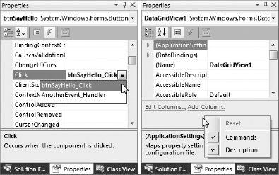
Certain components, such as the DataGridView, expose a number of commands, or shortcuts, that can be executed via the Properties window. On the right side of Figure 2-13 you can see two commands for the DataGridView: Edit Columns and Add Column. When you click either of these command links, you are presented with a dialog for performing that action.
If the Properties window has only a small amount of screen real estate, it can be difficult to scroll through the list of properties. If you right-click in the property grid you can uncheck the Command and Description checkboxes to hide these sections of the Properties window.
You have just seen how Visual Studio 2010 highlights properties that have changed by boldfacing the value. The question that you need to ask is, How does Visual Studio 2010 know what the default value is? The answer is that when the Properties window interrogates an object to determine what properties to display in the property grid, it looks for a number of design attributes. These attributes can be used to control which properties are displayed, the editor that is used to edit the value, and what the default value is. To show how you can use these attributes on your own components, start with adding a simple automatic property to your component:
- VB
Public Property Description As String

- C#
public string Description { get; set; }
By default, all public properties are displayed in the property grid. However, you can explicitly control this behavior by adding the Browsable attribute. If you set it to false the property will not appear in the property grid.
- VB
<System.ComponentModel.Browsable(False)>
Public Property Description As String

- C#
[System.ComponentModel.Browsable(false)]
public string Description { get; set; }
The DisplayName attribute is somewhat self-explanatory; it enables you to modify the display name of the property. In our case, we can change the name of the property as it appears in the property grid from Description to VS2010 Description.
- VB
<System.ComponentModel.DisplayName("VS2010 Description")>
Public Property Description As String
- C#
[System.ComponentModel.DisplayName("VS2010 Description")]
public string Description { get; set; }
In addition to defining the friendly or display name for the property, it is also worth providing a description, which appears in the bottom area of the Properties window when the property is selected. This ensures that users of your component understand what the property does.
- VB
<System.ComponentModel.Description("My first custom property")>
Public Property Description As String
- C#
[System.ComponentModel.Description("My first custom property")]
public string Description { get; set; }
By default, any property you expose is placed in the Misc group when the Properties window is in grouped view. Using the Category attribute, you can place your property in any of the existing groups, such as Appearance or Data, or a new group if you specify a group name that doesn't exist.
- VB
<System.ComponentModel.Category("Appearance")>
Public Property Description As String
- C#
[System.ComponentModel.Category("Appearance")]
public string Description { get; set; }
Earlier you saw how Visual Studio 2010 highlights properties that have changed from their initial or default values. The DefaultValue attribute is what Visual Studio 2010 looks for to determine the default value for the property.
- VB
Private Const cDefaultDescription As String = "<enter description>"
<System.ComponentModel.DefaultValue(cDefaultDescription)>
Public Property Description As String = cDefaultDescription

- C#
private const string cDefaultDescription = "<enter description>";
private string mDescription = cDefaultDescription;
[System.ComponentModel.DefaultValue(cDefaultDescription)]
public string Description
{
    get
    {
        return mDescription;
    }
    set
    {
        mDescription = value;
    }
}
In this case, if the value of the Description property is set to "<enter description>", Visual Studio 2010 removes the line of code that sets this property. If you modify a property and want to return to the default value, you can right-click the property in the Properties window and select Reset from the context menu.
Note
It is important to note that the DefaultValue attribute does not set the initial value of your property. It is recommended that if you specify the DefaultValue attribute you also set the initial value of your property to the same value, as done in the preceding code.
One of the features we all take for granted but that few truly understand is the concept of ambient properties. Typical examples are background and foreground colors and fonts: unless you explicitly set these via the Properties window they are inherited — not from their base classes, but from their parent control. A broader definition of an ambient property is a property that gets its value from another source.
Like the DefaultValue attribute, the AmbientValue attribute is used to indicate to Visual Studio 2010 when it should not add code to the designer file. Unfortunately, with ambient properties you can't hard-code a value for the designer to compare the current value to, because it is contingent on the property's source value. Because of this, when you define the AmbientValue attribute this tells the designer to look for a function called ShouldSerializePropertyName. In our case, it would be ShouldSerializeDescription, and this method is called to determine whether the current value of the property should be persisted to the designer code file.
- VB
Private mDescription As String = cDefaultDescription
<System.ComponentModel.AmbientValue(cDefaultDescription)>
Public Property Description As String
    Get
        If Me.mDescription = cDefaultDescription AndAlso
                             Me.Parent IsNot Nothing Then
            Return Parent.Text
        End If
        Return mDescription
    End Get
    Set(ByVal value As String)
        mDescription = value
    End Set
End Property

Private Function ShouldSerializeDescription() As Boolean
    If Me.Parent IsNot Nothing Then
        Return Not Me.Description = Me.Parent.Text
Else Return Not Me.Description = cDefaultDescription End If End function
- C#
private string mDescription = cDefaultDescription;
[System.ComponentModel.AmbientValue(cDefaultDescription)]
public string Description{
    get{
        if (this.mDescription == cDefaultDescription &&
            this.Parent != null){
            return Parent.Text;
        }
        return mDescription;
    }
    set{
        mDescription = value;
    }
}

private bool ShouldSerializeDescription(){
    if (this.Parent != null){
        return this.Description != this.Parent.Text;
    }
    else{
        return this.Description != cDefaultDescription;
    }
}
When you create a control with this property, the initial value would be set to the value of the DefaultDescription constant, but in the designer you would see a value corresponding to the Parent.Text value. There would also be no line explicitly setting this property in the designer code file, as reflected in the Properties window by the value being non-boldfaced. If you change the value of this property to anything other than the DefaultDescription constant, you will see that it becomes bold and a line is added to the designer code file. If you reset this property, the underlying value is set back to the value defined by AmbientValue, but all you will see is that it has returned to displaying the Parent.Text value.
In this chapter you have seen three of the most common tool windows in action. Knowing how to manipulate these windows can save you considerable time during development. However, the true power of Visual Studio 2010 is exposed when you start to incorporate the designer experience into your own components. This can be useful even if your components aren't going to be used outside your organization. Making effective use of the designer can improve not only the efficiency with which your controls are used, but also the performance of the application you are building.