
Using Google Website Optimizer opens the door for us to talk about the sub-industry within web analytics that deals with testing, experimentation, and multivariate analysis — a sub-industry, mind you, that is growing exponentially and rapidly making its way into department meetings and boardrooms across the globe. A few website owners today are starting to understand that if they do not run experiments on their websites, landing pages, and marketing initiatives, they are setting themselves up for failure. No longer can you get away with a website that is not touched for years and ads that run unattended on Google for months at a time. (Could you ever have gotten away with it in the first place?)
This small subset of website owners who "get it" know that testing in general, and using tools like Google Website Optimizer in particular, are the keys to victory over their competition. They're also getting that the statistics you saw in the previous chapter use elements from beginning statistics courses taught at colleges and universities all over the world. To take it a step further, the entire package of data in Google Analytics is a statistics package, and so are most of the metrics you see in Google AdWords. Needless to say, having some knowledge of elementary statistics will help you greatly in your quest for success.
In this chapter I'll discuss some of the basic statistical concepts that are covered in an elementary statistics class, and show you how they apply to your daily website advertising and measurement life. You'll learn about things like measures of center, standard deviation, and Z-scores, and throughout the chapter you'll see some examples of how they apply to web analytics and online testing.
Statistics are used everywhere online. Clicks, impressions, conversion rate, bounce rate, visits to purchase, and just about everything else you've read about so far in Your Google Game Plan for Success has something to do with statistics. As I mentioned in the introduction to this chapter, it's vital to have at least an elementary understanding of statistics so you have the deepest possible understanding of how the Web works. Statistics are used daily online, on the radio, on television, in sports, by your friends, and by your boss to justify statements or corroborate information being presented.
Elementary statistics is important to enrich your knowledge and open new doors for you. Not only will you become a better analyst and experiment designer, you'll also be able to apply your new knowledge in the real world. You don't have to complete a bachelor's in math or a master's in statistics to at least understand some fundamental concepts.
Performing a search on Google for statistics brings up about 500 million search results. Performing the same search on Google Images brings up a little over 200 million images of book covers, pie charts, graphs, and formulas, and even some screenshots of web-analytics programs. Statistics is seemingly everywhere you look.
There's also a dark side to statistics. There's a side that produces misinformation, and that you also need to be aware of. We've all heard the unsubstantiated claims in radio ads, in TV commercials, and online. Sometimes the claims are even made in person by friends and colleagues. Claims such as "Four out of five people hate their jobs" or "Eighty-five percent of teenage boys play video games" could very well be true, but are most likely regurgitations of what someone read or heard somewhere. So, as important as having an elementary knowledge of statistics is, it's equally as important to know which statistics have to be taken with a grain of salt.
Naturally, when we talk about statistics, we must talk about some of the definitions within elementary statistics. As I've written in some previous chapters, programs like Google Analytics are not server log files or accounting software like QuickBooks. Programs like Google Analytics are web-analytics programs that a website owner can use to observe statistical trends and extract valuable insights in order to take meaningful and intelligent action. At its very core, that's exactly what statistics is all about, too!
Let's start by defining two different types of data: qualitative and quantitative.
Qualitative data: Data that describes a non-numerical characteristic
Quantitative data: Data that consists of numbers that represent counts or measurements
The following sentence has both qualitative and quantitative data. Can you spot both types?
"I have 12 chocolate-chip cookies."
The qualitative data here is chocolate chip, which is a quality of the data set (here the data set is cookies). And, clearly, the quantitative data in the example sentence is 12, which is the count of chocolate-chip cookies that I have.
Basically, qualitative data describes something (chocolate chip, vanilla, key-word, source, medium) and quantitative data counts something (one, two, five hundred, a million, a bazillion). In Google Analytics, for example, and speaking in general terms, qualitative data includes the dimensions and quantitative data the metrics. Look at Figure 12-1 and you'll see the metrics (quantitative data) going across the top of the page and dimensions (qualitative data) going down the page in the custom report that I am building.
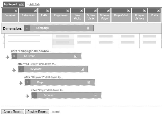
In Figure 12-1 the quantitative data points are the metrics going across the scorecard on the top. Bounces, Entrances, Exits, Page Views, and the other metrics are all numerical counts. The qualitative data points are the five dimensions going down the custom report. Campaign, Ad Group, Keyword, Page, and Browser are all descriptions of a data point that complement a quantitative measure.
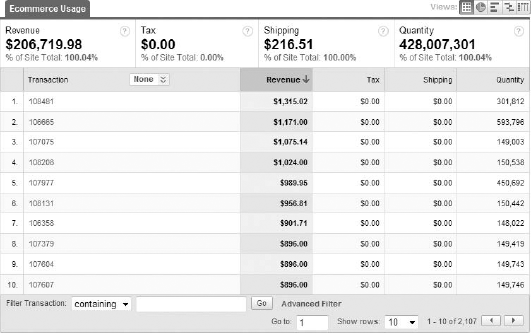
It's very important to note that some qualitative data can be represented numerically, but are not counts of anything, so they are not metrics. The Transactions report within the E-commerce section in Google Analytics is a perfect example of this. Notice in Figure 12-2 how the transaction IDs that were generated in this particular date range are all numbers. However, you can't add all these numbers up into something that is meaningful, and each transaction ID itself isn't a sum or a count of anything in particular. It is simply a qualitative attribute of a transaction, much as a ZIP code is a qualitative attribute of where you live.
The two other types of data that you should know of are called population and sample.
A population is the complete collection of all data (to be analyzed).
A sample is a portion of data from a population (to be analyzed).
When statisticians perform numerical measurements on a population, they are analyzing the full collection of data at their disposal. Suppose a statistician is able to determine the shirt color of each individual person at a basketball game. The population here would be everyone in the arena. Then the statistician can group the members of the population by shirt color.
When a statistician performs a numerical measurement on a sample, he or she is analyzing only a percentage of the population. Let's suppose that the same statistician at the basketball arena is going to determine the shirt color of every adult male in a particular seating section. These adult males would be considered a sample of the population of all adult male ticket holders in the entire arena.
A numerical representation of a large population (for example, all the males in the world, or everyone in the arena, who could be surveyed only at halftime) is called a parameter. A numerical measurement of a sample (for example, the adult males in the particular arena section) is called a statistic. All online programs like Google AdWords, Google Analytics, and Google Website Optimizer use statistics, not parameters. As you know from earlier chapters, there is no possible way to collect data from the entire population of visitors with a tag-based web-analytics solution like Google Analytics. Google Analytics uses data from a sample of that population, and generates statistics for you to analyze.
One interesting topic that I've saved for later is on-site survey tools, like 4Q by iPerceptions (www.4qsurvey.com/) and Kampyle (www.kampyle.com/), which record user input — feedback — about your website and your visitors' browsing experiences. You can use this data to make modifications and improvements on your site, and such tools are used by the savviest of website owners. Usually a small piece of JavaScript tracking code is installed on the pages of your website, and either during a visit or immediately after, the visitor will be prompted with questions and possibly a survey.
In the world of statistics, these types of on-site surveys are known as voluntary response surveys. In traditional statistics, voluntary response surveys are considered fundamentally flawed, and conclusions about a larger population should not be made from them. This is because the subjects (the sample) have made the decision to respond to the survey, which in itself taints the survey results. For a survey to be considered good in the traditional world, the survey subjects must not have decided whether or not to participate. In the traditional world, a good survey is made up of subjects in what's called a random sample, in which each subject of a population has an equal chance of being selected.
In the online world, voluntary response surveys actually work well, and website owners can collect valuable and insightful information from their visitors. There's no way to know whether a person will register a compliment or criticism, so the testing process itself seems to work out because of the variety of the replies of the respondents.
There are four sampling types other than random that you should know about. They are:
Systematic sampling: With systematic sampling, a starting point is determined, and then every nth subject is selected. A great example that you can use to visualize systematic sampling is a police officer who plans to pull over every tenth driver who passes by. The police officer selects a starting point (when he or she arrives) and then starts his or her systematic sampling technique by pulling over every tenth driver. Systematic sampling is usually not conducted by professional statisticians because it takes a long time to accumulate a large-enough sample, and a systematic sample is not a random sample (which is desired). Not every member of the population (every driver on the road) has the same odds of being selected (pulled over).
Convenience sampling: This sampling technique involves collecting data via the most convenient method available. An example of convenience sampling would be conducting a survey by selecting people who happen to be standing near you. Convenience sampling is a bad idea because it can lead to heavy pollution in the quality of the data itself, making for unreliable insights. For example, taking a sample at the Democratic National Convention and asking people nearby what they think of the opposing Republican candidate will heavily distort the results in a one-sided way.
Stratified sampling: Here a population is divided into groups (such as "all female students of this university"), and a sample is taken from that group (such as "all female chemistry students of this university"). Stratified sampling is usually performed when the survey taker wants a specific target.
Cluster sampling: Finally, cluster sampling occurs when a population is divided into groups (as in stratified sampling), and all members of a portion of those groups are used for a survey. Think of a state that is divided by county, with a survey taker polling a particular county. In stratified sampling, a sample (not everyone) from the county would be surveyed. In cluster sampling, everyone in that particular county would be surveyed, although residents of other counties might not be. In Google Analytics you could say that cluster sampling occurs when you create a duplicate profile with an include filter. For example, an "organic traffic only" profile would count only the cluster of organic traffic to the site.
With programs like Google Analytics and Microsoft Excel, you can build charts, graphs, and histograms by entering data into a set of rows and columns, or by logging in and accessing the desired report. When you take an elementary statistics class you'll most likely be required to build a histogram to show your instructor that you know how to organize a set of data and build a report on your own.
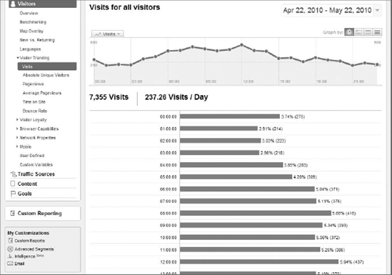
Simply speaking, a histogram is a bar graph, usually using vertical bars. In web analytics, bar graphs are usually represented as trending graphs that you see toward the top of most reports. Another reason statistics professors ask you to build a histogram is so you can evaluate whether or not the histogram is a normal distribution. When a histogram is normally distributed, it resembles the shape of a bell, where the extreme ends of the histogram are flat and the line rises until it reaches a high point in the middle. Normally distributed graphs are very important for the development of statistical methods and programs, but you won't find many histograms that look normally distributed. Figure 12-3 shows the trending graph by hour in the Visits report in the Visitors section of Google Analytics. This is probably as close to a normal distribution as you're going to get.
There are many types of charts, and each has its own name in statistics, but the normally distributed histogram is the most important of all. Google Website Optimizer uses a modified form of a time-series graph and a bar graph, while Google Analytics uses histograms, pie charts, and clusters (motion charts).
You've most likely heard of all four of these terms, and you've most likely heard them used interchangeably by peers, colleagues, and even your own college professors. They are used interchangeably by the general population, but each means something entirely different. They do have one thing in common: they are all measures of center.
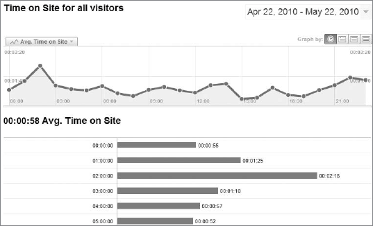
Mean: You find the mean (or the arithmetic mean) of a set of values by adding all the values and dividing by the total number of values. The mean corresponds to the term average used in web-analytics programs like Google Analytics. Figure 12-4 shows the Average Time on Site report, which is the mean of the time spent on a particular website.
Median: The median measures the value that falls directly in the middle of a set of data, when that set of data is organized from the lowest value to the highest (or vice versa). For example, let's say you have five numbers: 3, 5, 9, 14, and 75. The mean (average) of these five numbers is 21.2, but the median (the value in the center) is 9. Median and mean get mixed up all of the time in the real world, but as you can see, they are two different measures of center.
Mode: The mode is the number in a group of data that occurs most frequently. In the data set of 3, 4, 4, 5, 5, 5, 5, 6, and 7, the mode is 5, as it's the number that is repeated most often. The mode measure of center is seldom used.
Midrange: You calculate the midrange by taking the highest number in a set, adding it to the lowest number in the set, and dividing the result by two. In the 3, 5, 9, 14, 75 data set, the midrange is 39 (75 plus 3, divided by 2). The midrange is also seldom used as a measure of center.
Let's discuss the four measures of center in greater depth for a moment. The mean (average) takes all the values and divides their sum by the number of values. Take the data set that we used for the median example: 3, 5, 9, 14, and 75. The value 75 is the one that really doesn't fit in with this group. It's more than five times greater than the next-highest value. Is it an error? Possibly, but let's assume for the moment that it's not. That value is called an outlier, a value that is much higher or much lower than the others.
What I'm leading up to here is that while the mean is used most often in statistics to measure the center of a data set, it is sensitive to outliers, like 75 in the previous data set (but it is also very sensitive to small outliers in a set of data with large values). In a set with a few extremely large or small outliers, it may be more beneficial to use the median measurement of center, as it will be much closer to the "true" average of the data set. The median can actually be calculated very easily using Microsoft Excel and one of the predefined formulas.
But really, who's going to have the time to download an experiment or web-analytics data into Excel and determine outliers and discover the median of a data set? Not many businesspeople that I know of, that's for certain. To determine outliers, you would have to sort your data from low to high (or high to low) and pick out the extreme values on the low and high ends. To determine the median, you take the lowest value, add it to the highest value, and divide the sum by 2. Perhaps there's a better way — a best way — to obtain a measure of center?
The answer is that there really is none. You should use averages with caution and know that average calculations can be heavily affected by outliers. The Average Time on Site metric from Google Analytics is a perfect example of a metric that doesn't provide much insight, even though on the surface it sounds wonderful. But there are other metrics, like Average Order Value and Per-Visit Value, in which the presence of only a few extreme outliers can heavily distort the figures without your knowing it.
There's a popular saying these days in web analytics: "Averages lie!" You should know that there's a lot of truth in that saying. Don't rush to decisions based on an average — you can do better than that!
One of the most important concepts in elementary statistics is known as the standard deviation, a measure of variability from the mean (average). It's a compound statistic in that you must first calculate the mean (among a few other algebraic operations) in order to figure out the standard deviation.
Because the center of a data set only has a limited meaning and at times only a limited amount of value can be derived from it, statisticians developed the standard-deviation statistic to help place more context behind an average. For example, if I were to tell you that the average football player's career length has a mean of three years and a standard deviation of one year, this would indicate to you that if a particular football player's career lasted four years (the mean of three years plus the standard deviation of one), it would not be an unusual event. Likewise, if a particular football player's career lasted two years (the mean of three years minus the standard deviation of one), it would also not be unusual. The standard deviation is the allowance, plus or minus, that any piece of data can fall within and still be considered normal. In fact, most statistics texts and statisticians will allow values to range two standard deviations above or below the mean before considering them unusual. In our example, that would mean that a particular football player's career could last anywhere between one and five years (two standard deviations above or below the mean of three) and still be considered normal (or expected).
The range rule of thumb states that about 95 percent of all data in a set will fall within two standard deviations of the mean. Five percent of data in a set will fall outside this range. This isn't an exact figure, but it's close enough to be used as a rule of thumb.
What happens when a set of data ranges further than two standard deviations from the mean? What if some piece of data is 3, 4, or 10 standard deviations from the mean? If you said, "It's an outlier," you were correct. The question is what to do about it. Figure 12-5 is the Intelligence section from Google Analytics, which displays alerts to you when some metric or dimension falls or rises beyond two standard deviations from the mean. Take a close look at Figure 12-5. The first alert is the source containing Google for the % New Visits metric. The expected value (the mean with a few standard deviations built in) is 78.88 percent to 88.66 percent. However, for this particular day in comparison to the previous day (and in comparison to the expected value), the % New Visits metric hit 93.55 percent, which is equivalent to an increase of 16 percent. This increase was significant enough for this particular website owner to be alerted to it, because it was more than two standard deviations above the mean.
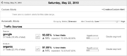
Figure 12-5. Deviations shown as percentage increases in the Intelligence section of Google Analytics
When the expected values fall more than two standard deviations below the mean, you'll see the percentage of decrease and its significance, as in the examples in Chapter 9. Standard deviations and the range rule of thumb play a critical role in how the Intelligence section works to provide you with important insights about what's happening on your website.
Z-scores are an interesting concept in statistics that allows you to compare values from different populations. Personally, I like using Z-scores to compare metrics between two different types of traffic, like paid and organic. You can use Z-scores as a great comparison tool for any two or more populations.
Z-scores take the value to be compared, the mean, and the standard deviation algebraically and produce a score that is usually between −2 and +2. For example, let's say there was the following question: "Which is relatively more chocolaty: a chocolate-chip cookie with 14 chocolate chips or a chocolate-chip ice cream cake with 350 chocolate chips?" Since the number of chocolate chips used in a cookie is so much smaller than the number of chocolate chips used in a chocolate-chip ice cream cake, and their sizes are also so different, it is impossible to compare the two populations without using a standard scoring system. By converting both population scores into Z-scores, you can compare the two Z-scores to be able to determine which dessert is the most chocolaty. When you compare your paid traffic to your organic traffic, it's easy to say that one is better than the other based upon a raw side-by-side comparison. As it turns out, they are two separate populations, and without a standard score like a Z-score, comparing them becomes iffy at best. You can find Z-score calculations online, but not within any web-analytics package that I'm currently aware of. I usually calculate my Z-scores on an Excel spreadsheet after downloading the raw data.
In essence, a Z-score is a number that you can use to compare two different data sets with different population sizes.
The final two statistics that I want you to learn about are confidence intervals and margin of error. Both play a critical role in traditional statistics, and both should be understood to have a critical role in experiment data and web analytics.
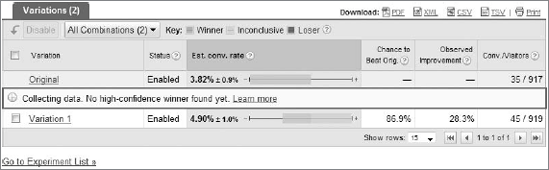
A confidence interval is normally expressed as a range of plus or minus a percentage. It is designed to show the person analyzing the data that the statistic can be plus or minus the percentage represented in the confidence interval and still be considered accurate. For example, take a look at Figure 12-6, which is an experiment from Google Website Optimizer that's still in progress.
For the original variation, you will see the estimated conversion rate metric listed as 3.82 percent. Next to that number you'll see plus or minus 0.9 percent. This is the conversion rate range for this variation that Google Website Optimizer predicts your variation will fall within. For the original variation, the conversion rate can be as high as 4.72 percent or as low as 2.92 percent and still be considered as accurate for this sample. For Variation 1, the confidence interval is a full plus or minus 1.0 percent.
A confidence interval is not necessarily the same thing as the margin of error. The margin of error in statistics is essentially the amount of the error in sampling. In one way, confidence intervals and margins of error are very similar, but technically they are not the same thing. Also, statistics is not an exact science — it's intended to be used to observe trends and extract valuable insights (where have you heard that before?).
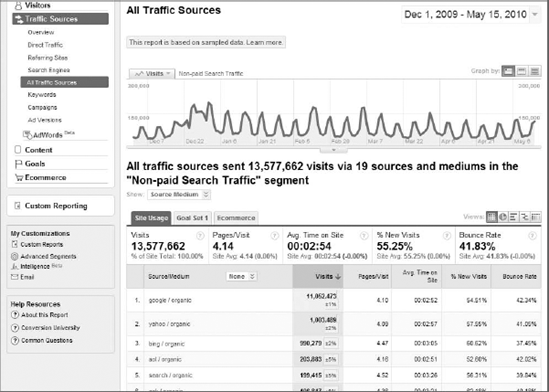
You'll see confidence intervals appear when you encounter data sampling in Google Analytics. Data sampling usually occurs as in Figure 12-7, when you attempt to segment by a very large number of visits, usually over a lengthy date range. Google Analytics enables data sampling as a means of conserving processing speed for all the other users. Data sampling (as performed in Google Analytics) means that Google can only show a portion of your data, albeit a very large portion. Without data sampling, one could theoretically crash a Google Analytics server, and that would not be desirable.
In Figure 12-7, the yellow highlighted boxes under the Visits column indicate Google's assessment of the accuracy of the metrics it is displaying. It's tough to make out from Figure 12-7, but for the first row (google/organic), Google shows a plus or minus 1 percent confidence interval in the Visits metric for this particular date range.
Now that you've gotten a very good sense of elementary statistical concepts, you'll be able to approach your experiment data and your web-analytics data in a whole new way. You'll have obtained a greater insight into how tools like Google Website Optimizer and Google Analytics work to display the data that you use in your daily business life. You're also very well aware of the pitfalls and dangers of the statistics on a random sample that tag-based web-analytics programs produce.
You'll definitely encounter bosses or clients who will not be able to get past the fact that these tools are not "100 percent accurate." To them, the accuracy of their web data (such as the number of banner clicks from a partner website that equal dollars for them) seems like their lifeline, but most of the time they simply need to be taught about how these systems work and what they can and can't do. Depending on your boss or coworker or client, he or she may be either very receptive to learning about statistics and the inner workings of Google Website Optimizer or Google Analytics, or he or she may be completely turned off by such concepts. You'll have to play it by ear and use your best judgment with each individual. For those who are hard to deal with, you will simply need to explain yourself clearly (as with anything in life). They may not like the answer because it doesn't provide them with their unachievable "100 percent accuracy," but explaining how it all works to your boss or co-worker is for their own good at the end of the day.