- Title Page
- Copyright Page
- Dedication
- Contents at a Glance
- Table of Contents
- Foreword
- About the Author
- Acknowledgments
- We Want to Hear from You!
- Reader Services
- Part I. Learning the Basics of VB
- Chapter 1. Introducing the .NET Framework 4.0
- Chapter 2. Getting Started with the Visual Studio 2010 IDE
- Chapter 3. The Anatomy of a Visual Basic Project
- Chapter 4. Data Types and Expressions
- Chapter 4. Data Types and Expressions
- Common Type System
- Understanding Value Types
- Understanding Reference Types
- Differences Between Value Types and Reference Types
- Converting Between Value Types and Reference Types
- Conversion Operators
- Working with .NET Fundamental Types
- Common Operators
- Iterations, Loops, and Conditional Code Blocks
- Chapter 5. Debugging Visual Basic 2010 Applications
- Chapter 6. Handling Errors and Exceptions
- Part II. Object-Oriented Programming with Visual Basic 2010
- Chapter 7. Class Fundamentals
- Chapter 8. Managing an Object’s Lifetime
- Chapter 9. Organizing Types Within Namespaces
- Chapter 10. Modules
- Chapter 11. Structures and Enumerations
- Chapter 12. Inheritance
- Chapter 13. Interfaces
- Chapter 14. Generics and Nullable Types
- Chapter 15. Delegates and Events
- Chapter 16. Working with Collections
- Chapter 16. Working with Collections
- Understanding Collections Architecture
- Working with Nongeneric Collections
- The ArrayList Collection
- The Queue Collection
- The Stack Collection
- The HashTable Collection
- The ListDictionary Collection
- The OrderedDictionary Collection
- The SortedList Collection
- The HybridDictionary Collection
- The StringCollection Collection
- The StringDictionary Collection
- The NameValueCollection Collection
- The BitArray Collection
- The Bitvector32 Collection
- Working with Generic Collections
- The List(Of T) Collection
- Working with Collection Initializers
- The ReadOnlyCollection(Of T) Collection
- The Dictionary(Of TKey, TValue) Collection
- The SortedDictionary(Of TKey, TValue) Collection
- The ObservableCollection(Of T) Collection
- The ReadonlyObservableCollection(Of T) Collection
- The LinkedList(Of T) Collection
- The Queue(Of T) and Stack(Of T) Collections
- Building Custom Collections
- Concurrent Collections
- Chapter 17. Visually Designing Objects
- Chapter 18. “Generate From Usage” Coding Techniques
- Part III. Advanced VB Language features
- Chapter 19. Manipulating Files and Streams
- Chapter 20. The My Namespace
- Chapter 21. Advanced Language Features
- Part IV. Data Access with ADO.NET and LINQ
- Chapter 22. Introducing ADO.NET and DataSets
- Chapter 23. Introducing LINQ
- Chapter 24. LINQ to Objects
- Chapter 24. LINQ to Objects
- Introducing LINQ to Objects
- Querying in Memory Objects
- Introducing Standard Query Operators
- Projection Operators
- Restriction Operators
- Aggregation Operators
- Understanding the Let Keyword
- Conversion Operators
- Generation Operators
- Ordering Operators
- Set Operators
- Grouping Operators
- Union Operators
- Equality Operators
- Quantifiers
- Concatenation Operators
- Elements Operators
- Partitioning Operators
- Chapter 25. LINQ to SQL
- Chapter 26. LINQ to DataSets
- Chapter 27. Introducing ADO.NET Entity Framework
- Chapter 28. Manipulating Xml Documents with LINQ and Xml Literals
- Chapter 29. Overview of Parallel LINQ
- Part V. Building Windows Applications
- Chapter 30. Creating Windows Forms 4.0 Applications
- Chapter 31. Creating WPF Applications
- Chapter 31. Creating WPF Applications
- What Is WPF?
- WPF Architecture
- Building WPF Applications with Visual Studio 2010
- Understanding the eXtensible Application Markup Language (XAML)
- Understanding Visual Tree and Logical Tree
- Handling Events in WPF
- Arranging Controls with Panels
- Managing Windows
- Introducing the Application Object
- Brief Overview of WPF Browser Applications
- Chapter 32. WPF Common Controls
- Chapter 32. WPF Common Controls
- Introducing WPF Controls Features
- Understanding the ContentControl
- Understanding Common Controls
- Border
- Button
- Calendar
- CheckBox
- ComboBox
- DataGrid
- DatePicker
- DocumentViewer
- Ellipse
- Expander
- Frame
- GroupBox
- Image
- Label
- ListBox
- ListView
- MediaElement
- Menu
- PasswordBox
- ProgressBar
- RadioButton
- Rectangle
- RichTextBox
- ScrollBar
- ScrollViewer
- Separator
- Slider
- StatusBar
- TabControl
- TextBlock
- TextBox
- ToolBar
- TreeView
- WebBrowser
- WindowsFormsHost
- Using Common Dialogs
- Chapter 33. Brushes, Styles, Templates, and Animations in WPF
- Chapter 34. Manipulating Documents and Media
- Chapter 35. Introducing Data-Binding
- Chapter 36. Localizing Applications
- Part VI. Building Web Applications
- Chapter 37. Building ASP.NET Web Applications
- Chapter 38. Publishing ASP.NET Web Applications
- Chapter 39. Building Rich Internet Applications with Silverlight
- Chapter 39. Building Rich Internet Applications with Silverlight
- Introducing Silverlight
- Creating Silverlight Projects with Visual Basic 2010
- Adding Controls and Handling Events
- Playing Media
- Animating UI Elements
- Introducing Navigation Applications
- Introducing WCF RIA Services
- “Out of Browser” Applications
- Chapter 40. Building and Deploying Applications for Windows Azure
- Part VII. Networking and Exposing Data Through Networks
- Chapter 41. Creating and Consuming WCF Services
- Chapter 42. Implementing and Consuming WCF Data Services
- Part VIII. Advanced .NET Framework with VB 2010
- Chapter 43. Serialization
- Chapter 44. Processes and Multithreading
- Chapter 45. Parallel Programming
- Chapter 46. Working with Assemblies
- Chapter 47. Reflection
- Chapter 48. Coding Attributes
- Chapter 49. Platform Invokes and Interoperability with the COM Architecture
- Chapter 50. Documenting the Source Code
- Chapter 51. Advanced Compilations with MSBuild
- Chapter 52. Building Customizations for Microsoft Office
- Part IX. Applications Deployment
- Chapter 53. Understanding the Global Assembly Cache
- Chapter 54. Setup & Deployment Projects for Windows Installer
- Chapter 55. Deploying Applications with ClickOnce
- Part X. Mastering the Visual Studio 2010 IDE
- Chapter 56. Advanced IDE Features
- Chapter 57. Introducing the Visual Studio Extensibility
- Chapter 58. Advanced Analysis Tools
- Chapter 59. Testing Code with Unit Tests, Test-Driven Development, and Code Contracts
- Appendixes
- Index
Introducing Control Templates
WPF controls have a particular structure, in which the layout system is separated from the behavior. When searching resources about WPF controls, you often find a definition stating that they are lookless. This means that WPF controls simply have no default aspect, whereas they expose a common set of properties that can be assigned for defining the layout and the behavior. This common set is referred to as control template. The WPF system provides a default control template for each available control in the Base Class Library. You can then override the existing template or create a custom one. Control templates are so versatile because you can completely redesign the control look while keeping its original behavior, but you can also improve the behavior. For example, you can use an Ellipse as a control template for a Button. The new Button will look like an Ellipse, but your user can still click it and you can still handle button events.
Use Expression Blend
Creating custom control templates can be a hard task to accomplish with Visual Studio. This is a developer tool and therefore cannot offer advanced design features as Expression Blend does. If you plan to make intensive use of custom control templates, use Blend. Use just Visual Studio if your custom templates are basic implementations. In the next examples you see something easy to implement with Visual Studio, although the logic of control templates is fully implemented.
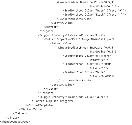
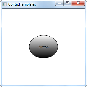
Basically control templates are implemented as styles, but actually they are not simple styles. The difference between styles and templates is that styles affect existing properties within an existing template, whereas a control template can completely override or replace properties and layout of a control. Talking in code terms, a control template is defined within a Style definition, setting the Template property and assigning the Value of this property. Code in Listing 33.3 shows how to utilize an Ellipse as the control template for buttons, where the background gradient color changes when the button is pressed or when the mouse pointer flies over it.
Listing 33.3 Building a Control Template

Tip: Restyling Windows
Control templates are not limited to user controls but they can be successfully implemented for completely restyling Window objects layout so that you can create custom windows while still taking advantage of their behavior. The template’s TargetType is therefore Window.
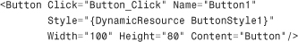
If you look at the code, you can notice how the button default aspect is replaced by an Ellipse within the ControlTemplate value of the Template property. Probably some concepts you learned about styles help you understand what is happening. Triggers enable changing the background color according to specific mouse actions. Don’t forget to add the ContentPresenter element in your custom templates because it enables showing text or other UI elements within your control. Generally control templates are assigned to controls using the DynamicResource markup extension. The following XAML line assigns the above custom control template to a button:
Changes will be also automatically reflected at design time. You can also assign an event handler for the Click event to ensure that everything is working fine:
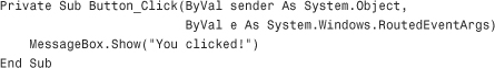
Figure 33.11 shows how the button looks within the running application when the mouse pointer passes over it.
Figure 33.11 The custom control template designs a button as an ellipse.
-
No Comment