- Title Page
- Copyright Page
- Dedication
- Contents at a Glance
- Table of Contents
- Foreword
- About the Author
- Acknowledgments
- We Want to Hear from You!
- Reader Services
- Part I. Learning the Basics of VB
- Chapter 1. Introducing the .NET Framework 4.0
- Chapter 2. Getting Started with the Visual Studio 2010 IDE
- Chapter 3. The Anatomy of a Visual Basic Project
- Chapter 4. Data Types and Expressions
- Chapter 4. Data Types and Expressions
- Common Type System
- Understanding Value Types
- Understanding Reference Types
- Differences Between Value Types and Reference Types
- Converting Between Value Types and Reference Types
- Conversion Operators
- Working with .NET Fundamental Types
- Common Operators
- Iterations, Loops, and Conditional Code Blocks
- Chapter 5. Debugging Visual Basic 2010 Applications
- Chapter 6. Handling Errors and Exceptions
- Part II. Object-Oriented Programming with Visual Basic 2010
- Chapter 7. Class Fundamentals
- Chapter 8. Managing an Object’s Lifetime
- Chapter 9. Organizing Types Within Namespaces
- Chapter 10. Modules
- Chapter 11. Structures and Enumerations
- Chapter 12. Inheritance
- Chapter 13. Interfaces
- Chapter 14. Generics and Nullable Types
- Chapter 15. Delegates and Events
- Chapter 16. Working with Collections
- Chapter 16. Working with Collections
- Understanding Collections Architecture
- Working with Nongeneric Collections
- The ArrayList Collection
- The Queue Collection
- The Stack Collection
- The HashTable Collection
- The ListDictionary Collection
- The OrderedDictionary Collection
- The SortedList Collection
- The HybridDictionary Collection
- The StringCollection Collection
- The StringDictionary Collection
- The NameValueCollection Collection
- The BitArray Collection
- The Bitvector32 Collection
- Working with Generic Collections
- The List(Of T) Collection
- Working with Collection Initializers
- The ReadOnlyCollection(Of T) Collection
- The Dictionary(Of TKey, TValue) Collection
- The SortedDictionary(Of TKey, TValue) Collection
- The ObservableCollection(Of T) Collection
- The ReadonlyObservableCollection(Of T) Collection
- The LinkedList(Of T) Collection
- The Queue(Of T) and Stack(Of T) Collections
- Building Custom Collections
- Concurrent Collections
- Chapter 17. Visually Designing Objects
- Chapter 18. “Generate From Usage” Coding Techniques
- Part III. Advanced VB Language features
- Chapter 19. Manipulating Files and Streams
- Chapter 20. The My Namespace
- Chapter 21. Advanced Language Features
- Part IV. Data Access with ADO.NET and LINQ
- Chapter 22. Introducing ADO.NET and DataSets
- Chapter 23. Introducing LINQ
- Chapter 24. LINQ to Objects
- Chapter 24. LINQ to Objects
- Introducing LINQ to Objects
- Querying in Memory Objects
- Introducing Standard Query Operators
- Projection Operators
- Restriction Operators
- Aggregation Operators
- Understanding the Let Keyword
- Conversion Operators
- Generation Operators
- Ordering Operators
- Set Operators
- Grouping Operators
- Union Operators
- Equality Operators
- Quantifiers
- Concatenation Operators
- Elements Operators
- Partitioning Operators
- Chapter 25. LINQ to SQL
- Chapter 26. LINQ to DataSets
- Chapter 27. Introducing ADO.NET Entity Framework
- Chapter 28. Manipulating Xml Documents with LINQ and Xml Literals
- Chapter 29. Overview of Parallel LINQ
- Part V. Building Windows Applications
- Chapter 30. Creating Windows Forms 4.0 Applications
- Chapter 31. Creating WPF Applications
- Chapter 31. Creating WPF Applications
- What Is WPF?
- WPF Architecture
- Building WPF Applications with Visual Studio 2010
- Understanding the eXtensible Application Markup Language (XAML)
- Understanding Visual Tree and Logical Tree
- Handling Events in WPF
- Arranging Controls with Panels
- Managing Windows
- Introducing the Application Object
- Brief Overview of WPF Browser Applications
- Chapter 32. WPF Common Controls
- Chapter 32. WPF Common Controls
- Introducing WPF Controls Features
- Understanding the ContentControl
- Understanding Common Controls
- Border
- Button
- Calendar
- CheckBox
- ComboBox
- DataGrid
- DatePicker
- DocumentViewer
- Ellipse
- Expander
- Frame
- GroupBox
- Image
- Label
- ListBox
- ListView
- MediaElement
- Menu
- PasswordBox
- ProgressBar
- RadioButton
- Rectangle
- RichTextBox
- ScrollBar
- ScrollViewer
- Separator
- Slider
- StatusBar
- TabControl
- TextBlock
- TextBox
- ToolBar
- TreeView
- WebBrowser
- WindowsFormsHost
- Using Common Dialogs
- Chapter 33. Brushes, Styles, Templates, and Animations in WPF
- Chapter 34. Manipulating Documents and Media
- Chapter 35. Introducing Data-Binding
- Chapter 36. Localizing Applications
- Part VI. Building Web Applications
- Chapter 37. Building ASP.NET Web Applications
- Chapter 38. Publishing ASP.NET Web Applications
- Chapter 39. Building Rich Internet Applications with Silverlight
- Chapter 39. Building Rich Internet Applications with Silverlight
- Introducing Silverlight
- Creating Silverlight Projects with Visual Basic 2010
- Adding Controls and Handling Events
- Playing Media
- Animating UI Elements
- Introducing Navigation Applications
- Introducing WCF RIA Services
- “Out of Browser” Applications
- Chapter 40. Building and Deploying Applications for Windows Azure
- Part VII. Networking and Exposing Data Through Networks
- Chapter 41. Creating and Consuming WCF Services
- Chapter 42. Implementing and Consuming WCF Data Services
- Part VIII. Advanced .NET Framework with VB 2010
- Chapter 43. Serialization
- Chapter 44. Processes and Multithreading
- Chapter 45. Parallel Programming
- Chapter 46. Working with Assemblies
- Chapter 47. Reflection
- Chapter 48. Coding Attributes
- Chapter 49. Platform Invokes and Interoperability with the COM Architecture
- Chapter 50. Documenting the Source Code
- Chapter 51. Advanced Compilations with MSBuild
- Chapter 52. Building Customizations for Microsoft Office
- Part IX. Applications Deployment
- Chapter 53. Understanding the Global Assembly Cache
- Chapter 54. Setup & Deployment Projects for Windows Installer
- Chapter 55. Deploying Applications with ClickOnce
- Part X. Mastering the Visual Studio 2010 IDE
- Chapter 56. Advanced IDE Features
- Chapter 57. Introducing the Visual Studio Extensibility
- Chapter 58. Advanced Analysis Tools
- Chapter 59. Testing Code with Unit Tests, Test-Driven Development, and Code Contracts
- Appendixes
- Index
Introducing Styles
One of the biggest benefits of WPF user controls is that their layout is completely customizable. As explained further in the “Introducing Control Templates” section, you can completely redefine their layout and behavior using templates. There are situations in which you have multiple controls of the same type and you want them to have the same properties. For example, you might want to implement three buttons and each button should have the same width, height, and font as the other ones. To avoid the need of applying the same properties for each control, which can be annoying if you have dozens of controls, you can define a Style. A style is an instance of the System.Windows.Style class and enables you to define a set of common properties for the specified type of control. Styles are defined within the Resources section of a Window, of panels, or at application level (Application.xaml file). Each style must have an identifier assigned via the x:Key attribute and is applied to controls assigning their Style property. Code in Listing 33.1 defines a style for buttons and applies the style to three buttons in the interface.
Listing 33.1 Defining and Assigning a Style for Buttons
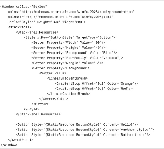
Understanding the scope of styles is important. In the code example the style is defined at the panel level, meaning that buttons outside the panel cannot get the style applied. Notice how the TargetType property enables specifying the target control type. If not specified, WPF assumes FrameworkElement as the target. Properties are specified via Setter elements. Each setter requires the target Property specification and its value. You can also define a complex value splitting its definition creating a Setter.Value node, which can store multiple lines of XAML code, as in Listing 33.1 where the technique is used to define a LinearGradientBrush gradient. Finally notice how the new style is assigned to buttons setting the Style property, pointing to the style identifier via a XAML markup extension named StaticResource.
StaticResource and DynamicResource
In different situations you can often find controls pointing to resources via StaticResource or DynamicResource markup extensions. The difference is that a StaticResource is something defined in the XAML that will not change during the application lifetime. It will be assigned only once even before its actual point of use. A DynamicResource instead is assigned when its value is effectively required and if its content changes during the application lifetime, its changes are reflected to the caller.
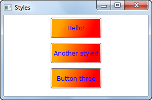
Running the code can produce the interesting result shown in Figure 33.10.
Figure 33.10 Styling multiple controls of the same type with Styles.
On the Visual Basic side, you create and apply a style as in the following code snippet:
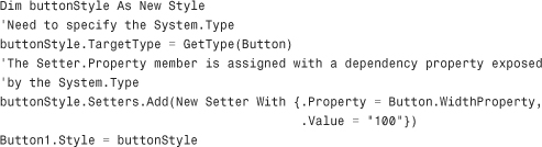
This can be particularly useful if you need to generate a style at runtime, although you generally define styles at design time; therefore, declaring and applying them via XAML is the most preferable way (so that designers can eventually take advantage of XAML for their work).
-
No Comment