Chapter 3. Understanding Cascading Style Sheets
In the previous chapter, you learned the basics of HTML and XHTML, including how to set up a skeletal HTML template for all your web content. In this chapter, you will learn how to fine-tune the display of your web content using Cascading Style Sheets (CSS).
The concept behind style sheets is simple: You create a style sheet document that specifies the fonts, colors, spacing, and other characteristics that establish a unique look for a website. You then link every page that should have that look to the style sheet, instead of specifying all those styles repeatedly in each separate document. Therefore, when you decide to change your official corporate typeface or color scheme, you can modify all your web pages at once just by changing one or two entries in your style sheet rather than changing them in all of your static web files. So, a style sheet is a grouping of formatting instructions that controls the appearance of several HTML pages at once.
Style sheets enable you to set a great number of formatting characteristics, including exacting typeface controls, letter and line spacing, and margins and page borders, just to name a few. Style sheets also enable sizes and other measurements to be specified in familiar units, such as inches, millimeters, points, and picas. You can also use style sheets to precisely position graphics and text anywhere on a web page, either at specific coordinates or relative to other items on the page.
Note
If you have three or more web pages that share (or should share) similar formatting and fonts, you might want to create a style sheet for them as you read this chapter. Even if you choose not to create a complete style sheet, you’ll find it helpful to apply styles to individual HTML elements directly within a web page.
In short, style sheets bring a sophisticated level of display to the Web. And they do so—you’ll pardon the expression—with style.
How CSS Works
The technology behind style sheets is called CSS, which stands for Cascading Style Sheets. CSS is a language that defines style constructs such as fonts, colors, and positioning, which are used to describe how information on a web page is formatted and displayed. CSS styles can be stored directly in an HTML web page or in a separate style sheet file. Either way, style sheets contain style rules that apply styles to elements of a given type. When used externally, style sheet rules are placed in an external style sheet document with the file extension .css.
A style rule is a formatting instruction that can be applied to an element on a web page, such as a paragraph of text or a link. Style rules consist of one or more style properties and their associated values. An internal style sheet is placed directly within a web page, whereas an external style sheet exists in a separate document and is simply linked to a web page via a special tag—more on this tag in a moment.
The cascading part of the name CSS refers to the manner in which style sheet rules are applied to elements in an HTML document. More specifically, styles in a CSS style sheet form a hierarchy in which more specific styles override more general styles. It is the responsibility of CSS to determine the precedence of style rules according to this hierarchy, which establishes a cascading effect. If that sounds a bit confusing, just think of the cascading mechanism in CSS as being similar to genetic inheritance, in which general traits are passed from parents to a child, but more specific traits are entirely unique to the child. Base style rules are applied throughout a style sheet but can be overridden by more specific style rules.
Note
You might notice that I use the term element a fair amount in this chapter (and I will for the rest of the book, for that matter). An element is simply a piece of information (content) in a web page, such as an image, a paragraph, or a link. Tags are used to code elements, and you can think of an element as a tag complete with descriptive information (attributes, text, images, and so on) within the tag.
A quick example should clear things up. Take a look at the following code to see whether you can tell what’s going on with the color of the text:
<div style="color:green">
This text is green.
<p style="color:blue">This text is blue.</p>
<p>This text is still green.</p>
</div>
In the previous example, the color green is applied to the <div> tag via the color style property. Therefore, the text in the <div> tag is colored green. Because both <p> tags are children of the <div> tag, the green text style cascades down to them. However, the first <p> tag overrides the color style and changes it to blue. The end result is that the first line (not surrounded by a paragraph tag) is green, the first official paragraph is blue, and the second official paragraph retains the cascaded green color.
If you made it through that description on your own, congratulations. If you understood it after I explained it in the text, congratulations to you as well. Understanding CSS isn’t like understanding rocket science, although many people will try to convince you that it is (so that they can charge high consultation fees, most likely!).
Like many web technologies, CSS has evolved over the years. The original version of CSS, known as Cascading Style Sheets Level 1 (CSS1) was created in 1996. The later CSS 2 standard was created in 1998, and CSS 2 is still in use today. All modern web browsers support CSS 2, and you can safely use CSS 2 style sheets without too much concern. So when I talk about CSS throughout the book, I’m referring to CSS 2.
You’ll find a complete reference guide to CSS at http://www.w3.org/Style/CSS/. The rest of this chapter explains how to put CSS to good use.
A Basic Style Sheet
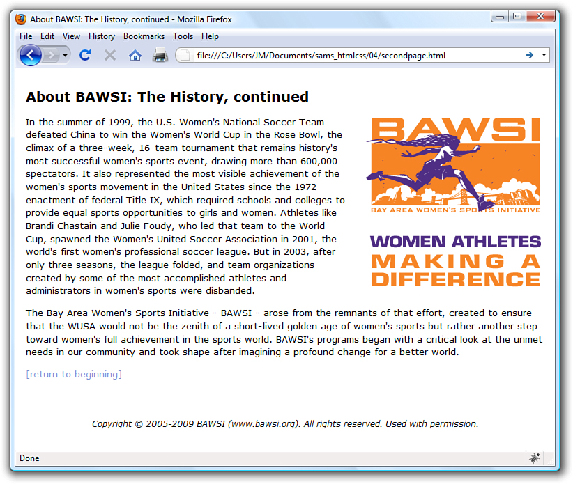
Despite their intimidating power, style sheets can be simple to create. Consider the web pages shown in Figure 3.1 and Figure 3.2. These pages share several visual properties that could be put into a common style sheet:
• They use a large, bold Verdana font for the headings and a normal size and weight Verdana font for the body text.
• They use an image named logo.gif floating within the content and on the right side of the page.
• All text is black except for subheadings, which are purple.
• They have margins on the left side and at the top.
• There is vertical space between lines of text.
• The footnotes are centered and in small print.
Figure 3.1 This page uses a style sheet to fine-tune the appearance and spacing of the text and images.
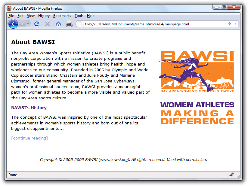
Figure 3.2 This page uses the same style sheet as the one shown in Figure 3.1, thus maintaining a consistent look and feel.
Listing 3.1 shows the code for the style sheet specifying these properties.
Listing 3.1 A Single External Style Sheet
body {
font-size: 10pt;
font-family: Verdana, Geneva, Arial, Helvetica, sans-serif;
color: black;
line-height: 14pt;
padding-left: 5pt;
padding-right: 5pt;
padding-top: 5pt;
}
h1 {
font: 14pt Verdana, Geneva, Arial, Helvetica, sans-serif;
font-weight: bold;
line-height: 20pt;
}
p.subheader {
font-weight: bold;
color: #593d87;
}
img {
padding: 3pt;
float: right;
}
a {
text-decoration: none;
}
a:link, a:visited {
color: #8094d6;
}
a:hover, a:active {
color: #FF9933;
}
div.footer {
font-size: 9pt;
font-style: italic;
line-height: 12pt;
text-align: center;
padding-top: 30pt;
}
This might initially appear to be a lot of code, but if you look closely, you’ll see that there isn’t a lot of information on each line of code. It’s fairly standard to place individual style rules on their own line to help make style sheets more readable, but that is a personal preference; you could put all the rules on one line as long as you kept using the semicolon to separate each rule (more on that in a bit). Speaking of code readability, perhaps the first thing you noticed about this style sheet code is that it doesn’t look anything like normal HTML code. CSS uses a language all its own to specify style sheets.
Of course, the listing includes some familiar HTML tags. As you might guess, body, h1, p, img, a, and div in the style sheet refer to the corresponding tags in the HTML documents to which the style sheet will be applied. The curly braces after each tag name contain the specifications for how all content within that tag should appear.
In this case, the style sheet says that all body text should be rendered at a size of 10 points, in the Verdana font (if possible), with the color black, and 14 points between lines. If the user does not have the Verdana font installed, the list of fonts in the style sheet represents the order in which the browser should search for fonts to use: Geneva, then Arial, and then Helvetica. If the user has none of those fonts, the browser will use whatever default sans serif font is available. Additionally, the page should have left, right, and top margins of 5 points each.
Any text within an <h1> tag should be rendered in boldface Verdana at a size of 14 points. Moving on, any paragraph that uses only the <p> tag will inherit all the styles indicated by the body element. However, if the <p> tag uses a special class named subheader, the text will appear bold and in the color #593d87 (a purple color).
The pt after each measurement in Listing 3.1 means points (there are 72 points in an inch). If you prefer, you can specify any style sheet measurement in inches (in), centimeters (cm), pixels (px), or widths-of-a-letter-m, which are called ems (em).
Note
You can specify font sizes as large as you like with style sheets, although some display devices and printers will not correctly handle fonts larger than 200 points.
You might have noticed that each style rule in the listing ends with a semicolon (;). Semicolons are used to separate style rules from each other. It is therefore customary to end each style rule with a semicolon, so you can easily add another style rule after it.
To link this style sheet to HTML documents, include a <link /> tag in the <head> section of each document. Listing 3.2 shows the HTML code for the page shown in Figure 3.1. It contains the following <link /> tag:
<link rel="stylesheet" type="text/css" href="styles.css" />
This assumes that the style sheet is stored under the name styles.css in the same folder as the HTML document. As long as the web browser supports style sheets—and all modern browsers do support style sheets—the properties specified in the style sheet will apply to the content in the page without the need for any special HTML formatting code. This confirms the ultimate goal of XHTML, which is to provide a separation between the content in a web page and the specific formatting required to display that content.
Listing 3.2 HTML Code for the Page Shown in Figure 3.1
<?xml version="1.0" encoding="UTF-8"?>
<!DOCTYPE html PUBLIC "-//W3C//DTD XHTML 1.1//EN"
"http://www.w3.org/TR/xhtml11/DTD/xhtml11.dtd">
<html xmlns="http://www.w3.org/1999/xhtml" xml:lang="en">
<head>
<title>About BAWSI</title>
<link rel="stylesheet" type="text/css" href="styles.css" />
</head>
<body>
<h1>About BAWSI</h1>
<p><img src="logo.gif" alt="BAWSI logo"/>The Bay Area Women's
Sports Initiative (BAWSI) is a public benefit, nonprofit
corporation with a mission to create programs and partnerships
through which women athletes bring health, hope and wholeness to
our community. Founded in 2005 by Olympic and World Cup soccer
stars Brandi Chastain and Julie Foudy and Marlene Bjornsrud,
former general manager of the San Jose CyberRays women's
professional soccer team, BAWSI provides a meaningful path for
women athletes to become a more visible and valued part of the
Bay Area sports culture.</p>
<p class="subheader">BAWSI's History</p>
<p>The concept of BAWSI was inspired by one of the most
spectacular achievements in women's sports history and born out
of one its biggest disappointments... </p>
<p><a href="secondpage.html">[continue reading]</a></p>
<div class="footer">Copyright © 2005-2009 BAWSI
(www.bawsi.org). All rights reserved. Used with permission.</div>
</body>
</html>
Tip
In most web browsers, you can view the style rules in a style sheet by opening the .css file and choosing Notepad or another text editor as the helper application to view the file. (To determine the name of the .css file, look at the HTML source of any web page that links to it.) To edit your own style sheets, just use a text editor.
Note
Although CSS is widely supported in all modern web browsers, it hasn’t always enjoyed such wide support. Additionally, not every browser’s support of CSS is flawless. To find out about how major browsers compare to each other in terms of CSS support, take a look at this website: http://www.quirksmode.org/css/contents.html.
The code in Listing 3.2 is interesting because it contains no formatting of any kind. In other words, there is nothing in the HTML code that dictates how the text and images are to be displayed—no colors, no fonts, nothing. Yet the page is carefully formatted and rendered to the screen, thanks to the link to the external style sheet, styles.css. The real benefit to this approach is that you can easily create a site with multiple pages that maintains a consistent look and feel. And you have the benefit of isolating the visual style of the page to a single document (the style sheet) so that one change impacts all pages.
A CSS Style Primer
You now have a basic knowledge of CSS style sheets and how they are based on style rules that describe the appearance of information in web pages. The next few sections of this chapter provide a quick overview of some of the most important style properties and allow you to get started using CSS in your own style sheets.
CSS includes various style properties that are used to control fonts, colors, alignment, and margins, to name just a few. The style properties in CSS can be generally grouped into two major categories:
• Layout properties—Consist of properties that affect the positioning of elements on a web page, such as margins, padding, alignment, and so on
• Formatting properties—Consist of properties that affect the visual display of elements within a website, such as the font type, size, color, and so on
Layout Properties
CSS layout properties are used to determine how content is placed on a web page. One of the most important layout properties is the display property, which describes how an element is displayed with respect to other elements. There are four possible values for the display property:
• block—The element is displayed on a new line, as in a new paragraph.
Note
The display property relies on a concept known as relative positioning, which means that elements are positioned relative to the location of other elements on a page. CSS also supports absolute positioning, which enables you to place an element at an exact location on a page independent of other elements. You’ll learn more about both of these types of positioning in Part III, “Advanced Web Page Design with CSS.”
• list-item—The element is displayed on a new line with a list-item mark (bullet) next to it.
• inline—The element is displayed inline with the current paragraph.
• none—The element is not displayed; it is hidden.
It’s easier to understand the display property if you visualize each element on a web page occupying a rectangular area when displayed—the display property controls the manner in which this rectangular area is displayed. For example, the block value results in the element being placed on a new line by itself, whereas the inline value places the element next to the content just before it. The display property is one of the few style properties that can be applied in most style rules. Following is an example of how to set the display property:
display:block;
You control the size of the rectangular area for an element with the width and height properties. Like many size-related CSS properties, width and height property values can be specified in several different units of measurement:
• in—Inches
• cm—Centimeters
• mm—Millimeters
• px—Pixels
• pt—Points
You can mix and match units however you choose within a style sheet, but it’s generally a good idea to be consistent across a set of similar style properties. For example, you might want to stick with points for font properties or pixels for dimensions. Following is an example of setting the width of an element using pixel units:
width: 200px;
Formatting Properties
CSS formatting properties are used to control the appearance of content on a web page, as opposed to controlling the physical positioning of the content. One of the most popular formatting properties is the border property, which is used to establish a visible boundary around an element with a box or partial box. The following border properties provide a means of describing the borders of an element:
• border-width—The width of the border edge
• border-color—The color of the border edge
• border-style—The style of the border edge
• border-left—The left side of the border
• border-right—The right side of the border
• border-top—The top of the border
• border-bottom—The bottom of the border
• border—All the border sides
The border-width property is used to establish the width of the border edge. It is often expressed in pixels, as the following code demonstrates:
border-width:5px;
Not surprisingly, the border-color and border-style properties are used to set the border color and style. Following is an example of how these two properties are set:
border-color:blue;
border-style:dotted;
The border-style property can be set to any of the following values:
• solid—A single-line border
• double—A double-line border
• dashed—A dashed border
• dotted—A dotted border
• groove—A border with a groove appearance
• ridge—A border with a ridge appearance
• inset—A border with an inset appearance
• outset—A border with an outset appearance
• none—No border
The default value of the border-style property is none, which is why elements don’t have a border unless you set the border property to a different style. The most common border styles are the solid and double styles.
Note
The exception to the default border-style of none is when an image is placed within an <a> tag so that it serves as a linked image. In that case, a solid border is automatically set by default. That’s why you often see linked images with the style border-style:none, which turns off the automatic border.
The border-left, border-right, border-top, and border-bottom properties enable you to set the border for each side of an element individually. If you want a border to appear the same on all four sides, you can use the single border property by itself, which expects the following styles separated by a space: border-width, border-style, and border-color. Following is an example of using the border property to set a border that consists of two (double) red lines that are a total of 10 pixels in width:
border:10px double red;
Whereas the color of an element’s border is set with the border-color property, the color of the inner region of an element is set using the color and background-color properties. The color property sets the color of text in an element (foreground) and the background-color property sets the color of the background behind the text. Following is an example of setting both color properties to predefined colors:
color:black;
background-color:orange;
You can also assign custom colors to these properties by specifying the colors in hexadecimal (covered in more detail in Chapter 8, “Working with Colors, Images, and Multimedia”) or as RGB (Red, Green, Blue) decimal values, just as you do in HTML:
background-color:#999999;
color:rgb(0,0,255);
You can also control the alignment and indentation of web page content without too much trouble. This is accomplished with the text-align and text-indent properties, as the following code demonstrates:
text-align:center;
text-indent:12px;
After you have an element properly aligned and indented, you might be interested in setting its font. The following font properties are used to set the various parameters associated with fonts:
• font-family—The family of the font
• font-size—The size of the font
• font-style—The style of the font (normal or italic)
• font-weight—The weight of the font (light, medium, bold, and so on)
The font-family property specifies a prioritized list of font family names. A prioritized list is used instead of a single value to provide alternatives in case a font isn’t available on a given system. The font-size property specifies the size of the font using a unit of measurement, usually points. Finally, the font-style property sets the style of the font and the font-weight property sets the weight of the font. Following is an example of setting these font properties:
font-family: Arial, sans-serif;
font-size: 36pt;
font-style: italic;
font-weight: medium;
Now that you know a whole lot more about style properties and how they work, refer back at Listing 3.1 and see whether it makes a bit more sense. Here’s a recap of the style properties used in that style sheet, which you can use as a guide for understanding how it works:
• font—Lets you set many font properties at once. You can specify a list of font names separated by commas; if the first is not available, the next is tried, and so on. You can also include the words bold and/or italic and a font size. Each of these font properties can be specified separately with font-family, font-size, font-weight, and font-style if you prefer.
• line-height—Also known in the publishing world as leading. This sets the height of each line of text, usually in points.
• color—Sets the text color using the standard color names or hexadecimal color codes (see Chapter 8 for more details).
• text-decoration—Useful for turning link underlining off—simply set it to none. The values of underline, italic, and line-through are also supported. The application of styles to links is covered in more detail in Chapter 7, “Using External and Internal Links.”
• text-align—Aligns text to the left, right, or center, along with justifying the text with a value of justify.
• padding—Adds padding to the left, right, top, and bottom of an element; this padding can be in measurement units or a percentage of the page width. Use padding-left and padding-right if you want to add padding to the left and right of the element independently. Use padding-top or padding-bottom to add padding to the top or bottom of the element, as appropriate. You’ll learn more about these style properties in Chapters 9, “Working with Margins, Padding, Alignment, and Floating,” and 10, “Understanding the CSS Box Model and Positioning.”
Using Style Classes
This is a “teach yourself” book, so you don’t have to go to a single class to learn how to give your pages great style, although you do need to learn what a style class is. Whenever you want some of the text on your pages to look different from the other text, you can create what amounts to a custom-built HTML tag. Each type of specially formatted text you define is called a style class. A style class is a custom set of formatting specifications that can be applied to any element in a web page.
Before showing you a style class, I need to take a quick step back and clarify some CSS terminology. First off, a CSS style property is a specific style that can be assigned a value, such as color or font-size. You associate a style property and its respective value with elements on a web page by using a selector. A selector is used to identify tags on a page to which you apply styles. Following is an example of a selector, a property, and a value all included in a basic style rule:
h1 { font: 36pt Courier; }
In this code, h1 is the selector, font is the style property, and 36pt Courier is the value. The selector is important because it means that the font setting will be applied to all h1 elements in the web page. But maybe you want to differentiate between some of the h1 elements—what then? The answer lies in style classes.
Suppose you want two different kinds of <h1> headings for use in your documents. You would create a style class for each one by putting the following CSS code in a style sheet:
h1.silly { font: 36pt Comic Sans; }
h1.serious { font: 36pt Arial; }
Notice that these selectors include a period (.) after h1, followed by a descriptive class name. To choose between the two style classes, use the class attribute, like this:
<h1 class="silly">Marvin's Munchies Inc. </h1>
<p>Text about Marvin's Munchies goes here. </p>
<h1 class="serious">MMI Investor Information</h1>
<p>Text for business investors goes here.</p>
When referencing a style class in HTML code, simply specify the class name in the class attribute of an element. In the previous example, the words Marvin's Munchies Inc. would appear in a 36-point Comic Sans font, assuming that you included a <link /> to the style sheet at the top of the web page and assuming that the user has the Comic Sans font installed. The words MMI Investor Information would appear in the 36-point Arial font instead. You can see another example of classes in action in Listing 3.2; look for the subheader <p> class and the footer <div> class.
What if you want to create a style class that could be applied to any element, rather than just headings or some other particular tag? You can associate a style class with the <div> tag, as in Listing 3.2, which is used to enclose any text in a block that is somewhat similar to a paragraph of text; the <div> tag is another useful container element.
You can essentially create your own custom HTML tag by using the div selector followed by a period (.) followed by any style class name you make up and any style specifications you choose. That tag can control any number of font, spacing, and margin settings all at once. Wherever you want to apply your custom tag in a page, use a <div> tag with the class attribute followed by the class name you created.
Tip
You might have noticed a change in the coding style when multiple properties are included in a style rule. For style rules with a single style, you’ll commonly see the property placed on the same line as the rule, like this:
div.footer { font-size: 9pt; }
However, when a style rule contains multiple style properties, it’s much easier to read and understand the code if you list the properties one-per-line, like this:
div.footer {
font-size:9pt;
font-style: italic;
line-height:12pt;
text-align: center;
padding-top: 30pt;
}
For example, the style sheet in Listing 3.1 includes the following style class specification:
div.footer {
font-size: 9pt;
font-style: italic;
line-height: 12pt;
text-align: center;
padding-top: 30pt;
}
This style class is applied in Listing 3.2 with the following tag:
<div class="footer">
Everything between that tag and the closing </div> tag in Listing 3.2 appears in 9-point, centered, italic text with 12-point vertical line spacing and 30 points of padding at the top of the element.
What makes style classes so valuable is how they isolate style code from web pages, effectively allowing you to focus your HTML code on the actual content in a page, not how it is going to appear on the screen. Then you can focus on how the content is rendered to the screen by fine-tuning the style sheet. You might be surprised by how a relatively small amount of code in a style sheet can have significant effects across an entire website. This makes your pages much easier to maintain and manipulate.
Using Style IDs
When you create custom style classes, you can use those classes as many times as you would like—they are not unique. However, there will be some instances when you want to have precise control over unique elements for layout or formatting purposes (or both). In such instances, look to IDs instead of classes.
A style ID is a custom set of formatting specifications that can be applied only to one element in a web page. You can use IDs across a set of pages but only once per time within each page.
For example, suppose you have a title within the body of all your pages. Each page has only one title, but all the pages themselves include one instance of that title. Following is an example of a selector with an ID indicated, plus a property and a value:
p#title {font: 24pt Verdana, Geneva, Arial, sans-serif}
Notice that this selector includes a hash mark, or pound sign (#), after p, followed by a descriptive ID name. When referencing a style ID in HTML code, simply specify the ID name in the id attribute of an element, like so:
<p id="title">Some Title Goes Here</p>
Everything between the opening and closing <p> tags will appear in 24-point Verdana text—but only once on any given page. You will often see style IDs used to define specific parts of a page for layout purposes, such as a header area, footer area, main body area, and so on. These types of areas in a page will appear only once per page, so using an ID rather than a class is the appropriate choice.
Internal Style Sheets and Inline Styles
In some situations, you might want to specify styles that will be used in only one web page, in which case you can enclose a style sheet between <style> and </style> tags and include it directly in an HTML document. Style sheets used in this manner must appear in the <head> of an HTML document. No <link /> tag is needed, and you cannot refer to that style sheet from any other page (unless you copy it into the beginning of that document, too). This kind of style sheet is known as an internal style sheet, as you learned earlier in the chapter.
Listing 3.3 shows an example of how you might specify an internal style sheet.
Listing 3.3 A Web Page with an Internal Style Sheet
<?xml version="1.0" encoding="UTF-8"?>
<!DOCTYPE html PUBLIC "-//W3C//DTD XHTML 1.1//EN"
"http://www.w3.org/TR/xhtml11/DTD/xhtml11.dtd">
<html xmlns="http://www.w3.org/1999/xhtml" xml:lang="en">
<head>
<title>Some Page</title>
<style type="text/css">
div.footer {
font-size: 9pt;
line-height: 12pt;
text-align: center;
}
</style>
</head>
<body>
...
<div class="footer">
Copyright 2009 Acme Products, Inc.
</div>
</body>
</html>
Note
<span> and </span> are dummy tags that do nothing in and of themselves except specify a range of content to apply any style attributes that you add. The only difference between <div> and <span> is that <div> is a block element and therefore forces a line break, whereas <span> doesn’t. Therefore, you should use <span> to modify the style of any portion of text that is to appear in the middle of a sentence or paragraph without any line break.
In the listing code, the div.footer style class is specified in an internal style sheet that appears in the head of the page. The style class is now available for use within the body of this page. And, in fact, it is used in the body of the page to style the copyright notice.
Internal style sheets are handy if you want to create a style rule that is used multiple times within a single page. However, in some instances you might need to apply a unique style to one particular element. This calls for an inline style rule, which allows you to specify a style for only a small part of a page, such as an individual element. For example, you can create and apply a style rule within a <p>, <div>, or <span> tag via the style attribute. This type of style is known as an inline style because it is specified right there in the middle of the HTML code.
Here’s how a sample style attribute might look:
<p style="color:green">
This text is green, but <span style="color:red">this text is
red.</span>
Back to green again, but...
</p>
<p>
...now the green is over, and we're back to the default color
for this page.
</p>
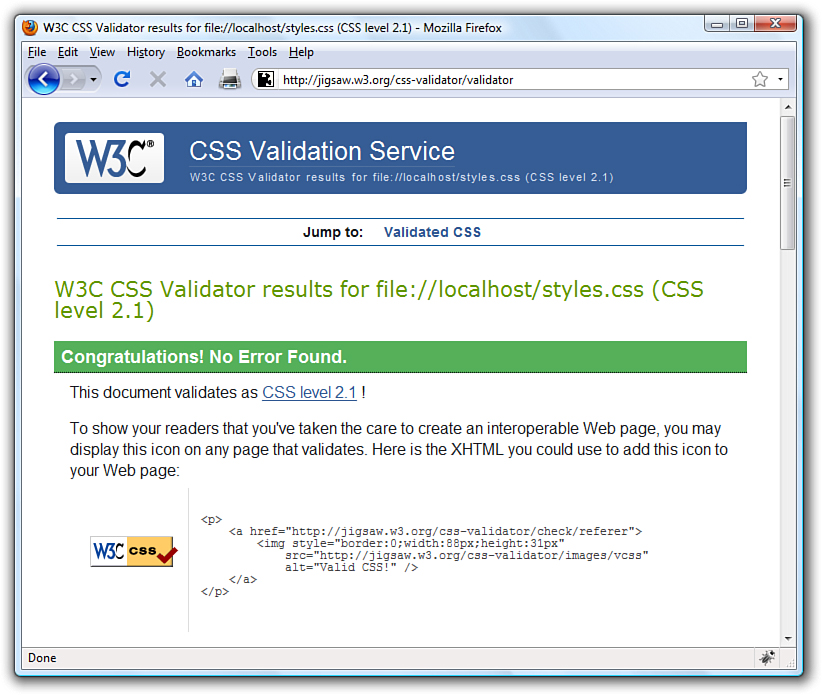
Figure 3.3 The W3C CSS Validator shows there are no errors in the style sheet contents of Listing 3.1.
This code makes use of the <span> tag to show how to apply the color style property in an inline style rule. In fact, both the <p> tag and the <span> tag in this example use the color property as an inline style. What’s important to understand is that the color:red style property overrides the color:green style property for the text appearing between the <span> and </span> tags. Then in the second paragraph, neither of the color styles applies because it is a completely new paragraph that adheres to the default color of the entire page.
Summary
In this chapter, you learned that a style sheet can control the appearance of many HTML pages at once. It can also give you extremely precise control over the typography, spacing, and positioning of HTML elements. You also discovered that by adding a style attribute to almost any HTML tag, you can control the style of any part of an HTML page without referring to a separate style sheet document.
You learned about three main approaches to including style sheets in your website: a separate style sheet file with the extension .css that is linked to in the <head> of your documents, a collection of style rules placed in the head of the document within the <style> tag, and as rules placed directly in an HTML tag via the style attribute.
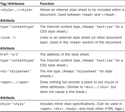
Table 3.1 summarizes the tags discussed in this chapter. Refer to the CSS 2 style sheet standards at http://www.w3c.org for details on what options can be included after the <style> tag or the style attribute.
Table 3.1 HTML Tags and Attributes Covered in Chapter 3
Q&A
Q. Say I link a style sheet to my page that says all text should be blue, but there’s a <span style="font-color:red"> tag in the page somewhere. Will that text display as blue or will it display as red?
A. Red. Local inline styles always take precedence over external style sheets. Any style specifications you put between <style> and </style> tags at the top of a page will also take precedence over external style sheets (but not over inline styles later in the same page). This is the cascading effect of style sheets that I mentioned earlier in the chapter. You can think of cascading style effects as starting with an external style sheet, which is overridden by an internal style sheet, which is overridden by inline styles.
Q. Can I link more than one style sheet to a single page?
A. Sure. For example, you might have a sheet for formatting (text, fonts, colors, and so on) and another one for layout (margins, padding, alignment, and so on)—just include a <link /> for both. Technically speaking, the CSS standard requires web browsers to give the user the option to choose between style sheets when multiple sheets are presented via multiple <link /> tags. However, in practice, all major web browsers simply include every style sheet. The preferred technique for linking in multiple style sheets involves using the special @import command. Following is an example of importing multiple style sheets with @import:
@import url(styles1.css);
@import url(styles2.css);
Similar to the <link /> tag, the @import command must be placed in the head of a web page. You learn more about this handy little command in Chapter 25, “Creating Print-Friendly Web Pages,” when you learn how to create a style sheet specifically for printing web pages.
Workshop
The workshop contains quiz questions and exercises to help you solidify your understanding of the material covered. Try to answer all questions before looking at the “Answers” section that follows.
Quiz
1. What code would you use to create a style sheet to specify 30-point blue Arial headings and all other text in double-spaced, 10-point blue Times Roman (or the default browser font)?
2. If you saved the style sheet you made for Question 1 as corporate.css, how would you apply it to a web page named intro.html?
3. How many different ways are there to ensure style rules can be applied to your content?
Answers
1. Your style sheet would include the following:
h1 { font: 30pt blue Arial; }
body { font: 10pt blue; }
2. Put the following tag between the <head> and </head> tags of the intro.html document:
<link rel="stylesheet" type="text/css" href="corporate.css" />
3. Three: externally, internally, and inline.
Exercises
• Using the style sheet you created earlier in this chapter, add some style classes to your style sheet. To see the fruits of your labor, apply those classes to the HTML page you created as well. Use classes with your <h1> and <p> tags to get the feel for things.
• Develop a standard style sheet for your website and link it into all your pages. (Use internal style sheets and/or inline styles for pages that need to deviate from it.) If you work for a corporation, chances are it has already developed font and style specifications for printed materials. Get a copy of those specifications and follow them for company web pages, too.
• Be sure to explore the official style sheet specs at http://www.w3.org/Style/CSS/ and try some of the more esoteric style properties not covered in this chapter.