Chapter 10. Understanding the CSS Box Model and Positioning
In the previous chapter, I mentioned the CSS Box Model a few times—this chapter begins with a discussion of the box model and explains how the information you learned in the previous chapter helps you understand this model. By learning the box model, you won’t tear your hair out when you create a design, and then realize the elements don’t line up or that they seem a little “off.” You’ll know that in almost all cases, something—the margin, the padding, or the border—just needs a little tweaking for it to work out.
You’ll also learn more about CSS positioning, including stacking elements on top of each in a three-dimensional way (rather than a vertical way). Finally, you’ll learn about controlling the flow of text around elements using the float property.
The CSS Box Model
Every element in HTML is considered a “box,” whether it is a paragraph, a <div>, an image, or so on. Boxes have consistent properties, whether we see them or not, and whether they are specified at all in the style sheet or not. They’re always present, and as designers, we have to keep their presence in mind when creating a layout.
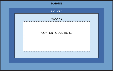
Figure 10.1 is a diagram of the box model. The box model describes the way in which every HTML block-level element has the potential for a border, padding, and margin and how the border, padding, and margin are applied. In other words, all elements have some padding between the content and the border of the element. Additionally, the border might or might not be visible, but there is space for it, just as there is a margin between the border of the element and any other content outside of the element.
Figure 10.1 Every element in HTML is represented by the CSS box model.
Here’s yet another explanation of the box model, going from the outside inward:
• The margin is the area outside of the element. It never has color; it is always transparent.
• The border extends around the element, on the outer edge of any padding. The border can be of several types, widths, and colors.
• The padding exists around the content and inherits the background color of the content area.
• The content is surrounded by padding.
Here’s where the tricky part comes in: To know the true height and width of an element, you have to take all the elements of the box model into account. If you remember the example from the previous chapter when, despite specifically indicating a <div> should be 250 pixels wide and 100 pixels high, that <div> had to grow larger to accommodate the padding in use.
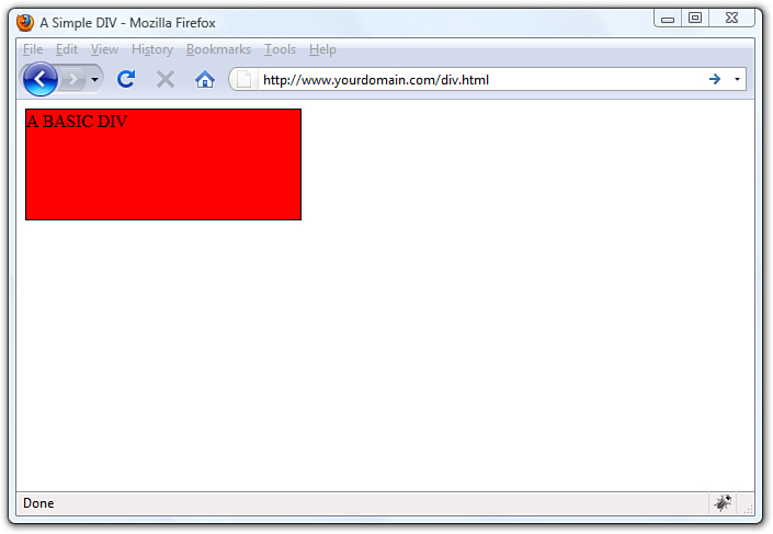
You already know how to set the width and height of an element using the width and height properties. The following example shows how to define a <div> that is 250 pixels wide, 100 pixels high, has a red background, and has a black single pixel border:
div {
width: 250px;
height: 100px;
background-color: #ff0000;
border: 1px solid #000000;
}
This simple <div> is shown in Figure 10.2.
Figure 10.2 This is a simple <div>.
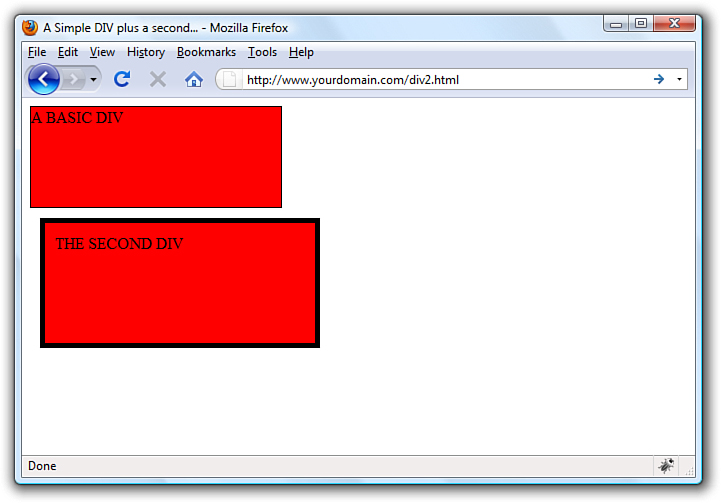
If we define a second element with these same properties, but also add margin and padding properties of a certain size, we begin to see how the size of the element changes. This is because of the box model.
The second <div> will be defined as follows, just adding 10 pixels of margin and 10 pixels of padding to the element:
div#d2 {
width: 250px;
height: 100px;
background-color: #ff0000;
border: 5px solid #000000;
margin: 10px;
padding: 10px;
}
The second <div>, shown in Figure 10.3, is defined as the same height and width as the first one, but the overall height and width of the entire box surrounding the element itself is much larger when margins and padding are put in play.
Figure 10.3 This is supposed to be another simple <div> but the box model affects the size of the second <div>.
The total width of an element is the sum of the following:
width + padding-left + padding-right + border-left + border-right +
margin-left + margin-right
The total height of an element is the sum of the following:
height + padding-top + padding-bottom + border-top + border-bottom +
margin-top + margin-bottom
Therefore, the second <div> has an actual width of 300 (250 + 10 + 10 + 5 + 5 + 10 + 10) and an actual height of 150 (100 + 10 + 10 + 5 + 5 + 10 + 10).
By now you can begin to see how the box model will affect your design. Let’s say you have only 250 pixels of horizontal space, but you like 10 pixels of margin, 10 pixels of padding, and 5 pixels of border on all sides. To accommodate what you like with what you have room to display, you must specify the width of your <div> as only 200 pixels, so that 200 + 10 + 10 + 5 + 5 + 10 + 10 would add up to that 250 pixels of available horizontal space.
Note
Throughout this book you’ve been drilled in the use of the DOCTYPE declaration—all sample code includes a DOCTYPE. Continue this practice not only so that your code validates, but because there is a very specific issue with Internet Explorer and the CSS box model: If a DOCTYPE is not defined, Internet Explorer manipulates the height and width of your elements in a way you did not intend. This causes browser incompatibility issues with your layout, so just remember to include a DOCTYPE.
Not only is it important to understand the concept behind the box model, but the mathematics of the model are important as well. In dynamically driven sites or sites in which the client-side display is driven by user interactions (such as through JavaScript events), your server-side or client-side code may draw and re-draw container elements on the fly. In other words, your code will produce the numbers, but you have to provide the boundaries.
Now that you’ve been schooled in the way of the box model, keep it in mind throughout the rest of the work you do in this book and in your web design. Among other things, it will affect element positioning and content flow, which are the two topics we will tackle next.
The Whole Scoop on Positioning
Relative positioning is the default type of positioning used by HTML. You can think of relative positioning as being akin to laying out checkers on a checkerboard: The checkers are arranged from left to right, and when you get to the edge of the board, you move on to the next row. Elements that are styled with the block value for the display style property are automatically placed on a new row, whereas inline elements are placed on the same row immediately next to the element preceding them. As an example, <p> and <div> tags are considered block elements, whereas the <span> tag is considered an inline element.
The other type of positioning supported by CSS is known as absolute positioning because it enables you to set the exact position of HTML content on a page. Although absolute positioning gives you the freedom to spell out exactly where an element is to appear, the position is still relative to any parent elements that appear on the page. In other words, absolute positioning enables you to specify the exact location of an element’s rectangular area with respect to its parent’s area, which is very different from relative positioning.
With the freedom of placing elements anywhere you want on a page, you can run into the problem of overlap, which is when an element takes up space used by another element. There is nothing stopping you from specifying the absolute locations of elements so they overlap. In this case, CSS relies on the z-index of each element to determine which element is on the top and which is on the bottom. You’ll learn more about the z-index of elements later in the chapter. For now, let’s look at exactly how you control whether a style rule uses relative or absolute positioning.
The type of positioning (relative or absolute) used by a particular style rule is determined by the position property, which is capable of having one of the following two values: relative or absolute. After specifying the type of positioning, you then provide the specific position using the following properties:
• left—The left position offset
• right—The right position offset
• top—The top position offset
• bottom—The bottom position offset
You might think that these position properties make sense only for absolute positioning, but they actually apply to both types of positioning. Under relative positioning, the position of an element is specified as an offset relative to the original position of the element. So, if you set the left property of an element to 25px, the left side of the element will be shifted over 25 pixels from its original (relative) position. An absolute position, on the other hand, is specified relative to the parent of the element to which the style is applied. So, if you set the left property of an element to 25px under absolute positioning, the left side of the element will appear 25 pixels to the right of the parent element’s left edge. On the other hand, using the right property with the same value would position the element so that its right side is 25 pixels to the right of the parent’s right edge.
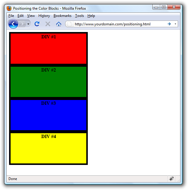
Let’s return to the color blocks example to show how positioning works. In Listing 10.1, the four color blocks have relative positioning specified. As you can see in Figure 10.4, the blocks are positioned vertically.
Figure 10.4 The color blocks are positioned vertically with one on top of the other.
Listing 10.1 Showing Relative Positioning with Four Color Blocks
<?xml version="1.0" encoding="UTF-8"?>
<!DOCTYPE html PUBLIC "-//W3C//DTD XHTML 1.1//EN"
"http://www.w3.org/TR/xhtml11/DTD/xhtml11.dtd"">
<html xmlns="http://www.w3.org/1999/xhtml" xml:lang="en">
<head>
<title>Positioning the Color Blocks</title>
<style type="text/css">
div {
position:relative;
width:250px;
height:100px;
border:5px solid #000;
color:black;
font-weight:bold;
text-align:center;
}
div#d1 {
background-color:red;
}
div#d2 {
background-color:green;
}
div#d3 {
background-color:blue;
}
div#d4 {
background-color:yellow;
}
</style>
</head>
<body>
<div id="d1">DIV #1</div>
<div id="d2">DIV #2</div>
<div id="d3">DIV #3</div>
<div id="d4">DIV #4</div>
</body>
</html>
The style sheet entry for the <div> element itself sets the position style property for the <div> element to relative. Because the remaining style rules are inherited from the <div> style rule, they inherit its relative positioning. In fact, the only difference between the other style rules is that they have different background colors.
Notice in Figure 10.4 that the <div> elements are displayed one after the next, which is what you would expect with relative positioning. But to make things more interesting, which is what we’re here to do, you can change the positioning to absolute and explicitly specify the placement of the colors. In Listing 10.2, the style sheet entries are changed to use absolute positioning to arrange the color blocks.
Listing 10.2 Using Absolute Positioning of the Color Blocks
<?xml version="1.0" encoding="UTF-8"?>
<!DOCTYPE html PUBLIC "-//W3C//DTD XHTML 1.1//EN"
"http://www.w3.org/TR/xhtml11/DTD/xhtml11.dtd">
<html xmlns="http://www.w3.org/1999/xhtml" xml:lang="en">
<head>
<title>Positioning the Color Blocks</title>
<style type="text/css">
div {
position:absolute;
width:250px;
height:100px;
border:5px solid #000;
color:black;
font-weight:bold;
text-align:center;
}
div#d1 {
background-color:red;
left:0px;
toppx;
}
div#d2 {
background-color:green;
left:75px;
top:25px;
}
div#d3 {
background-color:blue;
left:150px;
top:50px;
}
div#d4 {
background-color:yellow;
left:225px;
top:75px;
}
</style>
</head>
<body>
<div id="d1">DIV #1</div>
<div id="d2">DIV #2</div>
<div id="d3">DIV #3</div>
<div id="d4">DIV #4</div>
</body>
</html>
This style sheet sets the position property to absolute, which is necessary for the style sheet to use absolute positioning. Additionally, the left and top properties are set for each of the inherited <div> style rules. However, the position of each of these rules is set so that the elements are displayed overlapping each other, as shown in Figure 10.5.
Figure 10.5 The color blocks are displayed using absolute positioning.
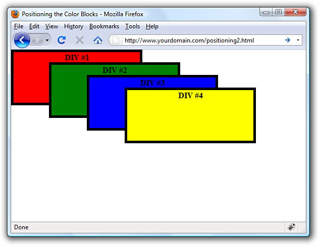
Now we’re talking layout! Figure 10.5 shows how absolute positioning enables you to place elements exactly where you want them. It also reveals how easy it is to arrange elements so that they overlap each other. You might be curious as to how a web browser knows which elements to draw on top when they overlap. The next section covers how you can control stacking order.
Controlling the Way Things Stack Up
There are situations in which you’d like to carefully control the manner in which elements overlap each other on a web page. The z-index style property enables you to set the order of elements with respect to how they stack on top of each other. Although the name z-index might sound a little strange, it refers to the notion of a third dimension (Z) that points into the computer screen, in addition to the two dimensions that go across (X) and down (Y) the screen. Another way to think of the z-index is the relative position of a single magazine within a stack of magazines. A magazine near the top of the stack has a higher z-index than a magazine lower in the stack. Similarly, an overlapped element with a higher z-index is displayed on top of an element with a lower z-index.
The z-index property is used to set a numeric value that indicates the relative z-index of a style rule. The number assigned to z-index has meaning only with respect to other style rules in a style sheet, which means that setting the z-index property for a single rule doesn’t mean much. On the other hand, if you set z-index for several style rules that apply to overlapped elements, the elements with higher z-index values will appear on top of elements with lower z-index values.
Note
Regardless of the z-index value you set for a style rule, an element displayed with the rule will always appear on top of its parent.
Listing 10.3 contains another version of the color blocks style sheet and HTML that uses z-index settings to alter the natural overlap of elements.
Listing 10.3 Using z-index to Alter the Display of Elements in the Color Blocks Sample
<?xml version="1.0" encoding="UTF-8"?>
<!DOCTYPE html PUBLIC "-//W3C//DTD XHTML 1.1//EN"
"http://www.w3.org/TR/xhtml11/DTD/xhtml11.dtd">
<html xmlns="http://www.w3.org/1999/xhtml" xml:lang="en">
<head>
<title>Positioning the Color Blocks</title>
<style type="text/css">
div {
position:absolute;
width:250px;
height:100px;
border:5px solid #000;
color:black;
font-weight:bold;
text-align:center;
}
div#d1 {
background-color:red;
left:0px;
top:0px;
z-index:0;
}
div#d2 {
background-color:green;
left:75px;
top:25px;
z-index:3;
}
div#d3 {
background-color:blue;
left:150px;
top:50px;
z-index:2;
}
div#d4 {
background-color:yellow;
left:225px;
top:75px;
z-index:1;
}
</style>
</head>
<body>
<div id="d1">DIV #1</div>
<div id="d2">DIV #2</div>
<div id="d3">DIV #3</div>
<div id="d4">DIV #4</div>
</body>
</html>
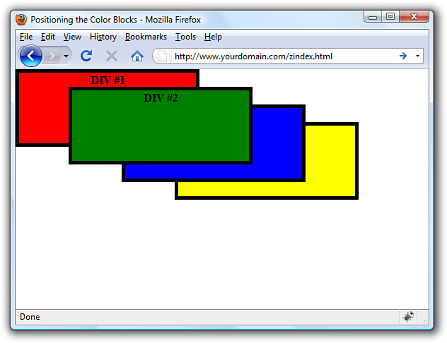
The only change in this code from what you saw in Listing 10.2 is the addition of the z-index property in each of the numbered div style classes. Notice that the first numbered div has a z-index setting of 0, which should make it the lowest element in terms of the z-index, whereas the second div has the highest z-index. Figure 10.6 shows the color blocks page as displayed with this style sheet, which clearly shows how the z-index affects the displayed content and makes it possible to carefully control the overlap of elements.
Figure 10.6 Using z-index to alter the display of the color blocks.
Although the examples show color blocks that are simple <div> elements, the z-index style property can affect any HTML content, including images.
Managing the Flow of Text
Now that you’ve seen some examples of placing elements relative to other elements or placing them absolutely, it’s time to revisit the flow of content around elements. The conceptual current line is an invisible line used to place elements on a page. This line has to do with the flow of elements on a page; it comes into play as elements are arranged next to each other across and down the page. Part of the flow of elements is the flow of text on a page. When you mix text with other elements (such as images), it’s important to control how the text flows around those other elements.
You’ve already seen two of these style properties in Chapter 9, “Working with Margins, Padding, Alignment, and Floating.” Following are some style properties that provide you with control over text flow:
• float—Determines how text flows around an element
• clear—Stops the flow of text around an element
• overflow—Controls the overflow of text when an element is too small to contain all the text
The float property is used to control how text flows around an element. It can be set to either left or right. These values determine where to position an element with respect to flowing text. So, setting an image’s float property to left positions the image to the left of flowing text.
As you learned in the previous chapter, you can prevent text from flowing next to an element by using the clear property, which can be set to none, left, right, or both. The default value for the clear property is none, indicating that text is to flow with no special considerations for the element. The left value causes text to stop flowing around an element until the left side of the page is free of the element. Likewise, the right value means that text is not to flow around the right side of the element. The both value indicates that text isn’t to flow around either side of the element.
The overflow property handles overflow text, which is text that doesn’t fit within its rectangular area; this can happen if you set the width and height of an element too small. The overflow property can be set to visible, hidden, or scroll. The visible setting automatically enlarges the element so that the overflow text will fit within it; this is the default setting for the property. The hidden value leaves the element the same size, allowing the overflow text to remain hidden from view. Perhaps the most interesting value is scroll, which adds scrollbars to the element so that you can move around and see the text.
Summary
This chapter began with an important discussion about the CSS box model and how to calculate the width and height of elements when taking margins, padding, and borders into consideration. The chapter continued by tackling absolute positioning of elements, and then you learned about positioning using z-index. You also discovered a few nifty little style properties that enable you to control the flow of text on a page.
This chapter was brief, but chock full of fundamental information about controlling the design of your site. It is worth re-reading and working through the examples so that you have a good foundation for your work.
Q&A
Q. How would I determine when to use relative positioning and when to use absolute positioning?
A. Although there are no set guidelines regarding the use of relative versus absolute positioning, the general idea is that absolute positioning is required only when you want to exert a finer degree of control over how content is positioned. This has to do with the fact that absolute positioning enables you to position content down to the exact pixel, whereas relative positioning is much less predictable in terms of how it positions content. This isn’t to say that relative positioning can’t do a good job of positioning elements on a page; it just means that absolute positioning is more exact. Of course, this also makes absolute positioning potentially more susceptible to changes in screen size, which you can’t really control.
Q. If I don’t specify the z-index of two elements that overlap each other, how do I know which element will appear on top?
A. If the z-index property isn’t set for overlapping elements, the element appearing later in the web page will appear on top. The easy way to remember this is to think of a web browser drawing each element on a page as it reads it from the HTML document; elements read later in the document are drawn on top of those that were read earlier.
Workshop
The workshop contains quiz questions and exercises to help you solidify your understanding of the material covered. Try to answer all questions before looking at the “Answers” section that follows.
Quiz
1. What’s the difference between relative positioning and absolute positioning?
2. Which CSS style property controls the manner in which elements overlap each other?
3. What HTML code could you use to display the words "Where would you like to" starting exactly at the upper-left corner of the browser window and displays the words "GO TODAY?" in large type exactly 80 pixels down and 20 pixels to the left of the corner?
Answers
1. In relative positioning, content is displayed according to the flow of a page, with each element physically appearing after the element preceding it in the HTML code. Absolute positioning, on the other hand, allows you to set the exact position of content on a page.
2. The z-index style property is used to control the manner in which elements overlap each other.
3. You could use the following:
<span style="position:absolute;left:0px;top:0px">
Where would you like to</span>
<h1 style="position:absolute;left:80px;top:20px">GO TODAY?</h1>
Exercises
• Practice working with the intricacies of the CSS box model by creating a series of elements with different margins, padding, and borders and see how these properties affect their height and width.
• Find a group of images that you like and use absolute positioning and maybe even some z-index values to arrange them in a sort of gallery. Try to place your images so they form a design (such as a square, triangle, or circle).