Chapter 8. Working with Colors, Images, and Multimedia
This list might look long, but each of these tasks is short and sweet, and will help you move your web development experience from the white background/black text examples so far in this book to more interesting (or at least colorful) examples. But that’s not to say that dark text on a light background is bad—in fact, it’s the most common color combination you’ll find online.
Although paying attention to color schemes and producing a visually appealing website is important, you don’t have to be an artist by trade to put high-impact graphics on your web pages. More importantly, you don’t need to spend hundreds or thousands of dollars on software, either. This chapter will help you get started with creating some of the images you can use in your website. Although the sample figures in this chapter use a popular and free graphics program for Windows, Mac, and Linux users (GNU Image Manipulation Program, or GIMP), you can apply the knowledge learned in this chapter to any major Windows or Macintosh graphics application—although the menus and options will look slightly different.
After you learn to create the graphics themselves, you’ll learn how to integrate your graphics using HTML and CSS. At the end of the chapter you’ll learn a bit about integrating additional media, or multimedia, into your website.
Best Practices for Choosing Colors
I can’t tell you exactly which colors to use in your website, but I can help you understand the considerations you should make when selecting those colors on your own. The colors you use can greatly influence your visitors; if you are running an e-commerce site, you will want to use colors that entice your users to view your catalog and eventually purchase something. To that end, you want to make sure colors are used judiciously and with respect. You might wonder how respect enters into the mix when talking about colors, but remember the World Wide Web is an international community and interpretations differ; for instance, pink is a very popular color in Japan, but very unpopular in Eastern European countries. Similarly, green is the color of money in the United States, but the vast majority of other countries have multi-colored paper bills such that “the color of money” isn’t a single color at all and thus the metaphor would be of no value to them.
Besides using colors that are culturally sensitive, other best practices include the following:
• Use a natural palette of colors. This doesn’t mean you should use earth tones, but instead refers to using colors that one would naturally see on a casual stroll around town—avoid ultrabright colors that can cause eye strain.
• Use a small color palette. You don’t need to use 15 different colors to achieve your goals. In fact, if your page includes text and images in 15 different colors, you might reevaluate the message you’re attempting to send. Focus on three or four main colors with a few complimentary colors, at the most.
• Consider your demographics. You are likely not able to control your demographics and thus have to find a middle ground that accommodates everyone. The colors enjoyed by younger people are not necessarily those appreciated by older people, just as there are color biases between men and women and people from different geographic regions and cultures.
With just these few tips in mind, it might seem as if your color options are limited. Not so—it simply means you should think about the decisions you’re making before you make them. A search for color theory in the search engine of your choice should give you more food for thought, as will the use of the color wheel.
The color wheel is a chart that shows the organization of colors in a circular manner. The method of display is an attempt to help you visualize the relationships between primary, secondary, and complementary colors. Color schemes are developed from working with the color wheel; understanding color schemes can help you determine the color palette to use consistently throughout your website. For example, knowing something about color relationships will hopefully enable you to avoid using orange text on a light blue background, or bright blue text on a brown background.
Some common color schemes in web design are as follows:
• Analogous—Colors that are adjacent to each other on the color wheel, such as yellow and green. One color is the dominant color and its analogous friend is used to enrich the display.
• Complementary—Colors that are opposite from each other on the color wheel, such as a warm color (red) and a cool color (green).
• Triadic—Three colors that are equally spaced around the color wheel. The triadic scheme provides balance while still allowing rich color use.
There are entire books and courses devoted to understanding color theory, so continuing the discussion in this book would indeed be a tangent. However, if you intend to work in web design and development, you will be served well by a solid understanding of the basics of color theory. Spend some time reading about it—an online search will provide a wealth of information.
Additionally, spend some hands-on time with the color wheel. The Color Scheme Generator at http://colorschemedesigner.com/ enables you to start with a base color and produce monochromatic, complementary, triadic, tetradic, analogic, and accented analogic color schemes.
Understanding Web Colors
Specifying a background color other than white for a web page is easier than you probably realize. For example, to specify blue as the background color for a page, put style="background-color:blue" inside the <body> tag or in the style sheet rule for the body element. Of course, you can use many colors other than blue. In fact, there are 16 colors listed in the W3C standards: aqua, black, blue, fuchsia, gray, green, lime, maroon, navy, olive, purple, red, silver, teal, white, and yellow.
Note
For a complete list of the 140 descriptive color names, their hexadecimal codes, and an example of the color as displayed by your browser, visit http://www.w3schools.com/HTML/html_colornames.asp.
Obviously there are many more colors displayed on the Web than just those 16. In fact, there are 140 color names that you can use with assurance that all browsers will display these colors similarly. Here’s a partial list of the 140 descriptive color names: azure, bisque, cornflowerblue, darksalmon, firebrick, honeydew, lemonchiffon, papayawhip, peachpuff, saddlebrown, thistle, tomato, wheat, and whitesmoke.
But names are subjective—for instance, if you look at the color chart of 140 cross-browser color names, you will not be able to distinguish between fuchsia and magenta. You will then realize that the associated hexadecimal color values for those two terms, fuchsia and magenta, are exactly the same: #FF00FF. You’ll learn about hexadecimal color values in the next section, but for now, know that if you want to be standards-compliant and use more than the 16 color names the W3C standards dictate, you should use the hexadecimal color codes whenever possible.
Tip
It’s worth pointing out that color names are not case-sensitive. So, Black, black, and BLACK are all black, although most web designers stick with lowercase or mixed case (if they use color names at all, as most designers will use the hexadecimal notation for a more nuanced approach to color use).
There are, in fact, 16 million colors made possible with hexadecimal color codes. However, most modern computer displays can display “only” 16,384. But 16,384 is still a lot more than 140, or 16.
You should be aware that not all computer monitors display colors in the same hues. What might appear as a beautiful light blue background color on your monitor might be more of a purple hue on another user’s monitor. Neutral, earth-tone colors (such as medium gray, tan, and ivory) can produce even more unpredictable results on many computer monitors. These colors might even seem to change color on one monitor depending on lighting conditions in the room or the time of day.
In addition to changing the background of your pages to a color other than white, you can change the color of text links, including various properties of links (such as the color for when a user hovers over a link versus when the user clicks a link—as you learned in previous chapters). You can also set the background color of container elements (such as paragraphs, divs, blockquotes, and table cells), and you can use colors to specify the borders around those elements. You’ll see some examples of colors and container elements later in this chapter.
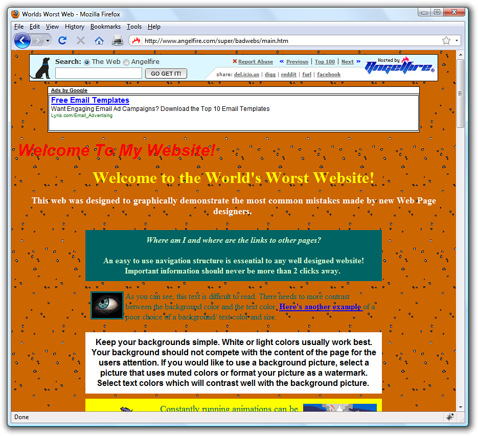
There are plenty of very bad websites, some created by earnest people with no trace of irony whatsoever. However, “The World’s Worst Website” shown in Figure 8.1 was purposefully created to show some of the more egregious sins of website design, especially with its use of colors. A screenshot does not do it justice—visit and experience the site for yourself at http://www.angelfire.com/super/badwebs/main.htm.
Figure 8.1 A partial screenshot of “The World’s Worst Website.”
If you search for bad website examples in your search engine, you will find many sites that collect examples of bad design and explain just why such a site should be in a Hall of Shame rather than a Hall of Fame. Many sites are considered bad because of their visual displays, and that display begins with color selection. Therefore, understanding colors, as well as the nuances of their specification and use, is a crucial step to creating a good website.
Using Hexadecimal Values for Colors
To remain standards-compliant, as well as to retain precise control over the colors in your website, you can reference colors by their hexadecimal value. The hexadecimal value of a color is an indication of how much red, green, and blue light should be mixed into each color. It works a little bit like Play-Doh—just mix in the amounts of red, blue, and green you want to get the appropriate color.
The hexadecimal color format is #rrggbb, in which rr, gg, and bb are two-digit hexadecimal values for the red (rr), green (gg), and blue (bb) components of the color. If you’re not familiar with hexadecimal numbers, don’t sweat it. Just remember that FF is the maximum and 00 is the minimum. Use one of the following codes for each component:
• FF means full brightness.
• CC means 80% brightness.
• 99 means 60% brightness.
• 66 means 40% brightness.
• 33 means 20% brightness.
• 00 means none of this color component.
For example, bright red is #FF0000, dark green is #003300, bluish-purple is #660099, and medium-gray is #999999. To make a page with a red background and dark green text, the HTML code would look like the following:
<body style="background-color:#FF0000; color:#003300">
Although only six examples of two-digit hexadecimal values are shown here, there are actually 225 combinations of two-digit hexadecimal values—0 through 9 and A through F, paired up. For example, F0 is a possible hex value (decimal value 240), 62 is a possible hex value (decimal value 98), and so on.
As previously discussed, the rr, gg, and bb in the #rrggbb hexadecimal color code format stand for the red, green, and blue components of the color. Each of those components has a decimal value ranging from 0 (no color) to 255 (full color).
So, white (or #FFFFFF) translates to a red value of 255, a green value of 255, and a blue value of 255. Similarly, black (#000000) translates to a red value of 0, a green value of 0, and a blue value of 0. True red is #FF0000 (all red, no green, and no blue), true green is #00FF00 (no red, all green, no blue), and true blue is #0000FF (no red, no green, and all blue). All other hexadecimal notations translate to some variation of the 255 possible values for each of the three colors. The cross-browser compatible color name cornflowerblue is associated with the hexadecimal notation #6495ED—a red value of 40, a green value of 149, and a blue value of 237 (almost all of the available blue values).
When picking colors, either through a graphics program or by finding something online that you like, you might see the color notion in hexadecimal or decimal. If you type hexadecimal color converter in your search engine, you will find numerous options to help you convert color values into something you can use in your style sheets.
Using CSS to Set Background, Text, and Border Colors
When using CSS, there are three instances in which color values can be used: when specifying the background color, the text color, or the border color of elements. Previous chapters contained examples of specifying colors without going in great detail about color notion or color theory. For example, in Chapter 7, “Using External and Internal Links,” you learned about using colors for various link states.
Figure 8.2 shows an example of color usage that could easily go into a web design Hall of Shame. I can’t imagine ever using these combinations of colors and styles in a serious website, but it serves here as an example of how color style could be applied to various elements.
Figure 8.2 Background, text, and border colors can all be set using CSS.
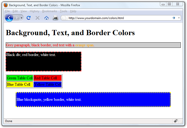
Listing 8.1 shows the XHTML and CSS styles used to produce Figure 8.2.
Listing 8.1 Using Styles to Produce Background, Text, and Border Colors
<?xml version="1.0" encoding="UTF-8"?>
<!DOCTYPE html PUBLIC "-//W3C//DTD XHTML 1.1//EN"
"http://www.w3.org/TR/xhtml11/DTD/xhtml11.dtd">
<html xmlns="http://www.w3.org/1999/xhtml" xml:lang="en">
<head>
<title>Background, Text, and Border Colors</title>
</head>
<body>
<h1>Background, Text, and Border Colors</h1>
<p style="background-color:#CCCCCC;
border:1px solid #000000; color:#FF0000">
Grey paragraph, black border, red text with a
<span style="color:#FFA500">orange span</span>.</p>
<div style="width:300px; height:75px; margin-bottom: 12px;
background-color:#000000; border:2px dashed #FF0000;
color: #FFFFFF">
Black div, red border, white text. </div>
<table border="1">
<tr>
<td style="background-color: #00FF00">Green Table Cell</td>
<td style="background-color: #FF0000">Red Table Cell</td>
</tr>
<tr>
<td style="background-color: #FFFF00">Blue Table Cell</td>
<td style="background-color: #0000FF">Yellow Table Cell</td>
</tr>
</table>
<blockquote style="background-color:#0000FF;
border:4px dotted #FFFF00; color:#FFFFFF"><p>Blue blockquote,
yellow border, white text.</p></blockquote>
</body>
</html>
Looking at the styles used in Listing 8.1, you should be able to figure out almost everything except some of the border styles. In CSS, borders can’t be designated as a color without also having a width and type; in the first example shown in Listing 8.1, the border width is 1px, and the border type is solid. In the second example shown in Listing 8.1, the border width is 2px, and the border type is dashed. In the fourth example shown in Listing 8.1, the border width is 4px, and the border type is dotted.
When picking colors for your website, remember that a little bit goes a long way—if you really like a bright and spectacular color, use it as an accent color and not throughout the primary design elements. For readability, remember that light backgrounds with dark text are much easier to read than dark backgrounds with light text.
Note
Adobe Photoshop is without a doubt the cream of the crop when it comes to image-editing programs. However, it is expensive and quite complex if you don’t have experience working with computer graphics. For more information on Adobe’s products, visit the Adobe website at http://www.adobe.com/. If you are in the market for one of their products, you can download a free evaluation version from their site.
Finally, consider the not-insignificant portion of your audience that might be color blind. For accessibility, you might consider using the Colorblind Web Page Filter tool at http://colorfilter.wickline.org/ to see what your site will look like to a person with color blindness.
Choosing Graphics Software
Selecting an overall color scheme for your website is one thing; creating or editing images to go into those templates are quite another—and beyond the scope of this book (or a single book, for that matter). However, in the sections that follow, you’ll learn a few of the basic actions that anyone maintaining a website should quickly master.
You can use almost any graphics program to create and edit images for your website, from the simple paint program that typically comes free with your computer’s operating system to an expensive professional program such as Adobe Photoshop. Similarly, if you have a digital camera or scanner attached to your computer, it probably came with some graphics software capable of creating web page graphics. There are also several free image editors available for download—or even online as a web application—that deal just with the manipulation of photographic elements.
If you already have software you think might be good for creating web graphics, try using it to do everything described in these next sections. If your software can’t do some of the tasks covered here, it probably won’t be a good tool for web graphics. In that case, download and install GIMP from http://www.gimp.org. This fully functional graphics program is completely free and is used to perform the actions shown in this chapter.
If GIMP doesn’t suit you, consider downloading the evaluation version of Adobe Photoshop or Corel DRAW. For photo manipulation only, there are many free options, all with helpful features. Google’s Picasa, which is available free at http://picasa.google.com/, is one such option. Picnik (http://www.picnik.com/) is another. Both of these programs are suited for editing images rather than creating them from scratch, and Picasa is also oriented toward organizing your digital photograph collection. As such, these types of programs are not necessarily going to help you design a banner or button image for your site. However, these programs can help you work with some supplementary images, and they are powerful enough that they are worth checking out.
The Least You Need to Know About Graphics
Two forces are always at odds when you post graphics and multimedia on the Internet. The users’ eyes and ears want all your content to be as detailed and accurate as possible, and they also want that information displayed immediately. Intricate, colorful graphics mean big file sizes, which increase the transfer time even over a fast connection. How do you maximize the quality of your presentation while minimizing file size? To make these choices, you need to understand how color and resolution work together to create a subjective sense of quality.
The resolution of an image is the number of individual dots, or pixels, that make up an image. Large, high-resolution images generally take longer to transfer and display than small, low-resolution images. Resolution is usually specified as the width times the height of the image, expressed in pixels; a 300×200 image, for example, is 300 pixels wide and 200 pixels high.
Note
There are several types of image resolution, including pixel, spatial, spectral, temporal, and radiometric. You could spend hours just learning about each type; and if you were taking a graphics design class, you might do just that. For now, however, all you need to remember is that large images take longer to download and also use a lot of space in your display. Display size and storage or transfer size are factors you should take into consideration when designing your website.
You might be surprised to find that resolution isn’t the most significant factor determining an image file’s storage size (and transfer time). This is because images used on web pages are always stored and transferred in compressed form. Image compression is the mathematical manipulation that images are put through to squeeze out repetitive patterns. The mathematics of image compression is complex, but the basic idea is that repeating patterns or large areas of the same color can be squeezed out when the image is stored on a disk. This makes the image file much smaller and allows it to be transferred faster over the Internet. The web browser then restores the original appearance of the image when the image is displayed.
In the sections that follow, you’ll learn how to create graphics with big visual impact but small file sizes. The techniques you’ll use to accomplish this depend on the contents and purpose of each image. There are as many uses for web graphics as there are web pages, but four types of graphics are by far the most common:
• Photos of people, products, or places
• Graphical banners and logos
• Buttons or icons to indicate actions and provide links
• Background textures for container elements
Preparing Photographic Images
To put photos on your web pages, you need to convert your print-based photos to digital images or create photos digitally by using a digital camera. You might need to use the custom software that comes with your scanner or camera to save pictures onto your hard drive, or you can just drag and drop files from your camera to your hard drive. If you are using a scanner to create digital versions of your print photos, you can control just about any scanner directly from the graphics program of your choice—see the software documentation for details.
Tip
If you don’t have a scanner or digital camera, almost all film developers offer a service that transfers photos from 35mm film to a CD-ROM or DVD-ROM for a modest fee. You can then copy the files from the CD-ROM or DVD-ROM to your hard drive, and then use your graphics program to open and modify the image files.
After you transfer the digital image files to your computer, you can use your graphics program to crop, resize, color-correct, and compress to get them ready for use in your website.
Cropping an Image
Because you want web page graphics to be as compact as possible, you’ll usually need to crop your digital photos. When you crop a photo, you select the area you want to display, and you crop away the rest.
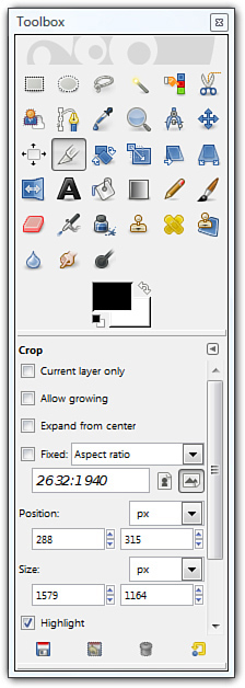
1. In the GIMP toolbox, click the crop tool (see Figure 8.3). Depending on the tool you select, there might be additional attributes you can select. For example, Figure 8.3 shows the attributes for the cropping tool (such as the aspect ratio, position, size, and so on).
Figure 8.3 Select the crop tool from the toolbox.
2. In the image you want to crop, draw a box around the selection by clicking the upper-left corner of the portion of the image you want to keep and holding the left mouse button while you drag down to the lower-right corner (see Figure 8.4).
Figure 8.4 Select the area of the image that you want to display.
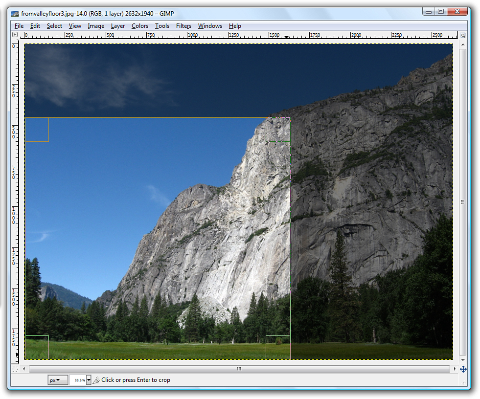
3. Click one of the corners of the selection to apply the cropping.
Even after your image has been cropped, it might be larger than it needs to be for a web page. Depending on the design of a specific web page, you might want to limit large images to no more than 800×600 pixels (if it is shown on a page by itself, such as an item catalog) or even 640×480 pixels or smaller. When shown alongside text, images tend to be in the 250 to 350 pixel range for width, so there’s just enough room for the text as well. In some cases, you might want to also provide a thumbnail version of the image that links to a larger version, in which case you’ll probably stick closer to 100 pixels in the larger dimension for the thumbnail.
Tip
Your graphics software will likely have an omnipresent size display somewhere in the image window itself. In GIMP, the current image size can be seen in the top of the window. Other programs might show it in the lower-right or lower-left corner. You might also see the magnification ratio in the window and the ability to change it (by zooming in or zooming out).
Resizing an Image
The exact tool necessary to change an image’s size will depend on the program you are using. In GIMP, go to the Image menu and click Scale Image to open the Scale Image dialog box (see Figure 8.5).
Figure 8.5 Use the Scale Image dialog box to change the size of an image.
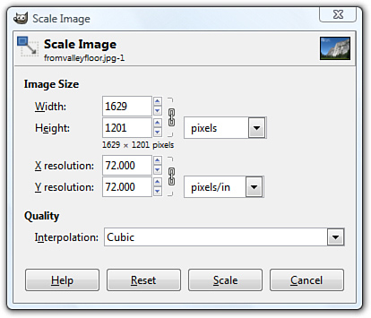
You’ll almost always want to resize using the existing aspect ratio, meaning that when you enter the width you’d like the image to be, the height will be calculated automatically (and vice versa) to keep the image from squishing out of shape. In GIMP, the aspect ratio is locked by default, as indicated by the chain link displayed next to the Width and Height options shown in Figure 8.5. Clicking once on the chain will unlock it, enabling you to specify pixel widths and heights of your own choosing—squished or not.
Note
As with many of the features in GIMP, the Scale Image dialog box appears in front of the window containing the image being resized. This placement enables you to make changes in the dialog box, apply them, and see the results immediately.
In most, if not all, graphics programs, you can also resize the image based on percentages instead of providing specific pixel dimensions. For example, if my image started out as 1629×1487, and I didn’t want to do the math to determine the values necessary to show it as half that width, I could simply select Percent (in this instance from the drop-down next to the pixel display shown in Figure 8.5) and change the default setting (100) to 50. The image width would then become 815 pixels wide by 744 high—and no math was necessary on my part.
Tweaking Image Colors
If you are editing photographic images rather than creating your own graphics, you might need to use some color-correction tools to get the photo just right. Like many image editing programs, GIMP offers several options for adjusting an image’s brightness, contrast, and color balance, as well as a filter to reduce the dreaded red-eye. To remove red-eye using GIMP, go to Filters, click Enhance, and then click Red Eye Removal.
Most of these options are pretty intuitive. If you want the image to be brighter, adjust the brightness. If you want more red in your image, adjust the color balance. In GIMP, the Colors menu gives you access to numerous tools. As with the Scale Image dialog box described in the previous section, each tool displays a dialog box in the foreground of your workspace. As you adjust the colors, the image reflects those changes. This preview function is a feature included in most image editing software.
Figure 8.6 shows the Adjust Hue/Lightness/Saturation tool, one of the many tools provided on the Colors menu. As shown in the figure, many color-related changes occur by using various sliders in dialog boxes to adjust the values you are working with. The Preview feature enables you to see what you are doing as you are doing it. The Reset Color button returns the image to its original state without any changes applied.
Figure 8.6 The Adjust Hue/Lightness/ Saturation tool is one of many slider-based color modification tools available in GIMP.
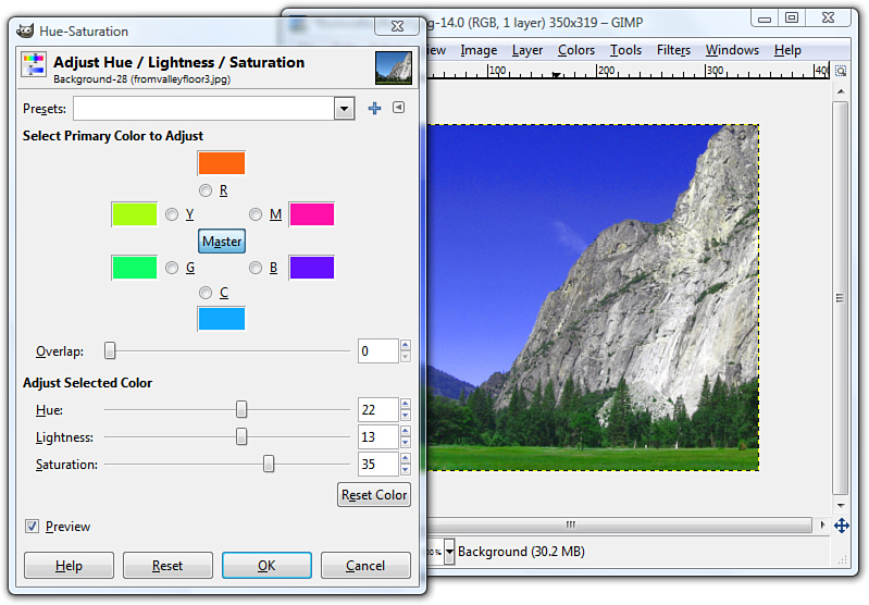
Because of the numerous tools available to you and the preview function available with each tool, a little playful experimentation is the best way to find out what each tool does.
Controlling JPEG Compression
Photographic images on the Web work best when saved in the JPEG file format rather than GIF; JPEG enables you to retain the number of colors in the file while still keeping the overall file size to a manageable level. When you’re finished adjusting the size and appearance of your photo, select File, Save As and choose JPEG as the file type. Your graphics program will likely provide you with another dialog box through which you can control various JPEG options, such as compression.
Figure 8.7 shows the Save as JPEG dialog box you’ll see when you save a JPEG in GIMP. You can see here that you can control the compression ratio for saving JPEG files by adjusting the Quality slider between 1 (low quality, small file size) and 100 (high quality, large file size).
Figure 8.7 GIMP enables you to reduce file size while still retaining image quality by saving in the JPEG format.
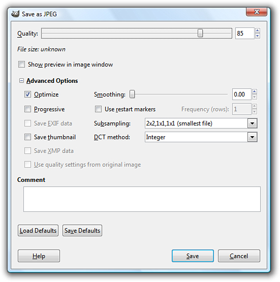
You might want to experiment a bit to see how various JPEG compression levels affect the quality of your images, but 85% quality (or 15% compression) is generally a good compromise between file size (and therefore download speed) and quality for most photographic images.
Creating Banners and Buttons
Graphics that you create from scratch, such as banners and buttons, require you to make considerations uniquely different from photographs.
The first decision you need to make when you produce a banner or button is how big it should be. Most people accessing the web now have a computer with a screen that is at least 1024×768 pixels in resolution, if not considerably larger. For example, my screen is currently set at 1440×900 pixels. You should generally plan your graphics so that they will always fit within smaller screens (1024×768), with room to spare for scrollbars and margins. The crucial size constraint is the horizontal width of your pages because scrolling a page horizontally is a huge hassle and a source of confusion for web users. Vertically scrolling a page is much more acceptable, so it’s okay if your pages are taller than the minimum screen sizes.
Tip
For many years, designing for 800×600 screen resolution has been the norm. Still keep that low number in mind, as many people do not open applications in full-screen mode. However, designing for a baseline 1,024×768 screen resolution is not a bad idea.
Assuming that you target a minimum resolution of 800×600 pixels, full-sized banners and title graphics should be no more than 770 pixels wide by 430 pixels tall, which is the maximum viewable area of the page after you’ve accounted for scrollbars, toolbars, and other parts of the browser window. Within a page, normal photos and artwork should be from 100 to 300 pixels in each dimension, and smaller buttons and icons should be 20 to 100 pixels tall and wide. Obviously, if you design for the 1024×768 resolution, you have more screen “real estate” to work with, but the size guidelines for banners, buttons, and other supplementary graphics are still in effect.
To create a new image in GIMP, go to File and choose New. The Create a New Image dialog box displays (see Figure 8.8). If you aren’t sure how big the image needs to be, just accept the default size of a 640×480. Or you can choose one of the other pre-determined sizes in the Template drop-down, such as Web banner common 468×60 or Web banner huge 728×90. Those two settings are indeed considered “common” and “huge” for website banners. Otherwise, enter the width and height of the new image.
Figure 8.8 You need to decide on the size of an image before you start working on it.
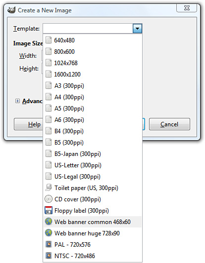
For the image’s background color, you should usually choose white to match the background that most web browsers use for web pages (although as you learned in the previous chapter, that color can be changed). When you know that you’ll be creating a page with a background other than white, you can choose a different background color for your image. Or you might want to create an image with no background at all, in which case you’ll select Transparency as the background color. When an image’s background is transparent, the web page behind the image is allowed to show through those areas of the image. In GIMP, select the background color for your new image by opening the Advanced Options in the Create a New Image dialog box.
When you enter the width and height of the image in pixels and click OK, you are faced with a blank canvas—an intimidating sight if you’re as art-phobic as most of us! However, because there are so many image creation tutorials (not to mention entire books) available to lead you through the process, I am comfortable leaving you to your own creative devices. This section is all about introducing you to the things you want to keep in mind when creating graphics for use in your sites. This section does not necessarily teach you exactly how to do it because being comfortable with the tool you choose is the first step to mastering them.
Reducing the Number of Colors in an Image
One of the most effective ways to reduce the size of, and therefore the download time for, an image is to reduce the number of colors used in the image. This can drastically reduce the visual quality of some photographic images, but it works great for most banners, buttons, and other icons.
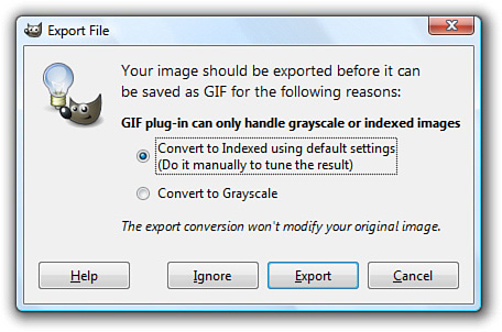
You’ll be glad to know that there is a special file format for images with a limited number of colors; it’s called the Graphics Interchange Format (GIF). When you save an image as a GIF, you might be prompted to flatten layers or reduce the number of colors by converting to an indexed image, as those are requirements for GIFs, as shown in Figure 8.9. The dialog box will simply ask you to confirm these changes that the save process will do for you—do not concern yourself with understanding these options at this time, but read your software’s help file regarding layers and indexed colors for a full understanding.
Figure 8.9 When saving an image as a GIF, you might be prompted to convert it to an indexed color palette.
Tip
Dithering is a technique used by image-editing programs to simulate a color that isn’t in the color palette with alternating pixels of two similar colors. For example, a dithered pink color would consist of alternating pixels of red and white pixels, which would give the general impression of pink. Dithering can make images look better in some cases, but it should usually be avoided for web page graphics. Why? It substantially increases the information complexity of an image, and that usually results in much larger file sizes and slower downloads.
Remember, the GIF image format is designed for images that contain areas of solid colors, such as web page titles and other illustrated graphics; the GIF format is not ideal for photographs.
PNG (pronounced “ping”) is another useful file format that is supported in all major web browsers. Although the GIF image format enables you to specify a single transparent color, which means that the background of the web page will show through those areas of an image, the PNG format takes things a step further by enabling you to specify varying degrees of transparency.
Working with Transparent Images
You might have seen websites that use background colors or images in their container elements, but also have images present in the foreground that allow the background to show through parts of the foreground graphics. In these cases, the images in the foreground have portions which are transparent, so that the images themselves—which are always on a rectangular canvas—do not show the areas of the canvas in which the design does not occur. You’ll often want to use these types of partially transparent images to make graphics look good over any background color or background image you might have in place.
To make part of an image transparent, the image must be saved in the GIF or PNG file format. As mentioned previously in this chapter, most graphics programs that support the GIF format enable you to specify one color to be transparent, whereas PNG images allow for a range of transparency. Largely because of this transparency range, the PNG format is superior to GIF. All the latest web browsers already support PNG images. For more information on the PNG image format, visit http://www.libpng.org/pub/png/pngintro.html.
The process of creating a transparent image depends on the type of image you are creating (GIF or PNG) and the graphics software you are using to create it. For instructions, look in your graphics program’s help files or type transparent images with [your program here] into your search engine.
Creating Tiled Backgrounds
Any GIF or JPEG image can be used as a background tile within a container element. However, before you go off and create a tiled background, especially a highly patterned tiled background, ask yourself what that tiled background adds to the overall look and feel of your website, and—more importantly—ask yourself if the text of the site can be read easily when placed over that pattern.
Think about the websites you frequent every day and consider the fact that few use tiled, patterned backgrounds on their entire page. If you restrict your browsing to websites for companies, products, sports teams, or other sites in which information (primarily text) is privileged, the number of sites with tiled, patterned backgrounds will decrease even further. Although the Web affords everyone the right of individuality in design, if you are creating a site for your business, you might want to avoid a highly patterned background with contrasting colored text.
If you do use a tiled, patterned background image for your entire site, remember that tiled images look best when you can’t tell they’re tiled images. In other words, you know you have a good image when the top edge of a background tile matches seamlessly with the bottom edge, and the left edge matches with the right.
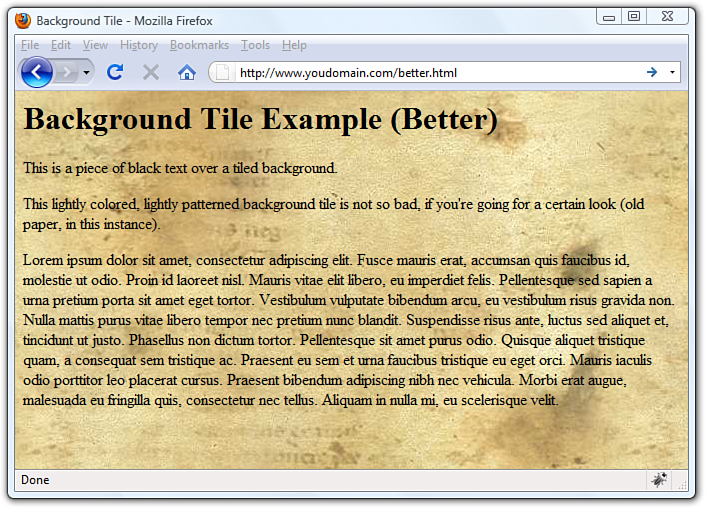
Figures 8.10 and 8.11 show background tiles in use, both with seamless background, but with varying degrees of effectiveness.
Figure 8.10 This is an example of a seamless background image whereby you can tell the background is tiled because you can see six identical shapes.
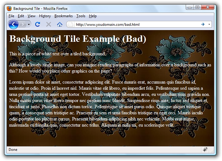
Figure 8.11 This is also an example of a seamless background image, only you can’t tell that it is tiled.
Further on in this chapter, you’ll learn how to place background images within your container elements. Despite my warnings in this section, there are actually times when background images can be powerful weapons in your design arsenal—just not when used as entire page backgrounds.
Tip
If you really want to use a background tile but you just cannot seem to get the pattern you want, you can check out some of the hundreds of sites on the Internet offering public-domain background images that are free or inexpensive, yet professionally designed.
Creating Animated Web Graphics
The GIF image format enables you to create animated images that can be used to add some motion that will spice up any web page. Animated GIF images also transfer much faster than most of the video or multimedia files that are often used for similar effect. With GIMP, you can create animated GIFs by creating multiple layers within an image, and then modifying the Animated GIF options when saving the file. Additionally, if you have a series of images you want to animate, you can use the free, web-based GIF animation service at Gickr (http://www.gickr.com/).
The first step in creating a GIF animation is to create a series of images to be displayed one after the other—or a series of layers, depending on your particular software program. Each of these images is called a frame. By the way, this use of the word frame has nothing whatsoever to do with the frames you’ll learn about in Chapter 20, “Using Windows and Frames.” Instead, think of the frames like how movies or cartoons are put together—the images that you see on the screen are made up of many individual frames with slight differences in their appearance. After you have your frames in mind, the process of tying them together is relatively simple—it’s the planning stage that’s the most difficult. Take some time to sketch out the frames in storyboard fashion, especially if you plan to have more than just a few frames. After you know how your frames are going to fit together, use the Gickr service mentioned earlier in this section, or read the documentation for your graphics software to learn its particular process for pulling it all together.
Placing Images on a Web Page
To put an image on a web page, first move the image file into the same folder as the HTML file or in a directory named images for easy organization.
Insert the following HTML tag at the point in the text where you want the image to appear. Use the name of your image file instead of myimage.gif:
<img src="myimage.gif" alt="My Image" />
Note
It doesn’t matter to the web server, web browser, or end user where you put your images, as long as you know where they are and as long as you use the correct paths in your HTML code.
If your image file were in the images directory below the document root, you would use the following:
<img src="/images/myimage.gif" alt="My Image" />
Both the src and the alt attributes of the <img /> tag are required in XHTML web pages. The src attribute identifies the image file, and the alt attribute enables you to specify descriptive text about the image, the latter of which is intended to serve as an alternative to the image in the event that a user is unable to view the image. You’ll read more on the alt attribute later, in the section “Describing Images with Text.”
Note
The <img /> tag also supports a title attribute that is used to describe an image. Unlike the alt attribute, the title attribute is truly intended to provide an image description with the assumption that the image is visible. The alt attribute serves a more important purpose and is put into play primarily when an image cannot be displayed, such as when a blind user is “viewing” a page using supplementary screen-reading software. The alt attribute is required, but it’s a good idea to provide both alt and title attributes if you want to ensure that your images are all well-described.
As an example of how to use the <img /> tag, Listing 8.2 inserts an image at the top of the page, before a paragraph of text. Whenever a web browser displays the HTML file in Listing 8.2, it automatically retrieves and displays the image file, as shown in Figure 8.12.
Figure 8.12 When a web browser displays the HTML code shown in Listing 8.2, it renders the hd.jpg image.
Listing 8.2 Using the <img /> Tag to Place Images on a Web Page
<?xml version="1.0" encoding="UTF-8"?>
<!DOCTYPE html PUBLIC "-//W3C//DTD XHTML 1.1//EN"
"http://www.w3.org/TR/xhtml11/DTD/xhtml11.dtd">
<html xmlns="http://www.w3.org/1999/xhtml" xml:lang="en">
<head>
<title>A Spectacular Yosemite View</title>
</head>
<body>
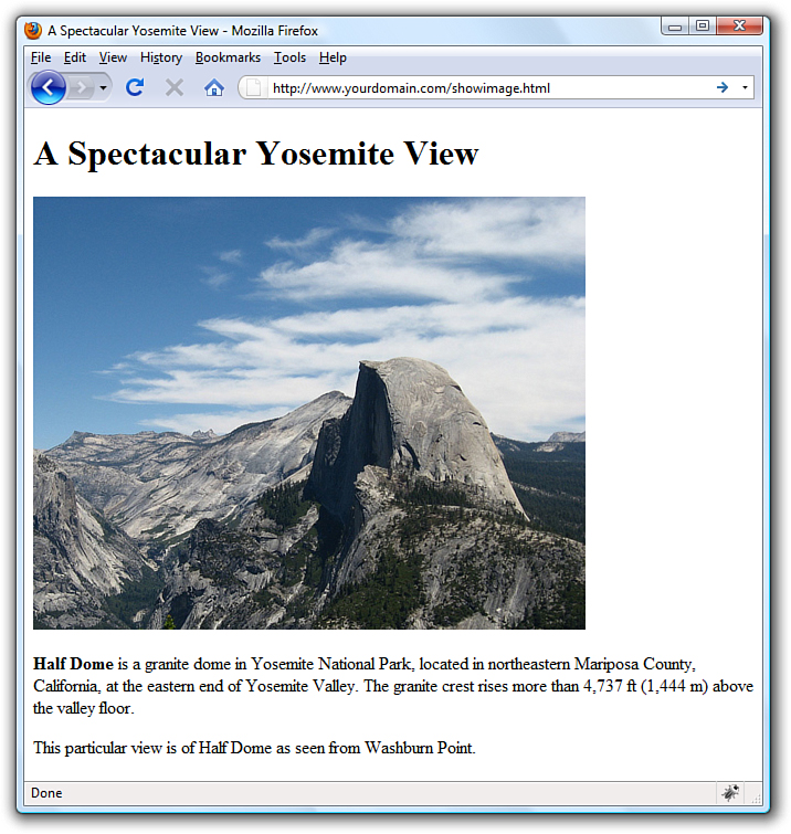
<h1>A Spectacular Yosemite View</h1>
<p><img src="hd.jpg" alt="Half Dome" /></p>
<p><strong>Half Dome</strong> is a granite dome in Yosemite National Park,
located in northeastern Mariposa County, California, at the eastern
end of Yosemite Valley. The granite crest rises more than 4,737 ft
(1,444 m) above the valley floor.</p>
<p>This particular view is of Half Dome as seen from Washburn
Point.</p>
</body>
</html>
Theoretically, you can include an image from any website within your own pages. In those cases, the image is retrieved from the other page’s web server whenever your page is displayed. You could do this, but you shouldn’t! Not only is it bad manners because you are using the other person’s bandwidth for your own personal gain, it also can make your pages display more slowly. You also have no way of controlling when the image might be changed or deleted.
If you are granted permission to republish an image from another web page, always transfer a copy of that image to your computer and use a local file reference, such as <img src="myimage.jpg" /> instead of <img src="http://www.otherserver.com/theirimage.jpg" />. This advice is not applicable, however, when you host your images—such as photographs—at a service specifically meant as an image repository, such as Flickr (http://www.flickr.com/). Services like Flickr provide you with a URL for each image, and each URL includes Flickr’s domain in the address.
If you guessed that img stands for image, you’re right. And src stands for source, which is a reference to the location of the image file. As discussed at the beginning of this book, an image is always stored in a file separate from the text, even though it appears to be part of the same page when viewed in a browser.
Just as with the <a href> tag used for hyperlinks, you can specify any complete Internet address in the src attribute of the <img /> tag. Alternatively, if an image is located in the same folder as the HTML file, you can specify just the filename. You can also use relative addresses, such as /images/birdy.jpg or ../smiley.gif.
Describing Images with Text
Each <img /> tag in Listing 8.2 includes a short text message, such as alt="Half Dome". The alt stands for alternate text, which is the message that appears in place of the image itself if it does not load. An image might not load if its address is incorrect, if the user has turned off automatic image downloading in her web browser preferences, or if the Internet connection is very slow and the data has yet to transfer. Figure 8.13 shows an example of alt text used in place of an image.
Figure 8.13 Users will see alt messages when images do not appear.
Even when graphics have fully loaded and are visible in the web browser, the alt message typically appears in a little box (known as a tool tip) whenever the mouse pointer passes over an image. The alt message also helps any user who is visually impaired (or is using a voice-based interface to read the web page).
You must include a suitable alt attribute in every <img /> tag on your web page, keeping in mind the variety of situations in which people might see that message. A brief description of the image is usually best, but web page authors sometimes put short advertising messages or subtle humor in their alt messages; too much humor and not enough information is frowned upon, however. For small or unimportant images, it’s tempting to omit the alt message altogether, but it is a required attribute of the <img /> tag. This doesn’t mean your page won’t display properly, but it does mean you’ll be in violation of the latest XHTML standards. I recommend assigning an empty text message to alt if you absolutely don’t need it (alt=""), which is sometimes the case with small or decorative images.
The title attribute is not required by the <img /> tag, but it functions similarly to the alt attribute; in fact, the title attribute supersedes the alt attribute for tool tips if both attributes are present. Knowing this, the best approach for describing images via text is to use both the alt attribute and the title attribute to provide relevant notation or helpful hints about the image that you think might be useful when viewed as a tool tip or via screen reader software.
Specifying Image Height and Width
Because text moves over the Internet much faster than graphics, most web browsers display the text on a page before they display images. This gives users something to read while they’re waiting to see the pictures, which makes the whole page seem to load faster.
You can make sure that everything on your page appears as quickly as possible and in the right places by explicitly stating each image’s height and width. That way, a web browser can immediately and accurately make room for each image as it lays out the page and while it waits for the images to finish transferring.
For each image you want to include in your site, you can use your graphics program to determine its exact height and width in pixels. You might also be able to find these image properties by using system tools. For example, in Windows, you can see an image’s height and width by right-clicking on the image, selecting Properties, and then selecting Details. After you know the height and width of an image, you can include its dimensions in the <img /> tag, like this:
<img src="myimage.gif" alt="Fancy Picture" width="200" height="100" />
Tip
The height and width specified for an image doesn’t have to match the image’s actual height and width. A web browser will try to squish or stretch the image to display whatever size you specify. However, this is generally a bad idea because browsers aren’t particularly good at resizing images. If you want an image to display smaller, you’re definitely better off resizing it in an image editor.
Aligning Images
Just as you can align text on a page, you can align images on the page using special attributes. Not only can you align images horizontally, you also can align them vertically with respect to text and other images that surround them.
Horizontal Image Alignment
As discussed in Chapter 5, “Working with Fonts, Text Blocks, and Lists,” you can use <div style="text-align:center">, <div style="text-align:right"> and <div style="text-align:left"> to align an element to the center, to the right margin, or to the left margin. These style settings affect both text and images and can be used within the <p> tag as well.
Like text, images are normally lined up with the left margin unless a style="text-align:center" or style="text-align:right" setting indicates that they should be centered or right-justified. In other words, left is the default value of the text-align style property.
You can also wrap text around images by using the float style property directly within the <img /> tag.
Note
The float style property is actually more powerful than described here and, in fact, applies to more than just images. You can use the float style property creatively to arrive at some interesting page layouts, as you’ll learn later in the book.
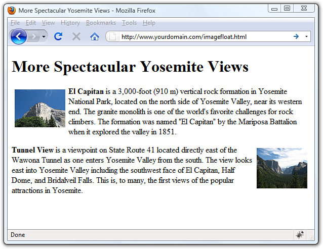
In Listing 8.3, <img style="float:left" /> aligns the first image to the left and wraps text around the right side of it, as you might expect. Similarly, <img style="float:right" /> aligns the second image to the right and wraps text around the left side of it. Figure 8.14 shows how these images align on a web page. There is no concept of floating an image to the center because there would be no way to determine how to wrap text on each side of it.
Figure 8.14 Showing the image alignment from Listing 8.3.
Listing 8.3 Using text-align Styles to Align Images on a Web Page
<?xml version="1.0" encoding="UTF-8"?>
<!DOCTYPE html PUBLIC "-//W3C//DTD XHTML 1.1//EN"
"http://www.w3.org/TR/xhtml11/DTD/xhtml11.dtd">
<html xmlns="http://www.w3.org/1999/xhtml" xml:lang="en">
<head>
<title>More Spectacular Yosemite Views</title>
</head>
<body>
<h1>More Spectacular Yosemite Views</h1>
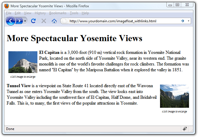
<p><img src="elcap_sm.jpg" alt="El Capitan" width="100"
height="75" style="float:left; padding: 6px;"/><strong>El
Capitan</strong> is a 3,000-foot (910 m) vertical rock formation
in Yosemite National Park, located on the north side of Yosemite
Valley, near its western end. The granite monolith is one of the
world's favorite challenges for rock climbers. The formation was
named "El Capitan" by the Mariposa Battalion when it explored the
valley in 1851.</p>
<p><img src="tunnelview_sm.jpg" alt="Tunnel View" width="100"
height="80" style="float:right; padding: 6px;"/><strong>Tunnel
View</strong> is a viewpoint on State Route 41 located directly east
of the Wawona Tunnel as one enters Yosemite Valley from the south.
The view looks east into Yosemite Valley including the southwest face
of El Capitan, Half Dome, and Bridalveil Falls. This is, to many, the
first views of the popular attractions in Yosemite.</p>
</body>
</html>
Note
Notice the addition of padding in the style attribute for both <img/> tags used in Listing 8.3. This padding provides some breathing room between the image and the text—6 pixels on all four sides of the image. You will learn more about padding in Chapter 9, “Working with Margins, Padding, Alignment, and Floating.”
Vertical Image Alignment
Sometimes, you might want to insert a small image in the middle of a line of text; or you might like to put a single line of text next to an image as a caption. In either case, it would be handy to have some control over how the text and images line up vertically. Should the bottom of the image line up with the bottom of the letters, or should the text and images all be arranged so that their middles line up? You can choose between these and several other options:
• To line up the top of an image with the top of the tallest image or letter on the same line, use <img style="vertical-align:text-top" />.
• To line up the bottom of an image with the bottom of the text, use <img style="vertical-align:text-bottom" />.
• To line up the middle of an image with the overall vertical center of everything on the line, use <img style="vertical-align:middle" />.
• To line up the bottom of an image with the baseline of the text, use <img style="vertical-align:baseline" />.
Note
The vertical-align style property also supports values of top and bottom, which can be used to align images with the overall top or bottom of a line of elements regardless of any text on the line.
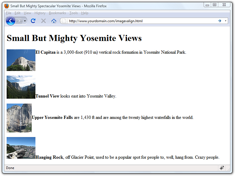
All four of these options are used in Listing 8.4 and displayed in Figure 8.15. Four thumbnail images are now listed vertically down the page, along with descriptive text next to each image. Various settings for the vertical-align style property are used to align each image and its relevant text.
Figure 8.15 Showing the vertical image alignment options used in Listing 8.4.
Listing 8.4 Using vertical-align Styles to Align Text with Images
<?xml version="1.0" encoding="UTF-8"?>
<!DOCTYPE html PUBLIC "-//W3C//DTD XHTML 1.1//EN"
"http://www.w3.org/TR/xhtml11/DTD/xhtml11.dtd">
<html xmlns="http://www.w3.org/1999/xhtml" xml:lang="en">
<head>
<title>Small But Mighty Spectacular Yosemite Views</title>
</head>
<body>
<h1>Small But Mighty Yosemite Views</h1>
<p><img src="elcap_sm.jpg" alt="El Capitan" width="100"
height="75" style="vertical-align:text-top;"/><strong>El
Capitan</strong> is a 3,000-foot (910 m) vertical rock formation
in Yosemite National Park.</p>
<p><img src="tunnelview_sm.jpg" alt="Tunnel View" width="100"
height="80" style="vertical-align:text-bottom;"/><strong>Tunnel
View</strong> looks east into Yosemite Valley.</p>
<p><img src="upperyosefalls_sm.jpg" alt="Upper Yosemite Falls"
width="87" height="100" style="vertical-align:middle;"/><strong>Upper
Yosemite Falls</strong> are 1,430 ft and are among the twenty highest
waterfalls in the world. </p>
<p><img src="hangingrock_sm.jpg" alt="Hanging Rock" width="100"
height="75" style="vertical-align:baseline;"/><strong>Hanging
Rock</strong>, off Glacier Point, used to be a popular spot for people
to, well, hang from. Crazy people.</p>
</body>
</html>
Tip
If you don’t include any align attribute in an <img /> tag, the bottom of the image will line up with the baseline of any text next to it. That means you never actually have to type style="vertical-align:baseline" because it is assumed by default. However, if you specify a margin for an image and intend for the alignment to be a bit more exacting with the text, you might want to explicitly set the vertical-align attribute to text-bottom. Take a look at the last image shown in Figure 8.15 to see an example of the text appearing slightly below the image due to the image margin—this is a result of the baseline setting for vertical-align.
Turning Images into Links
You probably noticed in Figure 8.12 that the image on the page is quite large, which is fine in this particular example but isn’t ideal when you’re trying to present multiple images. It makes more sense in this case to create smaller image thumbnails that link to larger versions of each image. Then, you can arrange the thumbnails on the page so that visitors can easily see all the content, even if they see only a smaller version of the actual (larger) image. Thumbnails are one of the many ways you can use image links to spice up your pages.
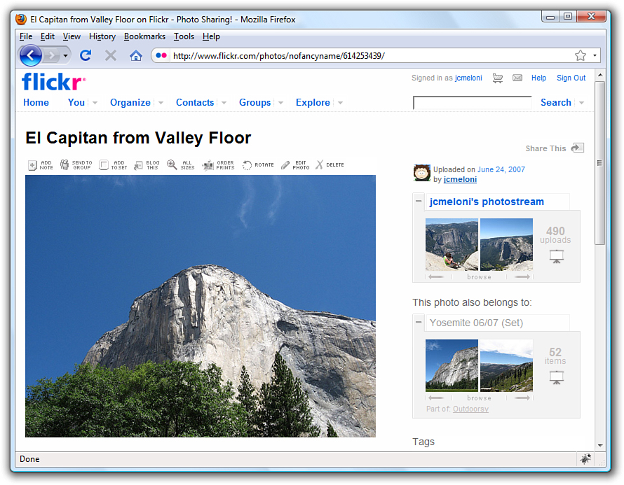
To turn any image into a clickable link to another page or image, you can use the <a href> tag that you used previously to make text links. Listing 8.5 contains the code for a modification of Listing 8.3—which already used thumbnails—to provide links to larger versions of the images. To ensure that the user knows to click the thumbnails, the image and some helper text is enclosed in a <div>, as shown in Figure 8.16.
Figure 8.16 Using thumbnails as links improves the layout of a page that uses large images.
Listing 8.5 Using Thumbnails for Effective Image Links
<?xml version="1.0" encoding="UTF-8"?>
<!DOCTYPE html PUBLIC "-//W3C//DTD XHTML 1.1//EN"
"http://www.w3.org/TR/xhtml11/DTD/xhtml11.dtd">
<html xmlns="http://www.w3.org/1999/xhtml" xml:lang="en">
<head>
<title>More Spectacular Yosemite Views</title>
<style type="text/css">
div.imageleft {
float:left;
clear: all;
text-align:center;
font-size:9px;
font-style:italic;
}
div.imageright {
float:right;
clear: all;
text-align:center;
font-size:9px;
font-style:italic;
}
img {
padding: 6px;
border: none;
}
</style>
</head>
<body>
<h1>More Spectacular Yosemite Views</h1>
<p><div class="imageleft">
<a href="http://www.flickr.com/photos/nofancyname/614253439/"><img
src="elcap_sm.jpg" alt="El Capitan" width="100" height="75"/></a>
<br/>click image to enlarge</div><strong>El Capitan</strong>
is a 3,000-foot (910 m) vertical rock formation in Yosemite National
Park, located on the north side of Yosemite Valley, near its western
end. The granite monolith is one of the world's favorite challenges
for rock climbers. The formation was named "El Capitan" by the
Mariposa Battalion when it explored the valley in 1851.</p>
<p><div class="imageright">
<a href="http://www.flickr.com/photos/nofancyname/614287355/"><img
src="tunnelview_sm.jpg" alt="Tunnel View" width="100" height="80"/></a>
<br/>click image to enlarge</div><strong>Tunnel View</strong> is a
viewpoint on State Route 41 located directly east of the Wawona Tunnel
as one enters Yosemite Valley from the south. The view looks east into
Yosemite Valley including the southwest face of El Capitan, Half Dome,
and Bridalveil Falls. This is, to many, the first views of the popular
attractions in Yosemite.</p>
</body>
</html>
The code in Listing 8.5 uses additional styles that will be explained in more detail in later chapters, but you should be able to figure out the basics:
• The <a> tags link these particular images to larger versions, which in this case are stored on an external server (at Flickr).
• The <div> tags, and their styles, are used to align those sets of graphics and caption text (and also include some padding).
Unless instructed otherwise, web browsers display a colored rectangle around the edge of each image link. Like text links, the rectangle usually appears blue for links that haven’t been visited recently or purple for links that have been visited recently—unless you specify different colored links in your style sheet. Because you seldom, if ever, want this unsightly line around your linked images, you should usually include style="border:none" in any <img /> tag within a link. In this instance, the border:none style is made part of the style sheet entry for the img element because we use the same styles twice.
When you click one of the thumbnail images on the sample page shown, the link is opened in the browser, as shown in Figure 8.17.
Figure 8.17 Clicking a linked thumbnail image opens the target of the link.
Using Background Images
As you learned earlier in this chapter, you can use background images to act as a sort of wallpaper in a container element, so that the text or other images appear on top of this underlying design.
The basic style properties that work together to create a background are as follows:
• background-color—Specifies the background color of the element. Although not image-related, it is part of the set of background-related properties.
• background-image—Specifies the image to use as the background of the element using the following syntax: url('imagename.gif').
• background-repeat—Specifies how the image should repeat, both horizontally and vertically. By default (without specifying anything), background images will repeat both horizontally and vertically. Other options are repeat (same as default), repeat-x (horizontal), repeat-y (vertical), and no-repeat (only one appearance of the graphic).
• background-position—Specifies where the image should be initially placed relative to its container. Options include top-left, top-center, top-right, center-left, center-center, center-right, bottom-left, bottom-center, bottom-right, and specific pixel and percentage placements.
When specifying a background image, you can put all of these specifications together into one property, like so:
body {
background: #ffffff url('imagename.gif') no-repeat top right;
}
In the previous style sheet entry, the body element of the web page will be white and include a graphic named imagename.gif on the top right. Another use for the background property is the creation of custom bullets for your unordered lists. To use images as bullets, first define the style for the <ul> tag as follows:
ul {
list-style-type: none;
padding-left: 0;
margin-left: 0;
}
Next, change the declaration for the <li> tag to:
li {
background: url(mybullet.gif) left center no-repeat
}
Make sure that mybullet.gif (or whatever you name your graphic) is on the web server and accessible; in that case, all unordered list items will show your custom image rather than the standard-filled disc bullet.
We will return to the specific use of background properties in Part III, “Advanced Web Page Design with CSS,” when using CSS for overall page layouts.
Using Imagemaps
Sometimes you might want to use an image as navigation, but beyond the simple button-based or link-based navigation that you often see in websites. For example, perhaps you have a website with medical information, and you want to show an image of the human body that links to pages that provide information about various body parts. Or, you have a website that provides a world map users can click to access information about countries. You can divide an image into regions that link to different documents, depending on where users click within that image. This is called an imagemap, and any image can be made into an imagemap.
Why Imagemaps Aren’t Always Necessary
The first thing you should know about imagemaps is that you probably won’t need to use them except in very special cases. It’s almost always easier and more efficient to use several ordinary images that are placed directly next to one another and provide a separate link for each image.
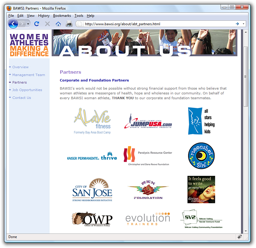
For example, see Figure 8.18. This is a web page that shows 12 different corporate logos; this example is a common type of web page in the business world, one in which you give a little free advertisement to your partners. You could present these logos as one large image and create an imagemap that provides links to each of the 12 companies. Users could click each logo in the image to visit each company’s site. Or, you could display the images on the page as in this example and use 12 separate images—one for each company—with each image including a link to that particular company.
Figure 8.18 Web page with 12 different logos; this could be presented as a single imagemap or divided into 12 separate pieces.
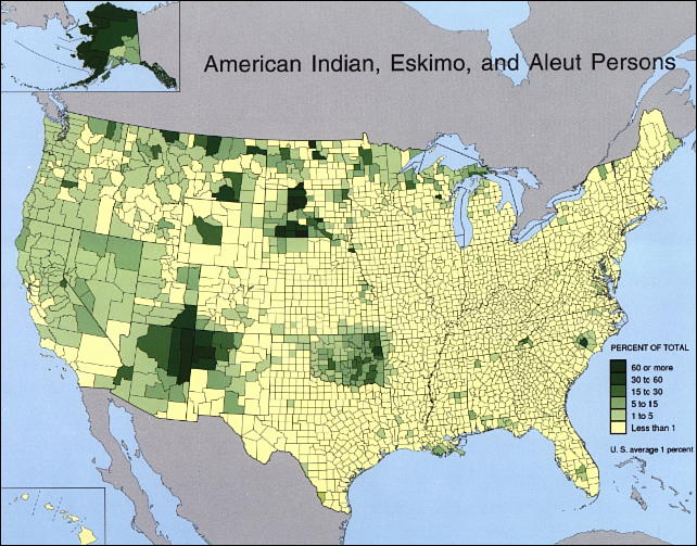
An imagemap is the best choice for an image that has numerous parts, is oddly arranged, or the design of the image itself might be too complicated to divide into separate images. Figure 8.19 shows an image that is best suited as an imagemap.
Figure 8.19 An image that wouldn’t take well to being sliced up—better make it an imagemap.
Mapping Regions Within an Image
To create any type of imagemap, you need to figure out the numerical pixel coordinates of each region within the image that you want to turn into a clickable link. These clickable links are also known as areas. Your graphics program might provide you with an easy way to find these coordinates. Or you might want to use a standalone imagemapping tool such as Mapedit (http://www.boutell.com/mapedit/) or the online imagemap maker at http://www.image-maps.com/. In addition to helping you map the coordinates, these tools also provide the HTML code necessary to make the maps work.
Using an imagemapping tool is often as simple as using your mouse to draw a rectangle (or a custom shape) around the area you want to be a link. Figure 8.20 shows the result of one of these rectangular selections as well as the interface for adding the URL and the title or alternate text for this link. Several pieces of information are necessary to creating the HTML for your imagemap: coordinates, target URL, title of link, and alternative text for the link.
Figure 8.20 Using an imagemapping tool to create linked areas of a single graphic.
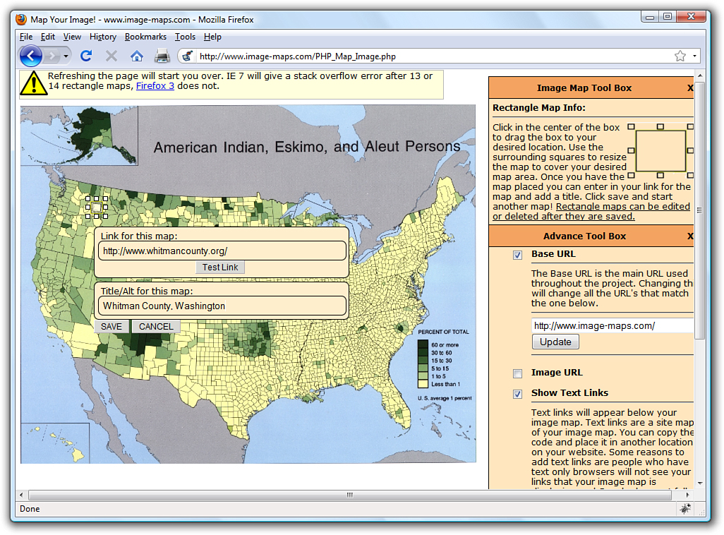
Creating the HTML for an Imagemap
If you use an imagemap generator, you will already have the HTML necessary for creating the imagemap. However, it is a good idea to understand the parts of the code so that you can check it for accuracy. The following HTML code is required to start any imagemap:
<map name="mapname">
Keep in mind that you can use whatever name you want for the name of the <map> tag, although it helps if you make it as descriptive as possible. Next, you’ll need an <area /> tag for each region of the image. Following is an example of a single <area /> tag that is used in the mapping-a-map imagemap example:
<area shape="rect" coords="100,136,116,152"
href="http://www.whitmancounty.org/"
alt="Whitman County, WA"
title="Whitman County, WA" />
This <area /> tag has five attributes, which you will use with every area you describe in an imagemap:
• shape indicates whether the region is a rectangle (shape="rect"), a circle (shape="circle"), or an irregular polygon (shape="poly").
• coords gives the exact pixel coordinates for the region. For rectangles, give the x,y coordinates of the upper-left corner followed by the x,y coordinates of the lower-right corner. For circles, give the x,y center point followed by the radius in pixels. For polygons, list the x,y coordinates of all the corners in a connect-the-dots order.
• href specifies the page to which the region links. You can use any address or filename that you would use in an ordinary <a href> link tag.
• alt enables you to provide a piece of text that is associated with the shape. Most browsers (Firefox excluded) display this text in a small box when a user hovers his mouse over the shape. This text adds a subtle but important visual cue to users who might not otherwise realize that they are looking at an imagemap. Firefox correctly uses the title attribute in addition to the alt attribute to provide a visual cue, which is why, as noted previously in this chapter, you should use both attributes.
Each distinct clickable region in an imagemap must be described as a single area, which means a typical imagemap consists of a list of areas. After coding the <area /> tags, you are done defining the imagemap, so wrap things up with a closing </map> tag.
The last step in creating an imagemap is wiring it to the actual map image. The map image is placed on the page using an ordinary <img /> tag. However, there is an extra usemap attribute that is coded like this:
<img src="map.png" usemap="#countymap"
style="border:none; width:650px; height:509px"
alt="Native Peoples Census Map" />
When specifying the value of the usemap attribute, use the name you put in the id of the <map> tag (and don’t forget the # symbol). Also include the style attribute to specify the height and width of the image and to turn off the border around the imagemap, which you might or might not elect to keep in imagemaps of your own.
Listing 8.6 shows the complete code for a sample web page containing the map graphic, its imagemap, and a few mapped areas.
Listing 8.6 Defining the Regions of an Imagemap with <map> and <area /> Tags
<?xml version="1.0" encoding="UTF-8"?>
<!DOCTYPE html PUBLIC "-//W3C//DTD XHTML 1.0 Transitional//EN"
"http://www.w3.org/TR/xhtml1/DTD/xhtml1-transitional.dtd">
<html xmlns="http://www.w3.org/1999/xhtml" xml:lang="en">
<head>
<title>Testing an Imagemap</title>
</head>
<body>
<h1>Testing an Imagemap</h1>
<p style="text-align:center">Click on a logo to go to the
county's web site.<br/>
<img src="map.png" usemap="#countymap"
style="border:none; width:650px;height:509px"
alt="Native Peoples Census Map" /></p>
<map name="countymap" id="countymap">
<area shape="rect" coords="100,136,116,152"
href="http://www.whitmancounty.org/"
alt="Whitman County, WA" title="Whitman County, WA" />
<area shape="rect" coords="29,271,42,283"
href="http://www.sccgov.org/" alt="Santa Clara County, CA"
title="Santa Clara County, CA" />
<area shape="rect" coords="535,216,548,228"
href="http://visitingmifflincounty.com/"
alt="Mifflin County, PA" title="Mifflin County, PA" />
</map>
</body>
</html>
Note
If you’re a stickler for details, you might have noticed—check out the first few lines of code—that this web page is coded as an XHTML 1.0 document, as opposed to the XHTML 1.1 used with most of the other examples in the book. This is done because some browsers (Internet Explorer, for one) are lagging in their support of a single XHTML 1.1 change in how imagemaps are used. This change is specific to the usemap attribute, which in XHTML 1.1 doesn’t require the # symbol in front of the map name. In fact, the # symbol isn’t allowed at all in XHTML 1.1. The # symbol is, however, allowed in XHTML 1.0, so to satisfy current web browsers and still provide you with a valid web page; this particular example uses XHTML 1.0.
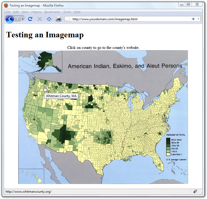
Figure 8.21 shows the imagemap in action. Notice in the bottom of your browser window that your browser (in this example, Firefox) displays the link address for whatever area the mouse is hovering over. Additionally, when you hover the mouse over an area, the alt or title text for that area—in this example, Whitman County—is displayed on the imagemap.
Figure 8.21 The imagemap defined in Listing 8.6 as it displays on the web page.
Note
There is a method of producing mapped images that relies solely on CSS and not the HTML <map> tag. You will learn more about this in Chapter 11, “Using CSS to Do More with Lists, Text, and Navigation.”
Integrating Multimedia into Your Website
Now that you’ve learned how to work with static images, the natural next step is to work with multimedia. The term multimedia encompasses everything we see and hear on a web page: audio, video, and animation, as well as static images and text. In this section, you won’t learn how to create any particular audio, video, or animation, but you will learn how to include such files in your site, through either linking or embedding the content.
Remember, though, that not every user has devices that will play your media type, nor do all users have broadband Internet connections which allow these large files to transfer quickly. Always warn your visitors that the links they click will take them to multimedia files and offer them the choice to view or listen to the content—don’t force the files upon them.
Creating multimedia of any kind can be a challenging and complicated task. If you’re planning to create your own content from scratch, you’ll need far more than this book to become the next crackerjack multimedia developer. After you have some content, however, this section will show you how to place your new creations into your web pages.
For those of us who are artistically challenged, several alternative ways to obtain useful multimedia assets are available. Aside from the obvious (such as hiring an artist), here are a few suggestions:
• Much of the material on the Internet is free. Of course, it’s still a good idea to double-check with the author or current owner of the content; you don’t want to be sued for copyright infringement. In addition, various offices of the U.S. government generate content which, by law, belongs to all Americans. (For example, any NASA footage found online is free for your use.)
• Many search engines (google.com, yahoo.com, bing.com, and so on) have specific search capabilities for finding multimedia files. As long as you are careful about copyright issues, this can be an easy way to find multimedia related to a specific topic. A simple search for sample Flash animations, sample QuickTime movie, or sample audio files will produce more results than you can handle.
• If you are creatively inclined, determine the medium you like most—for some of you it might be video production, others may enjoy audio production, and still others might want to dabble in animation. After you have determined a starting point, look into the various types of software which will enable you to create such artistic masterpieces. Many companies provide multimedia software, such as Adobe (http://www.adobe.com/) and Apple (http://www.apple.com/).
Linking to Multimedia Files
The simplest and most reliable option for incorporating a video or audio file into your website is to simply link it in with <a href>, exactly as you would link to another HTML file.
Note
Regardless of the specific media types shown in this chapter, the procedures shown for incorporating multimedia into your web pages will be similar no matter which media format you choose.
For example, the following line could be used to offer a MOV video of a hockey game:
<a href="hockey.mov">View the hockey video clip.</a>
When the user clicks the words View the hockey video clip., the hockey.mov QuickTime video file is transferred to her computer from your web server. Whichever helper application or plug-in she has installed automatically starts as soon as the file has finished downloading. If no compatible helper or plug-in can be found, the web browser will offer her a chance to download the appropriate plug-in or save the video on her hard drive for later viewing.
Note
In case you’re unfamiliar with helper applications (helper apps for short), they are the external programs that a web browser calls on to display any type of file it can’t handle on its own. Generally, the helper application associated with a file type is called on whenever a web browser can’t display that type of file on its own.
Plug-ins are a special sort of helper application installed directly into a web browser and they enable you to view multimedia content directly within the browser window.
The click action results in the browser either playing the video with the help of a plug-in (if one is found that can play the clip) or deferring to a suitable helper application.
If you change the link from pond.wmv (Windows Media) to pond.mov (QuickTime), your browser handles the link differently. Instead of launching another program, the QuickTime plug-in enables you to view the movie clip directly in the browser window.
As you might have guessed, this approach of using a simple link to play multimedia files offers the best backward compatibility because the browser bears all the responsibility of figuring out how to play a multimedia clip. The downside to this is that you don’t have much control over how a clip is played, and you definitely can’t play a clip directly in the context of a page.
Note
If your browser has no support for QuickTime, you can download the QuickTime player free from Apple at http://www.apple.com/quicktime/. Even if you do have QuickTime installed, some browsers might still play QuickTime movies differently based on whether a plug-in is installed. For example, on my Windows computer, Internet Explorer and Firefox both play QuickTime movies directly in the browser window via a plug-in, whereas Opera launches QuickTime as a helper application.
Embedding Multimedia Files
XHTML contains a standard <object> tag that is the preferred way to embed multimedia of any kind in a web page. This tag is used instead of the old <embed /> tag that you might still see in some HTML source code.
Embedding a multimedia file into a page produces a set of software controls that allow the file to be played directly—no secondary window is necessary, and there’s no need to navigate away from the page you are on. Following is code to embed the pond video using the <object> tag by itself:
<object classid="CLSID:6BF52A52-394A-11d3-B153-00C04F79FAA6"
width="320" height="305">
<param name="type" value="video/x-ms-wmv" />
<param name="URL" value="pond.wmv" />
<param name="uiMode" value="full" />
<param name="autoStart" value="false" />
</object>
This code isn’t too terribly complicated when you consider that it literally embeds a video directly into your web page (see Figure 8.22). The messiest part of the code is the classid attribute of the <object> tag, which is set to a long alphanumeric code. This code is the global ID for Windows Media Player, which means that you’re telling the <object> tag to embed Windows Media Player on the page to play the video clip. You can just copy and paste this code into your own web pages.
Figure 8.22 The <object> tag enables you to embed a video clip on a web page while specifying which media player is to play it.

Note
It’s important to note that Windows Media Player is a sophisticated enough media player that it automatically streams multimedia files, which means that it begins playing them after loading only the first few seconds of content. The idea is that the rest of the content is loaded in the background while you’re watching or listening to earlier portions. The result is that visitors don’t have to wait through long download times when viewing or listening to your multimedia clips.
The width and height attributes of the <object> tag determine the size of the embedded Windows Media Player window. Some browsers will automatically size the embedded player to fit the content if you leave these attributes off, whereas others won’t show anything at all. Play it safe by setting them to a size that suits the multimedia content being played.
There are four <param> tags within the <object> tag that are responsible for additional details about how the clip is to be played. Each tag has two attributes, name and value, which are responsible for associating data (value) with a particular setting (name). In this example, the URL for the media clip is set to pond.wmv. The third parameter, uiMode, determines which buttons and user interface options are made available by Windows Media Player—full indicates that all user interface features are enabled, such as the control buttons and volume slider. Finally, the autoStart parameter is set to false so that the video clip does not automatically start playing when the page is opened in a browser.
The type parameter is perhaps the trickiest. It identifies the type of media being displayed, which in this case is a Windows Media Video (WMV) file. This media type must be specified as one of the standard Internet MIME types.
A MIME type is an identifier for uniquely identifying different types of media objects on the Internet. MIME stands for Multipurpose Internet Mail Extensions, and this name comes from the fact that MIME types were originally used to identify email attachments. These MIME types should be used in the type attribute of the <object> tag to identify what kind of multimedia object is being referenced in the data attribute.
Following are the MIME types for several popular sound and video formats you might want to use in your web pages:
• WAV Audio—audio/x-wav
• AU Audio—audio/basic
• MP3 Audio—audio/mpeg
• MIDI Audio—audio/midi
• WMA Audio—audio/x-ms-wma
• RealAudio—audio/x-pn-realaudio-plugin
• AVI—video/x-msvideo
• WMV—video/x-ms-wmv
• MPEG Video—video/mpeg
• QuickTime—video/quicktime
Listing 8.7 shows the relevant code for the pond web page, where you can see the <object> tag as it appears in context.
Listing 8.7 Using an <object> Tag to Directly Embed a WMV Video Clip
<?xml version="1.0" encoding="UTF-8"?>
<!DOCTYPE html PUBLIC "-//W3C//DTD XHTML 1.1//EN"
"http://www.w3.org/TR/xhtml11/DTD/xhtml11.dtd">
<html xmlns="http://www.w3.org/1999/xhtml" xml:lang="en">
<head>
<title>Fun in the Pond</title>
</head>
<body>
<h1>Fun in the Pond</h1>
<div style="float:left; padding:3px">
<object classid="CLSID:6BF52A52-394A-11d3-B153-00C04F79FAA6"
width="320" height="305">
<param name="type" value="video/x-ms-wmv" />
<param name="URL" value="pond.wmv" />
<param name="uiMode" value="full" />
<param name="autoStart" value="false" />
<embed width="320" height="305" type="video/x-ms-wmv"
src="pond.wmv" controls="All" loop="false" autostart="false"
pluginspage="http://www.microsoft.com/windows/windowsmedia/" />
</object>
</div>
<p>Michael's backyard pond is not only a fun hobby but also
an ongoing home improvement project that is both creative and
relaxing.</p>
<p>He has numerous fish in the pond, all Koi from various places
as far as Japan, Israel, and Australia. Although they don't bark,
purr, or fetch anything other than food, these fish are his pets,
and good ones at that.</p>
</body>
</html>
Note
Because the <embed /> tag is not supported in XHTML, it will prevent your pages from validating. Unfortunately, there really is no workaround for this problem—we’ll just have to wait for browsers to fully support the <object> tag by itself or move to the <embed /> element of HTML5.
You might notice that there’s some extra code that didn’t appear in the earlier <object> tag example. Unfortunately, as discussed earlier in the section, not all web browsers are entirely consistent in their support of the <object> tag. For this reason, it is necessary to include an <embed /> tag within the <object> tag to account for browser inconsistencies. This isn’t an ideal solution, but it’s all we have while browser vendors continue to lag behind prevailing standards. If you pay close attention, you’ll notice that the <embed /> tag contains all the same information as the <object> tag.
Note
Video files aren’t the only media files you can include within your website using the <object> and <embed /> tags. Adding any multimedia file will follow the same process. To determine exactly which classid and codebase attributes to use, as well as additional parameters (in the <param /> tags), use your search engine to look up something like object embed mediatype, where mediatype is Real Audio, QuickTime, Flash, or whatever you want.
The <object> tag is a bit more complex than what is revealed here. However, you don’t need to know how to use the more advanced facets of the <object> tag just to play multimedia content. In other words, it isn’t important for you to become a multimedia guru to share some multimedia clips on your web pages.
Additional Tips for Using Multimedia
Before you add video, audio, or animations to your website, first ask yourself if you really should. When you use these types of multimedia, be sure to do so for a reason. Gratuitous sound and video, just like gratuitous images, can detract from your overall message. Then again, if your message is “Look at the videos I have made” or “Listen to my music and download some songs,” then multimedia absolutely must play a role in your website.
Here are a few additional tips to keep in mind:
• Don’t include multimedia in a page and set it to automatically play when the page loads. Always give users the option to start (and stop) your sound or video.
• When possible, give users a choice of multimedia players. Don’t limit yourself to multimedia content playable by only one type of player on only one operating system.
• Multimedia files are larger than the typical graphics and text files, which means you need to have the space on your web server to store them, as well as the bandwidth allotment to transfer them to whomever requests them via your website.
• If your site is entirely audio or video and offers very little by way of text or graphics, understand that a certain segment of your audience won’t see or hear what you want to present because of the limitations of their system or bandwidth. Provide these users with additional options to get your information.
• Leverage free online video hosting services, such as YouTube (http://www.youtube.com/). Not only does YouTube provide storage for your video clips, it will provide you with the code necessary to embed the video in your own web page. For example, Figure 8.23 shows the YouTube page for the cutest puppy in the world. If you copy and paste the text from the Embed area shown in the figure, you would get the following:
<object width="425" height="344">
<param name="movie" value="http://www.youtube.com/v/yPxiHd2BOpo
&rel=0&color1=0xb1b1b1&color2=0xcfcfcf&feature=player_profilepage
&fs=1"></param>
<param name="allowFullScreen" value="true"></param>
<param name="allowScriptAccess" value="always"></param>
<embed src="http://www.youtube.com/v/yPxiHd2BOpo&rel=0&color1=0xb1b1b1
&color2=0xcfcfcf&feature=player_profilepage&fs=1"
type="application/x-shockwave-flash" allowfullscreen="true"
allowScriptAccess="always" width="425" height="344"></embed>
</object>
Figure 8.23 YouTube provides storage of your video files as well as links and <object> code for use in your own pages.
You could then insert the code into your web page.
Summary
In this chapter, you learned a few best practices for thinking about color use, and how to use the color wheel to help you find colors that will complement your text. Additionally, you learned about hexadecimal notion for colors—that all colors are expressed in notations related to the amount of red, green, and blue in them—and how hexadecimal notation enables you to apply nuanced colors to your elements. More importantly, you learned about the three color-related style properties that can be used to apply color to container backgrounds, borders, and text using CSS.
You also learned the basics of preparing graphics for use on web pages. If nothing else, you learned that this is a very complex topic, and you learned just enough in this chapter to whet your appetite. The examples in this chapter used the popular (and free!) GIMP software package, but feel free to use the graphics software that best suits your needs. Among the actions you learned were how to crop, resize, and tweak image colors, and you also learned about the different file formats. There are many considerations you must keep in mind when including graphics in your site, including graphic size and resolution and how to use transparency, animated GIFs, and tiled backgrounds.
After you have created or edited some images, you can place them in your web page, which you also learned how to do through the <img /> tag. You learned how to include a short text message that appears in place of the image as it loads and also appears whenever users move the mouse pointer over the image. You also discovered how to control the horizontal and vertical alignment of each image and how to wrap text around the left or right of an image.
You learned how to use images as links—either by using the <a> tag around the images or by creating imagemaps. You also learned a little bit about how to use images in the background of container elements.
Finally, you learned how to embed video and sound into a web page. You discovered how to use a simple link to a multimedia file, which is the most broadly supported but least flexible option for playing media content. You then learned how to use the <object> tag to embed a media player directly in a web page. Not only that, you discovered that for maximum browser compatibility, it helps to assist the <object> tag with the <embed /> tag. The <object> and <embed /> tags can be used to include a vast array of media types, including WAV, MP3, RealAudio, and MIDI files—not to mention AVI, WMV, and QuickTime videos, to name just a few.
Table 8.1 summarizes the tags and attributes covered in this chapter.
Table 8.1 Tags and Attributes Covered in Chapter 8
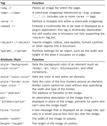
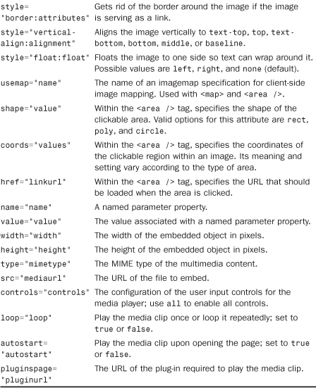
Q&A
Q. Instead of learning all this stuff myself, shouldn’t I just hire a graphic artist to design my pages?
A. This is a difficult question to answer, and it’s not because I have a conflict of interest here—I work for a web development and design agency, so it’s in my best interest to recommend agencies. But an agency isn’t always the best solution. Hiring a graphic designer takes time and money. Additionally, there are many graphic artists who do not produce work suitable for the Web—they are specifically print-based artists, and the print world is quite different than the online world. Also, hiring an individual who deems himself a graphic designer to create a website might not play to the strengths of that particular graphic designer. In other words, he might be good at designing the graphical elements of a website, but he might not be good as a content architect or at working with HTML and CSS. If your site is simply a personal site, a professional design might not be where you want to spend your money. But if your site is intended to promote a business, a product, a school, or anything else whereby your image is integral to your success, it’s worth your while (and money) to consult with web design professional.
Q. I’ve produced graphics for printing on paper. Are web page graphics any different?
A. Yes. In fact, many of the rules for print graphics are reversed on the Web. Web page graphics have to be low resolution, whereas print graphics should be as high resolution as possible. White washes out black on computer screens, whereas black bleeds into white on paper. Also, someone might stop a web page from loading when only half the graphics have been downloaded. Try to avoid falling into old habits if you’ve done a lot of print graphics design.
Q. I used the <img /> tag just as you advised, but when I view the page, all I see is a little box with some shapes in it. What’s wrong?
A. The broken image icon you’re seeing can mean one of two things: Either the web browser couldn’t find the image file or the image isn’t saved in a format the browser recognizes. To solve these problems, first check to make sure that the image is where it is supposed to be. If it is, then open the image in your graphics editor and save it again as a GIF, JPG, or PNG format.
Q. What happens if I overlap areas on an imagemap?
A. You are allowed to overlap areas on an imagemap. Just keep in mind that when determining which link to follow, one area will have precedence over the other area. Precedence is assigned according to which areas are listed first in the imagemap. For example, the first area in the map has precedence over the second area, which means that a click in the overlapping portion of the areas will link to the first area. If you have an area within an imagemap that doesn’t link to anything (known as a dead area), you can use this overlap trick to deliberately prevent this area from linking to anything. To do this, just place the dead area before other areas so that the dead area overlaps them, and then set its href attribute to "".
Q. I hear a lot about streaming video and audio. What does that mean?
A. In the past, video and audio files took minutes and sometimes hours to retrieve through most modems, which severely limited the inclusion of video and audio on web pages. The goal that everyone is moving toward is streaming video or audio, which plays while the data is being received. In other words, you don’t have to completely download the clip before you can start to watch it or listen to it.
Streaming playback is now widely supported through most media players, in both standalone versions and plug-ins. When you embed a media object using the <object> tag, the underlying media player automatically streams the media clip if streaming is supported in the player.
Workshop
The workshop contains quiz questions and exercises to help you solidify your understanding of the material covered. Try to answer all questions before looking at the “Answers” section that follows.
Quiz
1. How would you give a web page a black background and make all text bright green? Based on what you’ve learned in this chapter, would you even want to use that color combination?
2. You have a scanned picture of a horse that you need to put on a web page. How big should you make it? In what file format should you save it?
3. How would you insert an elephant.jpg image file at the top of a web page?
4. How would you make the word Elephant display whenever the actual elephant.jpg image couldn’t be displayed by a web browser?
Answers
1. Put the following at the beginning of the web page or use a style rule for the body element:
<body style="background-color:#000000; color:#00FF00">
2. Depending on how important the image is to your page, you should make it as small as 100×40 pixels or as large as 300×120 pixels. The JPEG format, with about 85% compression, would be best. Of course, you could also provide a thumbnail link to a larger image that is viewed by itself.
3. Copy the image file into the same directory folder as the HTML text file. Immediately after the <body> tag in the HTML text file, type <p><img src="elephant.jpg" alt="" /></p>.
<img src="elephant.jpg" alt="elephant" />
Exercises
• Select a base color that you like—perhaps a lovely blue or an earthy tone—and use the Color Scheme Generator at http://colorscheme-designer.com/ to come up with a set of colors that you can use in a website. I recommend the tetrad or accented analogic scheme types.
• After you have a set of colors—or a few options for sets of colors—create a basic HTML page with a <h1> element, a paragraph of text, and perhaps some list items. Use the color-related styles you’ve learned about in this chapter to change the background color of the page and the text of the various block-level elements, to see how these sets of colors might work together. See how they interact and determine which colors are best used for containers and which are best used for plain text, header text, and link text.
• Before you start designing graphics for an important business site, try spicing up your own personal home page. This will give you a chance to learn GIMP (or give you a chance to use your graphics software) so that you’ll know what you’re doing when you tackle the task at work.
• Practicing any of the image placement methods in this chapter will go a long way toward helping you determine the role that images can, and will, play in the websites you design. Using a few sample images, practice using the float style to place images and text in relation to one another. Remember the possible values for float are left, right, and none (default).