Chapter 11. Using CSS to Do More with Lists, Text, and Navigation
In Chapter 5, “Working with Fonts, Text Blocks, and Lists,” you were introduced to three types of HTML lists, and in Chapter 9, “Working with Margins, Padding, Alignment, and Floating,” you learned about margins, padding, and alignment of elements. In this chapter, you will learn how margins, padding, and alignment styles can be applied to different types of HTML lists, helping you produce some powerful design elements purely in HTML and CSS.
Specifically, you will learn how to modify the appearance of list elements—beyond the use of the list-style-type property that you learned in Chapter 5—and how to use a CSS-styled list to replace the client-side image maps you learned about in Chapter 8, “Working with Colors, Images, and Multimedia.” You will put into practice many of the CSS styles you’ve learned thus far, and the knowledge you will gain in this chapter will lead directly into using lists for more than just simply presenting a bulleted or numbered set of items. You will learn a few of the many ways to use lists as vertical or horizontal navigation, including how to use lists to create drop-down menus.
The methods explained in this chapter represent a very small subset of the numerous and varied navigation methods you can create using lists. However, the concepts are all similar; different results come from your own creativity and application of these basic concepts. To help you get your creative juices flowing, I will provide pointers to other examples of CSS-based navigation at the end of this chapter.
HTML List Refresher
As you learned in Chapter 5, there are three basic types of HTML lists. Each presents content in a slightly different way based on its type and the context:
• The ordered list is an indented list that displays numbers or letters before each list item. The ordered list is surrounded by <ol> and </ol> tags and list items are enclosed in the <li></li> tag pair. This list type is often used to display numbered steps or levels of content.
• The unordered list is an indented list that displays a bullet or other symbol before each list item. The unordered list is surrounded by <ul> and </ul> tags, and list items are enclosed in the <li></li> tag pair. This list type is often used to provide a visual cue to show that brief, yet specific, bits of information will follow.
• A definition list is often used to display terms and their meanings, thereby providing information hierarchy within the context of the list itself—much like the ordered list but without the numbering. The definition list is surrounded by <dl> and </dl> tags with <dt> and </dt> tags enclosing the term, and <dd> and </dd> tags enclosing the definitions.
When the content warrants it, you can nest your ordered and unordered—or place lists within other lists. Nested lists produce a content hierarchy, so reserve their use for when your content actually has a hierarchy you want to display (such as content outlines or tables of content). Or, as you will learn later in this chapter, you can use nested lists when your site navigation contains sub-navigational elements.
Note
Some older browsers handle margins and padding differently, especially around lists and list items. However, at the time of writing, the HTML and CSS in this and other chapters in this book are displayed identically in current versions of the major web browsers (Apple Safari, Google Chrome, Microsoft Internet Explorer, Mozilla Firefox, and Opera). Of course, you should still review your web content in all browsers before you publish it online, but the need for “hacking” style sheets to accommodate the rendering idiosyncrasies of browsers is fading away.
How the CSS Box Model Affects Lists
Specific list-related styles include list-style-image (for placement of an image as a list-item marker), list-style-position (indicating where to place the list-item marker), and list-style-type (the type of list-item marker itself). But although these styles control the structure of the list and list items, you can use margin, padding, color, and background-color styles to achieve even more specific displays with your lists.
In Chapter 9, you learned that every element has some padding between the content and the border of the element; you also learned there is a margin between the border of the element and any other content. This is true for lists, and when you are styling lists, you must remember that a “list” is actually made up of two elements: the parent list element type (<ul> or <ol>) and the individual list items themselves. Each of these elements has margins and padding that can be affected by a style sheet.
The examples in this chapter show you how different CSS styles affect the visual display of HTML lists and list items. Keep these basic differences in mind as you practice working with lists in this chapter, and you will be able to use lists to achieve advanced visual effects within site navigation.
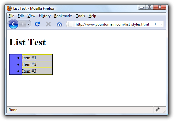
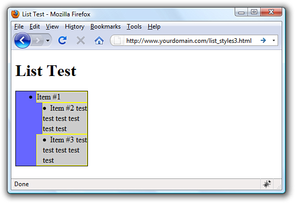
Listing 11.1 creates a basic list containing three items. In this listing, the unordered list itself (the <ul>) is given a blue background, a black border, and a specific width of 100 pixels, as shown in Figure 11.1. The list items (the individual <li>) have a gray background and a yellow border. The list item text and indicators (the bullet) are black.
Figure 11.1 Styling the list and list items with colors and borders.
Listing 11.1 Creating a Basic List with Color and Border Styles
<?xml version="1.0" encoding="UTF-8"?>
<!DOCTYPE html PUBLIC "-//W3C//DTD XHTML 1.1//EN"
"http://www.w3.org/TR/xhtml11/DTD/xhtml11.dtd">
<html xmlns="http://www.w3.org/1999/xhtml" xml:lang="en">
<head>
<title>List Test</title>
<style type="text/css">
ul {
background-color: #6666ff;
border: 1px solid #000000;
width:100px;
}
li {
background-color: #cccccc;
border: 1px solid #ffff00;
}
</style>
</head>
<body>
<h1>List Test</h1>
<ul>
<li>Item #1</li>
<li>Item #2</li>
<li>Item #3</li>
</ul>
</body>
</html>
Note
You can test the default padding-left value as displayed by different browsers by creating a simple test file such as that shown in Listing 11.1. Then, add padding-left: 40px; to the declaration for the ul selector in the style sheet. If you reload the page and the display does not change, then you know that your test browser uses 40 pixels as a default value for padding-left.
As shown in Figure 11.1, the <ul> creates a box in which the individual list items are placed. In this example, the entirety of the box has a blue background. But also note that the individual list items—in this example, they use a gray background and a yellow border—do not extend to the left edge of the box created by the <ul>.
This is because browsers automatically add a certain amount of padding to the left side of the <ul>. Browsers don’t add padding to the margin, as that would appear around the outside of the box. They add padding inside the box and only on the left side. That padding value is approximately 40 pixels.
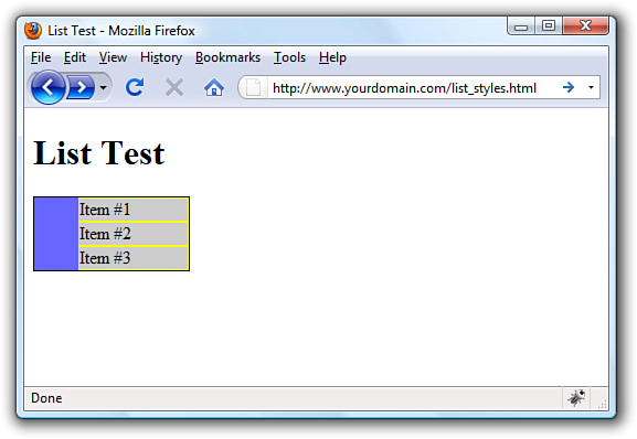
The default left-side padding value remains the same regardless of the type of list. If you add the following line to the style sheet, creating a list with no item indicators, you will find the padding remains the same (see Figure 11.2):
list-style-type: none;
Figure 11.2 The default left-side padding remains the same with or without list item indicators.
When you are creating a page layout that includes lists of any type, play around with padding to place the items “just so” on the page. Similarly, just because there is no default margin associated with lists doesn’t mean you can’t assign some to the display; adding margin values to the declaration for the ul selector will provide additional layout control.
But remember, so far we’ve worked with only the list definition itself; we haven’t worked with the application of styles to the individual list items. In Figures 11.1 and 11.2, the gray background and yellow border of the list item shows no default padding or margin. Figure 11.3 shows the different effects created by applying padding or margin values to list items rather than the overall list “box” itself.
Figure 11.3 Different values affect the padding and margins on list items.
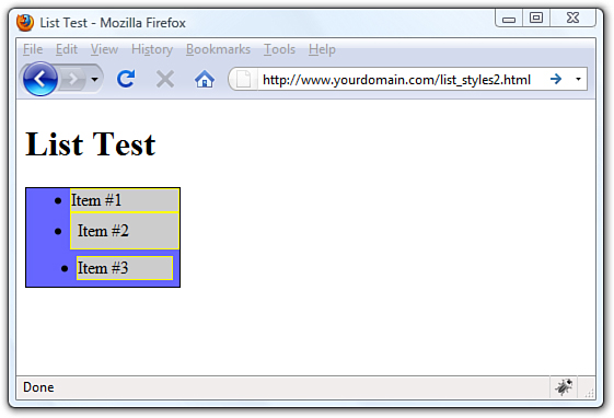
The first list item is the base item with no padding or margin applied to it. However, the second list item uses style="padding: 6px;", and you can see the six pixels of padding on all sides (between the content and the yellow border surrounding the element). Note that the placement of the bullet remains the same as the first list item. The third list item uses style="margin: 6px;" to apply six pixels of margin around the list item; this margin allows the blue background of the <ul> to show through.
Placing List Item Indicators
All this talk of margins and padding raises other issues: the control of list item indicators (when used) and how text should wrap around them (or not). The default value of the list-style-position property is “outside”—this placement means the bullets, numbers, or other indicators are kept to the left of the text, outside of the box created by the <li></li> tag pair. When text wraps within the list item, it wraps within that box and remains flush left with the left border of element.
But when the value of list-style-position is “inside,” the indicators are inside the box created by the <li></li> tag pair. Not only are the list item indicators then indented further (they essentially become part of the text), the text wraps beneath each item indicator.
An example of both outside and inside list-style-positions is shown in Figure 11.4. The only changes between Listing 11.1 and the code used to produce the example shown in Figure 11.4 (not including the filler text added to “Item #2” and “Item #3”) is that the second list item contains style="list-style-position: outside;", and the third list item contains style="list-style-position: inside;".
Figure 11.4 The difference between outside and inside values for list-style-position.

The additional filler text used for the second list item shows how the text wraps when the width of the list is defined as a value that is too narrow to display all on one line. The same result would have been achieved without using style="list-style-position: outside;" because that is the default value of list-style-position without any explicit statement in the code.
However, you can clearly see the difference when the “inside” position is used. In the third list item, the bullet and the text are both within the gray area bordered by yellow—the list item itself. Margins and padding affect list items differently when the value of list-style-position is inside (see Figure 11.5).
Figure 11.5 Margin and padding changes the display of items using the inside list-style-position.
In Figure 11.5, both the second and third list items have a list-style-position value of inside. However, the second list item has a margin-left value of 12 pixels, and the third list item has a padding-left value of 12 pixels. Although both content blocks (list indicator plus the text) show text wrapped around the bullet, and the placement of these blocks within the gray area defining the list item is the same, the affected area is the list item within the list itself.
As you would expect, the list item with the margin-left value of 12 pixels displays 12 pixels of red showing through the transparent margin surrounding the list item. Similarly, the list item with the padding-left value of 12 pixels displays 12 pixels of gray background (of the list item) before the content begins. Padding is within the element; margin is outside the element.
By understanding the way margins and padding affect both list items and the list in which they appear, you should be able to create navigation elements in your website that are pure CSS and do not rely on external images. Later in this chapter, you will learn how to create both vertical and horizontal navigation menus as well as menu drop-downs.
Note
For links to several tutorials geared toward creating XHTML and CSS image maps, visit http://designreviver.com/tutorials/css-image-map-techniques-and-tutorials/. The levels of interactivity in these tutorials differ, and some might introduce client-side coding outside of the scope of this book, but the explanations are thorough.
Creating Image Maps with List Items and CSS
In Chapter 8, you learned how to create client-side image maps using the <map/> tag in HTML. Image maps enable you to define an area of an image and assign a link to that area (rather than having to slice an image into pieces, apply links to individual pieces, and stitch the image back together in HTML). However, you can also create an image map purely out of valid XHTML and CSS.
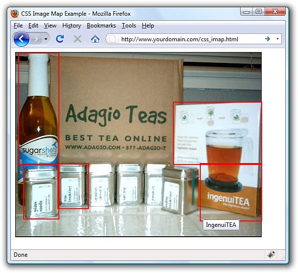
The code in Listing 11.2 produces an image map similar to the one shown in Figure 11.6. (The code in Listing 11.2 does not produce the red borders shown in the figure. The borders were added to the figure to highlight the defined areas.) When the code is rendered in a web browser, it simply looks like a web page with an image placed in it. The actions happen when your mouse hovers over a “hot” area.
Figure 11.6 CSS enables you to define hotspots in an image map.
Listing 11.2 Creating an Image Map Using CSS
<?xml version="1.0" encoding="UTF-8"?>
<!DOCTYPE html PUBLIC "-//W3C//DTD XHTML 1.1//EN"
"http://www.w3.org/TR/xhtml11/DTD/xhtml11.dtd">
<html xmlns="http://www.w3.org/1999/xhtml" xml:lang="en">
<head>
<title>CSS Image Map Example</title>
<style type="text/css">
#theImg {
width:500px;
height:375px;
background:url(tea_shipment.jpg) no-repeat;
position:relative;
border: 1px solid #000000;
}
#theImg ul {
margin:0px;
padding:0px;
list-style:none;
}
#theImg a {
position:absolute;
text-indent: -1000em;
}
#theImg a:hover {
border: 1px solid #ffffff;
}
#ss a {
top:0px;
left:5px;
width:80px;
height:225px;
}
#gn a {
top:226px;
left:15px;
width:70px;
height:110px;
}
#ib a {
top:225px;
left:85px;
width:60px;
height:90px;
}
#iTEA1 a {
top:100px;
left:320px;
width:178px;
height:125px;
}
#iTEA2 a {
top:225px;
left:375px;
width:123px;
height:115px;
}
</style>
</head>
<body>
<div id="theImg">
<ul>
<li id="ss"><a href="[some URL]"
title="Sugarshots">Sugarshots</a></li>
<li id="gn"><a href="[some URL]"
title="Golden Needle">Golden Needle</a></li>
<li id="ib"><a href="[some URL]"
title="Irish Breakfast">Irish Breakfast</a></li>
<li id="iTEA1"><a href="[some URL]"
title="IngenuiTEA">IngenuiTEA</a></li>
<li id="iTEA2"><a href="[some URL]"
title="IngenuiTEA">IngenuiTEA</a></li>
</ul>
</div>
</body>
</html>
As shown in Listing 11.2, the style sheet has quite a few entries but the actual HTML is quite short. List items are used to create five distinct clickable areas; those “areas” are list items given a specific height and width and placed over an image that sits in the background. If the image is removed from the background of the <div> that surrounds the list, the list items still exist and are still clickable.
Let’s walk through the style sheet so that you understand the pieces that make up this XHTML and CSS image map, which is—at its most basic level—just a list of links.
The list of links is enclosed in a <div> named "theImg". In the style sheet, this <div> is defined as block element that is 500 pixels wide, 375 pixels high, and with a 1-pixel solid black border. The background of this element is an image named tea_shipment.jpg that is placed in one position and does not repeat. The next bit of HTML that you see is the beginning of the unordered list (<ul>). In the style sheet, this unordered list is given margin and padding values of zero pixels all around and a list-style of none—list items will not be preceded by any icon.
The list item text itself never appears to the user because of this trick in the style sheet entry for all <a> tags within the <div>:
text-indent: -1000em;
By indenting the text negative 1000 ems, you can be assured that the text will never appear. It does exist, but it exists in a nonviewable area 1000 ems to the left of the browser window. In other words, if you raise your left hand and place it to the side of your computer monitor, text-indent:-1000em places the text somewhere to the left of your pinky finger. But that’s what we want because we don’t need to see the text link. We just need an area to be defined as a link so that the user’s cursor will change as it does when rolling over any link in a website.
When the user’s cursor hovers over a list item containing a link, that list item shows a one-pixel border that is solid white, thanks to this entry in the style sheet:
#theImg a:hover {
border: 1px solid #ffffff;
}
The list items themselves are then defined and placed in specific positions based on the areas of the image that are supposed to be the clickable areas. For example, the list item with the "ss" id for "Sugarshots"—the name of the item shown in the figure—has its top-left corner placed zero pixels from the top of the <div> and five pixels in from the left edge of the <div>. This list item is 80 pixels wide and 225 pixels high. Similar style declarations are made for the "#gn", "#ib", "#iTEA1", and "#iTEA2" list items, such that the linked areas associated with those IDs appear in certain positions relative to the image.
How Navigation Lists Differ from Regular Lists
When we talk about using lists to create navigation elements, we really mean using CSS to display content in the way website visitors expect navigation to look—in short, different from simple bulleted or numbered lists. Although it is true that a set of navigation elements is essentially a list of links, those links are typically displayed in a way that makes it clear that users should interact with the content:
• The user’s mouse cursor will change to indicate that the element is clickable.
• The area around the element changes appearance when the mouse hovers over it.
• The content area is visually set apart from regular text.
Older methods of creating navigation tended to rely on images—such as graphics with beveled edges and the use of contrasting colors for backgrounds and text—plus client-side programming with JavaScript to handle image-swapping based on mouse actions. But using pure CSS to create navigation from list elements produces a more usable, flexible, and search-engine friendly display that is accessible by users using all manner and sorts of devices.
Regardless of the layout of your navigational elements—horizontal or vertical—this chapter discusses two levels of navigation: primary and secondary. Primary navigation takes users to the introductory pages of main sections of your site; secondary navigation reflects those pages within a certain section.
Creating Vertical Navigation with CSS
Depending on your site architecture—both the display template you have created and the manner in which you have categorized the information in the site—you might find yourself using vertical navigation for either primary navigation or secondary navigation.
For example, suppose you have created a website for your company and the primary sections are About Us, Products, Support, and Press. Within the primary About Us section, you might have several other pages, such as Mission, History, Executive Team, and Contact Us—these other pages are the secondary navigation within the primary About Us section.
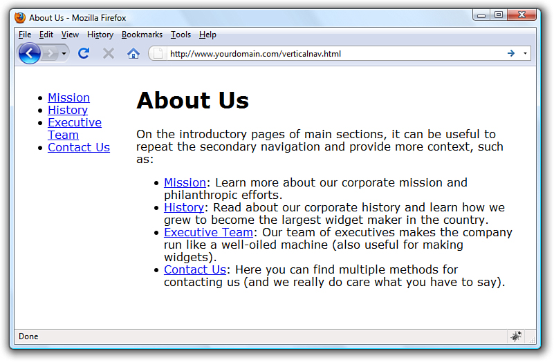
Listing 11.3 sets up a basic secondary page with vertical navigation in the side of the page and content in the middle of the page. The links in the side and the links in the content area of the page are basic HTML list elements.
This listing and the example shown in Figure 11.7 provides a starting point for showing you how CSS enables you to transform two similar HTML structures into two different visual displays (and thus two different contexts).
Figure 11.7 The starting point: unstyled list navigation.
Listing 11.3 Basic Page with Vertical Navigation in a List
<?xml version="1.0" encoding="UTF-8"?>
<!DOCTYPE html PUBLIC "-//W3C//DTD XHTML 1.1//EN"
"http://www.w3.org/TR/xhtml11/DTD/xhtml11.dtd">
<html xmlns="http://www.w3.org/1999/xhtml" xml:lang="en">
<head>
<title>About Us</title>
<style type="text/css">
body {
font: 12pt Verdana, Arial, Georgia, sans-serif;
}
#nav {
width:150px;
float:left;
margin-top:12px;
margin-right:18px;
}
#content {
width:550px;
float:left;
}
</style>
</head>
<body>
<div id="nav">
<ul>
<li><a href="#">Mission</a></li>
<li><a href="#">History</a></li>
<li><a href="#">Executive Team</a></li>
<li><a href="#">Contact Us</a></li>
</ul>
</div>
<div id="content">
<h1>About Us</h1>
<p>On the introductory pages of main sections, it can be useful
to repeat the secondary navigation and provide more context,
such as:</p>
<ul>
<li><a href="#">Mission</a>: Learn more about our corporate
mission and philanthropic efforts.</li>
<li><a href="#">History</a>: Read about our corporate history
and learn how we grew to become the largest widget maker
in the country.</li>
<li><a href="#">Executive Team</a>: Our team of executives makes
the company run like a well-oiled machine (also useful for
making widgets).</li>
<li><a href="#">Contact Us</a>: Here you can find multiple
methods for contacting us (and we really do care what you
have to say).</li>
</ul>
</div>
</body>
</html>
The contents of this page are set up in two <div> elements that sit next to each other: one is given an id value of nav and the other is given an id value of content. The only styles assigned to anything in this basic page are the width, margin, and float values associated with each <div>. No styles have been applied to the list elements.
To differentiate between the links present in the list in the content area and the links present in the list in the side navigation, add the following styles to the style sheet:
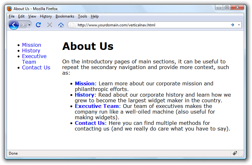
#nav a {
text-decoration: none;
}
#content a {
text-decoration: none;
font-weight: bold;
}
These styles simply say that all <a> links in the <div> with the id of nav have no underline, and all <a> links in the <div> with the id of content have no underline and are bold. The difference is shown in Figure 11.8.
Figure 11.8 Differentiating the list elements using CSS.
But to really make the side navigation list look like something special, you have to dig deeper into the style sheet.
Styling the Single-Level Vertical Navigation
The goal with this particular set of navigation elements is simply to present them as a block of links without bullets and with background and text colors that change depending on their link state (regular link, visited link, hovering over the link, or activated link). The first step in the process is already complete: separating the navigation from the content. We have done that by putting the navigation in a <div> with an id of nav.
Next, you need to modify the <ul> that defines the link within the nav <div>. Let’s take away the list indicator and ensure that there is no extra margin or padding hanging around besides the top margin. That top margin is used to line up the top of the navigation with the top of the “About Us” header text in the content area of the page:
#nav ul {
list-style: none;
margin: 12px 0px 0px 0px;;
padding: 0px;
}
Because the navigation list items themselves appear as colored areas, give each list item a bottom border so that some visual separation of the content can occur:
#nav li {
border-bottom: 1px solid #ffffff;
}
Now on to building the rest of the list items. The idea is that when the list items simply sit there acting as links, they are a special shade of blue with bold white text (although they are a smaller font size than the body text itself). To achieve that, add the following:
#nav li a:link, #nav li a:visited {
font-size: 10pt;
font-weight: bold;
display: block;
padding: 3px 0px 3px 3px;
background-color: #628794;
color: #ffffff;
}
All the styles used previously should be familiar to you, except perhaps the use of display: block; in the style sheet entry. Setting the display property to block ensures that the entire <li> element is in play when a user hovers his mouse over it. Figure 11.9 shows the vertical list menu with these new styles applied to it.
Figure 11.9 The vertical list is starting to look like a navigation menu.
When the user’s mouse hovers over a navigational list element, the idea is that some visual change takes place so the user knows the element is clickable. This is akin to how most software menus change color when a user’s cursor hovers over the menu items. In this case, we’ll change the background color of the list item, and we’ll change the text color of the list item; they’ll be different from the blue and white shown previously.
#nav li a:hover, #nav li a:active {
font-size: 10pt;
font-weight: bold;
display: block;
padding: 3px 0px 3px 3px;
background-color: #6cac46;
color: #000000;
}
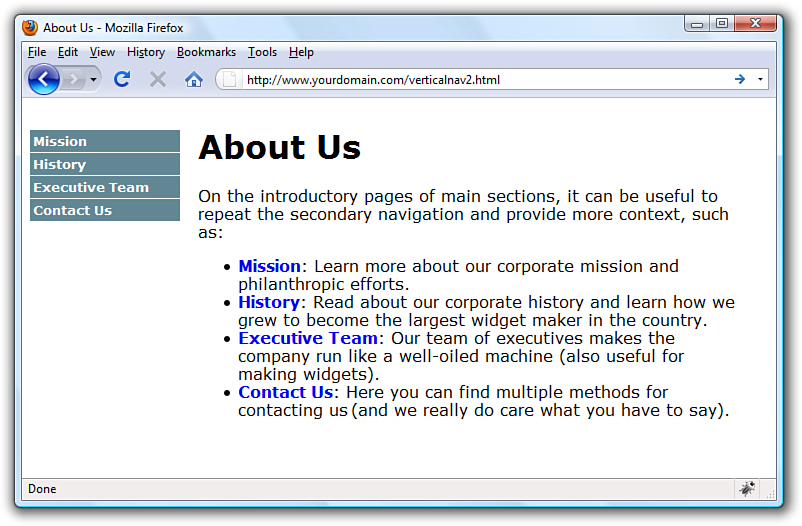
Figure 11.10 shows the results of all the stylistic work so far. By using a few entries in a style sheet, the simple list has been transformed into a visually differentiated menu.
Figure 11.10 The list items now change color when the mouse hovers over them.

Styling the Multilevel Vertical Navigation
What if your site architecture calls for another level of navigation that you want your users to see at all times? That is represented by nested lists (which you learned about in previous chapters) and more style sheet entries. In this case, assume that there are four navigation elements under the Executive Team link. In the HTML, modify the list as follows:
<ul>
<li><a href="#">Mission</a></li>
<li><a href="#">History</a></li>
<li><a href="#">Executive Team</a>
<ul>
<li><a href="#">» CEO</a>
<li><a href="#">» CFO</a>
<li><a href="#">» COO</a>
<li><a href="#">» Other Minions</a>
</ul>
</li>
<li><a href="#">Contact Us</a></li>
</ul>
This code produces a nested list under the Executive Team link (see Figure 11.11). The » HTML entity produces the right-pointing arrows that are displayed before the text in the new links.
Figure 11.11 Creating a nested navigation list (but one that is not yet styled well).
The new items appear as block elements within the list, but the hierarchy of information is not visually represented. To add some sort of visual element that identifies these items as sub-navigational elements attached to the Executive Team link, modify the style sheet again to add some indentation.
But before doing that, modify some of the other style sheet entries as well. In the previous section, we added selectors such as #nav ul and #nav li, which indicate “all <ul> in the <div> called nav” and “all <li> in the <div> called nav,” respectively. However, we now have two instances of <ul> and another set of <li> elements with the <div> called nav, all of which we want to appear different from the original set.
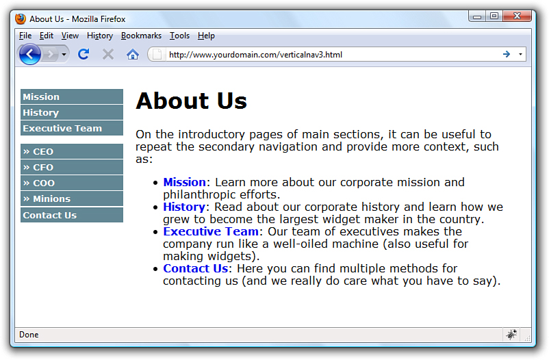
To ensure both sets of list items are styled appropriately, make sure that the style sheet selectors clearly indicate the hierarchy of the lists. To do that, use entries such as #nav ul and #nav ul li for the first level of lists and #nav ul ul and #nav ul ul li for the second level of lists. Listing 11.4 shows the new version of style sheet entries and HTML that produces the menu shown in Figure 11.12.
Figure 11.12 Creating two levels of vertical navigation using CSS.

Listing 11.4 Multilevel Vertical Navigation in a List
<?xml version="1.0" encoding="UTF-8"?>
<!DOCTYPE html PUBLIC "-//W3C//DTD XHTML 1.1//EN"
"http://www.w3.org/TR/xhtml11/DTD/xhtml11.dtd">
<html xmlns="http://www.w3.org/1999/xhtml" xml:lang="en">
<head>
<title>About Us</title>
<style type="text/css">
body {
font: 12pt Verdana, Arial, Georgia, sans-serif;
}
#nav {
width:150px;
float:left;
margin-top:12px;
margin-right:18px;
}
#content {
width:550px;
float:left;
}
#nav a {
text-decoration: none;
}
#content a {
text-decoration: none;
font-weight: bold;
}
#nav ul {
list-style: none;
margin: 12px 0px 0px 0px;
padding: 0px;
}
#nav ul li {
border-bottom: 1px solid #ffffff;
}
#nav ul li a:link, #nav ul li a:visited {
font-size: 10pt;
font-weight: bold;
display: block;
padding: 3px 0px 3px 3px;
background-color: #628794;
color: #ffffff;
}
#nav ul li a:hover, #nav ul li a:active {
font-size: 10pt;
font-weight: bold;
display: block;
padding: 3px 0px 3px 3px;
background-color: #c6a648;
color: #000000;
}
#nav ul ul {
margin: 0px;
padding: 0px;
}
#nav ul ul li {
border-bottom: none;
}
#nav ul ul li a:link, #nav ul ul li a:visited {
font-size: 8pt;
font-weight: bold;
display: block;
padding: 3px 0px 3px 18px;
background-color: #628794;
color: #ffffff;
}
#nav ul ul li a:hover, #nav ul ul li a:active {
font-size: 8pt;
font-weight: bold;
display: block;
padding: 3px 0px 3px 18px;
background-color: #c6a648;
color: #000000;
}
</style>
</head>
<body>
<div id="nav">
<ul>
<li><a href="#">Mission</a></li>
<li><a href="#">History</a></li>
<li><a href="#">Executive Team</a>
<ul>
<li><a href="#">» CEO</a></li>
<li><a href="#">» CFO</a></li>
<li><a href="#">» COO</a></li>
<li><a href="#">» Other Minions</a></li>
</ul>
</li>
<li><a href="#">Contact Us</a></li>
</ul>
</div>
<div id="content">
<h1>About Us</h1>
<p>On the introductory pages of main sections, it can be useful
to repeat the secondary navigation and provide more context,
such as:</p>
<ul>
<li><a href="#">Mission</a>: Learn more about our corporate
mission and philanthropic efforts.</li>
<li><a href="#">History</a>: Read about our corporate history
and learn how we grew to become the largest widget maker
in the country.</li>
<li><a href="#">Executive Team</a>: Our team of executives makes
the company run like a well-oiled machine (also useful for
making widgets).</li>
<li><a href="#">Contact Us</a>: Here you can find multiple
methods for contacting us (and we really do care what you
have to say.</li>
</ul>
</div>
</body>
</html>
The different ways of styling vertical navigation are limited only by your own creativity. You can use colors, margins, padding, background images, and any other valid CSS to produce vertical navigation that is quite flexible and easily modified. If you type CSS vertical navigation in your search engine, you will find thousands of examples—and they are all based on the simple principles you’ve learned in this chapter.
Creating Horizontal Navigation with CSS
The lessons on navigation began with vertical navigation because the concept of converting a list into navigation is easier to grasp when the navigation still looks like a list of items that you might write vertically on a piece of paper, like a grocery list. When creating horizontal navigation, you still use HTML list elements but instead of a vertical display achieved by using the inline value of the display property for both the <ul> and the <li>, use the block value of the display property instead. It really is as simple as that.
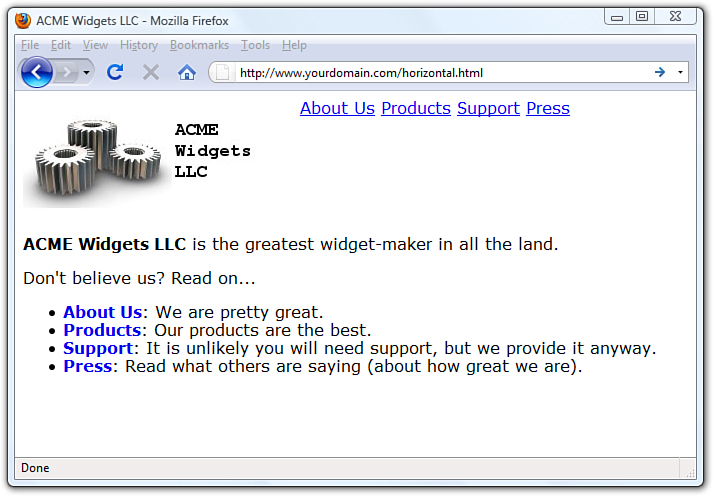
Listing 11.5 shows a starting point for a page featuring horizontal navigation. The page contains two main <div> elements: one for the header and one for the content. The header <div> contains a logo <div> and a navigation <div> floated next to each other. The list that appears in the navigation <div> has a display property value of inline for both the list and the list items. You can see these elements and their placement in Figure 11.13.
Figure 11.13 Creating functional—but not necessarily beautiful—horizontal navigation using inline list elements.
Listing 11.5 Basic Horizontal Navigation from a List
<?xml version="1.0" encoding="UTF-8"?>
<!DOCTYPE html PUBLIC "-//W3C//DTD XHTML 1.1//EN"
"http://www.w3.org/TR/xhtml11/DTD/xhtml11.dtd">
<html xmlns="http://www.w3.org/1999/xhtml" xml:lang="en">
<head>
<title>ACME Widgets LLC</title>
<style type="text/css">
body {
font: 12pt Verdana, Arial, Georgia, sans-serif;
}
#header {
width: auto;
}
#logo {
float:left;
}
#nav {
float:left;
}
#nav ul {
list-style: none;
display: inline;
}
#nav li {
display: inline;
}
#content {
width: auto;
float: left;
clear: left;
}
#content a {
text-decoration: none;
font-weight: bold;
}
</style>
</head>
<body>
<div id="header">
<div id="logo">
<img src="acmewidgets.jpg" alt="ACME Widgets LLC" />
</div>
<div id="nav">
<ul>
<li><a href="#">About Us</a></li>
<li><a href="#">Products</a></li>
<li><a href="#">Support</a></li>
<li><a href="#">Press</a></li>
</ul>
</div>
</div>
<div id="content">
<p><strong>ACME Widgets LLC</strong> is the greatest widget-maker
in all the land.</p>
<p>Don't believe us? Read on...</p>
<ul>
<li><a href="#">About Us</a>: We are pretty great.</li>
<li><a href="#">Products</a>: Our products are the best.</li>
<li><a href="#">Support</a>: It is unlikely you will need support,
but we provide it anyway.</li>
<li><a href="#">Press</a>: Read what others are saying (about how
great we are).</li>
</ul>
</div>
</body>
</html>
Modifying the display of this list occurs purely through CSS; the structure of the content within the HTML itself is already set. To achieve the desired display, use the following CSS. First, modify the <div> with the id of nav to be a particular width, display a background color and border, and use a top margin of 85 pixels (so that it displays near the bottom of the logo).
#nav {
float:left;
margin: 85px 0px 0px 0px;
width: 400px;
background-color: #628794;
border: 1px solid black;
}
The definition for the <ul> remains the same as in Listing 11.5, except for the changes in margin and padding:
#nav ul {
margin: 0px;
padding: 0px;
list-style: none;
display: inline;
}
The definition for the <li> remains the same as in Listing 11.5, except it has been given a line-height value of 1.8em:
#nav li {
display: inline;
line-height: 1.8em;
}
The link styles are similar to those used in the vertical navigation; these entries have different padding values, but the colors and font sizes remain the same:
#nav ul li a:link, #nav ul li a:visited {
font-size: 10pt;
font-weight: bold;
text-decoration: none;
padding: 7px 10px 7px 10px;
background-color: #628794;
color: #ffffff;
}
#nav ul li a:hover, #nav ul li a:active {
font-size: 10pt;
font-weight: bold;
text-decoration: none;
padding: px 10px 7px 10px;
background-color: #c6a648;
color: #000000;
}
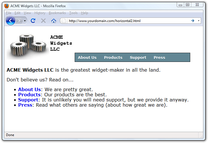
Putting these styles together, you produce the display shown in Figure 11.14.
Figure 11.14 Creating horizontal navigation with some style.
When the user rolls over the navigation elements, the background and text colors change in the same way they did when the user hovered her mouse over the vertical navigation menu. Also, just as you did with the vertical navigation menu, you can use nested lists to produce drop-down functionality in your horizontal menu. Try it yourself!
Summary
This chapter began with examples of how lists and list elements are affected by padding and margin styles. You first learned about the default padding associated with lists and how to control that padding. Next, you learned how to modify padding and margin values and how to place the list item indicator either inside or outside the list item so you could begin to think about how styles and lists can affect your overall site design. Finally, you learned how to leverage lists and list elements to create a pure XHTML and CSS image map, thus reducing the need for slicing up linked images or using the <map/> tag.
After learning to “think outside the (list) box,” if you will, you learned how to use unordered lists to produce horizontal or vertical navigation within your website. By using CSS instead of graphics, you will have more flexibility in both the display and maintenance of your site. Throughout this chapter you learned that with a few entries in your style sheet, you can turn plain underlined text links into areas with borders, background colors, and other text styles. Additionally, you learned how to present nested lists within menus.
Q&A
Q. There are an awful lot of web pages that talk about the “box model hack” regarding margins and padding, especially around lists and list elements. Are you sure I don’t have to use a hack?
A. At the beginning of this chapter, you learned that the HTML and CSS in this chapter (and others) all look the same in the current versions of the major web browsers. This is the product of several years of web developers having to do code hacks and other tricks before modern browsers began handling things according to CSS specifications rather than their own idiosyncrasies. Additionally, there is a growing movement to rid Internet users of the very old web browsers that necessitated most of these hacks in the first place. So, although I wouldn’t necessarily advise you to design only for the current versions of the major web browsers, I also wouldn’t recommend that you spend a ton of time implementing hacks for the older versions of browsers—which are used by less than 5% of the Internet population. You should continue to write solid code that validates and adheres to design principles, test your pages in a suite of browsers that best reflects your audience, and release your site to the world.
Q. The CSS image map seems like a lot of work. Is the <map/> tag so bad?
A. The <map/> tag isn’t at all bad and is valid in both XHTML and HTML5. The determination of coordinates used in client-side image maps can be difficult, however, especially without graphics software or software intended for the creation of client-side image maps. The CSS version gives you more options for defining and displaying clickable areas, only one of which you’ve seen here.
Q. Can I use graphics in the navigation menus as a custom list indicator?
A. Yes. You can use graphics within the HTML text of the list item or as background images within the <li> element. You can style your navigation elements just as you style any other list element. The only differences between an HTML unordered list and a CSS-based horizontal or vertical navigation list is that you are calling it that, and you are using the unordered list for a specific purpose outside of the body of the text. Along with that, you then style the list to show the user that it is indeed something different—and you can do that with small graphics to accentuate your lists.
Q. Where can I find more examples of what I can do with lists?
A. The last time I checked, typing CSS navigation in a search engine returned approximately 44 million results. Here are a few starting places:
• A List Apart’s CSS articles at http://www.alistapart.com/topics/code/
• Maxdesign’s CSS Listamatic at http://css.maxdesign.com.au/listamatic/
• Vitaly Friedman’s CSS Showcase at http://www.alvit.de/css-showcase/
Workshop
The workshop contains quiz questions and activities to help you solidify your understanding of the material covered. Try to answer all questions before looking at the “Answers” section that follows.
Quiz
1. What is the difference between the inside and outside list-style-position values? Which is the default value?
2. Does a list-style with a value of none still produce a structured list, either ordered or unordered?
3. When creating list-based navigation, how many levels of nested lists can you use?
4. When creating a navigation list of any type, can the four pseudoclasses for the a selector have the same values?
Answers
1. The list-style-position value of inside places the list item indicator inside the block created by the list item. A value of outside places the list item indicator outside the block. When inside, content wraps beneath the list item indicator. The default value is outside.
2. Yes. The only difference is that no list item indicator is present before the content within the list item.
3. Technically, you can nest your lists as deep as you want to. But from a usability standpoint, there is a limit to the number of levels that you would want to use to nest your lists. Three levels is typically the limit—more than that and you run the risk of creating a poorly organized site or simply giving the user more options than he needs to see at all times.
4. Sure, but then you run the risk of users not realizing that your beautiful menus are indeed menus (because no visual display would occur for a mouse action).
Exercises
• Find an image and try your hand at mapping areas using the technique shown in this chapter. Select an image that has areas where you could use hot spots or clickable areas leading to other web pages on your site or to someone else’s site. Then create the HTML and CSS to define the clickable areas and the URLs to which they should lead.
• Using the techniques shown for a multilevel vertical list, add subnavigation items to the vertical list created at the end of the chapter.
• Look at the numerous examples of CSS-based navigation used in websites and find some tricky-looking actions. Using the View Source function of your web browser, look at the CSS used by these sites and try to implement something similar for yourself.