If organizational requirements mandate creating a truly custom brand for SharePoint Product and Technologies sites, then the capabilities built in to the user interface will not be sufficient. Still, you should take every advantage of built-in support before making plans to develop a custom brand using other methods. A best practice is to keep it simple and keep it native when possible. From an end-user perspective, the native options are available on the Site Settings page. Most of them appear on the page in a column with the appropriate name of Look And Feel. Figure 11-3 shows the Look And Feel column of a publishing site.

Using the title, description, and icon settings is often an acceptable way for you to customize collaborative team sites. The current default image is loaded from the 12 hive using the following address: _Layouts/images/titlegraphic.gif. But a site administrator can define a custom site icon referenced from any Web-addressable location. Be aware that some image locations work better than others. For example, if a graphic is stored in a picture library on a different site, users will be forced to re-authenticate on the other site to retrieve the image. This can cause a performance delay and, quite honestly, an inconvenience to the user.
Note
Don’t underestimate the importance of user perception in your implementation. The technical reasons behind any branding solution don’t matter to the user. Users simply want an easy-to-use branding interface that addresses their business goals. Using graphics from another source that could possibly require authentication is a good example of a bad solution. Simple design decisions can often greatly enhance the user perception of the solution. In this example, placing all graphics in an anonymous picture library or enabling integrated authentication enhances user perception.
Another option is to load the icon from a picture library on the current site. Although this won’t cause re-authentication, it won’t lend itself to centralizing the graphic for a common look and feel. If a centralized graphic is desirable, you should use a solution to deploy the file to a custom subdirectory under the images directory of the 12 hive or host them in an anonymous picture library.
Additional functionality for controlling branding is added to the Site Settings page when the publishing infrastructure and publishing features are activated. These features include links to change master pages, navigation settings, and the governing of inheritance of page layouts and site templates. Don’t underestimate the power of the robust navigation functionality of publishing sites. Training your users how to create and modify global and current navigation can go a long way in empowering those users.
The Master Pages link on the site collection settings allows for two specific master pages to be set for an entire site collection. It also configures master page inheritance throughout the site collection. The two master pages that can be configured are the Site Master page and System Master page from the Master Page Gallery of the top-level site. The Site Master page will be used by layout pages in the pages document library of any publishing site collection. The System Master page is used by other pages in the site collection that do not use a specific master page, like the Application.master, and by most pages in the _Layouts virtual directory. The same Master Pages link in child sites of the site collection can be used to override the inheritance of the Site or System Master page at any level of the hierarchy. However, when you make selections at this level, the pages being chosen are stored in the top-level site’s Master Page Gallery and not the current site’s Master Page Gallery. When the publishing infrastructure feature is active on a site collection, all default master page requests are directed to the top-level site. The Site and System Master page settings work on both customized and uncustomized master pages. The Site and System Master page settings are critical when you plan to modify master pages using SharePoint Designer 2007 because they allow a set of customized master pages to be used throughout an entire site collection. Without these settings, any master page modified using SharePoint Designer 2007 will be available only in the site where it is stored.
Note
When you plan to use SharePoint Designer 2007 to modify master pages directly on production sites, consider turning on the publishing infrastructure feature for the site collection and setting the System Master page to be inherited throughout the site collection. Sites that participate in a Web content management system should also have the publishing feature enabled, and the Site Master page should be inherited.
Turning on the publishing infrastructure feature adds eight additional custom master pages to the top-level site’s Master Page Gallery. Although these master pages are fully functional, they are best used as examples of how master pages can be customized to change the layout, color scheme, and default navigation in a site. They provide alternate starting points when you create a custom master page.
The Master Pages link allows you to define an address for the location of an alternate CSS file. Any CSS file specified here will be the last CSS file loaded by the master page, so its styles will replace any similarly named styles in SharePoint’s default CSS files. There are only three occasions when the styles in this file do not represent the last style definitions loaded:
Styles defined inline on the master page or content/layout page will always load last when rendering a page.
Links to CSS files loaded through a content placeholder control on the master page will load after the alternate CSS file, but may load before or after inline styles depending on the placement of the content placeholder control on the master page.
Styles can be directly defined in a Content Editor Web Part (CEWP). Again, these styles will load after the alternate CSS file, but they are otherwise dependent on the location of the CEWP.
Note that when you edit master pages in SharePoint Designer 2007, most generated styles will be created as inline styles. To preserve a predictable and scalable set of styles, take care to create all styles in an alternate CSS file or files so that they can be loaded in a predictable fashion. Inline styles provide predictable results, but they cannot be reused or centrally managed.
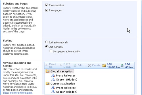
Navigation in a SharePoint Products and Technologies site collection is handled through server controls that dynamically load the addresses of pages, sites, and other links. Three types of navigation controls are used in most SharePoint master pages: the AspMenu control used for the top navigation bar and quick launch menu, the SiteMapPath control used for breadcrumb trails, and the SPTreeView used for a treeview alternative to the quick launch menu. These controls are bound either directly or through a SiteMapDataSource control to a SiteMapProvider. The Navigation link in the Site Settings page can be used to fine-tune how these navigation controls work. This is accomplished by adjusting whether they show sites or pages by default and how navigation nodes are sorted. Manual nodes can be added or existing nodes hidden from the Navigation controls. Figure 11-4 shows a portion of the Site Navigation Settings page.
Layout pages are used in a Web content management environment to advance branding beyond the master page down to the level of a content page. In a normal SharePoint Products and Technologies site, users can create pages where the majority of the content on the page is targeted toward one content placeholder control named PlaceholderMain. In a Layout page, the contents of PlaceholderMain are further restricted through the placement of field controls. These field controls, combined with a custom content type in the pages document library, restrict the type and placement of content that an author can put on a page. When they work in a publishing site, users will be required to pick from a predefined list of Layout pages when they add a page to a site. For example, there are a set of Layout pages called Article pages. When an Article page is displayed, it contains the text of an article and a picture. There are several variations to the page, such as Article Page With Image On Left, Article Page With Image On Right, and Article Page With Body Only, but they all share one thing in common: The user building the page can display only one picture and one text body in PlaceholderMain using any of these layouts.
By defining a set of Layout pages and turning on publishing, control can be maintained over the placement of everything on the resulting rendered page. The Page Layouts and Site Templates link on the Site Settings page of a publishing site grants control over which Layout pages will be available in lower-level sites.