
8
Interpreting Simulation Results: Target Curves and Scatterplots can be used to Graph the Distribution of the Sample Output
Let’s now focus on the output from a simulation analysis. It consists of the outputs of the analyses of many, many (for example, as we’ve said, 2000) possible future scenarios, the resulting possible outcomes of an investment or development project. How can we make sense of all this information?
We can quantitatively summarize and analyze such output in a variety of ways. Although summary statistics of the sample distribution are helpful for this purpose, we focus in this chapter on a particularly intuitive way in which we can display simulation results, to graph the distribution of the sample output. This chapter describes two important ways to do this: target curves and scatterplots.
8.1 Target Curves
Target curves are perhaps the most iconic representations of the simulation output. A target curve uses a simple line graph to depict the distribution of the simulated results. It plots the probability of occurrence (on the vertical axis) against some investment performance metric of interest, such as the net present value (NPV) or internal rate of return (IRR), on the horizontal axis.
We can think of a target curve as an estimate or simulation of the underlying, ex‐ante probability distribution that the investor faces. Indeed, a target curve represents a sample of the results of a simulation of possible future scenarios or outcomes for the target metric we are focusing on.
We can display target curves two ways: either as frequency distributions or as cumulative distributions. In some situations, for some people, the cumulative representation may be more intuitive. For others, the frequency distributions may be more appealing. The cumulative distribution is just the sum (or integral) of the frequency distribution.
For example, suppose that a target metric of interest is the NPV achieved ex‐post by a development project. To make the example simple, suppose that the output NPV of the project has only two values, −$100M and + $200M, and that each of these values occurs an equal number of times in the simulation model. Then the frequency target curve would consist of two vertical columns of equal height with a value on the vertical axis of 50%—one column at the –$100M value on the horizontal axis, and the other at the + $200M value. (The average outcome value would be + $50M, but there would be no column at that value.)
The cumulative target curve depicts the fraction of results that are below any level of performance. In our example, it would be a line at zero on the vertical axis for all values on the horizontal axis below –$100M. It would then jump up to 50% on the vertical axis for all values between –$100M and + $200M (including for the exact value of –$100M). Finally, it would again jump up, now to a value of 100% on the vertical axis for all values at and above + $200M. Figure 8.1 illustrates this example.

Figure 8.1 Cumulative target curve for a two‐state probability distribution.
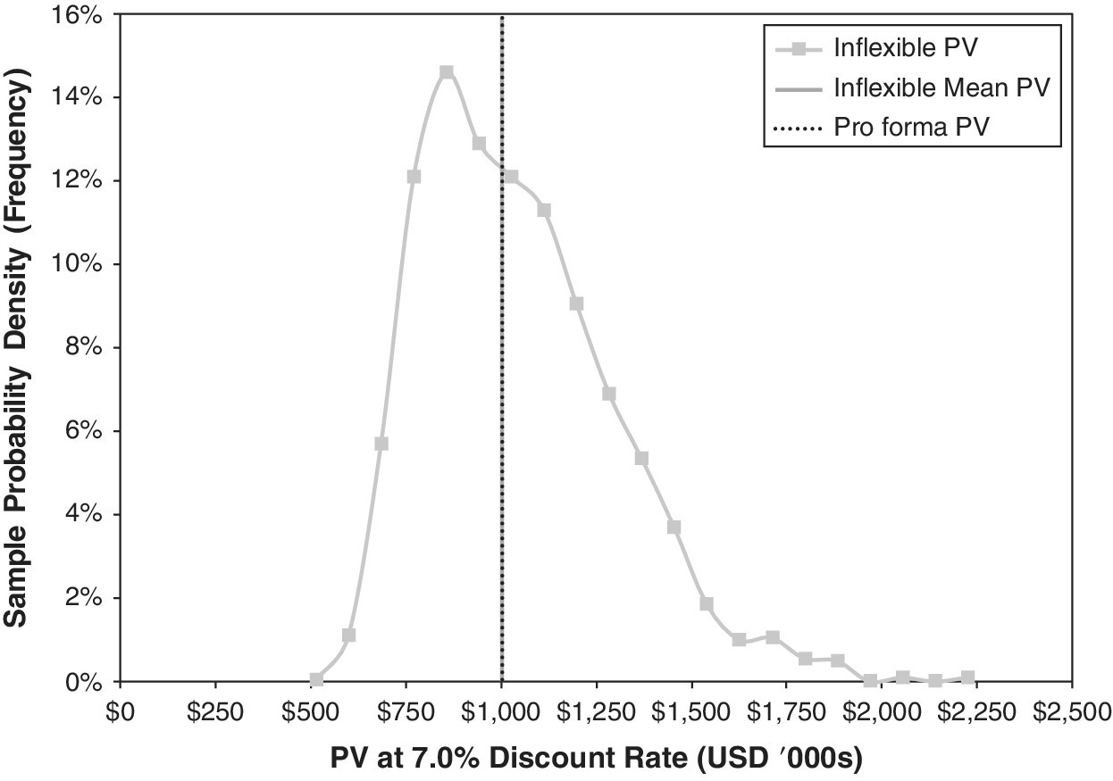
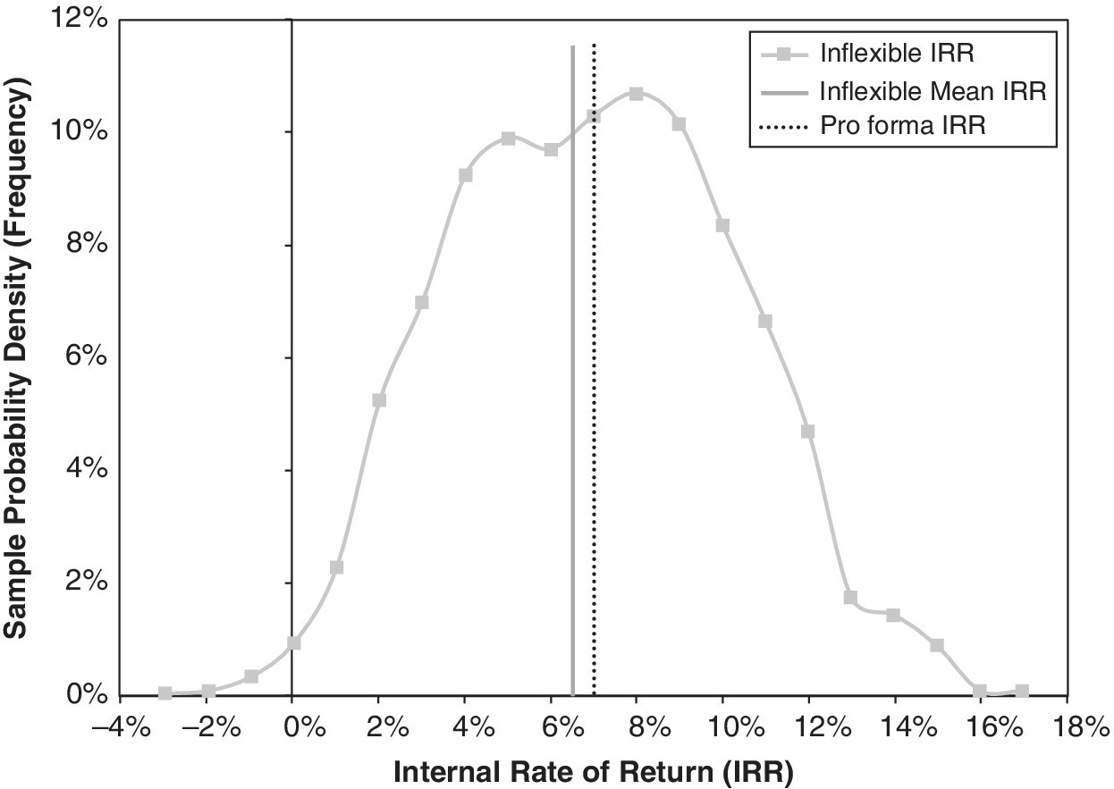
More generally, target curves represent continuous distributions. The frequency target curve represents the estimates of the underlying probability density function (PDF), while the cumulative target curve represents the corresponding cumulative distribution function (CDF). Figures 8.2 and 8.3 show realistic examples of what the simulation output distributions can look like. They show outcome frequency distributions for the present value (PV) and the internal rate of return (IRR) of a simulation run on the simple rental property investment that we introduced in Chapter 1, using the type of real estate price dynamics inputs described in the previous chapter. The graphs contrast the full range of the simulated outcome possibility distributions (the continuous frequency curves) with the corresponding metrics from the traditional, single‐stream pro forma DCF analysis (the dotted black vertical lines).
Figures 8.2 and 8.3 highlight features that we commonly observe when we use simulation to reveal the impacts of uncertainty on investment performance and asset valuation. The distribution of outcomes often differs from the distribution of inputs, as we discussed in Section 5.3. In this case, although input probability distributions were symmetric, we observe that:
- The distribution of PV outcomes in Figure 8.2 is not symmetric, even though its distribution of input cash flow uncertainties is symmetrically centered on the base case. Although its average PV is the same as the traditional pro forma PV, the median and modal PV outcomes are significantly below the average, as the value distribution has a positive skew in levels. (There is no possibility of negative value.)
- The average for (expectation of) the distribution of IRR outcomes in Figure 8.3 is significantly below the ex‐ante pro forma IRR, although the IRR distribution is symmetric around its average.
8.2 Comparing Target Curves
Figures 8.4 and 8.5 use cumulative target curves to compare the distributions of outcomes for two possible decisions. These alternatives represent different plans or strategies for dealing with uncertain future contingencies in a specific example case. In this instance, the left‐hand target curves represent the outcomes associated with an inflexible plan reflecting a traditional DCF. The right‐hand curves represent the results associated with a flexible alternative. (These are described further in the chapters that follow.)
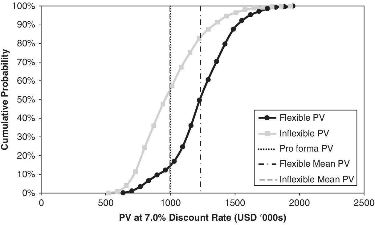

The right‐hand curves, for the flexible alternative, represent the alternative that most decision‐makers would probably view as the better choice. Viewing horizontally for any level of cumulative probability, the right‐hand curves indicate better outcomes (higher PV or IRR). Viewing vertically for any target metric outcome, the right‐hand curves show a lower probability of lower PV or IRR results—and, thus, complementarily higher probability of higher present value or investment return outcomes.
Cumulative target curves for alternatives sometimes cross each other. We cover such situations in detail later on. In general, such cases imply that one alternative has a broader range of outcomes than the other, and is thus more risky—in the sense that its possible outcomes have a broader dispersion. Such situations typically arise when we compare a risky alternative that has higher average outcomes with a safer choice that has lower probability of losses but also less opportunity for the highest upside outcomes. The better choice might then depend on management’s appetite for risk.
8.3 Value at Risk
Value at risk (VaR) is a measure of the possible downside of investments. Bankers, lenders, and investors generally use it as a measure of how bad investments can be in downside outcomes—and of their chances of recovering their loans! We define VaR in terms of the probability of failure. Thus, the 5% VaR represents the upper value, below which there is a 5% cumulative probability. That is, there is a 5% chance that things will turn out that bad or worse.
The cumulative target curve for NPV provides an immediate indication of the VaR at any desired level of probability. For example, to get the 10% VaR, you simply read across from the 10% cumulative probability on the vertical axis to find the intersection with the cumulative target curve, and read downward to find the 10% VaR. Thus, in Figure 8.4, we can see that the 10% VaR for the inflexible case is a PV of about 650, while it is about 900 for the flexible case. The VaR provides a handy measure of downside risks.
8.4 Scatterplots
The comparison of the simulated target curves in Figures 8.4 and 8.5 suggests that the flexible choice, with the curves further to the right, is better. But it is important to realize that flexibility does not always guarantee a superior result.
This is an important point. We need to spend a moment on it, as classical economic models of options frequently neglect this subtlety. Economic models implicitly assume optimal behavior. However, human beings who implement flexibility do not always behave optimally. Actual managers and investors deploy practical, heuristic, and feasible decision rules that cannot always produce superior results ex‐post. In general, good decisions can lead to losses. How often might this happen to us?
Simulation modeling provides a way to explore this important point. It supports a graphical tool—called the “scatterplot”—that is an excellent way to visually understand the range of possible outcomes. It shows how two alternatives differ on some metric in each of the 2000 (or however many) trials composing the simulation run.
Scatterplots consist of dots, each corresponding to the results of one independent, random scenario. The horizontal axis shows the outcome achieved by one choice, typically the inflexible plan. The vertical axis then shows the advantage of the alternative, typically the flexible plan. With this arrangement, any dots above the horizontal axis show when the flexible alternative outperforms the fixed alternative. Conversely, dots below this axis indicate when the inflexible choice performs better. Finally, dots to the right of the vertical axis show when the inflexible investment yields a positive IRR, and dots to its left show when the IRR is negative without flexibility.
Figure 8.6 presents a scatterplot of 2000 simulated random outcomes for a specific case. This example is different from the one shown in previous figures. Figure 8.6 compares flexible versus inflexible approaches to resale timing, along the lines of the situation discussed in Chapter 4 (but here, the model is more sophisticated, as will be discussed in the following chapters). In this scatterplot, the horizontal axis shows the IRR achieved by the inflexible resale timing, fixing the resale at the pro forma horizon Year 10, no matter what. The vertical axis shows the difference between the IRR achieved by having flexible resale timing minus that achieved by the inflexible timing within the same scenario (the same “future history” of pricing factors). (We will present the nature of the flexibility in this analysis in the following chapters.) As you can see, a few dots lie below the horizontal axis, reflecting scenarios in which the inflexible strategy performed better. Some dots are also to the left of the vertical axis, representing scenarios in which the investment led to negative IRRs in the inflexible case.
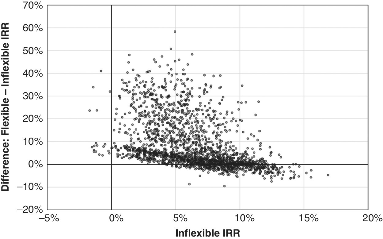
Figure 8.6 Scatterplot of simulated IRR differences.
In this example, the flexible case beats the inflexible 80% of the time in terms of the IRR outcome. About 15% of the scenarios see the inflexible beating the flexible. In the remaining 5%, the result is identical—which means that, even with flexibility on the resale timing, the property was sold at the end of Year 10, the same as it would be according to the pro forma horizon without resale timing flexibility.
Having flexibility does not guarantee that managers will always use it wisely. And, even when their decision is “wise,” in the sense of being very good from an ex‐ante perspective, that does not mean that, ex‐post, with the advantage of hindsight, it will always have produced the best results. In this context, the scatterplot, and the scenario‐by‐scenario comparison of the two alternatives that it represents, is a good way to get an intuitive feeling and insight about the relative desirability of different decision rules. In this case, flexible resale timing seems to win, pretty much hands down (see Box.8.1).
8.5 Conclusion
This chapter presented target curves and scatterplots as simple graphical representations of the outcomes of simulation. We will use them throughout the rest of the book.
Target curves come in two equivalent versions. They can either represent frequency of occurrence or the cumulative frequency, which is akin to a representation of cumulative probability. The cumulative curves are simply the summation of the frequency up to a point. Both perspectives represent the same outcome distribution; they just present it in two different ways.
Target curves provide easy visual means to identify preferable alternatives. As a rule, if one curve is always to the right, then it is the preferred case. The cumulative target curve also easily identifies the value at risk of alternatives.
The scatterplot provides a useful indication of the comparative advantage (and disadvantage) of two alternatives.