
CHAPTER 14
CASE STUDY: A CSS FORM
Building a CSS-based form is not overly difficult. Once the style sheet rules have been created, the XHTML is very simple to employ. A form, in fact, is much easier to build because it reuses much of the CSS, making it more of a process of repeating and possibly tweaking the code.
As with Web design, there are little tricks a designer should be aware of. The form in this chapter was built to show many of the challenges a designer may run into. Each row, in fact, illustrates a completely different element to consider.
The form is added initially to the design explained in Chapter 12 (see Figure 14.1) to provide a visual for how it will eventually look in a page. For the sake of simplicity, however, the form is later explained on its own. It could be added to any design, as long as it is not too wide for the allotted area on a page.
Figure 14.1
The sample form explained in this chapter.
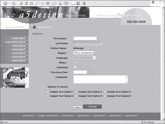
© 2014 Cengage Learning.
UNDERSTANDING THE FORM’S STRUCTURE
The structure of this form is relatively simple. It is a two-column format nested inside opening and closing <FORM> tags. It is made into a two-column format by floating the form field’s label, such as First Name, to the left of the actual form field. The background colors of the form elements are changed in Figure 14.2 to show the columns.
Figure 14.2
The background colors changed in the form to show how the two-column format is accomplished.
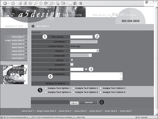
© 2014 Cengage Learning.
There are five things to note about the form’s structure, shown in Figure 14.2:
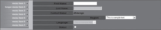
1. The left column, shown by number 1, is set to 220 pixels wide. Because every label has the same width and is floated to the left, the entire column looks like it is the same width. If, however, the designer were to change the width of the label in one of the rows, it becomes apparent that each label is technically autonomous, unlike elements structured in a traditional XHTML table layout (see Figure 14.3).
Figure 14.3
Example of how the width of each label is autonomous.
© 2014 Cengage Learning.
2. The right column is composed of the form fields. As shown in number 2, if the width of the left label were widened, the form field in the right column would change accordingly, but only for that row.
3. The right column could be styled or modified however necessary, as long as the row has space to the right. Number 3 shows how a calendar image has been positioned to the right of the Purchase Date form field. The rule declaring the background color of the entire form has been changed to a different color, which would make the entire area look like one color if the color of the left column were not different. Figure 14.4 illustrates how the background color of the entire Last Name row could be changed if need be.
Figure 14.4
Example of how the background color of the Last Name row could be stylized separately from the other rows.
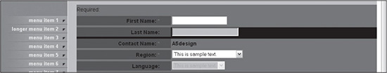
© 2014 Cengage Learning.
4. The height of the left column for each row is autonomous from the height of the right column because it is floated to the left, making it fall outside of the document flow. Number 4 represents how the height of the Comments label does not change when the height of the field in the right column increases the height of the row.
5. Because of the more involved layout of the row to the right of number 5, an XHTML table is used to position the form fields. The <DIV> nested inside is not assigned a class, which allows for the full width of the row to be used.
EXPLAINING THE STYLE SHEET USED FOR THE FORM
Because the global CSS rules are reused for nearly every form item, they are explained up front to give the reader a better overall understanding of what is happening. Listing 14.1 shows all the rules used in the style sheet.
Listing 14.1 CSS Rules That Comprise the Style Sheet
margin:0px 0px 0px 0px;
  }
.a5-required-field {
  color:#D60000;
  }
.a5-disabled-field {
  background:#7ED0D4;
  }
.a5-disabled-checkbox {
  background:#7ED0D4;
  voice-family:""}"";
  voice-family:inherit;
  }
  html>body .a5-disabled-checkbox {
    padding-top:3px;
  }
.a5-row-1 {
  height:30px;
  }
.a5-row-1 label {
  float: left;
  width: 220px;
  text-align: right;
  padding:0px 30px 0px 0px;
  }
There are several things to note about the styles used for the form. Following are explanations for each of the rules:
 .a5-form: Because browsers do not all apply the same default margin value for a form, the designer should declare it in order to provide consistency. One way this is accomplished is by setting the margins to 0.
.a5-required-field: There are several ways to show a user which field is required. Creating an asterisk next to the form label is one of the most common. This rule simply makes the asterisk red.
.a5-disabled-field: The form, when placed in the design (see Figure 14.1), has a background color behind it. Because of this, a background color for disabled fields is added to make the field look like it blends more into the background, visually representing the fact it’s disabled. To complete this usability, or lack thereof, the designer must also include code in the XHTML disabled=“true” to disable the field.
.a5-disabled-checkbox: This rule is added to consistently show the background color of a disabled checkbox in all browsers. Otherwise, some browsers render the background image entirely behind a checkbox or just partially behind it.
.a5-row-1: This rule, along with the next, are the most commonly used in the form. This particular rule is added to set the default height of the row.
.a5-row-1 label: This rule can be used to make the most sweeping changes in the form because it controls the default width of the left column. In this example, the width is set to 220 pixels. The rule also floats the column to the left side of the form, while forcing the label text to the right side of that column. A right padding value of 30 pixels is added to position the label text in from the right side, providing some visual space between the labels and the form fields.
BUILDING THE FORM ROW BY ROW
It is probably easiest to understand how to build the form if you see it built row by row. For demonstration purposes, the form is removed from the design and built separately. Following are explanations of how each row is built.
Test, Test, Test
The important thing to remember is to always test the form in various browsers. Sometimes, there are more cross-browser anomalies that arise when building a form than when building a Web page.
Adding the <FORM> Tag and Required Row
The first code to be added is the <FORM> tag. As with most forms, the main three attributes to add to the <FORM> tag are method, which tells the form to “post” or “get” the data; action, which in this case tells the form where to post the data; and the name attribute, which assigns a name to the form, uniquely identifying it. The final attribute added to this example is class, which calls the rule a5-form. This rule, declaring the default margin value as 0, defines the spacing outside the <FORM> tag, ensuring that all browsers display it the same rather than depending on their default values, which are not always the same.
The second section of code added is that which lays out the Required row. This row is added to let the user know that the red asterisk included for certain rows indicates that a particular row is required. This row has a local style added to create a top margin of 10 pixels in order to provide a little spacing between the form and the content it follows. Listing 14.2 displays this initial code added to the form.
Listing 14.2 Initial XHTML and CSS Code Added to Form
<form action="menu-item-3.cfm" method="post" name="sample_form" class="a5-form">
<div class="a5-row-1" style="margin:10px 0px 0px 0px;">
  Required: <span class="a5-required-field">*</span>
</div>
</form>
Adding the First Name Row
The First Name row is the next item to be added to the form. Figure 14.5 illustrates how the form looks when the row is added to the form.
Figure 14.5
The form with the First Name row added to the form.
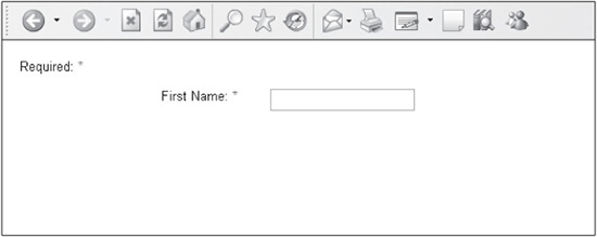
© 2014 Cengage Learning.
There are several things to note about this code:
The row is created by the <DIV> that has an id value of a5-row-1 assigned to it. As stated earlier, this row is assigned a height of 30 pixels.
The <LABEL> tag gives the designer the means to place a name next to the field it is identifying. While a <LABEL> tag is not necessary, doing so not only makes the content accessible, but it also allows the user to be able to click on that text, which will make the field the focus of the cursor. In other words, if the user clicks on the text First Name, the cursor will appear blinking in the First Name field. The <LABEL> tag knows where to place the cursor because of the for attribute, which is assigned a value of first_name. The designer then adds the id value of first_name in the form field. So, when the <LABEL> text is clicked, the browser knows to match the for value of the tag with the same id value of whichever form field has that value associated with it.
The <LABEL> tag is styled by the a5-row-1 label rule in the style sheet. This rule assigns a width of 220 pixels to the tag, floating it to the left of the form field, aligning its text to the right, and creating 30 pixels of padding to the right.
A <SPAN> tag, with the class a5-required-field assigned to it, is wrapped around an asterisk. The sole purpose of this style is to make the asterisk red to help it stand out visually.
Much of what is discussed with this example row is reused for many of the items in the form. Listing 14.3 shows the text that is added.
Listing 14.3 XHTML Code for First Name Row
<div class="a5-row-1">
    <label title="First Name" for="first_name">First Name: <span class="a5-required-
field">*</span></label>
    <input type="text" name="first_name" id="first_name" />
</div>
Adding the Last Name Row
The Last Name row uses much of the same code as the First Name line. The main difference is that this row is added to provide an example of a disabled row. Figure 14.6 shows how the disabled version appears when the a5-disabled-field class is added to the code in Listing 14.4. It is important to note that if the class were not added to the form field, it would still be disabled, but it would appear nearly the same as the First Name field. This is why the a5-disabled-field rule has a background color added to it.
Figure 14.6
The form with the Last Name row added.
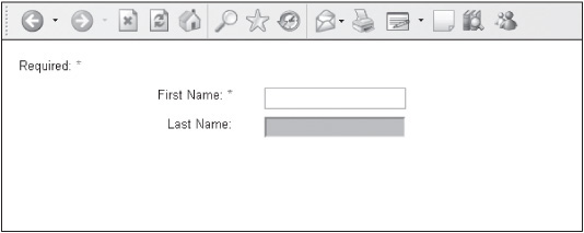
© 2014 Cengage Learning.
Listing 14.4 XHTML Code for Last Name Row
<div class="a5-row-1">
    <label title="Last Name" for="last_name">Last Name:</label>
  <input type="text" name="last_name" id="last_name" disabled="disabled" class="a5-
disabled-field" />
</div>
Adding the Contact Name Row
This row is added to show that text could be added in the right column instead of a form field (see Listing 14.5). This code is useful because dynamic forms often output just text in spaces generally allocated for fields, which, ultimately, are not submitted with the form, unless the data is also contained within a hidden form field (see Figure 14.4). The code, however, also shows that the right column area provides a lot of flexibility for the designer. An image or instructional text, for instance, could be added, if need be.
Listing 14.5 XHTML Code for Contact Name Row
<div class="a5-row-1">
    <label title="Contact Name">Contact Name: <span class="a5-required-field">*
</span></label>
    <strong>A5design</strong>
</div>
Adding the Region and Language Rows
The Region and Language rows are added to show how a drop-down menu would appear if it were added to a row. The Language element is different from the Region element in that it has been assigned the a5-disabled-field class. Similar to the Last Name field, it is assigned this class to change its background color to show it has been disabled. Unlike the <INPUT> tag, though, when the <SELECT> tag is disabled, it visually appears disabled by the way the browser renders it. Figure 14.7 shows how the four form elements appear when a background color is not assigned. Listing 14.6 shows the results of the code for the Region and Language rows.
Figure 14.7
An example of how the <INPUT> and <SELECT> fields appear differently when they are enabled and disabled.
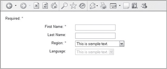
© 2014 Cengage Learning.
Listing 14.6 XHTML Code for Region and Language Rows
<div class="a5-row-1">
    <label title="Region" for="region">Region: <span class="a5-required-field">*
</span></label>
  <select name="region" id="region">
    <option value="This is sample text">This is sample text.</option>
    <option>This is longer sample text</option>
  </select>
</div>
<div class="a5-row-1">
    <label title="Language" for="language">Language:</label>
  <select name="language" id="language" disabled="disabled">
    <option value="This is sample text">This is sample text.</option>
  </select>
</div>
Adding the Status and Unlimited Rows
Similar to the Region and Language rows, the Status and Unlimited rows are included to show how a different form element would look when it was enabled and disabled. The Unlimited checkbox is the same as the Status checkbox, except it has been disabled. The slight difference in this example, as with the Last Name and Language examples of disabled form elements, is that this type of form field employs a different disabled class (i.e., a5-disabled-checkbox). Figure 14.8 shows how the checkbox looks in different browsers if it is merely assigned a background color, as with the a5-disabled-field class. It illustrates how the background color does not make up a consistent height in the left and right examples. This is why the a5-disabled-field class was created. It adds three pixels of padding to the top of the checkbox field for compliant browsers, so it appears like the left example in Figure 14.8 for all browsers. Listing 14.7 shows the code that is added to build the two rows.
Figure 14.8
How the checkbox appears in different browsers if it is not assigned the a5-disabled-checkbox class.
© 2014 Cengage Learning.
Listing 14.7 XHTML Code for Status and Unlimited Rows
<div class="a5-row-1">
   <label title="Unlimited" for="unlimited">Unlimited: </label>
  <input type="checkbox" name="status" id="status" />
</div>
<div class="a5-row-1">
   <label title="Unlimited" for="unlimited">Unlimited:</label>
  <span class="a5-disabled-checkbox"><input type="checkbox" name="unlimited"
id="unlimited" disabled="disabled" /></span>
</div>
Adding the Purchase Date Row
The Purchase Date row shows how an image can be included to the right of the form field. It is simply placed to the right of the field, as opposed to being floated to the right. If the designer were to get more technical, it could be assigned a few pixels of padding to the top so it is placed at the same height for all browsers. A <SPAN> container is wrapped around the image to provide 10 pixels of padding to the left. Listing 14.8 shows the code used to render the row.
Listing 14.8 XHTML and CSS Code for Purchase Date Row
<div class="a5-row-1">
   <label title="Purchase Date" for="purchase_date">Purchase Date:</label>
  <input type="text" name="purchase_date" id="purchase_date" style="width:70px;" />
<span style="padding-left:10px;"><img src="images/icon-calendar.gif" width="16"
height="15" alt="" border="0" /></span>
</div>
Adding the Comments Row
The code required to produce the Comments row is almost identical to several of the other rows, barring one difference—the row includes the <TEXTAREA> tag, which does not force the height of the row for compliant browsers, such as Firefox. The designer, therefore, needs to force the height of the row. One way to do so is to add a local style to the parent <DIV>, shown in Listing 14.9. Without declaring the height of the row, the row would look like the right side of Figure 14.9. The left side illustrates what the row looks like if a height is defined.
Figure 14.9
The Comments row and how it will appear in compliant browsers when a height is and isn’t defined when using the <TEXTAREA> tag.
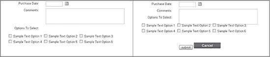
© 2014 Cengage Learning.
Listing 14.9 XHTML and CSS Code for Comments Row
<div class="a5-row-1" style="height:80px;">
   <label title="Comments" for="comments">Comments:</label>
  <textarea name="comments" id="comments" rows="3" cols="40"></textarea>
</div>
Adding the Options to Select Rows
The Options to Select rows add two more situations a designer may or may not come across. The first is to include only a section title and nothing more in a row. This is accomplished by merely not including a form field. The second is a little more involved. It requires two things: (1) define appropriate margins for positioning in the parent <DIV>, which, in this case, sets the bottom margin to 20 pixels and the left margin to 80 pixels; and (2) use a table to lay out the form fields in columns and rows. While the latter could be accomplished with CSS, the more simple and straightforward route is to use a table. The code in Listing 14.10 shows how simple the table needs to be.
Listing 14.10 XHTML and CSS Code for Options to Select Row
<div class="a5-row-1">
   <label>Options To Select:</label>
</div>
<div style="margin:0px 0px 20px 80px;">
  <table cellspacing="0" cellpadding="3" border="0">
  <tr>
  <td>
      <input type="checkbox" name="sample_text_1" id="sample_text_1" />
      <label title="Sample Text Option 1" for="sample_text_1">Sample Text
Option 1</label>
    </td>
    <td>
      <input type="checkbox" name="sample_text_2" id="sample_text_2" />
      <label title="Sample Text Option 2" for="sample_text_2">Sample Text
Option 2</label>
    </td>
    <td>
      <input type="checkbox" name="sample_text_3" id="sample_text_3" />
      <label title="Sample Text Option 3" for="sample_text_3">Sample
Text Option 3</label>
    </td>
  </tr>
  <tr>
  <td>
     <input type="checkbox" name="sample_text_4" id="sample_text_4" />
     <label title="Sample Text Option 4" for="sample_text_4">Sample Text
Option 4</label>
   </td>
  <td>
     <input type="checkbox" name="sample_text_5" id="sample_text_5" />
     <label title="Sample Text Option 5" for="sample_text_5">Sample Text
Option 5</label>
   </td>
   <td>
     <input type="checkbox" name="sample_text_6" id="sample_text_6" />
     <label title="Sample Text Option 6" for="sample_text_6">Sample Text
Option 6</label>
   </td>
  </tr>
  </table>
</div>
Adding the Submit and Cancel Buttons
The final row contains the Submit and Cancel buttons. There are several things to note about this section of code: (1) a local style is added to the <DIV> to provide 20 pixels of padding on the top and bottom, (2) the <LABEL> tag has added so that all browsers recognize the tag and account for its width, and (3) the two buttons are placed side by side without any additional styling. The Cancel button calls an image, while the Submit button is generated with XHTML (see Listing 14.11).
Listing 14.11 XHTML and CSS Code for Submit and Cancel Buttons
<div class="a5-row-1" style="padding:20px 0px 20px 0px;">
<label> </label>
<input type="submit" value="submit" />
<input type="image" src="images/button-cancel.gif" />
</div>
The Final Product
When all the code and images are added, the final 13-row form only needs the back-end functionality added to it. Figure 14.10 is the visual representation of the final code, which is shown in Listing 14.12.
Figure 14.10
How the final form appears prior to being added to the design (see Figure 14.1).
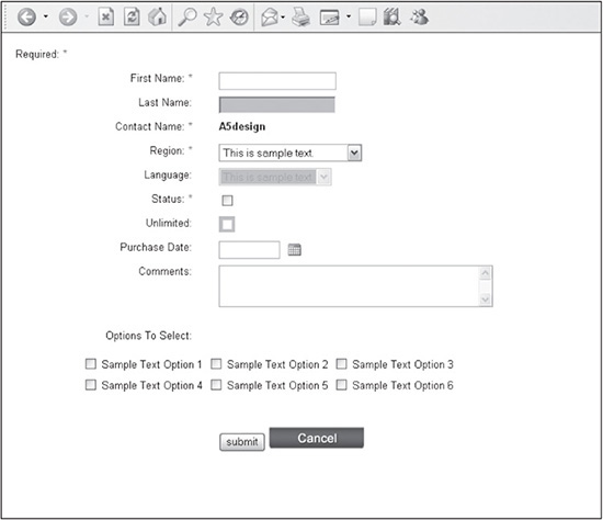
© 2014 Cengage Learning.
Listing 14.12 XHTML and CSS Code for Completed Form
<!DOCTYPE html PUBLIC "-//W3C//DTD XHTML 1.0 Transitional//EN" "DTD/xhtml1-
transitional.dtd">
<html xmlns="http://www.w3.org/1999/xhtml" xml:lang="en"
lang="en"><head><title></title>
<style type="text/css">
html, body {
margin:0px;
padding:10px;
font: 9.8pt arial, helvetica, sans-serif;
color:#000000;
}
.a5-form {
margin:0px 0px 0px 0px;
}
.a5-required-field {
color:#D60000;
}
.a5-disabled-field {
background:#7ED0D4;
}
.a5-disabled-checkbox {
background:#7ED0D4;
voice-family:""}"";
voice-family:inherit;
}
html>body .a5-disabled-checkbox {
padding-top:3px;
}
.a5-row-1 {
height:30px;
}
.a5-row-1 label {
float: left;
width: 220px;
text-align: right;
padding:0px 30px 0px 0px;
}
</style>
</head>
<body>
<form action="menu-item-3.cfm" method="post" name="sample_form" class="a5-form">
<div class="a5-row-1" style="margin:10px 0px 0px 0px;">
Required: <span class="a5-required-field">*</span>
</div>
<div class="a5-row-1">
<label title="First Name" for="first_name">First Name: <span class="a5-required-
field">*</span></label>
<input type="text" name="first_name" id="first_name" />
</div>
<div class="a5-row-1">
<label title="Last Name" for="last_name">Last Name:</label>
<input type="text" name="last_name" id="last_name" disabled="disabled" class="a5-
disabled-field" />
</div>
<div class="a5-row-1">
<label title="Contact Name">Contact Name: <span class="a5-required-field">*
</span></label>
<strong>A5design</strong>
</div>
<div class="a5-row-1">
<label title="Region" for="region">Region: <span class="a5-required-field">*
</span></label>
<select name="region" id="region">
<option value="This is sample text">This is sample text.</option>
<option>This is longer sample text</option>
</select>
</div>
<div class="a5-row-1">
<label title="Language" for="language">Language:</label>
<select name="language" id="language" disabled="disabled" class="a5-disabled-
field">
<option>This is sample text.</option>
</select>
</div>
<div class="a5-row-1">
<label title="Status" for="status">Status: <span class="a5-required-field">*
</span></label>
<input type="checkbox" name="status" id="status" />
</div>
<div class="a5-row-1">
<label title="Unlimited" for="unlimited">Unlimited:</label>
<span class="a5-disabled-checkbox"><input type="checkbox" name="unlimited"
id="unlimited" disabled="disabled" /></span>
</div>
<div class="a5-row-1">
<label title="Purchase Date" for="purchase_date">Purchase Date:</label>
<input type="text" name="purchase_date" id="purchase_date" style="width:70px;" />
<span style="padding-left:10px;"><img src="images/icon-calendar.gif" width="16"
height="15" alt="" border="0" /></span>
</div>
<div class="a5-row-1" style="height:80px;">
<label title="Comments" for="comments">Comments:</label>
<textarea name="comments" id="comments" rows="3" cols="40"></textarea>
</div>
<div class="a5-row-1">
<label>Options To Select:</label>
</div>
<div style="margin:0px 0px 20px 80px;">
<table cellspacing="0" cellpadding="3" border="0">
<tr>
<td>
<input type="checkbox" name="sample_text_1" id="sample_text_1" />
<label title="Sample Text Option 1" for="sample_text_1">Sample Text
Option 1</label>
</td>
<td>
<input type="checkbox" name="sample_text_2" id="sample_text_2" />
<label title="Sample Text Option 2" for="sample_text_2">Sample Text
Option 2</label>
</td>
<td>
<input type="checkbox" name="sample_text_3" id="sample_text_3" />
<label title="Sample Text Option 3" for="sample_text_3">Sample Text
Option 3</label>
</td>
</tr>
<tr>
<td>
<input type="checkbox" name="sample_text_4" id="sample_text_4" />
<label title="Sample Text Option 4" for="sample_text_4">Sample Text
Option 4</label>
</td>
<td>
<input type="checkbox" name="sample_text_5" id="sample_text_5" />
<label title="Sample Text Option 5" for="sample_text_5">Sample Text
Option 5</label>
</td>
<td>
<input type="checkbox" name="sample_text_6" id="sample_text_6" />
<label title="Sample Text Option 6" for="sample_text_6">Sample
Text Option 6</label>
</td>
</tr>
</table>
</div>
<div class="a5-row-1" style="padding:20px 0px 20px 0px;">
<label> </label>
<input type="submit" value="submit" />
<input type="image" src="images/button-cancel.gif" />
</div>
</form>
</body>
</html>
SUMMARY
Creating a form with CSS is not difficult once the designer understands the basic structure of the layout. After rules have been created for each row and the <LABEL> text, there are only a few nuances that need to be learned to control the form fields and the <DIV> tags that contain them. When these are understood, it becomes much easier for the designer to satisfy the majority of form requests he will come across using the methods discussed in this chapter. Even if a form needs to be more involved, the basics that are explained will provide a strong foundation for such a request.