
When you select photos from your collection, it is important to pay close attention to a number of factors that will influence the colors and your perceptions of the exposure balance. The small screen on the back of your camera is fine for what it does, but it isn’t as high a quality or as color-accurate as your computer monitor. Even if you have a great monitor or computer screen, you might still not be seeing the best representation of your files. This is one of the real pitfalls of digital photography. With slides and prints, you were always seeing the finished product with no filters other than your own eyes and the light in the room. With digital photography, your perception of the image is influenced by the various monitors you use to view the image, the light in the room where you are working, and the quality and ink levels of any printer you choose to use to print out the photo. Even if you take your images to a professional printer, you may experience some differences in color and contrast levels. For this reason, it is important to eliminate as many variables as you can. For a quick example of how disparate various reproductions of a digital image can be, do a Google image search for the Mona Lisa: (www.google.com – image:Mona Lisa). Aside from the various spoofs on the painting, you will see images of more than a dozen versions of the actual painting, with wildly divergent color profiles and contrast ratios. If you are creating a web page, then you have to accept the fact that your viewers may have monitors that are different from yours, and that is out of your control. All you can do is supply the most color-accurate picture to begin with.
To begin, there are side-by-side comparisons you can make, or you can calibrate your monitor. First, take a look at an image with a lot of color in it. How close is it to what you remember from the stage? Can you take your laptop into the theatre and compare directly? Do you have any programs that are otherwise influencing the color output of your screen? What external lighting is affecting that screen? I run a program called f.lux, which takes into account time of day, location, and surrounding lighting conditions, and adjusts the color of the screen on my laptop to a warmer tone at night or when I’m in the dark. This is very useful if I have my laptop open during technical rehearsals because I can have the screen color-keyed to tungsten light, and it doesn’t throw off my color sense. It’s a great little program, but I do need to turn it off when I’m using my laptop for image editing. If you are using such a program, and have disabled it, the most basic place to start is by adjusting the screen’s brightness and contrast.
Once you’ve done that, hook your laptop to an external monitor, and put the same image up on both…are they close or wildly divergent? If one looks right on, then congratulations, you can move on to viewing and editing your work, but if not, it’s time to dig a bit deeper into the calibration world. There are several techniques for adjusting your laptop screen or monitor, ranging in cost and ease. There are some basic calibration tools built into most stand-alone monitors, allowing you access to several adjustments, such as brightness or tint. You may be able to adjust these by eye to find the settings that are fairly accurate, but it is very difficult to quantify these settings, or verify that they are, in fact, accurate. Current computer operating systems also have some built-in options for calibration, but much like those on stand-alone monitors, you are still dealing with very broad adjustments.
The Mac has a calibration feature that is pretty effective, built into its System Preferences. If you run its calibration, you will end up with a profile that can be stored again for use in similar lighting conditions. Windows has a similar system that relies a bit more on user input, but might also be enough.
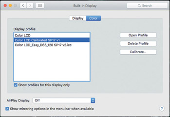
Figure 18.1:
Mac monitor calibration window.
You may also want or need to resort to a more external method for doing this, if the built-in calibration options result in strange colors or just don’t feel right. There are a number of calibration devices out there, with a wide range of prices, depending on how much help your computer needs. I admit that this might be getting pretty far afield for most people, but if you work with a number of other colleagues or students, maybe having one of these devices for your group might be useful. The way they work is that you take the calibration device, and plug it into the computer via Universal Serial Bus (USB), and then run the software. The software will help you position the device on the screen so that it can read the screen output and adjust it accordingly.
Once this has finished, the software will create a monitor profile that you can switch to with just a few clicks. This allows you to enable and disable your various screen and external monitor profiles as your needs dictate. Many of these sensors are set up to respond to and adjust the screen to compensate for changes in external lighting.
Once you are satisfied with your screen output, you can do a quick test to see how things are between your monitor and your printer. All you need to do is print out a nice, high-quality print of a selected colorful image, and then compare it to the image you still see on the screen. The screen image will have a bit more luminosity to it, since it’s on the screen instead of paper, but the things we are also looking at are color, contrast, and exposure. How close is that printout? If they are different, which one looks more accurate to you? If it’s the monitor still, then take your image file and have it printed professionally, and see how much it differs from the output from your printer. You may need to resort to professional printing or upgrade your printer if you are otherwise unsatisfied with the results.
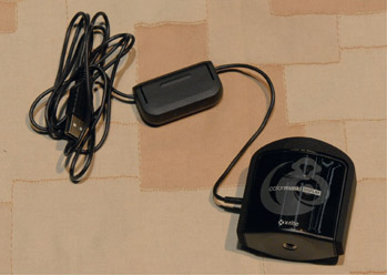
Figure 18.2:
Color Munki screen calibration device.
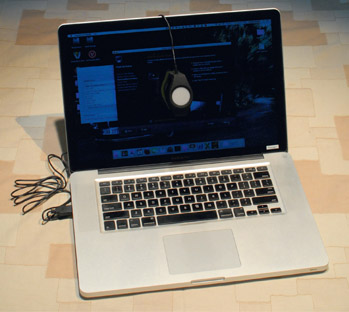
Figure 18.3:
Color Munki calibration tool installed and in position for calibration.
Photo Editing and Manipulation
If you are satisfied that your monitor and printer are both displaying the images correctly for your needs, then you can accurately sort through your images and cull what you don’t need to keep. I try to identify 12–24 files that represent the best of the lot, and might pull them into a sub-folder as a starting place if I want to feature a shot from that production or project.
As part of this process, you may identify files that are in need of some help, or you realize that you don’t have a perfect shot of a pivotal moment, and need to do some image editing. I must pause here and restate my position on digital photo manipulation. I’ve been presenting workshops across the country for 15 years on the topic of theatrical photography, and maintain that it is critical to get the best shot possible in the camera so that it isn’t necessary to do much in the way of manipulation or adjustment later on. For all of you who heard me before, I am not abandoning my soapbox on this particular topic, but felt that I still needed to address the possibilities available to young photographers. Sometimes you just don’t get a good shot of something that is particularly important to your portfolio, and you need to go back and “save” the shot from one of the “less-than-perfect” images you did capture. The skill to capture what you need will come with time and practice, so until then, I offer some suggestions on editing.
I am not, however, a Photoshop expert, and there are far better how-to books out there about Photoshop and similar programs. If you plan to get into this area of things seriously, get a good guide to the photo-manipulation program of your choice. Often, all I need to use is the Mac Preview application to rotate shots around and maybe do some simple cropping. I have, on occasion, needed to work with Photoshop to do some more delicate adjustments, but not for my portfolio use. In that sense, I will stay a purist, and will use the editing programs to create images for teaching purposes and such. So, let’s discuss a few things you might want to do to help present your photos as best you can.
Borders and Cropping
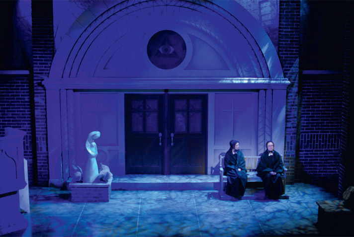
This is probably the most basic level of editing, other than making sure the photo is turned the right way up. In fact, in the days of slide film, a crop was required. A 35mm slide was a slightly different aspect ratio (2:3) than an 8 × 10 print would be (4:5). So, if you wanted to print the entire slide, you would end up with black bars top and bottom, or you would have to choose to lose a little of the image off one or both sides. This assumes that you are doing a “full-bleed” print. A full-bleed print means that there is no white border around the edge of the image. This has always been my preference, simply because there isn’t a white border around most proscenium arches. The colors surrounding a print always influence your perception of the print. Even in this book, where the pages are white, your perception of the images I’ve chosen is different than if you saw them on the otherwise black pages of my portfolio. Compare your perception of Figures 18.4 and 18.5, which are the same exact photo image, but against different screen backgrounds. Even this will have an effect on how you view the pictures. Are you looking at them in a brightly lit office or a dimly lit theatre? Again, the surroundings will influence your view of the image.
As with most all of the manipulations mentioned in this chapter, you need to think about your end use. How will the image be displayed – physical print or digital? In what context will it be shown – website, portfolio, emailed image, PowerPoint presentation? For example, is it essential that you have the picture viewed against a black background? If you are putting it on your website, you can set the background on the webpage to ensure this, but if you are sending some images to someone, maybe you need to edit them to add a thick black border around the image.
As far as actual cropping goes, if you are cropping down a number of photos that will be displayed together, try to ensure that they are the same size and aspect ratio when cropped, if appropriate. I tried to keep most all full-stage production shots in this book in the same aspect ratio for continuity, but they won’t be 8 × 10s anymore when the book goes to print. Most of the other demo and example photos have been cropped to best show the item or concept being shared. In the examples shown in Figures 18.6 and 18.7, I was distracted by the shadows of the floor mics, so I just trimmed the bottom so that the mics are gone without cutting Julie’s skirt off at the hemline. It’s a minor change, but I feel that it makes a big difference in the end.
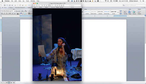
Figure 18.4: Photo-call picture against a white background of Word files.
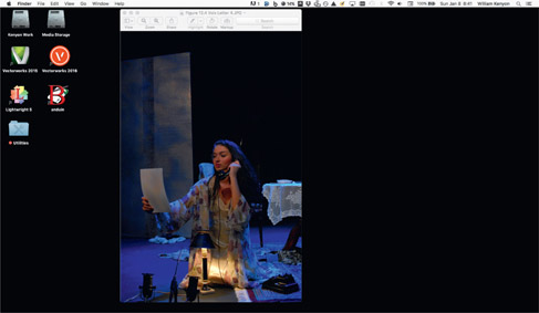
Figure 18.5:
Photo-call picture against a dark desktop background.
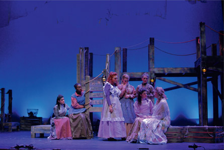
Figure 18.6: Julie and female chorus from Carousel, Bucknell University, Nov. 2016.
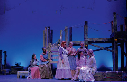
Figure 18.7:
Cropped version of Julie and female chorus from Carousel, Bucknell University, Nov. 2016.
Another framing and cropping decision that you may need to make concerns all the lights in the shot when you are in a smaller space. We looked earlier at a shot where a few lights were present, but not a big deal. In this shot, the entire light plot is visible, since the venue has a low grid. I would need to resize and crop this shot much like a wide-screen movie to include the characters but eliminate all the fixtures. I’ve decided to leave it as is, since this is what the audience saw. This is the last production I shot on film before briefly experimenting with a digital point & shoot Nikon E995 for a few months, and then finally committing to the full-bore DSLR that I now use.
Focus
There isn’t much you can do if your shot is out of focus. Some programs have a “Sharpen” feature, but that will only help you out so much. This is an area where you’ve got to get it right the first time. If, on the other hand, you want to soften some edges on the background items to help create focus, that is possible in the software. If you can do it by careful depth-offield planning, all the better.
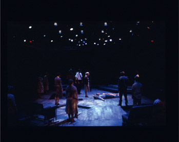
Figure 18.8:
Production moment from Rimers of Eldritch, Penn State University, Fall 2005.
Exposure
Hopefully your experience after working through all the suggestions I’ve made will help you get great exposures every time, but when you run into a shot that isn’t properly exposed, this is certainly an area where you can tweak the brightness or contrast. If you have a choice, it’s better to brighten up a shot that is too dark, since there may still be detail available to you in the shadows. Often things that are over-exposed are just too blown out to have any detail left. At this point they can’t be rescued. As with any filter for adjustment that can be made using photo-manipulation software, the further you have to push an adjustment, the less believable the photo becomes. Little tweaks are easily made, but it’s hard to apply a filter to fix one aspect of the photo without possibly shifting other aspects of the photo in a way you don’t want. With adjustments like this, it’s advisable to save multiple copies so that you can step your way back through the process if you decide you need to start part of the way over. Remember to always work from a copy so that your untouched original is still available if you have to go back all the way to the start.
Color Balance
This is another area where you can salvage the photos that maybe are slightly off. You will have trouble making sweeping changes to the delicate color balances in your photos without running the risk of some of the colors becoming skewed or unbelievable. The problem with the filters and adjustment sliders found in most photo-manipulation software is the fact that it’s often difficult to apply these filters or changes proportionally across the photo. You have to do a lot of work to isolate certain problem areas using masking layers, and then figure out how to blend the filtered layers and the unfiltered layers back together in a believable fashion. I’m not saying it’s not possible, but it does take a good bit of time, effort, and skill. Often, it’s more time and skill than I have available. If you are just tweaking the color balance, you may be able to get solid results by experimenting with the wide range of adjustment tools. If you are doing some of this finer detail work, you should probably start with a RAW file first, rather than the JPEG if you can. As we know, the RAW file has a great deal more data in it, so it should be a far better starting point for this kind of work. Eventually you will need to save the RAW file as an output file, with JPEG being the most common and easiest to print from if you are visiting a printer or office store.
When you decide on your end use, you might actually want to prepare different versions of a photograph for multiple uses. In my classes, I still teach my students to build a “hard” portfolio to bring with them to interviews, in addition to creating a portfolio website. You’ll need a high-resolution version of the file for printing. If you are only ever intending that a picture be viewed on a typical computer monitor, then you don’t need a high-resolution version, which will take a while to download and view. The same goes for the actual printed versions. If you are preparing something that you are mailing off for an interview, you need it to look good, but only last a week. Maybe you can get away with regular inks and paper. If you are putting the work on display, or want to keep the hard copy for a long time, spend the money on the archival-level paper and quality inks. This might also mean it’s time to investigate the professional-grade printing available to you. A digital image printed on a glossy or semi-glossy photo paper has so much more depth and luminosity to it than plain paper.
If you have a local option for professional printing, it’s a great idea to go there and get to know the people working there. You will ultimately have better results from folks who understand your needs and are willing to work with you to retain some repeat business. While many of the office supply stores are more convenient in terms of hours, we find that it’s never the same people twice, and we often have to have things redone multiple times before they are right. Don’t be afraid to stand your ground and refuse to pay for things that are printed incorrectly. I’ve often been told I should just settle for whatever the printer spits out, but I won’t. Many of my students have also had run-ins with the local Walmart, which has a copy center as part of the photo-finishing center. They’ve been told that Walmart won’t print the digital images because they are concerned about copyright issues. This happens even when the students tell them that there isn’t an issue because they took the photo, and hence have the copyright on the image! If it was just one time, I wouldn’t mention it, but this is an issue that is apparently tied to corporate policy, and has occurred many times over a span of years. If that is your only choice, just give yourself the time to deal with this as a potential issue, and go during the day when you can talk to a manager if a concern is raised.
When it comes time to show your work, remember that the people you are sharing with will never know what you left out if you don’t point it out. Celebrate the successes in your presentation, and don’t belabor the things that didn’t turn out the way you had hoped. We all wish we had a bit more time in the theatre to fine-tune things, but sometimes it is just not possible. Be selective and edit with your head, not your heart. You will need your heart later when you develop a presentation to go with the pictures, but for now, when you are “culling the herd,” ask yourself if you are attached to a particular image because it is a great example of a moment in the show, or because it has some personal meaning that won’t be apparent to the reviewer. I’ve seen this happen many times, where a young designer has put an otherwise mediocre shot in their presentation because it was their favorite dance number. While it may evoke some fond memories, it has now tarnished your whole presentation a little bit.