
For the next few chapters, we will explore the options for creating games using Windows Phone 7's other technology: Silverlight.
While XNA is focused specifically on creating games, Silverlight's objective is to allow applications in general to be created. This means that it doesn't provide many of the graphical technologies that we have found during our explanation of XNA. It doesn't, for example, offer support for rendering 3D objects.
Its graphical capabilities are still fairly comprehensive, however, allowing us to perform virtually everything that XNA's sprites can do, including scaling, rotation, transparency, and so on. They are very useful for game creation.
Silverlight also provides a very useful facility that is almost entirely missing from XNA: the ability to create a rich user interface. If your game needs to focus on detailed information displays and complex interaction from the user, you might find that Silverlight has the tools that can enable you to implement this quickly and easily.
In this chapter, we will begin to explore Silverlight: its capabilities and how we can develop with it. If you haven't used Silverlight before, you will gain a broad understanding of how to use it. This book's focus is on gaming rather than Silverlight itself, however, so we cannot hope to cover everything that Silverlight can do. Many other excellent books are available if you want to further your understanding beyond the information that is presented here.
If you are already familiar with Silverlight, much of this material might already be familiar to you. It might still be worth skimming the chapter, however, because there are differences that you might not expect in the way Silverlight operates on the phone as compared with in a browser.
Let's take a quick tour through the past and present of Silverlight so that we can understand its evolution into the product that we use today.
In the beginning, there was Windows Presentation Foundation(WPF). This technology, introduced by Microsoft in 2006 as part of .NET 3.0, was for desktop PC development and introduced a new graphics API.
Prior to this, 2D rendering in Windows was generally performed using the aging Graphics Device Interface(GDI). GDI has its strengths, but rendering games and fast-moving animated graphics are not among them. The majority of operations performed using GDI are driven by the processor rather than by the graphics hardware, limiting the performance of applications that use it.
WPF dramatically improves on these capabilities by offloading the graphics rendering onto the graphics hardware via the DirectX rendering system. As a result of this change, vastly improved levels of performance can be obtained with less load to the CPU itself, allowing the processor instead to focus on tasks such as data processing, game logic, and so on.
The sophisticated rendering abilities of the graphics hardware can also be taken advantage of by WPF, allowing for a much richer visual display. Graphics hardware can easily rotate, scale, perform alpha blending and transparency effects, and perform other visual transformations; so all this functionality becomes immediately available to the WPF user interface. 3D graphics rendering is also supported.
One of the important features of WPF is a layout engine that allows flexible and complex user interface designs to be specified. This engine uses a declarative language called XAML (short for eXtensible Application Markup Language and pronounced "zammal") to define the contents of the screens generated by WPF. We will be spending quite some time looking at XAML in this chapter.
A year after the release of the first version of WPF, Microsoft released the first version of Silverlight. Silverlight began as a web browser technology, based on WPF (and in fact was originally codenamed WPF/E, short for Windows Presentation Foundation/Everywhere). It took the central graphic presentation functionality present in WPF and allowed it to be used to deliver content within web pages using a small and reasonably unobtrusive browser plug-in. The 3D rendering element of WPF was not included in the transformation to Silverlight (and indeed is still not included today).
Silverlight 1.0 was useful and powerful in many ways, but was not as flexible as it might have been. It exposed a Document Object Model(DOM) that could be used to interact with and manipulate the content that it was presenting within the browser, but all interaction with this object model had to be performed using JavaScript. It also had no user interface controls built in to its runtime.
Silverlight 2, which was released in 2008, contained a large number of changes and enhancements. Possibly the most significant of these was the capability for it to be programmed using the .NET Common Language Runtime(CLR). As a result of this enhancement, code could be created using any of the managed .NET languages, such as C# or Visual Basic.NET. This hugely increased the flexibility of the environment and opened it up as a usable platform to millions of existing .NET developers. Code embedded into Silverlight apps is known as code behind code because it sits behind the user-facing presentation layer. This is analogous to the code that is contained within a Form class in WinForms development.
Along with this change were numerous others, including the addition of flexible user interface controls (such as text boxes, combo boxes, check boxes, sliders, and many more), LINQ, data access functionality, and the capability for managed code within a Silverlight application to interact with the HTML on the page outside of the application itself. This resulted in a highly flexible and dynamic environment to work in.
In 2009, Silverlight 3 was released, bringing with it a number of additions such as new user interface controls, better audio and video decoding, and high-definition video streaming. Another very useful change in this new version is its capability to run outside of the browser. Instead of having to live inside a web page, a Silverlight application could now be installed on the PC as a stand-alone application, resulting in a very simple delivery and deployment experience.
The latest version of Silverlight is version 4, released in 2010. It contains another list of enhancements, though none on quite the same scale as seen in the earlier updates. New features include capabilities to work with printers and the clipboard; support for the right mouse button and mouse wheel; and the capability to use a web cam and microphone.
Clearly, a Silverlight application running on a Windows Phone 7 device is working in a very different environment from one running in a web browser or on the desktop. Nevertheless, it still offers a huge amount of functionality and a great degree of flexibility for presenting data to and interacting with the user.
The version of Silverlight that runs on Windows Phone is version 3, not the more recent version 4. Because Silverlight on the phone is running in a known environment, however (unlike in a web browser that could be one of a number of browsers on one of a number of operating systems), it can take advantage of other facilities within the phone. As a result, it can safely use external libraries to provide accelerometer input, for example, or can hook into XNA for additional audio capabilities.
The binaries produced for Silverlight on the phone are identical to those produced for web-based or desktop applications. This means that third-party Silverlight libraries can theoretically be used by Windows Phone 7 applications. If you decide to try this, however, do bear in mind that desktop-targeted Silverlight libraries might require .NET namespaces and capabilities that are not available in Windows Phone 7; and might expect more processing power, memory, or available screen real estate than the phone can offer, so you will need to experiment with them to ensure their suitability.
In practice, you need to make some changes to your Silverlight games before they will run comfortably on off-phone platforms, but this is a definite possibility and a great way to advertise your game. We will explore this subject further in Chapter 16.
To begin working with Silverlight, we must first create a Silverlight project. This is done by selecting the Silverlight for Windows Phone option within the project Templates panel of the New Project dialog, shown in Figure 11-1.

Try this now and create an empty Silverlight project to experiment with based on the Windows Phone Application template. Once again, you might find it beneficial to switch off the "Create directory for solution" option because it results in less directory nesting in the generated project.
The project opens within the IDE, showing a split view of the project's MainPage.xaml file, as discussed all the way back in Chapter 1.
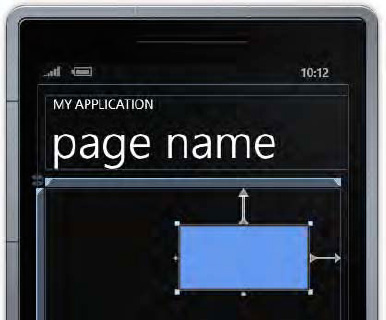
Run the resulting project and allow it to be deployed to a device or to the emulator. The resulting application simply shows a black screen with an application name and a title at the top. The title initially displays the value page name. As this name suggests, the top-level design unit within Silverlight applications is called a page (analogous to the form in WinForms projects).
If you are running on a real device or the emulator with a fully supported graphics card in your PC, you should also see the frame rate counter displayed on the right edge of the screen. These counters show some useful performance indicators that can help identify how fast the application is running and rendering to the screen. We will explore these counters in more detail in the "Silverlight Performance" section in Chapter 13.
The initial page of the project, with the performance counters displayed, is shown in Figure 11-2.

As Figure 11-1 shows, the Windows Phone development environment comes with five project templates. Let's take a look at each of these templates and find out the types of projects that they are most likely to be useful for. Try creating a project using each of the templates and experimenting with their functionality as you work through this section.
This is a general-purpose template that can be used as a basis for any type of application. It provides what essentially amounts to an empty but working environment, ready for further customization.
Most of the other project templates provide a starting point based around a particular user interface approach. There is a high probability that the games you create will not need to use these approaches, so the basic Windows Phone Application template is likely to be the most suitable starting point for game development.
The DataboundApplication template shows a simple example of creating a multi-item scrolling page with expandable detail behind each of the items. The default application shows a series of sample items (that are being built from a class elsewhere within the project). When one is selected, a detail page opens to provide more information on the item.
This template provides an example of one of the navigational models available within Silverlight. Selecting an item navigates forward into the detail of that item. The hardware Back button can then be pressed to return back to the item list page again. Pressing Back once again closes the application (because this is the root page) and returns to the phone's front page. This process feels similar to navigating backward through pages in a web browser and is consistent with the experience that we saw in XNA games when we covered tombstoning.
This template is less likely to be a useful starting point for game development.
As you would expect, this template creates an empty class library project, ready to be populated and referenced from other Silverlight projects. Apart from some project references and a blank class file, projects created from this template are completely blank.
This template creates a project based around one of the Metro user interface's new paradigms: the Panorama. Panoramic page layouts are to be found in many areas of the core phone operating system and many applications built on top of it.
The organization of the Panorama consists of an extra wide, horizontally scrolling page, inside of which are distinct columns of data. By swiping left or right, the user can navigate between these columns. The individual columns can be different in presentation and style, and will often include a vertical scrolling component to allow more content to be contained than can fit on the screen.
The vertical columns are sized so that the next column to the right is just visible, giving a visual clue to the user that more content is available than that presented on the screen. Further indications of this are contained within the Panorama title, which is displayed in a large font that usually stretches off the right edge of the screen.
This is an important configuration for many applications, but as with the databound application, it is less likely to be useful for us as a basis for writing games.
The final template creates a project using a Pivot control. This is another Metro control type, and in many ways looks and feels similar to the Panorama, offering items grouped together under a series of headings.
In practice, the main difference between these two controls is down to presentation. It is also more common to find applications that dynamically add headings based on user configuration (for example, adding multiple cities to a weather forecasting application or different categories for a news reporting app). The headings within a Pivot control can be seen as analogous to tabs in a tab control in a desktop user interface.
This template is once again less likely to be used for game projects.
Getting comfortable with the Visual Studio IDE can take a little time when working with Silverlight projects. The main building blocks of the projects are the pages, which are represented by .xaml files.
Generally when working on pages, the IDE will be run using the "split" view, with the actual XAML code on one side of the screen and a preview of the page on the other. As changes are made to the XAML, they are immediately reflected in the preview, allowing the effect of code changes to be quickly and easily understood.
New in Visual Studio 2010 is the capability to actually interact with this preview. In Visual Studio 2008, the preview was just that: a read-only display of how the hand-crafted XAML would appear when the application was launched. Visual Studio 2010 turns the preview into a visual designer, just like the form designer that is available when developing WinForms applications.
Using the preview to visually design pages can be extremely useful and a great time-saving device. Controls can be visually added to and arranged within the preview, and the corresponding XAML code updates to reflect the changes that have been made. Clicking a control within the preview not only visually selects it within the designer, but also scrolls to and highlights the corresponding control in the XAML pane. Using these two panes together provides a very rich and powerful user interface design experience—once you've got the hang of it!
Note
As an additional or alternative method for editing page designs, Microsoft provides a comprehensive user interface design tool called Expression Blend. The idea behind this application is that designers, who don't necessarily have any programming experience, can use Expression Blend to create rich and attractive user interface frameworks, behind which the programmers can then slot in the required program code. Expression Blend 4 for Windows Phone is provided for free as part of the Windows Phone 7 software development kit and is well worth investigating if you find that you have large amounts of page design to do. This book will focus only on developing Silverlight applications within the main Visual Studio IDE, however.
Associated with each .xaml page file is a corresponding .cs code file, containing the "code behind" the page. This code file can be accessed either by clicking the View Code button in the Solution Explorer toolbar or by expanding the .xaml file within Solution Explorer's tree and double-clicking the .cs file that is revealed, as shown in Figure 11-3.

All these areas of the IDE are important for designing our game. The user interface and many of the game components will be created in the page and XAML designer, and the game logic and processing will be created in the C# code window just as in any other type of application.
Let's take a more detailed look at the solution that Visual Studio creates for us when we ask it for a Silverlight application. These are the files created when the Windows Phone Application template is selected; other templates might result in additional files within the generated solution, but the core files detailed here are present in all the templates.
Unlike new XNA solutions, the solution for a new Silverlight application consists of just one project. Any resources that we need to call on (such as graphic or sound files) are embedded directly into the main application rather than being provided by a separate Content project.
The project contains three images: ApplicationIcon.png, Background.png, and SplashScreenImage.png, which are used to control the icons and start-up image used by the project.
The first of these images, ApplicationIcon.png, is a small 62-x-62-pixel icon that will be displayed within the application list on the device. Background.png is a larger icon at 173 × 173 pixels; it will be displayed on the main home page if the user decides to pin the application from the app list. Both of these images default to a white starburst shape on a black background. You will want to customize these images to allow your game to stand out. The two images should ideally be essentially the same except for their size so that the user doesn't get confused as to which icon the game uses.
The final image, SplashScreenImage.png, is a full-screen image measuring 480 × 800 pixels that is displayed when the game is initializing. When starting up the empty project applications, a small clock image appears briefly in the middle of the screen; this is the default splash screen image. It is perfectly acceptable to retain this default image, but you might want to add a little extra sparkle by customizing it. If you aren't sure what image to use, you can create a loading image based on a screenshot from within your game.
Alongside these images are two Silverlight page files: App.xaml and MainPage.xaml. The first file, App.xaml, contains a nonvisual XAML listing that sets up the application-wide environment for the project. Its default content is shown in Listing 11-1.
Example 11.1. The XAML contained within App.xaml
<Application
    x:Class="WindowsPhoneApplication1.App"
    xmlns="http://schemas.microsoft.com/winfx/2006/xaml/presentation"
    xmlns:x="http://schemas.microsoft.com/winfx/2006/xaml"
    xmlns:phone="clr-namespace:Microsoft.Phone.Controls;assembly=Microsoft.Phone"
    xmlns:shell="clr-namespace:Microsoft.Phone.Shell;assembly=Microsoft.Phone">

    <!--Application Resources-->
    <Application.Resources>
    </Application.Resources>

    <Application.ApplicationLifetimeObjects>
        <!--Required object that handles lifetime events for the application-->
        <shell:PhoneApplicationService
            Launching="Application_Launching" Closing="Application_Closing"
            Activated="Application_Activated" Deactivated="Application_Deactivated"/>
    </Application.ApplicationLifetimeObjects>
</Application>
Don't worry too much about what is going on in here for the moment, but something you will be able to spot is the configuration of the application life cycle event handlers. Event functions are set up to process the launching, closing, activated, and deactivated events just as we set up in the Game Framework project for XNA. While the appearance and development styles of Silverlight and XNA might be very different, they are both running on the same underlying platform and have many internal similarities, such as this one.
The App.xaml file also has code behind it, which you can find by opening up the App.xaml.cs file, as described earlier. This file contains initialization code for the project. The majority of the code here is in scope for modification as per the needs of individual projects, so feel free to add or customize the content of this file. Open the file now in Visual Studio to take a look at its content.
At the beginning of the code is the declaration for a property named RootFrame. This can be accessed from anywhere within the project in order to gain access to the page that is currently open. We will see how to do this later on.
Following on from this is the class constructor. The main area of interest is a block of code that only executes when the Visual Studio debugger is attached. Inside, the class updates various properties that can help with debugging, so it makes sense only to use these properties when actually connected to the debugger—this approach minimizes the risk of debugging information being accidentally activated in production code.
The first updated property is the EnableFrameRateCounter, which we have already briefly discussed. If you ever want to turn the counter off, simply comment out this line of code. The rest of the block is commented out, but contains code to set two further properties named EnableRedrawRegions and EnableCacheVisualization. We will discuss these properties in the "Silverlight Performance" section in Chapter 13.
After the constructor you will find four functions that respond to the application life cycle events. Any processing code that you need to put into place when these events occur can be added here.
Note
You won't find any C# code that wires up these functions to the corresponding events. The event handlers are actually set up by the XAML code shown in Listing 11-1. We will look into how event handlers are specified for events using XAML in the "Exploring XAML" section later in this chapter.
The final functions here allow the debugger to be triggered on two specific events that might occur within the application: an unhandled exception and a navigation failure (which will occur if there is a problem moving from one page to the next). Both of these event handlers are useful to have to help diagnose problems when developing applications.
At last we reach the final file within the project: MainPage.xaml. As you have already seen, this file initially provides the XAML required to set up a simple outline page, ready for your custom content to be added inside. We will look at how the XAML fits together in a moment.
The class behind this page is essentially empty, ready to be populated with whatever additional code your game requires.
Note
This blank page is identical to the one that you will get if you select to add a new Page item to your project.
The Hidden Source Files
Although not initially visible within Solution Explorer, there are three additional files included in the project. They can be found by expanding the Properties node in the project tree.
Inside you will find AppManifest.xml, which is essentially an empty XML document, and AssemblyInfo.cs, which provides all the details of the assembly (title, author, copyright details, and so on) that will be built into the binary when it is compiled.
The third file, WMAppManifest.xml, contains various application parameters that will be used to control how the application is deployed and launched. Of interest is the DefaultTask element, which specifies the initial Silverlight page that should be displayed when the application launches. If you add other pages and want to make one of them the start page, you can change this value to point to it as needed.
Just as with any other .NET environment, you can easily share and reuse functionality that your games require by building class libraries. If you want to create a class library based specifically around the Silverlight platform, use the Silverlight Class Library template detailed earlier in this chapter.
It is also possible to create class library projects that will work in both XNA and Silverlight. You can create the project from the Silverlight Class Library template or the XNA Game Library template, but remember that any code you write that needs to work in both environments should not specifically target features from the other platform. It is fine to create classes that manipulate basic datatypes, but once you start specifically referring to XNA or Silverlight classes, you will quickly find that problems occur when running in the other environment.
Note
Silverlight and XNA can add binary (DLL) references to assemblies created in one another's environments, but Visual Studio does not like adding project references between the two different environments. You will therefore either need to add references by browsing to their DLL files or stick to keeping your assemblies focused on just one environment or the other.
Let's continue our journey into Silverlight by spending some time looking at XAML.
XAML is both intricate and complex, and although not a fully fledged programming language in its own right, it nonetheless contains all sorts of tricks and features and will take time to master. In this section, you will take a crash course in XAML and learn just the basics you need in order to set up a gaming environment.
While you will get a good idea of what XAML can do and a high-level understanding of how it works, providing a full and in-depth description of all its features is beyond the scope of this book. As and when you want to further your knowledge, there are many good books and online resources that will allow you to expand and deepen your knowledge. (Matthew MacDonald's Pro Silverlight series is one I can recommend.)
XAML's primary purpose is to define the user interface layout of pages displayed within a Silverlight application.
Visual development environments have used text-based representations of form designs for a very long time. Starting back with the original pre-.NET versions of Visual Basic, forms were designed using a visual layout tool, and those designs were stored using a special syntax built purely around the need to define user interface elements and set the values of their properties. These designs were system-generated and only designed to be system-readable. They could be modified by hand, but to do so required the designer to explore the data files outside of the IDE and "hack" them. Such editing was not supported or recommended.
Things improved somewhat with the introduction of the .NET environment. The visual form designer continued to result in system-generated code, and it was by default still hidden away. The code it created was no longer in a special structure, however; it was plain C# or VB.NET, and it could be viewed and edited directly within the IDE if the developer wanted to do so. Generally it was still easier to simply use the form designer, however, not least of which because it generated reams and reams of verbose code.
The approach taken with WPF and Silverlight is somewhat different. The UI is marked up in XAML, and it is not only in plain view and editable but also editing is encouraged and recommended. In earlier versions of Visual Studio, manual editing of XAML was the only way to build it at all.
This open and structured approach to layout provides a number of benefits. It allows you to see exactly, without any ambiguity, what the structure and content of your user interface actually is. It lets you interact at a detailed level with its objects and properties without having to navigate through a complex visual interface. And with a little practice and experience, it also allows you to create your user interface more quickly than using the visual designer.
One of the things that made this approach less usable in the pre-WPF approach to form design was the verbosity of the UI construction code. Adding a text box to a form and setting its properties could require a dozen or more lines of code. XAML removes this problem by using a concise and targeted notation for specifying its content. User interface controls (or elements) are defined by simple XML elements, whose names correspond to the classes that they represent. Properties and events are defined by XML attributes (though support for complex properties that cannot be represented by a simple value is present, too).
When you compile your Silverlight project, the compiler processes all the XAML that has been defined and actually turns it into C# code. This code is then compiled as part of your project, just as any other C# code would be. Because of this, virtually everything that you can do in XAML could also be done by writing code instead.
Alongside all this, the XAML editor has a degree of predictive intelligence. While you are using it, the editor will do its best to insert the markup that you will need next (quotes around attribute values, closing elements, and so on), and Visual Studio's IntelliSense feature will provide suggestions for available attributes and property values. It can take a little time to learn to work with this feature rather than fight against it, but once you come to terms with it, you will find that it saves you a lot of time.
To begin with, feel free to use the visual designer to create your XAML for you. You can easily create and modify elements and their properties and more-or-less leave the XAML itself alone. But keep an eye on what is happening behind your page design and don't be afraid to make any changes to the markup directly in the editor. Before too long, you might find yourself more at home editing the XAML than using the designer.
Pages within Silverlight are structured in a conceptually similar way to pages in HTML. They are set up in a hierarchical system whereby elements are contained within other elements. If you add a panel and then want to add a text box inside that panel, the text box must be defined inside the panel's element within the XAML definition.
Silverlight elements can even have styles applied to them in a similar way to the way cascading style sheets(CSS) can be used for HTML documents. Silverlight styles are not as sophisticated as CSS but still can provide a method for updating elements within pages in a consistent manner.
Other similarities exist with the HTML world too. We have already seen that each Silverlight design is stored within a page, and when we want to take the user from one page to another, we do this by navigating to a page using a URI, just as we would in a web browser. The URIs are formed in a way that references content within the Silverlight application rather than actually looking on the Internet.
Parameter values can be passed between these pages by specifying them within the URI's query string, just as parameters are passed between pages within a web browser.
If you create an empty project based on the Windows Phone Databound Application template, you can see this application page navigation feature in use. Inside the MainPage.xaml.cs file is the code shown in Listing 11-2. The NavigationService.Navigate call is provided with the target page URI including the query string, which in this case indicates the index of the item within the list that has been touched by the user.
Example 11.2. Navigating to the DetailsPage and passing it a parameter value
// Handle selection changed on ListBox
    private void MainListBox_SelectionChanged(object sender, SelectionChangedEventArgs e)
    {
        // If selected index is −1 (no selection) do nothing
        if (MainListBox.SelectedIndex == −1)
            return;
// Navigate to the new page
NavigationService.Navigate(new Uri("/DetailsPage.xaml?selectedItem=" +
MainListBox.SelectedIndex, UriKind.Relative));
// Reset selected index to −1 (no selection)
MainListBox.SelectedIndex = −1;
}Don't forget that although we are using Silverlight to create stand-alone applications in the context of Windows Phone, the platform's origins are entirely web-based. This no doubt goes a long way to explain the similarities between the two environments.
Let's take a more detailed look at some XAML code and break it down so that we can understand what it is doing. We'll examine this by taking a tour through some of the classes within a Silverlight project and will then summarize everything at the end.
The first example that we will look at is the App.xaml file from the default Windows Phone Application template, the beginning of which is reproduced in Listing 11-3.
Example 11.3. The start of the App.xaml file
<Application
    x:Class="WindowsPhoneApplication1.App"
    xmlns="http://schemas.microsoft.com/winfx/2006/xaml/presentation"
    xmlns:x="http://schemas.microsoft.com/winfx/2006/xaml"
    xmlns:phone="clr-namespace:Microsoft.Phone.Controls;assembly=Microsoft.Phone"
    xmlns:shell="clr-namespace:Microsoft.Phone.Shell;assembly=Microsoft.Phone">
You might notice that this particular file doesn't display the visual editor when it is opened in Visual Studio; you will see the reason for that in a moment.
The very first line declares an XML element named Application. The name of the element defines the class from which this particular class inherits. The first line after this sets the x:Class attribute to have the value WindowsPhoneApplication1.App. It specifies the namespace inside which the class resides (WindowsPhoneApplication1) and the name of the class (App).
If you open the code behind the XAML, you will find that the class declaration begins with the code shown in Listing 11-4. This is exactly the same information, but written using the C# syntax.
Example 11.4. The App class declaration in the C# code behind
namespace WindowsPhoneApplication1
{
    public partial class App : Application
    {
Note
The XAML and the code for a class definition must agree on the details specified here; if the base class, namespace, or class name are inconsistent between the two, a compilation error will occur.
The next block of content within App.xaml defines four XML namespaces. These namespaces allow us to map elements within the following XAML back to specific DLLs or areas of functionality.
The first namespace that is defined references the URL http://schemas.microsoft.com/winfx/2006/xaml/presentation, which is the namespace used for Silverlight. No namespace prefix is specified for this, so all following elements within the document will default to this namespace unless another is explicitly specified.
Following this is the x namespace, refencing http://schemas.microsoft.com/winfx/2006/xaml. This namespace provides additional content specific to XAML, such as the x:Class attribute that was already discussed.
The remaining namespaces both reference .NET namespaces Microsoft.Phone.Controls and Microsoft.Phone.Shell. With these namespaces present, we can refer to items within these .NET namespaces by specifying the appropriate XML namespace (phone or shell). The editor will automatically create further namespace entries if controls from other assemblies are added to the page from the Toolbox.
Bearing all this in mind, let's now skip forward to another file: MainPage.xaml. The file begins as shown in Listing 11-5.
Example 11.5. The beginning of MainPage.xaml
<phone:PhoneApplicationPage
    x:Class="WindowsPhoneApplication1.MainPage"
    xmlns="http://schemas.microsoft.com/winfx/2006/xaml/presentation"
    xmlns:x="http://schemas.microsoft.com/winfx/2006/xaml"
    xmlns:phone="clr-namespace:Microsoft.Phone.Controls;assembly=Microsoft.Phone"
    xmlns:shell="clr-namespace:Microsoft.Phone.Shell;assembly=Microsoft.Phone"
    xmlns:d="http://schemas.microsoft.com/expression/blend/2008"
    xmlns:mc="http://schemas.openxmlformats.org/markup-compatibility/2006"
This time, the root element is of type PhoneApplicationPage from the phone namespace. We already know that the phone namespace maps into the Microsoft.Phone.Controls .NET namespace, so this tells us that the type of class represented by this XAML is derived from Microsoft.Phone.Controls.PhoneApplicationPage. The second line names the class as MainPage within the WindowsPhoneApplication1 .NET namespace. Once again we can confirm this by viewing the code behind for the class and seeing that it reveals exactly the same information, as shown in Listing 11-6.
Example 11.6. The code behind for the MainPage class declaration
namespace WindowsPhoneApplication1
{
    public partial class MainPage : PhoneApplicationPage
    {
Following the class name is another slightly larger list of XML namespaces. They are the same as in App.xaml, except for the addition of the d and mc namespaces. These namespaces are present primarily for the benefit of the visual designer (and for external designers such as Expression Blend), and we can safely ignore them from the perspective of managing our page designs.
A few lines farther down within the file you will see an element of type Grid being defined. The complete declaration for this and its content is shown in Listing 11-7.
Example 11.7. The code behind for the MainPage class declaration
<!--LayoutRoot is the root grid where all page content is placed-->
    <Grid x:Name="LayoutRoot" Background="Transparent">
        <Grid.RowDefinitions>
            <RowDefinition Height="Auto"/>
            <RowDefinition Height="*"/>
        </Grid.RowDefinitions>

        <!--TitlePanel contains the name of the application and page title-->
        <StackPanel x:Name="TitlePanel" Grid.Row="0" Margin="12,17,0,28">
            <TextBlock x:Name="ApplicationTitle" Text="MY APPLICATION"
                                             Style="{StaticResource PhoneTextNormalStyle}"/>
            <TextBlock x:Name="PageTitle" Text="page name"
                                             Margin="9,-7,0,0"
                                             Style="{StaticResource PhoneTextTitle1Style}"/>
        </StackPanel>

        <!--ContentPanel - place additional content here-->
        <Grid x:Name="ContentPanel" Grid.Row="1" Margin="12,0,12,0"></Grid>
    </Grid>
This code declares a series of controls that are present within the page. Before we look in more detail at what the controls are for and how the XAML syntax is used to declare them, let's look at a visual representation of the controls within the page. Figure 11-4 shows the same controls within MainPage inside a Silverlight application. Other pages can be contained within the application, too (represented conceptually as Page2 and Page3 in this diagram).
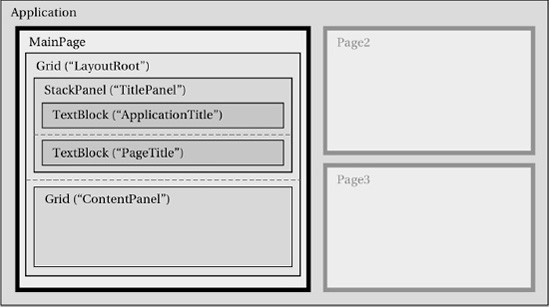
Let's focus on the outermost Grid element first. Elements defined within the body of the XAML document represent objects that are being created. The name of the element specifies the name of the class to be used to create the object. Because the element's name is Grid, this element will create an instance of the Grid class. No namespace has been specified, so the default namespace will be used; as we know, this is the Silverlight namespace, and so the control will be taken from Silverlight's built-in classes, of which Grid is one.
The element declaration also specifies two attributes: x:Name and Background. When attributes are provided for an element, these attributes are used to set properties of the object that has been created. In other words, this XML element creates a Grid object, sets its Name to be LayoutRoot, and sets its Background to be Transparent. In addition, the grid is not simply floating within the page class; it is added as part of the collection of controls within the page.
This tiny piece of XAML creates an internal class variable, assigns to it a new instance of the Grid class, sets the grid's Background property, and adds the grid into the page's control collection. Clearly the corresponding C# required to do this would be a lot longer. Although XAML definitely needs an investment of time to learn, its capability to create content in a concise way is second to none.
More examples of creating and configuring objects can be seen in the TextBlock definitions inside the grid. TextBlock elements are similar to WinForms Label controls in many ways and can be used to simply place text onto the page. The "MY APPLICATION" and "page name" text items displayed at the top of the page are both implemented using the TextBlock element.
For each of the TextBlocks defined, three attributes are specified to set the element's name, text, and style. The text can be set to whatever is required; the style is configured to apply the standard presentation being used by the application.
Note
Although all the elements we have examined so far have provided an x:Name attribute, there is no need for elements to specify this. If such an attribute is provided, an internal variable with the specified name will be created so that the defined object can be referenced from within the page's C# code. If the name is omitted, the object will be created as normal but without this internal variable, making it impossible to directly access the created object. You should therefore set the x:Name attribute on any objects that you need to refer to in your code.
There is an alternative syntax for specifying properties of the elements created within the XAML. Instead of specifying an attribute, we can create a child element and set its name to be the name of the class whose property it is to set, followed by a period, and then the property name. The XAML shown in Listing 11-8 is functionally identical to the first TextBlock declaration from Listing 11-7. Setting properties in this way is known as the property-element syntax.
Example 11.8. Setting an element property using a child element
<TextBlock x:Name="ApplicationTitle" Style="{StaticResource PhoneTextNormalStyle}">
            <TextBlock.Text>MY APPLICATION</TextBlock.Text>
        </TextBlock>
Why is this new syntax for setting properties useful? We can set more complex values than we can provide in a simple attribute string value. Many properties need to set other objects as their values, and we need a way to initialize those objects, too. The property-element syntax allows for those objects to be defined and have all their properties initialized in just the same way that the main elements are.
Note
Property elements cannot have attributes of their own, and they cannot duplicate properties set by the parent element's attributes. Configuring the XAML in either of these ways will result in a compilation error.
We can see an example of this in Listing 11-9. The XAML here defines a Border element within the page. This new element provides a way of drawing a rectangular border around an object inside it, and we will examine it in more detail later in the next chapter. The object it contains is stored in a property named Child, and in this example the property is given another TextBlock object. Clearly we could not specify this child object just in an attribute string.
Example 11.9. Setting an element property to be a complex object rather than a simple value
<Border BorderBrush="Yellow" BorderThickness="3">
            <Border.Child>
                <TextBlock Text="Bordered text" />
            </Border.Child>
        </Border>
There are two simplifications that we can apply to the XAML in order to reduce the amount of code that is present—though they do also result in a degree of behavior that might appear to be "magic" at first glance, performing tasks that are not explicitly spelled out in the code.
First of all, each element provided by or for Silverlight can be defined with a ContentProperty attribute. This provides Silverlight with a default property to use if a child element is specified without first specifying a property of the parent.
As an example, look again at the XAML present in Listing 11-9. The Border object's Child property is set to contain a TextBlock object by explicitly providing the Border.Child element using property-element syntax. If we take a look at the definition for the Border class inside the IDE, we will find that it is declared as shown in Listing 11-10. The presence of the ContentProperty attribute tells us that by default, objects created for the Border will be assigned to its Child property if no explicit property assignment is made.
Example 11.10. The declaration of the Silverlight Border class
[ContentProperty("Child", true)]
    public sealed class Border : FrameworkElement
As a result of this, we can simplify the code from Listing 11-9 to that in Listing 11-11.
Example 11.11. Setting the Border.Child property based on its ContentProperty attribute
<Border BorderBrush="Yellow" BorderThickness="3">
            <TextBlock Text="Bordered text" />
        </Border>
This cut-down XAML can be a little harder to understand if you don't understand the way in which the objects have been configured in terms of their ContentProperty attributes, but generally these are set to the most obvious and sensible property, which can result in simpler and more readable code overall.
The second simplification in the XAML is with regard to collections. If the class to which child elements are being added is a list or dictionary class (i.e., it implements one of the generic IList or IDictionary interfaces), those elements will be added to the list or dictionary if they do not specify an explicit property name. This collection behavior takes precedence over the ContentProperty attribute.
Before we wrap up and summarize everything we've seen about XAML, let's quickly return back to App.xaml where we started, and look at the rest of the file. All the remaining content should make sense now.
After the opening of the Application XML element, the code shown in Listing 11-12 is present.
Example 11.12. The remainder of App.xaml
<!--Application Resources-->
    <Application.Resources>
    </Application.Resources>

    <Application.ApplicationLifetimeObjects>
        <!--Required object that handles lifetime events for the application-->
        <shell:PhoneApplicationService
            Launching="Application_Launching" Closing="Application_Closing"
            Activated="Application_Activated" Deactivated="Application_Deactivated"/>
    </Application.ApplicationLifetimeObjects>
</Application>
The first element here sets the Resources property of the Application class. Because this element contains no embedded elements, its presence here has no effect, but creates a placeholder into which resources can be added later on should they be required.
The next element sets the ApplicationLifetimeObjects property of the Application class. This time, the element does contain some content and it creates an instance of the Microsoft.Phone.Shell.PhoneApplicationService class. Four attributes are specified for this new object for the Launching, Closing, Activated, and Deactivated properties.
These are, of course, the application life cycle events, and the values being provided for these attributes are the names of the event handlers within the code behind that will be used to handle the events. If you view the code behind, you will see the four event handlers. You can also access the code behind the page by right-clicking the function name inside the XAML and selecting Navigate to Event Handler.
So event handlers can be hooked into the XAML just as if they were property values, and .NET will automatically wire the event and the handler together.
The final question to answer is one that we asked earlier: why doesn't the page designer appear for this XAML file? The reason is because the class derives from Application, which is not recognized by Visual Studio as a class that requires a designer. If the class were instead deriving from a designable class such as PhoneApplicationPage (as MainPage.xaml does), the designer would appear.
Here is a summary of the rules that we have explored for creating XAML code:
The root element of the XAML specifies the class from which we are inheriting.
The
x:Classattribute defines the .NET Namespace and class name for the class being created.XML namespaces define names for .NET namespaces from which classes can be retrieved.
Elements within the XAML document specify instances of objects, the class of which is defined by the element name.
Element objects can be made accessible as internal fields by using the
x:Nameattribute, though there is no requirement to do so if access to the object through code is not necessary.Element attributes set properties of the object being created.
Property-element syntax allows nested elements to set properties of their parent by specifying
[ParentClass].[PropertyName]as their element name.If no parent property is specified for content contained within a parent element, it will either be added to a list or dictionary within the parent element, or will apply to the property specified as the parent's
ContentProperty.Object event handlers can be set with attributes that contain the C# event handler function names.
This is not a complete list of XAML syntax rules, and we have glossed over certain areas of internal complexity, but it should be sufficient for us to keep moving forward into Silverlight game design.
Regardless of how dirty you want to get your hands in terms of manually crafting XAML, you will spend a lot of time working with the visual page designer displayed alongside the XAML window. Until you are comfortable crafting XAML directly, this designer is a great way to get started with adding new page elements and can often provide a way of updating the XAML that is more efficient than manual editing.
In this section, we will look at some of the options available for using the designer.
Controls can be added to the page designer in a very similar way to how controls are added to forms using the WinForms form designer. A control can be selected from the Toolbox and then drawn on to the page, or alternatively a control can be double-clicked in the Toolbox to add a new instance with a default size to the page.
An important thing to remember about the page is that it follows a hierarchical design, much more so than a WinForms form generally does. WinForms might place some controls inside panels or tabpanels, but the hierarchy inside a Silverlight page tends to be much deeper than this. The default MainPage provided when an empty project is created already contains the page itself, inside which is a Grid control that handles the separation of the headings and the main content, inside which is a further Grid handling the layout of the main page content.
When controls are added by being drawn onto the page, their container will be set based on the point at which the draw operation first begins. As the mouse cursor moves across the page design, Silverlight highlights the container that is effective at each position by putting a blue border around it, which makes it much easier to see where the control will be added before actually creating it.
When a control is added by double-clicking it in the Toolbox, it will be added to whichever container is currently selected within the designer. If the currently selected control is not a container, it will be added to that control's container.
Figure 11-5 shows a capture of the page designer with a new Rectangle control added and currently selected within the designer. The Rectangle is a very simple control that is very easy to see on the page, and so is handy for us to experiment with. It has had its Fill property set so that the region occupied by the rectangle is clearly visible.

Controls can be repositioned simply by dragging them. The designer will automatically snap the control's position to match the positions of other nearby controls within the page. This can be extremely useful for building a consistent layout, but if it gets the positioning wrong, the snapping can be temporarily disabled by holding down the Alt key.
Resizing controls is achieved by dragging one of the eight handles around the perimeter of the control until they reach the required dimensions. The designer will show a very handy measurement indicator alongside the control as it is resized that shows the control's new size.
It is also possible to drag a control into a new container. The control will be placed into whichever container is directly under the mouse cursor as it is being dragged. Once again, the designer highlights the target container with a blue outline as the control is dragged to clarify exactly where the control will be positioned within the container hierarchy when it is dropped.
Tip
When you select controls within the page designer, the corresponding XAML element within the code window will be highlighted. Similarly, when you click a XAML element, the page designer will highlight the corresponding control. This can be a very useful way of understanding the relationship between the two views of the page, and of quickly reaching a relevant part of the code or the page design.
Displayed by default alongside the page designer is a window called Document Outline. This displays a constantly updated map of the element hierarchy of the current page. This is synchronized with the page designer and the XAML view, and provides both a useful way of visualizing the structure of the elements within your page and a quick way of selecting one of the controls.
The Document Outline window is shown in Figure 11-6. If it is not open within your development environment, it can be opened from the View/Other Windows/Document Outline menu item. This window provides a simple view of the control structure similar in concept to the diagram that we used to visualize the page contents in Figure 11-4, but is interactive and always up to date.

Hovering the mouse cursor over one of the items within the Document Outline window will display a pop-up preview of the element and all its contents. Note, however, that this is displayed with a white background, so controls with white content (the two TextBlock controls, for example) will appear to be blank.
Just as in the WinForms designer, Silverlight's page designer provides a Properties window inside which all available properties of the selected control can be configured. As you would expect, it also supports multiple selection of controls, allowing many property values to be updated together. It can be a great time-saver compared with manually editing a series of properties in the XAML editor.
The Properties window has a number of useful enhancements compared with the WinForms designer. One of these is the capability to filter the displayed properties to just those containing a specific search string. Enter some text into the Search box above the property values, and the property list will be filtered as required, as shown in Figure 11-7.

The control name display works a little differently in the WinForms designer. Because controls are not required to have a name, there is no drop-down-list at the top of the Properties window to allow named controls to be selected (the Document Outline window is the closest approximation). Instead, the control type is provided, along with the control's name if it has one, or the text <no name> if it does not. The name is editable here and can be modified, added, or removed by clicking into the name box, as shown in Figure 11-8.

While many properties require simple values to be entered (numbers, strings, and so on), many others do not and instead require more complex objects to be specified. The Properties window has a particularly nice way of allowing such object values to be entered. Such properties have a small drop-down arrow displayed next to their values, which can be clicked to open a visual property editor appropriate for the type of data the property is storing. Figure 11-9 shows one of these editors, in this case for the Margin property.

Once the property editor has been dropped open, the drop-down array changes to a pushpin icon. Clicking this icon will pin the property editor into the Properties list so that it remains open, as shown in Figure 11-10. If you need to update a property repeatedly, pinning can be a real time saver.

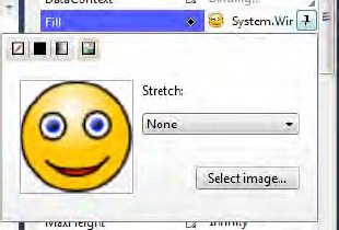
While many of these property editors are very useful, one worthy of particular note is the color editor. This editor is used by many control properties (the Fill property of the Rectangle control, for example), and can be seen in Figure 11-11.

In addition to allowing colors to be entered by RGB value, the editor also permits selection from a color patch, from a drop-down list of named colors, or by using an eyedropper. After activating the eyedropper, any pixel on the entire screen can be clicked, and its color will be pulled into the property editor.
The color editor also can work with color gradients and images, and offers control over alpha levels so that objects can be made semitransparent.
The Properties window has another purpose, too: allowing event handlers for controls to be created. If you click the Events tab at the top of the window, it will display all possible events for the selected control. To create a handler for one of the events, simply double-click its name in the list, and Visual Studio will take care of the rest.
Double-clicking the MouseLeftButtonDown event (which might seem like a peculiar name for Windows Phone, but it is copied from the original browser-based Silverlight environment) will modify the Rectangle's XAML, as shown in Listing 11-13.
Example 11.13. The Rectangle's XAML after the addition of an event handler
<Rectangle Stroke="Black" Margin="186,49,133,436" Fill="#FF8879C1"
              MouseLeftButtonDown="Rectangle_MouseLeftButtonDown" />
Visual Studio has created a handler function for the event named Rectangle_MouseLeftButtonDown, and it can be found in the code behind the page. The empty handler is shown in Listing 11-14.
Example 11.14. The Rectangle's event handler function
private void Rectangle_MouseLeftButtonDown(object sender, MouseButtonEventArgs e)
    {

    }
Note
If Visual Studio is adding an event handler to a control with a name, it will name the handler as controlname_eventname(for example, MyControl_MouseLeftButtonDown). If the control does not have a name, it will prefix the handler with the control's class name instead (for example, Rectangle_MouseLeftButtonDown). If a handler already exists with this name, it will suffix it with a unique number (for example, Rectangle_MouseLeftButtonDown_1). It is a good idea, therefore, to name your controls before you begin adding event handlers to provide a more comprehensible set of event handler function names.
Configured values can be removed from properties and events by clicking the icon next to the property name and selecting Reset Value from the pop-up menu, as shown in Figure 11-12. This will remove the property value from the XAML, resetting it back to its default value.

As Figure 11-5 shows, arrows are displayed to the top and left edges of the rectangle in the page designer, pointing toward the inner edges of its container (which have also been highlighted). These arrows help you to visualize the position of the control, the position of its container, and the way in which the control is anchored to the container.
Because the arrows are shown above and to the left, the control is anchored to the top and left edges of its container. If its container moves or changes size, the rectangle will always maintain the same distance from the top and left of its container.
The XAML for the control is shown in Listing 11-15. Notice that among its properties are HorizontalAlignment (set to Left) and VerticalAlignment (set to Top). These are the properties that control the anchoring of the element.
Example 11.15. The XAML for the Rectangle control
<Rectangle Height="100" HorizontalAlignment="Left" Margin="76,58,0,0"
                Name="rectangle1" Stroke="Black" StrokeThickness="1" VerticalAlignment="Top"
                Width="200" Fill="CornflowerBlue" />
The position of the rectangle is not set using Left and Top coordinates, as it would be in a WinForms form, but instead by specifying a margin between itself and its container. The margin here specifies that it should be set 76 pixels away from its container's left edge and 58 pixels from the container's top (the four elements within the margin represent the left, top, right, and bottom margin sizes, respectively). Because the control has been given an explicit Width and Height, the right and bottom elements of the margin are ignored.
If we modify the HorizontalAlignment so that it is set to Right, the rectangle jumps all the way across so it is touching the right edge of its container. Now the margin's left distance is being ignored because the rectangle is no longer left-aligned. If we increase the right element of the margin (the third element), the rectangle sets itself to be this distance from the right edge of its container, moving back toward the left of the page. The designer now shows arrows from the rectangle to the top and right of its container, indicating that they are the edges to which it is anchored, as shown in Figure 11-13.
You can see the right alignment working by resizing the Grid control inside which the rectangle is contained. This is most easily achieved by selecting the grid control and then dragging the arrow on its right edge, as shown in Figure 11-14. You will see that as the grid is resized, the rectangle maintains a constant distance from its right edge.

Another available alignment value is Center. This mode doesn't actually center the element within its container as you might expect, but instead maintains the same relative distances on both of its sides, regardless of how large the container gets. In this mode, both horizontal arrows disappear from the rectangle to indicate that it is not anchored to either side of its container. Try setting this alignment mode and then resize the grid; the rectangle stays proportionally in the same position.
The final alignment mode is Stretch, which anchors to both sides of the container and displays arrows on either side to indicate it. However, there is a sizing conflict within the control at this stage: we are specifying both a width and also a left and right margin. When the control is so configured, the width takes precedence, so the stretch mode is actually ignored. Try editing the XAML and removing the Width attribute; the control will calculate its width based on its left and right margins. Set up like this, the control does indeed stretch and shrink when its container resizes.
This automatic sizing is another example of how Silverlight's layout behaves in many ways along the same lines of that of HTML. Whereas in a WinForms project you would have to put specific design effort into making the user interface resize (using the controls' Anchor properties), in Silverlight this behavior is pretty much automatic and requires a minimum of design effort.
Before we move on to look at the available Silverlight controls, let's discuss how we specify colors and brushes in Silverlight.
Silverlight understands XAML color specifications in several different formats. The first is via the standard set of named colors, as we have already used in XNA and as can be seen in Listing 11-16. Any known color name can be specified for one of the color properties within XAML or can be selected within the color list inside the color picker dialog.
Alongside the normal list of named colors there is also the special color value Transparent. Setting this value causes the color to become completely invisible, showing through whatever is behind.
Alternatively, colors can be specified numerically as a hexadecimal number. The number is formed of three sets of two-digit values: the first two digits are the red intensity, the following two digits are the green intensity, and the final two digits are the blue intensity. The value 8000F0 therefore represents a color with half-intensity red (80), no green (00), and nearly full blue (F0). An example of using a color in this way is shown in Listing 11-17.
The hex notation can be extended to include an alpha component, too. The alpha component in Silverlight controls transparency just as it did in XNA. A control whose color is set to have full alpha will appear opaque, whereas those with their alpha value set to zero will be entirely invisible. Values in between will result in semitransparency. Transparency can be used all over the place in Silverlight that can allow for some very rich-looking graphical displays.
To specify an alpha component, add an additional two digits to the front of the hex value. If we want to specify the color in Listing 11-17 with a 25 percent alpha component, we can modify the color value to be #408000F0. If the alpha component is not included within the color specification, it is assumed to be set to its maximum value (FF).
Although these color examples make it look like the Rectangle's Fill property is a color property, it is in fact storing a brush rather than a color. In Silverlight, a brush allows us to specify how a solid region of the screen should be filled. Filling with a single color is clearly one of the brush options available, but there are several others. Let's take a look at these.
When a color is specified for a control's property without any further brush information being provided, Silverlight defaults to creating an instance of the SolidColorBrush class. If we were to write the code from Listing 11-16 in full, instead of relying on the ContentProperty attributes, it would actually look like Listing 11-18.
Example 11.18. Specifying a named color using the SolidColorBrush
<Rectangle>
            <Rectangle.Fill>
                <SolidColorBrush>
                    <SolidColorBrush.Color>
                        <Color>Red</Color>
                    </SolidColorBrush.Color>
                </SolidColorBrush>
            </Rectangle.Fill>
        </Rectangle>
While this code is clearly much more long-winded than it needs to be, it does clarify what is actually happening within the Silverlight objects' properties. The Fill property of the rectangle isn't being given just a color, but rather a SolidColorBrush, and it is this brush that is receiving the color.
The Color structure is being set here using a named color, but the hexnotation can be used, too. When colors are set directly into their structure, they also support a third notation, in which we set the alpha, red, green, and blue intensity levels individually as properties of the color. Listing 11-19 shows how this notation can be used to set an opaque orange color. It also omits the SolidColorBrush.Color property specification because this is the defined content property for SolidColorBrush.
Silverlight can provide a much more attractive color filling than just solid color. It has two gradient brushes that provide color fades within the area being filled. The first of these is the LinearGradientBrush.
The first thing that this brush needs to know is a start point and end point within the area that it is filling. Each of these points is specified as a coordinate in the range of 0 to 1 along each axis (similar to the way we specified texture coordinates in XNA). The coordinate (0, 0) is on the top left of the area, while (1, 1) is the bottom right of the area.
Silverlight draws an imaginary line between these two points and places its first gradient fade color at the start point and the last gradient color at the end point. It then fades between these two points, extending the color out perpendicular to the imaginary line to fill the whole area.
For example, if we specify a start coordinate of (0, 0) (top-left) and an end coordinate of (0, 1) (bottom-left), the imaginary line will stretch down the entire left edge of the fill region. Because the line is vertical, the gradient fade will extend horizontally across the region. This fill effect is shown in Figure 11-15, which uses white as its start color and gray as its end color; the two coordinates and the imaginary line are shown to help clarify the effect, although they are not displayed by Silverlight.

If the coordinates were changed to start at (0, 0) (top left) and end at (1, 0) (top right), the imaginary line would extend across the width of the area, so the gradient would fade across the area instead.
The coordinates need not be restricted to forming horizontal or vertical lines, of course. Figure 11-16 shows a linear gradient brush with coordinates (0,0) to (1,1) (top left to bottom right). The brush fades diagonally across the area of the fill.

The XAML required to set up these gradient fades is really very simple. Listing 11-20 configures a Rectangle to use the gradient fill shown in Figure 11-16.
Example 11.20. Specifying a diagonal linear gradient fill
<Rectangle>
            <Rectangle.Fill>
                <LinearGradientBrush EndPoint="1,1" StartPoint="0,0">
                    <GradientStop Color="White" Offset="0" />
                    <GradientStop Color="Gray" Offset="1" />
                </LinearGradientBrush>
            </Rectangle.Fill>
        </Rectangle>
Note
If you would rather set the StartPoint and EndPoint coordinates in pixels rather than as a proportion of the fill area, you can do it by setting the LinearGradientBrush's MappingMode property to Absolute. Both coordinates will then operate as pixel offsets from the top-left corner.
You will see in the XAML code that the two fade colors are specified by providing GradientStop structures, and that each also contains an Offset property as well as a color. This offset specifies the proportion across the imaginary gradient line at which this particular color should appear. Gradient fills are not limited to just two GradientStop items; we can use as many as we like, which allows more complex color fades to be achieved.
Tip
You can also use the alpha component of the colors in your GradientStop items, which can result in gradients that fade between being transparent and opaque, in addition to or instead of fading colors.
Listing 11-21 shows another piece of XAML, this time containing four GradientStop items. The gradient fill begins in white and fades to black 25 percent of the way along. At 50 percent, it fades to white again, finally fading to gray at the end of the line.
Example 11.21. Multiple GradientStop items within a gradient fill
<Rectangle>
            <Rectangle.Fill>
                <LinearGradientBrush EndPoint="0,1" StartPoint="0,0">
                    <GradientStop Color="White" Offset="0" />
                    <GradientStop Color="Black" Offset="0.25" />
                    <GradientStop Color="White" Offset="0.5" />
                    <GradientStop Color="Gray" Offset="1" />
                </LinearGradientBrush>
            </Rectangle.Fill>
        </Rectangle>
The end result of this fill is shown in Figure 11-17. The four gradient stop points are displayed on the left edge of the figure for illustrative purposes.

Tip
If you don't fancy creating the GradientStop items by hand, the color property editor contains comprehensive support for editing them. Stops can be easily added, colored, and positioned by moving colored sliders within the editor window. The editor can be accessed by selecting the property whose color is to be set—for example, the Fill property of the Rectangle control.
Another feature that the LinearGradientBrush can offer is the ability to place its start and end points so they do not completely cover the whole of the fill area. For example, if the start and end points were (0.333, 0) and (0.666, 0), respectively, the line would only cover the middle third of the fill area.
The brush has three different ways of handling such coordinate ranges, specified by the SpreadMethod property. If set to Pad (the default), the line will be extended in each direction until it fills the entire area, and all the additional area will be filled with the color specified nearest to that end of the line. (In simple terms, the line extension at its beginning will be filled with the color at offset 0, and the extension at its end will be filled with the color at offset 1.)
If SpreadMethod is set to Repeat, it will extend the line and repeat the original color range across the extension area at both ends. If it is set to Reflect, it will repeat the original color range once again, but will reverse it so that it mirrors the defined gradient stop colors.
These color spread methods can provide a useful and simple way of providing more complex fills than could be practically achieved by adding large numbers of repeating gradient stop items.
Figure 11-18 shows a horizontal white-to-gray gradient fill from coordinates (0.333, 0) to (0.666, 0) using each of the different SpreadMethod modes. On the left is Pad mode, in the middle is Repeat, and on the right is Reflect.

With very little effort, some very pleasing effects can be obtained from this brush. Consider using the brush with perhaps a fairly subtle fade for the background in your game screens—it can produce a much more pleasing result than a simple block of solid color.
The second gradient brush is the RadialGradientBrush, which provides similar functionality to the LinearGradientBrush but working with gradients that radiate out from an origin point. An example of this brush is shown in Figure 11-19, fading from white at its start point to gray at its end point.

The XAML required to achieve this fill is shown in Listing 11-22.
Example 11.22. Filling an area with a RadialGradientBrush
<Rectangle>
            <Rectangle.Fill>
                <RadialGradientBrush>
                    <GradientStop Color="White" Offset="0" />
                    <GradientStop Color="Gray" Offset="1" />
                </RadialGradientBrush>
            </Rectangle.Fill>
        </Rectangle>
Just like the linear brush, RadialGradientBrush allows multiple GradientStop items to be added to provide additional color points within the filled area. The Offset of each of these stops still ranges between 0 and 1, but now refers to the distance between the origin of the radial fill (with an offset of 0) to its outer edge (with an offset of 1).
The radial fill does not use start and end points as the linear fill does, but instead has two similar points called Center and GradientOrigin. Center specifies a point that will be the center of the outermost circle formed by the radial fill. GradientOrigin specifies a second point that is the focal point of the fill. Both of these points are specified with values in the range of 0 to 1 on each axis, where 0 is the left or top edge, and 1 is the right or bottom edge. Once again, the MappingMode property can be set to Absolute to change them to be interpreted as pixel offsets instead.
Alongside these properties are two values that define the size of the outermost circle. RadiusX and RadiusY both default to 0.5 to specify that the circle should be the same width and height as the area it fills. They can be decreased to focus the fill more tightly or increased to allow the circular area to expand so that it is greater than the fill area. Increasing the radius will allow the gradient to extend right into the corners of the area, which would otherwise be a solid color (as can be seen in Figure 11-19).
The RadialGradientBrush also supports the SpreadMethod property that we saw in the LinearGradientBrush. Setting it to Repeat or Reflect will cause the area outside of the defined circular region to be filled using this same behavior.
The final type of brush we can use for filling areas is the ImageBrush. As its name suggests, this brush fills the area with an image.
The easiest way to insert an image into the brush is to open the color property editor and select the Image Brush item inside. This will present you with a Select Image button that can be used to browse for images on your computer, shown in Figure 11-20.
Note
Just as in XNA, Silverlight supports BMP, JPG, and PNG images. GIF images are not supported and BMP images are not recommended!
When you select and add an image, Visual Studio creates a new folder within your project called Images and copies the selected image into it. The image is then added into the project with a Build Action of Resource. This embeds the image into your project so that it is accessible after deployment. If you change your mind about which images you want to use, remember to remove any unwanted images from the project because they will otherwise still be compiled in, wasting resources in your finished game.
The resulting XAML for the ImageBrush can be seen in Listing 11-23.
Example 11.23. Filling an area with an ImageBrush
<ImageBrush ImageSource="/WindowsPhoneApplication1;component/Images/SmileyFace.jpg" />
By default, the selected image will appear at its actual size within the area that it is filling. There are four values available for the Stretch property that can be used to affect the size of the image within the brush.
The default stretch mode is None, which results in the behavior you have already seen. Setting it to Fill will stretch (or shrink) the image so that it completely fills the defined area. If the aspect ratio of the area does not match that of the image, the image will be distorted. We can avoid this by using either of the remaining modes: Uniform will stretch (or shrink) the image so that it is as large as it can possibly be while still fitting entirely inside the fill area without distorting, while UniformFill will entirely fill the area without distorting (possibly resulting in some of the image being clipped).
Examples of each of these modes can be seen in Figure 11-21. From left to right, the modes are None, Fill, Uniform, and UniformFill.

The image can also be positioned within the fill area by setting the AlignmentX and AlignmentY properties. These properties allow the image to be aligned to the left or right, top or bottom, or remain vertically or horizontally centered as required.
It is very likely that you will want to set colors in C# code, too, and this can be easily accomplished. XAML's capability to hide the object structure away doesn't apply in C# code, however, so it is not possible to simply assign a color to a Fill property, for example. Listing 11-24 shows the code that is needed to create a new SolidColorBrush and put it into place inside the Fill property of a Rectangle. Of course, if the Rectangle were already configured with a brush at design time, and we simply wanted to change its color, we could update the existing brush rather than creating a new one.
Example 11.24. Creating a SolidColorBrush for a Rectangle's Fill property
MyRectangle.Fill = new SolidColorBrush(Color.FromArgb(255, 255, 127, 0));
The ColorFade example project that accompanies this chapter provides a simple demonstration of updating the gradient stops in a RadialGradientBrush. The design time configuration for the page puts a radial brush into the large Rectangle occupying the main area of the page. Each time the rectangle is tapped, it removes the existing gradient stops and adds three new ones. The first two stops will have offset 0 and 1, respectively, while the last stop will have a randomized position between the two. All the stops are given a random color.
The XAML for the Rectangle is shown in Listing 11-25. Note that the brush has been given a name instead of the Rectangle because we don't need to access any of the Rectangle's other properties.
Example 11.25. The Rectangle's XAML from the ColorFade example project
<Rectangle Height="562" Margin="0,0,0,0" Width="411"
                                      MouseLeftButtonDown="rectangle1_MouseLeftButtonDown">
            <Rectangle.Fill>
                <RadialGradientBrush x:Name="FadeBrush">
                    <GradientStop Color="Black" Offset="0" />
                    <GradientStop Color="White" Offset="1" />
                </RadialGradientBrush>
            </Rectangle.Fill>
        </Rectangle>
The code that updates the radial brush is implemented in the rectangle1_MouseLeftButtonDown event handler, shown in Listing 11-26. You can also see from this listing that the gradient stops do not need to be sorted into the order of their Offset values; Silverlight will take care of this automatically.
Example 11.26. Randomizing the gradient stops within the RadialGradientBrush
private void rectangle1_MouseLeftButtonDown(object sender, MouseButtonEventArgs e)
    {
        GradientStop gradStop;
        Random rand = new Random();

        // Clear the existing gradient stops
        FadeBrush.GradientStops.Clear();

        // Add a new stop with offset 0 (radial center)
        gradStop = new GradientStop();
        gradStop.Color = Color.FromArgb(255, (byte)rand.Next(256), (byte)rand.Next(256),
                                                                      (byte)rand.Next(256));
        gradStop.Offset = 0;
        FadeBrush.GradientStops.Add(gradStop);

        // Add a new stop with offset 1 (radial edge)
        gradStop = new GradientStop();
        gradStop.Color = Color.FromArgb(255, (byte)rand.Next(256), (byte)rand.Next(256),
                                                                      (byte)rand.Next(256));
        gradStop.Offset = 1;
        FadeBrush.GradientStops.Add(gradStop);

        // Add a new stop with a random offset
        gradStop = new GradientStop();
        gradStop.Color = Color.FromArgb(255, (byte)rand.Next(256), (byte)rand.Next(256),
                                                                      (byte)rand.Next(256));
        gradStop.Offset = rand.Next(100) / 100.0f;
        FadeBrush.GradientStops.Add(gradStop);
}More complex effects can be achieved by placing multiple objects together, each with different brushes. A simple (and rather garish) example of this can be seen in the MultipleGradientBrushes example project, an image from which is shown in Figure 11-22.

This example creates a TextBlock control contained within a Border control. The Border has been filled with a linear red-white gradient background and also a linear gradient border, while the text has been given a radial gradient for its foreground color. You will find that these brushes can be used in a large variety of places throughout all the available Silverlight controls.
The thing that this example probably demonstrates best is that it is very easy to overuse these brushes. Used with a little more subtlety than they have been here, however, they can be a very effective way of adding interest to areas of the screen that would otherwise be dull and unexciting.
Silverlight is a rich and complex environment with many features and functions, many of which will not be obvious the first time you encounter them or find a need to call on them. This chapter has given you a rapid tour through some of the areas of functionality that Silverlight has to offer, but there is a huge amount more that we simply don't have the space to include within this book.
If you need help with using Silverlight or have questions about how to achieve things, the official Silverlight web site at www.silverlight.net is a great place to look for assistance. Among other things, the site contains some active discussion forums, including one that is specifically targeted at Silverlight development for Windows Phone 7.
Please spend some time experimenting and familiarizing yourself with Silverlight. In the next chapter, we will turn our attention to the various controls that can be used in Silverlight games and applications.