
C H A P T E R 5
Rich Input and Select Components
Data input is one of the main functions of any web application. RichFaces provides various, easy-to-use rich components for entering input such as <rich:inplaceSelect>, <rich:autocomplete>, <rich_calendar>, and many more. As with all rich components, rich input components come with a skins feature, a rich JavaScript client API, and facets to make it easier for you to redefine component markup. All the rich input components and their powerful and flexible features will make it easy for you to create applications using RichFaces.
 Note Although some components provide out-of-the-box Ajax functionality, others, such as
 <rich:toolbar>, don't provide any Ajax functionality. Components like that just provide rich UI. All components in the rich: tag library can also be skinned. Skins, covered in more detail in Chapter 12, let you change the look and feel of the application easily and on the fly. We just wanted to mention this in case you were wondering why a component such as <rich:toolbar> is rich.
Note When you run examples in other chapters and notice that your colors are different, don't be concerned. We are simply using a different skin for many of the screen shots in this book. This chapter uses the blueSky skin. Jump forward to Chapter 12 to discover the types of skins available. Pick any one you want, and set it in the web.xml file per the instructions in that chapter. Also keep in mind that if you have the printed book, then the screen shots will be black and white. If you have the eBook, then you will have color screen shots.
Getting Started
All the rich input components described in this chapter extend standard JSF inputs and selects with specific rich capabilities, customization, and features. This means that the UIInput (base class for input components) core functionality is available for every component. For example, as with standard JSF input components, all rich input-based components support the following features:
- Binding to the model using the value attribute
- Attaching converters and validators
- Ability to disable the input
- Customization of tab order for inputs on the page
All the inputs have a number of new features unified across most of the components, which will be shown throughout the chapter and include the following:
- Default label support. When the initial value is not specified, an optional label can be used to provide instructions to the user; for example, “Click to edit.”
- Many controls can be activated and used via keyboard. It is also possible to disable or enable keyboard support.
Note Most features described in this chapter are applicable to most input components, except one: the <rich:fileUpload> component. Although still an input, it is based on different foundation classes than other input components. We cover the <rich:fileUpload> component at the end of this chapter.
Using <rich:inplaceInput>
<rich:inplaceInput> is a rich extension to the standard input component; an example is shown in Figure 5-1.
Figure 5-1. <rich:inplaceInput> component
It's possible to click the label to have the component switch to an input field. Once the input is entered, the component switches back to label state. So, let's start with the simplest case, shown in Listing 5-1.
Listing 5-1. The simplest case.
<h:form>

   <h:panelGrid columns="1">

      <rich:inplaceInput value="#{inplaceInputBean.name}"

         defaultLabel="Click to edit name"/>

      <rich:inplaceInput value="#{inplaceInputBean.email}"

         defaultLabel="Click to edit email"/>

   </h:panelGrid>

</h:form>
The managed bean is shown in Listing 5-2.
@ManagedBean

@RequestScoped

public class InplaceInputBean {


    private String email;

    private String name;


    // Setter and getter methods

}
This is really not much different from using the standard input component. One extra attribute that we are using here is defaultLabel, which sets the label that you can click to start editing the value. Figure 5-2 shows what this code produces.
Figure 5-2. <rich:inplaceInput> with default labels
If the value to which the component is bound has an initial value, then that value will be displayed instead of the label.
Once the value has been changed, the change in value is indicated by a small red triangle in the top-left corner, as shown in Figure 5-3.

Figure 5-3. <rich:inplaceInput> with the value changed
To start editing, you click the label. When done editing, you click anywhere outside the component to save the input. This is important: keep in mind that nothing is sent to the server. In other words, no Ajax request is fired to the server. The value has changed only in the browser. This means it's a rich client-side component. You would click a button or a link to submit the page. Alternatively, it's possible to use <a4j:ajax> on component JavaScript events to send an Ajax request to the server (the events are shown later).
There is also an option to add controls to save or cancel the changes, as shown in Figure 5-4. To enable controls, set showControls="true".
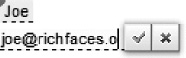
Figure 5-4. <rich:inplaceInput> with controls to save or cancel the input
The component provides many event handlers attributes. One of the most common is the standard onchange event attribute, which is normally used to add some processing when the value is changed. You can use it to send an Ajax request to validate the new input. In Listing 5-3, we attached Ajax behavior to be fired on change event. Every edit and saving of the value causes the output to be updated with the entered string value.
Listing 5-3. Attaching Ajax behavior to be fired on change event
<h:form>

   <h:panelGrid columns="1">

      <rich:inplaceInput value="#{inplaceInputBean.name}"

         defaultLabel="Double click to edit name" editEvent="dblclick">

         <a4j:ajax event="change" render="out" />

      </rich:inplaceInput>

      <h:outputText value="#{inplaceInputBean.name}" id="out"/>

   </h:panelGrid>

</h:form>
Entering a new value into the component, and either blurring (tabbing out or clicking outside the component) or pressing the Enter key, causes an Ajax request with a new value to be sent to the server, updating the output component. Note that the editEvent attribute allows you to customize the event, which will cause the component to be switched to editable state. In our example, dblclick used.
Let's look at another feature. Whenever the control loses focus and the value has been changed, the new value gets applied. It looks similar to a spreadsheet functionality (you tab out and the new value gets set). However, in some cases any input change could be tied to an expensive server-side database call or a complex service invocation. In such cases, the user should confirm before the value is saved. saveOnBlur="false" could be used and will cause the component to cancel changes. It's useful when showControls="true".
<rich:inplaceInput value="#{inplaceInputBean.name}"

   saveOnBlur="false" showControls="true" defaultLabel="Click to edit name"/>
If the saveOnblur property is set to false, applying a new value is only possible by using the Enter key or clicking on the save UI control. Losing focus will reset the value to the previous value.
This covers the <rich:inplaceInput> component. Keep in mind again that all the standard conversion and validation rules apply here as well.
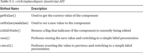
JavaScript API
The component provides the JavaScript functions shown in Table 5-1, which could be invoked on the client.
Listing 5-4 shows an example updating another <rich:inplaceInput> input component on the client.
Listing 5-4. Updating another <rich:inplaceInput> input component on the client
<h:panelGrid>

   <rich:inplaceInput defaultLabel="Enter your name" id="name"

      onchange="#{rich:component('nickname')}.

          setValue(#{rich:component('name')}.getValue());" />

   <rich:inplaceInput defaultLabel="Enter your nickname" id="nickname" />

</h:panelGrid>
With the code in Listing 5-4, the nickname input component will be set to a value entered in the name input component, when that value changes (on change event). Note that this assignment is done via the component JavaScript API and thus no event or Ajax request is fired to the server.
Using <rich:inplaceSelect>
<rich:inplaceSelect> is similar to <rich:inplaceInput>, but instead of allowing the user to enter the value, it shows a drop-down list from which a value can be selected, as shown in Figure 5-5.
Figure 5-5. <rich:inplaceInput> component
Figure 5-6 shows the component when activated.
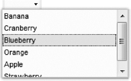
Figure 5-6. <rich:inplaceSelect> component activated
Listing 5-5 shows the JSF page code.
Listing 5-5. Shows the JSF page code
<rich:inplaceSelect value="#{inplaceSelectBean.fruit}"

   defaultLabel="Select fruit">

   <f:selectItem itemValue="1" itemLabel="Banana" />

   <f:selectItem itemValue="2" itemLabel="Cranberry" />

   <f:selectItem itemValue="3" itemLabel="Blueberry" />

   <f:selectItem itemValue="4" itemLabel="Orange" />

   <f:selectItem itemValue="5" itemLabel="Apple" />
<f:selectItem itemValue="6" itemLabel="Strawberry" />
</rich:inplaceSelect>
The bean for the samples contains the single string property with getter and setter, so it's omitted. The same defaultLabel attribute (as in <rich:inplaceInput>) sets the label to be displayed if #{inplaceSelectBean.fruit} is initialized to one of the values; then that value will be displayed instead of the “Select fruit” label.
Creating the list of options is rather simple. You just use the standard <f:selectItem> or <f:selectItems> tag to build the list. The core of this component is based on the JSF standard UISelectOne class.
As with <rich:inplaceInput>, you can add controls to the component in order to either save or cancel the edited value by setting showControls="true" (see Figure 5-7).
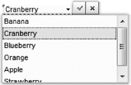
Figure 5-7. <rich:inplaceSelect> additional UI controls
Also similar to <rich:inplaceInput>, the components provide a set of client-side event handlers that could be processed on the client side or used to fire Ajax requests. Let's create a simple dependent select component using the Ajax requests fired on the change component event. The page is shown in Listing 5-6.
Listing 5-6. Creating a simple dependent select component using the Ajax request
<h:form>

   <h:panelGrid>

   <rich:inplaceSelect defaultLabel="Double click to select items type"

      value="#{inplaceSelectBean2.currentType}"

      valueChangeListener="#{inplaceSelectBean2.valueChanged}"

      editEvent="dblclick">

      <f:selectItems value="#{inplaceSelectBean2.firstList}" />

      <a4j:ajax event="change" render="second" execute="@this" />

      </rich:inplaceSelect>

      <a4j:outputPanel id="second" layout="block">

         <rich:inplaceSelect value="#{inplaceSelectBean2.currentType}"

            defaultLabel="Click to select item"

            rendered="#{not empty inplaceSelectBean2.currentType}">

            <f:selectItems value="#{inplaceSelectBean2.secondList}" />

         </rich:inplaceSelect>

      </a4j:outputPanel>

      <h:panelGrid>

   </h:form>
A simple Java bean, which holds both of the select item lists and changes the second list when selection in the first list is changed, is shown in Listing 5-7.
Listing 5-7. A simple Java bean
@ManagedBean

@RequestScoped

public class InplaceSelectBean2 {

   private static final String[] FRUITS = { "Banana", "Cranberry", "Blueberry", "Orange" };

   private static final String[] VEGETABLES = { "Potatoes", "Broccoli",

      "Garlic", "Carrot" };

   private String currentItem = null;

   private String currentType = null;

   private List<SelectItem> firstList = new ArrayList<SelectItem>();

   private List<SelectItem> secondList = new ArrayList<SelectItem>();


   public InplaceSelectBean2() {

      SelectItem item = new SelectItem("fruits", "Fruits");

      firstList.add(item);

      item = new SelectItem("vegetables", "Vegetables");

      firstList.add(item);

      for (int i = 0; i < FRUITS.length; i++) {

         item = new SelectItem(FRUITS[i]);

      }

   }


   public void valueChanged(ValueChangeEvent event) {

      secondList.clear();

      if (null != event.getNewValue()) {

         String[] currentItems;

         if (((String) event.getNewValue()).equals("fruits")) {

            currentItems = FRUITS;

         } else {

            currentItems = VEGETABLES;

         }

         for (int i = 0; i < currentItems.length; i++) {

            SelectItem item = new SelectItem(currentItems[i]);

            secondList.add(item);

         }

      }

   }

   //Getters and setters

}
After the page renders you should see a single select, as shown in Figure 5-8.
Figure 5-8. <rich:inplaceSelect> component
After a value is selected, a second select will appear with the items based on the chosen type, as shown in Figure 5-9.
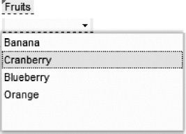
Figure 5-9. Dependent <rich:inplaceSelect> components
Note The editEvent attribute used in the sample works the same as <rich:inplaceInput>. You should double-click to trigger switching to the edit state.
There are options that allow you to make a selection in a more careful fashion: saveOnSelect and saveOnBlur. You already know about saveOnBlur from the <rich:inplaceInput> section, so let's look at saveOnSelect. Normally as you could see trying a sample select saves value and getting to the saved state right after the selection is made. If that attribute is set to false, the list will be closed on selection; but the component will not save the value waiting for additional actions, like pressing enter, clicking the UI save control, or blurring the component if the saveOnBlur has a true value.
JavaScript API
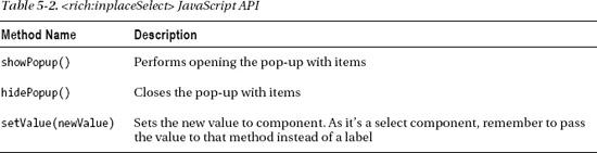
The component provides the same JavaScript API as <rich:inplaceInput>. Table 5-2 shows methods that are only available on the <rich:inplaceSelect> component.
This covers the <rich:inplaceSelect> components available in the RichFaces 4 release.
Using <rich:autocomplete>
<rich:autocomplete> is an input component that provides suggestions during user input. For those who worked with RichFaces 3, this component is redesigned and combines the functionality of <rich:suggestionBox> and rich:comboBox components. Even though <rich:autocomplete> provides a rich input feature, under the hood it's just the basic input component.
The new <rich:autocomplete> component can be configured to work in the following four modes:
- Ajax. Every
keyuptriggers an Ajax request that updates the suggestions list and shows new results to the user. - Cached Ajax. In this mode, the component requests data when the minimum number of characters is entered, but doesn't make additional requests if the prefix does not change. Further list filtering is performed completely on the client side until the prefix changes.
- Client. All the data is rendered to the client when the component is rendered. From then on, only client filtering is used for suggestions. No Ajax requests are fired to the server.
- Lazy Client. Similar to client mode, a complete list is fetched only after the component is activated and the minimum number of characters is entered. No additional Ajax requests are performed after that, even if the initial prefix changes. Client filtering is performed on further typing, as the component expects all the data loaded during a single Ajax request.
Let's review two completely new modes: cached Ajax and lazy client. These two work similarly but without additional optimization of requests count. Although we mentioned optimization, these two modes could be still useful in some cases. For example, where the list is really small and additional Ajax requests for data are unexpected, only the client mode should be used. Or if the suggestions fetching algorithm is complex and depends on every letter in user input, Ajax mode should be used.
Listing 5-8 shows an example of <rich:autocompete> using the lazy client mode.
Listing 5-8. An example of <rich:autocompete> using the lazy client mode
<h:form>

   <rich:autocomplete autocompleteList="#{autocompleteBean.suggestions}"

      mode="lazyClient"/>

</h:form>
Listing 5-9 shows the managed bean.
Listing 5-9. The managed bean
@ManagedBean

@SessionScoped

public class AutocompleteBean {

   private List<String> suggestions = null;


   public AutocompleteBean() {

      suggestions = new ArrayList<String>();

      suggestions.add("Banana");

      suggestions.add("Cranberry");

      suggestions.add("Blueberry");
suggestions.add("Orange");
suggestions.add("Apple");
suggestions.add("Strawberry");
}
//Getter and setter
}
Figure 5-10 shows what is rendered when the user starts typing.
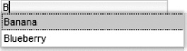
Figure 5-10. <rich:autocomplete> component
The component fetches all the suggestions via Ajax when the first letter is entered, and assumes that the list will not be changed. All further filtering will be on the client. An Ajax request is sent to get all the data just once, the first time the component is activated, and no further requests will be sent. If we change the mode to client in Listing 5-8, the component will render all the data to the client on initial rendering and no Ajax requests will be sent at all. Any filtering will be done on the client.
The autocompleteList attribute is used to define data for the component. It points the component to a list of strings. In addition, the component provides one more way to define data: the autocompleteMethod attribute. It should be defined with a method that accepts a single string parameter and returns a list of suggestions. The parameter passed is the current value (prefix) from client input. Inside the method you can write any custom logic to return a list of suggestions based on the prefix passed from the client. But if you are using the autocompleteMethod for suggestions population instead of autocompleteList for client or lazy client mode, then you should not consider the prefix, as the component assumes that all the data will be loaded and thus will make no requests on prefix changes. Listing 5-10 shows how it works when using cachedAjax mode.
Listing 5-10. Using cachedAjax mode
<h:form>

   <rich:autocomplete autocompleteMethod="#{autocompleteBean.autocomplete}"

      mode="cachedAjax" tokens="," minChars="2" />

</h:form>
Listing 5-11 shows the method code from the managed bean (it uses the same suggestions list).
Listing 5-11. Shows the method code from the managed bean
public List<String> autocomplete(String prefix) {

   List<String> result = new ArrayList<String>();

   for (String suggestion : suggestions) {

      if (suggestion.startsWith(prefix)){

         result.add(suggestion);

      }

   }

   return result;

}
We should get almost the same results as from the previous example. However, there are two differences. Attribute minChars specifies the minimum number of characters entered before the component will ask the server side for suggestions (send an Ajax request). You will get the suggestions only after typing two or more letters. The tokens attribute is used and is set to a single comma (,) value. This attribute should be defined with some string and every character after that token string will become a separator between words. So, every character from that string (defined using token attribute) becomes a separator between different words. Figure 5-11 shows what happens when using a token followed by additional characters (prefix).
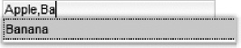
Figure 5-11. <rich:autocomplete> using tokens
Let's try to change mode from cachedAjax to just ajax. In such case you will see that the request will be sent on every keyup after two letters entered rather than being called only on prefix changes.
Now, let's review more attributes that affect the look and feel, as well as selection features. The component can render an additional button that will show all the suggestions even if the minChars condition hasn't been satisfied, as shown in Listing 5-12.
Listing 5-12. Rendering an additional button that shows all the suggestions
<h:form>

   <rich:autocomplete autocompleteList="#{autocompleteBean.suggestions}"

      mode="lazyClient" showButton="true" selectFirst="true" />

</h:form>
The result is shown in Figure 5-12. Note the button on the right side of input (with the arrow pointing down). Also, notice that the first matching suggestion is shown inside the input and will be set into the input when you blur out. That's getting achieved by the selectFirst attribute set to true.
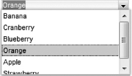
Figure 5-12. <rich:autocomplete> with selectFirst=”true”
Another design-related attribute is autofill. If set to true, the component will insert the remaining part of the first matching suggestion, as shown in Figure 5-13. It will be inserted selected so further input will update it.
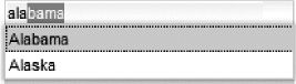
Figure 5-13.<rich:autocomplete> with autofill=”true”
<rich:autocomplete> Client-side Filter Customization
You're able to return the suggestions from the server according to any custom filtering logic in autocompleteMethod. But, the same could be done on the client side when using client mode or just autocompleteList for fetching the data. All you have to define is the clientFilterFunction attribute, which should be set to a JavaScript function name that does the filtering. It should accept two parameters: prefix entered and suggestion string. It should return true in case the string matches the prefix, or false if not. The method will be called by the component for every available suggestion for the current prefix. The default filter function uses “startsWith” logic to filter results, but you can easily customize it to use anything else. For example, Listing 5-13 shows a JavaScript function that performs filtering using the “contains” rule for substring value.
Listing 5-13. Shows a JavaScript function that performs filtering
<script>

function customFilter(subString, value){

   if(subString.length>=1) {

      if(value.indexOf(subString)!=-1)

         return true;

      else

         return false;

   }

   return true;

};

</script>


<h:form>

   <rich:autocomplete autocompleteList="#{autocompleteBean.suggestions}"

      mode="lazyClient" clientFilterFunction="customFilter"/>

</h:form>
Running the JavaScript custom filter function is shown in Figure 5-14. User-entered “be” appears as a substring in all three values shown in the list.

Figure 5-14. <rich:autocomplete> custom client filtering
As mentioned earlier, “contains” logic is now used for filtering instead of the default “startsWith.”
Using Complex Markup in <rich:autocomplete> Pop-ups
The <rich:autocomplete> examples we have shown you so far used a simple list of strings in the pop-up as suggestions for user input. In general, you're free to use any custom objects for suggestions. In that case the component should be defined with the pop-up list representation and the property of the custom object, which should actually be inserted into the input when that object is selected.
Let's look at an example using custom objects and start with a managed bean, shown in Listing 5-14.
Listing 5-14. An example using custom objects
@ManagedBean

@SessionScoped

public class StatesSuggestionBean {


private List<State> statesList;


   private String state; // Getter and setter


   @PostConstruct

   public void init() {

      statesList = new ArrayList<State>();

      statesList.add(new State("Alabama", "Montgomery"));

      statesList.add(new State("Alaska", "Juneau"));

      statesList.add(new State("Arizona", "Phoenix"));

      statesList.add(new State("Arkansas", "Little Rock"));

      statesList.add(new State("California", "Sacramento"));

      statesList.add(new State("Colorado", "Denver"));

      statesList.add(new State("Connecticut", "Hartford"));

      statesList.add(new State("Delaware", "Dover"));

      statesList.add(new State("Florida", "Tallahassee"));

      statesList.add(new State("Georgia", "Atlanta"));

      statesList.add(new State("Hawaii", "Honolulu"));

      statesList.add(new State("Idaho", "Boise"));

      statesList.add(new State("Illinois", "Springfield"));

      statesList.add(new State("Indiana", "Indianapolis"));

      statesList.add(new State("Iowa", "Des Moines"));

      statesList.add(new State("Kansas", "Topeka"));

      statesList.add(new State("Kentucky", "Frankfort"));

      statesList.add(new State("Louisiana", "Baton Rouge"));

      statesList.add(new State("Maine", "Augusta"));

      statesList.add(new State("Maryland", "Annapolis"));

      statesList.add(new State("Massachusetts", "Boston"));

      statesList.add(new State("Michigan", "Lansing"));

      statesList.add(new State("Minnesota", "St. Paul"));

      statesList.add(new State("Mississippi", "Jackson"));

      statesList.add(new State("Missouri", "Jefferson City"));

      statesList.add(new State("Montana", "Helena"));

      statesList.add(new State("Nebraska", "Lincoln"));

      statesList.add(new State("Nevada", "Carson City"));

      statesList.add(new State("New Hampshire", "Concord"));

      statesList.add(new State("New Jersey", "Trenton"));

      statesList.add(new State("New Mexico", "Santa Fe"));

      statesList.add(new State("New York", "Albany"));
statesList.add(new State("North Carolina", "Raleigh"));
statesList.add(new State("North Dakota", "Bismarck"));
statesList.add(new State("Ohio", "Columbus"));
statesList.add(new State("Oklahoma", "Oklahoma City"));
statesList.add(new State("Oregon", "Salem"));
statesList.add(new State("Pennsylvania", "Harrisburg"));
statesList.add(new State("Rhode Island", "Providence"));
statesList.add(new State("South Carolina", "Columbia"));
statesList.add(new State("South Dakota", "Pierre"));
statesList.add(new State("Tennessee", "Nashville"));
statesList.add(new State("Texas", "Austin"));
statesList.add(new State("Utah", "Salt Lake City"));
statesList.add(new State("Vermont", "Montpelier"));
statesList.add(new State("Virginia", "Richmond"));
statesList.add(new State("Washington", "Olympia"));
statesList.add(new State("West Virginia", "Charleston"));
statesList.add(new State("Wisconsin", "Madison"));
statesList.add(new State("Wyoming", "Cheyenne"));
}
public List<State> getStatesList() {
return statesList;
}
}
Listing 5-15 shows the State class.
Listing 5-15. Shows the State class
public class State {


   private String name;

   private String capital;

   private String flagImage;


   // getters and setters


   public State (String name, String capital){

      this.name = name;

      this.capital = capital;

      this.flagImage = "/images/states/flag_"+(name.toLowerCase()).replace("

          ", "")+".gif";

   }

}
We are done with the backend logic, or the model. We haven't yet implemented the listener that will return the suggested values. We will do that shortly. Let's now write the JSF page, shown in Listing 5-16.
Listing 5-16. Write the JSF page
<h:form>

   <rich:autocomplete layout="table" autocompleteMethod="#{statesSuggestionBean.suggest}"

      var="state" fetchValue="#{state.name}">
<rich:column>
<h:outputText value="#{state.name}"/>
</rich:column>
<rich:column>
<h:outputText value="#{state.capital}"/>
</rich:column>
<rich:column>
<h:graphicImage value="#{state.flagImage}"/>
</rich:column>
</rich:autocomplete>
</h:form>
This is where you can see the difference between using custom objects or just strings in the suggestion. As we are using custom objects, and can display multiple object properties (as we do in the example), the <rich:column> tag is used to define data columns in the pop-up. This also allows you display content other than text, such as images. Next, we need to create the suggest method that will return values based on input provided. Listing 5-17 shows the method that is placed inside the managed bean.
Listing 5-17. Shows the method that is placed inside the managed bean
public ArrayList <State> suggest (String input){

   ArrayList <State> result = new ArrayList <State>();

   for(State state : statesList) {

      if ((state.getName().toLowerCase()).startsWith(input.toLowerCase()))

         result.add(state);

      }

   return result;

}
All we are doing is going through the list of states and checking whether the current state name starts with the prefix entered. Because this is inside a managed bean, you are free to implement any other method of retrieving the suggested values. Figure 5-15 shows the result.
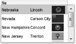
Figure 5-15. <rich:autocomplete> with complex content inside the pop-up
Another attribute we want to tell you about is fetchValue. As we show objects with multiple properties in a suggestions pop-up, we give a hint as to what to insert in the selection from the objects list. In this case a state name is used for insertion. If you don't specify fetchValue, then the object string representation will be inserted (State.toString() in this case).
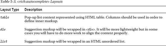
We are also using the layout attribute. This attribute controls what markup the component will use for pop-up when a complex list is displayed. In our example, we use the table layout All possible layouts are shown in Table 5-3.
As you can see, the component is very flexible. You can display any type of information and in any number of columns.
JavaScript API
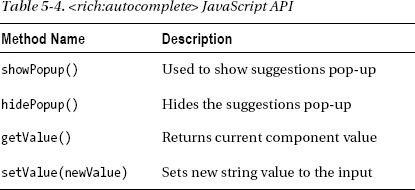
Table 5-4 shows component client-side JavaScript API.
Using <rich:select>
<rich:select> is a brand new component in RichFaces 4 and it is based on a standard UISelectOne component under the hood, as shown in Listing 5-18.
Listing 5-18. Using <rich:select>
<rich:select id="select" defaultLabel="Select Value..." value="#{selectBean.value}">>

   <f:selectItem itemValue="0" itemLabel="Banana" />

   <f:selectItem itemValue="1" itemLabel="Cranberry" />

   <f:selectItem itemValue="2" itemLabel="Blueberry" />

   <f:selectItem itemValue="3" itemLabel="Orange" />

   <f:selectItem itemValue="4" itemLabel="Strawberry" />

   <f:selectItem itemValue="4" itemLabel="Apple" />

</rich:select>
Figure 5-16 shows what will be rendered.
Figure 5-16. <rich:select> component
After clicking the component, it will show the list of options (as does the standard component), as in Figure 5-17.
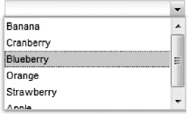
Figure 5-17. <rich:select> pop-up selection
You are probably wondering, why does RichFaces re-implement the standard <h:selectOneMenu> component? The answer is that the RichFaces component provides a number of extra features. The component is skinned using the RichFaces skins feature, unlike the standard component that renders differently in the various browsers and has styling limitations in some browsers The component provides a default label (common to all RichFaces inputs), and has direct keyboard-input features.
You will learn about skins in Chapter 12, so let's see how the direct keyboard-input feature works. All you need to activate this feature is to add enableManualInput="true". After the component renders, you will be able to type into the input field directly and the component will filter the list according to the prefix entered, as shown in Figure 5-18.
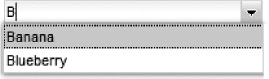
Figure 5-18. <rich:select> with direct typing enabled
As the component provides select functionality, if you enter a value that can't be matched with any of selection items, the input will be highlighted as erroneous (the incorrect input will be shown in red) as shown in Figure 5-19 Keep in mind that such input will cause validation errors when the page is submitted.
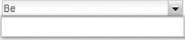
Figure 5-19. <rich:select> with incorrect input
The selection change is a client-side operation. As for any other rich client component, we can attach an Ajax behavior to some component event to fire an Ajax request. Let's repeat the dependent selects example, but now using the <rich:select> component. The JSF page is shown in Listing 5-19.
<h:form>

   <h:panelGrid>

      <rich:select defaultLabel="Click to select items type"

         value="#{selectBean.currentType}"

         valueChangeListener="#{selectBean.valueChanged}"

         editEvent="dblclick">

         <f:selectItems value="#{selectBean.firstList}" />

         <a4j:ajax event="change" render="second" execute="@this" />

      </rich:select>

      <a4j:outputPanel id="second" layout="block">

         <rich:select value="#{selectBean.currentType}"

            defaultLabel="Click to select item"

            rendered="#{not empty selectBean.currentType}">

            <f:selectItems value="#{selectBean.secondList}" />

         </rich:select>

      </a4j:outputPanel>

   <h:panelGrid>

</h:form>
As you can see, the page code is completely the same as in the <rich:inplaceSelect> example (Listing 5-7). We just replaced the <rich:inplaceSelect> component with <rich:select>. Listing 5-20 shows the managed bean code, which is also unchanged.
Listing 5-20. Shows the unchanged managed bean code
@ManagedBean

@RequestScoped

public class SelectBean {

   private static final String[] FRUITS = { "Banana", "Cranberry",

      "Blueberry", "Orange" };

   private static final String[] VEGETABLES = { "Potatoes", "Broccoli",

      "Garlic", "Carrot" };

   private String currentItem = null;

   private String currentType = null;

   private List<SelectItem> firstList = new ArrayList<SelectItem>();

   private List<SelectItem> secondList = new ArrayList<SelectItem>();


   public SelectBean() {

      SelectItem item = new SelectItem("fruits", "Fruits");

      firstList.add(item);

      item = new SelectItem("vegetables", "Vegetables");

      firstList.add(item);

      for (int i = 0; i < FRUITS.length; i++) {

         item = new SelectItem(FRUITS[i]);

      }

   }

   public void valueChanged(ValueChangeEvent event) {

      secondList.clear();

      if (null != event.getNewValue()) {

         String[] currentItems;

         if (((String) event.getNewValue()).equals("fruits")) {
currentItems = FRUITS;
} else {
currentItems = VEGETABLES;
}
for (int i = 0; i < currentItems.length; i++) {
SelectItem item = new SelectItem(currentItems[i]);
secondList.add(item);
}
}
}
//Getters and setters
}
Figure 5-20 shows the result. When the type selection is made in the first component, the second component list is updated based on the value selected in the first.
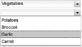
Figure 5-20. Dynamic <rich:select> components
JavaScript API
Table 5-5 shows component JavaScript API.
Using <rich:inputNumberSlider>
<rich:inputNumberSlider> renders a slider for inputting a number, as shown in Figure 5-21.
Figure 5-21. <rich:inputNumberSlider> component
The code is rather simple, that's all you need to render the component.
<rich:inputNumberSlider value="#{inputNumberBean.numberOfItems}" />
The InputNumberBean code is rather simple and contains just the single integer property with getter and setter, so it's omitted.
As this is basically just a rich input field, all the standard JSF rules, such as conversion/validation and event handling, apply to this component.
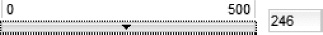
The component provides a number of rich features. You can easily set the minimum or maximum values, as well as the step value shown in Figure 5-22 (the amount by which the value will be increased or decreased when the handle is dragged).
Figure 5-22. <rich:inputNumberSlider> with custom boundary values
Listing 5-21 shows the component configured with the minimum and maximum value, as well as the step size.
Listing 5-21. Shows the component configured with minimum and maximum value
<rich:inputNumberSlider value="#{inputNumberBean.numberOfItems}"

   minValue="0"

   maxValue="500"

   step="2"/>
In order to disable manual input, set the enableManualInput attribute to false. This will force the user to use the component slider to set the value. Figure 5-23 shows the result.
Figure 5-23. <rich:inputNumberSlider> with manual input disabled
Listing 5-22 shows the component with the disabled manual input.
Listing 5-22. Shows the component with the disabled manual input
<rich:inputNumberSlider value="#{inputNumberBean.numberOfItems}"

   minValue="0"

   maxValue="500"

   step="2"

   enableManualInput="false"/>
To place the input field on the left side, set the inputPosition attribute, as shown in Figure 5-24.
Figure 5-24. <rich:inputNumberSlider> with input shown on the left
Listing 5-23 shows the code to position the input on the left.
Listing 5-23. Shows the code to position the input
<rich:inputNumberSlider value="#{inputNumberBean.numberOfItems}"

   minValue="0"

   maxValue="500"

   step="2"

   inputPosition="left"/>
The default value is right. To hide the input field completely, set showInput="false" as shown in Listing 5-24.
Listing 5-24.Hiding the input field completely
<rich:inputNumberSlider value="#{inputNumberBean.numberOfItems}"

   minValue="0"

   maxValue="500"

   step="2"

   showInput="false"/>
Figure 5-25 shows the component with the input field hidden.
Figure 5-25. <rich:inputNumberSlider> with input not displayed
In order to add additional arrow controls on the slider sides, use the showArrows attribute, as shown in Listing 5-25.
Listing 5-25. Using the showArrows attribute
<rich:inputNumberSlider value="#{inputNumberBean.numberOfItems}"

   minValue="0" maxValue="500"

   step="2" showArrows="true" />
Figure 5-26 shows the result.
Figure 5-26. <rich:inputNumberSlider> with additional arrows next to boundary values
Other attributes, such as showBoundaryValues, determine whether the minimum/maximum values are shown. If set to false, showToolTip will not display a tooltip when the handle is dragged. The tooltip shows the current value of the component when dragged.
As with any other input, <rich:inputNumberSlider> provides disabled attribute that allows a disabling component according to some permissions and so on. Figure 5-27 shows how a disabled component looks.
Figure 5-27. <rich:inputNumberSlider> with manual input disabled
JavaScript API
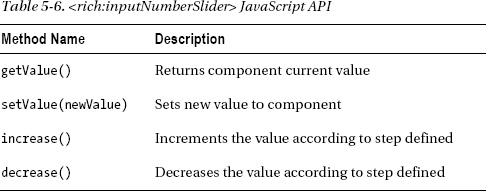
Table 5-6 shows the component JavaScript API.
Using <rich:inputnumberspinner>
<rich_inputnumberspinner> provides a familiar input field, but it renders a slider with up and down arrows to increase or decrease the value, as shown in Figure 5-28.
Figure 5-28. <rich_inputnumberspinner> component
The code is rather simple again; that's all you need to do to render the <rich:inplaceNumberSpinner> component.
<rich_inputnumberspinner value="#{inputNumberBean.numberOfItems}"/>
Listing 5-26 shows that similar attributes exist on <rich_inputnumberspinner> as on <rich:inputNumberSlider>.
Listing 5-26. Shows that similar attributes exist
<rich_inputnumberspinner value="#{inputNumberBean.numberOfItems}"

   maxValue="500"

   minValue="0"

   step="5"

   enableManualInput="false"/>
You can set the minimum and maximum values, set the step size, and disable manual input.
One other attribute available on this component is cycled. While set to true, when the value reaches one of the boundaries (minimum/maximum), it will be set to the next boundary or reversed.
JavaScript API
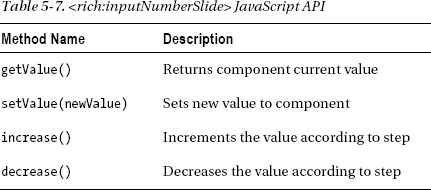
Table 5-7 shows the JavaScript API available on this component.
Using <rich:calendar>
The calendar component allows you to select the date and time values either inline or via a pop-up menu.
<rich_calendar value="#{calendarBean.today}"

   datePattern="dd/M/yy HH:mm:ss"/>
Where #{calendarBean.today} is of type java.util.Date with getter and setter methods.
Note Calendar allows a value to be bound to different type of objects: String, Date, GregorianCalendar. It will convert the current value automatically depending on the type of value, or you could add a custom converter for custom date types.
Figure 5-29 shows an example of selecting a date. Note that by default the calendar is rendered with an input field. When activated, the calendar is shown in a pop-up.

Figure 5-29. <rich_calendar> component
Figure 5-30 shows an example of how the month selection works.
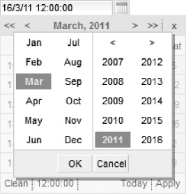
Figure 5-30. Month selection with <rich_calendar>
Figure 5-31 shows an example of selecting time.
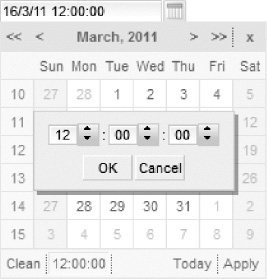
Figure 5-31. Time selection with <rich_calendar>
NoteThe time selection turns on automatically when the pattern for calendar contains time. If it contains only the date, time controls will not appear.
All the examples shown so far in the calendar are pop-ups. Figure 5-32 shows an inline calendar.

Figure 5-32. <rich_calendar>shown as rendered inline
As you see in Figure 5-32, the calendar has the same look and feel, but no input field is displayed. Listing 5-27 shows the component code to render an inline calendar.
Listing 5-27. Shows the component code to render an inline calendar
<rich_calendar value="#{calendarBean.today}"

   datePattern="dd/M/yy hh:mm:a" popup="false"/>
Calendar Internationalization
The calendar component provides very rich UI, as shown in Figure 5-32, and comes with a large number of text labels and other internal controls. This brings us to a very important calendar feature: internationalization support. Table 5-8 shows attributes that are available in order to customize labels related to the dates pop-up representation.
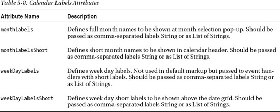
By default, values from Table 5-8 are set with data from current Locale and should be used only if you want to define custom labels.
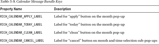
We also need to handle all the UI labels localization. The calendar component does not provide attributes for all the labels available on the component. The reason is rather simple. The set of the labels is very large and defining them all on the page would make the component look “heavy.” Thus, the component uses message bundles for getting predefined localization properties. Table 5-9 lists available calendar properties.
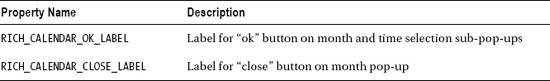
These properties could be defined in either one of the two places, the choice is up to the developer. It could be an application message bundle (registered in a JSF configuration file) or it could be a separate message bundle that should be placed in an org.richfaces.renderkit package with name calendar.properties.
Let's look at an example shown in Figure 5-33 using the component with an Italian locale.

Figure 5-33. <rich_calendar> with Italian locale
In order to achieve that, we created a bundle_it.properties file in a Java source root folder with content from Listing 5-28.
Listing 5-28. Creating a bundle_it.properties file in a Java source root folder
RICH_CALENDAR_APPLY_LABEL=Applica

RICH_CALENDAR_TODAY_LABEL=Oggi

RICH_CALENDAR_CLEAN_LABEL=Reimposta

RICH_CALENDAR_CANCEL_LABEL=Annulla

RICH_CALENDAR_OK_LABEL=Ok

RICH_CALENDAR_CLOSE_LABEL=Chiudi
Next, we added the registered file in faces-config.xml.
<application>

   <message-bundle>bundle</message-bundle>

</application>
And now set the calendar to use an Italian locale.
<rich_calendar datePattern="dd/M/yy hh:mm:ss" locale="it"/>
Note There is no need for explicit definitions of the locale attribute in most cases. Applying current locale will affect all calendars and corresponding bundles will be used for all of them. You should just provide those bundles.
Server-side Customization with CalendarDataModel
The calendar component supports a data model definition that allows customizing month markup according to a custom data model. In order to create a data model, we need to implement two interfaces: CalendarDataModel and CalendarDataModelItem. The class that implements CalendarDataModel will have the getData method implemented and responsible for returning instances (a range of dates, for example) of CalendarDataModelItem for a given date range. Each CalendarDataModelItem represents one calendar day. It also defines a getTooltip reserved method that will be used for future tooltip implementations. CalendarDataModelItem implementation has methods listed in Table 5-10.
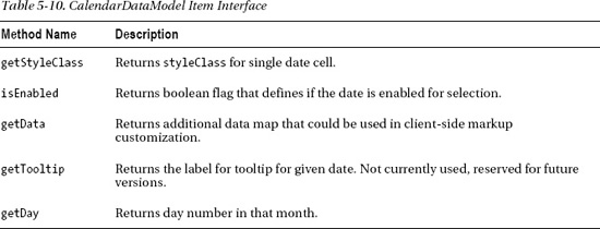
All methods listed will be called by the calendar during month data-fetching in order to apply customizations to every date cell.
The calendar component works in two modes: Ajax and client. In client mode, the calendar switches between months on the client side, rebuilding the month markup every time it is switched on. In Ajax mode, new month data is fetched from the server. The dataModel is used in both cases if defined. In Ajax mode it's called when switching between months to load new months' data. For client mode we have to specify preloadDateRangeBegin and preloadDateRangeEnd attributes. Those attributes define a range of dates for which the data model will be loaded to the client. Then it will be used to construct the month on the client.
Let's look at an example of data model usage. We will use Ajax mode. The data model will define simple rules, as follows:
- Dates that are before the current date are disabled and styled correspondingly.
- Tuesdays and Thursdays are considered “busy” days that are disabled and styled in a special way.
- Saturdays and Sundays are disabled and also will have a special style.
Listing 5-29 shows the JSF page code.
Listing 5-29. The JSF page code
<style>

   .bdc {

      background-color: gray;

   }

   .wdc {

      font-weight: bold;

      font-style: italic;

   }

</style>

<h:form>

   <rich_calendar mode="ajax" popup="false"

      dataModel="#{calendarModel}" />

</h:form>
Note Don't forget to place <rich_calendar> inside <h:form> when using Ajax mode.
The managed bean code is shown in Listing 5-30.
Listing 5-30. The managed bean code
@ManagedBean

@ApplicationScoped

public class CalendarModel implements CalendarDataModel {

   private static final String WEEKEND_DAY_CLASS = "wdc";

   private static final String BUSY_DAY_CLASS = "bdc";

   private static final String BOUNDARY_DAY_CLASS = "rf-ca-boundary-dates";


   private boolean checkBusyDay(Calendar calendar) {

      return (calendar.get(Calendar.DAY_OF_WEEK) == Calendar.TUESDAY ||

      calendar.get(Calendar.DAY_OF_WEEK) == Calendar.THURSDAY);

   }


   private boolean checkWeekend(Calendar calendar) {

      return (calendar.get(Calendar.DAY_OF_WEEK) == Calendar.SUNDAY ||

      calendar.get(Calendar.DAY_OF_WEEK) == Calendar.SATURDAY);

   }


   public CalendarDataModelItem[] getData(Date[] dateArray) {

      CalendarDataModelItem[] modelItems = new CalendarModelItem[dateArray.length];

      Calendar current = GregorianCalendar.getInstance();
Calendar today = GregorianCalendar.getInstance();
today.setTime(new Date());
for (int i = 0; i < dateArray.length; i++) {
current.setTime(dateArray[i]);
CalendarModelItem modelItem = new CalendarModelItem();
if (current.before(today)) {
modelItem.setEnabled(false);
modelItem.setStyleClass(BOUNDARY_DAY_CLASS);
}
else if (checkBusyDay(current)){
modelItem.setEnabled(false);
modelItem.setStyleClass(BUSY_DAY_CLASS);
}
else if (checkWeekend(current)){
modelItem.setEnabled(false);
modelItem.setStyleClass(WEEKEND_DAY_CLASS);
}
else{
modelItem.setEnabled(true);
modelItem.setStyleClass("");
}
modelItems[i] = modelItem;
}
return modelItems;
}
@Override
public Object getToolTip(Date date) {
return null;
}
}
public class CalendarModelItem implements CalendarDataModelItem{
private boolean enabled;
private String styleClass;
@Override
public boolean isEnabled() {
return enabled;
}
@Override
public String getStyleClass() {
return styleClass;
}
public void setEnabled(boolean enabled) {
this.enabled = enabled;
}
public void setStyleClass(String styleClass) {
this.styleClass = styleClass;
} // All the other methods from interface just return null in this
example
}
The calendar displayed is shown in Figure 5-34.

Figure 5-34. <rich_calendar> with a custom data model
Notice that our “busy” dates are disabled and styled with gray color. Weekends are styled in bold-italic. While creation of the data for the current month (see the getData method of the model) we are setting an enabled flag and style class according to the requirements we listed earlier. Also, the calendar that you see is displayed inline because we set the popup='false' attribute.
Client-side Customization with JavaScript
The calendar component also supports client-side customization. There are two attributes available: dayClassFunction and dayDisableFunction. These attributes should be defined with the JavaScript function names. The functions should accept a date parameter and return a CSS class and boolean flag, which indicates if the date is available for selection. Listing 5-31 shows a sample that achieves almost the same result as the previous one, which uses a data model but on the client side.
Listing 5-31. Using a data model but on the client side
<style>

.everyThirdDay {

   background-color: gray;

}


.weekendBold {

   font-weight: bold;

   font-style: italic;

}

</style>

   <script type="text/javascript">
var curDt = new Date();
function disablementFunction(day){
if (day.isWeekend) return false;
if (curDt==undefined){
curDt = day.date.getDate();
}
if (curDt.getTime() - day.date.getTime() < 0) return true; else return false;
}
function disabledClassesProv(day){
if (curDt.getTime() - day.date.getTime() >= 0) return 'rf-cal-boundary-day';
var res = '';
if (day.isWeekend) res+='weekendBold ';
if (day.day%3==0) res+='everyThirdDay';
return res;
}
</script>
<rich_calendar dayDisableFunction="disablementFunction"
dayClassFunction="disabledClassesProv"/>
The result is shown in Figure 5-35.

Figure 5-35. Client-side customization for the <rich_calendar>
Every third date is grayed, weekends have bold and italic styling, and all the dates before the current are disabled.
The calendar component also provides very rich JavaScript API, which allows you to control its state on the client. Listing 5-32 shows synchronizations between two calendars. Let's say that if a user has picked a start date, the user should pick a second date after the start date. In Listing 5-32, we are setting the same date in the second calendar by default. As we are using component JavaScript API, a #{rich:component('id')} function is used to reference the calendar and invoke a JavaScript method.
Listing 5-32. Using a <rich:component(id)> function used to reference the calendar
<h:panelGrid columns="2">

   From:

   <rich_calendar id="c1"

      onchange="#{rich:component('c2')}.

      setValue(#{rich:component('c1')}.getValue())" />

   To:

   <rich_calendar id="c2" />

</h:panelGrid>
Figure 5-36 shows the result: after picking a start date in the first calendar component, the second calendar component is set to a start date automatically.
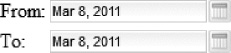
Figure 5-36. Using <rich_calendar> JavaScript API
JavaScript API
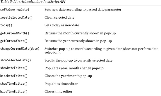
The component provides a very rich JavaScript API. Table 5-11 lists the most important methods. For a complete list of calendar JavaScript API, please visit the JBoss Community RichFaces web site at http://jboss.org/richfaces/docs.
Component Facets
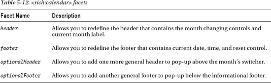
<rich_calendar> facets listed in Table 5-12 are used in order to redefine parts of the component.
Uploading files with <rich:fileUpload>
<rich:fileUpload>, shown in Figure 5-37, is a component that provides asynchronous file input features and a highly customizable rich look and feel with uploading files information and progress indication.
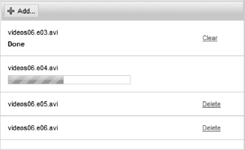
Figure 5-37. <rich:fileUpload> component
The JSF page code that defines the component is shown in Listing 5-33.
Listing 5-33. The JSF page code
<h:form>

   <rich:fileUpload fileUploadListener="#{fileUploadBean.listener}"/>

<h:form>
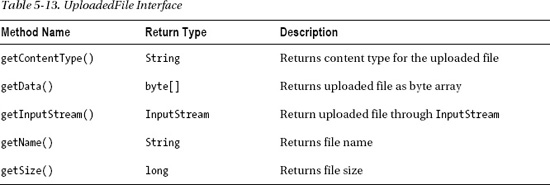
The only attribute that you will have to use is fileUploadListener. It should be defined with a method expression, and the listener method will be responsible for processing uploaded files. It should be a void method that accepts a single parameter of org.richfaces.event.FileUploadEvent type. FileUploadEvent provides a getUploadedFile method that returns an instance of the uploaded file described in Listing 5-34.
Let's also look at a simple bean that stores an uploaded file object in session.
Listing 5-34. A simple managed bean
import org.richfaces.model.UploadedFile;

...

@ManagedBean

@SessionScoped

public class FileUploadBean {

   private UploadedFile file;

   public void listener(FileUploadEvent event) throws Exception {

      file = event.getUploadedFile();

   }

   //Getters and setters

}
Table 5-13 lists UploadedFile interface methods that can be used to obtain uploaded file information.
Let's review a number of additional settings. At first, as with any component that sends Ajax requests to the server, you have to use a form to wrap the component. However, using the RichFaces file upload component, you don't need to make the form a multipart form, as it will be automatically handled by RichFaces. Using the standard <h:form> is sufficient.
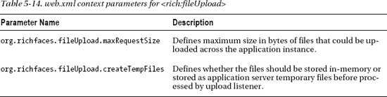
File upload component has two options that are defined as application context-parameters in web.xml listed in Table 5-14.
Now let's add a limitation as to what kind of files can be uploaded, as in Listing 5-35.
Listing 5-35. Adding a limitation to what files can be uploaded
<rich:fileUpload id="fileUpload" acceptedTypes="jpg, gif, png"

   fileUploadListener="#{fileUploadBean.listener}"

  disabled="#{fileUploadBean.filesCountExceeded}"/>
Now the component will allow uploading only .jpg, .gif and .png images and once #{fileUploadBean.filesCountExceeded} evaluates to true, the component will be disabled and not allow any additional uploads. If #{fileUploadBean.filesCountExceeded} changes on the server, the component needs to be re-rendered in order to update its state on the client.
Let's look at another example uploading images with thumbnail support, as in Listing 5-36.
Listing 5-36. Uploading images with thumbnail support
<h:form>

   <h:panelGrid columns="2" columnClasses="top,top">

      <rich:fileUpload fileUploadListener="#{fileUploadBean.listener}"

         maxFilesQuantity="#{fileUploadBean.uploadsAvailable}" id="upload"

         acceptedTypes="jpg, gif, png, bmp">

         <a4j:ajax event="uploadcomplete" execute="@none" render="info" />

      </rich:fileUpload>

   <h:panelGroup id="info">

   <rich:panel bodyClass="info">

      <f:facet name="header">Uploaded Files Info</f:facet>

      <rich:dataGrid columns="1" value="#{fileUploadBean.files}" var="file" rowKeyVar="row">

         <rich:panel>

            <h:panelGrid columns="2">

            <a4j:mediaOutput element="img" mimeType="#{file.contentType}"

               createContent="#{fileUploadBean.paint}" value="#{row}" style="width:100px;

height:100px;"

               cacheable="false">

               <f:param value="#{fileUploadBean.timeStamp}" name="time" />

            </a4j:mediaOutput>

            <h:panelGrid columns="2">

               <h:outputText value="File Name:" />

               <h:outputText value="#{file.name}" />

               <h:outputText value="File Length(bytes):" />

               <h:outputText value="#{file.size}" />
</h:panelGrid>
</h:panelGrid>
</rich:panel>
</rich:dataGrid>
</rich:panel>
</h:panelGroup>
</h:panelGrid>
</h:form>
And the managed bean snippet is shown in Listing 5-37.
Listing 5-37. The managed bean snippet
@ManagedBean

@SessionScoped

public class FileUploadBean {

   private ArrayList<UploadedFile> files = new ArrayList<UploadedFile>();


   public void paint(OutputStream stream, Object object) throws IOException {

      stream.write(getFiles().get((Integer) object).getData());

   }


   public void listener(FileUploadEvent event) throws Exception {

      UploadedFile item = event.getUploadedFile();

      files.add(item);

   }


   public Date getTimeStamp(){

      return new Date();

   }


   // Getters and setters

}
After the files are uploaded, <a4j:ajax> performs an Ajax request to the server and updates the thumbnails panel, as shown in Figure 5-38.
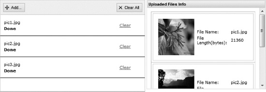
Figure 5-38. <rich:fileUpload> with thumbnails panel
Every uploaded file was stored in a list. We then iterate over the list using the <rich:dataGrid> component and pass the image to a <a4j:mediaOutput> component in order to output the image file thumbnail.
Component Facets
A single progress facet is available on the <rich:fileUpload> component. It allows you to redefine built-in <rich:progressBar> functionality in the component. You could place <rich:progressBar> inside the facet and customize its behavior or look and feel as you need.
Component JavaScript API
As of the writing of this book, the <rich:fileUpload> component doesn't provide public JavaScript API. JavaScript API might be added in future releases. Visit the JBoss Community RichFaces site at http://richfaces.org for updates.
Summary
This chapter covered RichFaces input components. All input components provide rich client functionality and some have built-in Ajax support. For input components that don't provide built-in Ajax support out of the box, you can easily add Ajax support by attaching <a4j:ajax> behavior to any event available on the component.
As you are working with these components, don't forget the rich JavaScript API many provide. Many components also provide facets to redefine some part of a component. All these features make RichFaces input components very powerful and flexible.
Under the hood, most components are just inputs so all the basic JSF concepts, such as conversion and validation, apply here as well. To see all the input components in action, view the components demo on the JBoss Community RichFaces site at http://www.jboss.org/richfaces/demos.
Now that we are done with rich input components, in the next chapter we will tell you about rich output components, such as pop-up panels, tabs, and more.