
C H A P T E R 13
Skins
RichFaces comes with a built-in skins feature that allows you to control the look and feel of your entire application from a single place. The skins feature is sometimes called themes, and in this context they’re the same thing.
You are probably wondering why you wouldn’t just use good old CSS to change the look and feel of your application. CSS is not going anywhere; you are still going to use it. The basic idea is to provide more abstraction when working with the look and feel. Instead of repeating the same color in the CSS file, you will be able to dictate that all panel headers or tab labels will be this style or all table headers will have that color, and so on. In situations where you need more control and flexibility, you can still use CSS and overwrite skin generated styles. However, when using skins, by changing just a few parameters, it is possible to alter the appearance of RichFaces components in a synchronized fashion without messing up the user interface consistency. Skins is a high-level extension of standard CSS, which can be used together with regular CSS declarations.
In this chapter we will show you how to use skins in RichFaces. We will show you how to use the built-in skins, how to create and use your own custom skins, and how to customize and overwrite skins-generated CSS. Finally, we will show you how to enable the skins feature for standard HTML and JSF tags.
Using Built-in Skins
RichFaces provides a number of built-in skins. You have to do very little to use them. The following are the out-of-the-box skins with color schema, which you will find in the richfaces-core-impl-4.0.x JAR file.
- DEFAULT (gray colors)
- plain (no predefined colors or background images)
- emeraldTown (green colors)
- blueSky (light blue colors)
- wine (dark green colors)
- japanCherry (pink colors)
- ruby (deep red colors)
- classic (blue colors)
- deepMarine (Cyan colors)
 Note Because the page you are looking at is black and white, we’ll use two very different skins to demonstrate examples in the chapter. We’ll use
 ruby, which is a dark skin, and blueSky, which is a lighter skin. You should be able to see the difference even on the black-and-white pages of this book. An even better option is to create a new project and follow the steps throughout this chapter; this way, you’ll be able to see the results in actual color.
To start using skins in your application, you need to add the org.richfaces.skin context parameter to the web.xml file of the application and specify the name of the skin. Just take any application you have built and add the context parameter shown in Listing 13-1 (if the context parameter already exists in web.xml, just set it to the desired skin).
Listing 13-1. Adding the context parameter
<context-param>

   <param-name>org.richfaces.skin</param-name>

   <param-value>ruby</param-value>

</context-param>
That’s it; you don’t need to do anything else. Restart the server, and you should see the new look and feel.
Figure 13-1 shows an example using the ruby skin. The panel header (<rich:panel>) and tabs (<rich:tab>) have a dark red palette, and you didn’t have to specify any CSS.
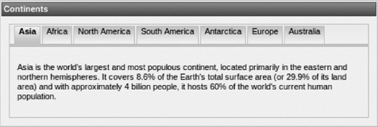
Figure 13-1. Rich panel and tabs in ruby skin
If you want to try another skin, just update the context parameter, restart the server, and see how it looks. Figure 13-2 is an example using the blueSky skin.
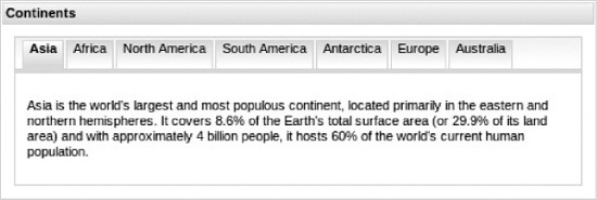
Figure 13-2. Rich panel and tabs in blueSky skin
Again, notice how the entire page has been updated according to the selected skin. Listing 13-2 shows the source (some text was omitted to save space).
Listing 13-2. The source
<rich:panel style="width:500px;">

   <f:facet name="header">

       Continents

   </f:facet>

   <rich:tabPanel switchType="client">

      <rich:tab header="Asia">

      ...

      </rich:tab>

      <rich:tab header="Africa">

      ...

      </rich:tab>

      <rich:tab header="North America">

      ...

      </rich:tab>

      <rich:tab header="South America">

      ...

      </rich:tab>

      <rich:tab header="Antarctica">

      ...

      </rich:tab>

      <rich:tab header="Europe">

      ...

      </rich:tab>

      <rich:tab header="Australia">

      ...

      </rich:tab>

   </rich:tabPanel>

</rich:panel>
Note As mentioned earlier, all the default skins are located in the richfaces-core-impl-4.0.x.jar file, which is in the META-INF/skins directory.
Listing 13-3 shows the code for the ruby skin (it’s just property file). As you can see, the skin defines fonts, colors for various sections, and parts of the user interface. Later in the chapter you will see how you can easily build your own skin.
Listing 13-3. Code for the ruby skin
#Colors

headerBackgroundColor=#900000

headerGradientColor=#DF5858

headerTextColor=#FFFFFF

headerWeightFont=bold


generalBackgroundColor=#f1f1f1

generalTextColor=#000000

generalSizeFont=11px

generalFamilyFont=Arial, Verdana, sans-serif


controlTextColor=#000000

controlBackgroundColor=#ffffff

additionalBackgroundColor=#F9E4E4


shadowBackgroundColor=#000000

shadowOpacity=1


panelBorderColor=#C0C0C0

subBorderColor=#ffffff


tabBackgroundColor=#EDAEAE

tabDisabledTextColor=#C47979


trimColor=#F7C4C4


tipBackgroundColor=#FAE6B0

tipBorderColor=#E5973E


selectControlColor=#FF9409


generalLinkColor=#CF0000

hoverLinkColor=#FF0000

visitedLinkColor=#CF0000


# Fonts

headerSizeFont=11px

headerFamilyFont=Arial, Verdana, sans-serif


tabSizeFont=11
tabFamilyFont=Arial, Verdana, sans-serif


buttonSizeFont=11

buttonFamilyFont=Arial, Verdana, sans-serif


tableBackgroundColor=#FFFFFF

tableHeaderBackgroundColor=#EB9A99

tableSubHeaderBackgroundColor=#F7DBDB

tableFooterBackgroundColor=#cccccc

tableSubfooterBackgroundColor=#f1f1f1

tableBorderColor=#C0C0C0

tableBorderWidth=1px

tableHeaderTextColor=#980808


#Calendar colors

calendarWeekBackgroundColor=#f5f5f5

calendarHolidaysBackgroundColor=#FFF1F1

calendarHolidaysTextColor=#980808

calendarCurrentBackgroundColor=#808080

calendarCurrentTextColor=#ffffff

calendarSpecBackgroundColor=#f1f1f1

calendarSpecTextColor=#000000


warningColor=#FFE6E6

warningBackgroundColor=#FF0000


editorBackgroundColor=#F1F1F1

editBackgroundColor=#FEFFDA


#Gradients

gradientType=plain
Note Two new properties were added in RichFaces 4: tableHeaderBackgroundColor and tableSubHeaderBackgroundColor. In RichFaces 3.3.x table headers used panel header colors.
How do the skins work? You now have the org.richfaces.skin context parameter in your web.xml file, so RichFaces will take the value of the parameter and parse bundled RichFaces ECSS stylesheets on the fly to fill corresponding properties with values from skin properties. Yes, it is still plain CSS behind the scenes.
Note In addition to dynamic resources generation, RichFaces offers an option to generate all the skin resources during application compile time. That allows it to serve resources in a static manner through CDN (Content Delivery Network), for example. RichFaces provides a special resource plug-in that is responsible for static resources generation and makes it possible to deploy a RichFaces application in the cloud.
Note In RichFaces 4 a new ECSS (EL CSS) format that uses standard CSS syntax is introduced, removing proprietary .xcss format. Later we’ll show you how it looks and why a separate format rather than CSS parsing is used.
Creating Your Own Skins
As you can see, several skins are available for you to try, but you might want to create your own. That’s easy enough to do. In fact, you can basically take an existing skin and make changes until you like how the page is rendered.
First you have to place a custom skin where RichFaces can find it. You can put it in one of the following classpath directories in your application: META-INF/skins/ or WEB-INF/classes.
Note You could use skins packaged in application JAR files. Skin files should be placed in META-INF/skins/ folder inside the JAR file.
Take the ruby skin and copy it to the Java source directory in the application. When the application is built, it will be copied to WEB-INF/classes.
Let’s say you want to change the skin name. Suppose you want to call your skin newyork. The naming convention is rather simple (name.skin.properties). Because you want to call your skin newyork, you will rename the file you just copied to
newyork.skin.properties
Next you have to register the skin in the web.xml file, as shown in Listing 13-4.
Listing 13-4. Register the skin in the web.xml file
<context-param>

   <param-name>org.richfaces.skin</param-name>

   <param-value>newyork</param-value>

</context-param>
If you keep it as it is, you simply have created a copy of the ruby skin with a different name. Your goal in this section is to create a custom skin that is different.
Make the changes to the following parameters in the skin, as shown in Listing 13-5.
Listing 13-5. Shows changes to the parameters in the skin
generalSizeFont=16px

headerSizeFont=16px
When using your custom skin, the rendered page should look like that shown in Figure 13-3. As you can see if you open the file, you have modified the font sizes. All RichFaces components will now inherit this look and feel throughout the application.
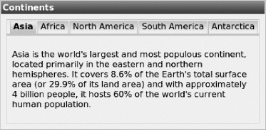
Figure 13-3. Rich panel and tabs in custom skin
Note We’re changing only the font attributes to make it easier for you to see the difference on the black-and-white page.
In the previous example, you copied the whole skin and then modified skin parameters. An alternative way to create a custom skin (it’s probably also simpler), is to create a new skin and base it on any of the existing skins, rather than copying the whole skin file. Overwrite only the parameter you need. For example, the newyork.skin.properties file will look like Listing 13-6.
Listing 13-6. The newyork.skin.properties file
baseSkin=ruby

generalSizeFont=16px

headerSizeFont=16px
The result would be identical to the previous image.
You are not only limited to redefining existing skin parameters, it’s also possible to define custom skin parameters. The custom skin parameters will not be used in RichFaces components, but you will be able to apply them to some standard or third-party components. The way of applying skin parameters to any components on the view is described next. Skin parameters in the skin file could be defined with EL values.
Changing the Skin Parameter
You are probably asking, how do I know which skin parameter to change? In other words, how do the skin parameters correspond to the CSS properties of the components? To find this information, go to the RichFaces 4 Component Reference available at the JBoss Community RichFaces Documentation web site (www.jboss.org/richfaces/docs). The “Style classes and skin parameters” section is available for every component. There you’ll find which skin parameters define which CSS properties.
You have used <rich:tabPanel> and <rich:tab>, so next you’ll see how skin parameters for these components correspond to CSS properties.
<rich:tabPanel>
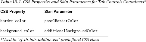
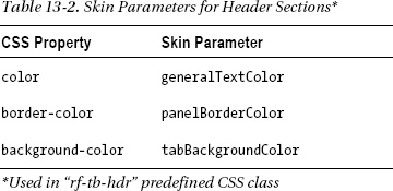
Table 13-1 shows how CSS properties correspond to skin parameters. From this table you can see that the border color of the <div> element, which wraps all the tab headers, is determined by the panelBorderColor skin property.
<rich:tab>
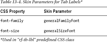
Determining how skin parameters correspond to CSS properties is the same for the <rich:tab> component. Tables 13-2, 13-3, 13-4, and 13-5 show how CSS properties correspond to skin parameters when using the <rich:tab> component.
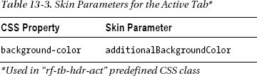
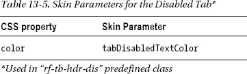
To define the background color for the active tab, you would set the additionalBackgroundColor skin parameter, as shown in Table 13-3. To define the disabled tab text color, you would set the tabDisabledTextColor skin parameter, as shown in Table 13-5, which would result in the parameters in the skin file shown in Listing 13-7.
Listing 13-7. Parameters in the skin file
additionalBackgroundColor=blue

tabDisabledTextColor=green
Using Skins and CSS
Using skins gives you a lot of abstraction in defining CSS for the application. However, sometimes you might need more flexibility and control over the look and feel. In other words, you might want to define additional styles beyond what the skins permit.
There are three levels to defining the look and feel of your application. Each stage or level gives you a different degree of control. The three approaches are as follows:
- Skin-based CSS. Using ECSS (EL CSS) stylesheets with skin property values applied
- Redefining skin-inserted CSS classes
- Adding user-defined styles (via
styleorstyleClass-like attributes; RichFaces components make available many other class-based attributes)
Skin-Based CSS
Using skins is basically a global way of describing the look and feel of the application. RichFaces will go through the ECSS files applying properties of the currently loaded skin. This is the first approach. You control the look and feel of an application entirely through skins.
What is ECSS?
In RichFaces 4, ECSS (EL CSS) files are used to generate component CSS according to skin on the fly when the page is rendered. It uses the familiar CSS format. Listing 13-8 shows how a portion of the panel.ecss file for <rich:panel> looks.
Listing 13-8. A portion of the panel.ecss file
.rf-p{

   background-color:'#{richSkin.generalBackgroundColor}';

   color:'#{richSkin.panelBorderColor}';
   border-width:1px;

   border-style:solid;

   padding:1px;

}

.rf-p-hdr{

   background-color:'#{richSkin.headerBackgroundColor}';

   border-color:'#{richSkin.headerBackgroundColor}';

   …

}
But why ECSS and not just simple CSS with EL inside? Yes, JSF 2 allows you to use EL expressions in CSS resources right out of the box. However, there are problems:
- JSF allows turning off EL usage in stylesheets if application CSS files have not used it. This is allowed in order to improve performance. But it is not acceptable for RichFaces components, where skins is the core feature and components styling could be completely broken.
- RichFaces parses the ECSS files to trim properties that are not defined by skin. This additional parsing should be done on RichFaces resources only and not applied to any third-party or standard stylesheets.
If you created your own ECSS stylesheet and need to add to the view, you should simply use JSF 2 facilities for that, for example
<h:outputStylesheet name="application.ecss"/>
or with a ResourceDependency annotation, such as
@ResourceDependency(name="application.ecss")
Redefining Skin-Based CSS Classes
We’ll now demonstrate how to redefine or customize CSS styles generated by the skin.
To add new custom styles, simply append your custom style into any of the predefined CSS classes coming from the skin ECSS. Using the same approach, you can overwrite any of the default styles. Let’s look at an example using the <rich:panel> component shown in Listing 13-9.
Listing 13-9. An example using the <rich:panel> component
<rich:panel id="panel" style="width:300px">

   <f:facet name="header">

        Using skins is so cool!

   </f:facet>

   I can easily change how my application looks

</rich:panel>
It produces the example using the ruby skin shown in Figure 13-4.
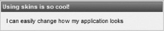
Figure 13-4. Rich panel in ruby skin
Listing 13-10 shows part of the HTML generated for this component when the page is rendered.
Listing 13-10. Part of the HTML generated
<div style="width: 300px;" id="panel" class="rf-p">

   <div id="panel_header" class="rf-p-hdr">

        Using skins is so cool!

   </div>

   <div id="panel_body" class="rf-p-b ">

        I can easily change how my application looks

   </div>

</div>
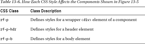
The <rich:panel> component consists of three <div> HTML tags: one for the header, one for the body, and one for a parent that wraps the header and body. If you look closely, you will see that special CSS classes have been inserted in Listing 13-11.
Listing 13-11. Inserted CSS classes
<div style="width: 300px;" id="panel" class="rf-p">

<div id="panel_header" class="rf-p-hdr">

<div id="panel_body" class="rf-p-b ">
Those style classes are defined in the panel.ecss stylesheet and contain CSS properties based on current skin parameters. Listing 13-12 shows how the file looks.
Listing 13-12. Shows the file
.rf-p{

   background-color:'#{richSkin.generalBackgroundColor}';

   color:'#{richSkin.panelBorderColor}';

   border-width:1px;

   border-style:solid;

   padding:1px;

}


.rf-p-hdr{

   background-color:'#{richSkin.headerBackgroundColor}';

   border-color:'#{richSkin.headerBackgroundColor}';

   font-size:'#{richSkin.headerSizeFont}';

   color:'#{richSkin.headerTextColor}';

   font-weight:'#{richSkin.headerWeightFont}';

   font-family:'#{richSkin.headerFamilyFont}';

   padding:2px;

   border-width:1px;

   border-style:solid;

   background-position:top left;
   background-repeat:repeat-x;

   background-

     image:"url(#{resource['org.richfaces.renderkit.html.GradientA']})";

}


.rf-p-b{

   font-size:'#{richSkin.generalSizeFont}';

   color:'#{richSkin.generalTextColor}';

   font-family:'#{richSkin.generalFamilyFont}';

   padding:10px;

}
First let’s redefine existing styles. Let’s use the first CSS class rf-p for that. Well, you just take the defined CSS properties, create a CSS class in the page with the same name, and set them to values you want. Suppose we only want to overwrite color and border style properties, as shown in Listing 13-13.
Listing 13-13. Overwriting color and border style properties
<style>

.rf-p{


   color: red;

   border-style: dotted;

}


</style>
You can overwrite one, two, or all properties.
Adding new custom properties is just as simple. Using the rf-p-b skin-based CSS class, add any custom property not present in the skin-based CSS with a desired value, as shown in Listing 13-14.
Listing 13-14. Using the rf-p-b skin-based CSS class
<style>

.rf-p-b {

    font-style: italic;

    font-weight: bold;

}

</style>
The result is shown in Figure 13-5.
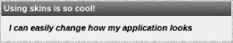
Figure 13-5. Overwriting skin-generated CSS
In general, to redefine styles for all <rich:panel> components on a page using CSS, it’s enough to create classes with the same skin-based CSS class names and redefine necessary properties in them. You don’t necessarily have to use the style tag; you can as easily define the styles in a separate CSS file and load it via <h:outputStylesheet> tag.
Keep in mind that redefining CSS properties in this way will affect all the tab panels on the same page. We will show you how to control that in a later section of this chapter.
Redefining the CSS Class Name
In Listing 13-5 you looked inside the generated HTML source, but that’s not the best way to find the CSS class name. To find out which class names are generated, you again have to refer to the RichFaces 4 Component Reference at the JBoss Community web site. Go to www.jboss.org/richfaces/docs to open a reference. Find the <rich:panel> component section there and look through the “Style classes and skin parameters” section inside.
All components will display a table showing how various CSS class names correspond to components.
Table 13-6 explains how each CSS class corresponds to the component’s appearance.
The rest of components follow the same approach.
The last approach is to use fully user-defined classes just as you would normally.
User-Defined Style
The last approach is to use the attributes you have always used, such as style, styleClass, and any other component-defined style properties, such as bodyClass, headerClass, and so on, to define custom style classes. Using the same example, you add a user-defined class to the <rich:panel> component using the styleClass attribute, as shown in Listing 13-15.
Listing 13-15. Adding a user-defined class to the <rich:panel> component using the styleClass attribute
<rich:panel id="panel" style="width:300px" styleClass="myClass">

   <f:facet name="header">

      Using skins is so cool...

   </f:facet>

   I can easily change how my application looks

</rich:panel>
myClass is defined in Listing 13-16.
The generated HTML is shown in Listing 13-17.
Listing 13-17. Generated HTML
<div style="width: 300px;" id="panel" class="rf-p myClass">

   <div id="panel_header" class="rf-p-hdr">

        Using skins is so cool!

   </div>

   <div id="panel_body" class="rf-p-b">

        I can easily change how my application looks

   </div>

</div>
The final result shows how italics have been applied to the whole panel, as in Figure 13-6.

Figure 13-6. Applying italics to the whole panel
This approach allows you to control styling for a particular panel component. Even if you have multiple panels, only one will be affected.
To summarize, there are three different ways to work with the look and feel of your application. The first level is using the built-in skins feature. Keep in mind that skins are simply a higher-level abstraction to good old CSS. The next level is redefining the CSS classes automatically generated for each component. The last level is using attributes such as style and styleClass (and any other component that defines the style attribute) to gain even further control over the look and feel. This last method allows you to change the look and feel for just the component on the current page without affecting components on other pages.
Dynamically Changing Skins
We have shown you how to create and use custom skins. It’s also possible to load any skin when the application is running, including your custom skin. To enable such functionality, the org.richfaces.skin parameter in web.xml has to point to an EL expression that resolves to the current skin, as shown in Listing 13-18.
Listing 13-18. Using the org.richfaces.skin parameter
<context-param>

   <param-name>org.richfaces.skin</param-name>

   <param-value>#{skinBean.currentSkin}</param-value>

</context-param>
The bean would look like Listing 13-19.
Listing 13-19. The managed bean
@ManagedBean(name="skinBean")

@SessionScoped

public class SkinBean implements Serializable {


   private String currentSkin = "newyork";


   public String getCurrentSkin() {

       return currentSkin;

   }


   public void setCurrentSkin(String skin) {

       this.currentSkin = skin;

   }

}
In this example, skin property inside the SkinBean managed bean will hold the currently selected skin. It should be initialized to some initial skin value, for example, through the managed bean’s configuration or just initializing the property with initial skin name as done in Listing 13-13. The bean should also be placed in session scope so that the skin is not reset on each request.
Now you can easily change the look and feel of the application by dynamically setting the currentSkin property to one of the available skins in your application.
Note If you are changing skins when the application is running, it makes sense to reload the full page. Without a full-page refresh, it’s not possible to update all the ECSS loaded Update of resources via Ajax might result in unexpected results.
Standard Controls Skinning
Starting with RichFaces 3.2.1, the RichFaces team made standard controls skinning pretty simple. Nothing needs to be done in order for the skins to be applied to all standard controls.
In Listing 13-20, let’s look at a very simple example of a JSF page without RichFaces.
Listing 13-20. Example of a JSF page without RichFaces
<h:panelGrid columns="1">

   <h:outputText value="Favorite city: "/>

   <h:inputText value="#{geography.city}"/>

</h:panelGrid>

<h:commandButton action="next" value="Submit"/>
The result is shown in Figure 13-7.

Figure 13-7. The resulted image
So far, there is nothing interesting—just a plain JSF page.
In RichFaces 4, the context parameter shown in Listing 13-21 is available and set to true by default. This means that all standard controls on a page will be skinned.
Listing 13-21. The context parameter
<context-param>

   <param-name>org.richfaces.enableControlSkinning</param-name>

   <param-value>true</param-value>

</context-param>
This example will now look like Figure 13-8, with the RichFaces added and ruby skin defined.

Figure 13-8. Favorite City
If you want to style controls on your own without influencing all the standard ones, define the context parameter with false value.
Another parameter that is set to false by default is org.richfaces.enableControlSkinningClasses. To enable it, add the code found in Listing 13-22 to your web.xml file.
Listing 13-22. org.richfaces.enableControlSkinningClasses
<context-param>

   <param-name>org.richfaces.enableControlSkinningClasses</param-name>

   <param-value>true</param-value>

</context-param>
When enabled, it offers a special predefined CSS class: rfs-ctn (the short name implies a RichFaces container, in case you are wondering). When this CSS class is used on a container-like component (<h:panelGrid>, <rich:panel>, or just <div>), any standard controls inside the container will be skinned using standard controls skinning classes.
The code examples in Listing 13-23 are basically equivalent. The only difference is that in the first one you apply the rfs-ctn style to a <div> tag, while in the second example you apply it to <h:panelGrid> instead.
Listing 13-23. Equivalent code samples
<div class="rfs-ctn">

   <h:panelGrid columns="1" >

      <h:outputText value="Favorite city: " />

      <h:inputText value="#{geography.city}" />

      <h:commandButton action="next" value="Submit" />

   </h:panelGrid>

</div>


<h:panelGrid columns="1" styleClass="rfs-ctn">

   <h:outputText value="Favorite city: " />

   <h:inputText value="#{geography.city}" />

   <h:commandButton action="next" value="Submit" />

</h:panelGrid>
When we enabled org.richfaces.enableControlSkinningClasses, we also turned off org.richfaces.enableControlSkinning, as only one approach should be used in application. The result is shown in Figure 13-9.
Note In general, you should use one of the standard control skinning approaches in your application. Either skin all the standard components and HTML tags automatically (setting org.richfaces.enableControlSkinning to true) or apply the special CSS class rfs-ctn (setting org.richfaces.enableControlSkinningClasses to true) on containers to skin standard components and HTML tags within that container only.
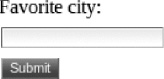
Figure 13-9. Skinning standard JSF components
Standard Controls skinning applies not only to components but also to standard HTML controls (as simple CSS selectors for HTML elements used under the hood). The code in Listing 13-24 is an example.
Listing 13-24. Standard Controls skinning
<h:panelGrid columns="1" styleClass=" rfs-ctn">

   <h:outputText value="Favorite city: " />

   <h:inputText value="#{geography.city}" />

   <h:commandButton action="next" value="Submit" />

   <input type="button" value="HTML Button"/>

</h:panelGrid>
It will display Figure 13-10.
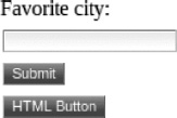
Figure 13-10. Applying the skins feature to standard HTML tags
More specific CSS classes representing various skin parameters are also available. To learn what’s available, look inside the richfaces-core-impl-4.0.x.jar file in /META-INF/resources/skinning-classes.ecss. This file will also show you the mapping between specially defined CSS class parameters and skin parameters. Listing 13-25 is an example entry.
Listing 13-25. Example entry
.rfs-txt-general{

   font-size: '#{richSkin.generalSizeFont}';

   font-family: '#{richSkin.generalFamilyFont}';

   color: '#{richSkin.generalTextColor}';


}
A specially defined .rfs-txt-general CSS class will be combined from the skin properties generalSizeFont, generalFamilyFont, and generalTextColor. In turn, these skin properties correspond to the font-size, font-family, and color CSS properties, respectively. Listing 13-26 is an example using .rfs-txt-general and another .rfs-btn (similar to .rfs-txt-general).
Listing 13-26. Example using .rfs-txt-general and another .rfs-btn
<h:panelGrid columns="1">

   <h:outputText value="Favorite city: " styleClass="rfs-txt-general"/>

   <h:inputText value="#{geography.city}" styleClass="rfs-txt-general"/>

   <h:commandButton action="next" value="Submit" styleClass="rfs-btn"/>

</h:panelGrid>
This will display Figure 13-11.
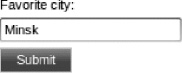
Figure 13-11. Using special RichFaces CSS classes to skin standard JSF components
Notice that “Favorite city” (<h:outputText>) has been skinned as well. It has a different style than the previous examples.
Using #{richSkin} Implicit Object
It’s possible to turn off the “Standard Controls Skinning” feature and style a single component without loading the complete standard skinning ECSS. In such case you should use skin properties directly from the current skin, in particular components styles. This allows you to skin standard controls without having to update that particular style each time you change skin or skin parameters.
Suppose you add a button to your tabs example and turned the standard controls skinning feature off, as in the following code:
<h:commandButton action="next" value="Next page -

    I want to learn about world oceans!"/>
The result is shown in Figure 13-12.
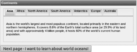
Figure 13-12. Using #{richSkin} to skin standard JSF components
As you can see, it’s a standard JSF button (h:commandButton) and, of course, not skinnable. You can add a style via the style or styleClass attribute that matches the current skin (ruby), but then you would need to adjust it each time you change the skin. A better way is to use skin parameters to add style to the button. For example, you can use tabBackgroundColor as the color for the button, as shown in Listing 13-27. Of course, you can use any other skin parameter from the skin.
Listing 13-27. tabBackgroundColor
<h:commandButton action="next" value="Next page -

   I want to learn about world oceans!"

   style="background-color:#{richSkin.tabBackgroundColor}"/>
The result is shown in Figure 13-13.

Figure 13-13. Standard JSF buttons styled with skin colors using #{richSkin}
Let’s review #{richSkin.tabBackgroundColor}. #{richSkin} is an implicit object that points to the current skin and allows you to access any of the skin’s parameters. It’s no different from the #{view} and #{initParam} implicit objects. You can reference any skin parameter in this way. It’s just the same as usage of the object in ECSS files.
You can pull styles from the skin without even using any RichFaces components, as shown in Listing 13-28.
Listing 13-28. Pulling styles from the skin without using RichFace components
<div style="color: #D01F3C;

   border: 2px solid #{richSkin.panelBorderColor};

   width: 300px">

   I can even use Skins without any RichFaces components

</div>
Listing 13-29 is an example of how to highlight a row in a table when the mouse cursor is over that row, and returns default color when the cursor moves out.
Listing 13-29. Highlighting a row in a table
<rich:dataTable value="#{carBean.allCars}" var="car" rows="10"

   onRowMouseOver="this.style.backgroundColor='#D5D2D1'"

   onRowMouseOut="this.style.backgroundColor='#{richSkin.tableBackgroundColor}'">


   <rich:column>

      <h:outputText value="#{car.make}" />

   </rich:column>

   <!--Other columns-->

</rich:dataTable>
Result from last example are shown in Figure 13-14.
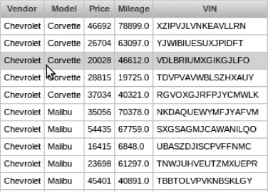
Figure 13-14. Highlighting currently selected row using #{richSkin}
Summary
This chapter demonstrated one of the major features in RichFaces: skins. Skins is simply a powerful extension to CSS. By using skins, you can easily change the look and feel of your entire application. The chapter also demonstrated various ways to create custom skins, as well as customizing, extending, and redefining existing skins. We also covered skinning non-RichFaces components, such as standard JSF tags and standard HTML tags.
Now that we are done with skins, the next chapter will cover RichFaces Component Development Kit (CDK). The CDK allows you to quickly and easily build your own custom rich components.