
CHAPTER 4
Summarizing Data
In previous chapters, you used a pivot table to summarize insurance policy data and reported on the grand total of insured value by region and by building construction type. In most of the reports, you showed a total sum, and in one report you changed the report so it showed a total count of the policies sold. In this chapter, you'll use different data to create a pivot table, and you'll explore other ways of summarizing the data. You'll work with the grand totals and subtotals in the pivot table and learn how to group the data for a range of numbers or dates.
Exploring a Work Orders Example
To follow the examples in this chapter, download and open the sample file named WorkOrders_01.xlsx, available at www.apress.com. In this workbook, you'll find data about your company's service call work orders, including the costs, labor hours, payment type, whether parts or labor are covered under warranty, and other dates. Figure 4-1 shows a sample of the data.
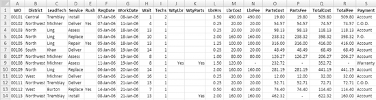
Figure 4-1. Service call work orders data
You'll use a pivot table to summarize the work order data to see the following:
- Which technicians are working the most
- Which service types require the most rush jobs
- The average time spent on a service call
- One year's results versus the next
Note In the sample file, an Excel table named WorkOrders has been created from the work order data. If you are using your own data to work through the instructions in this chapter, you should create an Excel table from your data and then name the Excel table.
Your first task is to create a report on the average hours that each technician spends on the different types of service calls. This will help your service coordinator schedule the service calls, because you'll know how long each type of job normally takes. To get started, you'll check the source data to see which fields contain the data that you need for your report and then create a pivot table with those fields:
- In the Excel table named WorkOrders on Sheet1, you can see the technician names in the LeadTech column. In the Service column, you can see the service type, such as Install or Repair. The final field you'll use in this report is LbrHrs, which is the total hours of labor on the service call.
- From the Excel table, create a pivot table on a new worksheet. In the PivotTable Field List pane, put the LeadTech field in the Row Labels area, Service in the Column Labels area, and LbrHrs in the Values area, where it will become Sum of LbrHrs.
This report gives you an overview of the type of service that each technician is doing, with a sum of labor hours, as shown in Figure 4-2.
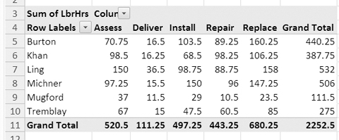
Figure 4-2. Sum of labor hours per service type
Note In this chapter's figures, some column widths have been manually adjusted.
Using the Summary Functions
Because the LbrHrs column in the source data consists of numbers only, it was automatically summarized as Sum of LbrHrs when you added it to the pivot table. If the LbrHrs field had contained cells with text or blank cells, it might have been summarized as Count of LbrHrs.
You'll make a change to the LbrHrs summary function to show the average time that each technician spends on each type of service:
- Right-click one of the LbrHrs cells in the pivot table, such as cell B5, which contains the total hours that Burton spent doing assessments.
- From the context menu, choose Summarize Data By, and click Average.
- The pivot table now shows the average labor hours per technician for each service type, and the label at the top left of the pivot table has changed from Sum of LbrHrs to Average of LbrHrs (see Figure 4-3).
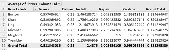
Figure 4-3. Average labor hours per technician for each service type
Your report now shows the average hours per technician for each service call type. However, because the number of decimal places vary within the pivot table columns, it's hard to visually compare the results. You'll format the numbers so they are consistent, and the summary will be easier for you and other readers to understand at a glance:
- Right-click one of the LbrHrs cells in the pivot table, such as cell E7.
- From the context menu, choose Number Format (see Figure 4-4).
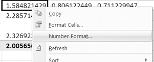
Figure 4-4. Number Format command on the context menu
- The Format Cells dialog box opens, with only the Number tab available.
- From the Category list, select Number.
For this data, two decimal places will be sufficient, because 0.01 hour is just 36 seconds, and the service coordinator doesn't require anything beyond that level of precision. In other situations, you may require more decimal places.
- For Decimal Places, select 2, and then click OK to close the Format Cells dialog box.
With the values all showing the same number of decimal places, it's much easier to compare the data and to see that installations have the highest average time (see Figure 4-5). Thanks to your report, the service coordinator will be able to schedule enough time for those jobs.
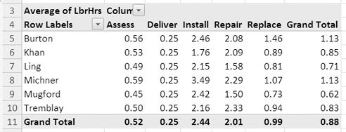
Figure 4-5. Consistent number formatting makes comparisons easier.
When you add date and number fields to the Values area, Sum is the default summary function, and when you add text fields to the Values area, Count is the default summary function. Although these are the most commonly used functions, other functions may be required for some of your pivot table analysis. Including Sum and Count, you can use 11 summary functions for the value fields; Table 4-1 shows a brief overview of these functions.
| Function | Description | Similar Worksheet Function |
| Sum | Totals the source data | SUM |
| Count | Counts numbers, text. and errors in the source data | COUNTA |
| Average | Totals the source data and divides by the number of values | AVERAGE |
| Max | Shows the highest value from the source data | MAX |
| Min | Shows the lowest value from the source data | MIN |
| Product | Multiplies all the source data and may result in a very large number | PRODUCT |
| Count Numbers | Counts the numbers in the source data | COUNT |
| StdDev | Shows the standard deviation for a sample of the source data | STDDEV |
| StdDevp | Shows the standard deviation for the entire population for the source data | STDDEVP |
| Var | Shows the variance for a sample of the source data | VAR |
| Varp | Shows the variance for the entire population for the source data | VARP |
The first six summary functions—Sum, Count, Average, Max, and Product—are available on the context menu when you right-click a value cell in the pivot table. To give the service coordinator a better idea of the range of times required for a job, you'll create two more reports, using the Min (minimum) and Max (maximum) functions:
- Right-click a cell in the Values area, and in the context menu, click Summarize Data By and then Max to see the longest time that each technician spent on each service type.
- Using the context menu, click Summarize Data By and then Min to see the shortest time that each technician spent on each service type.
You can apply the remaining summary functions by using the More Options command as described next. You'll create one more report for the service coordinator by using the StdDevp (standard deviation) function.
- Right-click a value cell in the work orders pivot table.
- In the context menu, click Summarize Data By, and click More Options.
- In the Value Field Settings dialog box, click the Summarize By tab.
- In the Summarize Value Field By list, select StdDevp, and click OK. The pivot table now shows the standard deviation of labor hours per service type for each technician.
This compares the labor hours for each job to the average labor hours for that technician on that type of job. A lower number means that there is less variance in the labor hours. Because all the deliveries are a fixed time of .25 hours, the standard deviation is zero for all the technicians. Assessments ranged from .25 hours to 2 hours, so the standard deviation for all the technicians is low. For installation jobs, the standard deviation is much higher for most of the technicians, and this indicates there is a wide range of times for repair jobs. For example, Michner's labor hours ranged from 1 to 19.5 hours, resulting in a standard deviation of 3.79. The StdDevp function was used instead of StDev because the source data for the pivot table is all the service call data (the entire population) for the company for the past two years. If you had only a sample of the service call data, you could use the StDev function.
- To complete the analysis, reapply the Average summary function by using the context menu.
The pivot table now shows the average time per service type for each technician.
Showing Multiple Value Fields
Now that you have calculated the average times, the service coordinator has asked you to show a count of jobs where the labor was done under warranty. You check the source data and see a column with the heading WtyLbr. WtyLbr is a text field that contains Yes if the labor is covered by warranty.
Currently, the pivot table shows the Average of LbrHrs values, and you'll add the Count of WtyLbr values to show how many service calls were performed under a labor warranty:
- Select a cell in the pivot table so the PivotTable Field List pane is visible.
- In the PivotTable Field List pane, drag the WtyLbr field to the Values area, where it will default to Count of WtyLbr, because it is a text field.
- In the pivot table, a second column of values, with the heading Count of WtyLbr, appears for each service type (see Figure 4-6).
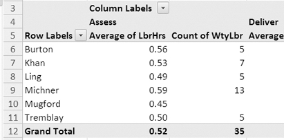
Figure 4-6. Two value fields in the pivot table
With the two value fields now in the pivot table, you can see that Assessments had the greatest number of jobs done under a labor warranty and that Michner is the technician with the highest average labor hours per assessment call.
Changing the Value Field Headings
When a field is added to the Values area of the pivot table, its heading cells show its summary function and its field name. For example, in your pivot table the value fields have the rather long headings of Average of LbrHrs and Count of WtyLbr. To make the headings easier to read, you can shorten them:
- Select a cell in the pivot table to activate it.
- In the PivotTable Field List pane, click the Average of LbrHrs field within the Values area, and click Value Field Settings (see Figure 4-7).
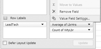
Figure 4-7. Value Field Settings option in the PivotTable Field List pane
- In the Value Field Settings dialog box, type Avg Hrs in the Custom Name box.
- Click OK to close the Value Field Settings dialog box.
A quicker way to change the value field heading is to make the change directly in a pivot table cell:
- In the pivot table, select one of the cells that contains the heading Count of WtyLbr.
- In the cell, type Wty Lbr, and then press the Enter key to complete the change. All the Count of WtyLbr headings show the revised custom name.
Tip The custom name cannot be the same as the field name in the source data. You can add a space in the text, or at the end of the text, to make the custom name slightly different from the field name.
In the pivot table and in the Values area of the PivotTable Field List pane, the value fields now show the custom names you entered. As a result, the columns can be narrower, and the headings are easier to read.
Showing Multiple Summaries for One Value Field
Now that you've finished your reports for the service coordinator, the accountant wants a report on the total service fees and average fee for each type of service call. You'll change the pivot table fields to focus on the fees collected instead of on the hours.
Before you make any changes to the pivot table, you check the source data to see which fields you'll use to calculate the fees. The TotalFee column includes the labor fees and parts fees for each work order and shows the total amount collected on the work order.
In the labor hour reports, you used two different fields in the Values area. For this report you'll add two copies of the TotalFee field to the Values area and use a different summary function in each copy. You'll clear the pivot table to get a fresh start, and then you'll add the fields you need for the accountant's report:
- Select a cell in the pivot table to activate it.
- On the Ribbon, under the PivotTable Tools tab, click the Options tab.
- In the Actions group, click Clear, and click Clear All to remove all the fields from the pivot table.
- In the PivotTable Field List pane, add Service to the Row Labels area, and add TotalFee to the Values area.
- In the pivot table, change the heading for Sum of TotalFee to Total WO.
- In the PivotTable Field List pane, drag another copy of TotalFee to the Values area, where it will become Sum of TotalFee.
- In the PivotTable Field List pane, click the Sum of TotalFee field in the Values area, and choose Value Field Settings.
- In the Value Field Settings dialog box, select the Average function on the Summarize By tab.
- Enter Avg WO for Custom Name.
- Click the Number Format button, and change the number format to Currency.
Note The currency symbol in your pivot table will depend on the regional settings in your computer.
- Click the OK button to close the Format Cells dialog box, and then click OK to close the Value Field Settings dialog box.
- To make the pivot table easier to read, change the number format for the TotalFee field to the Currency format.
The pivot table now shows the total charged for each service type and the average amount charged for each service type (see Figure 4-8). Replacements have the highest total fees collected, and installations have the highest average fee.
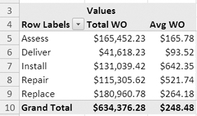
Figure 4-8. Two copies of the same value field in the pivot table
Changing the Order of the Value Fields
Once you have multiple value fields in the pivot table, you may want to rearrange them. You'll move the Avg WO field so it is to the left of the Total WO field in the pivot table layout:
- Select a cell in the pivot table to activate it.
- In the PivotTable Field List pane, in the Values area, drag the Avg WO field so it is above the Total WO field.
Tip Don't drag the field too high, or it will be removed from the pivot table layout. If the pointer has a circle with a bar through it, that indicates the field cannot be dropped in its current location.
- As you drag the field, a light gray bar will appear above the Total WO field, indicating where the field will be dropped (see Figure 4-9).
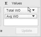
Figure 4-9. Drag a value to a new position in the PivotTable Field List pane.
- Release the mouse button, and the Avg WO button will drop above the Total WO button.
In the pivot table on the worksheet, the value fields switch places, and the Avg WO column is to the left of the Total WO column. Another way to change the value field order is to make the change directly in the pivot table.
- In the pivot table, select the cell that contains the heading Avg WO.
- Point to the border of the cell, and when the pointer changes to a four-headed arrow, drag the heading cell to the right of the Total WO cell.
- As you drag the field, a gray bar will appear to the right of the Total WO field, indicating where the field will be dropped (see Figure 4-10).
Figure 4-10. Drag a value to a new position in the pivot table.
- Release the mouse button, and the Avg WO field will drop to the right of Total WO.
In the PivotTable Field List pane, the value fields switch places, and Avg WO is below Total WO.
Changing the Position of the Value Fields
When you add multiple value fields to a pivot table, their headings appear, by default, in the column area. If you prefer, you can move the headings to the row area, where the value fields will be listed vertically instead of horizontally.
In the PivotTable Field List pane, Excel automatically adds a special field button when multiple value fields are in the layout. You'll use that button to relocate the value fields.
- Select a cell in the pivot table to activate it.
- In the PivotTable Field List pane, in the Column Labels area, locate the Σ Values button that represents the value field labels (see Figure 4-11).
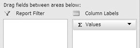
Figure 4-11. Value field labels in the PivotTable Field List pane
- Drag the Σ Values button to the Row Labels area, below the Service field.
- Release the mouse button, and the value field labels will move to the Row Labels area.
In the pivot table, the value field labels are listed under each service type. To see the summary differently, you could move the Σ Values field in the PivotTable Field List pane so it's above the Service field in the Row Labels area. With that layout, the services would be listed under each value field heading.
Showing or Hiding Grand Totals
On some service calls, two technicians are required instead of just one. The service manager wants a report on the labor costs for one-technician and two-technician jobs for each type of service call. You check the source data and see a column with the heading Techs. The number in that column indicates whether one or two technicians were required. You can use the column with the heading LbrCost to show the total labor costs for each work order.
First you'll clear the pivot table layout, and then you'll add different fields so you can analyze the labor cost for each type of service call:
- Select a cell in the pivot table to activate it.
- On the Ribbon, under the PivotTable Tools tab, click the Options tab.
- In the Actions group, click Clear, and click Clear All to remove all the fields from the pivot table.
- In the PivotTable Field List pane, add Service to the Row Labels area, and add LbrCost and LbrHrs to the Values area.
- In the PivotTable Field List pane, drag the Σ Values button to the Column Labels area so the value fields are arranged horizontally.
The pivot table now shows the total labor cost for each service type, and there is a grand total at the bottom of the pivot table that totals the columns of labor costs and labor hours for all services (see Figure 4-12). These are the grand totals for columns.
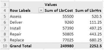
Figure 4-12. Grand totals for columns
Because there are no label fields in the Column Labels area, the pivot table has no grand totals for rows. There is nothing in the pivot table that should be totaled across the row—labor cost and labor hours are different fields and shouldn't be totaled.
The service manager wants the summary by one- and two-technician calls, so you'll add the Tech field to the Column Labels area:
- In the PivotTable Field List pane, remove the check mark from LbrHrs. This will remove it from the pivot table to simplify the layout for now.
- In the PivotTable Field List pane, drag the Techs field to the Column Labels area.
Now that there is a field in the Column Labels area, there is a grand total for rows at the right of the pivot table, which shows the total labor cost for each service type (see Figure 4-13). There is still a grand total for columns at the bottom of the pivot table, which totals the labor costs and shows the total cost for one-technician calls, the total cost for two-technician calls, and the total for all calls.
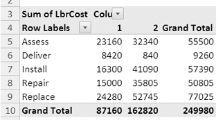
Figure 4-13. Grand totals for rows and grand totals for columns
When you add fields to the Row Labels or Column Labels area, Excel automatically adds the grand totals to the pivot table layout. In some cases, you may not want either of the grand totals displayed. You'll hide the row grand total at the right of the pivot table. This will reduce the number of columns in the pivot table and will help focus the reader's attention on the comparison between one-technician and two-technician calls.
- Select a cell in the pivot table to activate it.
- On the Ribbon, under the PivotTable Tools tab, click the Options tab.
- At the far left, in the PivotTable group, click the Options command (see Figure 4-14) to open the PivotTable Options dialog box.
Figure 4-14. The pivot table Options command
- On the Totals & Filters tab, in the Grand Totals section, remove the check mark for Show Grand Totals for Rows (see Figure 4-15).
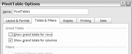
Figure 4-15. Set the grand totals options
- Click OK to close the PivotTable Options dialog box.
The grand totals for rows, at the right of the pivot table, have been removed, and the grand totals for columns are still visible. The one-technician and two-technician calls can be compared, without the distraction of the grand totals for rows.
When you want to see the grand totals for rows again, you can use a command on the Ribbon to turn them on. You'll show the grand totals for rows in your pivot table again:
- Select a cell in the pivot table.
- On the Ribbon, under the PivotTable Tools tab, click the Design tab.
- In the Layout group, click the Options command to open the PivotTable Options dialog box.
- Click On For Rows and Columns.
The grand totals for rows reappear in the pivot table.
Creating Subtotals
The accountant likes the labor cost report you produced and has asked to see the labor costs broken down by rush and nonrush calls for each service type. In the source data, you find a column with the heading Rush. If a rush job was requested, a Yes is entered in that column. You'll add the Rush field to the pivot table layout.
Currently your pivot table has one field in the Row Labels area and one field in the Column Labels area. When you add a second field to the Row Labels area, subtotals will be created.
- Select a cell in the pivot table to activate it.
- In the PivotTable Field List pane, add a check mark to the Rush field.
Excels adds the Rush field to the Row Labels area in the pivot table, and each label in the Service field shows a subtotal of the Rush labels below it (see Figure 4-16). The rows with a Yes label are the rush calls, and the rows with a (blank) label are the nonrush calls.
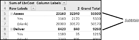
Figure 4-16. Subtotals for Row Labels area
Excel will also add subtotals to the pivot table if you place more than one field in the Column Labels area. To see a more detailed breakdown of the labor costs, you'll add the LeadTech field to the pivot table layout. That will let you see, for one-technician and two-technician jobs, what each technician's total labor costs are.
- Select a cell in the pivot table to activate it.
- In the PivotTable Field List pane, drag the LeadTech field to the Column Labels area, above the Techs field.
The LeadTech field is added to the Column Labels area in the pivot table and subtotals the labor costs for one-technician and two-technician jobs (see Figure 4-17).
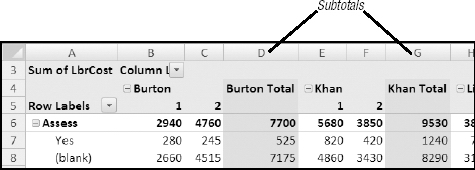
Figure 4-17. Subtotals for Column Labels area
When there are multiple fields in the Row Labels area or the Column Labels area, the last field in the list of fields is called an inner field (see Figure 4-18). All the fields above it in the list of fields are called outer fields. Only the outer fields automatically display subtotals. The inner field does not.
In Figure 4-18 the District field has been added to the Row Labels area.
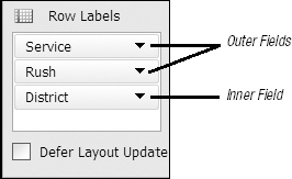
Figure 4-18. Inner and outer fields in the PivotTable Field List pane
Because it is the last field in the list of Row Labels, District is the inner field and doesn't display subtotals. Rush, which was previously the inner field, becomes an outer field, and displays subtotals. Remove the District field, and the Rush is once again the inner field.
Showing or Hiding Subtotals
As you have seen, subtotals are automatically added when multiple fields are placed in the Row Labels area or Column Labels area of the pivot table. Although the subtotals can add useful information, you don't always want them in the pivot table. To simplify a pivot table layout, you may want to hide the subtotals for one or more of the pivot fields.
First you'll change the subtotal settings for all the fields in the pivot table, and later you'll adjust the settings for individual fields. Because the pivot table looks a bit crowded, with all the columns of labor costs, you'll turn off all the subtotals in the pivot table to see whether that improves the appearance.
- Select a cell in the pivot table.
- On the Ribbon, under the PivotTable Tools tab, click the Design tab.
- At the far left, in the Layout group, click the Subtotals command (see Figure 4-19).
- Click Do Not Show Subtotals.
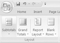
Figure 4-19. Subtotals command on the Ribbon
The Service labels remain in the pivot table, but the labor costs have been removed from those rows. The columns with total labor costs for each lead technician have also been removed. The grand totals for rows and grand totals for columns remain in the pivot table.
It was easy to hide the subtotals for all the fields in the pivot table, but now suppose you'd like to show the subtotals for the Service field to see the total cost per service type. You'll change the subtotal setting for just that field:
- In the pivot table, right-click one of the Service labels, such as cell A6.
- In the context menu, click the Subtotal "Service" option.
The LeadTech subtotals remain hidden, but the subtotals for the Service field are now visible. The grand totals for rows and columns remain in the pivot table.
Showing Subtotals Above or Below Items
In a pivot table layout, subtotals for the Row fields can appear above or below the items that they subtotal. Currently, the Service field in your pivot table has its subtotals displayed above its items. You'll change one of the pivot table settings to display all the subtotals again and select a position in which to display the row subtotals:
- Select a cell in the pivot table.
- On the Ribbon, under the PivotTable Tools tab, click the Design tab.
- At the far left, in the Layout group, click the Subtotals command.
- Click Show All Subtotals at Top of Group.
Note Changing this setting will affect the position of the subtotals in all the row fields in the pivot table.
The subtotals for the Service field appear above the rush items. Because the Rush field is the last field in the Row Labels area, with no items below it, the Rush field is an inner field and does not display subtotals. The LeadTech field, in the Column Labels area, also shows subtotals again, but these come after the LeadTech items. Only the subtotals in the Row Labels area change position.
Next, you'll apply the remaining option for subtotals to display them below the items.
- Select a cell in the pivot table.
- On the Ribbon, under the PivotTable Tools tab, click the Design tab.
- At the far left, in the Layout group, click the Subtotals command.
- Click Show All Subtotals at Bottom of Group.
The outer row field, Service, displays a heading row with only a label at the top of the group and a subtotal row at the end of the group of items (see Figure 4-20). The Column Labels subtotals do not change.
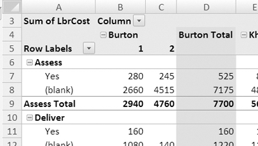
Figure 4-20. Subtotals at bottom of group
Changing the Function for a Subtotal
When subtotals appear in the pivot table, they automatically use the Sum function to total the data in the group. You can change the function that is used to summarize the value fields just as you changed the summary function for a value field. You'll change the summary function for the Service subtotals to see a count instead of a sum.
Note If there are multiple value fields in the pivot table, the subtotal functions will be the same for all value fields. You can't apply different summary functions to the individual value fields in a pivot table.
- In the pivot table, right-click one of the Service labels, such as cell A6.
- In the context menu, click Field Settings to open the Field Settings dialog box.
- On the Subtotals & Filters tab, in the Subtotals section, select Custom (see Figure 4-21).
- In the list of functions, click Count, and then click OK to close the Field Settings dialog box.
The subtotals for the Service field now show the count of records for each service type, and the label for the subtotal has changed to end with Count, instead of Total. For example, the first service type is Assess, and its subtotal label has changed from Assess Total to Assess Count.
Note If you point to a custom subtotal value, the pivot table tool tip will show the name of the value field, not the summary function used in the subtotal. For example, if you point to cell B9, its tool tip title is Sum of LbrCost, not Count of LbrCost. The Row information in the tool tip is correct and shows Row: Assess Count.
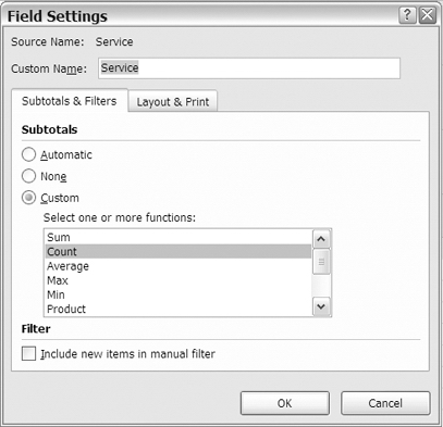
Figure 4-21. Custom functions for subtotals
Creating Additional Subtotals
When subtotals are automatically created in the pivot table, there is only one subtotal row peritem. You can create additional subtotals to show other summary functions. Your pivot table currently shows the sum of labor cost in the Service field. You can add another subtotal to the field to show the highest labor cost.
Note If you include more than one subtotal for a field, the subtotals for that field are shown at the bottom of the group, even if you have selected Show All Subtotals at Top of Group.
- In the pivot table, right-click one of the Service labels, such as cell A6.
- In the context menu, click Field Settings to open the Field Settings dialog box.
- On the Subtotals & Filters tab, in the Subtotals section, select Custom.
- In the list of functions, click the Sum function and the Max function.
- Click the OK button to close the Field Settings dialog box.
The accountant's report on labor costs is now completed. The subtotals for the Service field show the sum of labor cost and the highest labor cost, while the label for each subtotal shows its summary function name (see Figure 4-22).
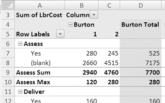
Figure 4-22. Multiple subtotals
Note Grand totals may be incorrect for subtotals if the function used is different from the function used in the value field. You may want to hide the grand totals when using subtotals with custom functions.
Grouping Numbers and Dates
Up to this point, you've added fields to the Row Labels area and Column Labels area and then summarized the value fields by the labels that automatically appear. For example, when you added the Service field to the Row Labels area, the labels Assess, Deliver, Install, Repair, and Replace appeared in column A, and you summarized the labor hours or labor costs for each of those labels.
In a pivot table, you can group numbers, dates, or text to create new labels and summarize the data by these groups. For example, if your source data contains dates, you can group the dates by year to show annual totals. If the source data has numeric test scores, you can group the numbers into 1–50 and 51–100 and show a count of results in each range of scores.
Grouping Numbers
The service manager wants to know how long customers are waiting for a service call. In the source data, you can see a column with the heading Wait. This is the number of days between the request date (ReqDate) and the day of the service call (WorkDate). To create a count, you'll use the WO field, which is the work order number. Every row has a work order number, so this will give you a reliable count.
You'll add the Wait field to the pivot table and organize the numbers into groups to create new labels. To start, you'll remove all the fields from the pivot table layout and then add different fields:
- In the PivotTable Field List pane, remove the check marks from all the fields. The empty pivot table appears on the worksheet.
- In the PivotTable Field List pane, drag the Wait field to the Row Labels area.
- Drag the WO field to the Values area, where it will become Count of WO, because the work order numbers are stored as text.
In the Row Labels area, you can see all the wait days listed, and in the next column is the count of work orders for each wait period. For example, 19 work orders had a 2-day wait, and 68 work orders had an 8-day wait (see Figure 4-23).
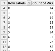
Figure 4-23. Wait days in the row labels
This level of detail may be required occasionally, but you could group the wait days, instead of listing each number individually. For example, you could list the days in groups of seven days, which would group the wait days into week lengths. This would give you a shorter list of items and would make it easier to spot which wait lengths are most common.
- In the pivot table, select a cell in the Wait labels area, such as cell A5.
- On the Ribbon, under the PivotTable Tools tab, click the Options tab.
- In the Group group, click Group Field (see Figure 4-24).
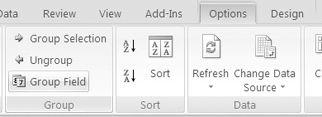
Figure 4-24. Group Field command
Note The Group Field command is available only if the currently selected field is a number or date field.
- In the Grouping dialog box, the lowest and highest number from the Wait field are automatically entered as the Starting At and Ending At numbers. The By box contains a 10, which is the default number for grouping (see Figure 4-25).
- Leave the Starting At box set at zero, which is the lowest number in the data source.
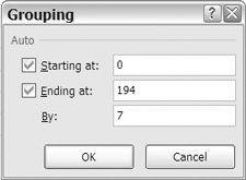
Figure 4-25. Grouping dialog box
- In the By box, type 7, which is the number of wait days you want in each group.
- Click the OK button to close the Grouping dialog box.
Instead of individual wait days, the row labels now show number groups in seven-day intervals, such as 0–6 and 28–34 (see Figure 4-26).
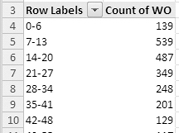
Figure 4-26. Grouped numbers for Wait labels
You can send your report to the service manager, showing that most customers had a two-to three-week wait for service.
Ungrouping Items
If your pivot table contains groups, you may want to remove them. You'll remove the grouping from the Wait field to show the individual numbers again.
- Right-click a cell that contains a Wait label, such as cell A5.
- In the context menu, click Ungroup.
The grouping is removed from the Wait field, and the individual Wait days are shown.
Grouping Dates
You can also group dates in a pivot table field to display a range of dates under one label. To determine the busiest times of the year, the service manager wants a report that shows a count of service calls for each month. The WorkDate field in your source data contains dates that span almost two years. Instead of summarizing the data by the individual work dates, you can group the dates by year and month. You'll remove the Wait field from the pivot table and move the WorkDate field into the Row Labels area:
- In the PivotTable Field List, remove the check mark from the Wait field.
- Add a check mark to the WorkDate field to add it to the Row Labels area.
In the Row Labels area, you can see all the work dates listed, and in the next column is the count of work orders for each day. However, the list is very long, and you want to see a summary for each month, instead of each day.
- In the pivot table, right-click a cell that contains a WorkDate label, such as cell A5.
- In the context menu, click Group.
- In the Grouping dialog box, the earliest date in your source data appears in the Starting At text box. The latest date in your source data appears in the Ending At text box. You can leave these default entries.
- In the By list, select Years and Months as the interval for your grouping (see Figure 4-27).
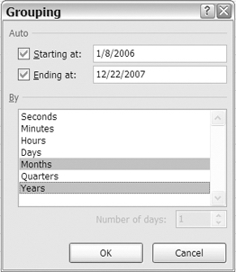
Figure 4-27. Grouping dialog box
- Click the OK button to close the Grouping dialog box.
Instead of individual dates, the row labels now show Years and Months so the service manager can see the number of work orders that were completed in each month.
In the PivotTable Field List pane, Excel adds a Years field to the end of the field list. You grouped by Years and Months so that the data for each year is summarized separately. If you selected only Months, the January data for both years would have been summarized together.
Grouping Selected Items
The service manager has assigned each technician to one of two teams, Team A and Team B. To see how the work orders have been split between the two teams, you'll create a report that counts the work orders for each group.
The Group Field command and Grouping dialog box work only for number and date fields. For text fields, you can select and group labels to display those items together. You'll remove the WorkDate field from the pivot table and move the LeadTech field into the Row Labels area:
- In the PivotTable Field List pane, remove the check marks from the WorkDate field and from the Years field.
- Add a check mark to the LeadTech field to add it to the Row Labels area.
In the Row Labels area, you can see all the technician names listed, and in the next column is the count of work orders for each technician. You'll group the lead technicians into the two teams—Burton, Ling, and Tremblay are in Team A, and Khan, Michner, and Mugford are in Team B.
- In the pivot table, select cell A4, which contains the label for Burton.
- Hold the Ctrl key, and select cells A6 and A9, the labels for Ling and Tremblay.
- With the three labels selected, on the Ribbon, under the PivotTable Tools tab, click the Options tab.
- In the Group group, click Group Selection.
This creates a new field named LeadTech2, which you can see in the PivotTable Field List pane, and a new set of labels in the pivot table. The group you created for the selected technicians is labeled Group1, and each of the remaining technicians has a separate label (see Figure 4-28).
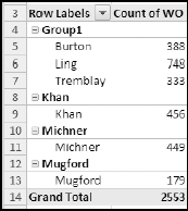
Figure 4-28. Group selected labels
Next, you'll group the remaining technicians:
- In the pivot table, select cell A9, which contains the label for Khan. You can select either the outer label or the inner label, and the result will be the same.
- Hold the Ctrl key, and select the labels for Michner and Mugford. If you selected an outer label in Step 1, continue to select outer labels. If you selected an inner label in Step 1, continue to select inner labels.
- With the technician labels selected, on the Ribbon, under the PivotTable Tools tab, click the Options tab.
- In the Group group, click Group Selection.
This creates another item, named Group2, in the LeadTech2 field.
When you create groups by using the Group Selection command, they are automatically given a numbered name, such as Group1. You can change these names, so they are more meaningful as headings in the pivot table. You'll change the group labels so they show the team names:
- Select cell A4 that contains the Group1 group label.
- Type Team A as a new name for the group.
- Press the Enter key to complete the name change.
- Rename the Group2 group label as Team B (see Figure 4-29).
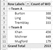
Figure 4-29. Group labels renamed
The pivot table now shows the lead technicians grouped into their teams. If you want to see the total for each team, you can turn on subtotals, above or below the group items. To see the team totals without the technician names, remove the check mark from LeadTech in the PivotTable Field List pane.
Note If you want to ungroup items that you grouped by selecting them, you will have to ungroup each group separately. Click a group's label cell, and then click the Ungroup command in the Ribbon. When the groups have all been ungrouped, the field's name will be removed from the PivotTable Field List pane.
You can save your file now as WorkOrders_02.xlsx. That will leave the original file unchanged since its last save, and you can use the new file for your work in the next chapter.
Summary
In this chapter, you learned different ways to summarize the data in the pivot table. First, you changed the function that was used for a value field and tested the result of using different functions. You added multiple value fields and summarized the same value field using different functions.
Next, you hid and showed the grand totals for rows and columns, added subtotals to the outer fields in the pivot table, and positioned the subtotals above or below the items.
Finally, you grouped the items in the row fields to summarize by a range of numbers or a date range. For the text field, you manually selected and grouped the items.
I have now covered the basics of summarizing the pivot table data, and next you'll apply formatting to enhance the presentation of the data.