
A favorite pet napping in the sun or wild flowers swaying in the breeze make great subjects for drawings, but not all potential subjects will come composition-ready. For example, I’m often inspired by hand-painted pottery. But photographing a beautiful piece where I discover it on a cluttered shelf that’s covered in dust certainly won’t do it any justice! Setting up your own still life composition puts you in control, allowing you to stage the subject in the best light—figuratively and literally! Not only can you adjust lighting, you also can physically move various objects within the composition to achieve a picture-perfect reference, as I’ve done in this still life example.
Capturing the Moment Near a large window, I play with the elements to find the best arrangement, lighting, and pattern of shadows. Many artists would then begin drawing, but I begin photographing. Still lifes are inanimate, but natural lighting shifts quickly, transforming highlights and shadows. Photography stops time—a real advantage!
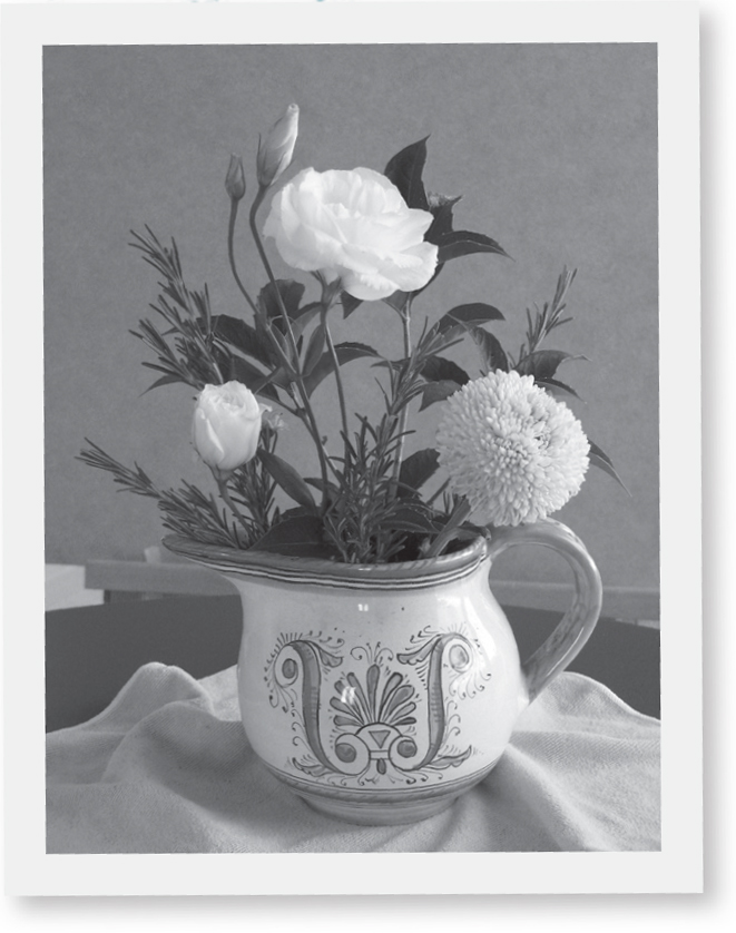
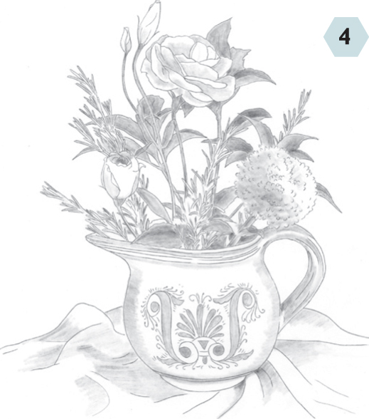
Step One First establish the main shapes. I block in simple outlines with an HB, starting with the largest shape, the circular pitcher bowl. I relate the size and position of the flowers to the “vase,” studying the photo for proportion clues; for example, the two largest blossoms are the same width, about half the width of the pitcher.
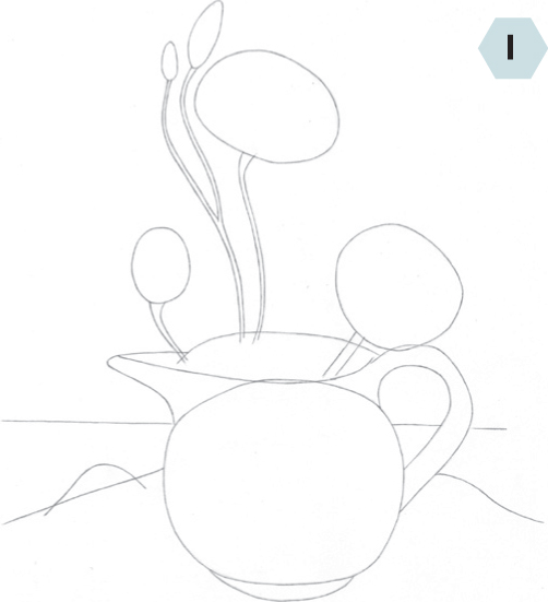
Step Two With the main shapes established, it’s time to rough in smaller detail shapes. Still using the HB, I map out the design on the pitcher, and then I draw rounded triangles for leaves, varying the lengths according to the proportions I see in my photo. I establish some of the main branches of Rosemary, adding short lines to represent needles. I also map out a few cloth fold lines.
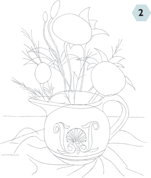
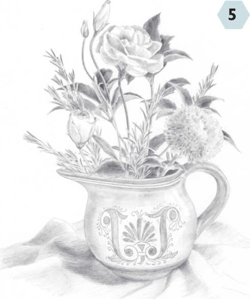
Step Three After securing heavyweight tracing vellum over my sketch with artist’s drafting tape, I sharpen my HB for a more refined outline, using the basic sketch as guide. I delineate the petals of the Lisianthus blossoms and make short curving lines for the Chrysanthemum texture. I also refine the leaves and Rosemary. I detail the pitcher, but decide not to copy the table line. I transfer this drawing to plate-finish Bristol paper.
Step Four I refer to the photo to find the main shadow patterns. Then, with a large blending stump, I apply the lightest tone to the shadows of the Lisianthus petals before laying a slightly darker tone on the shadows of the mum. For the leaves, I deepen the tone, switching to the stump’s point for stems and Rosemary needles. Using the stump’s side, I shade the pitcher using horizontal curved strokes that follow the form. I also add basic shading to the cloth.
Step Five With my HB, I make long strokes in the direction of the petals’ curves. For leaves, needles, and stems, I switch to a 2B, applying heavier pressure for deeper shadows. Next I switch to the tip of the stump to revisit the leaves, adding tone to deepen the value. I indicate lighter shadows on the mum. Then, returning to my HB, I shade the pitcher and cloth with long curved strokes.
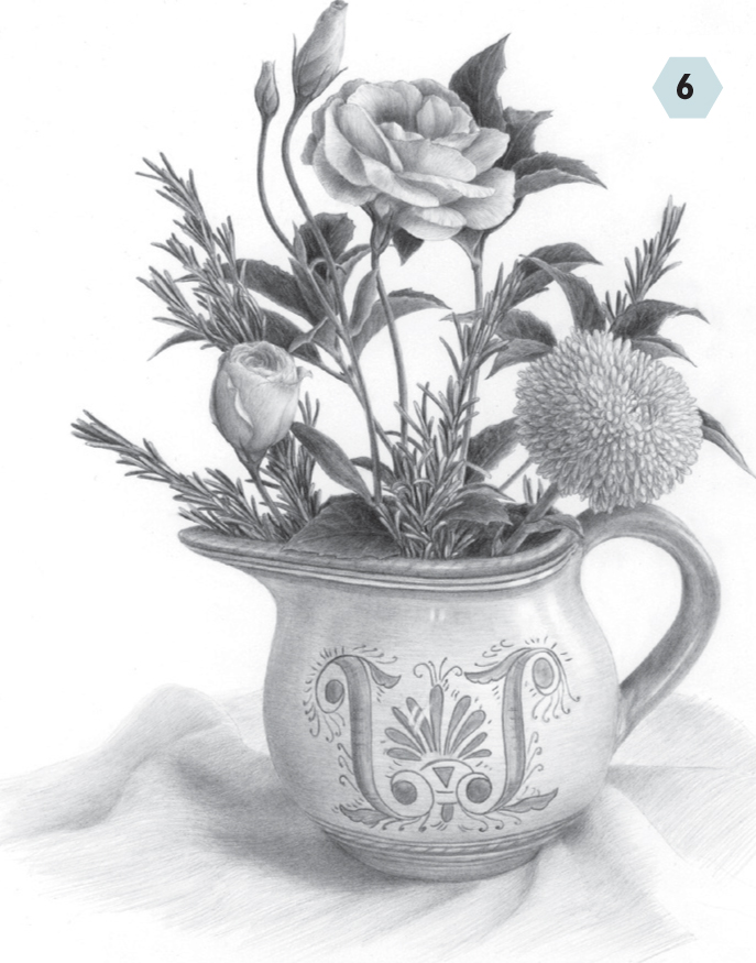
Step Six I deepen tones starting with the leaves, where I apply a 4B with heavy pressure, blend with a stump, and repeat. I alternate between a 2B and a 4B for stems and needles, and then use an HB on the flowers, with small U-shaped strokes for the mum’s texture. I use a 2B for the Lisianthus’ deepest and the mum’s larger shadows. I also tone the pitcher with the sides of the 2B and HB before picking out highlights with a kneaded eraser. Next I tone the decoration with the 4B, and the cloth using the side of the 2B. After a final check against my photo, I clean up with my eraser.
Lighting can be soft and diffuse or bright and intense. And depending on the position of the light source, it can create strong silhouettes or shape-defining highlights. The possibilities are endless! Don’t be afraid to play and experiment—the more you do, the more interesting results you’ll produce. You might be surprised by what you discover!
NO
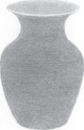
The slightly elevated viewpoint from which we’re viewing provides a roundness to the bottom and lip of the vase. But the backlighting of the subject means this rounded form has no highlights; it becomes a silhouette with a somewhat flat and two-dimensional look. Backlighting can be great for creating drama, but when the form is more important than the mood, it may not be the right choice.
YES
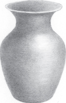
In this example, we’re again viewing the vase from slightly above. But something has changed: This time, the vase appears more three-dimensional. The difference is in the lighting. With the light source directed toward the vase from a 3/4 angle, a nice highlight and form shadow result, further defining the roundness and dimension of the form. By emphasizing its form, we’ve put this vase in the best light!