Light and white objects puzzle many artists, but they can be a real joy to work with once you figure out the right approach. First it’s important to establish that no “white” subject is ever truly white; light shading depicts the gray-toned lights and highlights of even white subjects, which would have no form or dimension without. Even with this gray shading, we can create the illusion of a white object by employing the contrast of a dark background, which simultaneously directs the eye to the lighter object and creates interest. A dark background further helps us define the shape of the object; when we fill in the negative space, the shape of the lighter object appears. I’ll show you how it’s done with a pretty white ibis!

Tracking Down a Subject The ibis is a frequent visitor to my backyard. Unfortunately, I never seem to get my camera out before it moves on to visit another neighbor. So I decided to go to the local zoo—often in zoos and parks, birds and animals are more comfortable with people, making them easier to photograph. The ibis spends a lot of time near water and is very active, so I knew I wanted to show these features in my drawing. With that in mind, I followed the birds around with my camera, squatting at their eye level. And I got a great shot!
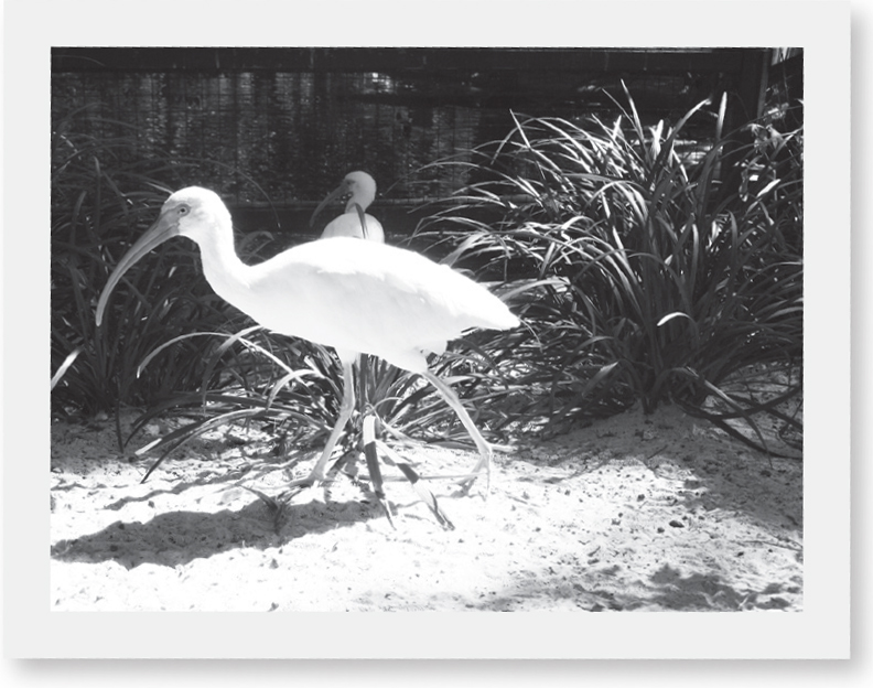
Combining References While at the zoo, I took pictures with water and grasses in the background too. None of those ibis shots would’ve made a good drawing, but that doesn’t mean I need to abandon them all together. Instead, I combine references, pairing the best ibis pose with this photo, which has a pleasing background with dark tones that will emphasize the bird’s whiteness. Remember that you don’t have to use everything in your references.

Step One Approaching a light subject is the same as drawing any other at the start. When I look at my reference, I see that the body is an elongated egg shape. For the neck, the curve is important, as is making sure the length and width are proportionate to the body. For the head and beak, I check proportions and angles against the photo. I sketch simple lines to represent legs and feet, and I place the eye and pattern on the head. Then I turn to a second photo for the background, adding a few lines for the ground and some of the main curves for the grasses.

Step Two Because I’m combining references, my rough sketch is the first time I’m seeing my subject and background together in one design. Mapping out the basic shapes helps me determine if I’ve made a good choice, which I think I have. Now I can move on to sketching in a few more details, such as feathers, the line where the feathers meet the leg, and the beak opening. I also draw a few more grass blades, adding a second line to each to get a better feel for the dimension.

Step Three Now it’s time to use my guide to create a more refined sketch. After taping a piece of heavyweight vellum over my initial drawing, I redraw the bird, this time eliminating unnecessary construction lines and creating a more natural shape. I add in a few short lines to indicate texture amongst the feathers, using elongated U-shaped lines to delineate larger feathers. Next I redraw the grasses, mixing in additional blades of grass. And I draw a few lines on the ground to indicate a texture there.

Step Four After transferring my sketch to a piece of plate Bristol, I take a large stump, dip it in graphite powder, and use the side to lay tone for the water, making long horizontal strokes. I create variation with a second layer in places before switching to the stump’s point to darken between grass blades and add light ground shadows. With the side of a thinner stump, I apply very light shading to the bird. With the point of a very thin stump, I darken the eye and add a shadow under the feet.
Just as I use the dark of the negative space to help define light subjects, I use light spaces to help shape and define dark subjects when I’m drawing them. Whether it’s dark water in the background or a blackbird’s head in the foreground, dark subject matter finds me “drawing” a lot with my eraser! First I establish a dark base tone, and then I lift out to create the lighter tones and highlights.
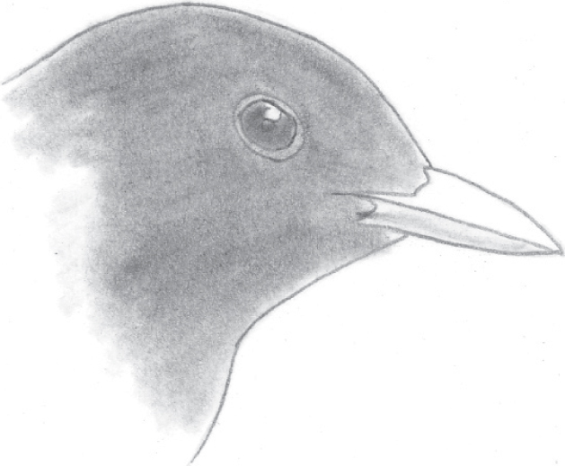
Step 1 After establishing the outline, I shade the head with a medium stump, stroking in the direction of the feathers. Before moving on to the eye, I determine the location of the highlight so I can “save” the white of the paper. Working around that area, I darken the eye and pupil with the stump. Then, with a very light touch, I add tone to the lower beak.

Step 2 After the initial tone is placed, I use the eraser as I would a pencil, making strokes that follow the direction of the feather texture. As I lift out tone, the form of the bird’s head becomes more developed. A kneaded eraser is ideal for this task, because it can be molded into different shapes, producing a nice variation in line thickness.

Step 3 Now I alternate between pencils and my eraser to refine the development. I use both the side and point of a 2B to create short strokes for the feather texture. Then I develop the darkest areas with a 4B. I shade the beak using an HB and a 2B. And then I revisit the highlights, lifting out the tone with a kneaded eraser to create variation in the head and eye.

Step Five Developing the background will make it easier to determine the appropriate values for the “white” subject in contrast. So with the side of a 2B and then a 4B, I apply horizontal strokes to the water, varying pressure and spacing, and lifting out reflections. As I work, I also lift out the grass blades to keep the edges clean. I return to the side of the 2B to shade the grass with long strokes. Using the side of a 6B lead in a large holder, I add texture to the ground with extremely light pressure, letting the paper pick up irregular touches of graphite. With the point of an HB, I add texture to the bird with short strokes, lightly shade the beak with long strokes, and delineate the eye. Then I fill in the dark pupil with a sharp 2B.
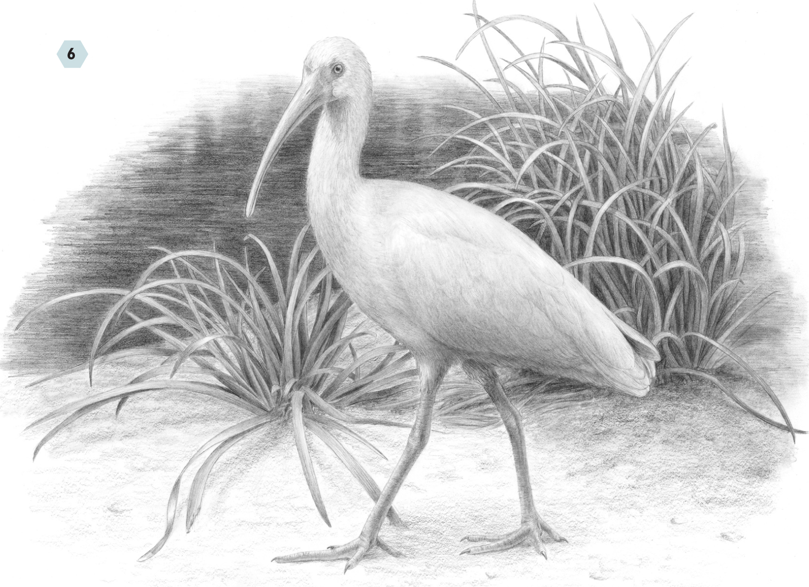
Step Six I refine the grass blades with the side and point of a 2B. Where necessary, I darken the spaces between the blades using the 2B and a 4B. With the side of the 4B, I add texture to the ground. The negative space surrounding the ibis is well developed, defining the bird’s shape; now it’s time to refine the form. With the side of 2B, I model the beak, using the point for the edges. For feathers, I alternate between the sides and points of an HB and a 2B. The feather texture of the ibis is subtle, so I work with a light touch and slowly build up tone, using my kneaded eraser to pick out light areas. Around the neck, I apply short strokes, switching to longer strokes for the body and larger feathers. I use heavier pressure only in the shadowed areas on the bird’s underside. For the legs, I make long strokes with the side of the 2B; over these, I apply shorter curved strokes across the legs with the point of the pencil. I also use the point of the pencil to draw the details of the feet. When satisfied, I use the kneaded eraser to pick out the last of the highlights.