
The best inspiration often comes from nature, and I’m particularly drawn to my garden in full bloom! I often make quick sketches outdoors, but when I want to complete a more finished drawing, my camera is a great aid, as it captures the detail of the delicate subject as well as that moment’s exact lighting. And sometimes the camera really rewards by capturing a fleeting moment in nature, such as the time a passing butterfly decided to pose for me on one of the prettiest flowers in my garden—the Fountain Butterfly Bush!

Adapting as Needed Because nature is uncontrollable, a willingness to adapt goes a long way when working with outdoor subjects! When the butterfly posed in my garden, I got a beautiful shot of the insect—but not of the flower. I continued taking photos anyway, knowing I could combine the two elements on paper. But then the sun didn’t cooperate, and I couldn’t get a good pattern of light and shadow. So I adapted again, this time bringing the outdoors indoors and photographing a flower from my garden in the natural light from my window.

Step One Don’t be intimidated by intricate subjects like this Fountain Butterfly Bush. The small details can wait; at this stage, simply look for large shapes. After positioning an elongated oval for the blossom mass, I block in the butterfly, referring to my photos to be sure the proportion is correct in relation to the flower. I pay careful attention to the angles and the shape of the negative space as I sketch the leaves.

Step Two Now I move on to smaller shapes, but still keep my sketch very vague, looking to establish placement and proportion before focusing on details. I draw small circles in the oval to represent the placement of the florets, also adding lines to indicate those that have not opened. Moving on to the butterfly, I demarcate the wings within the block, and I represent the body with a thin oval. I also create detail lines along the leaves’ edges.

Step Three Before beginning my more refined sketch, I attach a piece of heavyweight tracing vellum over my initial drawing with tape. Using the shapes underneath to guide my proportions, I draw the individual florets, paying attention to changes in the angle as I approach the sides of the flower. Now that the blocking is established, the many florets aren’t overwhelming! I also redraw the wings more accurately, shaping the edges and indicating the pattern. I redraw the leaves to refine the edges. And then I transfer my sketch to plate Bristol board.

Step Four For the initial light graphite wash, I use a medium stump, applying light pressure to the tip to tone the florets. I pick up heavier graphite for the dark tone at the florets’ center, and then I switch to the side of the stump for the wings, which I tone with long strokes. I use heavier tone for the edges and dark patterns of the butterfly, as well as the body of the insect, which I fill with circular strokes. I switch to a large stump to shade the leaves, moving outward from the center vein. And I use the stump point to wash over the stem with a long stroke.

Step Five Using the side of a 2B, I apply somewhat heavy pressure to the upper unopened blossoms and stems. I darken the centers of the florets with the pencil point, replicating the tiny shadows, not just making dots. Now applying light pressure, I make long strokes along the wings; with a dull point, I create short strokes to add tone to the edges and make the zigzag pattern near the head. I switch to the side of a 4B for the dark portions of the wing pattern. And with circular strokes, I darken the butterfly’s body. To develop the leaves, I use the side of the 2B, stroking in the direction of the veins. I also darken the stem.
On page 15, I explained why the direction of the light source was important, but I only touched upon the intensity of light—or whether it’s bright and direct or soft and diffuse. Typically, I enjoy the effect of direct sunlight, as it can really make a subject more pronounced by creating strong shadows and contrasts. For this lesson, however, I was able to get better contrasts indoors with indirect lighting. It’s good to always explore your options to find out what works best for each new subject!

Indirect Lighting When lighting is soft and diffuse, there are no strong highlights on the subject. There also are no strong shadows. This can result in a subject without much variation in tone, as shown here. But indirect lighting also can produce a light and romantic feel when applied to a proper subject, such as one that already contains strong contrasts.
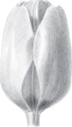
Direct Lighting In this example, the intensity of the light creates stronger highlights—and stronger shadows, as well. Those contrasts and variations make the cup shape of the tulip stand out, also giving the inner petals greater definition. Strong highlights and shadows are appropriate to this bud.

Step Six I lay in the deepest shadows of the florets with the point of my 4B before returning to my 2B to refine the shading. I delicately pick out highlights with my eraser, and then revisit with an HB to redefine any edges I’ve lost. I apply another layer of the same types of strokes as before to the butterfly before lifting out a few white spots on the wings with my eraser. I return to the darkest areas of the wings with the 4B, and then I alternate between the point and side of the 2B for the leaf shadows. Along the leaves’ edges, I construct more detail using the pencil point and my eraser. Then I use the side of the 2B to finish the stem.