All the drawings we’ve accomplished thus far in the book have been realistic depictions, but we’re going to approach this project with a different method, something called “trompe l’oeil” (French for “fooling the eye”). This technique is more typically applied to painted murals, but no matter the medium, it’s a way for artists to heighten the illusion of three dimensions through optical tricks, including the use of shallow depth, overlapping objects, and careful placement of shadows.
When you’re dealing with multiple objects that have varying shapes, the best composition doesn’t always jump out at you right away. I will rearrange the objects to find the most pleasing pattern, making small thumbnail sketches to help me simplify the composition and see the objects in a different way.
No

In life, I liked this selection, but when I created the thumbnail, I saw the way the horseshoe was “wedged” into the triangular space, which didn’t work for me.
No
Horseshoe aside, here’s another setup that appeared balanced at first. But when I sketched my thumbnail,, I found there was too much “weight” to one side.
Yes

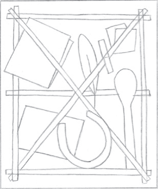
I was pretty sure this composition was what I wanted. Sketching the thumbnail confirmed my suspicion. I like this balance of objects and how the shapes direct the eye.
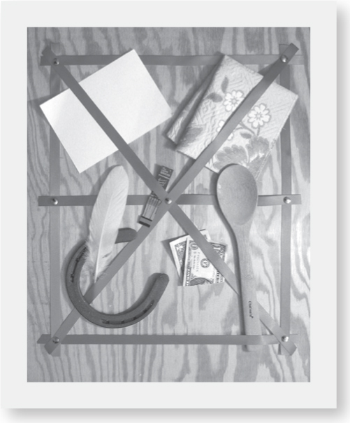
Exploring a Motif For this drawing, I decided to create a “portrait’ of my family with a collection of mementos. The letter rack is a common motif within the trompe l’oeil genre, and it provided an opportunity to create a composition with layered meaning as well as visual interest. The overlapping of objects is important here, as is the shallow depth. And I adjusted the lighting to create obvious shadows, enhancing the sense of illusion.

Step One After selecting the best composition, I begin my drawing with an HB. I start with the ribbons of the letter rack, which create a gridlike pattern that will make it easier for me to place the other objects. I sketch the outlines of each shape, ignoring all detail but paying attention to accuracy for position and overlaps.

Step Two On a piece of heavyweight vellum layered over my drawing, I carefully retrace the ribbons, this time also drawing in the tacks that hold them in place. I work out the design for the surfing postcard and add the flower design detail to the folded fabric. I also add detail to the dollar bill and other objects. After carefully studying the cast shadows of each object, I outline those, as well. Then I add the grain pattern of the wood background.

Step Three After transfering the drawing to a clean sheet of Bristol paper, I make long strokes with a large stump to add graphite tone to the ribbons. I also stroke tone on the horseshoe, following the direction of the form. Using the tip of the same stump, I touch in shadows on all the objects. I switch to a smaller stump to shade the flower design. Applying light pressure and curving strokes, I add a touch of tone to the postcard. And then I use a very thin stump to carefully tone the dollar bill.

Step Four I apply the ribbon’s cast shadows with a sharp 2B, paying careful attention to the thin shadows along the edges and how they curve as the ribbon lifts from the board. I deepen the cast shadows around the rest of the objects before adding detail to the fabric and horseshoe, texture to the feather, and tone to the matches. I switch to a sharp 2H to add the design to the currency. With a medium stump, I tone the spoon, postcard, and feather. I switch to a large stump for the grain pattern.

Step Five Using the stump’s tip, I tone the tacks. Then with a 4B, I further define the tacks, deepen the ribbon and horseshoe, and refine the card and fabric shadows. I deepen the tone in the waves with the sides of both a 2B and a 4B. Then with a kneaded eraser, I lift out highlights on the ribbon and tacks, also “drawing” the white wave. I switch to the 2B for the fabric and spoon. For the matches, I use the thin stump on the tips, the 2B on the cover, and the 4B on the cast shadow. I switch to an HB to add feather texture and refine the detail of the dollar.

Step Six I use a sharpened 4B to refine the ribbon’s shadows and the horseshoe, switching to a 2B for the postcard print and the spoon tone. To create fabric texture, I work with the 2B’s tip and 4B’s side. Next, I pick up the HB, using the side for the fabric quilting and the tip for the feather shading and dollar detail. For the matches, I use a sharp 4B for tone and a sharp HB for detail. I add wood grain texture using a 2B and long strokes; then, with the sharp tip, I make short lines, varying spacing for a natural look.