
5 ILLUSTRATING THE CONTEXT OF USE
Perfection is finally attained not when there is no longer anything to add, but when there is no longer anything to take away.
Antoine de Saint-Exupéry (1939)
INTRODUCTION
This chapter describes how to document our understanding of the context of use in a way that will help the team to take the design forward. We start by reviewing the elements of the context of use that should be documented. We then explore a handful of key techniques for doing this, including the use of personas, user journey maps and scenarios. We introduce the concept of user needs. We consider the importance of keeping the interface simple, as shown by Hick’s law, and note how defining key tasks can help us do this. Finally, we describe user stories, a developer-friendly format for defining what the system should do.
LEARNING OBJECTIVES
After reading this chapter you will be able to:
|
Remember |
|
|
Understand |
|
|
Apply |
|
THE CONTEXT-OF-USE DESCRIPTION
We need to describe the context of use for several reasons, the two most important being: to support the design of the product, and to support evaluation of the product. The ISO/IEC 25063:2014 standard provides a useful checklist of all the things that might be covered by the context-of-use description. Bearing in mind that only those things have to be documented that will actually be significant for design or evaluation, the list includes:
1. Scope1
- What is the system for?
- What constraints are there on the design of the system?
- Who are the significant distinctly different user groups?
- What other stakeholders could have an impact on the use of the system?
- What are the key constraints of each user group which will affect their relationship with the system?
2. Users
- Demographics such as such as age, gender or education
- Psychological and social characteristics such as cognitive abilities, cultural aspects
- Background, language, literacy, knowledge and skills, motivation and attitude
- Physical and sensory characteristics such as body dimensions, handedness, visual and auditory abilities
3. Goals
- Goals and responsibilities of the user groups and the organisation
- Intended outcomes (including personal goals) that people in each stakeholder group are trying to accomplish
- Any relevant goals of the design organisation (i.e. you, as opposed to your customer)
4. Tasks of each user group
- Description of each task
- For each task: the goal, the result or outcome; whether there is discretion in how to carry out the task; duration, frequency, complexity
5. Technical, social and physical environment(s)
- Elements of the technological environment, for example tools, equipment, hardware configuration, input device(s), network connection, assistive technologies
- Aspects of the social and organisational environment, for example availability of assistance, responsibilities, group dynamics, time pressures, interruptions
- Physical environment – time, location, workplace, lighting, temperature
6. Problems
- Any identified problems that are observed or reported, which could help identify user needs and potential improvements
When aiming for compliance with a standard, there is a temptation to treat it as an exact formal template. This is not the intention – the list is a starting point and a reminder in case things are forgotten. Rather than creating a word-processed document with paragraphs of description under each heading, it is more helpful to produce some of the graphical or semi-graphical artefacts described in the rest of this chapter, which convey the results of user research to development teams in a way that maximises empathy for the end users and focuses the effort.
One way of pulling together what we currently know, or think we know, about the users of our product is to use personas. This technique is attributed to Alan Cooper (2004), although its roots lie further back, in techniques used in marketing. A UX persona has nothing to do with the normal English use of the term; the basic idea is based on the psychology of design and development teams. For team members to achieve an intuitive understanding of the users, the most effective approach is to create an archetype of each group – a symbolic figure whom team members can easily picture in their mind’s eye and refer to by their name, rather than talking about abstractly defined user groups.
A persona, then, is a named fictitious person who represents a group. What do we mean by a group, and how do we identify these groups? This brings us back to a point mentioned in Chapter 3: the importance of focusing our design. It is very difficult to design a useful product or service that meets the needs of everyone in the world, because people’s needs and attributes vary so much. We can generally only succeed in creating something useful and usable if we focus on a clearly defined population of users – that is, a set of people who all have attributes and needs in common.

Definition: user group
A subset of intended users who are differentiated from other intended users by characteristics of the users, tasks or environments that could influence usability (ISO 9241-11)
The more homogeneous the user population, the more opportunity we have to tailor the product exactly to fit their goals and environments; thus the ideal number of personas we would be designing for would be one. In reality, there are often commercial or organisational reasons why we must consider the needs of more than one group, but the fewer, the better. We can usually distinguish one of them as the most essential: this is the primary persona, which takes priority over the others.

More than one primary persona?
If there are two or more user groups that seem to have an equally strong case for being the primary persona, consider whether in fact their needs are different enough to be distinct personas. If so, then you will probably want to create two separate interfaces, one for each group.
It is also sometimes useful to create negative personas (also known as anti-personas) – outlining for the sake of clarity the types of user that we have decided that the system is not going to be designed to support.
Professional UX practice over the years has often involved creating carefully constructed and beautifully documented persona descriptions. These typically include at least:
- Name
- Photograph (usually obtained from a stock photography service)
- Age
- Location
- Employment status
- A soundbite exemplifying the individual’s motivations or attitudes
- A description of the individual’s goals and behaviours that are relevant to their potential use of the product
- Optionally, various further items, such as socio-economic status or computer literacy level
Traditional customer profiles, as used in marketing, look similar but focus on the demographic details, such as age and socio-economic profile. To use personas effectively, it is vital to appreciate that these are in fact the least important parts of the description. Equally, details such as the name and photograph are of no significance in themselves; they are only there to help the team use the persona. The important points are the descriptions of the user’s motivations (their goals), their behaviours, the tools that they are using and the problems that they are encountering – in other words, the items that are specified in ISO/IEC 25063:2014, as described earlier in this chapter.
Because it takes significant effort to develop a set of personas and document them in the format described above, and because companies have often commissioned this work from specialist agencies who naturally charge a significant fee, there is often a desire to re-use persona descriptions across multiple projects. This unfortunately reinforces a tendency that already existed, to treat persona descriptions as a sacrosanct and unchangeable text. The most fruitful approach is exactly the opposite: to keep on questioning and refining the persona descriptions, as your team gradually finds out more about your customers.

The map is not the territory
There can be a tendency to mistake documentation for reality. Just as business analysts sometimes talk about ‘requirements’ when they actually mean ‘requirements documentation’, UX people sometimes talk about ‘personas’ when they really mean ‘persona descriptions’. It seems like a trivial distinction, but in fact it is important to remember that the documentation is only a map, not the territory itself. Easy though it may be to forget, our context-of-use descriptions are of little significance in themselves: what matters is our users, and our team’s understanding of them.
The reason why developing persona descriptions is expensive is that they need to be based on research. It is sadly very common for organisations to invent a set of personas from thin air and behave as if they were based on something more substantial. These have been referred to, not undeservedly, as ‘bullshit personas’ as well as ‘assumption personas’ (Sharon, 2016) and can be positively harmful if they point the team in the wrong direction and there is no mechanism for correcting the mistakes. If you are following the approach described in this book, you will not have this problem, because you can build your personas directly from the information you have gathered on field visits.
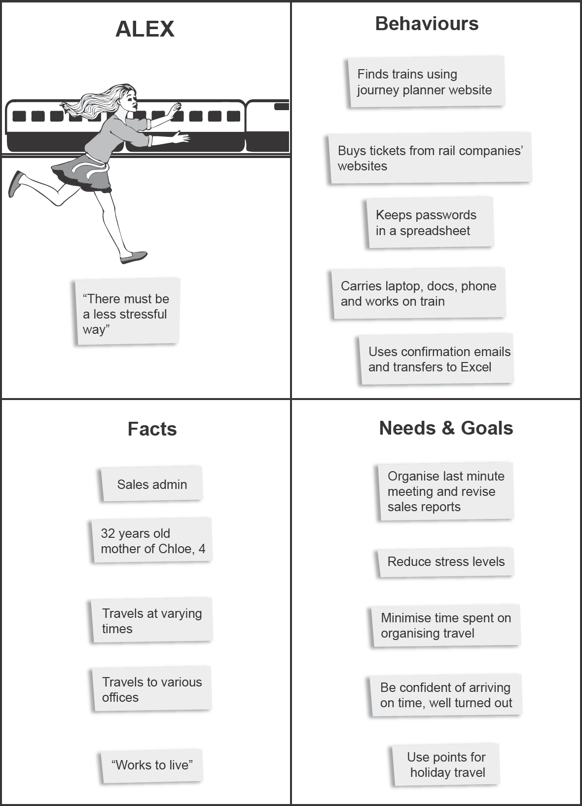
On the other hand, it is an exaggeration to say that a persona can never be any use if it is not based on research. A more realistic approach is the ‘Lean UX’ (Gothelf and Seiden, 2013) technique of proto-personas. Here, the team creates very rough persona descriptions (Figure 5.1) to guide the work in the first project iterations, on the explicit understanding that these are based on assumptions which will probably be falsified. At the first opportunity, the team carries out research that allows the initial set of personas to be thrown away, or radically changed. This is not the end of the process – the personas are continually changed and updated during the project as new information becomes available. The persona description can continue to be documented in a rough form, because this encourages the required experimental attitude. It is the job of user researchers to ensure that the team does continue to deepen and extend its knowledge of the users throughout the course of the work.
Figure 5.1 Persona description
In Chapter 4, we described how observations written on sticky notes can be grouped together into an affinity diagram, which enables us to see a logical structure emerging from an amorphous mass of data. There is another way of arranging observations that gives a specific and valuable meaning to the data: namely, if we arrange them according to the time dimension. This is the underlying principle for a range of techniques with names such as ‘maps’, ‘journeys’, ‘journey maps’ or variations on these terms. It is possible to divide these diagram types into numerous categories (Kalbach, 2016) but what they have in common is more important than what distinguishes them. We refer to these diagrams as journey maps (Figure 5.2).
Figure 5.2 Journey map
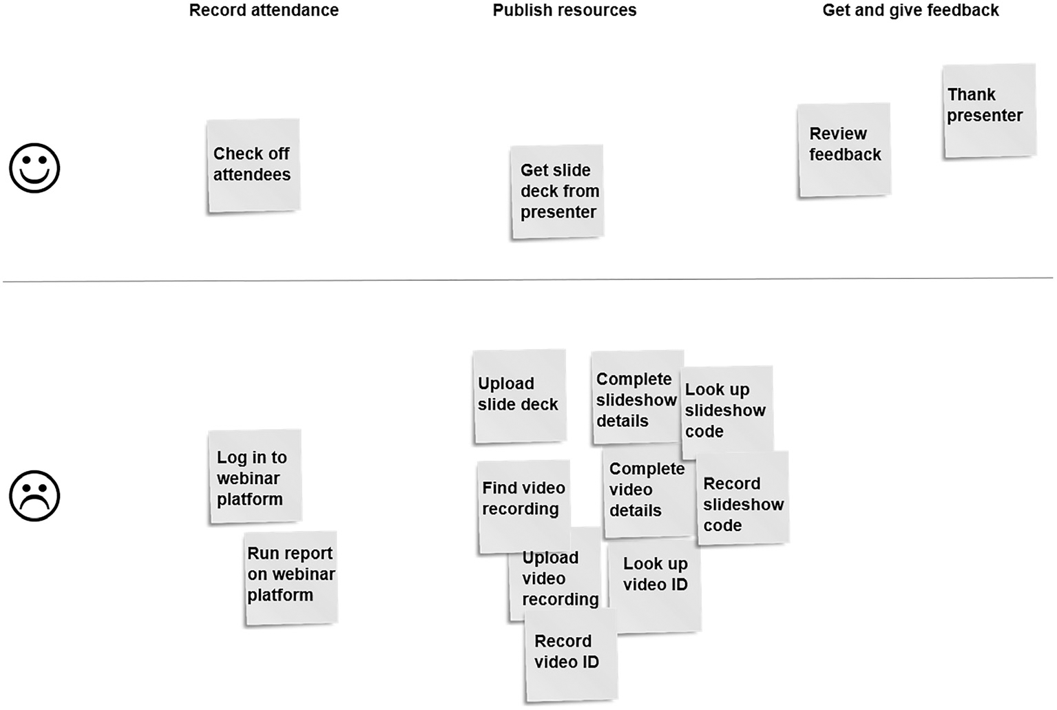
Journey maps are usually arranged along an axis that runs from left to right, representing time. The map consists of a number of episodes that collectively tell a story about either:
- the experience that one research participant has described to us or that we have observed;
- an aggregation of several individuals’ experiences in relation to the same thing; or
- the general experience that we would like users of our product or service to have in the future.
A journey map can describe a short experience, such as making a purchase on a website, or a longer experience that might last months, years or even decades, such as being the owner of a specific model of car or the customer of a particular hotel chain.
Because only one of the two available diagramming dimensions is used to represent time, the other is available for representing further information. Sometimes it is used to represent the user’s affective state, where the top of the chart represents positive feelings and the bottom represents negative ones. Sometimes the diagram is divided into horizontal bands, each being used to represent a different type of information regarding each episode, for example:
- As on an empathy map, what the user sees, hears and feels.
- As in AEIOU, what environment the user is in, what people or organisational units they interact with, and what equipment or software user interface components they use.
- The different levels of visible and invisible organisational and technological support for episodes in the user journey – this is referred to as a service blueprint.
Journey maps are an immensely useful tool for visualising, comparing and analysing experiences. They sometimes bear a superficial resemblance to activity diagrams or business process models, but there is a profound difference: journey maps aim to understand the experience from the human users’ subjective point of view, whereas activity diagrams and business process models aim to show an objective overall representation based on the notion of a piece of work flowing through the system.
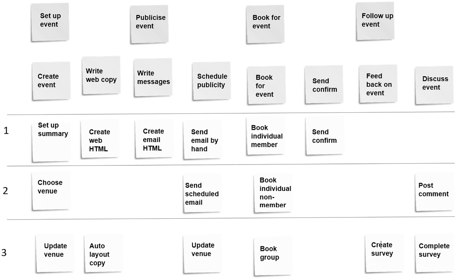
User journey maps and user story maps
A user story map (Figure 5.3) is similar to a user journey map, but it is created for a very specific reason – to organise development activity rather than to describe the users’ current experience. See the description of user stories later in this chapter for more details.
SCENARIOS
A scenario is a story describing a typical situation that might be experienced by a member of one of our user groups. In the same way that personas help the project team to understand and relate intuitively to the users, scenarios help the team to maintain a proper understanding of required solution functionality, by telling a story that is complete with realistic details of the environment. Scenarios are a perfect fit with persona descriptions – together, they paint a compelling picture of the problems that people encounter in trying to achieve their goals, and how a given design might improve things.
Scenarios can be documented in a range of ways. Like so many of the other techniques in this book, they are most useful when kept short and simple. A brief textual description is very easy to produce. An even more vivid illustration can sometimes be provided by drawing a cartoon-like storyboard or comic strip. Even for those of us with few artistic skills, it is surprisingly easy to do this using a few simple ideas (Cheng, 2012; Greenberg et al., 2011).
USER NEEDS
Personas and scenarios help us to understand the context of use correctly by providing realistic detail in a structured way. User needs, on the other hand, allow us to focus clearly on the users’ tasks and goals by articulating them in a very concise way.
‘User needs’ can be a technical term
Quite often, the term ‘user needs’ is used in a very general way to refer to the functionality that users need, and is a synonym for ‘user requirements’. As Kim Goodwin (2011) points out, this choice of language is sometimes a subtle way for UX people to gain a greater measure of influence over requirements definition by using their own terminology.
However, in this book we use it in a more restricted and specific sense, as described below. This is the interpretation of ‘user needs’ used by the UK Government (GOV.UK, 2017).
A user need describes something that a user needs (or wants) to do. It is a high-level objective, independent of any details of how the objective might be achieved using any particular solution.
A user need is expressed in ‘user story format’:
As a [user role]
I need/want to [do this task]
so that [I can achieve this goal]
The simplicity and rigour of this format is valuable, as it forces us to think clearly about who the user is and what goals they are seeking to achieve. The best user need descriptions are expressed using wording that would realistically be used by the users themselves, not using tech-speak. A user need description should be about the user and what they want to achieve, not about the system.
KEY TASKS
Users can have many needs. On most projects, numerous ideas will come up about functionality that should be provided. Each set of stakeholders will have their own ideas and priorities: business owners, product managers and developers all want to give their input. User research is likely to throw up quite a range of possibilities. However, one of the worst mistakes we can make when designing a system is to try to please everyone – by taking this approach, we are likely to end up pleasing no one. Even if we focus our design on a single persona, there may be a very large set of functionality envisaged.
Hick’s law is one of the few well-known scientific findings that have a clear and undisputed significance for user experience design. If we think about a simple list of links displayed on a web page navigation control, it is easy to see that the more links there are to choose from, the harder it will be to find the right one. But the principle is far more widely applicable than that. The fact is that the fewer functions a system provides, the easier it is to use. The marginal effect of every new added feature may be insignificant on its own, but eventually the cumulative effect of too much functionality is to make a system unusable.
We need an effective way of paring down the mass of proposed functionality to the essentials. One useful idea comes from user experience consultant David Travis (2006) with the concept of Red Routes. This is based on the analogy of London’s road system, where certain roads have been identified as the key arteries that keep circulation going in the city’s traffic system. Red lines are painted on these roads and the authorities are zealous in ensuring that no obstacles to traffic, such as parked cars, are allowed even for a minute. Similarly, we can identify red routes in a website. These are complete journeys through the website that allow users to achieve the goals that they set out to do when they came to the site. They are defined in terms of outcomes that users value. They are likely to be activities that are critically important to users or to the business (or both) and may well be activities that are carried out frequently. Identify these, and we will know the journeys that the system simply must support as well as possible. All other design considerations must be subordinated to this, probably to the extent of leaving out (or making less visible) nice-to-have functionality that makes the red routes harder to navigate.

Hick’s law
The time taken to make a decision increases as the number of choices is expanded.
USER STORIES
A user story represents a unit of development work that needs to be done. It is a tool for managing the backlog of work that remains to be done at any given time on an Agile project. User stories are not ‘stories’ in the usual sense of the word, but they are orientated towards users: each user story describes something that has value for a given user group because it helps them to achieve their goals.
We have already seen the user story format, when discussing user needs. A user need is a high-level user story.
User stories are the crucial link between user experience design and software design. If they are framed in the right way, making full use of the personas, goals, tasks and scenarios discovered in user research, they make a massive contribution towards delivering a useful and usable product.
User story maps are a technique for helping a development team to decide how to order the work in such a way as to deliver value in each project iteration. Because a key consideration is the need to create a coherent set of functions that support users in achieving their goals, it follows that the stories are arranged into a time-ordered sequence, and so the resulting map looks very much like any other user journey map.
User story format
User stories are not really documents: they consist of all the thinking, conversations and decision-making that has taken place within the development team relating to the unit of work in question. However, they are traditionally summarised on user story cards. Strictly speaking, there are no hard and fast rules about the format of user story cards, but the format described in this section has become so common that it is sometimes called ‘user story format’. This is known to developers as the role–feature–reason template. From a UX perspective, we might prefer to call it the user–task–goal format:
- As a [user role]
- I need/want to [do this task]
- So that [I can achieve this goal]
SUMMARY
The context of use consists of the users, their tasks and goals, their resources and their environment.
The users of a system and, to some extent, all the other context-of-use items can be illustrated by defining personas – fictitious archetypes that represent the key user groups, concentrating on their behaviours and needs. The development of the users’ experience over time within their environment can be documented in user journey maps and scenarios.
Having achieved a rich and detailed view of the context of use, we need to narrow our focus to the most important things. Defining user needs is the first step towards this.
As Hick’s law states, ‘The time taken to make a decision increases as the number of choices is expanded.’ The simpler a system’s user interface, the more usable it has the potential to be. It should be optimised for the users’ key tasks – those that are frequent and result in valuable outcomes.
User stories encapsulate desired functionality and are written in the form, ‘As a [user role], I need/want to [do this task], so that [I can achieve this goal]’. Defining user stories allows us to start moving towards creating design solutions based on a solid understanding of the context of use.
NOTE
1. ‘Scope’ is not strictly an element of the context of use, as defined by ISO 9241-11. The items under this section relate to the goals (first bullet point), environment (second point) and users (remaining points) respectively.
Cheng, K. (2012) See What I Mean: How to Use Comics to Communicate Ideas. Rosenfeld Media, New York.
Cooper, A. (2004) The Inmates are Running the Asylum: Why High-Tech Products Drive Us Crazy and How to Restore the Sanity. SAMS, Indianapolis, IN.
de Saint-Exupéry, A. (1939) Terre des hommes. Gallimard, Lagny-sur-Marne.
Gothelf, J. and Seiden, J. (2013) Lean UX: Applying Lean Principles to Improve User Experience. O’Reilly Media, Sebastopol, CA.
Goodwin, K. (2011) Designing for the Digital Age: How to Create Human-Centered Products and Services. Wiley, Indianapolis, IN.
GOV.UK (2017) Learning About Users and Their Needs. Available from: https://www.gov.uk/service-manual/user-research/start-by-learning-user-needs
Greenberg, S., Carpendale, S., Marquardt, N. and Buxton, B. (2011) Sketching User Experiences: The Workbook. Elsevier, Waltham, MA.
ISO/IEC 25063:2014 (2014) Systems and Software Engineering – Systems and Software Quality Requirements and Evaluation (SQuaRE) – Common Industry Format (CIF) for Usability: Context of Use Description. International Organization for Standardization (ISO), Geneva.
Kalbach, J. (2016) Mapping Experiences: A Complete Guide to Creating Value Through Journeys, Blueprints, and Diagrams. O’Reilly Media, Sebastopol, CA.
Sharon, T. (2016) Validating Product Ideas: Through Lean User Research. Rosenfeld Media, New York.
Travis, D. (2006) Red Route Usability: The Key User Journeys with your Web Site. Available from: https://www.userfocus.co.uk/articles/redroutes.html
FURTHER READING
Cooper, A., Reimann, R., Cronin, D. and Noessel, C. (2014) About Face: The Essentials of Interaction Design. Wiley, Indianapolis, IN.
Patton, J. and Economy, P. (2014) User Story Mapping: Discover the Whole Story, Build the Right Product. O’Reilly Media, Sebastopol, CA.
Pruitt, J. and Adlin, T. (2006) The Persona Lifecycle: Keeping People in Mind throughout Product Design. Morgan Kaufmann, San Francisco, CA.
Travis, D. (2002) E-Commerce Usability: Tools and Techniques to Perfect the On-Line Experience. Taylor & Francis, London.
1. You are working on a government system that allows people to apply for a driving licence. Which of the following would be examples of user needs for such a service?
a. It should be easy to navigate
b. The font size should be at least 12 pt
c. Apply for provisional entitlement to drive a lorry
d. It should work on mobile devices as well as desktop computers
2. You are designing an interface for a government system that will be used by a large number of users. Which design approach would be MOST LIKELY to be successful?
a. Administer a survey to at least 1000 potential users to uncover the key demographic characteristics
b. Include a wide range of functions to suit most people
c. Emulate design patterns from high traffic, social networking sites
d. Design for specific groups of users with specific needs
3. A new application is proposed that enables individuals to look up all bus services within a small city. Which of the following would be the BEST user description to be used in the system design?
a. A commuter who uses three buses a day each way to get to work, with short intervals to change between buses
b. A 27-year-old bus spotter, who is interested in the cumulative late running of services
c. Police traffic control staff, interested in the effect of roadworks and traffic lights on services
d. An inspector for a bus operating company who wants to check on the performance of individual drivers
4. Identify the key user needs in this pen portrait of a user for a GPS system aimed at hikers:
1. Peter has been a keen walker since he was a teenager.
2. He enjoys purchasing the latest gadgets and technology.
3. He wants to discover out-of-the-way sites with an interesting history.
4. He says he needs a mobile phone provider with better coverage in out-of-the-way locations.
a. 1 and 2 only
b. 2 only
c. 3 and 4 only
d. 3 only
1. The correct answer is (c).
(b) and (d) are non-functional specifications referring to a specific implementation and are not expressions of a user’s need from the service. (a) is an abstract requirement that assumes the system will have some kind of navigation. It may not. This leaves (c) as the correct answer.
2. The correct answer is (d).
This question tests candidates’ understanding of focusing on users in design. (a) is wrong because demographic characteristics are of only rudimentary use when doing design. (b) is wrong because it will lead to a system that suffers from bloat but still does not meet the needs of users. (c) is wrong because design is contextual, and an approach that works on one site may not work on another. This leaves (d) as the best answer.
3. The correct answer is (a).
This question is about identifying the main user group in the design of a system. All of these groups are potential users of the system, but the question asks the candidate to identify the best user description; that is, the group that is most likely to have a need for the service. Option (a) is more realistic (in terms of genuine use), so this gives the best answer. This is not to invalidate the use of a bus spotter as a potential user – but people in this category are not using the service as the majority of people would – ‘is my bus on time and likely to get me to my destination as required?’ Option (c) is another likely secondary user group, but again will not be the main user of the service (that is, the service should not be designed specifically for this audience). Option (d) is another possible secondary user, although this user will almost certainly require other data (such as driver names) alongside the timetable.
4. The correct answer is (d).
A good user need will begin with a word like ‘needs’ or ‘wants’. Although (1) is useful information for a persona, it is not a user need: it simply captures a little of the user’s domain knowledge. Similarly, (2) is not a need but a personality trait. (4) is a possible option, but notice the phrase, ‘he says’ in the stem. This isn’t a need but an implementation. The user need behind this could be met by other implementations (for example, a system that allowed the user to download maps before setting off on the walk). This leaves option (3) as the only user need in the list and makes (d) the correct choice.