
INTRODUCTION
This chapter describes how to assess the usability of a product, service or system. There are two ways of evaluating the usability of a system: usability inspection and usability testing. While usability testing involves having users work with the product or prototype and attempt to carry out tasks, usability inspection can be carried out by one or more individuals within the design team, without needing to involve any test participants.
We start by looking at ways in which a single person can inspect a system and draw conclusions about its usability. In particular, we consider guidelines such as Jakob Nielsen’s (1993) usability heuristics. We move on to a discussion of how to conduct moderated usability tests, and stress the importance of these as the only reliable indicator of usability. We look at how to prioritise and report on usability test findings, before finally thinking about how to evaluate the accessibility of systems.
LEARNING OBJECTIVES
After reading this chapter you will be able to:
|
Remember |
|
|
Apply |
|
A well-known form of usability inspection is heuristic evaluation (Nielsen, 1993). This is based on systematically examining the user interface with a view to assessing its compliance with generally applicable principles (heuristics) of usable design.
Many usability researchers have proposed lists of guidelines that can be used in a heuristic evaluation. For example, Ben Shneiderman et al. (2016) define eight ‘golden rules’ of user interface design; Susan Weinschenk and Dean Barker (2000) provide a list that has been adapted to be suitable for speech interfaces. However, by far the most widely referenced is Jakob Nielsen’s (1993) list of 10 usability heuristics.

Nielsen’s usability heuristics
- Visibility of system status
- Match between system and the real world
- User control and freedom
- Consistency and standards
- Help users recognise, diagnose and recover from errors
- Error prevention
- Recognition rather than recall
- Flexibility and efficiency of use
- Aesthetic and minimalist design
- Help and documentation
Let’s look at these heuristics.
1. Visibility of system status
The user should be able to understand what the system is doing at any time. Has it accepted their input? Is it processing it? If so, how long will it take? Is it waiting for more input? These considerations apply at many levels. Buttons should provide visual feedback showing both that they will be activated if the user clicks or taps, and that they have been activated when they do.
A wizard or other sequence of screens should provide information about the current position of the transaction. When the user starts a new session using the application, it should provide information showing that it remembers the user’s previous work, together with their preferences and settings.
2. Match between system and the real world
The language used in the interface should match the language that comes naturally to the user when talking and thinking about the subject domain. The concepts used, and the relationships between them, should make sense to the user.
The user should be free to take whatever action they want at any point. The system should be able to remember what the user is doing so that they can resume a task later if they need to take a break for any reason.
4. Consistency and standards
When people talk about an interface being ‘intuitive’, what they really mean is that it should be familiar. This means taking into account all the user’s previous experience with interfaces, as discussed in Chapter 8. The producers of major operating systems, such as Apple, Google and Microsoft, publish style guides defining how interfaces should work on their platform – these should be followed.
5. Help users recognise, diagnose and recover from errors
This guideline covers both error conditions that have arisen in the software, and mistakes that users themselves have made.
6. Error prevention
Even better than helping users to recover from errors is making it impossible for them to make mistakes in the first place. Choosing the right user interface controls will help with this. Wherever possible, the interface should constrain the user’s input so as to make it impossible to enter data of an invalid type. The next step is to help the user to enter data that is not only valid, but actually correct. We can see an example of this in the way that websites ask the user for their postal address. The most basic way of doing this would be to provide text input fields, such as ‘Address Line 1’, ‘Address Line 2’, ‘Town’ and ‘Postcode’, and leave it to the user to fill them in correctly. It is better to ask for the user’s postcode, check it against a list of valid postcodes, and then ask them to choose from a list of the actual addresses at that postcode. A similar approach can be taken if asking for details of the user’s car – the registration number can be checked against an online database that will then provide the details without the user needing to enter them.
7. Recognition rather than recall
It is extremely hard for human beings to recall random strings of letters and numbers unaided – yet some systems designers still persist in expecting them to, for example by enforcing the use of passwords that not only must adhere to complex rules about the use of special characters, numbers, capital letters and so on, but also must be changed frequently. We are far better at recognising words and phrases when they are presented to us as choices in a list; we are even better at recognising pictures, especially pictures of people’s faces.
8. Flexibility and efficiency of use
It almost goes without saying that it should be possible to carry out tasks with the minimum expenditure of time and effort.
9. Aesthetic and minimalist design
The important word in this guideline is ‘minimalist’. Nothing should appear in the interface unless there is a reason for it: preferably a reason that directly supports the achievement of the user’s goals.
Help and documentation should be available, appropriate and usable. They should be structured around the real tasks that users need to carry out, and the problems that they are likely to encounter, as discovered during user research and usability testing. The aim should be to design an interface that is so easy to use that no help or documentation is required – but this is not an excuse for not producing any.

Usability heuristics in service design
Usability guidelines such as Nielsen’s heuristics originated as tools for assessing the user interface of software applications. However, they provide a sound basis for evaluating more complex socio-technical systems. For example, consider a service designed to enable citizens to file their tax returns, whether online or by any other means. We might ask questions such as:
- Can the user find out whether their tax return has been received? Can they find out whether it has been approved or not? (Heuristic 1)
- Are communications with the user couched in terms that they can understand and which relate to everyday life, or are they rooted in arcane taxation-related terminology? (Heuristic 2)
- Is information on previous returns available? (Heuristics 1 and 7)
- Is simple and effective guidance given to minimise the risk of errors? (Heuristics 6 and 10)
USABILITY TESTING
With usability inspection, a usability specialist can find any glaring defects that may be present in the usability of an interface. This is a form of negative testing. Finding errors does not provide confidence that users will be able to achieve their goals effectively, efficiently and with satisfaction. For that we need to employ usability testing.
There is only one way to know if a system is usable
A product or system is usable if, and only if, the specified users can achieve their specified goals with effectiveness, efficiency and satisfaction in the specified context of use.
You can find usability problems by inspecting the product or by testing its intrinsic properties, but you cannot prove its usability that way. You must find out if real users can use it to achieve realistic goals.
Usability testing can and should be carried out throughout the user-centred design cycle. It is the most effective tool at our disposal for ensuring that the system meets the users’ needs. It involves a user attempting to carry out tasks with guidance and observation from a specialist – the test moderator – while thinking aloud. This means that the test participant provides a running commentary on what is going through their head when trying to use the interface.
Types of test
Usability tests are either formative or summative. A formative test is one whose output is used to feed back into the design of the product. Most usability testing falls into this category. By contrast, a summative test evaluates the usability of a product in order to see whether it meets predefined criteria, for example as part of a formal release procedure, quality audit or procurement exercise.
In-person usability tests involve the moderator and participant being physically present in the same place. These can sometimes be run in the participant’s own environment, but normally there are several participants to get through in one day, which rules this out. In these cases you will want to run the tests at your own premises or at some other location that is easily accessible for the participants. A high-end approach would be to use a special-purpose usability testing lab equipped with commonly used phones, tablets and computers, a two-way mirror that allows observers to watch the session without being seen, recording equipment and eye-tracking kit.
It is increasing normal to run remote usability tests over the internet. This is much cheaper than running in-person tests. There are now many special-purpose software tools that support the process and record the test, but any screen-sharing software with a recording function can be used. Remote usability tests provide the moderator with reduced ability to interact with the participant and observe their reactions. This must be balanced against the low cost and comparative administrative ease of remote testing.
An extreme version of the remote usability test is the unmoderated usability test. Here, the participant uses the instructions they have been given to carry out the activities in their own time. They record the session for the researcher’s review later on. Clearly, this type of test provides the lowest possible degree of opportunity for the researcher to interact with the participant and gain insight into their reactions. Perhaps the greatest risk is that the participant will fail to ‘think aloud’ sufficiently, reducing the overall usefulness of the test. If the budget is tight, unmoderated tests can be useful when testing small, well-defined pieces of design.
Steps involved in running a test
Executing a usability test involves the following steps:
- Identify research questions that need to be answered
- Identify and recruit some test participants
- Devise test tasks and scenarios that will answer the questions
- Prepare the environment for running the test
- Moderate the test
- Record your findings
- Prioritise the issues
Identifying research questions
The types of questions that need to be answered will change and develop over the course of a project. Initially, you will want to know general things like:
- Do the concepts embodied in this design match the users’ mental model?
- Does the interface support a sequence of tasks that is realistic for the user?
- Will the system as envisaged genuinely be useful?
Time invested on getting real experimental data to answer these questions at an early stage is time very well spent. Later, you will want to answer more specific questions such as:
- How long does it take the user to understand how to carry out a task?
- Does the user ‘get it right first time’?
- For specific elements of form labelling, microcontent and navigation: does the user notice them? Do they understand them?
- How long does it take the user to complete the task?
- Does the user report any impatience, confusion or dissatisfaction?
At some points you may also want to compare alternative design options to see which work best.
As far as possible, the research questions should frame the issues in terms of the user’s ability to carry out tasks, rather than focusing on details of the interface.
Recruiting test participants
The research questions will be based on the specific user groups or personas for whom the task is relevant. For our usability testing we need to recruit suitable representatives of those groups. We saw in Chapter 4 what makes someone a suitable representative.
Recruiting test participants and managing all the associated administration is a time-consuming task. There are agencies who will look after the recruitment and management of participants for both face-to-face and remote usability testing. Alternatively you may be able to recruit participants directly from your customer base. Either way, it is important to develop a screener. This is a questionnaire which can be used to confirm that an individual is indeed a good match for the ‘specified user’ in ISO 9241-11 (2018) terms.
To ensure that participants keep the appointment and take the session seriously, it is a good idea to offer them something in exchange for taking part. This could take the form of money, vouchers for ecommerce sites or similar. If the participants are your customers, you may be able to offer them something of value as part of that relationship, such as early access to products or discounts.
How many test participants are required? This is a controversial topic. The more participants, the better; then again, even one participant is very much better than none. When running formative tests in an iterative process, it is more valuable to test frequently than to involve a large number of participants each time. Around five participants may be enough to derive useful results from each prototype. As this is not a statistically significant sample size, it will not allow you to make numerical or statistical comparisons, but it will let you get a feel for the answers to questions like the ones mentioned above.
Some teams have a regular usability testing schedule where they book participants and facilities on a regular basis at the same time every week, rather than only starting to organise a test session when they have something specific to test. Summative testing will involve many more participants, carefully chosen to give more thorough representation of the expected user population.
Devising test tasks and scenarios
We saw in Chapter 5 how we can distil our user research findings into key tasks and user stories. These give us a concise record of what user goals, tasks and activities must be supported by the system, and which are the most important. We can produce prototypes, as described in Chapter 10, representing possible designs for supporting those tasks, and explore their usefulness with usability testing. The general procedure for usability testing is the same regardless of the prototype’s degree of fidelity.
The key point to remember when designing test tasks is that they should be oriented towards real user goals. The test participant should be given tasks that are meaningful to them, and represent things they really would want to get done with the system. They should be challenged to carry out the tasks with a minimum of direction from the moderator.
The tasks to be tested should be written down in advance. This will help to ensure that each participant is given the same tasks. Each task should have success criteria defined. What does it mean to say that the task was carried out successfully? This might include multiple measures of effectiveness and efficiency.
The moderator needs to set the scene and provide meaningful, realistic detail that will create the appropriate context for the participant. The test scenario is the story that we tell the participant so that they can imagine themselves in the situation described and recognise the task as something they would typically want to do.
Preparing the environment
If the participants are coming to you, you will need to have facilities for welcoming them, a place where they can wait until they are needed and refreshments. A printed form for the participant to record their informed consent should be available. The moderator also needs to have the scenario description ready. This might contain a detailed word-by-word script. Any important aspects of the technical environment should be checked in advance – for example, if an internet connection is required, then it must be available.
Preparation must be made for the session to be video recorded. The recording should preferably focus on the user interface and show how the user is interacting with it. Additionally, it is sometimes helpful to have a parallel recoding of the user’s facial expressions. If used, eye tracking (see Chapter 9) is normally done separately as a special kind of test.
Moderating a test
As the test moderator, your job is to ensure that you gain the greatest possible amount of valid, relevant information that will allow the research questions to be answered. This can be done by following the steps summarised in Figure 11.1 and listed below.
Figure 11.1 Key steps in conducting a usability test
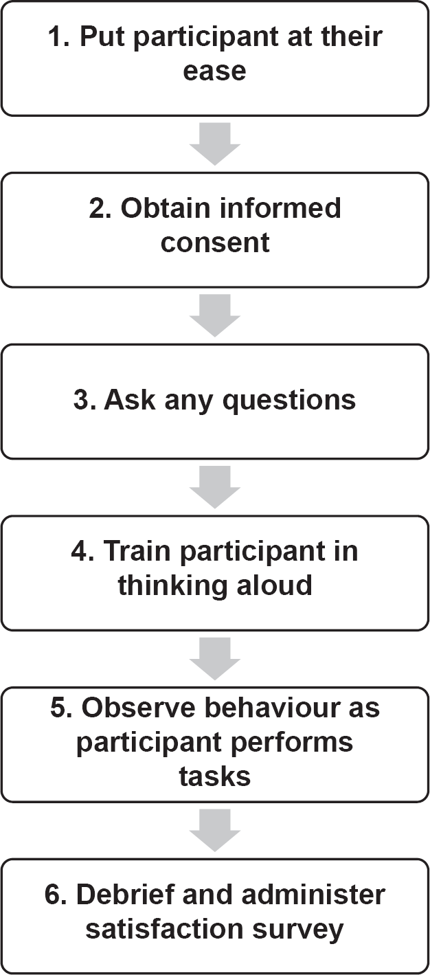
- Put the participant at their ease. Welcome them and ensure that they are comfortable. Explain to them the purpose of the test and your respective roles. Make sure that they understand it is the product that is being tested, not them. Make it clear that you want full and honest feedback on the product being tested. It can be helpful to stress that you were not involved in creating it – if the participant believes that is the case, they may try to avoid offending you with negative feedback.
- Obtain the participant’s informed consent (see Chapter 4).
- Ask any questions that you need answers to regarding the participant and their context.
- Explain how think-aloud testing works. The participant needs to tell you at every stage what they are trying to do, what they are looking for or expecting to find presented in the interface, and what decisions they make as they go through the process. They must tell you whenever they are confused by something or get stuck. Explain that you would like them to ask you any questions that occur to them, but warn them that they may get a non-committal answer or none at all. This is not due to rudeness but to your need to see what would happen if they were using the interface alone, without any guidance.
It is helpful to give a quick demonstration yourself of how thinking aloud is done. You might also ask the participant to do a practice run. In both cases, it is a good idea to choose a task that is as different as possible from the real ones that you are about to go through, so that the participant is not inappropriately ‘primed’ to say certain types of things.
- Now for the main part of the test. Give the participant the tasks to do and observe what happens. When describing the tasks, it is important to use language that is easy to understand and does not give any clues regarding what the participant should look for in the interface. For example, if you are testing whether users will notice the ‘unsubscribe’ button on a web page, do not say ‘Now see if you can work out how to unsubscribe yourself.’ Say something like, ‘Imagine that you’ve decided you wouldn’t like to receive any more communications from this company – take some action to sort that out.’
The most important thing for the moderator to do is nothing. In other words, you should not answer any questions or give any guidance on how to use the interface. If the participant asks you how to do something, use the boomerang technique – turn the question back to the participant. If they ask, ‘What is this button for?’, ask them ‘What do you think it’s for?’ Do not allow the session to be diverted into any irrelevant discussions. If the participant says something that does not require an answer, then ignore it or make an encouraging noise. There is no need to praise them for anything that they manage to do.
Some participants find that thinking aloud comes much more naturally to them than others. If they are not saying enough, ask open questions, completely free of reference to the interface details, such as ‘What are you thinking’?
If the participant gets completely stuck, then there may come a point at which they are clearly in such discomfort that you feel compelled either to help them complete the task or end the session. In this case, you may be able to move on to the next task in your plan and salvage some more benefit from the time you have both invested.
- When all the tasks have been completed or the allotted time is over, you may want to administer a satisfaction survey such as a SUS survey (see Chapter 6). Also allow some time for answering questions and collecting any comments that the participant may want to make.
Recording usability issues
Defining the tasks clearly in advance, including the associated success criteria, makes it relatively straightforward to record the results of the usability test. You will also want to record your observations of things you noticed about what happened when the user tried to carry out the tasks. Make sure that you record what you saw and heard, rather than just your interpretation of what might be the reason for the observation. Interpretation is of course valuable, but must be kept separate, so that the observations can be accurately and objectively grouped, compared and analysed.
As discussed in Chapter 4, this can be done formally, by filling in a spreadsheet or other tabular record, or informally, by writing each observation on a sticky note. A formal approach is appropriate when carrying out a summative test; an informal approach will often work better for formative tests.
Prioritising usability issues
The objective of usability testing is often framed in terms of finding as many problems as possible. It is perhaps more accurate to say that the test should answer as many questions as possible, as conclusively as possible. Findings can be positive as well as negative.
Usability problems can be categorised according to three key criteria: impact, frequency and persistence. This allows us to create an action plan for dealing with them.
Issues with a high impact are typically those that affect the completion rate of tasks. The more severely the completion rate is affected, the higher the impact. We also need to take into account the importance of the task itself: it is especially important to address issues that affect critical tasks.
Frequency is a measure of how many test participants encountered the issue. It is quite common to find an issue that only affects one participant. If there are only four or five in the sample, it is difficult to know how important the issue is and a judgement must be made or further testing done. If an issue affects multiple participants it needs to be addressed.
The persistence of an issue is the degree to which it annoys and disrupts use of the system by recurring frequently. For example, if there is an issue that occurs on every page of a website, then user satisfaction is bound to be impacted.
One way of using these three measures is to group issues into four grades of priority: low, medium, serious and critical. If the issue scores highly on all three measures, then it is critical. If it scores highly on two, it is serious. If it scores highly on one, then it is medium; if it does not score highly on any, then it is low.
The World Wide Web Consortium (W3C) is the standards body for web protocols. The Web Content Accessibility Guidelines (WCAG) published as part of W3C’s Web Accessibility Initiative (WAI) give numerous recommendations for making web-based systems more accessible. The guidelines are specifically aimed at improving access for:
a wider range of people with disabilities, including accommodations for blindness and low vision, deafness and hearing loss, limited movement, speech disabilities, photosensitivity, and combinations of these, and some accommodation for learning disabilities and cognitive limitations (W3C, 2018)
But they make the key point that ‘following these guidelines will also often make Web content more usable to users in general’. The guidelines are applicable to any system with an HTML-based user interface.
The WCAG-WAI guidelines are a valuable resource for the evaluation of accessibility. Testable success criteria are provided for each guideline. There are three levels of conformance, from A at the lowest level to AAA at the highest.
The general principles set out in the guidelines are that web content should be:
- Perceivable: the user must have access to the content and controls in a form that they can perceive.
- Operable: it must be possible for the user to operate the navigation and other controls with a device that they are able to use, such as the keyboard.
- Understandable: the user must be able to read or hear and interpret the text that is presented, and predict the way the system will respond to their actions.
- Robust: the content must be coded in such a way that it can be interpreted by a wide range of device software, including assistive technology.
SUMMARY
There are two main types of usability evaluation: usability inspection and usability testing. Inspection can be carried out by one individual using a set of guidelines such as Nielsen’s usability heuristics, which are the best known among many sets of system usability principles.
A usability test evaluates empirically whether the specified user can carry out tasks effectively, efficiently and with satisfaction, using a prototype that has been created to embody one or more design hypotheses. The user is given realistic and meaningful tasks that relate to their own typical objectives in using the system. The test moderator must allow the participant to work completely unaided, and must record their observations – what they see and hear – without interpretation. Test results can be assigned a priority of critical, serious, medium or low, depending on how many of the following criteria they score highly on: impact, frequency and persistence.
W3C’s (2018) Web Content Accessibility Guidelines (WCAG-WAI) are the most commonly referenced standard for web accessibility.
REFERENCES
ISO 9241-11:2018 (2018) Ergonomics of Human-System Interaction – Part 11: Usability: Definitions and Concepts. International Organization for Standardization (ISO), Geneva.
Nielsen, J. (1993) Usability Engineering. Morgan Kaufmann, San Diego, CA.
Shneiderman, B., Plaisant, C., Cohen, M., Jacobs, S., Elmqvist, N. and Diakopoulos, N. (2016) Designing the User Interface: Strategies for Effective Human-Computer Interaction. Pearson, Harlow.
W3C (2018) Web Content Accessibility Guidelines (WCAG) 2.1. W3C Recommendation 05 June 2018. Available from: https://www.w3.org/TR/WCAG21/
Weinschenk, S. and Barker, D.T. (2000) Designing Effective Speech Interfaces (Vol. 1). Wiley, New York.
FURTHER READING
ISO/IEC 25066:2016(en) (2016) Systems and Software Engineering – Systems and Software Quality Requirements and Evaluation (SQuaRE) – Common Industry Format (CIF) for Usability – Evaluation Report. International Organization for Standardization (ISO), Geneva.
Krug, S. (2014) Don’t Make Me Think, Revisited: A Common Sense Approach to Web Usability. New Riders, Berkeley, CA.
Rubin, J. and Chisnell, D. (2008) Handbook of Usability Testing: How to Plan, Design and Conduct Effective Tests. Wiley, Indianapolis, IN.
Tedesco, D. and Tranquada, F. (2013) The Moderator’s Survival Guide: Handling Common, Tricky, and Sticky Situations in User Research. Morgan Kaufmann, Waltham, MA.
EXAMPLE EXAMINATION QUESTIONS
1. Which of the following data sets could be useful for recording quantitative data during usability evaluations?
a. Success rate, error rates, observations about the pathways taken by users
b. Task time, error rates, satisfaction questionnaire ratings
c. Task time, observations about pathways taken by users, problems experienced
d. Success rates, problems experienced, satisfaction questionnaire ratings
2. You are evaluating a new interactive voice response system in which users are expected to make selections from a telephone keypad. Which one of the following research questions could be answered with a small number of participants (say five)?
a. Are users quicker with the new system or with the old system?
b. How much would people pay to use the service?
c. What are the demographic characteristics of the target audience?
d. What are the main usability issues with the system?
3. Which of the following are useful objectives from a usability test?
1. Check the system is easy to use
2. Ensure users understand the terminology
3. Assess if the user experience is acceptable
4. Decide if one version of the interface is more usable than another version
5. See if users can export their saved files with the web version of the user interface
6. Discover usability issues with the user registration process
a. 1, 2 and 4 only
b. 3, 5 and 6 only
c. 1 and 3 only
d. 2, 5 and 6 only
4. Place the following stages of a usability test in order.
1. Recruit users
2. Agree the test objectives
3. Run a pilot test
4. Create task scenarios
a. 1, 2, 3, 4
b. 2, 1, 4, 3
c. 1, 4, 2, 3
d. 2, 3, 4, 1
5. You are moderating a usability test. The participant has been working quickly through a test task but then pauses for a while. Which of the following would be suitable prompts?
1. What are you thinking right now?
2. If you were the designer, how would you have designed this screen?
3. Are you looking for the ‘Help’ function?
4. Please remember to think out loud
5. Let’s stop this task here and come back to it later
6. What do you want to see here?
a. 1 and 4 only
b. 2 and 6 only
c. 1, 3, 5 and 6 only
d. 2, 3, 4 and 5 only
6. Which of the following tasks would be suitable to use in a usability test of a stylus-based tablet input device aimed at digital illustrators?
1. You have just received your new tablet device. Install the product and check that it works correctly
2. Configure the tablet for left-handed use
3. Open the software extension for the tablet and set the Mapping Mode to ‘Pen’
4. Adjust the feel of the eraser to the point where it feels hard
5. Compare the responsiveness of the device when used over Bluetooth and when connected via USB
a. 3, 4 and 5 only
b. 1, 2 and 4 only
c. 1 and 2 only
d. 4 and 5 only
ANSWERS TO EXAMPLE QUESTIONS
1. The correct answer is (b).
All items are valid types of data that can be collected during usability tests, but option (b) is the only option that has just quantitative data types. The other options include mixtures of quantitative and qualitative data.
This question aims to test a candidate’s understanding of the kinds of research that can be done with small sample sizes. (a) is incorrect because this question will require some kind of statistical comparison, and this isn’t plausible with a small sample size. (b) is incorrect because this is an opinion-based question that again will need a large sample size. (c) is incorrect because a small sample size will badly skew the results. (For example, if four of the five participants are male, does this mean 80% of the population is male?) (d) is the correct answer as a well-run usability test will identify the main usability issues even if the sample size is relatively small.
3. The correct answer is (d).
(1) is a poor choice for a usability objective because it is unmeasurable in its current state: what does ‘easy to use’ mean in this context? (3) suffers from the same problem: what does ‘acceptable’ mean? Neither of these is specific enough to be a useful objective in a usability test. The remaining choices are specific enough, which makes (d) the correct choice.
4. The correct answer is (b).
(2) has to be the first choice because the test objectives will have implications for the users who are recruited and the task scenarios that are used. (4) must come before (3) because the pilot test cannot take place without the scenarios. The only answer with (2), (4) and (3) in order is choice (b). It’s possible that user recruitment (1) could take place last, although it would be inefficient to do so (it makes more sense to start recruitment as early as possible since this can cause a delay).
5. The correct answer is (a).
This question tests if candidates realise their role as a test moderator is simply to help participants to keep talking and not to influence their stream of consciousness. (2) and (6) are poor questions because participants are not designers: it’s not clear how the design team can take action on what the participant says here. (3) is a poor choice because it may bias the participant to look for help or to confabulate and say they were looking for help when they were not. (5) is a poor choice because the participant isn’t struggling: the user has simply paused. This is when the researcher learns about the problems the participant is experiencing and this shouldn’t be cut short. This leaves (1) and (4) that are both good prompts to make and so (a) the correct answer.
6. The correct answer is (b).
This question aims to test that candidates can choose between good and poor tasks in a usability test. (3) is a poor task because it explains to users how they should do the task (it is more like a user acceptance test task). (5) is a poor task because it is not realistic: this isn’t the kind of task a user would normally expect to carry out. The remaining tasks are all tasks that real users would carry out with the product, which makes (b) the correct answer.