
8 INTERACTION DESIGN
Most people make the mistake of thinking design is what it looks like. People think it’s this veneer – that the designers are handed this box and told, ‘Make it look good!’ That’s not what we think design is. It’s not just what it looks like and feels like. Design is how it works.
Steve Jobs (quoted in Walker, 2003)
INTRODUCTION
This chapter is about designing user interfaces – not what they look like, but how they work. We define the concept of interaction design and set out basic principles for designing usable user interfaces. We give some examples of how to choose the right user interface controls when designing a graphical user interface (GUI). We introduce the idea of user interface patterns and present some examples of them. Finally, we discuss the importance of physical ergonomics and Fitts’ law.
LEARNING OBJECTIVES
After reading this chapter you will be able to:
|
Remember |
|
|
Understand |
|
|
Apply |
|
WHAT IS INTERACTION DESIGN?
Whereas information architecture is about helping users to find the content and functions that they need in order to carry out tasks, interaction design (IxD) is about what happens next: how does the user interact with the system to carry out the task?
Most often, tasks are initiated by the user themselves. With a digital product or service, this will typically involve the user choosing to access the application or site and carry out the task by interacting with the functionality which has been designed for that purpose. We also need to consider those interactions that are initiated by the system. For example, these might take the form of alerts using a mobile device’s notifications functionality, or notifications via email or SMS.

Definition: interaction design
The practice of identifying design solutions and creating prototype user interfaces
Most digital products make use of the user’s sense of sight to convey information and to show the possibilities that are available; for this reason, the next chapter is devoted to visual design. However, interaction design is not just about what things look like. Other modalities for interacting with digital products are becoming increasingly important. Systems often present information in auditory form, that is, via the user’s sense of hearing. Assistive technology for people who cannot see usually falls into this category. Increasingly, systems take input from the user via speech. There are also interfaces that communicate via haptics, that is, the user’s sense of touch: when your phone alerts you to a call by vibrating in your pocket, this is a haptic interface.
Interaction design involves addressing design issues in more abstract terms than simply what a screen display looks like. It is about designing the logic of the conversation that the user has with the system. This dialogue can then be implemented in different ways depending on the characteristics of both the user and the device they are using.
PRINCIPLES OF USABLE USER INTERFACES
Focus on the user’s tasks: As we saw in Chapter 6, usability means effectiveness, efficiency and satisfaction in achieving goals. Therefore we have to focus on the tasks that the user must carry out to achieve their goals, and make it easy for them to carry them out quickly and accurately.
Keep it simple: When engaged in trying to complete a task, people only perceive what is relevant to that task. If an interface is designed without attention to this principle, and contains extraneous information or functionality, users will not perceive it. The importance of this point cannot be overstated. The simpler the interface, and the less clutter it contains, the easier it will be to understand and use. Respecting this principle in practice calls for constant vigilance on the part of the design team, to make sure that they are remembering ‘You are not your user’ (see Chapter 3). It is very hard for designers and developers, who are working with the product all day every day, to distance themselves from it sufficiently to take the user’s point of view.
Be predictable: The interface will also be easier to understand and use if it is consistent: consistent with the user’s experience of the rest of the system, and consistent with everything else in the user’s experience of using comparable systems.
Leverage the user’s knowledge: At the time of writing, it is still true to say that the designer of an interface based on speech and hearing, or an augmented reality application, may not be able to assume much of this experience on the user’s part. However, when it comes to knowledge of how to use a visual interface, or GUI, the user is far from a blank slate. They will typically have invested thousands of hours using this operating system, or a similar one, and perhaps the same amount of time using similar applications. This has two implications for designing usable interfaces:
- Exploit the user’s knowledge of standard user interface controls (by control, we mean elements that are employed by the user to take some action when operating a GUI, such as scrollbars, drop down menus, radio buttons, hyperlinks and so on). When you stop to think about it, the behaviour of some of these items is quite complex, but most users have already internalised this knowledge and know how to use the controls without thinking – provided they are used in the appropriate context.
- Conversely, avoid inventing new user interface controls, using standard ones in non-standard ways, or creating UI elements that look as if they are standard controls but in fact are not. This creates cognitive friction – the frustration that the user experiences when something does not work the way they expect it to.
Create accessibility using semantic markup: The common language that now forms the basis for thinking about interface design is Hypertext Markup Language (HTML). When we design a UI in terms of HTML elements, we are doing interaction design, not visual design, because HTML is a semantic markup language. In other words, the building blocks for the interface are not solely or primarily visual elements, even though we might think so when we see them displayed in a web browser. They are in fact instructions to the ‘user agent’ software (e.g. browser) about the meaning of each item on the page and how it relates to the other elements. This means that two different user agents can present the same interface in a completely different way, to support the varying needs of users with a range of abilities using a range of equipment. The difference might be relatively small, such as the use of different font sizes or background colours; or it might extend to using a completely different modality, such as input and output via speech instead of touchscreen or the classic GUI combination of keyboard, mouse and screen. This automatic translation from one interface style to another can only be reliably achieved if designers play by the rules.
CHOOSING THE RIGHT USER INTERFACE CONTROLS
Your choice of interface elements can have a significant impact on the time it takes users to achieve their goals. Consider the sequence of detailed cognitive and motor operations that the user has to go through in order to send a piece of information through a GUI:
- Find or remember the piece of information that is needed.
- Search the user interface for the relevant control.
- Recognise the type of control, remember how it is used and understand the constraints it places on the information that can be entered – or otherwise work it out by trial and error.
- Position themselves correctly in relation to the input device.
- Interact with the input device so as to enter the information.
- Recognise whether they have entered the information as intended.
- If an error condition is signalled by the system, recognise that this has happened, understand what the problem is and start again.
At each step of the way, the difference between a correct or incorrect choice of control is potentially huge in terms of effectiveness, efficiency and satisfaction. These general principles will help when selecting user interface controls:
- Use a control that the user expects to encounter.
- Make it hard, or preferably impossible, to submit invalid information.
- Avoid hiding information that is likely to help orientate the user.
- Conversely, do hide information that is unlikely to be helpful.
- Prioritise usability on the device that the user is most likely to be using.
Below are some guidelines for putting these principles into practice and using GUI controls appropriately in particular situations. These are a starting point. If you have a good reason to believe that ‘best practice’ may not give your users the best results in a particular case, you should test your hypothesis by incorporating some relevant testing into your user research schedule.
Moving to another page
Use a hyperlink. Another option is a button, but a button implies the intention to take a specific action rather than simply navigate elsewhere. It is possible to apply visual styling to a hyperlink so that it looks exactly like a button (or vice versa), but be aware that the options are not treated the same way by all devices or by assistive technology.
Choosing only one of two options
Use a pair of radio buttons. Do not use checkboxes. An alternative is to use a toggle control, but there are two potential drawbacks with this:
- Toggle controls are not directly supported by some UI languages, such as HTML, so will not work so reliably across devices or with assistive technology.
- Because there are only two options in a toggle control, it is easy to design it in a confusing way so that it is hard for the user to know whether it is on or off.
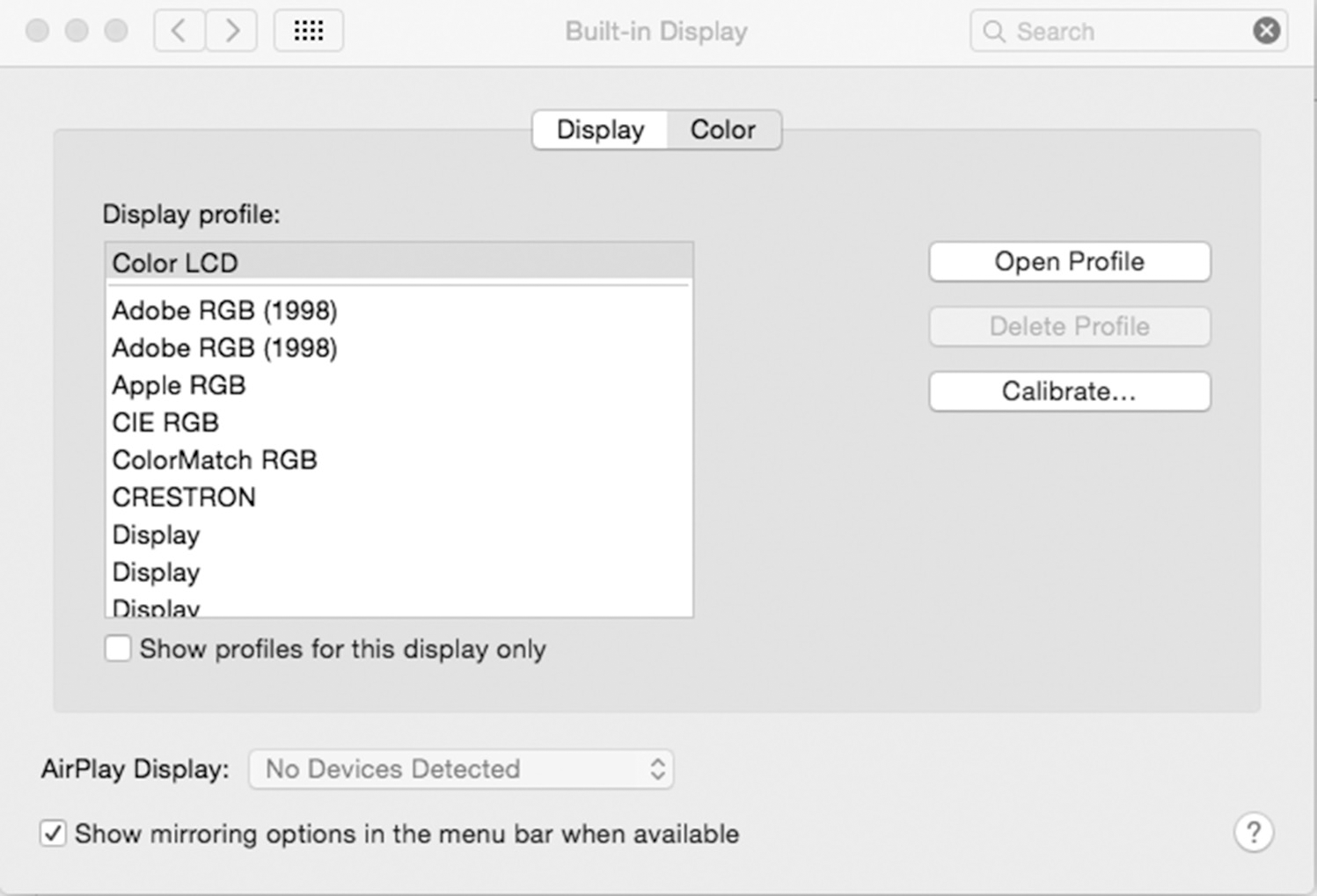
Figure 8.1 shows an example of this kind of two-part control: a segmented control containing two options, ‘Display’ and ‘Color’. Which one is currently active? The user might imagine the answer to be ‘Display’, since the text underneath begins with that word. However, the correct answer is that ‘Color’ is currently active.
Choosing one or two of two options
Use a pair of checkboxes. Do not use radio buttons.
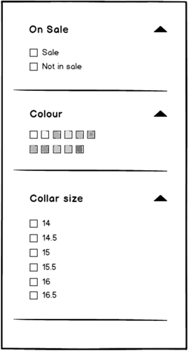
Choosing from a fixed set of three or more options
There are two questions to ask in this situation:
- Are the options mutually exclusive?
- Can all the options be displayed simultaneously?
If the options are not mutually exclusive, use a set of checkboxes. Do not use radio buttons. Another option is a list box (see the list of profiles in Figure 8.1 for example). The drawbacks of a list box are:
- They are relatively uncommon, so some people do not know how to use them – for example, by using the Control and Shift keys correctly in Microsoft Windows.
- In HTML, list boxes are implemented using the <select> element, which can be hard to use on mobile devices.
If the options are mutually exclusive, use a set of radio buttons. Do not use checkboxes.
Sometimes the number of possible options is very large. For example, a list of countries might have more than 200 entries. In this case, a set of radio buttons will take up so much space on the screen that the user will be obliged to scroll to see it all, and will not be able to see the rest of the display at the same time. The dropdown list control is designed for presenting lists without taking up extra space on the screen, and is very widely used, both for this reason and because it is easy to implement. However, it is one of the least usable controls, precisely because the options are hidden most of the time. A better approach might be to consider whether it is always necessary to show all the options. For example, if 80 per cent of your website visitors are from the same country, and 80 per cent of the remainder are from a group of five other countries, the most usable design might be to present a set of seven radio buttons, with the first country selected by default, the last option being ‘Another country’ and leading to a further set of options that are not normally visible.
This last suggestion is an example of progressive disclosure, the general technique of starting by showing the user only a small set of information or interaction possibilities, and presenting other, more advanced or obscure options if the user explicitly asks for them. This reduces complexity and clutter in the UI.
Choosing from a set of options that may not contain the desired answer
The combo box control is designed to deal with this situation – a combination of a drop down menu and a text box for entering the answer if absent from the list. Combo boxes are well supported on native desktop platforms, but are absent from HTML and are not particularly usable on mobile devices. It may be better to present a set of radio buttons with a final ‘other’ option, leading to the display of a text field that would not otherwise be seen – another example of progressive disclosure.
Another way of dealing with this situation is to use auto complete – an interaction design pattern that can be associated with a text field where, as the user starts to type, the system displays a list of matching suggestions that can be picked from.
Entering a structured piece of information
When entering a structured piece of information such as a date, URL, telephone number, email address or credit card number, think carefully about the users’ characteristics, the task context and the technical environment when deciding how to support these operations, and in critical cases, consider doing usability testing. HTML5 provides special-purpose form elements for the first four examples listed. (Note that at the time of writing, there are deficiencies in support for the <input type=”number”> HTML5 element in some browsers and assistive technology.) These make it easier for the user to enter the right information and avoid errors. For example, if an input control is designated as a telephone number, a touchscreen device should display a numeric keypad so that the user does not enter non-numeric characters in the field. However, remember that platform support for HTML5 varies widely.
Date picker controls make it impossible to enter an invalid date. However, they can be hard to use if they force the user to scroll repeatedly. Choose a default value that minimises scrolling. It may sometimes be preferable to use simple numeric input fields for the year, month and day. A form sometimes contains multiple date fields with logical interdependencies, for example, the start and end date for a booking. Usability testing should find any problems resulting from the way you have designed for this situation.
The palette of elements that can be used to make up a user interface ranges from the large-scale to the detailed. The controls discussed above are at the level of fine detail. Conventional ways of structuring user interaction at a higher level are often referred to as patterns. Design patterns are collected and documented in many books (for example, Scott and Neil, 2009) and websites. Each pattern exists to solve a specific type of generic design problem. As with form controls, using well-established patterns in a predictable way is an excellent technique for leveraging your users’ existing knowledge and experience, as well as the effort that other designers have put into developing and refining these ideas. It is beyond the scope of this book to catalogue patterns extensively, but a few examples are discussed below to give you a flavour of their nature and scope.
Faceted search
Problem: The user wants to find a list of items that meet various different criteria simultaneously. The required flexibility cannot be achieved with a single hierarchical information architecture optimised for one browsing strategy.
Solution: Provide a set of search controls that allow the user to experiment with specifying and changing criteria under several different headings (facets) at the same time (see Figure 8.2).
Figure 8.2 Clothes shopping with faceted search
Problem: The user of a web application wants to see a list of information items. However, there may be hundreds, thousands or even millions of items that match the search criteria. Putting all this information on one page would seriously damage performance and overwhelm the user.
Solution: Split the results into subsets of, say, 50 items at a time and display each subset on a different page. Provide controls that allow the user to go forwards and backwards through the sequence of pages, or jump to the beginning or the end (see Figure 8.3). Tell the user how many pages there are in total, and what the number of the page they are currently looking at is. Optionally, provide links allowing the user to go straight to any one of the next few pages. Optionally, allow them to type in the number of a page to go straight there. Optionally, allow the user to change the number of items on each page.
Figure 8.3 Pagination control

Infinite scrolling
Problem: The same problem as addressed by the Pagination control.
Solution: Whenever the user scrolls down to the end of the page, automatically display additional results without the user needing to take any action, so that the amount of information on the page grows progressively.
Breadcrumbs
Problem: A website has an information architecture several layers deep. To stay orientated within the overall structure, the user needs help in remembering the path that they have followed to reach the current page from the home page, and may like to be able to reach any of the intermediate pages easily.
Solution: At the top of each page, present a chain of links representing the sequence of pages that the user followed to reach this page from the home page (Figure 8.4).
Figure 8.4 Breadcrumbs (Source: https://www.w3schools.com/howto/tryit.asp?filename=tryhow_css_breadcrumbs)

Wizard
Problem: To carry out a particular task, such as setting up an application for the first time, making a purchase or signing up for a service, it is necessary for the user of the product to carry out a large number of steps – more than can be done reasonably on one page. There may be multiple possible paths through the process. If the user abandons it part-way through, the application will be left in an inconsistent state, so their changes will need to be discarded.
Solution: Organise the process into a predictable sequence of steps split up into a series of pages, supporting the multiple possibilities in as simple and quick a way as possible. Guide the user through the sequence, making it hard for them to get distracted from the task in hand by removing other navigation items for the duration of the task. Give a clear visual indication of how many steps there are in the process, and how many have been carried out so far.
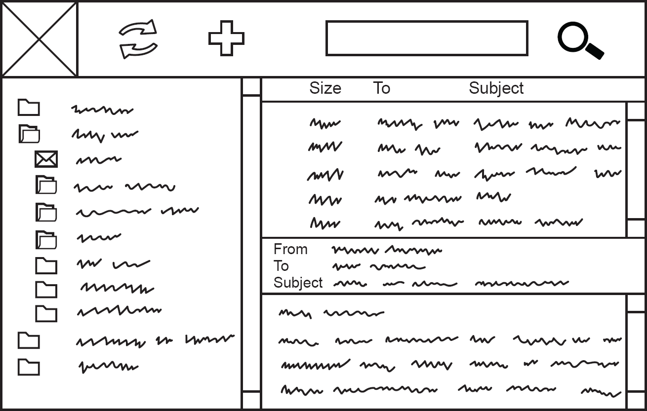
Organiser-Workspace
Problem: The user needs to navigate around a database of items or documents, organised into folders. They need to see a list of all the items within a folder, while also maintaining an overview of the folder structure and their current place in it. Having chosen an item to examine more closely, or decided to create a new one, they then need to be able to work on it in detail.
Solution: Divide the screen into left and right. In the left-hand pane, show a hierarchical tree browser control, allowing the user to navigate around the folder structure, focus on areas of interest by expanding and collapsing branches of the tree, and select one folder for examination. Divide the right-hand pane into top and bottom. In the top pane, show a list of the items in the selected folder, with columns showing attributes of each item. Use the bottom pane as a workspace for viewing and editing an individual item. Preferably, allow the user to resize the panes by moving the boundaries between them. This is what Alan Cooper et al. (2014) call the Organiser-Workspace pattern, and has been typical for Microsoft products for many years (see Figure 8.5).
Figure 8.5 The Organiser-Workspace pattern
Problem: The user wants to choose from a set of items that are best represented by pictures. If the screen is large, showing all the pictures on the screen might be possible, but would be overwhelming and would make it hard to find the right item (see Hick’s law). If the screen is small, it is only possible to show one picture at a time anyway.
Solution: Show one picture (or, if space permits, a small number of pictures arranged in a horizontal row) at a time, with controls to the left and right of the picture to indicate that other pictures are available to be browsed through, and make it possible to scroll left or right as easily as possible, by swiping, using the keyboard’s arrow keys or clicking on the screen to either side of the currently displayed picture. Optionally, the pictures could be programmed to scroll automatically every second or two in the absence of user interaction (however, note that animating the UI in a way that diminishes the user’s control over it is generally not a good idea). A common convention is to show the number of items in the carousel with a number of small circles underneath it, one of which has its appearance altered to show that it is the currently visible one.
PHYSICAL ERGONOMICS OF USER INTERFACE CONTROLS
The design of user interface controls is largely a matter of cognitive ergonomics: how can we optimise the product to fit the user’s mental processes? However, operating a user interface also calls for physical, as well as cognitive effort. The user needs to be physically able to see the controls and manipulate them using parts of their body, such as their hand to operate a mouse, or their fingertips to use a touchscreen.
On touchscreens, controls need to be large enough and have enough space around them for the user to be able to touch the right area without accidentally touching something else. This includes people with large fingers, people whose hands are shaking and those with long fingernails.
Using a mouse or trackpad is hard for many people, either because of motor disability or as a result of working in a cramped space or with an unfamiliar computer. Even for those with no such difficulties, moving the mouse pointer a long distance on the screen requires moving the mouse a long way. The operation is even harder if the control being moved to is small. The larger the controls and the smaller the required mouse movements, the more efficiently the user will be able to carry out their tasks. Fitts’ law states this in more formal terms.

Fitts’ law
The time taken to move to a target is a function of the target size and the distance to the target.
For people who find a mouse difficult, particularly severe problems are presented by controls that require a combination of moving the mouse, waiting for visual feedback and holding down or releasing the mouse button. Examples of this are dragging an icon into a folder and waiting for the folder to be highlighted before releasing the mouse button, or using a multi-level drop down menu where the user has to move the mouse pointer over the right toolbar menu item in order see the drop down menu, then move the mouse pointer over the right item in the menu to see the next level of the menu, and so on, all without accidentally moving the mouse off the menu so that it disappears and they have to start again.
SUMMARY
Interaction design involves thinking about the flow of information between user and system at a detailed level. Without committing prematurely to any decisions about visual form, the interaction designer designs prototype interface mechanisms that allow the team to test out ideas for how the user can most effectively carry out their tasks.
Useful and usable interfaces are simple, focused on the user’s tasks, take into account the user’s knowledge and expectations, and are designed from the beginning to be usable on a range of devices that are appropriate for the users. Choosing suitable interface mechanisms can have a strong positive or negative effect on effectiveness, efficiency and satisfaction.
The choice of interactive controls is partly a matter of using well-established tools in the correct fashion. Another way of leveraging the user’s existing knowledge and avoiding the creation of baffling homemade solutions is to take advantage of well-documented and familiar user interface patterns, such as wizards, Organiser-Workspace, breadcrumbs and faceted search.
REFERENCES
Cooper, A., Reimann, R., Cronin, D. and Noessel, C. (2014) About Face: The Essentials of Interaction Design. Wiley, Indianapolis, IN.
Scott, B. and Neil, T. (2009) Designing Web Interfaces: Principles and Patterns for Rich Interactions. O’Reilly Media, Sebastopol, CA.
Walker, R. (2003) The guts of a new machine. The New York Times, 30.
FURTHER READING
Goodwin, K. (2011) Designing for the Digital Age: How to Create Human-Centered Products and Services. Wiley, Indianapolis, IN.
Jarrett, C. and Gaffney, G. (2008) Forms That Work: Designing Web Forms for Usability. Morgan Kaufmann, Burlington, MA.
1. You are creating a form for a hotel booking system. One field is titled, ‘Select a type of room’ and the possible answers are ‘Single’, ‘Double’ and ‘Twin’. What would be the correct user interface control to accept responses?
a. A set of radio buttons
b. A set of checkboxes
c. A free text field
d. A drop down menu
2. Users are requested to indicate at the end of the online application which daily newspaper(s) they read. Which would be the MOST appropriate user interface control to use?
a. Check boxes
b. Radio buttons
c. Text box
d. Drop down menu
3. Which law states that the time required to move to a target is a function of the target size and distance to the target?
a. Hick’s law
b. The power law of practice
c. Fitts’ law
d. Nielsen’s law
4. The design team are struggling to decide whether to use a set of radio buttons or a drop down menu to help users choose from a list of about 12 items. What would you advise?
a. Choose a drop down menu as this will reduce the amount of screen real estate needed for the control
b. Choose radio buttons as this will expose all of the options to users without them having to click to see the choices
c. Prototype both alternatives and observe how users interact with the controls in an upcoming usability test
d. Design a new control that combines the best of both approaches
1. The correct answer is (a).
(b) is incorrect because this will accept more than one choice and the choices are mutually exclusive (‘Choose a type of room’). (c) is incorrect because it will result in typing errors. (d) is incorrect because there are only three choices and using a drop down is less efficient than clicking a single radio button (click to activate the drop down, scroll to correct answer, release mouse). This leaves (a) as the correct answer.
2. The correct answer is (a).
The question indicates that more than one choice can be made. This rules out radio buttons and a drop down menu for selection. Entering text into a free format text box allows all kinds of difficulties to be encountered – is ‘The Times’ the same as ‘Times’? And what about ‘The London Times’? Having eliminated other choices, the best option is that which remains, option (a) – check boxes.
3. The correct answer is (c).
(a) is wrong because Hick’s law refers to the time taken to make a decision with a user interface based on the number of choices. (b) is wrong because this refers to learning improvement with time. (d) is wrong because Nielsen’s law refers to internet bandwidth. This leaves (c) as the correct answer.
4. The correct answer is (c).
The purpose of this question is to see if candidates realise that the best way to choose between options in a user interface is by having real user data rather than opinions. (d) is wrong, because it makes sense to use a control that’s consistent with other controls that people use, rather than create a new one. Without any more information about the context in the question stem, it’s impossible to choose between (a) and (b) since both might be sensible choices in a particular context. This leaves (c) as the correct choice. Although it’s true that it might not make sense to run a usability test if the only aim of the test was to make a decision about controls, the question points out that this is an ‘upcoming’ test, so it would be a quick and cheap way to inject this question into the upcoming test and get a definitive answer.