
The following code snippet will plot the data we downloaded and processed:
def show_plot(key="", show=True):
    fig = plt.figure()
    fig.set_figwidth(20)
    fig.set_figheight(15)
    for code in codes:
        index = code.split("/")[1]
        if key and len(key) > 0:
            label = "{}_{}".format(index, key)
        else:
            label = index
        _ = plt.plot(closings[label], label=label)

    _ = plt.legend(loc='upper right')
    if show:
        plt.show()

show = True
show_plot("", show=show)
show_plot("scaled", show=show)
show_plot("log_return", show=show)
The original market data to close values. As you can see here, the value for WAWEL is a couple of magnitudes larger than the other markets:

The closing values for WAWEL visually reduced the trends in data for the other market values. We will scale this data so we can see it better. Take a look at the following screenshot:

The scaled market values help us visualize the trends better. Now, let's see how the log_return looks:
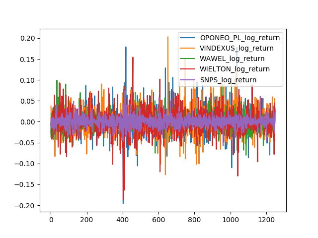
The log returns the markets' closing values