
Without even having TensorFlow installed, you can play with a reference implementation of TensorBoard. You can get started here:
https://www.tensorflow.org/tensorboard/index.html#graphs.
You can follow along with the code here:
The example uses the CIFAR-10 image set. The CIFAR-10 dataset consists of 60,000 images in 10 classes compiled by Alex Krizhevsky, Vinod Nair, and Geoffrey Hinton. The dataset has become one of several standard learning tools and benchmarks for machine learning efforts.
Let's start with the Graph Explorer. We can immediately see a convolutional network being used. This is not surprising as we're trying to classify images here:

This is just one possible view of the graph. You can try the Graph Explorer as well. It allows deep dives into individual components.
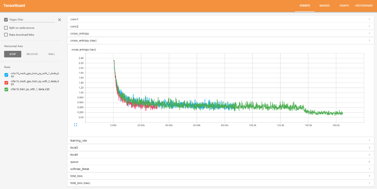
Our next stop on the quick preview is the EVENTS tab. This tab shows scalar data over time. The different statistics are grouped into individual tabs on the right-hand side. The following screenshot shows a number of popular scalar statistics, such as loss, learning rate, cross entropy, and sparsity across multiple parts of the network:
The HISTOGRAMS tab is a close cousin as it shows tensor data over time. Despite the name, as of TensorFlow v0.7, it does not actually display histograms. Rather, it shows summaries of tensor data using percentiles.
The summary view is shown in the following figure. Just like with the EVENTS tab, the data is grouped into tabs on the right-hand side. Different runs can be toggled on and off and runs can be shown overlaid, allowing interesting comparisons.
It features three runs, which we can see on the left side, and we'll look at just the softmax function and associated parameters.
For now, don't worry too much about what these mean, we're just looking at what we can achieve for our own classifiers:

However, the summary view does not do justice to the utility of the HISTOGRAMS tab. Instead, we will zoom into a single graph to observe what is going on. This is shown in the following figure:

Notice that each histogram chart shows a time series of nine lines. The top is the maximum, in middle the median, and the bottom the minimum. The three lines directly above and below the median are 1½ standard deviation, 1 standard deviation, and ½ standard deviation marks.
Obviously, this does represent multimodal distributions as it is not a histogram. However, it does provide a quick gist of what would otherwise be a mountain of data to shift through.
A couple of things to note are how data can be collected and segregated by runs, how different data streams can be collected, how we can enlarge the views, and how we can zoom into each of the graphs.
Enough of graphics, let's jump into the code so we can run this for ourselves!