Chapter 7: Ad Hoc Analytics
Welcome to Part 3 of Serverless Analytics with Amazon Athena! In the preceding chapters, you learned how to run basic Athena queries and established an understanding of key Athena concepts. You then connected to a data lake that you built and secured. Along the way, you've been learning how to organize and model your data for use by Athena. Now that you have much of the prerequisite knowledge for using Athena, we once again shift our focus. The next few chapters will revisit many of the concepts you've already learned as you work through four of the most common use cases that lead customers to choose Athena for their business.
We begin right here, in this chapter, by unraveling both what it means to run ad hoc analytics queries as well as why the industry seems to have an insatiable appetite for running such queries. We'll also go through building a template for how you can adopt Athena and its related tooling within your organization as part of a complete ad hoc analytics strategy.
In the subsequent sections of this chapter, we will cover the following topics:
- Understanding the ad hoc analytics hype
- Building an ad hoc analytics strategy
- Using QuickSight with Athena
- Using Jupyter Notebooks with Athena
Technical requirements
Wherever possible, we will provide samples or instructions to guide you through the setup. However, to complete the activities in this chapter, you will need to ensure you have the following prerequisites available. Our command-line examples will be executed using Ubuntu, but most types of Linux should work without modification, including Ubuntu on Windows Subsystem for Linux.
You will need an internet connection to access GitHub, S3, and the AWS console.
You will also require a computer with the following:
- A Chrome, Safari, or Microsoft Edge browser installed
- The AWS CLI installed
This chapter also requires you to have an AWS account and an accompanying IAM user (or role) with sufficient privileges to complete this chapter's activities. Throughout this book, we will provide detailed IAM policies that attempt to honor the age-old best practice of "least privilege." For simplicity, you can always run through these exercises with a user that has full access. Still, we recommend using scoped-down IAM policies to avoid making costly mistakes and learning more about using IAM to secure your applications and data. You can find the suggested IAM policy for this chapter in the book's accompanying GitHub repository, listed as chapter_7/iam_policy_chapter_7.json, here: https://bit.ly/2R5GztW. The primary changes from the IAM policy recommended for Chapter 1, Your First Query, include the following:
- The addition of QuickSight permissions. Keep in mind that an administrator will be required to create your QuickSight account and also enable QuickSight to access Athena and S3. These permissions were too broad for us to feel comfortable adding them to the chapter's IAM policy.
- SageMaker notebook permissions.
- IAM role manipulation permissions used to create a SageMaker role for your notebook.
Understanding the ad hoc analytics hype
If you are lucky, you may not be aware of the buzzword levels of hype surrounding ad hoc analytics. Fortunately, there are strong fundamentals behind the increasing level of interest and importance placed on having good tooling for ad hoc analytics. In a moment, we'll attempt to form a proper definition of ad hoc analytics, but not before we run a time travel query of our own to set the stage for what we now know as ad hoc analytics.
As a society, we've been collecting data since the advent of commerce. In the era before modern big data technologies, the business intelligence landscape was a very different place. Most data capture and entry was a manual affair, frequently driven by government accounting and auditing requirements. Particularly savvy companies were tracking their own, non-accounting-related Key Performance Indicators (KPIs), but these exercises were often short-lived and targeted at achieving specific outcomes. It is essential to understand the difference between the past data landscape, where information was scarce, and today, where data availability is not the most common limiting factor.
While preparing to write this chapter, I looked for examples of companies doing the modern-day equivalent of ad hoc analytics before the advent of big data. How did organizations do this before IoT and cloud computing upended the economics of data capture and retention? In the process, I solved a mystery behind a 25-gallon container of pencils that had been in my parents' garage for nearly 30 years. While helping my father clean out his garage, he asked me how this book was coming along. I told him I was stuck looking for an example of how companies answered questions about their day-to-day operations. Questions such as which products get returned most often or how much productivity is lost in maintenance of old machinery. That's when I finally got the entire backstory to the seemingly endless supply of pencils my father kept behind his ear as a contractor. My grandfather had worked at a large pencil manufacturer back in the 1990s. The story begins with quality control issues that caused poor writing quality and led to entire production batches needing to be scrapped. Folks like my grandfather were working overtime to make up for the production shortfall. Oddly, the more they produced, the lower their yields became.
My grandfather was one of the folks pulled off the production line to aid in quality control. They were already doing periodic quality control. That's how they noticed the issue in the first place. It wasn't enough. They started sampling random pencils from the production line every 5 minutes and tagging them with the date, time, ambient temperature, and ambient humidity. Then they'd sharpen the pencil and write a few words with it to gauge its relative quality before recording the results in a notebook. Each day, the numbers from the various production lines were collated and submitted by USPS to the head office. Eventually, after months of these manual activities and lost production, someone noticed a pattern. When humidity rose above a certain threshold, the quality started to falter, but only toward the end of the week. It turned out that when their production exceeded the on-hand supply of raw materials, they'd get fresh batches of glue delivered. The fresh glue was more sensitive to high humidity. Unfortunately, the manufacturing line's humidity tended to peak at the end of the week, as they were due to receive a new batch of raw materials. This entire investigation was a crude form of ad hoc analysis, and that barrel in the garage was full of the pencils my grandfather had tested but didn't want to throw away.
Potentially charming anecdotes aside, this is a classic example of a long OODA loop. The OODA loop shown in the following Figure 7.1 represents the four stages of sound decision making. You start by observing in order to orient yourself to the problem at hand before deciding on what to do and finally acting on that decision. The hallmark of many successful businesses is a short OODA loop because they can react to changing information quickly. The longer it takes you to detect and understand why something bad, or good, is happening, the less likely you can navigate the situation successfully. This can result in missed business opportunities, lost customer confidence, or regulatory impact. The need to shorten the OODA loop has driven the world to capture and retain as much potentially relevant data as possible, fueled in part by improvements in embedded systems that have fueled the IoT boom. Physical businesses, such as the pencil manufacturer we just discussed, can now record hundreds of KPIs in real time for a fraction of what it cost them to measure three variables every 5 minutes a few decades ago. The rapid fall in data acquisition costs has led to compound annual data growth rates above 50% and shifted the OODA loop problem to the right.
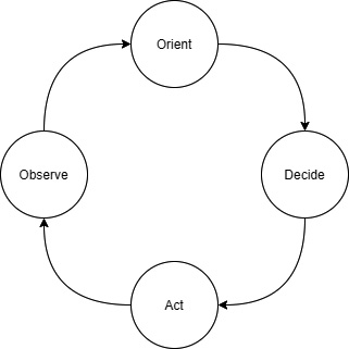
Figure 7.1 – The almightly OODA loop
Fast forward to today, and most organizations can capture more data than they know what to do with. As a result, essential business insights are buried among mountains of uninteresting information that may become useful in the future. Typically, an organization will periodically review KPIs using scheduled reports. These reviews often raise new questions. Why is this off trend? How long has this been happening? At what point will we need to account for that? Identifying unexplained trends is only the first step to generating actionable insights. Once you've observed something interesting, the second step in the OODA loop is to orient yourself to the context that is causing it. To do that, we need to ask follow-up questions of our data. These questions are ad hoc because they are situational and depend on information from previous observations. As a result, only the analytical tasks that go into the observe portion of the OODA loop can be standardized into scheduled reports. The exploratory and root cause research-related queries that often follow are too varied and numerous to be known in advance. There you have the creation of the ad hoc analytics craze.
Organizations that are early on the maturity curve will often establish centralized reporting teams that field requests for both scheduled and ad hoc reports. Reporting teams attempt to bridge a skills gap that has historically existed between the subject-matter experts and query experts. For example, a fashion-savvy merchandiser running an apparel business may not know how to write a MapReduce job to identify the emerging trend in unmatched socks. This leads them to miss out on an opportunity to be fully stocked before prices rise as this new style takes off. Or maybe my five-year-old is the only one driving such buying patterns. Organizations often try and bridge this skills gap by creating entire teams dedicated to fielding reporting requests. This model can work for small organizations, but quickly becomes a bottleneck at scale. The unyielding inflow of requests, each of which may spawn more follow-up requests, contributes to high turnover in such teams.
Aside from the scaling challenges, centralized reporting teams add non-obvious friction to the analytics process. Individuals writing the reports may have enough understanding of the data's relationships to properly offer or use techniques such as the approximate query functions we covered in Chapter 3, Key Features, Query Types, and Functions. Since they are kept at a distance from the data and tools to query that data, customers become implicitly biased or trained by past reporting experiences. This limits their future asks, creating a cycle that approaches zero utility.
Organizations are looking to tools such as Amazon Athena combined with easy-to-use tools such as QuickSight to democratize access to data. In the next section, you'll explore a possible ad hoc analytics strategy that combines Athena, QuickSight, and Jupyter Notebooks to provide flexible options for a broad spectrum of ad hoc analytics use cases.
Building an ad hoc analytics strategy
As we've seen in our examples, by putting the information in the hands of subject-matter experts, you can make better, faster decisions. Thus, it should be a focal point of any ad hoc analytics strategy to improve the accessibility of data, putting it in the hands of the individuals best suited to interpret the insights it contains. Our first step in forming such a strategy is to remember that while this book will present solutions based on the Athena ecosystem, it is rarely a good idea to lock yourself into any single product or analytics engine. The underlying technologies, pricing models, and supporting tooling will make trade-offs that necessarily favor one use case over others. If something sounds too good to be true, such as a product claiming to be the only analytics system you need, it's probably mediocre at a wide range of things and unlikely to be the best in class for anything. This is part of the philosophy behind AWS's fit-for-purpose database strategy and is equally applicable to analytics. The important things to consider include the following:
- Choosing your storage
- Sharing data
- Selecting query engines
- Deploying to customers
We'll check these out in more detail in the following sections.
Choosing your storage
Let's start our hypothetical ad hoc analytics strategy with storage. Where will you house the data? Will each team store their own data? Suppose for a minute that we avoided being prescriptive about this. After all, we painted the notion of a centralized reporting team as less than ideal. Maybe the same is true for standardizing storage. Different teams may even have different storage needs. Be careful about falling into this trap. The storage system you choose may limit your options for discovering and sharing data across your organization. This can mean the difference between having a ubiquitous data lake and many siloed data ponds. Nearly every Online Analytics Processing (OLAP) use case can be made better by separating storage and compute with an S3-like object store. Some esoteric use cases may indeed have specialized performance or auditability requirements that make S3 a less-than-ideal choice. You should avoid the temptation to shape your strategy based on outliers that you may never actually encounter. Instead, leave room in your strategy for how you will evaluate, approve, and integrate these exceptions.
If you're following the best practices in earlier chapters, you're likely to arrive at a strategy that treats S3 and your data lake. All data providers will be expected to master their data in S3 using Parquet for structured data and text for unstructured data. The accompanying metadata for these datasets will be housed in AWS Glue Data Catalog. AWS Data Catalog aids in discoverability and sharing since most metadata can be inferred from the S3 data itself. For teams, or systems, that have their own storage, they will be required to maintain an authoritative copy in the data lake on a cadence. This can be done as periodic, incremental additions to S3 or full snapshots that supersede previous versions. In Chapter 6, AWS Glue and AWS Lake Formation, and Chapter 14, Lake Formation – Advanced Topics, you learn how Lake Formation helps make it easier to integrate with an S3-backed data lake.
Sharing data
Most of the really interesting use cases for ad hoc analytics will require data from multiple sources. For small organizations, you may be able to get by with handling access requests using IAM policies and organizational processes. However, once you get past a handful of datasets and a couple of consumers, you'll want tooling to support your processes. This is especially true if you deal with sensitive Personally Identifiable Information (PII) or are subject to GDPR regulations. S3 permissions are limited to enforcing object or prefix (directory) level access. S3 is oblivious to the contents of your objects and their semantic meaning. This means S3 permissions alone cannot restrict sensitive columns or apply row-level filters to prevent someone from reading budget records from a yet-to-be-announced project. If you're taking security seriously, you'll want to make Lake Formation a core part of your analytics strategy. AWS Lake Formation abstracts the details of crafting IAM policies and offers an interface where you can permission your data lake customers on the dimensions they are most familiar with. You simply manage table-, column-, and even row-level access controls from an interface that is designed for analytics use cases. Since Lake Formation is integrated with Amazon Athena, Amazon EMR, and Amazon Redshift, you can avoid the classic problem of having authorization information spread across multiple systems. Lake Formation can even facilitate cross-account data sharing, facilitating the post-acquisition mergers of technology and reducing the strain on your AWS account design.
Selecting query engines
Luckily, our decision to use Amazon S3 to house our data lake means we are not locked into a particular query engine. In fact, we can support multiple query engines with relative ease. You shouldn't take that to mean that it's a good idea to have a dozen different query technologies, only that our choices thus far have derisked the importance of any one product. To begin, you'll want to offer a serverless query engine with a SQL interface, such as Amazon Athena. SQL is a broadly taught and widely understood language. Many of your employees may already be familiar with SQL, and if they aren't, it's easy to get them started. Electing a serverless option always makes it easier to keep costs under control since ad hoc workloads tend to make for challenging capacity planning exercises. This is even more important when your end customers may not be well versed in starting or stopping servers for their queries. Beyond SQL, Athena also offers support for custom data connectors and User-Defined Functions (UDFs). This can help provide a single query interface even if some of the data may not be in our S3 data lake. While it is beyond the scope of this book, you can complement Athena's SQL interface with Glue ETL or Amazon EMR to add Apache Spark-based query capabilities that can support more sophisticated forms of customization. With Apache Spark, you can introduce your own business logic at every stage of the query. This can become a deeply technical exercise, but our strategy's goal is to lay out a plan. If we encounter these situations, we want a general idea for delivering the required capability.
Deploying to customers
Some customers of your ad hoc analytics offering will be comfortable writing and running SQL directly in the Athena console, but we can do better than Athena's console experience. Your organization will likely want to create repeatable reports and dashboards and even share their ad hoc analysis. They may even want to post-process results using standard statistical libraries. Luckily, Amazon Athena supports JDBC and ODBC connectivity so that you can use a wide range of client applications, such as Microsoft Excel, or BI tools, such as Tableau. For our hypothetical company, we'll support two different ad hoc analytics experiences. The first will be a more traditional experience built on Amazon QuickSight connecting to Athena. This option should be suitable for those experienced with SQL or other BI tooling. It will allow our customers to visualize trends and dig into patterns while minimizing the need for specialized technical skills. We'll also support a more advanced experience in the form of Jupyter Notebooks. Jupyter Notebooks allows authors to mix traditional SQL, statistical analysis tools, visualizations, text documentation, and custom business logic in the form of actual code.
This may seem daunting at first and perhaps only appropriate for developers, but that isn't the case. The collaborative features of notebooks allow you to share and customize analysis in a way that enables you to introduce more powerful tooling with a commensurately steep learning curve.
Now that we've established both the definition and importance of ad hoc analytics, let's see whether we can make our hypothetical strategy a bit more tangible. In the remainder of this chapter, we will walk through implementing this strategy to run ad hoc queries over the data lake we built in previous chapters using Athena, Amazon QuickSight, and SageMaker Jupyter Notebooks.
Using QuickSight with Athena
AWS QuickSight is a data analysis and visualization tool that offers out-of-the-box integrations with popular AWS analytics tools and databases such as Athena, Redshift, MySQL, and others. QuickSight has its own analytics engine called Spice. Spice is capable of low-latency aggregations, searches, and other common analytics operations. When combined with a large-scale analytics engine such as Athena, QuickSight can be used for a combination of data exploration, reporting, and dashboarding tasks. This section will briefly introduce you to QuickSight and use it to visualize both our earthquake and Yellow Taxi ride datasets. Since QuickSight itself is a WYSIWYG (What Ya See Is What Ya Get) authoring experience with lots of built-in guidance, we won't spend much time walking you through each step in this section. Instead, we will focus on the broad strokes and let you explore QuickSight yourself. Regardless of this simplification, our QuickSight exercise will have multiple steps and take you 15 to 20 minutes to complete. In that process, you'll be tackling the following objectives:
- Sign up for QuickSight.
- Add datasets to QuickSight.
- Create a new analysis.
- Visualize a geospatial dataset.
- Visualize a numeric dataset.
- Explore anomalies in a numeric dataset
Let's dive right in!
Getting sample data
By this point in the book, you've gathered sample data, imported it to S3, and prepared tables for use in Athena half a dozen times. We'll be reusing many of those datasets and tables to save time and focus on the new topics presented in this chapter. In case you skipped previous chapters or just prefer to start with a clean slate, you can download and run our Chapter 7 data preparation script using the following commands from AWS Cloud Shell or your preferred terminal environment. The script will download several years of the NYC Yellow Taxicab dataset into an S3 landing zone before reorganizing that data into an optimized table of partitioned Parquet files. It will also download a small dataset containing geospatial data about recent earthquake activity in the US state of California. This script is likely to take 20 minutes to run from AWS Cloud Shell as it encompasses much of the data lake work from the first three chapters. Once the script completes, it may take a few more minutes for the final Athena query it launches to complete and the resulting table to become usable. You can reuse the S3 bucket and Athena workgroups you made in earlier chapters:
wget -O build_my_data_lake.sh https://bit.ly/3suTuU8
chmod +x build_my_data_lake.sh
./build_my_data_lake.sh <S3_BUCKET> <ATHENA_WORKGROUP_NAME>
Setting up QuickSight
If you aren't already a QuickSight customer, we recommend signing up for the Standard package when following these exercises. Unlike the other services we've used in this book, QuickSight's pricing model is more akin to traditional software licenses, with the Standard plan costing you between $13 and $50 a month per named user. Luckily, if you've never used QuickSight before, you may be able to complete this exercise within the free trial window. Your first time visiting QuickSight, you'll be prompted to sign up. Signing up for and configuring QuickSight requires IAM permissions that are broader than what we typically include in our chapter policies. As such, we recommend using a separate IAM user with administrative access to set up QuickSight. In Figure 7.2, we show the key properties you'll need to set when signing up. The most notable is allowing QuickSight to have access to Amazon Athena and Amazon S3. If you attempt to do this without privileged access, you'll encounter issues when you attempt to access Athena in later steps.
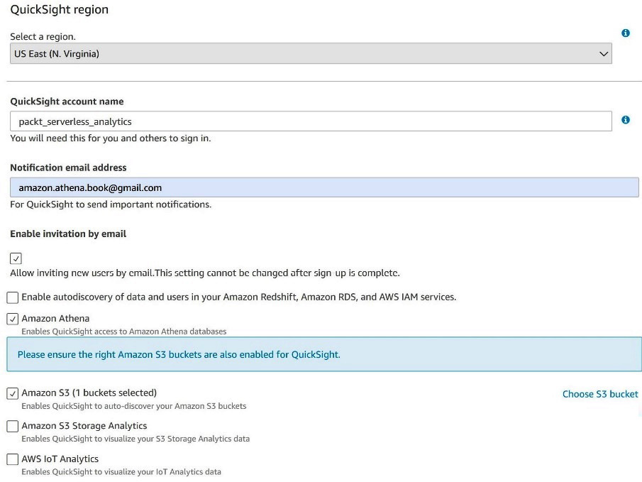
Figure 7.2 – Signing up for QuickSight
Once you or an administrator has completed the sign-up process, you'll be able to start analyzing data. Before we create our first dashboard, we'll need to define one or more datasets that can be used in our analysis. A QuickSight dataset can be thought of as a table and its associated source connectivity information. For example, we'll be using two datasets from Athena in our exercise. The first will be the chapter_7_earthquakes table from the packt_serverless_analytics database, with the chapter_7_nyc_taxi_parquet table being our second dataset. From the main QuickSight page, we can select datasets to view existing or create new datasets. Even if you've never used QuickSight before, you will have several sample datasets listed as options. When you click New Datasets, you'll get to choose from various sources, including Athena. After selecting Athena, a popup will appear asking you to select a workgroup.
If you are following along with the configurations in this book, you should choose the packt-athena-analytics workgroup. In Figure 7.3, we complete the final steps in adding a new dataset by selecting an Athena catalog, database, and table. You should repeat this process for both the chapter_7_earthquakes and chapter_7_nyc_taxi_parquet tables.
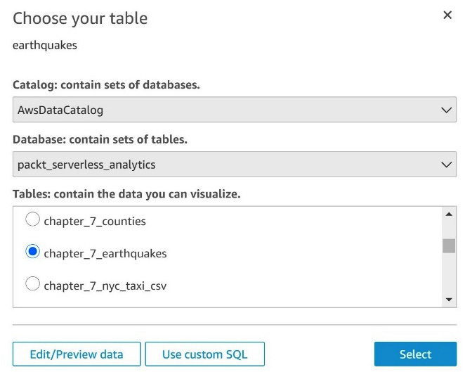
Figure 7.3 – Adding a dataset
Unable to create dataset errors
If you didn't have sufficient administrative rights when you signed up for QuickSight, you might encounter issues adding new datasets. If you see errors related to listing Athena workgroups or accessing the results location, you'll need an administrator to go into the QuickSight settings and re-enable Athena in the Security and permissions section.
Once you've created the datasets, you are ready to start analyzing your data. For now, ensure that chapter_7_earthquakes is selected. Then you can click on the New analysis button on QuickSight's main screen, as shown in Figure 7.4. In QuickSight nomenclature, an analysis is a multi-tab workspace with different visualizations and calculated fields. Once you are happy with an analysis, you can publish it as a read-only dashboard or share it with other QuickSight users in your organization. Since QuickSight is continuously saving your analysis, you can quickly backtrack from a failed exploration by undoing hundreds of recent edits.
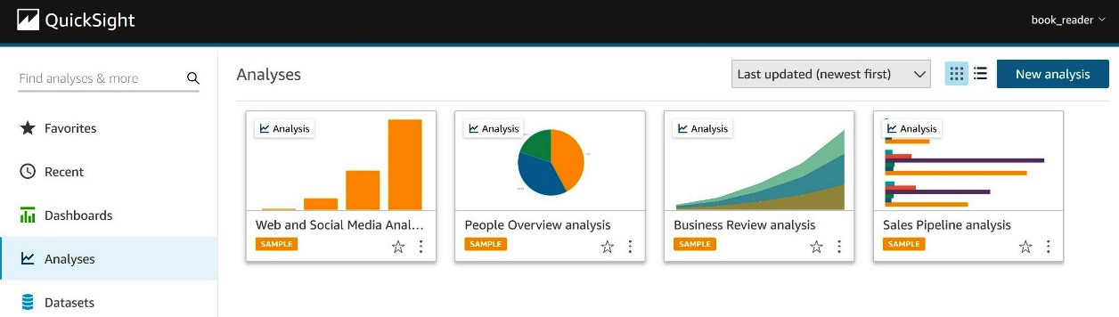
Figure 7.4 – Creating a new analysis
Your new analysis will start with a single blank tab. Let's add a new geospatial visualization to that tab by clicking Points Map from the visualization type pallet on the left navigation. Next, we'll select the longitude and latitude fields of the chapter_7_earthquakes dataset we added earlier as our geospatial fields. Since we want to understand the relationship between location, magnitude, and depth, we can use the magnitude and depth columns as our size and color fields, respectively. The ease of use and rich visualizations are where QuickSight shines. Figure 7.5 shows how, in just a few clicks, we've created our first analysis of earthquakes around the world:
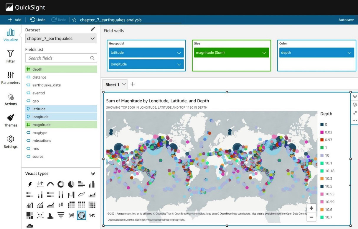
Figure 7.5 – Visualizing earthquake data
Visualizations can help better understand relationships in our data, but ad hoc analysis is all about iterating. Let's see how QuickSight can help us get to the bottom of interesting patterns in our data. If you plan to keep your earthquake data example, go ahead and create a new tab in our analysis for a deep dive into the NYC Yellow Taxi dataset we added earlier. Our first visualization on this new tab will be a combination bar and line graph where we will graph the average tip_amount field by year as bars on the chart. For the lines, we will add the count of rides by using the total_amount field. The first thing you'll notice is that we seem to have erroneous or incomplete data in our table for many years in the future, and even some in the past are contributing strange data to our graph. Luckily, QuickSight offers a handy tool for filtering data that goes into a visualization. Click on the chart and then on the year field's settings in the left navigation pane. From there, you can select add filter for this field and use the Filters dialog to include only data from 2017, 2018, 2019, and 2020. Once that's done, the graph should automatically refresh and resemble Figure 7.6:
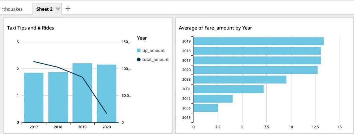
Figure 7.6 – Visualizing yellow taxi ride data
With the noisy data removed, we can see that the total number of rides, represented by the total_amount series in our legend, has been trading down for the last 3 years. We mostly ignore 2020 since our data is incomplete. Interestingly, the average tip amount has increased. This would suggest that customer satisfaction is rising. So why could ridership be down? Let's confirm that tips aren't simply growing due to increasing fares by adding a second graph to this tab. In Figure 7.5, we added a new bar chart with year as the y axis and average fare_amount as the value. Just as we did for the previous chart, you'll again want to filter out erroneous values by applying a filter to the year column in this graph, too. Once the graph renders, you can see that the increase in tips is not tied to a commensurate rise in fares. Customers are consciously choosing to tip more.
QuickSight customization
In Figure 7.6, we could not rename the total_amount series in the Taxi Tips and # Rides chart's legend to something more indicative of the actual value, such as "Number of Rides." While this is a pedantic example of the drawbacks of using WYSIWYG editors, it is indicative of the control you give up when using a tool such as QuickSight. There is an inherent conflict between the myriad of parameters in fully customizable systems and ease-of-use tools such as QuickSight. Please don't take the limited legend customization we've called out here as a reason not to use QuickSight. It's merely an easy-to-convey example of why you're unlikely to find a single tool to satisfy all your customers.
We haven't yet learned why ridership is down. If we really worked for the Taxi and Limousine Commission, we might want to dive deeper into the data and possibly run some A/B testing. Running additional queries along these dimensions could help us understand whether price or other supply and demand factors are playing a role in the decline. This might help confirm the impact of things such as ride-sharing services. For now, we'll put aside our QuickSight analysis and switch to Jupyter Notebooks for the next leg in the ad hoc analysis of our NYC Yellow Taxi dataset.
Using Jupyter Notebooks with Athena
Depending on the proficiency level in querying data, some individuals may consider QuickSight to be more of a dashboarding tool that populates results based on pre-set parameters. Individuals looking for a more fluid and interactive experience may feel their needs are better satisfied by a tool designed for authoring and sharing investigations. You're already familiar with the Athena console's basic ability to write queries and display tabular results. Jupyter Notebooks is a powerful companion to analytics engines such as Athena.
In this section, we'll walk through setting up a Jupyter notebook, connecting it to Amazon Athena, and running advanced ad hoc analytics over the NYC Yellow Taxi ride dataset. If you are unfamiliar with SageMaker or Jupyter Notebooks, don't worry. We will walk you through every step of the process so you can add this new tool to your shelf. For the uninitiated, AWS describes SageMaker as the most comprehensive machine learning service around. SageMaker is best thought of as a suite of services that accelerate your ability to adopt and deploy machine learning in any and every situation where it might be useful. That means SageMaker has dedicated tooling for data preparation tasks such as labeling and feature engineering work that may require nuanced techniques for statistical bias detection. You may be wondering what that has to do with Athena and ad hoc analytics. Well, training machine learning models requires good input data.
In many cases, your models are only as good as the inputs to your training. As such, Jupyter Notebooks provides an excellent interface and workflow for exploring data and capturing findings.
To begin, we'll need to create an IAM role that our SageMaker Jupyter notebook will use when interacting with other AWS services such as Athena. You can do this by navigating to the IAM console, selecting the Roles section, and clicking the Create role button. Once you do that, you'll be presented with the dialog in Figure 7.7. Be sure to select AWS service as the type of trusted entity and SageMaker as the entity, just as we have in Figure 7.7:
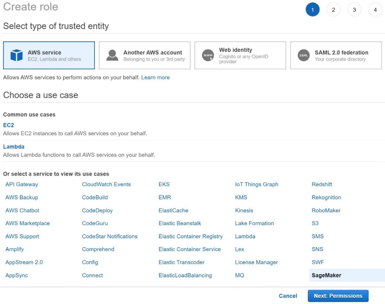
Figure 7.7 – Creating an IAM role dialog
These settings tell IAM that we want to create a role that is explicitly for use with SageMaker. This helps scope down both the types of activities the IAM role can perform and the contexts from which it can be assumed. In the next step, you'll have the opportunity to add the specific policies for the activities we plan to perform using this IAM role.
We recommend adding the packt_serverless_analytics policy that we have been enhancing throughout this book and used earlier in this chapter. As a reminder, you can find the suggested IAM policy in the book's accompanying GitHub repository listed as chapter_7/iam_policy_chapter_7.json here: https://bit.ly/2R5GztW.
Once you've added the policy, you can move on to the Add tags step. Adding tags is optional, so you can skip that for now and go to the final step of giving your new IAM role a name. We've recommended naming your new IAM role packt-serverless-analytics-sagemaker since this chapter's IAM policy already includes permissions that will allow you to create and modify roles matching that name without added access. If everything went as expected, your IAM role summary should match Figure 7.8. If you forgot to attach the packt_serverless_analytics policy, you can do so now using the Attach policies button highlighted here:

Figure 7.8 – IAM role summary dialog
With our shiny new IAM role in hand, we are ready to start a SageMaker Jupyter notebook and begin exploring the NYC yellow taxi ride dataset with Athena while using handy analysis libraries such as pandas, Matplotlib, and Seaborn. Don't worry if these sound more like species of tropical fish than ad hoc analytics tools. We'll introduce you to these libraries and how they can make your life easier a bit later in this section. On the SageMaker console, you can click on Notebook and then the Notebook instances section. From there, you can click on Create notebook instance to open the dialog in Figures 7.9 and 7.10:
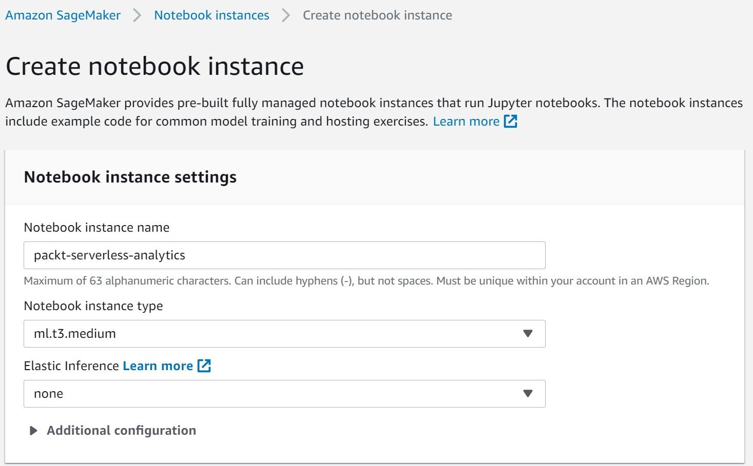
Figure 7.9 – SageMaker Create notebook instance dialog
In the first portion of the notebook creation dialog, you'll pick a name and instance type for your notebook. We recommend naming your notebook packt-serverless-analytics since your IAM policy is already configured to grant you the ability to administer notebooks matching that name. Any instance type that is at least as powerful as an ml.t3.medium will be sufficient to complete the exercises in this section.
We recommend the ml.t3.medium because it has a generous free tier, which should easily allow you to complete all the exercises at no additional charge. You'll only end up paying for Athena and S3 usage. We won't be doing any heavy machine learning, so you can leave the Elastic Inference option on none. This option allows you to attach specialized hardware to your notebook that makes the application of machine learning models, also known as inference, significantly faster through the use of AWS's custom inferential chips. Our final step is to set the IAM role that our new notebook instances will use when interacting with other AWS services such as Athena and S3. In Figure 7.10, you can see that we used the packet-serverless-analytics-sagemaker role we created earlier. Once you've done that, you can leave the remaining options at their default values and create the notebook.
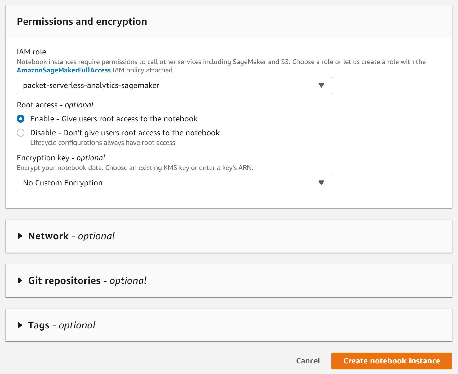
Figure 7.10 – SageMaker Create notebook instance dialog continued
Your new notebook instance will take a few minutes to start. While we wait, let's outline what we're going to do with our notebook and get introduced to the statistical libraries that will help us do even more with Athena.
pandas
pandas is a fast, flexible, and open source data analysis library built on top of the Python programing language. It aims to make working with tabular data such as that stored in spreadsheets or a SQL engine easier. If you're looking for help exploring, cleaning, or processing your data, then pandas is the right tool for you. In pandas, tabular data is stored in a structure known as a DataFrame. Out of the box, pandas supports many different file formats and data sources, including CSV, Excel, SQL, JSON, and Parquet. Athena returns data in CSV format, making it easy for us to use pandas with Athena query results. pandas also provides convenient hooks for plotting your data using a variety of visualization tools, including Matplotlib. In a moment, we'll use pandas to bridge between Athena and other data analysis tools.
Matplotlib and Seaborn
Matplotlib is a comprehensive open source Python library for visualizing data in static or interactive plots. Its creators like to say that "Matplotlib makes easy things easy and hard things possible." Many Matplotlib users turn to this library to create publication-quality plots for everything from company financial reports to scientific journal articles. As a long-time user of Matplotlib myself, I appreciate how much control it allows you to retain. You can fully customize line styles, fonts, and axes properties, and even export to various image formats. However, if you are new to the library, the sheer number of options can be a bit overwhelming. So, we won't be using Matplotlib directly in this exercise. Instead, we'll use a higher-level interface library called Seaborn. Seaborn provides a simplified interface for using Matplotlib to create common chart activities such as scatter, bar, or line graphs. Both libraries have excellent integration with Jupyter Notebooks so that your plots render right on the page.
SciPy and NumPy
By now, you can probably guess that both SciPy and NumPy are open source mathematics libraries built in Python. NumPy contains abstractions for multidimensional arrays of data. Such structures can come in handy when applying mathematical operations over an entire column of a table. NumPy also offers highly optimized functions for sorting, selection, applying discrete logic, and a host of statistical operations over these arrays. SciPy builds on the functionality provided by NumPy to create ready-to-use solutions for common scientific and mathematical problems. Later in this section, we will use SciPy's outlier detection algorithm to purge errant data from our Athena results.
Using our notebook to explore
Your notebook instance should just about be ready for use. Let's outline what exploration we'll perform once it's running. The beauty of using Athena from a Jupyter notebook is that you can simply have a conversation with your data and not have to plan it all out in advance. We're itemizing the steps here, so you know what to expect along the way:
- Connect our notebook instance to Athena.
- Run a simple Athena query and print the result using pandas.
- Visualize the result of our simple Athena query using Seaborn.
- Prune any erroneous data using SciPy for outlier detection.
- Run a correlation analysis over an aggregate Athena query.
Embedded in these steps is an important cycle. We ask a question by querying Athena. We notice something interesting in the result. We run a follow-up query in Athena. We dissect the result further. This is the ad hoc analytics cycle that differentiates ad hoc analytics from pre-canned reports or dashboards. It has no clear or pre-packaged end. Your next query depends on what you find along the way. This may seem a bit abstract, so we'll make it more concrete by applying this to our NYC yellow taxi dataset.
If you'd like to skip ahead or need added guidance in writing the code snippets we'll be using to run our ad hoc analytics, you can get a prepopulated notebook file from the book's GitHub repository at chapter_7/packt_serverless_analytics_chatper_7.ipynb here: https://bit.ly/3rQKGGI. GitHub nicely renders the notebook file so that you can see it right from the link. Unfortunately, that makes downloading it for later upload to your SageMaker notebook instance a bit tricky. To get around that, click on the Raw view, and then you can perform a Save as operation from your browser.
Step 1 – connecting our notebook instance to Athena
From the SageMaker console, go ahead and click the Open Jupyter link as shown in Figure 7.11. This will open a new browser tab or window connected to your Jupyter notebook instances. Behind the scenes, SageMaker is handling all the connectivity between your browser and what is your own personal Jupyter notebook server.
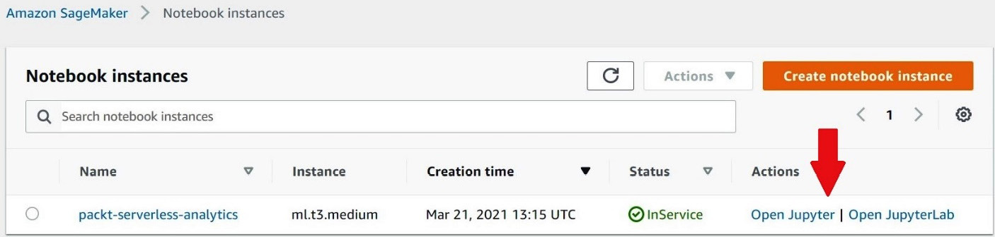
Figure 7.11 – Opening a Jupyter notebook
Just as we've done in Figure 7.12, you'll want to click on New and select conda_python3 for the notebook type. The value may appear at a different position in the dropdown than it does in Figure 7.12, so don't be afraid to scroll to find it. This setting determines how our notebook will run the data explorations tasks we are about to write. By selecting conda_python3, we are telling Jupyter that it can run our code snippets using Python. Sparkmagic is another common choice if you want to use Apache Spark as your computing platform. For now, we'll stick with Python, but the flexibility of Jupyter Notebooks makes it an excellent choice for any ad hoc analytics strategy. Once you pick the notebook type, yet another browser tab will open with your new notebook. The new notebook file will be named Untitled.ipynb, so our first step will be to give it a helpful name by clicking on File and then Rename.
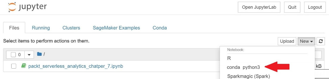
Figure 7.12 – Creating a new notebook file
Now that you have your notebook ready to use, we'll connect it to Amazon Athena by installing the Athena Python driver. To do this, we'll write the following code snippet in the first cell of the notebook. Cells are represented as a free-form textbox and can be executed independently, with subsequent cells having access to variables, data, and other states produced by earlier cells. After executing a cell, its output is shown immediately below it. You can edit, run, edit, and re-run a cell as often as you'd like. You can also add new cells at any time. The entire experience is very fluid, making it perfect for an imperfect exercise such as ad hoc data analysis. Let's put this into practice by running our first cell. Once you've typed the code into the cell, you can either click Run or press Shft + Enter to run the cell and add a new cell directly below it:
import sys
!{sys.executable} -m pip install PyAthena
This particular cell will take a couple of minutes to execute, with the result containing a few dozen log lines detailing which software packages and dependencies were installed. You are now ready to query Athena from your notebook.
Step 2 – running a simple Athena query and printing the result using pandas
Go ahead and add a cell to your notebook. This cell will be used to import our newly installed Athena Python driver and the pre-installed pandas library. This is done by typing the first two import statements from the following code snippet. In both cases, we are aliasing our imports to something more convenient. Then we use the connect() function that we imported from pyathena to connect to our Athena workgroup and database using the work_group and schema_name arguments, respectively. You'll also notice that we set the region_name argument to match the AWS Region we've been using for all our exercises:
from pyathena import connect
import pandas as pd
conn = connect(work_group='packt-athena-analytics',
region_name='us-east-1',
schema_name='packt_serverless_analytics')
Still working in the same cell, we can now run our Athena query by using pandas' read_sql() function to read the result of our query into a DataFrame as shown in the following code snippet. In this example, we are running a query to get the count of yellow taxi rides by year. On the final line of the cell, we print the first three values from the result. Go ahead and run this cell:
athena_results = pd.read_sql("""SELECT year, COUNT(*) as num_rides
FROM chapter_7_nyc_taxi_parquet
GROUP BY year
ORDER BY num_rides DESC""", conn)
athena_results.head(3)
Viewing the first few rows of the result is great, but we could have done that in the Athena console. We opted for a notebook experience for the ecosystem that included data visualization. That's where Seaborn comes into the picture.
Step 3 – visualizing results using Seaborn
If you didn't already add another cell, go ahead and do that now. In this next cell, we will use Seaborn to graph the number of yellow taxi rides each year as a bar graph. Since this is the first cell that requires Matplotlib and Seaborn, we begin by importing and aliasing these tools. We then conclude this cell by calling Seaborn's barplot function to graph the year and num_rides columns of our DataFrame:
from matplotlib import pyplot as plt
import seaborn as sns
seaborn.barplot(x="year", y="num_rides", data=athena_results)
But the resulting graph shown in Figure 7.13 seems a bit odd. There are so many years that we can't even read the y axis.
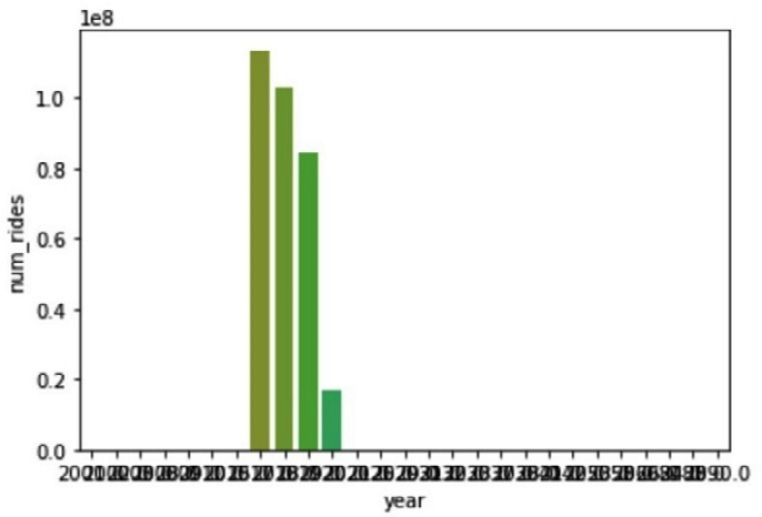
Figure 7.13 – Visualizing data using Seaborn
It seems we have a data quality issue with some rides having erroneous years. In the next cell, we'll use SciPy to detect and filter out those outliers.
Step 4 – pruning any erroneous data using SciPy
Our visualization in step 3 has shown that we have some rides with erroneous start or end values. In our case, our sample dataset only has yellow taxi ride data from 2017, 2018, 2019, and 2020 so any other values must be bad data. In practice, identifying bad data won't always be that easy. It would be useful to have a mechanism for detecting outliers that doesn't require foreknowledge of the dataset. Luckily, SciPy has a set of functions that can help. In our next cell, we'll use SciPy's stats module to compute the zscore of the num_rides column for each row. A zscore, also known as a standard score, measures how many standard deviations above or below the population mean a value is.
Using the following code snippet as a guide, we start by importing the stats module from SciPy. Depending on your version of pandas, you'll want to suppress chained_assignment warnings, as we have done. Then we use the zscore function from the stats module to calculate the zscore for the num_rides column. This function returns a DataFrame with as many rows as the input column. pandas DataFrames make it easy to add a new column to our Athena result and fill it with the calculated values from our new DataFrame. We do that by assigning the result to a new column in our original DataFrame. We conclude this cell by printing the results DataFrame to see the zscores alongside our original values:
from scipy import stats
#surpressing warning related to chained assignments
pd.options.mode.chained_assignment = None
zscore = stats.zscore(athena_results['num_rides'])
athena_results['zscore']=zscore
print(athena_results)
When you are ready, go ahead and run this cell. Figure 7.14 shows the first few results from the output. As expected, the bulk of the rides are in the four years we loaded into our data lake, but we've also got data from 2088, 2058, and a few other years that are far in the future. Interestingly, SciPy generated negative zscores for all the rows with erroneous years. This is because the ride counts for those years are so far from the population mean. Let's add another cell and repeat our visualization after filtering by zscore.
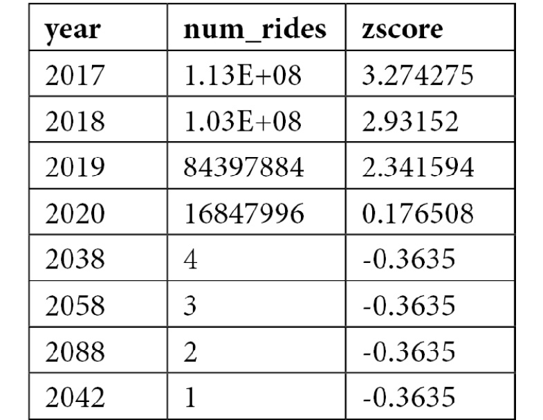
Table 7.1 – zscore values
This cell will be short, thanks to pandas' shorthand for filtering a DataFrame. We select the subset of the athena_results DataFrame where the zscore column is greater than zero and assign the result to a new athena_filtered DataFrame. We then repeat our earlier plot command to produce a new bar chart:
athena_filtered = athena_results [athena_results['zscore'] > 0]
seaborn.barplot(x="year", y="num_rides", data=athena_filtered)
After running this cell, we get a much more reasonable chart, like the one in Figure 7.15. Even with all the erroneous data points removed, we can still see a clear downward trend in the number of yellow taxi rides beginning in 2018. Some of this may be attributed to the rise of ride-sharing services such as Uber, or there may be other factors at play.
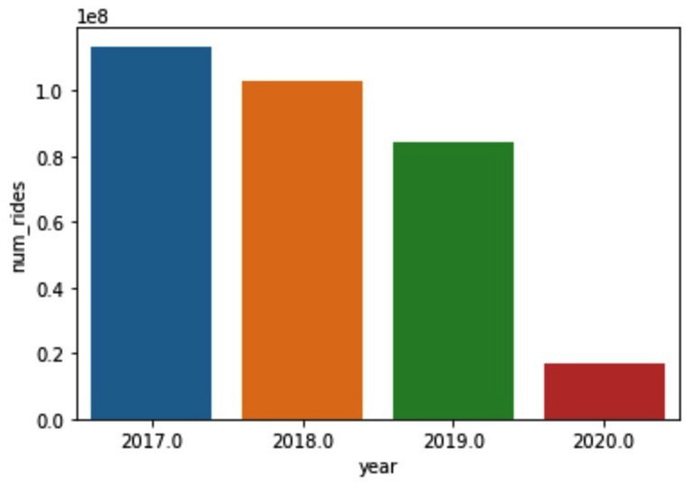
Figure 7.14 – zscore values
Running a correlation analysis
In our final notebook cells, we'll attempt to use the average tip amount as a proxy for customer satisfaction. We'll then check whether using the tip amount is a flawed proxy for customer sentiment by looking at how the tip amount correlates with other metrics such as trip speed and time of day. Add a new cell and run a new Athena query to get the average fare amount, average tip amount, and total rides grouped by day, as we've done in the following code snippet:
athena_results_2 = pd.read_sql("""
SELECT date_trunc('day',
date_parse(tpep_pickup_datetime,'%Y-%m-%d %H:%i:%s')) as day,
COUNT(*) as ride_count,
AVG(fare_amount) as avg_fare_amount,
AVG(tip_amount) as avg_tip_amount
FROM chapter_7_nyc_taxi_parquet
GROUP BY date_trunc('day',
date_parse(tpep_pickup_datetime,'%Y-%m-%d %H:%i:%s'))
ORDER BY day ASC""", conn)
In the same cell, we'll then calculate the zscore of the ride_count column so that we can again filter out the outliers. Since this query gathers daily data, we adjust our zscore threshold to -1 to allow for a broader range of valid values. Once you've included the code from this following snippet, you can run the cell. Executing the cell may take a minute or two if you are using the ml.t3.medium instance type for your notebook instance. This is because the notebook needs to retrieve all results from Athena using Athena's results API. As we discussed in an earlier chapter, Athena's results API is not as performant as reading the data directly from the Athena results file in S3:
zscore2 = stats.zscore(athena_results_2["ride_count"])
athena_results_2['zscore']=zscore2
athena_filtered_2= athena_results_2[athena_results_2['zscore'] > -1]
Once the cell completes executing, you can add another cell that we'll use to generate a scatter plot that varies color and point size based on tip amount and fare amount, respectively. We do this by importing the mdates and ticker modules from Matplotlib. Then we use the previously mentioned customizability of Matplotlib to manually set a wide aspect ratio for our plot and pass this into Seaborn's scatterplot function. You can see the full detail of how to configure the plot in the following code snippet. We conclude the cell by customizing the frequency and format of our graph's y axis using the set_major_locator() and set_major_formatter() functions of our plot object:
import matplotlib.dates as mdates
import matplotlib.ticker as ticker
fig, ax = pyplot.subplots(figsize= (16.7, 6.27))
plot = seaborn.scatterplot(ax=ax, x="day", y="ride_count", size="avg_fare_amount", sizes=(1, 150), hue="avg_tip_amount", data=athena_filtered_2)
plot.xaxis.set_major_locator(ticker.MultipleLocator(125))
plot.xaxis.set_major_formatter(mdates.DateFormatter('%m/%Y'))
plt.show()
When run, the cell produces the chart in Figure 7.15. At a glance, we can see that while the daily number of rides is indeed trending down, the average tip amount is actually increasing even though the average cost of a ride is relatively flat. This suggests that customer satisfaction is not a likely reason for the reduction in yellow taxi rides. For completeness, we'll still carry out a correlation analysis of our key metrics to better understand the relationships in our data.
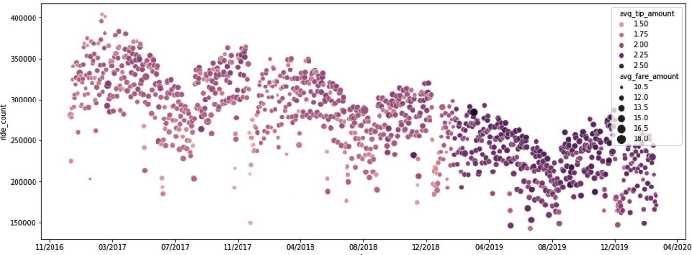
Figure 7.15 – Plotting the ride count versus the average tip amount versus the average fare amount over time
Let's add one final cell to our notebook. We'll start this cell by running an Athena query to get hourly averages for ride duration, distance, fare, tip, and the number of rides. We conclude the cell by calling the pandas corr() function to calculate the correlation between all the columns in our results DataFrame:
athena_results_3=pd.read_sql("""SELECT
max(hour(date_parse(tpep_pickup_datetime,
'%Y-%m-%d %H:%i:%s'))) as hour_val,
avg(date_diff('second',
date_parse(tpep_pickup_datetime, '%Y-%m-%d %H:%i:%s'),
date_parse(tpep_dropoff_datetime, '%Y-%m-%d %H:%i:%s')))
as duration,
avg(trip_distance) as trip_distance,
avg(fare_amount) as fare_amount,
avg(tip_amount) as tip_amount,
count(*) as cnt
from chapter_7_nyc_taxi_parquet
WHERE year=2018
group by date_trunc('hour', date_parse(tpep_pickup_datetime,'%Y-%m-%d %H:%i:%s')) """, conn)
athena_results_3.corr()
pandas' corr() function implements several techniques for calculating a correlation matrix. By default, it uses the Pearson method to determine the covariance between two variables and then divide that factor by the product of the two variables' standard deviations. Covariance refers to the tendency for two variables to increase or decrease, with the relationship between height and age of students being a simple example of highly correlated variables. The Pearson method can only capture linear relationships between variables and has a range of 1 for highly correlated, 0 for uncorrelated, and -1 for inversely correlated.
Figure 7.16 shows the output of the correlation matrix outputted by our final cell. Interestingly, tip_amount is not correlated to duration. This goes against every movie you've seen where someone jumps in a taxi and offers a big tip to run every red light. In fact, tip_amount is most correlated with trip_distance. The relationship, or lack thereof, between the time of day (hour_val) is another surprise. You would think that ride duration would spike during peak commute times, but the lack of correlation between hour_val and duration suggests otherwise even though ride_count is highly correlated to the time of day. If we were continuing our ad hoc analysis of this dataset, our next step would be to look at how duration manages to be unaffected by ride count, a seemingly obvious traffic volume indicator.
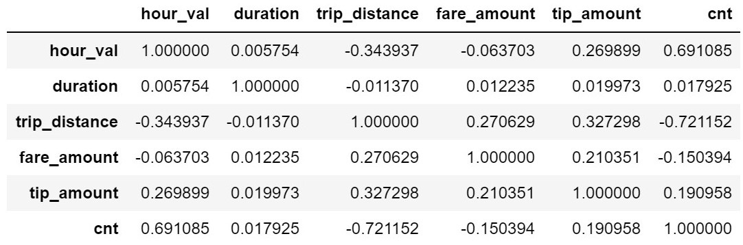
Figure 7.16 – DataFrame correlation values
In this section, we managed to run multiple Athena queries, targeting different slices of data, and pivot our ad hoc analysis based on findings along the way. We did all that while staying in one tool, our notebook. The tools we used are capable of much more than the simple explorations we undertook. Hopefully, this exercise has demonstrated why they would be a powerful addition to any ad hoc analytics strategy.
Summary
In this chapter, you got hands-on with the first of Athena's four most common usages – ad hoc analytics. We did this by looking at the history of business intelligence and learning about the OODA loop. Ad hoc analytics shortens the OODA loop by making it easier to use data to observe and orient yourself to the situation. The increased accessibility of data ultimately leads to the heightened situational awareness required for making sound decisions. With clarity of data behind your decisions, your organization will be less likely to waste time before acting on those choices. A short OODA loop also helps you react to poor decisions or calculated risks such as A/B tests.
The OODA loop isn't a new concept, and it's not the catalyst of the rising importance of ad hoc analytics. Instead, the proliferation of data has made it necessary for every decision maker in your organization to have access to critical business metrics at a moment's notice. We saw how some organizations attempt to meet this need through centralized reporting teams that bridge the skills gap between subject-matter experts that understand the semantic meaning of the data and the technical expertise required to access the data itself.
Athena shrinks the skills gap by hiding much of the complexity behind a SQL façade. Basic SQL knowledge is becoming increasingly common even in non-technical roles. Complimentary tools such as QuickSight further democratize access to data by providing a more guided experience. Jupyter Notebooks rounds out the strategy by providing an escape valve for advanced users and data scientists to use popular libraries with their data.
In Chapter 8, Querying Unstructured and Semi-Structured Data, you'll learn about another typical Athena use case. Querying loosely structured data is a challenging undertaking and partly the result of traditional SQL tables and schemas being too rigid and ill-equipped to support the pace of software evolution.