
Chapter 12. Visualization
Visualization has a reputation in cybersecurity for being glitzy but shallow, more like frosting than cake. However, visualization remains an area of active research and offers an opportunity to apply cybersecurity science. Researcher Danny Quist once posed this as a fundamental visualization question: “How is my tool better than grep?” This question gets at the enormous volume of cybersecurity-related data—especially logs—long dominated by searching and parsing, and grep has been the gold standard cybersecurity tool to beat. This chapter assumes that you are already familiar with the basic concepts and value of visualization and looks at the intersection of science and visualization, how the scientific method can strengthen credibility to visualization by measuring and evaluating how your visualizations are working, and visualization choices to avoid. It also presents a sample case study showing how to experimentally evaluate visualizations in a forensics tool.
Let’s start with definitions and terminology. Visualization must be based on nonvisible data, use an image as the primary means of communication, and provide a way to learn something about the data. There are a great deal of pretty pictures created in the name of visualization that fail these criteria, even on the data walls of cybersecurity watch floors and operations centers. Within data visualization there are also many types, including charts, maps, networks, animations, and infographics.
Visualization is a natural match for cybersecurity. The cyber domain has vast amounts of data along with the need to recognize patterns and anomalies. Humans, being part of the cybersecurity process, need to consume and understand data, and vision is the highest-bandwidth human sense. Visualization can support exploration, discovery, decision making, and communication. One famous example of the importance of visualization is Anscombe’s quartet, four datasets with nearly identical simple statistical properties that appear very different when graphed (Figure 12-1). As we mentioned in Chapter 2, one of the best ways to start analyzing data is to literally look at it using a graph or chart, even if those visualizations are not the ultimate product.
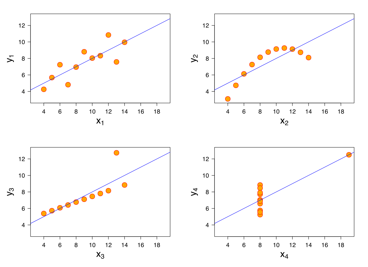
Figure 12-1. Visualization of Anscombe’s quartet showing visual differences despite identical simple summary statistics
However, the art and science of visualization for cybersecurity requires knowledge of both cybersecurity and visualization—two skills that few people possess. Deep knowledge and context about cybersecurity data is necessary to create visualizations that are meaningful and useful to users. On the other hand, cybersecurity developers often fail to acknowledge their ignorance in visualization theory, visual efficiency, and human-computer interaction. This knowledge split is best addressed by teams of experts who together can create effective cybersecurity visualizations.
Tip
There is a wide range of open research topics in visualization. Effective human interaction with visualizations remains a challenge for designers, and visualizations of multidimensional data have long been a topic of interest.
An Example Scientific Experiment in Cybersecurity Visualization
For an example of scientific experimentation in cybersecurity visualization, see the paper “Malware Images: Visualization and Automatic Classification” by Nataraj, Karthikeyan, Jacob, and Manjunath (2011).1 In the abstract that follows, you can see that the hypothesis of this experiment was that visualizations of malware binaries from the same family appear visually similar in layout and texture. This hypothesis was confirmed in experimental tests. You can see the visual similarities in the images from two different malware families in Figure 12-2.2

Figure 12-2. Visualization showing two families of malware, the first row belonging to the family Fakerean and the second row belonging to the family Dontovo.A
The authors say that “we went through the thumbnails of [1,713 malware images in 8 malware families] and verified that the images belonging to a family were indeed similar.” The experiment could have been further validated by showing the images to unbiased evaluators to measure users’ effectiveness, efficiency, and satisfaction.
Abstract from a cybersecurity visualization experimentWe propose a simple yet effective method for visualizing and classifying malware using image processing techniques. Malware binaries are visualized as gray-scale images, with the observation that for many malware families, the images belonging to the same family appear very similar in layout and texture. Motivated by this visual similarity, a classification method using standard image features is proposed. Neither disassembly nor code execution is required for classification. Preliminary experimental results are quite promising with 98% classification accuracy on a malware database of 9,458 samples with 25 different malware families. Our technique also exhibits interesting resilience to popular obfuscation techniques such as section encryption.
Let’s look at one way you could create images of malware using the open source tool, colorize. This tool can visualize raw file data and offers one way to visually compare binaries. These images could be used for your own visual similarity study. Here’s one approach:
Gather the files you want to compare visually. Say you have 10 Windows executables:
c:viz> dir *.exe
variant1.exe    variant2.exe    variant3.exe    variant4.exe
variant5.exe    variant6.exe    variant7.exe    variant8.exe
variant9.exe    variant10.exe
Run colorize on each file to create images:
c:viz> colorize -o -w 512 variant1.exe
c:viz> colorize -o -w 512 variant2.exe
...
Compare images to each other and see what the visual similarities and differences reveal to you about how these files are related. You may wish to measure how well this visualization helps other experts in a task such as identifying families of malware (Figure 12-3).
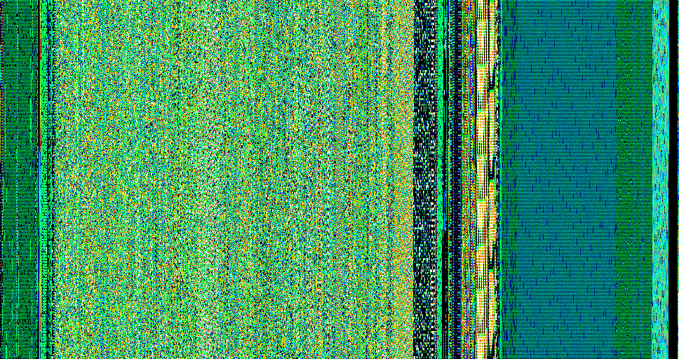
Figure 12-3. Example output of the colorize program showing a visualization of the binary
Graphical Representations of Cybersecurity Data
The goal of visualization should be to aid a human in accomplishing his or her task. Professor Edward Tufte, statistician and prominent author on data visualization, wrote that “indeed graphics can be more precise and revealing than conventional statistical computations.”3
Security and network administrators faced with these challenges may be familiar with the visualization capabilities of their security tools today. For example, Splunk is a well-known commercial package for analyzing data such as logs, and includes native visualization capabilities. Kibana is an open source data visualization platform and is often used in conjunction with two other log processing and searching tools, Logstash and Elasticsearch. As you can see in Figure 12-4 and Figure 12-5, these platforms offer traditional types of graphics including bar graphs, pie graphs, histograms, and world maps.
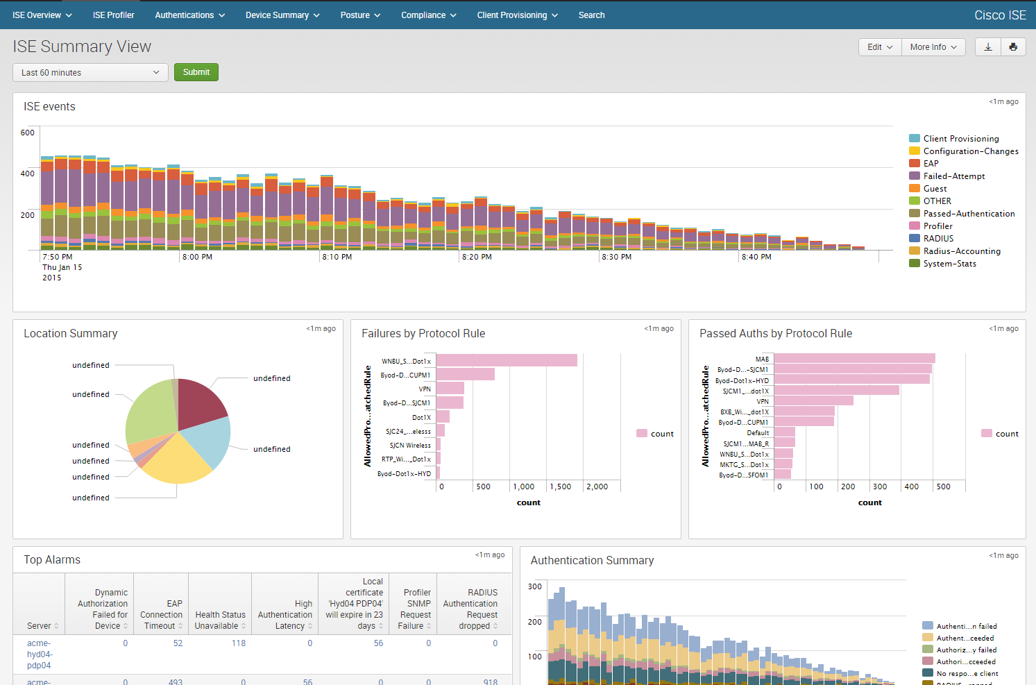
Figure 12-4. An example of cybersecurity visualizations from Splunk using data from the Cisco Identity Services Engine
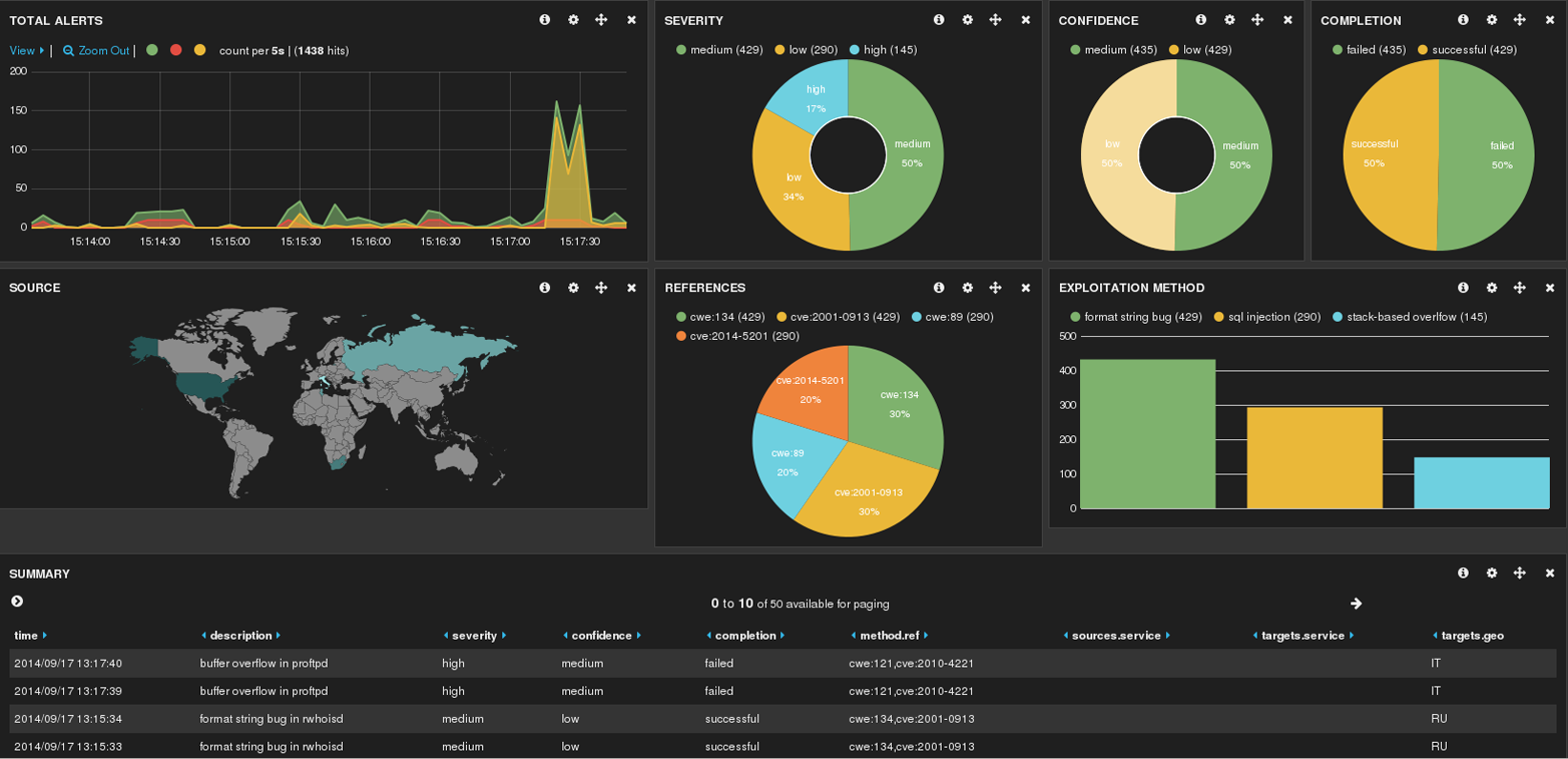
Figure 12-5. An example of open source visualization using Hakabana, a Kibana dashboard for Haka security alerts
Unfortunately, visualizations are often used inappropriately, leading intentionally or unintentionally to ambiguity or cognitive bias of the viewer. Let’s look at the challenges associated with one kind of visualization: the pie chart. You might consider pie charts one of many equal choices for displaying data, but there are actually appropriate and inappropriate uses for pie charts. The basic premise of a pie chart is that the pie represents a meaningful whole. Don’t use a pie chart if the sum of the slices doesn’t add up to 100%. Data represented in the pie chart must also be unique to one slice—they cannot be counted in more than one slice. Another unfortunate problem with pie charts is that human viewers are not very good about judging the angle (and therefore relative size) of a slice. Research suggests that people have low confidence and low accuracy in reading pie charts, and that people’s perception of the slices can be manipulated simply by rotating the pie. As a result, it is better to use pie charts to illustrate comparisons of the slices to the whole, not to compare slices to each other. Therefore, consider the pie chart only when there are few slices (fewer than five to seven), when the parts are mutually exclusive, when the slices make up a meaningful whole, and when you want to show part-whole relationships. Examples of pie charts can be seen in Appendix A.
Tip
For more examples of good and bad illustrations of quantative information, visit Perceptual Edge.
Ben Shneiderman, a visualization expert, developed his own visual information-seeking mantra: overview first, zoom and filter, then details-on-demand.4 While not a set of evaluation criteria per se, the mantra summarizes many visual design guidelines and provides a framework for designing cybersecurity visualizations. These principles have been validated with scientific studies showing that they measurably improve human use of visualizations.
Science can help with cybersecurity visualization in determining two important criteria: how to visualize and how to evaluate visualizations. Choices about how to visualize data should be informed by psychological, behavioral, and cultural science. Consider something as routine as color choice. Say you want to display computer infections on a colored map. Imagine the Norse Attack Map in Figure 12-6 colored all red or all green.
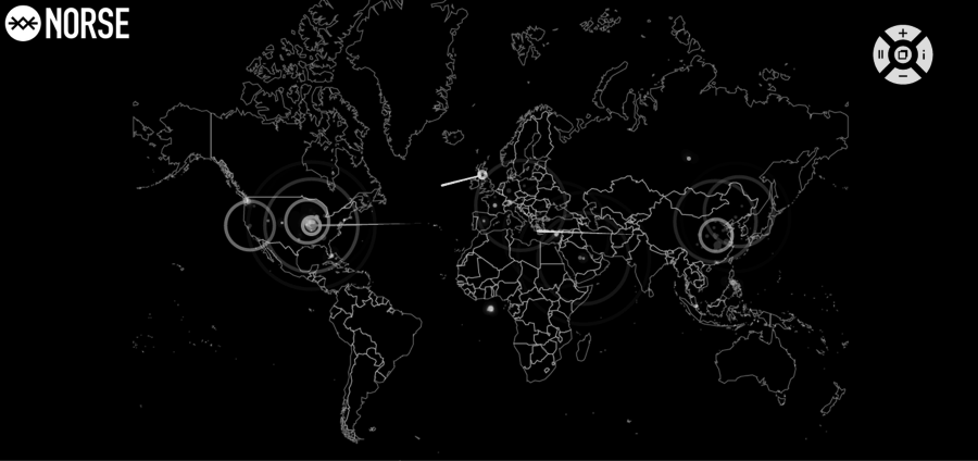
Figure 12-6. Norse attack map
Here are some questions to ask when choosing one color over another:
Will people with red–green color blindness have difficulty interpreting the graphic?
Will the graphic be seen and interpreted differently by people in China, where red is associated with good fortune, and the United States, where red can symbolize danger?
Is red an appropriate color for the environments where the graphic is likely to appear, such as a dimly lit security watch floor?
Will the color produce an illegible image if printed in black and white?
All of these learned or cultural assumptions can affect the ultimate usefulness of the visualization, and each can be measured and evaluated to maximize the choices.
Scientifically informed deliberate choices about visualizations can also be tested, and the next section will look more in depth at how to use experimentation to evaluate visualizations.
Experimental Evaluation of Security Visualization
Chapter 11 discussed three usability measures: effectiveness, efficiency, and satisfaction. A key challenge for visualization is evaluating if and how a visualization meets these criteria. You may wish to test hypotheses such as this new tool effectively conveys information to a novice user, or users are satisfied when using my tool to solve a problem.
There is no universal approach and no single way to evaluate all security visualizations. In fact, there is no consensus in the visualization community about what constitutes an evaluation. Different metrics and assessment techniques should be applied depending on the purpose and scope of the evaluation. In addition to the three usability measures mentioned above, some evaluations will consider other factors such as the effect on collaboration, cognitive workload, and component interoperability.
User studies are an important method for evaluating cybersecurity visualizations. These studies can help you pinpoint why a particular visualization is effective or not with the target user population. Finding users to test your hypotheses can be challenging, and different users are appropriate in different situations (e.g., expertise, age, nationality). It is important to understand your test subjects to recognize and account for biases that they may bring to the experiment.
When you look at how researchers conduct experimental evaluations of visualizations, there are four general types of evaluation:
Controlled experiments comparing design elements. This category compares different types or implementations of a specific widget (e.g., a world map) or compares how well nonvisual data maps to a graphical representation. This is a controlled experiment because it changes exactly one variable while keeping other variables constant.
Usability evaluation. This area is composed of studies that allow users to interact with a tool and provide feedback to the developers and designers about effectiveness, efficiency, and satisfaction, or allows the experimenter to measure and evaluate those criteria
Controlled experiments comparing two or more tools. This category compares the differences in effectiveness, efficiency, and satisfaction between different tools with the same goal. Generally, these studies compare a new tool with similar existing tools.
Real-world case studies. This area is composed of research and reports describing how real users in natural environments perform their real tasks. These studies can be very specific to the users or the environment and have low external validity (generalizability to other situations).
One or more of these evaluation types may be appropriate for your situation. Within each type are a variety of evaluation techniques, some of which are experimental. Surveys, for example, allow you to gather quantitative and qualitative data, but a survey is not an experimental evaluation. On the other hand, if you used interface instrumentation to collect usage and user interaction information, this technique could be used to collect data in a controlled experiment. Simulations are another common evaluation technique because they offer control over the experiment while incorporating realistic scenarios and conditions. One of the more advanced techniques is psychophysiological measurements, such as eye tracking, heart rate, and brain measurements taken during a user’s interaction with a visualization.
Let’s look at a slightly modified version of a usability evaluation. In Figure 12-7, the researcher wants to see if test subjects can correctly answer questions using the new visualization by asking a task-based question.
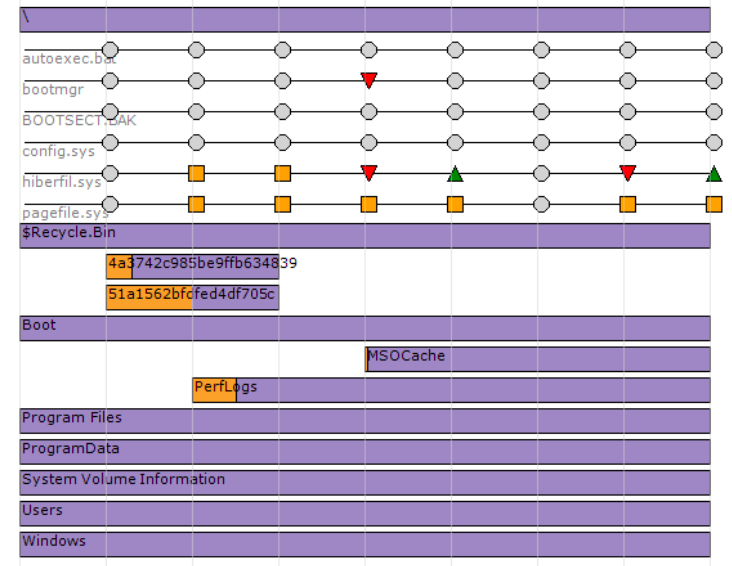
Figure 12-7. User evaluation question: How many subdirectories exist within the root (“”) directory?
In a subsequent part of the study, the developer may give the subject the answer in order to solicit feedback about why the subject got the answer wrong, and the user’s satisfaction with the visualization (see Figure 12-8).
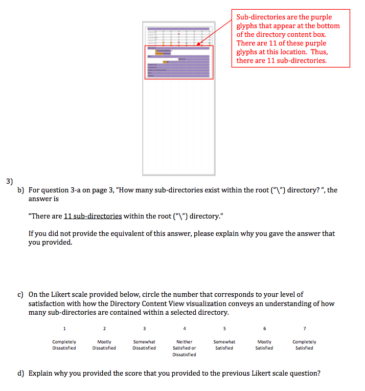
Figure 12-8. User evaluation, continued
As you can tell, there are a wide variety of approaches to evaluation, each with its own tradeoffs. Experimental evaluation will help you evaluate how the visualization is meeting your intended goals, improve the product, and compare one visualization to another.
Case Study: Is My Visualization Helping Users Work More Effectively?
In this section, we walk through a hypothetical scientific experiment in security visualization. In this experiment, we will perform an experimental evaluation of a fictitious tool called EvidenceViz, which visualizes a digital forensic disk image in an attempt to more quickly draw a human’s attention to potential evidence.
There are numerous options for measuring a user’s performance. One is to measure user accuracy at performing a certain task. Another is to measure the time required to perform the task. A third is to measure emotional responses, such as the confidence the user has in her answer (indicating effectiveness). Yet another is qualitative feedback as in a questionnaire. Tool developers and researchers sometimes have to use their judgment about which evaluation is the most useful or compelling for other people who will use or critique the tool. No specific measurement is necessarily expected or required for a given solution, though there are trends in academic evaluations toward usability testing and simulation, and very few longitudinal studies—repeated observations of the same user(s) over time—and interface instrumentations.
The goal of this testing is to help the efficacy of the new visualization technique by narrowly evaluating one aspect: time required to perform a task. Given our desire to measure the effectiveness of the visualization at helping a forensic analyst identify evidence of cyber crime based on the time spent on the task, here is a hypothesis:
Forensic analysts will find specific evidence of cyber crime faster using EvidenceViz than with EnCase.
EnCase and FTK are two of the most popular forensic tools, and the independent variables in the experiment are the visualization techniques, yours and theirs. The null hypothesis is that your visualization is not more effective than the currently used techniques. The scientific method says that we must keep all other variables in the experiment constant. In particular, we want to create an experiment where test subjects will perform the same task, described next, but one randomly assigned group will use EvidenceViz and another group will use EnCase or FTK.
The task performed by forensic analyst test subjects should reflect realistic work. The discovery and identification of digital images is a very common forensic task because photographs are part of many crimes. For the purposes of this experiment, we want a hard drive image that is realistic but controlled. For many reasons, including legal and ethical, you should not use a forensic image from a real-life crime. There are differing opinions about the degree of realism required. You may benefit from using a preexisting scenario-based image, or may wish to create a new image of your own. If you create a new image, consider ways to make it look realistic, such as by browsing Internet websites and creating documents. Then, plant the data (e.g., images of cats) that you intend the visualization tools to help the test subjects find.
Note
There are numerous considerations when creating realistic data for experimentation. For more on one experience creating forensic evidence in a realistic scenario, see “Creating Realistic Corpora for Forensic and Security Education” by Woods et al. (2011).
In this particular user study, we must make a trade-off. Either the same study participants will see the same forensic image in multiple visualization tools, or individual participants will see the forensic image in only one tool. Using the same people eliminates individual differences but biases the experiment because the task requires the participant to find something, and he or she will likely know the answer after the first test. On the other hand, when only one set of participants sees a particular technique, you cannot isolate effects from individual differences and it requires more participants. There is no general consensus about how many participants are needed in a usability study. There have been empirical results endorsing the specific number of participants as 4±1, 10±2, and various other formulas. You also want to consider whether to specify or randomize other attributes of the participants, including experience. You should consider giving users at least a basic primer on new or unfamiliar tools to rule out the bias in completion time from familiarity with one tool over another.
With these considerations in mind, assume you are able to find 20 volunteers who all have equivalent experience as forensic analysts, 10 each for EvidenceViz and EnCase. You bring in each participant, explain the experiment, allow him or her to complete the task with one of the visualization tools, and time how long it takes to complete the task. The specific task isn’t important, and could be finding a set of images or constructing an event timeline. When you calculate the results, you could find that on average it took 10.49 minutes to complete the task with EnCase and 7.10 minutes with EvidenceViz. Using this evidence, you can accept the hypothesis with proof that for this group of people in this situation, people found evidence faster with EvidenceViz than EnCase.
Warning
Be careful about the claims you make from this study. It did not prove that EvidenceViz is universally “better” than EnCase. The results must be viewed from the narrow lens of the specific task, the specific test subjects, the specific software versions, and other characteristics of the experiment.
How to Find More Information
Research in visualization is presented at various conferences, but especially at the IEEE Visualization Conference (VIS), the Workshop on Visualization for Cyber Security (VizSec), and the IEEE Visual Analytics Science and Technology (VAST) Conference. The Visual Analytics Benchmark Repository is a useful collection of ground truth datasets for use in visualization research.
Conclusion
This chapter looked at the intersection of science and visualization. The key concepts and takeaways are:
Deep knowledge and context about cybersecurity data is necessary to create visualizations that are meaningful and useful to users.
In one example, experimental tests showed that visualizations of malware binaries from the same family appear visually similar in layout and texture.
Cybersecurity science can be used to evaluate whether or not a visualization aids a human in accomplishing his or her task. When used inappropriately, visualizations may intentionally or unintentionally lead to ambiguity or cognitive bias of the viewer.
There are four general types of visualization evaluations: controlled experiments comparing design elements, usability evaluation, controlled experiments comparing two or more tools, and real-world case studies.
References
Greg Conti. Security Data Visualization: Graphical Techniques for Network Analysis (San Francisco, CA: No Starch Press, 2007)
Noah Iliinsky and Julie Steele. Designing Data Visualizations (Boston, MA: O’Reilly Media, 2011)
Raffael Marty. Applied Security Visualization (Boston, MA: Addison-Wesley Professional, 2008)
Edward R. Tufte. The Visual Display of Quantitative Information (Cheshire, CT: Graphics Press, 2001)
1 L. Nataraj, S. Karthikeyan, G. Jacob, and B. S. Manjunath. 2011. “Malware images: visualization and automatic classification.” In Proceedings of the 8th International Symposium on Visualization for Cyber Security (VizSec ’11). ACM, New York, NY.
3 Edward Tufte. The Visual Display of Quantitative Information. (Graphics Press, 1983).
4 Ben Shneiderman. “The Eyes Have It: A Task by Data Type Taxonomy for Information Visualizations.” In Proceedings of the IEEE Symposium on Visual Languages (IEEE Computer Society Press, 1996).