
Chapter 10
Tracking Trends and Making Forecasts
Plotting a Best-Fit Trendline
If you want to get a sense of the overall trend displayed by a set of data, the easiest way is to use a chart to plot a best-fit trendline. This is a straight line through the chart’s data points where the differences between the chart points that reside above the line and those that reside below the line cancel each other out.
A best-fit trendline is an example of regression analysis, which is a statistical tool for analyzing the relationship between two phenomena, where one depends upon the other. For example, housing sales depend upon interest rates. In this case, you would say that housing sales are the dependent variable and interest rates are the independent variable.
Plotting a Best-Fit Trendline
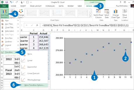
![]() Click the chart to select it.
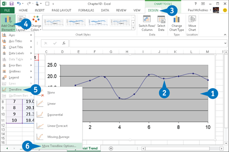
Click the chart to select it.
![]() If your chart has multiple data series, click the series you want to analyze.
If your chart has multiple data series, click the series you want to analyze.
Note: To add a best-fit trendline, you must plot your data series as an XY (Scatter) chart.
![]() Click the Design tab.
Click the Design tab.
![]() Click Add Chart Element.
Click Add Chart Element.
![]() Click Trendline.
Click Trendline.
![]() Click More Trendline Options.
Click More Trendline Options.
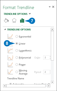
The Format Trendline pane appears.
![]() Click the Trendline Options tab.
Click the Trendline Options tab.
![]() Click the Linear option (
Click the Linear option (![]() changes to
changes to ![]() ).
).

![]() Scroll down and click the Display Equation on Chart check box (
Scroll down and click the Display Equation on Chart check box (![]() changes to
changes to ![]() ).
).
![]() Click the Display R-Squared Value on Chart check box (
Click the Display R-Squared Value on Chart check box (![]() changes to
changes to ![]() ).
).
![]() Click Close.
Click Close.
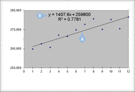
A Excel plots the best-fit trendline.
B Excel displays the regression equation and the R2 value.
Calculating Best-Fit Values
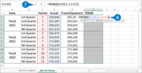
If your analysis requires exact trend values, you could plot the best-fit trendline and then use the regression equation to calculate the values. However, if the data values change, you need to recalculate the values. A better solution is to use the TREND function.
TREND takes up to four arguments. The only required argument is known_y’s, which is a range reference or array of the dependent values. The known_x’s argument is a range reference or array of the independent values (the default is the array {1,2,3,...],n}, where n is the number of known_y’s). The new_x’s argument is for forecasting, so it is not required here. The const argument determines the y-intercept: FALSE places it at 0, and TRUE (the default) calculates the y-intercept based on the known_y’s.
Calculating Best-Fit Values
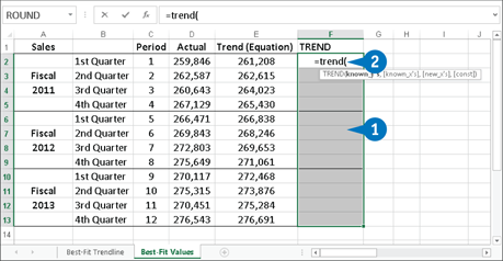
![]() Select the cells in which you want the best-fit values to appear.
Select the cells in which you want the best-fit values to appear.
![]() Type =trend(.
Type =trend(.
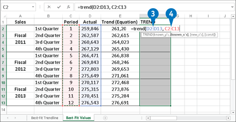
![]() Type a reference or array that represents the dependent values.
Type a reference or array that represents the dependent values.
![]() Type a comma and then type a reference or array that represents the independent values.
Type a comma and then type a reference or array that represents the independent values.
Note: In the example shown here, the independent values are the period numbers 1, 2, 3, and so on. However, these are the default values for the known_x’s argument, so technically you could omit this argument in this example.
![]() If you prefer to use a trend starting point of 0, type two commas and then type FALSE (not shown).
If you prefer to use a trend starting point of 0, type two commas and then type FALSE (not shown).
![]() Type 20.
Type 20.
![]() Press and hold Ctrl + Shift and then click the Enter button or press Enter.
Press and hold Ctrl + Shift and then click the Enter button or press Enter.
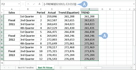
A Excel calculates the best-fit trend values and enters them as an array.
Plotting Forecasted Values
If you find that the best-fit trendline or the best-fit values indicate that the dependent and independent variables are well correlated, then you can take advantage of that correlation to forecast future values. This analysis assumes that the major factors underlying the existing data will remain more or less constant over the number of periods in your forecast.
The easiest way to calculate forecasted values is to use a chart to extend the best-fit trendline into one or more future periods. However, note that to work with a best-fit trendline and use it to plot forecasted values, you must plot your data series as an XY (Scatter) chart.
Plotting Forecasted Values
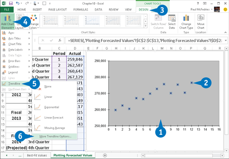
![]() Click the chart to select it.
Click the chart to select it.
![]() If your chart has multiple data series, click the series you want to analyze.
If your chart has multiple data series, click the series you want to analyze.
![]() Click the Design tab.
Click the Design tab.
![]() Click Add Chart Element.
Click Add Chart Element.
![]() Click Trendline.
Click Trendline.
![]() Click More Trendline Options.
Click More Trendline Options.

The Format Trendline pane appears.
![]() Click the Trendline Options tab.
Click the Trendline Options tab.
![]() Click the Linear option (
Click the Linear option (![]() changes to
changes to ![]() ).
).
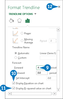
![]() Scroll down and type the number of units you want to project the trendline into in the future the Forward text box.
Scroll down and type the number of units you want to project the trendline into in the future the Forward text box.
![]() Click the Display Equation on Chart check box (
Click the Display Equation on Chart check box (![]() changes to
changes to ![]() ).
).
![]() Click the Display R-Squared Value on Chart check box (
Click the Display R-Squared Value on Chart check box (![]() changes to
changes to ![]() ).
).
![]() Click Close.
Click Close.
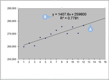
A Excel plots the forecasted values.
B Excel displays the regression equation and the R2 value.
Extending a Linear Trend
If forecasting is part of your data analysis, you can use the Excel fill handle and Series command to extend a linear trend into one or more future periods. With a linear trend, the dependent variable is related to the independent variable by some constant amount. For example, you might find that housing sales (the dependent variable) increase by 100,000 units whenever interest rates (the independent variable) decrease by 1 percent. Similarly, you might find that company revenue (the dependent variable) increases by $250,000 for every $50,000 you spend on advertising (the independent variable). With this linear relationship, you can forecast future periods by using Excel’s fill handle and Series command to extend your existing data.
Extending a Linear Trend
Using the Fill Handle

![]() Select the existing data.
Select the existing data.
![]() Click and drag the fill handle to extend the selection over the number of future periods you want to forecast.
Click and drag the fill handle to extend the selection over the number of future periods you want to forecast.

A Excel extends the existing data with the forecasted values.
Using the Series Command
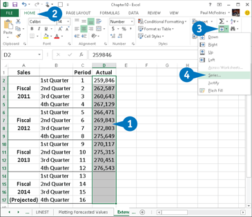
![]() Select the existing data and the cells where you want the forecasted data to appear.
Select the existing data and the cells where you want the forecasted data to appear.
![]() Click the Home tab.
Click the Home tab.
![]() Click Fill.
Click Fill.
![]() Click Series.
Click Series.
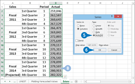
Excel displays the Series dialog box.
![]() Click the AutoFill option (
Click the AutoFill option (![]() change to
change to ![]() ).
).
![]() Click OK.
Click OK.
B Excel extends the existing linear trend with the forecasted values.
APPLY IT
If your data analysis requires that you see the actual values that make up a linear trend, the Series command can help. To begin, copy the historical data into an adjacent row or column, and then select the range that includes both the copied historical data and the blank cells that will contain the projections. Click the Home tab, click Fill, and then click Series to open the Series dialog box. Click the Trend check box (![]() changes to
changes to ![]() ), click the Linear option (
), click the Linear option (![]() changes to
changes to ![]() ), and then click OK. Excel replaces the copied historical data with the best-fit trend numbers and projects the trend onto the blank cells.
), and then click OK. Excel replaces the copied historical data with the best-fit trend numbers and projects the trend onto the blank cells.
Calculating Forecasted Linear Values
If your analysis requires exact forecast values, you could extend the best-fit trendline and then use the regression equation to calculate the values, or you could use the fill handle or Series command to extend the linear trend. These are easy methods, but if the historical values change, then you need to repeat these procedures to recalculate the forecasted values. A more efficient solution is to use the TREND function.
In this situation, you need to use TREND not only with the known_y’s argument (a reference to the dependent values) and optionally the known_x’s argument (a reference to the independent values), but also the new_x’s argument. The new_x’s argument is a range reference or array that represents the new independent values for which you want forecasted dependent values.
Calculating Forecasted Linear Values
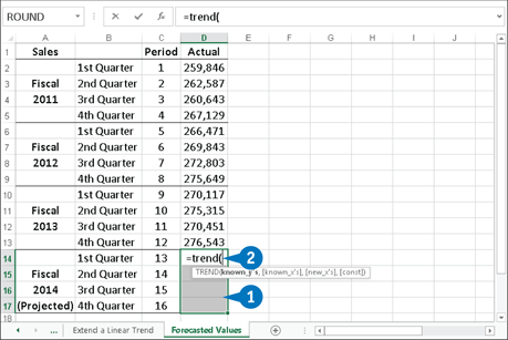
![]() Select the cells in which you want the forecasted values to appear.
Select the cells in which you want the forecasted values to appear.
![]() Type =trend(.
Type =trend(.
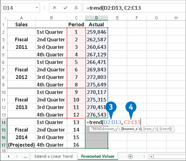
![]() Type a reference or array that represents the dependent values.
Type a reference or array that represents the dependent values.
![]() Type a comma and then type a reference or array that represents the independent values.
Type a comma and then type a reference or array that represents the independent values.
Note: In the example shown here, the independent values are the period numbers 1, 2, 3, and so on. However, these are the default values for the known_x’s argument, so technically you could omit this argument in this example.

![]() Type a comma and then a reference or array that represents the new independent values.
Type a comma and then a reference or array that represents the new independent values.
![]() If you prefer to use a trend starting point of 0, type a comma and then type FALSE (not shown).
If you prefer to use a trend starting point of 0, type a comma and then type FALSE (not shown).
![]() Type 20.
Type 20.
![]() Press and hold Ctrl + Shift and then click the Enter button or press Enter.
Press and hold Ctrl + Shift and then click the Enter button or press Enter.
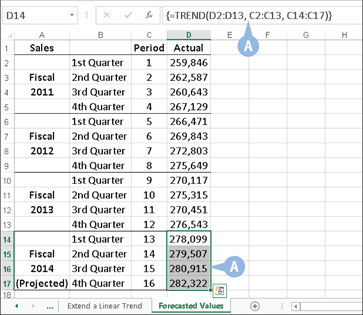
A Excel calculates the forecasted values.
Plotting an Exponential Trendline
You can apply regression analysis to nonlinear data, such as an exponential trend, which rises or falls at an increasing rate. It is called exponential because the trendline resembles the graph of a number being raised to successively higher values of an exponent. For example, the series 21, 22, 23 starts slowly (2, 4, 8, and so on), but by the time you get to 220, the series value is up to 1,048,576, and 2100 is a number that is 31 digits long.
To visualize such a trend, you can plot an exponential trendline. This is a curved line through the data points where the differences between the points on one side of the line and the points on the other side of the line cancel each other out.
Plotting an Exponential Trendline

![]() Click the chart to select it.
Click the chart to select it.
![]() If your chart has multiple data series, click the series you want to analyze.
If your chart has multiple data series, click the series you want to analyze.
![]() Click the Design tab.
Click the Design tab.
![]() Click Add Chart Element.
Click Add Chart Element.
![]() Click Trendline.
Click Trendline.
![]() Click More Trendline Options.
Click More Trendline Options.
The Format Trendline pane appears.
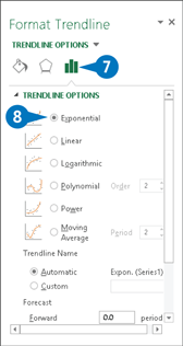
![]() Click the Trendline Options tab.
Click the Trendline Options tab.
![]() Click the Exponential option (
Click the Exponential option (![]() changes to
changes to ![]() ).
).

![]() Scroll down and click the Display Equation on Chart check box (
Scroll down and click the Display Equation on Chart check box (![]() changes to
changes to ![]() ).
).
![]() Click the Display R-Squared Value on Chart check box (
Click the Display R-Squared Value on Chart check box (![]() changes to
changes to ![]() ).
).
![]() Click Close.
Click Close.
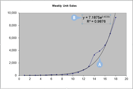
A Excel plots the exponential trendline.
B Excel displays the regression equation and the R2 value, as described in the Extra section.
Calculating Exponential Trend Values
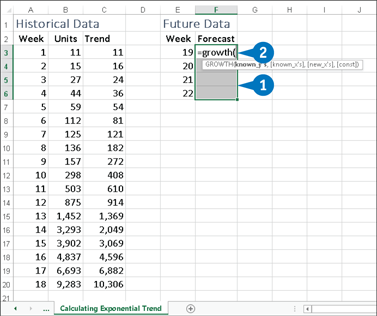
If you require exact exponential trend values, you could plot the trendline and then use the regression equation to calculate them. However, if the data values change, you need to recalculate the trend values. A better solution is to use the GROWTH function.
GROWTH takes up to four arguments. The known_y’s argument is required and is a reference to the dependent values. The known_x’s argument is a reference to the independent values (the default is the array {1,2,3,...],n}, where n is the number of known_y’s). The new_x’s argument is a reference to the new independent values for which you want forecasted dependent values. The const argument determines the value of b in the regression equation: FALSE places it at 1, while TRUE (the default) calculates b based on the known_y’s.
Calculating Exponential Trend Values
![]() Select the cells in which you want the trend values to appear.
Select the cells in which you want the trend values to appear.
![]() Type =growth(.
Type =growth(.

![]() Type a reference or array that represents the dependent values.
Type a reference or array that represents the dependent values.
![]() Type a comma and then type a reference or array that represents the independent values.
Type a comma and then type a reference or array that represents the independent values.
Note: In the example shown here, the independent values are the period numbers 1, 2, 3, and so on. However, these are the default values for the known_x’s argument, so technically you could omit this argument in this example.
![]() Type a comma and then a reference or array that represents the new independent values.
Type a comma and then a reference or array that represents the new independent values.
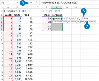
![]() If you prefer to use a trend starting point of 0, type a comma and then type FALSE (not shown).
If you prefer to use a trend starting point of 0, type a comma and then type FALSE (not shown).
![]() Type 20.
Type 20.
![]() Press Ctrl + Shift and then click the Enter button or press Enter.
Press Ctrl + Shift and then click the Enter button or press Enter.
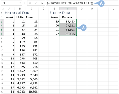
A Excel calculates the exponential trend values.
Plotting a Logarithmic Trendline
You can apply regression analysis to nonlinear data, such as data that exhibits logarithmic behavior. A logarithmic trend is one in which the data rises or falls very quickly at the beginning, but then slows down and levels off over time. An example of a logarithmic trend is the sales pattern of a highly anticipated new product, which typically sells in large quantities for a short time and then levels off.
To visualize such a trend, you can plot a logarithmic trendline. This is a curved line through the data points where the differences between the points on one side of the line and those on the other side of the line cancel each other out.
Plotting a Logarithmic Trendline

![]() Click the chart to select it.
Click the chart to select it.
![]() If your chart has multiple data series, click the series you want to analyze.
If your chart has multiple data series, click the series you want to analyze.
![]() Click the Design tab.
Click the Design tab.
![]() Click Add Chart Element.
Click Add Chart Element.
![]() Click Trendline.
Click Trendline.
![]() Click More Trendline Options.
Click More Trendline Options.

The Format Trendline pane appears.
![]() Click the Trendline Options tab.
Click the Trendline Options tab.
![]() Click the Logarithmic option (
Click the Logarithmic option (![]() changes to
changes to ![]() ).
).
![]() Scroll down and click the Display Equation on Chart check box (
Scroll down and click the Display Equation on Chart check box (![]() changes to
changes to ![]() ).
).
![]() Click the Display R-Squared Value on Chart check box (
Click the Display R-Squared Value on Chart check box (![]() changes to
changes to ![]() ).
).
![]() Click Close.
Click Close.

A Excel plots the logarithmic trendline.
B Excel displays the regression equation and the R2 value.
Plotting a Power Trendline
In many cases of regression analysis, the best fit is provided by a power trend, where the data increases or decreases steadily. Such a trend is clearly not exponential or logarithmic, both of which imply extreme behavior, either at the end (in the case of exponential) of the trend or at the beginning (in the case of logarithmic). Examples of power trends include revenues, profits, and margins in successful companies, all of which show steady increases in the rate of growth year after year.
A power trend sounds linear, but plotting the power trendline shows a curved best-fit line through the data points. In your analysis of such data, it is usually best to try a linear trendline first. If that does not give a good fit, switch to a power trendline.
Plotting a Power Trendline
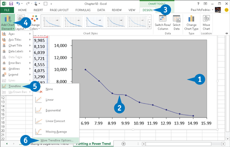
![]() Click the chart to select it.
Click the chart to select it.
![]() If your chart has multiple data series, click the series you want to analyze.
If your chart has multiple data series, click the series you want to analyze.
![]() Click the Design tab.
Click the Design tab.
![]() Click Add Chart Element.
Click Add Chart Element.
![]() Click Trendline.
Click Trendline.
![]() Click More Trendline Options.
Click More Trendline Options.
The Format Trendline pane appears.
![]() Click the Trendline Options tab.
Click the Trendline Options tab.
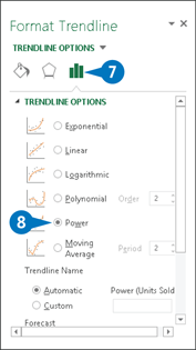
![]() Click the Power option (
Click the Power option (![]() changes to
changes to ![]() ).
).

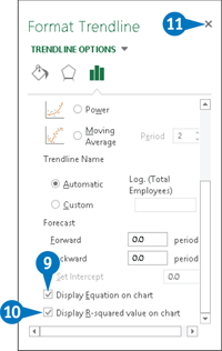
![]() Click the Display Equation on Chart check box (
Click the Display Equation on Chart check box (![]() changes to
changes to ![]() ).
).
![]() Click the Display R-Squared Value on Chart check box (
Click the Display R-Squared Value on Chart check box (![]() changes to
changes to ![]() ).
).
![]() Click Close.
Click Close.
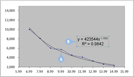
A Excel plots the power trendline.
B Excel displays the regression equation and the R2 value.
Plotting a Polynomial Trendline
For data that fluctuates, your analysis must take into account nonlinear polynomial behavior. In many real-world scenarios, the relationship between the dependent and independent variables is not unidirectional. For example, rather than constantly rising — uniformly, as in a linear trend, sharply as in an exponential or logarithmic trend, or steadily as in a power trend — data such as unit sales, profits, and costs might move up and down.
To visualize such a trend, you can plot a polynomial trendline. This is a best-fit line of multiple curves derived using an equation that uses multiple powers of x. The number of powers of x is the order of the polynomial equation. Generally, the higher the order, the tighter the curve fits your existing data, but the more unpredictable your forecasted values are.
Plotting a Polynomial Trendline
![]() Click the chart to select it.
Click the chart to select it.
![]() If your chart has multiple data series, click the series you want to analyze.
If your chart has multiple data series, click the series you want to analyze.
![]() Click the Design tab.
Click the Design tab.
![]() Click Add Chart Element.
Click Add Chart Element.
![]() Click Trendline.
Click Trendline.
![]() Click More Trendline Options.
Click More Trendline Options.

The Format Trendline pane appears.
![]() Click the Trendline Options tab.
Click the Trendline Options tab.
![]() Click the Polynomial options (
Click the Polynomial options (![]() changes to
changes to ![]() ).
).
![]() Click the Order spin box arrows and select the order of the polynomial equation you want.
Click the Order spin box arrows and select the order of the polynomial equation you want.

![]() Click the Display Equation on Chart check box (
Click the Display Equation on Chart check box (![]() changes to
changes to ![]() ).
).
![]() Click the Display R-Squared Value on Chart check box (
Click the Display R-Squared Value on Chart check box (![]() changes to
changes to ![]() ).
).
![]() Click Close.
Click Close.

A Excel plots the polynomial trendline.
B Excel displays the regression equation and the R2 value.