
12.1 Turning Data into Information
It is sometimes said that a good experiment analyses itself. It is true that careful planning and data collection make the analysis easier and this is why we devoted so much space to them in the two preceding chapters. But it is equally true that we would not make experiments if we knew the outcome. Effects may turn out to be very weak or there may be unexpected aspects of the data that make them difficult to analyze. And even when the data are good, it may not be straightforward to present the results clearly and concisely.
Even though the preparations in the preceding two chapters will improve our prospects, they do not guarantee success. They say that the road to hell is paved with good intentions. You will know what this means if you spend months planning an experiment, getting your setup to work and collecting data, only to find that the data are insufficient to support a clear conclusion. One way to avoid unpleasant surprises when evaluating the data is to do parts of the analysis already during the data collection phase. This allows us to anticipate potential problems. If the results are not promising, parts of the experiment may have to be redesigned. This is, of course, also the reason for the recommendation in the last chapter that we should not collect all the data in one go.
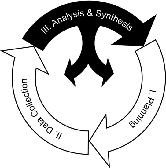
In the last chapter we mentioned that it is sometimes necessary to revisit the planning phase during the data collection phase. In the same way, we may occasionally have to return from the analysis and synthesis phase to the planning or data collection phases. Figure 12.1 shows where in the research process we now find ourselves. The large black arrow points to the planning phase because the knowledge obtained from an experiment that worked well often gives rise to new questions and ideas for research. The smaller arrows indicate that, if the experiment works less well, we may have to reiterate parts of previous research steps.
Figure 12.1 The three phases of research. During the analysis and synthesis phase it may be necessary to revisit the planning phase or the data collection phase in order to build a solid scientific argument.
The analysis begins by looking at the results and trying to find trends and regularities. An initial problem that may have to be overcome is that some experiments do not directly produce numerical data. This is true, for example, when the results come in the form of images. Though effects in such data may be visible in a “soft” way to the eye, they should be boiled down to meaningful numbers to make quantitative analysis easier. As discussed in the last chapter, numbers can be plotted graphically and treated mathematically, whereas soft features only can be qualitatively described.
For this reason, we will break the data analysis down into two activities. The first is data processing, where raw data are turned into a quantitative format. The second activity is the actual analysis, which aims at figuring out what the data can tell us. Processing might involve image analysis or other procedures required to turn soft features in the data into numbers. Once numerical values have been extracted and put into a spreadsheet we can start with the actual analysis, looking for patterns and regularities to arrive at conclusions supported by diagrams and mathematical relationships.
The word analysis has many meanings. In experimental research, it refers to the process of distilling the complex information in raw data into components that carry meaning in the light of our research question. This may be straightforward but in some cases it may require an effort. These components are very similar to the theoretical concepts discussed in Chapter 5. They do not have to be direct properties of the phenomenon under study to be useful. It is sufficient to find a useful representation of the phenomenon – one that can be expressed in numbers. Most of the experiments that have been discussed in this book use such indirect measures to support the conclusions. For instance, in the beetle experiment (Chapter 10, Experiment 1) the phenomenon of interest is the beetle's ability to orient but it is measured by the rolling time on the arena.
In the ideal case we will already have formed a concrete idea of which measures to use during the planning phase but, sometimes, the analysis takes an unexpected turn. Finding the best way to present your data can require a problem-solving process that is likely to involve a bit of trial-and-error. The following two examples will cast some light over what this process can be like.
Example 12.1: Imagine that you want to investigate the properties of a fuel spray in a spray chamber. You vary certain factors that you suspect will affect the propagation of the spray. The measurements are made using a high-speed video camera, producing a time-resolved sequence of images of the spray during fuel injection. These image sequences contain information about the effects in your experiment but you need to extract the essence of this information and present it in quantitative form. Even if there were space in a journal article to show all the film frames, your readers would not appreciate having to search the information out for themselves. You could start by measuring the distance between the injector and the spray tip in each film frame and plot it as function of time. This will produce a curve describing the spray propagation in each movie. But presenting many such curves together will probably result in a crowded diagram, making it difficult to discern subtle differences between the cases. Since time is not an experimental factor it is probably not the most interesting variable to put on the abscissa of your diagrams. You should instead extract representative numbers from the time trends and plot them, not as a function of time, but as a function of your experimental factors. You could use the maximum spray penetration length, the average spray speed, the deceleration, or other numbers that contain concentrated information about the spray propagation. Their dependencies on the experimental factors can be more clearly visualized in diagrams than the direct time trends from the films.![]()
Example 12.2: In the diesel engine experiment (Chapter 10, Experiment 2) the data processing consisted in turning information in images into lift-off lengths. Typical images are shown in Figure 10.5. As explained in Example 11.4, the data processing involved minimizing the effects of vibrations. Lift-off lengths were finally extracted from the images by the following algorithm:
Firstly, the images were digitized. Pixels where the signal exceeded the detector noise level were set to white, while the remaining pixels were set to black. A pie-shaped evaluation region was then drawn around each burning spray in the images. The narrow end of the region pointed at the injector and the wide end coincided with the combustion chamber wall. Within each region, the number of white pixels was counted as function of the radial distance from the injector. The lift-off position appeared as an abrupt increase in the white pixel count at a certain distance from the injector. Images often suffer from noise, reflections and other unintended features; this method was developed to work around such problems. It was found to provide consistent results for the entire set of data.![]()
In both these examples the data have a natural dimension that is not an experimental factor. In Example 12.1 the dimension is time, since the spray propagation is captured on a film. In the other example the dimension is distance from the injector. When processing the data it is easy to become attached to such natural dimensions and forget that we are interested in the influence of the experimental factors. Coupling our response variables to the experimental factors, or to other variables that are firmly coupled to our hypothesis, makes it easier to demonstrate the relevant patterns in the data.
When the interesting numerical responses have been identified and extracted, the data should be arranged in a table, just as we did in Chapter 9. The rows should correspond to the measurements and each column to a variable. The factor variables should be located in the left-hand part of the table and the response variables to the right. This will make it is easier to toy with the data to look for patterns.
If you are using a Microsoft Excel® spreadsheet you can now select a factor column and sort the values from the smallest to the largest. Make sure that the other columns are sorted according to the chosen column, so the rows remain intact after sorting. This makes it easy to compare the responses to the sorted factor values. Are there any obvious patterns? Does any response seem to correlate positively or negatively with the factor? If the factor is categorical, are there any obvious differences between the groups? Continue like this with all the factor columns. You can also add new columns to the table. For instance, if you expect that there is a quadratic effect, you could add a column containing the square of a factor. The response may also be a function of several factors and you could create columns containing ratios or products of factors to investigate this. Your subject matter knowledge will probably lead you to factor combinations that seem relevant but try to test unconventional ideas too.
At this point you might find that the results are quite different from what you expected. This may force you to follow a new line of thought in your analysis, but it may also mean that you have to take the experiment back to the planning phase and start anew. This is what happened in Experiment 2. The original idea was actually to investigate how the injection pressure affected the lift-off length in an optical engine. When studying high-speed video films of the burning sprays, no distinct effect of the injection pressure could be found. But there was an unexpected feature of the data. As mentioned in Chapter 10, Chartier was puzzled to find that the lift-off length was constantly drifting towards the injector. He wondered if this could be due to the burning sprays replenishing the space between them with hot combustion products and developed Experiment 2 to test this hypothesis. In other words, he took his experiment from the analysis and synthesis phase back to the planning phase, following one of the smaller black arrows in Figure 12.1, before completing the investigation and publishing the results.
Sorting the data and looking for patterns is a useful start but there are, of course, limitations to the relationships you can spot by just looking at a table. This is especially true for large sets of data. The most important step in the analysis is therefore to represent the data graphically.