
12.2 Graphical Analysis
It is much easier to see relationships between variables in diagrams than in the numerical values themselves. The most common graphic tools have been introduced in the earlier chapters of this book and are only be briefly recapitulated here. They include tools for investigating distributions, for instance of residuals, but also tools for studying the relationships between two or more variables. When working with continuous variables, the scatter plot is probably the most popular type of diagram. Depending on the measurement precision it may or may not be illustrative to connect the points in a scatter plot by lines. If the data are noisy a regression line may be a better option. In cases when we are interested in the simultaneous influence of two variables, contour plots are illustrative.
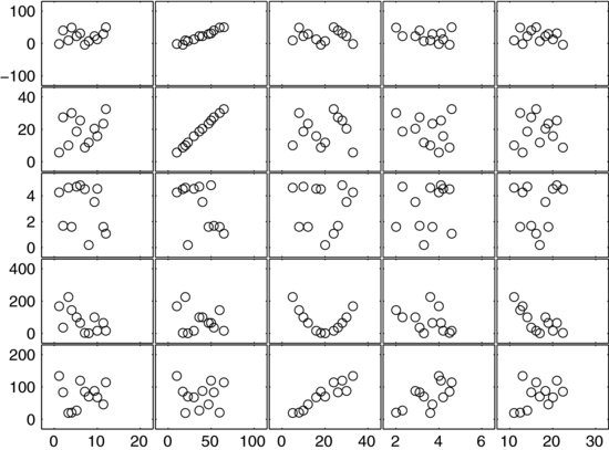
One way to look for patterns and relationships in larger sets of continuous data is to plot all variables simultaneously in a scatter plot matrix. Figure 12.2 shows an example of such a diagram, where five factor variables are aligned along the x-axis and five responses along the y-axis. This graph provides a convenient overview of all the relationships between the variables. Most of the panes do not display any particular patterns. In the two rightmost panes on the top there is no variation in the response at all, except for some noise. It is more difficult to say if there are any effects in the two panes below them, for instance, because the noise is so dominant. Four panes in the matrix stand out, showing distinct structures that indicate relationships. This diagram was made using the PLOTMATRIX function in MathWorks MATLAB®. Excel has no native functionality for creating this type of diagram.
Figure 12.2 Scatter plot matrix connecting five factor variables on the x-axis with five response variables on the y-axis.
For categorical variables, bar plots are more useful than scatter plots. An example of a bar plot is found in the widowbird example of Chapter 6, where Figure 6.12 shows the birds’ mating success before and after tail treatment. If we want to compare both the central tendency and the distribution of two or more data sets, the box plot is a more useful graph.
Example 12.3: In Experiment 2 (Chapter 10), the lift-off lengths tended to be shorter on one side of the burning sprays. The tendency seemed to correlate with the motion of the in-cylinder air, which was rotating about the cylinder centerline (counter-clockwise in Figure 10.5). This type of air motion is called swirl and the downwind side of the spray was therefore called the “downswirl’ side, whereas the upwind side was referred to as the “upswirl’ side. The box plot in Figure 12.3 shows how the lift-off lengths were distributed over the entire data set. The two sides of the spray have similar degrees of dispersion and skew but the median value on the downswirl side is about 15% lower than that on the upswirl side. A similar trend had previously been reported from another study [1]. Interestingly, Experiment 2 used a stronger swirling flow and also showed a greater difference in lift-off length between the two sides of the spray. These results seemed to support the hypothesis that hot burned gases affected the lift-off length. This is because the airflow was expected to displace hot products from the upswirl to the downswirl side of the spray. Under the research hypothesis, it is fair to assume that a greater quantity of hot gases on the downswirl side of the spray will shorten the lift-off length there.![]()
Figure 12.3 Box plot showing how the lift-off lengths are distributed across the whole data set. Lift-off lengths tend to be shorter on the downswirl side than on the upswirl side.
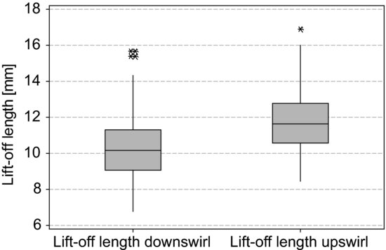
You may have noted that the responses in Figure 12.3 are not plotted as a function of the experimental factors. As explained in the example, the plot still provides support for the scientific argument that hot gases affect the lift off length. This is because the variables on the abscissa are firmly coupled to the research hypothesis. Interestingly, the idea that the lift-off length could be asymmetric about the spray did not occur when designing the experiment. The effect was discovered when processing the data and was included in the analysis since it provided additional support for the research hypothesis. It should also be noted that the variable on the abscissa is categorical, although the experimental design was based on continuous numerical factors. This illustrates that there is nothing automatic about data analysis. Even data from carefully designed experiments often contain unexpected features.
The final aim of the analysis is to build a scientific argument, where your data is the evidence that demonstrates the soundness of your conclusions. Clear diagrams are probably the most intuitive and convincing way to support your conclusions; this is the reason why the discussion in almost all research papers is built around them. But a diagram is not an argument in its own right. It only describes what happened in your experiment. Looking at our example experiments we realize that trends and differences in the data make sense only in the light of the research hypothesis.
So, although the analysis phase in many ways is a process of finding the diagrams that most clearly display the essential features of your data, this process must be firmly guided by your research question. Did the results confirm or disprove your initial hypothesis? Can established theories explain the results, or are there discrepancies? Do you need further hypotheses and experiments to confirm your findings? Your diagrams must answer questions like these if you are to build a coherent scientific argument from them.