
10.6 Tools for Generating Hypotheses
The first step in generating hypotheses is to trace an observed phenomenon back to potential causes. This requires an active imagination. The theoretical framework that you have developed by working in your field will affect how you see and approach research problems. As discussed in the section about creativity in Chapter 5, this tends to make you search for certain types of solutions that give you a sense of familiarity and security. In other words, your expertise tends to close you off from alternative lines of thought. Needless to say, this can be an obstacle when looking for new ideas.
It may seem contradictory to first stress the need for developing a mental map of the research problems in your field and then explain that this map is an obstacle for your thinking. The truth is that creative work is contradictory. To be able to do anything of value you must develop the map and use it, but it is also important to be able to free yourself of this intellectual luggage in situations where fresh thinking is required. Remember that the map is not fixed. It is a product of your own thinking, and thereby varies from the maps of other researchers. It is a dynamic map that changes and grows as you learn from experience.
It is often useful to visualize a problem in different ways. One way to do this is the so-called cause-and-effect diagram, introduced by Kaoru Ishikawa as a quality control tool in the 1960s. Due to its shape it is sometimes called a fishbone diagram. Here, we will use the term Ishikawa diagram to avoid confusion with cause-and-effect tables, which will be introduced later. The diagram allows the cause-and-effect relationships in a process to be summarized and it is, therefore, useful also in scientific research. When constructing the diagram, we are forced to think of as many different explanations for a phenomenon as possible, which keeps us from settling with the first and most obvious idea.
To make a cause-and-effect diagram, take a large piece of paper and write the effect or phenomenon that interests you in a box at the far right of the sheet. Then draw an arrow across the paper from the left to the box on the right. If you are studying a process this axis represents the timeline, but the diagram can also be used to analyze phenomena that does not have an obvious temporal dimension. Now, think carefully about all the possible main causes for the effect. When applying the diagram to an engineering process these are often the “5Ms”; man, machine, material, method, and measurement. In other situations you may choose other broad headings that apply to your particular problem. In Experiment 1, for example, the beetles rolling straight could potentially be explained by a wide range of sensory perceptions, like smelling, hearing and so on. Enter such main causes into the diagram with smaller arrows pointing onto the main axis. If the diagram describes a process you should start from the left and follow the order of the process. The result is a diagram that roughly resembles a fishbone or a Christmas tree that has fallen over to the right (Figure 10.6). It shows one possible Ishikawa diagram for Experiment 1. It is useful to try various methods of classification, for example process order (time), physical location (space), or any other classification that comes to mind. In this case, various visual cues were chosen as headings. The next step is to look at each of the branches in turn and try to find as many subcauses as possible. Enter them into the diagram with arrows pointing onto the branch. Remember that Figure 10.6 is just one conceivable diagram for Experiment 1. Another person could come up with other ideas or prefer different classifications. There is no right diagram; the mental process that is started when drawing the diagram is more important than the diagram itself. One important goal is to move beyond the obvious ideas suggested by your current knowledge and explore new perspectives on the problem.
Figure 10.6 Ishikawa diagram of potential causes explaining why the dung beetle can roll a ball along a straight path.
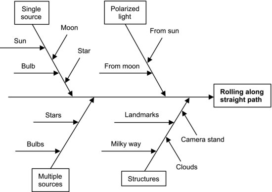
As Ishikawa himself points out, there are no specific rules for drawing the diagram. The important thing is to break the causes down using sub-branches, sub-sub-branches and so on, to the point where you have identified potential causes that can be investigated. Why-analysis is a very useful tool in this process [6].
Sometimes, the research problem focuses on a process, as in Experiment 2. Here, the effect is the result of a sequence of events experienced by the fuel, from entering through the nozzle to ending up as combustion products in the exhaust port. Other research problems focus on phenomena that have no obvious timeline. Experiment 1 is a good example of this, as the beetle's orientation could be explained by a number of visual (and potentially other) cues, but it would not make any sense to order them on a time axis. The diagram is still a useful way to structure your thoughts but you may prefer to put the effect at the center of the paper and organize the causes like spokes and subspokes around it, as in a mind map. That is really what the diagram is – a tool for organizing and visualizing your thoughts. Ishikawa preferred the timeline structure with angled arrows because it gives a visual impression of following a river back to its source [6].
It could be useful to interact with other people when constructing the diagram, or even to make it a team exercise. This will often increase the number of ideas and perspectives considered. If you run out of paper space you could transfer a branch of the diagram to a separate sheet and elaborate it further. When you are satisfied, put the diagram away and let your subconscious process the information. It is important to abstain from negative comments during the brainstorming phase, as it tends to kill the creativity. It is better to let the diagram “cook overnight” before starting to rank the causes according to how you perceive their importance. You formulate hypotheses by stating in simple sentences how you expect the causes to be coupled to the effect. Apart from the hypotheses, the diagram will give you a clearer picture of your problem than you had before.
It is now useful to employ another tool – a cause-and-effect table. It gives a less graphical but more structured overview of the potential causes and allows you to elaborate on how you think they are coupled to the effect. This table will be a convenient starting point when you develop your experiment. Start with a fresh piece of paper and write the most promising causes in a column on the left. They should preferably be given in the form of variables that can be manipulated. Next to each variable, write an action describing the manipulation. Put the column heading “Cause” above these columns at the top. To the right of this heading, write down names of effects that are relevant to your study as additional column headings. These should be variables that can be measured. The Ishikawa diagram allowed you to follow the phenomenon of interest back to its potential source, so you could in principle use several intermediate branches between the phenomenon and its final cause as headings. In that case it is convenient to write them in an order that describes a causal chain from the causes on the left to the phenomenon on the right. You could put down any other effects that you expect the causes to have as well, as these may provide additional ideas for your experiment. It is important to stress that research problems are different and, accordingly, the structure of the diagram may differ.
After listing potential causes and effects in the table, it is possible to make simple thought experiments. Look at the causes on the left, which are given as variables and actions. Try to imagine what these actions do to each of the effect variables on the right. Does the effect decrease when the cause variable increases? If so, write a “–” sign in the effect column. If the effect and cause are positively correlated, write a “+” sign. If you expect the effect to be very strong, you could put a double “+” sign or, if you think the effect is weak, put the sign within parentheses. Not all causes will affect all effects, so it may be appropriate to put a zero in a column. If it is difficult to anticipate an effect, you could use a “?”, and you can use other symbols to represent a quadratic dependence and so forth. If the columns of the table describe a causal chain between the root cause on the left and the final effect on the right, you may have to consider all the columns to the left of a given column to estimate what that particular effect will be.
Table 10.1 shows a possible cause-and-effect table for Experiment 1, which was developed from parts of the Ishikawa diagram in Figure 10.6. It contains clues to how various hypotheses can be tested. For example, if we assume that the beetles use the polarization pattern from scattered moonlight for orientation, they would not be able to roll straight on nights without a moon. This is represented by a “+” sign in the “random walk” column, as that effect is expected to be correlated with the absence of moonlight. The sky polarization can be used for orientation if the moon is up, even if it is hidden from view. This is indicated with a “+” in the “constant direction” column. The final cause under the polarized light heading is the use of a polarization filter, which could affect the beetle's sense of direction and make it change direction. As described in Experiment 1, all of these observations were made in the field and thereby support the hypothesis that the beetles use the polarization properties of scattered moonlight for orientation.
Table 10.1 Cause-and-effect table based on parts of the Ishikawa diagram in Figure 10.6.
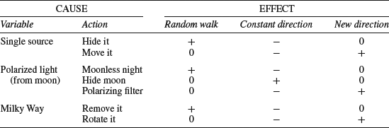
After filling out the whole table you have a qualitative description of how you anticipate the root causes to be coupled to the phenomenon of interest. In some cases the relationship is expected to be strong and in other cases the outcome is less predictable. The causes that are strongly coupled to the effect are generally the most promising ones to test experimentally, as a strong effect will provide a more unambiguous test of your hypothesis than a weak one. If an effect that was expected to be strong turns out to be absent in your experiment, you may discard your hypothesis and move on to another one.
Again, this is just one way of constructing a cause-and-effect table. You do not have to adhere strictly to this format. Every research problem is unique and yours may invite other ways of organizing causes and effects. Remember that the techniques presented in this chapter are tools to aid your thoughts. They should be adapted to suit the problem, not mindlessly repeated.
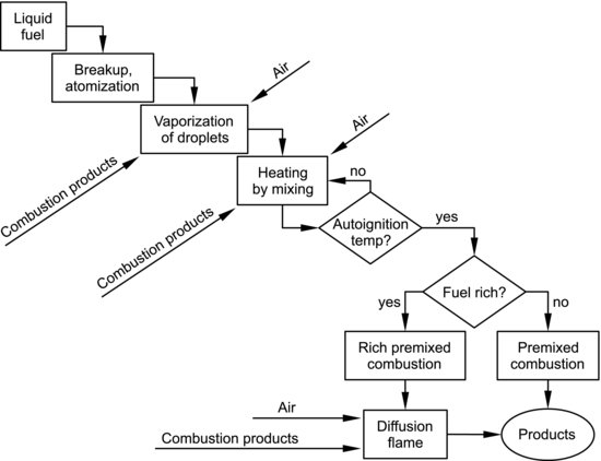
Our brains seem to prefer concrete, visual scenarios to abstract reasoning. If you are studying a process, one method for visualizing the research problem is to close your eyes and imagine taking part in the process. In Experiment 2, for example, the fuel goes through a number of events in the cylinder. If we imagine being a fuel molecule and try to picture how it experiences all these steps, we will be forced to consider the parts of the process in detail. Our mental walk through the process can be documented in a process diagram. This is basically a set of boxes that represent the steps of a process, connected by lines or arrows. There are standards for how these boxes should be drawn to describe different types of events but for your private use you may draw the boxes whichever way you find useful. Figure 10.7 shows a simple process diagram describing the fuel history in Experiment 2. The research question in this experiment was whether significant amounts of hot combustion products were mixed into the spray or not. The diagram could be made considerably more complex but this version is sufficient to convey a general idea. When there are alternative results of a specific process step, this is represented by diamond-shaped boxes with conditions written into them. Depending on whether a condition is fulfilled or not, the process may follow one of two paths, represented by lines labeled with the words “yes” and “no”. Visualizing the process like this can highlight critical events and suggest ideas for experiments. If we, for instance, wish to confirm that hot combustion products are present and play a role in the auto-ignition step, Figure 10.7 tells us that these hot products will affect the vaporization step too. This gives us an additional method of supporting the hypothesis that combustion products are mixed into the spray. Without the diagram this possibility might have been overlooked.
Figure 10.7 Simplified process diagram of the fuel history from entering the combustion chamber through the nozzle to ending up as combustion products in the exhaust port.
The tools introduced in this section are intentionally quite simple and intuitive, since the focus should be on the research problem and not on the tools. Their purpose is to help us consider more possibilities than we would if we settled with our first idea. Allow plenty of time for working with them. Even though the techniques are simple, exploring the various perspectives is hard work if it is done seriously. When using these tools, the voyage is more important than the destination. You could develop your own thinking techniques too. Any method that works with your way of thinking is of course useful.