

Chapter 2
Statistics Review
Always Take a Random and Representative Sample
Statistics Is Not an Exact Science
Understand a Z Score
Understand the Central Limit Theorem
Understand One-Sample Hypothesis Testing and p-Values
Many Approaches/Techniques Are Correct, and a Few Are Wrong
Regardless of the academic field of study—business, psychology, or sociology—the first applied statistics course introduces the statistical foundation topics of descriptive statistics, probability, probability distributions (discrete and continuous), sampling distribution of the mean, confidence intervals, one-sample hypothesis testing, and perhaps two-sample hypothesis testing, simple linear regression, multiple linear regression, and ANOVA. Not considering the mechanics/processes of performing these statistical techniques, what fundamental concepts should you remember? We believe there are six fundamental concepts:
1. Always take a random and representative sample
2. Statistics is not an exact science.
3. Understand a Z score.
4. Understand the central limit theorem (not every distribution has to be bell-shaped).
5. Understand one-sample hypothesis testing and p-values.
6. Many approaches/techniques are correct, and a few are wrong.
Let’s examine each concept further.
Always Take a Random and Representative Sample
Fundamental Concepts 1 and 2: Always take a random and representative sample, and statistics is not an exact science.
What is a random and representative sample (we will call it a 2R sample)? By representative, we mean representative of the population of interest. A good example to understand what we mean is state election polling. You do not want to sample everyone in the state. First, an individual must be old enough and registered to vote. You cannot vote if you are not registered. Next, not everyone who is registered votes. So, if the individual is registered, does he/she plan to vote? Again, we are not interested in the individual if he/she does not plan to vote. We do not care about their voting preferences because they will not have an impact on the election. Thus, the population of interest is those individuals who are registered to vote and plan to vote. From this representative population of registered voters who plan to vote, we want to choose a random sample. By random, we mean that each individual has an equal chance of being selected. So you could imagine that there is a huge container with balls that represent each individual identified as being registered and planning to vote. From this container, we choose so many balls (without replacing the ball). In such a case, each individual has an equal chance of being drawn.
We want the sample to be a 2R sample; but, why is that so important?
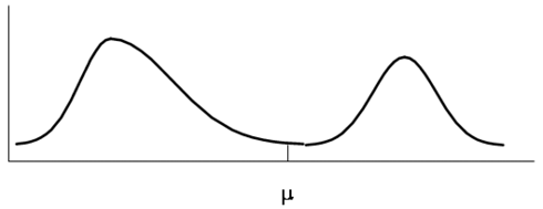
For two related reasons. First, if the sample is a 2R sample, then the sample distribution of observations will follow a similar pattern/shape as the population. Suppose that the population distribution of interest is the weights of sumo wrestlers and horse jockeys (sort of a ridiculous distribution of interest, but that should help you remember why it is important). What does the shape of the population distribution of weights of sumo wrestlers and jockeys look like? Probably somewhat like the distribution in Figure 2.1. That is, it’s bimodal or two-humped.
Figure 2.1 Population Distribution of the Weights of Sumo Wrestlers and Jockeys
If we take a 2R sample, the distribution of sampled weights would look somewhat like the population distribution in Figure 2.2, where the solid line is the population distribution and the dashed line is the sample distribution.
Figure 2.2 Population and a Sample Distribution of the Weights of Sumo Wrestlers and Jockeys
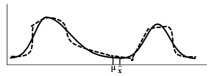
Why not exactly the same? Because it is a sample, not the entire population. It may differ, but just slightly. If the sample was of the entire population, then it would look exactly the same. Again, so what? Why is this so important?
Statistics Is Not an Exact Science
The population parameters (such as the population mean, µ, the population variance, σ2, or the population standard deviation, σ) are the true values of the population. These are the values that we are interested in knowing. In most situations, the only way that we would know these values exactly was if we were to sample the entire population (or census) of interest. In most real-world situations, this would be a prohibitively large number (costing too much and taking too much time); as a result, we take a 2R sample.
Because the sample is a 2R sample, the sample distribution of observations is very similar to the population distribution of observations. Therefore, the sample statistics, calculated from the sample, are good estimates of their corresponding population parameters. That is, statistically they will be relatively close to their population parameters because we took a 2R sample.
The sample statistics (such as the sample mean, sample variance, and sample standard deviation) are estimates of their corresponding population parameters. It is highly unlikely that they will equal their corresponding population parameter. It is more likely that they will be slightly below or slightly above the actual population parameter, as shown in Figure 2.2.
Further, if another 2R sample is taken, most likely the sample statistics from the second sample will be different from the first sample; they will be slightly less or more than the actual population parameter.
For example, let’s say that a company’s union is on the verge of striking. We take a 2R sample of 2000 union workers. Let us assume that this sample size is statistically large. Out of the 2000, 1040 of them say they are going to strike. First, 1040 out of 2000 is 52%, which is greater than 50%. Can we therefore conclude that they will go on strike? Given that 52% is an estimate of the percentage of the total number of union workers who are willing to strike, we know that another 2R sample will provide another percentage. But another sample could produce a percentage perhaps higher and perhaps lower, and perhaps even less than 50%. By using statistical techniques, we can test the likelihood of the population parameter being greater than 50%. (We can construct a confidence interval, and if the lower confidence level is greater than 50%, we can be highly confident that the true population proportion is greater than 50%. Or we can conduct a hypothesis test to measure the likelihood that the proportion is greater than 50%.)
Bottom line: When we take a 2R sample, our sample statistics will be good (statistically relatively close, i.e., not too far away) estimates of their corresponding population parameters. And we must realize that these sample statistics are estimates, in that, if other 2R samples are taken, they will produce different estimates.
Understand a Z Score
Fundamental Concept 3: Understand a Z score.
Let’s say that you are sitting in on a marketing meeting. The marketing manager is presenting the past performance of one product over the past several years. Some of the statistical information that the manager provides is the average monthly sales and standard deviation. (More than likely, the manager would not present the standard deviation, but, a quick conservatively large estimate of the standard deviation is the (Max – Min)/4; the manager most likely would give the minimum and maximum values.)
Let’s say the average monthly sales are $500 million, and the standard deviation is $10 million. The marketing manager starts to present a new advertising campaign which he/she claims would increase sales to $570 million per month. Let’s say that the new advertising looks promising. What is the likelihood of this happening? If we calculate the Z score:
![]()
The Z score (and the t score) is not just a number. The Z score is how many standard deviations away that a value, like the 570, is from the mean of 500. The Z score can provide us some guidance, regardless of the shape of the distribution. A Z score greater than (absolute value) 3 is considered an outlier and highly unlikely. In our example, if the new marketing campaign is as effective as suggested, the likelihood of increasing monthly sales by 7 standard deviations is extremely low.
On the other hand, what if we calculated the standard deviation, and it was $50 million? The Z score now is 1.4 standard deviations. As you might expect, this can occur. Depending on how much you like the new advertising campaign, you would believe it could occur. So the number $570 million can be far away, or it could be close to the mean of $500 million. It depends upon the spread of the data, which is measured by the standard deviation.
In general, the Z score is like a traffic light. If it is greater than the absolute value of 3 (denoted |3|), the light is red; this is an extreme value. If the Z score is between |1.96| and |3|, the light is yellow; this value is borderline. If the Z score is less than |1.96|, the light is green, and the value is just considered random variation. (The cutpoints of 3 and 1.96 may vary slightly depending on the situation.)
Understand the Central Limit Theorem
Fundamental Concept 4: Understand the central limit theorem (not every distribution has to be bell-shaped).
This concept is where most students become lost in their first statistics class; they complete their statistics course thinking every distribution is normal or bell-shaped. No, that is not true. However, if the assumptions are not violated and the central limit theorem holds, then, something called the sampling distribution of the sample means will be bell-shaped. And this sampling distribution is used for inferential statistics; i.e., it is applied in constructing confidence intervals and performing hypothesis tests. Let us explain.
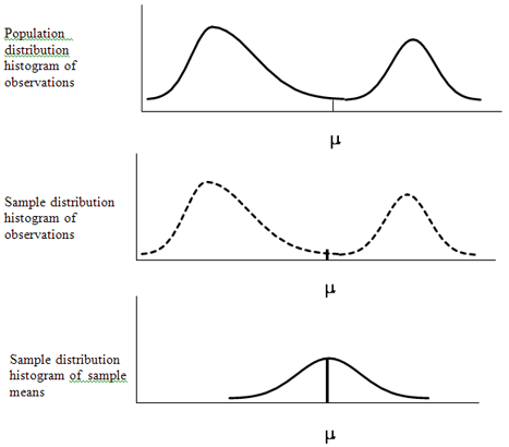
If we take a 2R sample, the histogram of the sample distribution of observations will be close to the histogram of the population distribution of observations (Fundamental Concept 1). We also know that the sample mean from sample to sample will vary (Fundamental Concept 2). Let’s say we actually know the value of the population mean. If we took several samples, there would be approximately an equal number of sample means slightly less than the population mean and slightly more than the population mean. There will also be some sample means further away, above and below the population mean.
Now, let’s say we took every combination of sample size n (and let n be any number greater than 30), and we calculated the sample mean for each sample. Given all these sample means, we then produce a frequency distribution and corresponding histogram of sample means. We call this distribution the sampling distribution of sample means. A good number of sample means will be slightly less and more, and fewer farther away (above and below), with equal chance of being greater than or less than the population mean. If you try to visualize this, the histogram of all these sample means would be bell-shaped, as in Figure 2.3. This should make intuitive sense.
Figure 2.3 Population Distribution and Sample Distribution of Observations and Sampling Distribution of the Means for the Weights of Sumo Wrestlers and Jockeys
Nevertheless, there is one major problem. To get this histogram of sample means, we said that every combination of sample size n needs to be collected and analyzed. That, in most cases, is an enormous number of samples and would be prohibitive. Additionally, in the real world, we only take one 2R sample.
This is where the central limit theorem (CLT) comes to our rescue. The CLT will hold regardless of the shape of the population distribution histogram of observations—whether it is normal, bimodal (like the sumo wrestlers and jockeys), whatever shape, as long as a 2R sample is taken and the sample size is greater than 30. Then, the sampling distribution of sample means will be approximately normal, with a mean of ![]() and a standard deviation of
and a standard deviation of ![]() (which is called the standard error).
(which is called the standard error).
What does this mean? We do not have to take an enormous number of samples. We need to take only one 2R sample with a sample size greater than 30. In most situations this will not be a problem. (If it is an issue, you should use nonparametric statistical techniques.) If we have a 2R sample greater than 30, we can approximate the sampling distribution of sample means by using the sample’s ![]() and standard error,
and standard error, ![]() . If we collect a 2R sample greater than 30, the CLT holds. As a result, we can use inferential statistics; i.e., we can construct confidence intervals and perform hypothesis tests. The fact that we can approximate the sample distribution of the sample means by taking only one 2R sample greater than 30 is rather remarkable and is why the CLT theorem is known as the “cornerstone of statistics.”
. If we collect a 2R sample greater than 30, the CLT holds. As a result, we can use inferential statistics; i.e., we can construct confidence intervals and perform hypothesis tests. The fact that we can approximate the sample distribution of the sample means by taking only one 2R sample greater than 30 is rather remarkable and is why the CLT theorem is known as the “cornerstone of statistics.”
The implications of the CLT are highly significant. Let’s illustrate the outcomes of the CLT further with an empirical example. The example that we will use is the population of the weights of sumo wrestlers and jockeys.
Open the Excel file called SumowrestlersJockeysnew.xls and go to the first worksheet called data. In column A, we generated our population of 5000 sumo wrestlers and jockeys weights with 30% of them being sumo wrestlers.
First, you need the Excel’ Data Analysis add-in. (If you have loaded it already you can jump to the next paragraph). To upload the Data Analysis add-in:
1. Click File from the list of options at the top of window.
2. A box of options will appear. On the left side toward the bottom, click Options.
3. A dialog box will appear with a list of options on the left. Click Add-Ins.
4. The right side of this dialog box will now lists Add-Ins. Toward the bottom of the dialog box there will appear
![]()
Click Go.
5. A new dialog box will appear listing the Add-Ins available with a check box on the left. Click the check boxes for Analysis ToolPak and Analysis ToolPak—VBA. Then click OK.
If you click Data on the list of options at the top of window, all the way toward the right of the list of tools will be Data Analysis.
Now, let’s generate the population distribution of weights:
1. Click Data on the list of options at the top of the window. Then click Data Analysis.
2. A new dialog box will appear with an alphabetically ordered list of Analysis tools. Click Histogram and OK.
3. In the Histogram dialog box, for the Input Range, enter $A$2:$A$5001; for the Bin Range, enter $H$2:$H$37; for the Output range, enter $K$1. Then click the options Cumulative Percentage and Chart Output and click OK, as in Figure 2.4 below.
Figure 2.4 Excel Data Analysis Tool Histogram Dialog Box
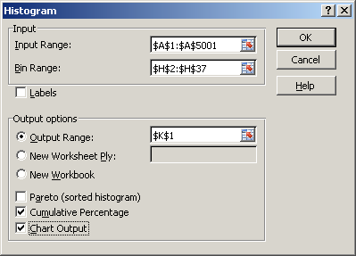
Figure 2.5 Output of the Histogram Data Analysis Tool
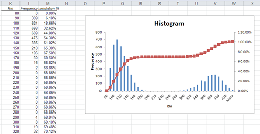
A frequency distribution and histogram similar to Figure 2.5 will be generated.
Given the population distribution of sumo wrestlers and jockeys, we will generate a random sample of 30 and a corresponding dynamic frequency distribution and histogram (you will understand the term dynamic shortly).
1. Select the 1 random sample worksheet. In columns C and D, you will find percentages that are based upon the cumulative percentages in column M of the worksheet data. Additionally, in column E, you will find the average (or midpoint) of that particular range.
2. In cell K2, enter =rand(). Copy and paste K2 into cells K3 to K31.
3. In cell L2, enter =VLOOKUP(K2,$C$2:$E$37,3). Copy and paste L2 into cells L3 to L31.
You have now generated a random sample of 30. If you press F9, the random sample will change.
4. To produce the corresponding frequency distribution (and BE CAREFUL!), highlight the cells P2 to P37. In cell P2, enter the following:
=frequency(L2:L31,O2:O37)
THEN BEFORE pressing ENTER, simultaneously hold down and press Ctrl, Shift, and Enter.
The frequency function finds the frequency for each bin, O2:O37, for the cells L2:L31. Also, when you simultaneously hold down the keys, an array is created. Again, as you press the F9 key, the random sample and corresponding frequency distribution changes. (Hence, this is why we call it a dynamic frequency distribution.)
5. To produce the corresponding dynamic histogram, highlight the cells P2 to P37. Click Insert from the top list of options. Click the Chart type Column icon. An icon menu of column graphs is displayed. Click under the left icon under the 2-D Columns. A histogram of your frequency distribution is produced, similar to Figure 2.6.
To add the axis labels, under the group of Chart Tools at the top of the screen (remember to click on the graph), click Layout. A menu of options appears below. Select Axis Titles→Primary Horizontal Axis Title→Title Below Axis. Type Weights and press Enter. For the vertical axis, select Axis Titles→Primary Vertical Axis Title→Vertical title and type Frequency.
Figure 2.6 Histogram of a Random Sample of 30 Sumo Wrestler and Jockeys Weights
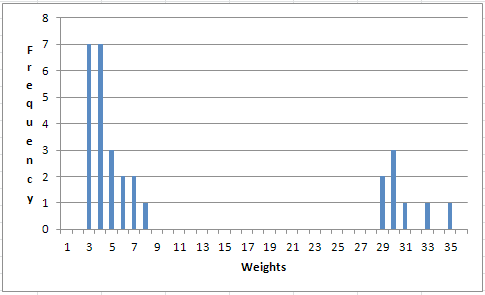
If you press F9, the random sample changes, the frequency distribution changes, and the histogram changes. As you can see, the histogram is definitely not bell-shaped and does look somewhat like the population distribution in Figure 2.5.
Now, go to the sampling distribution worksheet. Similarly to how we generated a random sample in the random sample worksheet, we have already generated 50 random samples, each of size 30, in columns L to BI. Below each random sample, the average of that sample is calculated in row 33. Further in column BL is the dynamic frequency distribution, and there is a corresponding histogram of the 50 sample means. If you press F9, the 50 random samples, averages, frequency distribution, and histogram change. The histogram of the sampling distribution of sample means (which is based on only 50 samples—not on every combination) is not bimodal, but is for the most part bell-shaped.
Understand One-Sample Hypothesis Testing and p-Values
Fundamental Concept 5: Understand one-sample hypothesis testing and p-values.
One of the inferential statistical techniques that we can apply, thanks to the CLT, is one-sample hypothesis testing of the mean. Generally speaking, hypothesis testing consists of two hypotheses, the null hypothesis, called H0, and the opposite to H0—the alternative hypothesis, called H1 or Ha. The null hypothesis for one-sample hypothesis testing of the mean tests whether the population mean is equal to, less than or equal to, or greater than or equal to a particular constant. An excellent analogy for hypothesis testing is our judicial system. The null hypothesis, H0, is that you are innocent, and the alternative hypothesis, H1, is that you are guilty.
Once the hypotheses are identified, the statistical test statistic is calculated, whether it is a Z or t value. (For simplicity’s sake, in our discussion here we will say only the Z values, i.e, Zcalc or Zcritical, when this does pertain to other tests—e.g., t, F, χ2.) This Zcalc is compared to what we will call the critical Z, Zcritical. The Zcritical value is based upon what is called a level of significance, called α, which is usually equal to 0.10, 0.05, or 0.01. The level of significance can be viewed as the probability of making an error (or mistake), given that the H0 is correct. Relating this to the judicial system, this is the probability of wrongly determining someone is guilty when in reality they are innocent, so we want to keep the level of significance rather small. Remember that statistics is not an exact science. We are dealing with estimates of the actual values. (The only way that we can be completely certain is if we use the entire population.) So, we want to keep the likelihood of making an error relatively small.
There are two possible statistical decisions and conclusions that are based on comparing the two Z values, Zcalc and Zcritical. If |Zcalc| > |Zcritical|, we reject H0. When we reject H0, there is enough statistical evidence to support H1. That is, in terms of the judicial system, there is overwhelming evidence to conclude that the individual is guilty. On the other hand, we do fail to reject H0 when |Zcalc| ≤ |Zcritical|, and we conclude that there is not enough statistical evidence to support H1. That is, in terms of the judicial system, there is not enough evidence to conclude that the individual is guilty. The judicial system would then say that the person is innocent, but, in reality this is not necessarily true. We just did not have enough evidence to say that the person is guilty.
As we discussed under Fundamental Concept 3, understanding Z scores, the |Zcritical| and also the |Zcalc| are not simply numbers; they represent the number of standard deviations away from the mean that a value is. In this case, it is the number of standard deviations away from the hypothesized value used in H0. So, we reject H0 when we have a relatively large |Zcalc|, i.e., |Zcalc| > |Zcritical|. That is, we reject H0 when the value is a relatively large number of standard deviations away from the hypothesized value. Conversely, when we have a relatively small |Zcalc| (i.e., |Zcalc| ≤ |Zcritical│), we fail to reject H0. That is, the |Zcalc| value is relatively near the hypothesized value and could be simply due to random variation.
Instead of comparing the two Z values, Zcalc and Zcritical, another more generalizable approach that can also be used with other hypothesis tests (i.e., tests involving other distributions like t, F, χ2) is a concept known as p-values. The p-value is the probability of rejecting H0. Thus, in terms of the one-sample hypothesis test using the Z, the p-value is the probability that is associated with Zcalc. So, as shown in Table 2.1, a relatively large |Zcalc| results in rejecting H0 and has a relatively small p-value. Alternatively, a relatively small |Zcalc| results in not rejecting H0 and has a relatively large p-value.
Table 2.1 Decisions and Conclusions to Hypothesis Tests in Relationship to the p-value
|
Critical Value |
p-value |
Statistical Decision |
Conclusion |
|
│ZCALC│> │ZCritical│ |
p-value < α |
Reject H0 |
There is enough evidence to say that H1 is true. |
|
│ZCALC│≤ │ZCritical│ |
p-value ≥ α |
Do Not Reject H0 |
There is not enough evidence to say that H1 is true. |
General interpretation of a p-value is if it is:
■ Less than 1%, there is overwhelming evidence that supports the alternative hypothesis.
■ Between 1% and 5%, there is strong evidence that supports the alternative hypothesis.
■ Between 5% and 10%, there is weak evidence that supports the alternative hypothesis.
■ Greater than 10%, there is little to no evidence that supports the alternative hypothesis.
An excellent real-world example of p-values is the criterion that the Federal Food and Drug Administration (FDA) uses to approve new drugs. A new drug is said to be effective if it has a p-value less than 0.05 (and FDA does not change the threshold of 0.05). So, a new drug is approved only if there is strong evidence that it is effective.
Many Approaches/Techniques Are Correct, and a Few Are Wrong
Fundamental Concept 6: Many approaches/techniques are correct, and a few are wrong.
In your first statistics course, many and perhaps an overwhelming number of approaches and techniques were presented. When do you use them? Do you remember why you use them? Some approaches/techniques should not even be considered with some data. Two major questions should be asked when considering applying a statistical approach/technique:
1. Is it statistically appropriate?
2. What will it possibly tell us?
An important factor to consider in deciding which technique to use is whether one or more of the variables is categorical or continuous. Categorical data can be nominal data such as gender, or it may be ordinal such as the Likert scale. Continuous data can have fractions (or no fractions, in which the data is an integer), and we can measure the distance between values. But with categorical data, we cannot measure distance. Simply in terms of graphing, we would use bar and pie charts for categorical data but not for continuous data. On the other hand, graphing a continuous variable requires a histogram. When summarizing data, descriptive statistics are insightful for continuous variables; a frequency distribution is much more useful for categorical data.
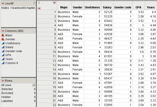
To illustrate, we will use the data in Table 2.2 and in the file Countif.xls and worksheet rawdata. The data consists of survey data from 20 students asking them how useful their statistics class was (column C), where 1 represents extremely not useful and 5 represents extremely useful, along with some individual descriptors of major (Business or Arts and Sciences (A&S)), Gender, current salary, GPA, and years since graduating. Major and Gender (and correspondingly Gender code) are examples of nominal data. The Likert scale of usefulness is an example of ordinal data. Salary, GPA, and years are examples of continuous data.
Table 2.2 Data and Descriptive Statistics in Countif.xls file and Worksheet Statistics
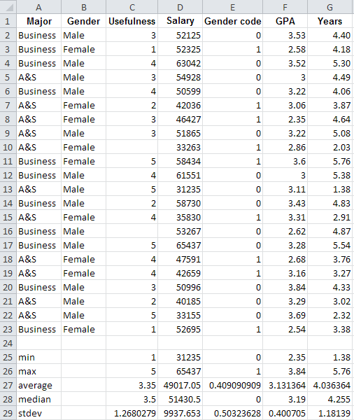
Using some Excel functions, we provided some descriptive statistics in rows 25 to 29 in the stats worksheet. These descriptive statistics are valuable in understanding the continuous data—e.g., the fact that the average is less than the median, and the salary data is slightly left-skewed with a minimum of $31,235, a maximum of $65,437 and a mean of $49,017. Descriptive statistics for the categorical data are not very helpful. E.g., for the usefulness variable, an average of 3.35 was calculated, slightly above the middle value of 3. A frequency distribution would give much more insight.
Use JMP and open Countif.xls file. There are two ways that you can open an Excel file. One way is similar to opening any file in JMP, and the other way is directly from inside Excel (when JMP has been added to Excel as an Add-in).
1. To open the file in JMP, first click to open JMP. From the top menu, click File→Open. Locate the Countif.xls Excel file on your computer and click on it in the selection window. You get the Open Data File dialog box. Click on option Best Guess under Should Row 1 be Labels? Check the box for Allow individual worksheet selection. Click OPEN. The Select the sheets to import dialog box with the file’s worksheets listed will appear. Click rawdata and click OK. The data table should then appear.
2. If you want to open JMP from within Excel (and you can be in stats or rawdata), on the top Excel menu click JMP. (Note: The first time you use this approach, select Preferences. Check the box for Use the first row s as column names. Click OK. Subsequent use of this approach does not require you to click Preferences.) Highlight cells A1:G23. Click Data Table. JMP should open and the data table will appear.
Figure 2.7 Modeling Types of Gender
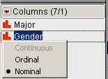
In JMP, as illustrated in Figure 2.7, move your cursor to the Columns panel and the red bar chart symbol, ![]() , next to the variable Gender. When your pointer changes to a hand,
, next to the variable Gender. When your pointer changes to a hand, ![]() , then right-click. You will get three rows of options: continuous (which is grayed out), ordinal, and nominal. Next to nominal will be a dark colored dot, which indicates JMP’s best guess of what type of data the column Gender is Nominal.
, then right-click. You will get three rows of options: continuous (which is grayed out), ordinal, and nominal. Next to nominal will be a dark colored dot, which indicates JMP’s best guess of what type of data the column Gender is Nominal.
If you move your cursor over the blue triangle, ![]() , beside Usefulness, you will see the black dot next to Continuous. But actually the data is ordinal. So click Ordinal. JMP now considers that column as ordinal (note that the blue triangle changed to green bars,
, beside Usefulness, you will see the black dot next to Continuous. But actually the data is ordinal. So click Ordinal. JMP now considers that column as ordinal (note that the blue triangle changed to green bars, ![]() ).
).
Following the same process, change the column Gender code to nominal (the blue triangle now changes to red bars). The Table should look like Figure 2.8. To save the file as a JMP file, first, in the Table panel, right-click Notes and select Delete. At the top menu, click File→Save As, type as filename Countif, and click OK.
Figure 2.8 Countif.jmp after Modeling Type Changes
At the top menu in JMP, select Analyze→Distribution. The Distribution dialog box will appear. In this new dialog box, click Major, hold down the shift key, click Years, and release. All the variables should be highlighted, as in Figure 2.9.
Figure 2.9 The JMP Distribution Dialog Box
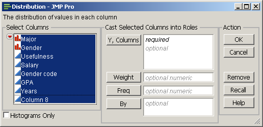
Click Y, Columns, and all the variables should be transferred over to the box to the right. Click OK and a new window will appear. Examine Figure 2.10 and your Distribution window in JMP. All the categorical variables (Major, Gender, Usefulness, and Gender code), whether they are nominal or ordinal, have frequency numbers and a histogram, not descriptive statistics. But the continuous variables have descriptive statistics and a histogram.
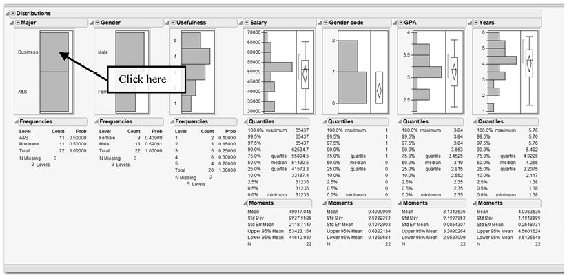
As shown in Figure 2.10, click the area/bar of the Major histogram for Business. You can immediately see the distribution of Business students; they are highlighted in each of the histograms.
Figure 2.10 Distribution Output for Countif.xls Data
What if you want to further examine the relationship between Business and these other variables or the relationship between any two of these variables (i.e., perform some bivariate analysis). You can click any of the bars in the histograms to see the corresponding data in the other histograms. We could possibly look at every combination, but what is the right approach?
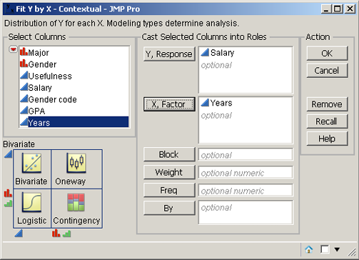
JMP provides excellent direction. Select Analyze→Fit Y by X. The bivariate diagram in the lower left of the new window, as in Figure 2.11, provides guidance on which technique is appropriate. For example, select Analyze→Fit Y by X. Drag Salary to the white box to the right of Y, Response (or click Salary and then click Y, Response). Similarly, click Years, hold down the left mouse button, and drag it to the white box to the right of X, Factor. The Fit Y by X dialog box should look like Figure 2.11. According to the lower left diagram in Figure 2.11, bivariate analysis will be performed. Click OK.
Figure 2.11 Fit Y by X Dialog Box
Click the red triangle in the Bivariate Fit of Salary by Years window, and click Fit Line. The output will look like Figure 2.12. The large positive coefficient of 7743.7163 demonstrates a strong positive relationship. (Positive implies that as Years increases Salary also increases; or the slope is positive. In contrast, a negative relationship has a negative slope. So, as the X variable increases, the Y variable decreases.) The RSquare value or the coefficient of determination is 0.847457, which also shows a strong relationship.
Figure 2.12 Bivariate Analysis of Salary by Years
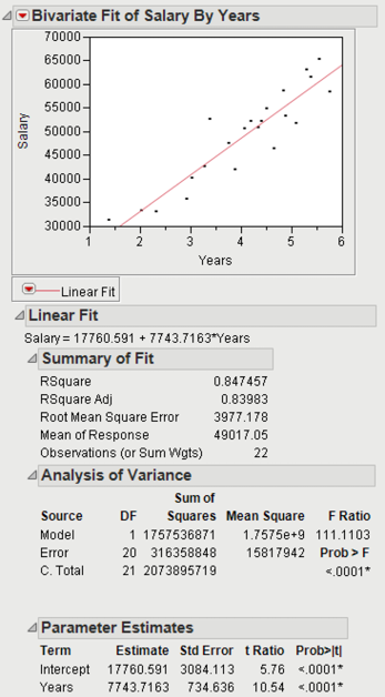
RSquare values can range from 0 (no relationship) to 1 (exact/perfect relationship). The square root of the RSquare multiplied by 1 if it has a positive slope (that is, for this example the coefficient for years is positive) or multiplied by -1 if it has a negative slope is equal to the correlation. Correlation values near -1 or 1 show strong relationships. (A negative correlation implies a negative relationship, while a positive correlation implies a positive relationship.) Correlation values near 0 imply no linear relationship.
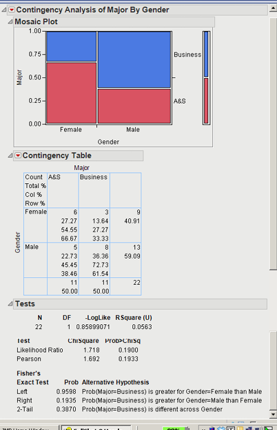
On the other hand, what if we drag Major and Gender to the Y, Response and X, Factor, respectively, and click OK. The bivariate analysis diagram on the lower left in Figure 2.11 would suggest a Contingency analysis. The contingency analysis is shown in Figure 2.13.
The Mosaic Plot visually graphs the percentages from the contingency table. From the Mosaic plot, visually there appears to be a significant difference in Gender by Major. However, looking at the χ2 test of independence results, the p-value or Prob>ChiSq is 0.1933. The χ2 test assesses whether the row variable is significantly related to the column variable. That is, in this case, is Gender related to Major and vice versa? With a p-value of 0.1993, we would fail to reject H0 and conclude that there is not a significant relationship between Major and Gender. (It should be noted that performing the χ2 test with this data is not advised because some of the expected values are less than 5.)
Figure 2.13 Contingency Analysis of Major by Gender
As we illustrated, JMP, in the bivariate analysis diagram of the Fit Y by X dialog box, helps the analyst select the proper statistical method to use. The Y variable is usually considered to be a dependent variable. For example, if the X variable is continuous and the Y is categorical (nominal or ordinal), then in the lower left of the diagram in Figure 2.11 logistic regression will be used. This will be discussed in Chapter 5. In another scenario, with the X variable as categorical and the Y variable as continuous, JMP will suggest One-way ANOVA, which will also be discussed in Chapter 4. If there is no dependence in the variables of interest, as you will learn in this book, there are other techniques to use.
Additionally, depending on the type of data, some techniques are appropriate and some are not. As we can see, one of the major factors is the type of data being considered—i.e., continuous or categorical. While JMP is a great help, just because an approach/technique appears appropriate, before running it, you need to step back and ask yourself what the results could provide. Part of that answer requires understanding and having knowledge of the problem situation. For example, we could be considering the bivariate analysis of GPA and Years. But, logically they are not related, and if a relationship is demonstrated it would most likely be a spurious one. What would it mean?
So you may decide you have an appropriate approach/technique, and it could provide some meaningful insight. However, we cannot guarantee that you will get the results you expect or anticipate. We are not sure how it will work out. Yes, the approach/technique is appropriate. But depending on the theoretical and actual relationship that underlies the data, it may or may not be helpful. This process of exploration is all part of developing and telling the statistical story behind the data.