

Chapter 3
Introduction to Multivariate Data
Multivariate Data and Multivariate Data Analysis
Using Tables to Explore Multivariate Data
Using Graphs to Explore Multivariate Data
Multivariate Data and Multivariate Data Analysis
Most data sets in the real-world are multivariate; that is, they contain more than two variables. Generally speaking, a data set can be viewed conceptually as shown in Figure 3.1, where the columns represent variables and the rows are objects. The rows or objects are the entities by which the observations/measurements were taken (for example, by event, case, transaction, person, companies, etc.). The columns or variables are the characteristics by which the objects were measured. Multivariate data analysis is when more than two variables are analyzed simultaneously.
Figure 3.1 A Conceptual View of a Data Set
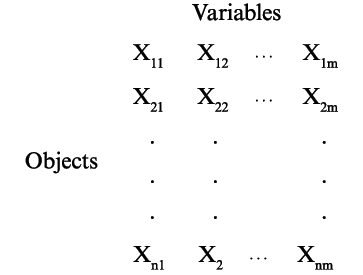
Figure 3.2 provides a framework of statistical and visual methods for analyzing multivariate data. The initial multivariate analytical steps should be the data discovery of relationships through tables and graphs. Some of this data discovery will include univariate descriptive statistics or distribution analysis and perhaps some bivariate analyses (e.g., scatterplots and contingency tables, as discussed in Chapter 2). In this chapter, we will explore some of the multivariate tables and graphs to consider.
Figure 3.2 A Framework to Multivariate Analysis
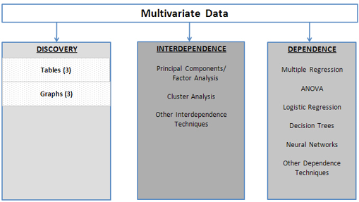
As shown in Figure 3.2, there are numerous multivariate statistical and data mining techniques available to analyze multivariate data. Several of the more popular multivariate, and a few of the data mining, techniques will be discussed in this text (factor analysis/principal components, cluster analysis, multiple regression, ANOVA, logistic regression, and decision trees). Generally speaking, we categorize these techniques into interdependence and dependence techniques, as shown in Figure 3.2. The interdependence techniques examine relationships either between the variables (columns) or the observations (rows) without considering causality. With dependence techniques, one or more variables are identified as the dependent variable(s), and one assumes X variables cause Y(s). The objective of these dependence techniques is to examine and measure the relationship between other (independent) variables and the dependent variable(s). Two dependence techniques that may have been covered in an introductory statistics course, multiple regression and ANOVA, will be reviewed in Chapter 4.
One last word of caution/advice before we start our multivariate journey (this is just a reiteration of the sixth fundamental concept discussed in Chapter 2). With all the many discovery tools and the numerous statistical techniques, we cannot guarantee that they will produce any useful insights until you try them. Successful results really depend on the data set. But, on the other hand, there are times when it is inappropriate to use a tool or technique. Throughout the following chapters, we will provide some guidance of when or when not to use a tool/technique.
Using Tables to Explore Multivariate Data
Row and Column tables, contingency tables, crosstabs, Excel PivotTables, and JMP Tabulate are basic OLAP tools that are used to produce tables to examine/summarize relationships between two or more variables. To illustrate, we will use the survey data from 20 students in the file Countif.xls and in the worksheet rawdata from Chapter 2, as shown in Table 2.2.
To generate a PivotTable in Excel:
1. Highlight cells A1:G23. Click Insert on the top menu. A new set of icons appears. All the way to the left, click PivotTable. When the dialog box appears, click OK.
2. A new worksheet will appear similar to Figure 3.3. In the upper part of the PivotTable Field List box (on the right side of the worksheet), drag Major all the way to the left, in column A where it says Drop Row Fields Here and release the mouse button. Similarly, drag Gender to where it says Drop Column Fields Here.
Notice back in the upper part of the PivotTable Field List box, under Choose fields to add to report, that Major and Gender have check marks next to them. In the lower part of the box, under Column labels, see Gender; under Row labels see Major.
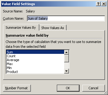
3. Drag Salary to the left where it says Drop Value Fields Here. Salary in the upper part of the PivotTable Field List box is now checked. Below under ∑ Values is the Sum of Salary. Click the drop arrow for the Summary of Salary to open a list of options. Click the Value Field Setting, and a new dialog box similar to Figure 3.4 will appear. In the dialog box, you can change the displayed results to various summary statistics. Click Average (notice that the Custom Name changes to Average of Salary). Click OK.
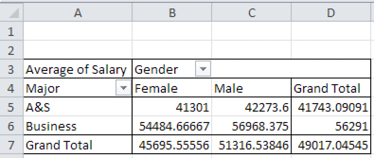
The resulting PivotTable should look similar to Figure 3.5, which shows the average salary by Gender and Major.
Figure 3.3 PivotTable Worksheet
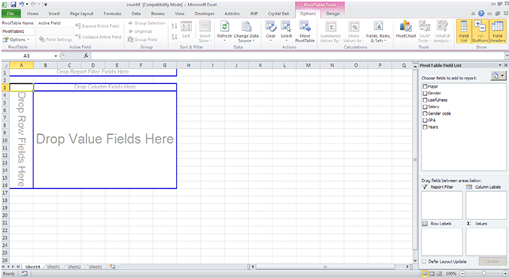
Figure 3.4 Value Field Setting Dialog Box
As the JMP diagram in the Fit Y by X dialog box directs us (as shown in Figure 2.10), the rows and columns are categorical data in a contingency table. This is, in general, the same for these OLAP tools. The data in the PivotTable can be further sliced by dragging a categorical variable into the Drop Report Filter Fields Here area.
Figure 3.5 Resulting Excel PivotTable
To generate a similar table in JMP:
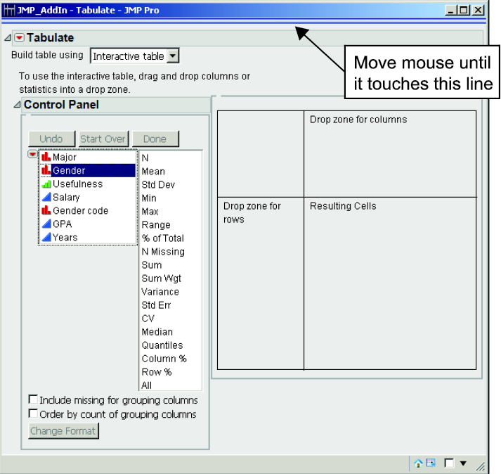
1. Open Countif.jmp. Click Tables→Tabulate. The Tabulate dialog box appears (Figure 3.6).
Figure 3.6 The Tabulate Dialog Box
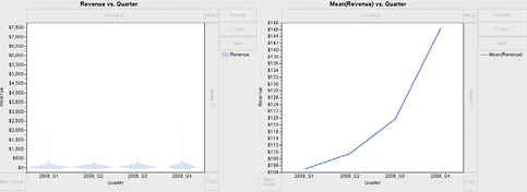
2. Drag Salary to the Resulting Cells area. The table now shows the sum of all the salaries (1078375). In the Control Panel, drag Mean to Sum (1078375). The average salary is 49017.0454. Drag Gender to Salary, where it now shows Salary (Female Mean=45695.555556 and Male Mean=51316.538462). Lastly, drag Major to the white square to the left of the Mean for Females (45695.55). Click the red triangle and click Show Chart. The table and chart should now look like Figure 3.7.
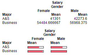
3. If you want to copy and paste the JMP table and chart into Microsoft Word or Microsoft PowerPoint, as shown in Figure 3.6, move your mouse to the top horizontal lines near the top of the Tabulate dialog box. The result is the activation of the Menu and Toolbars, as seen at the top of Figure 3.7. A row of icons will appear as shown in Figure 3.7. Click the Selection icon ![]() , as shown in Figure 3.7. Click in the table, hold down the shift key, and click in the chart. Right-click the mouse and select Copy. Go to a Word or PowerPoint file and paste them in. The table and chart will appear like Figure 3.8. Note: To copy and paste JMP results from other JMP tools/techniques, you follow this same process.
, as shown in Figure 3.7. Click in the table, hold down the shift key, and click in the chart. Right-click the mouse and select Copy. Go to a Word or PowerPoint file and paste them in. The table and chart will appear like Figure 3.8. Note: To copy and paste JMP results from other JMP tools/techniques, you follow this same process.
Figure 3.7 Selection Button to Copy the Output
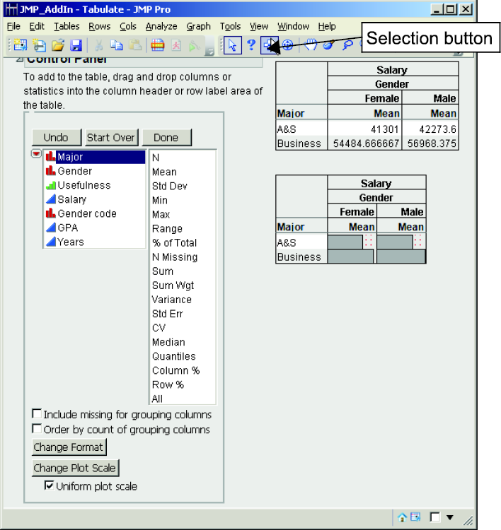
Figure 3.8 Resulting Copy of the Tabulate Table and Chart (into a Microsoft Word Document)
Using Graphs to Explore Multivariate Data
Graphical presentation tools provide powerful insight into multivariate data. JMP provides a large selection of visualization tools beyond the simple XY scatterplots, bar charts, and pie charts. One such tool that is extremely useful in exploring multivariate data is the Graph Builder.
Let’s initially look at and use the Graph Builder with the Countif.jmp data set.
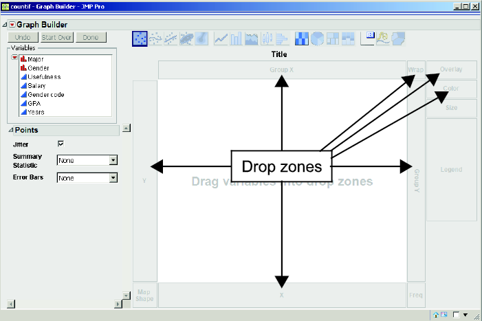
Select Graph→Graph Builder. The Graph Builder dialog box will appear, as in Figure 3.9. On the left of the dialog box, there is a window that has a list of our variables, and to the right is a graphical sandbox in which we can design our graph. As noted in Figure 3.9, there are several areas called drop zones where we can drop the variables. We can bring over to these drop zones either continuous or categorical (ordinal and nominal) data.
Figure 3.9 Graph Builder Dialog Box
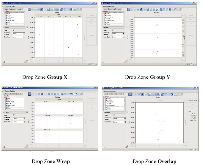
Click Salary and drag it around to the different drop zones. The graph immediately reacts as you move over the drop zones. Release Salary in the Y drop zone area. Now, click Years and again drag it around to the different drop zones and observe how the graph reacts, as shown in Figure 3.10. Notice that when you move Years to:
Group X (you get several vertical graphs and further notice that years are grouped—or put into intervals).
Group Y (you will get several horizontal graphs).
Wrap and Overlay (Years is grouped into Year categories).
Figure 3.10 Graph of Salary and Year when Year Is in Different Drop Zones
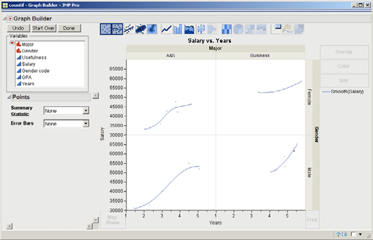
Release Years in the X drop zone. Click Major and drag it around to the drop zones. Also, move Major over the Y and X drop zones, and observe how you can add another variable to those drop zones. Finally, release Major in the Group X drop zone. Lastly, click on Gender and drag it to the Group Y drop zone. There should now be four graphs as shown in Figure 3.11. We can quickly see that the Business students have higher salaries and are older (more years since they graduated).
Figure 3.11 Graph of Salary versus Year by Major and Gender
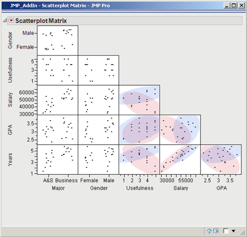
Another useful visualization tool for providing insights to multivariate data is the scatterplot matrix. Data that consists of k variables would require k(k-1) two-dimensional XY scatterplots; thus every combination of two variables is in an XY scatterplot. The upper triangle of graphs is the same as the lower triangle of graphs, except that the coordinates are reversed. Thus usually only one side of the triangle is shown. An advantage of the scatterplot matrix is that changes in one dimension can be observed by scanning across all the graphs in a particular row or column.
For example, let’s produce a scatterplot matrix of the Countif.jmp data.
1. Select Graph→Scatterplot Matrix, and the scatterplot matrix dialog box will appear. Hold down the CTRL key and click every variable one by one except for Gender Code. All the variables are now highlighted except for Gender Code. Click Y, Columns and all the variables are listed. Notice toward the lower left of the dialog box, there is Matrix Format; there is a drop-down arrow with Lower Triangular selected. If you click the drop-down arrow, you can see the different options available. Leave it as Lower Triangular. Click OK.
Figure 3.12 Scatterplot Matrix of Countif.jmp
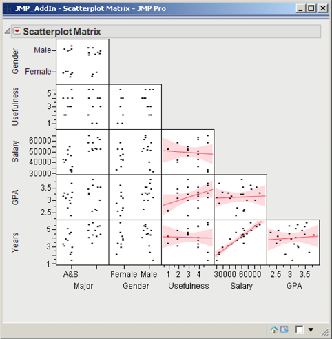
2. A scatterplot matrix similar to Figure 3.12 will appear. For every scatterplot in the left-most column of the scatterplot matrix (which is labeled Major), the X axis is Major. Move the mouse on top of any point and left-click the mouse. That observation is now highlighted in that scatterplot but also in the other scatterplots. So you can observe how that observation performs in the other dimensions. Additionally, the row number appears. Similarly, you can hold down the left mouse button and highlight an area of points. The corresponding selected points in the other scatterplots are also highlighted as well as those observations in the data table.
3. Click the red triangle and Fit Line. In the scatterplots where both variables are continuous (in this case, Salary vs Years, Salary vs GPA, and GPA vs Years), a line is fitted with a confidence interval as shown in Figure 3.12. The smaller the width of the interval, the stronger the relationship. That is, Salary and Years have a strong relationship.
Generally speaking, the scatterplots in a scatterplot matrix are more informative with continuous variables as opposed to categorical variables. Nevertheless, insight into the effect of a categorical variable on the other variables can be visualized with the scatterplot matrix by using the Group option. For example:
1. Select Graph→Scatterplot Matrix. Click Recall, and all our variables are now listed under Y, Columns. Select Major→Group. Click OK.
2. The scatterplot matrix appears. Click the red triangle and Shaded Ellipses.
As shown in Figure 3.13, when we examine the ellipses, it appears that Arts and Sciences (A&S) students have lower salaries than Business students, and in the data set there were more A&S students that have recently graduated than Business students.
Figure 3.13 Scatterplot with Shaded Ellipses
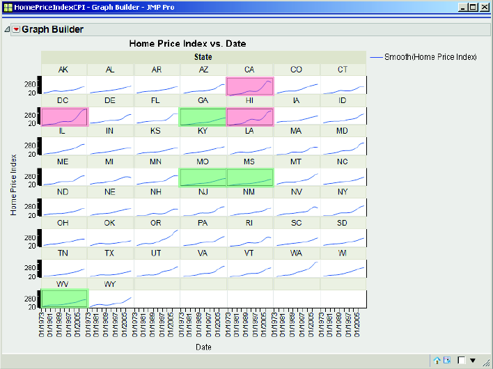
Let’s explore another data set that contains time as a variable, the HomePriceIndexCPI1.jmp1. This file includes the quarterly home price index and consumer price index for each of the states in the United States and for the District of Columbia, from May 1975 until September 2009. This table has been sorted by State and Date. Initially, you could examine all the variables in a scatterplot matrix. If you do, the scatterplots are not very helpful—too many dates and states. Let’s use the Graph Builder:
In JMP, open HomePriceIndexCPI1.jmp. Select Graph→Graph Builder. Click Date and drag it to the X drop zone. Click Home Price Index, and drag it to the Y drop zone. The graph is not too informative yet. Now, click State and drag it to the Wrap drop zone.
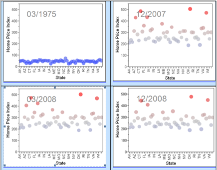
We now have 51 small charts, by State, of Home Price Index vs Date, as shown in Figure 3.14. This set of charts is called a trellis chart: for each level of a categorical variable, a chart is created (similarly, the charts in Figure 3.11 are a trellis chart). Trellis charts can be extremely effective in discovering relationships with multivariate data. With this data, we can see by state the trend of their home price index. Some states increase significantly, such as CA, HI, and DC (highlighted in red), and some very slowly, such as GA, MO, MS, and WV (highlighted in green).
Figure 3.14 Trellis Chart of the Home Price Indices by State
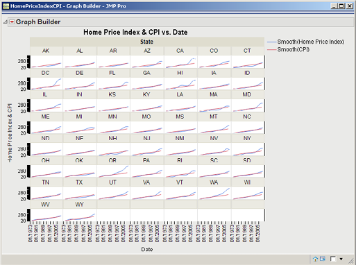
We can add CPI to the charts by clicking CPI and dragging it to the Y drop zone (just to the right of the Y axis label Home Price Index), as shown in Figure 3.15.
Figure 3.15 Trellis Chart of Home Price Index and CPI by State
Another informative visualization chart is the Bubble plot, which can be very effective with data over time. To generate a Bubble plot with the Home Price Index data:
Select Graph→Bubble Plot. Drag Home Price Index to Y, drag State to X, drag Date to Time, and drag Home Price Index to Coloring, as shown in Figure 3.16. Click OK.
Click the go icon ![]() , and you can observe how the home price indexes for the states increase over time until 2008, and then they decrease. Figure 3.17 captures the bubble plot at four dates. You can increase the speed by moving the slider to the right. Further, you can save this as a Flash file, so that you can send it in an e-mail or include it as part of a presentation, by clicking the red triangle and selecting Save for Adobe Flash platform (.SWF).
, and you can observe how the home price indexes for the states increase over time until 2008, and then they decrease. Figure 3.17 captures the bubble plot at four dates. You can increase the speed by moving the slider to the right. Further, you can save this as a Flash file, so that you can send it in an e-mail or include it as part of a presentation, by clicking the red triangle and selecting Save for Adobe Flash platform (.SWF).
Figure 3.16 Bubble Plot Dialog Box
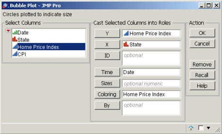
Figure 3.17 Bubble Plot of Home Price Index by State for a Few Dates
Let’s examine another data set, profit by product.jmp2. This file contains sales data, including Revenue, Cost of Sales, and two calculated columns—Gross Profit and GP% (percentage of gross profit). (Notice that the ![]() to the right of the Gross Profit and GP% variables, respectively. Double-click the plus sign for either variable, and the Formula dialog box will appear with the corresponding formulas.)
to the right of the Gross Profit and GP% variables, respectively. Double-click the plus sign for either variable, and the Formula dialog box will appear with the corresponding formulas.)
The data is organized by time (quarter), distribution channel, product line, and customer ID. If we were examining this data set “in the real-world,” the first step would be to generate and examine the results of some univariate and bivariate analyses with descriptive statistics, scatterplots, and tables. Next, since the data set is multivariate, graphics are likely to provide significant insights. So, let’s use the JMP Graph Builder:
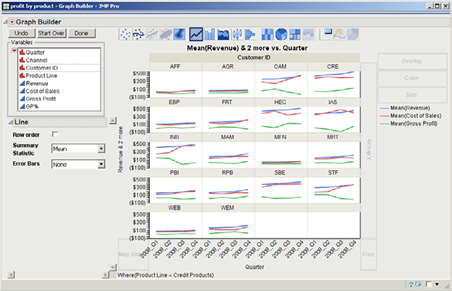
1. Select Graph→Graph Builder. Drag Quarter to the X drop zone. Drag Revenue to the Y drop zone. Instead of viewing the boxplot, let’s look at a line of the average revenue by quarter by right-clicking any open space in the graph and then selecting Box Plot→Change to→Contour. The density Revenue values are displayed by Quarter, as in Figure 3.18. Now, right-click inside any of the shaded revenue density areas. Then select Contour→Change to→Line, as shown in Figure 3.18.
Figure 3.18 Revenue by Quarter Using Contours and Line Graphs
2. Add Cost of Sales and Gross Profit to the Y axis, by dragging Cost of Sales to the Y drop zone. (Be careful to not remove Revenue—release the mouse button just to the right of the Y axis.) Similarly, drag Gross Profit just to the right of Y. Drag Product Line to the Wrap drop zone. Click Done. These steps should product a trellis chart similar to Figure 3.19.
Figure 3.19 Trellis Chart of the Average Revenue, Cost of Sales, and Gross Product over Time (Quarter) by Product Line
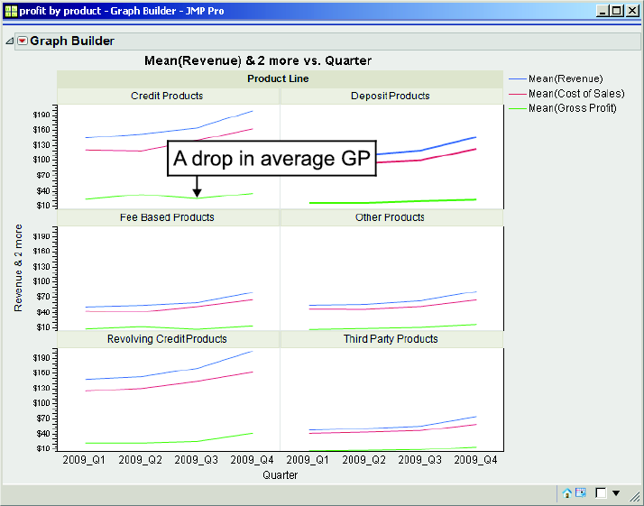
Examining Figure 3.19, we can see that, in terms of average Gross Profit, the Credit Products product line did not do too well in Quarter 3. We can focus or drill down on the Revenue and Cost of Sales of the Credit Products by using the Data Filter feature of JMP. The Data Filter when used in concert with the Graph Builder enhances our exploration capability.
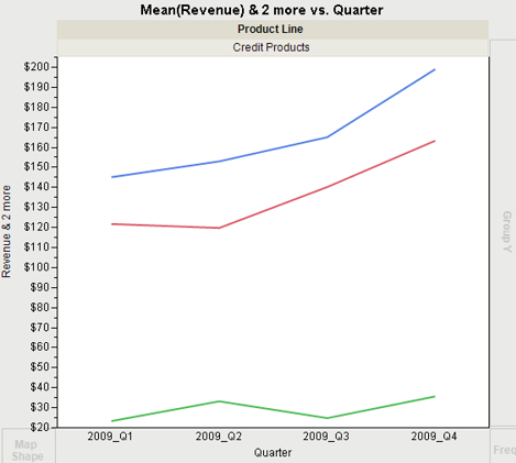
3. On the main menu in the data sheet window, select Rows→Data Filter. Click Product Line. Check the Include option. The graph now includes only Credit Products and looks like Figure 3.20. In the rows panel, note that 5,144 rows are Selected and 19,402 are Excluded.
Figure 3.20 Graph of the Average Revenue, Cost of Sales and Gross Product by Quarter for the Credit Products Product Line
4. Because we are looking only at Credit Products, drag Product Line from the top graph back over and release it on top of the other variables (i.e., at the left side in the Select Columns box). We can now focus on all our Credit Products customers by dragging Customer ID to the Wrap drop zone. The graph should look like Figure 3.21.
Figure 3.21 Graph of the Average Revenue, Cost of Sales, and Gross Product by Quarter for the Credit Products Product Line by Customer ID
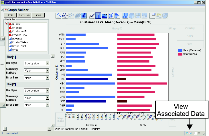
5. However, if we have too many customers, this trellis chart may be way too busy. So, with the filter in play, let’s build another graph. Click Start Over in the Graph Builder dialog box. Drag Customer ID to the Y drop zone; drag Revenue to the X drop zone. Right-click on any point and then select Box Plot→Change to→Bar. Drag GP% to the X drop zone. The graph should look similar to Figure 3.22
We can quickly see for our Credit Products product line that the average sales (i.e., revenue) of customers IAS and CAM are relatively high, but their average percentage gross profit is rather low. We may want to further examine these customers separately. An effective feature of JMP is called dynamic linking: as you interact with the graph, you also interact with the data table. So, we can easily create a subset of the data with just these two customers.
6. Click on one of the bars for IAS. Then hold down the shift key and click one of the bars for CAM. The bars for these two companies should be highlighted. In the Graph Builder window, click the View Associated Data icon ![]() in the extreme lower right. The data table will be displayed with 64 rows selected. Select Table→Subset. In the Subset window, change the Output table name from its default to CAM IAS profit by product. Click OK. A new data table is created and displayed with only 64 rows for customers IAS and CAM only. Select File→Save→Save. We can further analyze these two customers at a later time; let’s return to Graph Builder.
in the extreme lower right. The data table will be displayed with 64 rows selected. Select Table→Subset. In the Subset window, change the Output table name from its default to CAM IAS profit by product. Click OK. A new data table is created and displayed with only 64 rows for customers IAS and CAM only. Select File→Save→Save. We can further analyze these two customers at a later time; let’s return to Graph Builder.
Figure 3.22 Bar Chart of the Average Revenue and %GP of Credit Products Customers
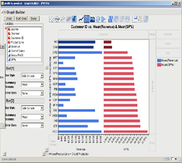
7. If you have difficulty getting the Graph Builder dialog box back (Figure 3.22), navigate to the JMP Home Window and click profit by product—Graph Builder. Those two customers were rather easy to identify, but what if we had a large number of customers? We can sort the customers by average percent gross profit by redragging GP% to the Y drop zone. With the cursor somewhere on the Y axis, right-click and then click Ascending. Now, we can easily see the customers who are not doing well in terms of average percent gross profit as shown in Figure 3.23.
Note, as annotated in Figure 3.22, if you click the small data table icon ![]() in the lower-right corner, a table will list the associated data with the graph.
in the lower-right corner, a table will list the associated data with the graph.
Figure 3.23 Bar Chart of the Average Revenue and %GP of Credit Products Customers in Ascending Order
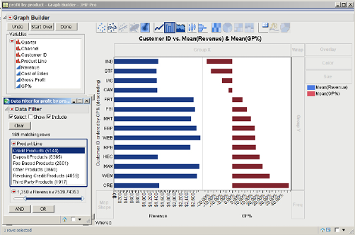
We can further explore the Credit Products product line and develop a better understanding of the data by adding another element to our filter. For example, we may postulate that there may be a correlation between average size of sales and gross profit. We can visualize this relationship by following this next step.
8. In the Data Filter dialog box, click the AND icon. In the list of Add Filter Columns, click Revenue. Click Add. A scroll bar will appear.
![]()
Double-click $0.54293389, change the value to 1350, and press Enter. As a result, 169 rows were matched. The graph should look similar to Figure 3.24.
We can see that with four customers we are losing money. If we wish to examine them further, we could subset these four customers to another JMP table, as we did earlier in this chapter.
Figure 3.24 Bar Chart Employing Further Elements of the Data Filter
With the above examples, we have illustrated that by using several of the JMP visualization tools, and the additional layer of the data filter, we can quickly explore and develop a better understanding of a large amount of multivariate data.
(Endnotes)
1 Thanks to Chuck Pirrello of SAS for providing the data set.
2 Thanks to Chuck Pirrello of SAS for providing the data set.