

Chapter 8
Decision Trees
An Example of Classification Trees
An Example of a Regression Tree
References
Exercises
Figure 8.1 A Framework for Multivariate Analysis
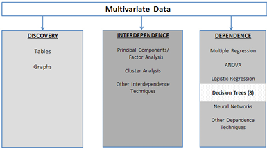
The decision tree is one of the most widely used techniques for describing and organizing multivariate data. As shown in Figure 8.1, a decision tree is one of the dependence techniques in which the dependent variable can be either discrete (the usual case) or continuous. Also, a decision tree is usually considered to be a data mining technique. One of its strengths is its ability to categorize data in ways that other methods cannot. For example, it can uncover nonlinear relationships that might be missed by, say, linear regression. A decision tree is easy to understand and easy to explain, which is always important when an analyst has to communicate results to a non-technical audience. Decision trees do not always produce the best results, but they offer a reasonable compromise between models that perform well and models that can be simply explained. Decision trees are useful not only for modeling, but are also very useful for exploring a data set, especially when you have little idea of how to model the data.
A decision tree is a hierarchical collection of rules that specify how a data set is to be broken up into smaller groups based on a target variable (i.e., a dependent Y variable). If the target variable is categorical, then the decision tree is called a classification tree. If the target variable is continuous, then the decision tree is called a regression tree. In either case, the tree starts with a single root node. Here a decision is made to split the node based on some non-target variable, creating two (or more) new nodes or leaves. Each of these nodes can be similarly split into new nodes, if possible.
Suppose we have historical data on whether bank customers defaulted on small, unsecured personal loans, and we are interested in developing rules to help us decide whether a credit applicant is a good risk or a bad risk. We might build a decision tree as shown in Figure 8.2. Our target variable, risk, is categorical (good or bad), so this is a classification tree. We first break income into two groups: high and low (e.g., income above $75,000 and income below $75,000). Savings is also broken into two groups, high and low. Based on the historical data, persons with high incomes who can easily pay off the loan out of current income have low default rates and are categorized as good risks without regard to their savings. Persons with low incomes cannot pay off the loan out of current income. But they can pay it off out of savings if they have sufficient savings, which explains the rest of the tree. In each “good risk” leaf, the historical data indicate more persons paid back the loan than not. In each “bad risk” leaf, more persons defaulted than not.
Figure 8.2 Classifying Bank Customers as “Good” or “Bad” Risks for a Loan
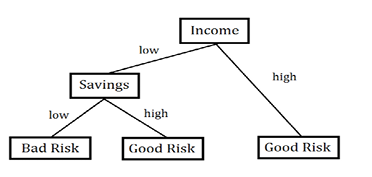
Several questions come to mind. Why only binary splits? Why not split into three or more groups? As Hastie et al. (2009) explain, the reason is that multiway splits use up the data too quickly; besides, multiway splits can always be accomplished by some number of binary splits. You might ask, “What are the cut-off levels for low and high income?” These might be determined by the analyst, who enters the Income variable as categorical, or it might be determined by the computer program if the Income variable is entered as a continuous variable. You might also ask, “Why is income grouped first and then savings? Why not savings first and then income?” The tree-building algorithm determined that splitting first on Income produced “better groups” than splitting first on Savings. Most of the high income customers did not default whereas most of the low income customers defaulted. However, further segregating on the basis of savings revealed that most of the low income customers with high savings did not default.
A common question is, “Can you just put a data set into a tree and expect good results?” The answer is a decided, “No!” Thought must be given to which variables should be included. Theory and business knowledge must guide variable selection. As an example, beware of including a variable that is highly correlated with the target variable. To see the reason for this, suppose the target variable (Y) is whether a prospective customer purchases insurance. If the variable “premium paid” is included in the tree, it will soak up all the variance in the target variable, since only customers who actually do purchase insurance pay premiums. There is also the question of whether an X variable should be transformed and, if so, how. As an example, should Income be entered as continuous, or should it be binned into a discrete variable. If it is to be binned, what should be the cutoffs for the bins? Still more questions remain. If we had many variables, which variables would be used to build the tree? When should we stop splitting nodes?
An Example of Classification Trees
The questions given above are best answered by means of a simple example. A big problem on college campuses is “freshman retention.” For a variety of reasons, many freshmen do not return for their sophomore year. If the causes for departures could be identified, then perhaps remedial programs could be instituted that might enable these students to complete their college education. Open the Freshmen1.jmp data table, which contains 100 observations on several variables that are thought to affect whether a freshman returns for the sophomore year. These variables are described in Table 8.1.
Table 8.1 The Variables in the freshmen1.jmp Data Set
|
Variable |
Coding and theoretical reason for including an X variable |
|
return |
=1 if the student returns for sophomore year, =0 otherwise. |
|
GPA |
Students with a low freshman GPA fail out and do not return. |
|
College |
The specific college in which the students enroll might affect the decision to return; the engineering college is very demanding and might have a high failure rate. |
|
Accommodations |
Whether students live in a dorm or on-campus might affect the decision to return. There is not enough dorm space, and some students might hate living off-campus. |
|
Part-Time Work Hours |
Students who have to work a lot might not enjoy college as much as other students. |
|
Attends Office Hours |
Students who never attend office hours might be academically weak, need lots of help, and are inclined to fail out; or they might be very strong and never need to attend office hours. |
|
High School GPA |
Students who were stronger academically in high school might be more inclined to return for sophomore year. |
|
Miles from Home |
Students who live farther from home might be homesick and wish to transfer to a school closer to home. |
Note that, in the JMP data table, all the variables are correctly labeled as continuous or categorical, and whether they are X or Y variables. Usually, the user has to make these assignments. JMP knows that Return is the target variable (see the small “y” in the blue circle to the right of Return in the columns window), which has 23 zeros and 77 ones. To begin building a decision tree, select Analyze→Modeling→Partition and Figure 8.3 will appear.
The data are represented in the graph at the top of the window. Above the horizontal line are 77 data points, and below it (or touching it) are 23 points, which correspond to the number of ones and zeros in the target variable. Points that represent observations are placed in the proper area, above or below the line separating 1 (return) and 0 (not return). As the tree is built, this graph will be subdivided into smaller rectangles, but it can then be hard to interpret. It is much easier to interpret the tree, so we will largely focus on the tree and not on the graph of the data.
Figure 8.3 Partition Initial Output with Discrete Dependent Variable
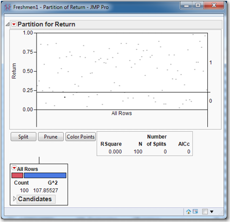
Next notice the box immediately under the graph, which shows information on how well the tree represents the data. Since the tree has yet to be constructed, the familiar RSquare statistic is zero. The number of observations in the data set, N, is 100. No splits have been made, and the AICc is zero. This last statistic is the Akaike Information Criterion where the lowercase C denotes that a correction for finite samples has been applied. The AIC (and AICc) is a model-fitting criterion that trades off bias against variance; a lower AIC (and AICc) is preferred to a higher one.
Next observe the box in the lower left corner, which is the root node of the tree. We can see that there are 100 observations in the data set. The bar indicates how many zeros (red) and ones (blue) are in this node. The “G^2” statistic is displayed; this is the likelihood ratio goodness-of-fit test statistic, and it (like the LogWorth statistic, which is not shown yet) can be used to make splits. What drives the creation of a tree is a criterion function—i.e., something to be maximized or minimized. In the case of a classification tree, the criterion function by which nodes are split is the LogWorth statistic, which is to be maximized. The Chi-square test of Independence can be applied to the case of multi-way splits and multi-outcome targets. The p-value of the test will indicate the likelihood of a significant relationship between the observed value and the target proportions for each branch. These p-values tend to be very close to zero with large data sets, so the quality of a split is reported by LogWorth = (-1)*ln(chi-squared p-value).
JMP automatically checks all the predictor, or independent, variables, and all the possible splits for them, and chooses the variable and split that maximize the LogWorth statistic. Click the red triangle at the top of the partition window. Under Display Options, select Show Split Prob. For each level in the data set (zeros and ones), Rate and Prob numbers have appeared. The Rate shows the proportion of each level in the node, while the Prob shows the proportion that the model predicts for each level, as shown in Figure 8.4.
Figure 8.4 Initial Rate, Probabilities, and LogWorths
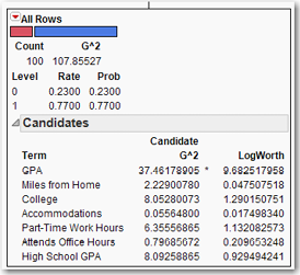
Click the gray arrow to expand the Candidates box. These are “candidate” variables for the next split. As shown in Figure 8.4, see that GPA has the highest G2 as well as the highest LogWorth. That LogWorth and G2 both are maximized for the same variable is indicated by the asterisk between them. (In the case that G2 and LogWorth are not maximized by the same variable, the “greater than” (>) and “less than” (<) symbols are used to indicate the respective maxima.) In some sense, the LogWorth and G2 statistics can be used to rank the variables in terms of their importance for explaining the target variable, a concept to which we shall return. Clearly, the root node should be split on the GPA variable. Click Split to see several changes in the window as shown in Figure 8.5.
Figure 8.5 Decision Tree after First Split
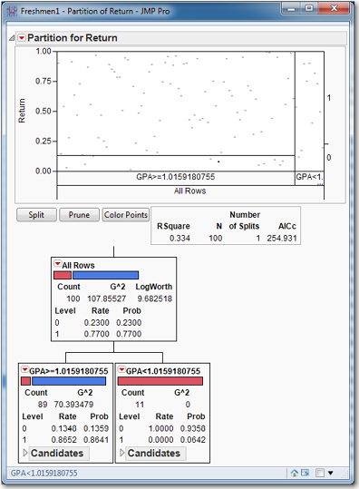
In Figure 8.5, the graph has new rectangles in it, to represent the effect this split has on the data. RSquare has increased from zero to 0.334; the number of splits is 1, and the AICc is 254.9. In the root node, suddenly the LogWorth statistic has appeared. More importantly, the first split divides the data into two nodes depending on whether GPA is above or below 1.0159. The node that contains students whose GPA is less than 1.0159 has 11 students, all of whom are zeros: they did not return for their sophomore year. This node cannot be split anymore because it is pure (G2=0). Splitting the data to create nodes, or subsets, of increasing purity is the goal of tree building. This node provides us with an estimate of the probability that a freshman with a GPA of less than 1.0159 will return for sophomore year: zero—though perhaps the sample size may be a bit small. Perhaps further examination of these students might shed some light on the reasons for their deficient GPAs, and remedial help (extra tutoring, better advising, and specialized study halls) could prevent such students from failing out in the future. In considering the event that a freshman with a GPA above 1.0159 returns for sophomore year, we see that our best estimate of this probability is 0.86 or so. (The simple ratio of returning students to total students in this node is 0.8652, while the model’s estimate of the probability is 0.8641.)
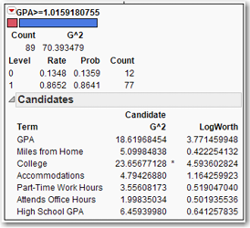
The other node, for freshmen with a GPA above 1.0159, contains 89 students. From the blue portion of the bar, we see that most of them are ones (who returned for their sophomore year). Expanding the Candidates box in the GPA above 1.0159 node, we see that the largest LogWorth is College, as shown in Figure 8.6.
Figure 8.6 Candidate Variables for Splitting an Impure Node
So the next split will be on the College variable. Click Split and expand the Candidates boxes in both of the newly created nodes. As can be seen in Figure 8.7, the R2 has increased substantially to 0.553, and the AICc has decreased substantially as well, to 216.145. The parent node has been split into two child nodes, one with 62 students and one with 27 students. The bar for the former indicates one or two zeros—that the node is not pure can be seen by observing that G2= 10.238. (If the node was pure, then G2 would be zero.) The bar for the latter indicates a substantial number of zeros, though still less than half.
Figure 8.7 Splitting a Node (n=89)
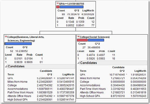
What we see from these splits is that almost all the students who do not return for sophomore year and have not failed out are all in the School of Social Sciences. The schools of Business, Liberal Arts, Sciences, and Engineering do not have a problem retaining students who have not failed out; only one of 62 did not return. What is it about the School of Social Sciences that it leads all the other schools in freshmen not returning?
Before clicking Split again, let us try to figure out what will happen next. Check the candidate variables for both nodes. For the node with 62 observations, the largest LogWorth is 0.5987 for the variable Attends Office Hours. For the node with 27 observations, the largest LogWorth is 1.919 for the variable GPA. We can expect that the node with 27 observations will split next, and it will split on the GPA variable. Look again at the node with 62 observations. We can tell by the Rate for zero that there is only one non-returning student in this group. If there were any doubt, clicking the red triangle in the partitions table, selecting Display Options, and then selecting Show Split Count shows the count next to the probability. There is really no point in developing further branches from this node, because there is no point in trying to model a 1-out-of-62 occurrence. Click Split to see a tree that contains the nodes shown in Figure 8.8.
Figure 8.8 Splitting a Node (n=27)
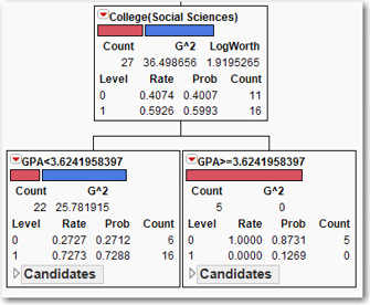
We now have a leaf of non-returning students whose GPA exceeds 3.624. We can conjecture that these students, having achieved a high GPA in their freshman year, are transferring out to better schools. Perhaps they find the school too easy and seek more demanding courses; perhaps the creation of “honors” courses might retain these students. Check the candidate variables for the newly created node for students whose GPA is less than 3.624. The highest LogWorth is 2.4039 for the variable GPA. When we click Split again, what will happen? Will the node with 62 observations split, or will the split be on the node for students with a GPA lower than 3.624? Which has the higher LogWorth for a candidate variable? It’s the node for students with a GPA lower than 3.624, so that’s where the next split will occur. The node with 62 observations will not split until all nodes in the branch for GPA < 3.624 have a LogWorth less than 0.5987. Click Split.
Figure 8.9 Splitting a Node (n=22)
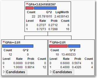
The node for GPA < 3.624 has been split into a leaf for GPA>2.01. These students all return. And a node for GPA < 2.01 is split about 50-50. Check the candidate variables for this node; the highest LogWorth is 0.279 for the variable Part Time Work Hours. Since 0.279 is less than 0.5987, the next split will be on the node with 62 observations. But since we’re only pursuing a couple of zeros in this branch, there is not much to be gained by analyzing this newest split.
Continue clicking Split until the GPA < 2.01 node is split into two nodes with 5 observations each. (This is really far too few observations to make a reliable inference. But let’s pretend anyway—30 is a much better minimum number of observations for a node, as recommend by Tuffery, 2011.) The clear difference is that students who work more than 30 hours a week tend to not return with higher probability than students who work fewer than 30 hours a week. More financial aid to these students might decrease their need to work so much, resulting in a higher grade point and a return for their sophomore year. A simple classification tree analysis of this data set has produced a tree with 7 splits and an RSquare of 0.796, and has revealed some actionable insights into improving the retention of freshmen. Note that the algorithm, on its own, found the critical GPA cutoffs of 1.0159 (student has a “D” average) and 2.01 (student has a “C” average).
Suppose that we had not examined each leaf as it was created. Suppose that we built the tree quickly, looking only at R2 or AICc to guide our efforts, and wound up with a tree with several splits, some which we suspect will not be useful. What would we do? We would look for leaves that are predominantly non-returners. This is easily achieved by examining the bars in each node and looking for bars that are predominantly red. Look at the node with 62 observations; this node has but a single non-returning student in it. All the branches and nodes that extend from this node are superfluous, so let us “prune” them from the tree. By pruning the tree, we will end up with a smaller, simpler set of rules that still predicts almost as well as the larger, unpruned tree. Click the red triangle for this node, and click Prune Below.
Observe that the RSquare has dropped to 0.764, and the number of splits has dropped to 5. You can see how much simpler the tree has become, without losing any substantive nodes or much of its ability to predict Y. After you grow a tree, it is very often useful to go back and prune nonessential branches. In pruning, we must balance two dangers. A tree that is too large can overfit the data, while a tree that is too small might overlook important structures in the data. There do exist automated methods for growing and pruning trees, but they are beyond the scope of this book. A nontechnical discussion can be found in Linoff and Berry (2011).
Restore the tree to its full size by undoing the pruning. Click the red triangle in the node that was pruned, and click Split Here. Next click the just-created Attends Office Hours(Regularly) node and click Split Here. The RSquare is again 0.796, and the number of splits is again 7.
Let’s conclude this analysis by making use of two more important concepts. First, observe that the seventh and final split only increased the R2 from 0.782 to 0.796. Let us remove the nodes created by the last split. In keeping with the arborist’s terminology, click Prune to undo the last split, so that the number of splits is 6 and the RSquare is 0.782. Very often we grow a tree larger than we need, and then prune it back to the desired size. After having grown the proper-size classification tree, it is often useful to consider summaries of the tree’s predictive power.
The first of these summaries of the ability of a tree to predict the value of Y is to compute probabilities for each observation, as was done for Logistic Regression. Click the red triangle for Partition for Return and select Save Columns→Save Prediction Formula. In the data table will appear Prob(Return==0), Prob(Return==1) and Most Likely Return. As you look down the rows, there will be much duplication in the probabilities for observations, because all the observations in a particular node are assigned the same probabilities.
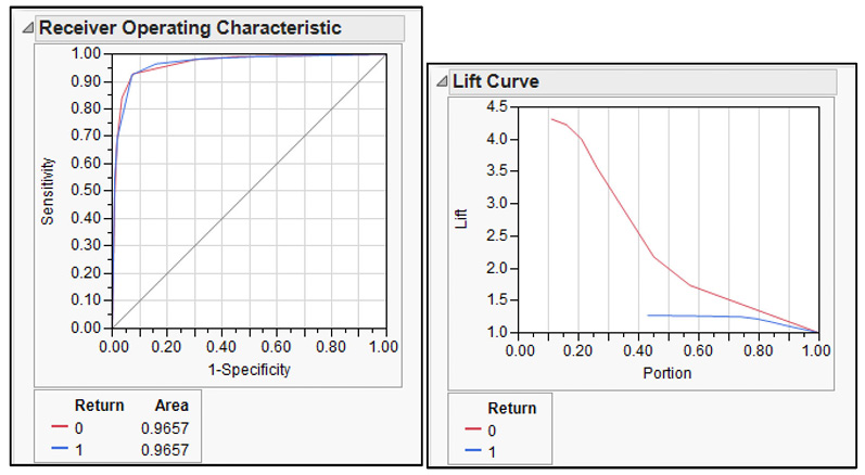
Next are two important graphical summaries, the ROC (Receiver Operating Characteristic) curve and the Lift curve. To see these two curves, click the red triangle in the Partition window, click ROC Curve, and repeat by clicking Lift Curve. See that these curves are now displayed in the output, as shown in Figure 8.10. While they are very useful, for now, we only remark on their existence; they will be explained in great detail in Chapter 9.
Figure 8.10 ROC and Lift Curves
An Example of a Regression Tree
The type of tree created depends on the target variable. Above we created a classification tree because the Y variable was binary. To use the regression tree approach on the same data set we have been using, we need a continuous target variable.
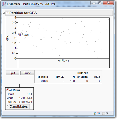
Suppose we want to explore the components of GPA. In the data table, click the blue x next to GPA and change its role to Y. Click the blue y next to Return and change its role to No Role. As before, select Analyze→Modeling→Partition. See that the root node contains all 100 observations with a mean of 2.216 as shown in Figure 8.11. (If you like, you can verify this by selecting Analyze→Distributions.) In Figure 8.11, observe the new statistic in the results box, RMSE, which stands for Root Mean Square Error. This can be interpreted as the standard deviation of the target variable in that node. In the present case, GPA is the continuous target variable. Click Candidates to see that the first split will be made on Attends Office Hours. Click Split. The two new nodes contain 71 and 29 observations. The former has a mean GPA of 2.00689, and the latter has a mean GPA of 2.728. This is quite a difference in GPA! The regression tree algorithm simply runs a regression of the target variable on a constant for the data in each node, effectively calculating the mean of the target variable in each node.
Figure 8.11 Partition Initial Output with Continuous Discrete Dependent Variable
It is important to understand that this is how Regression Trees work, so it is worthwhile to spend some time exploring this idea. We will briefly digress to explore the figure of 2.2160642 that we see in Figure 8.11. Let’s create a new variable called Regularly that equals 1 if Attends Office Hours is Regularly and equals zero otherwise.
In the data table, click in the column Attends Office Hours. Select Cols→Recode. For Never, change the New Value to 0; for Regularly, change the New Value to 1; and for Sometimes, change the New Value to 0. Select In Place and change it to New Column. Click OK to create a new variable called Attends Office Hours 2. Observe that Attends Office Hours is clearly a nominal variable because it is character data. Attends Office Hours 2 consists of numbers, but should be a nominal variable. Make sure that it is nominal.
To calculate the mean GPA for the Attends Office Hours regularly (Regularly = 1) and Attends Office Hours rarely or never (Regularly = 0), proceed as follows.
Select Analyze→Distribution. Under Y, Columns, delete all the variables except GPA. Click Attends Office Hours 2 and then click By. Click OK. In the Distributions window, you should see that mean GPA is 2.00689 when Attends Office Hours 2 = 0, and that GPA is 2.728 when Attends Office Hours 2 = 1. Regression Trees really do calculate the mean of the target variable for each node. Be sure to delete the variable Attends Office Hours 2 from the data table so that it is not used in subsequent analyses. In the data table, right-click Attends Office Hours 2 and select Delete Columns.
Let’s resume with the tree building. Click the red triangle in the first node (with 100 observations) and select Prune Below. We are going to split several times, and each time we split we are going to record some information from the RSquare Report Table as shown in Figure 8.12: the RSquare, the RMSE, and the AICc. You can write this down on paper or use JMP. We will use JMP. Right-click in the RSquare Report Table and select Make into Data Table. A new data table appears that shows the RSquare, RMSE, N, Number of Split, and AICc. Every time you click Split, you produce such a data table. After splitting 14 times, there will be 14 such tables. Copy and paste the information into a single table, as shown in Figure 8.13.
Figure 8.12 RSquare Report Table before Splitting
Figure 8.13 Table Containing Statistics from Several Splits
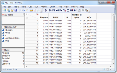
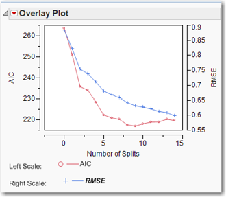
Continue splitting until the number of splits is 14 and the R2 is 0.543. For each split, write down the R2, the RMSE, and the AICc. To use the AICc as a model selection criterion, we would interpret the AICc as a function of the number of splits, with the goal of minimizing the AICc. It sometimes occurs that the AICc simply continues to decrease, perhaps ever so slightly, as the number of splits increases. In such a case, the AICc is not a useful indicator for determining the number of splits. In other cases, the AICc decreases as the number of splits increases, reaches a minimum, and then begins to increase. In such a case, it may be useful to stop splitting when the AICc reaches a minimum. The RMSE and AICc are plotted in Figure 8.14. In the present case, the number of splits that minimizes the AICc is 9, with an AICc of 217.01. It is true that AICc is 219.6 on split 14 and 220.27 on split 13. So the plot of AICc versus splits is not a perfect bowl shape. But it is still true that AICc has a local minimum at 9 splits. All these comments are not to suggest that we cannot continue splitting past 9 splits if we continue to uncover useful information.
Figure 8.14 Plot of AIC and RMSE versus Number of Splits
Start over again by pruning everything below the first node. Now create a tree with 9 splits, the number of splits suggested in Figure 8.13. A very practical question is, what can we say about the effect on GPA of the variables in the data set that might be useful to a college administrator? The largest driver of GPA appears to be whether a student attends office hours regularly. This split (and all other splits) effectively divides the node into two groups: high GPA (for this node, students with an average GPA of 2.728) and low GPA (for this node, students with an average GPA of 2.00689). Further, there appears to be no difference between students who attend Never and those who attend Sometimes; we can say this because there is no split between Never and Sometimes students.
For the group of high GPA students (attends office hours regularly with GPA above 2.728), those who live off-campus have substantially lower GPAs than other students. This suggests that the off-campus lifestyle is conducive to many more non-studying activities than living on campus. Among the high GPA students who live in dorms, those who attend school close to home have higher GPAs (3.40 versus 2.74), though the sample size is too small to have much trust in this node. Certainly, if this result was obtained with a larger sample, it might be interesting to investigate the reasons for such a relationship. Perhaps the ability to go home for a non-holiday weekend is conducive to the mental health necessary to sustain a successful studying regimen.
On the low-GPA side of the tree (attends office hours never or sometimes with a GPA of 2.00), we again see that students who attend school closer to home have higher GPAs (2.83 versus 1.82— i.e., nearly a “B” versus less than a “C”). For those lower-GPA students who live far from home, it really matters whether the student is enrolled in Social Sciences or Liberal Arts on the one hand, or Sciences, Business, or Engineering on the other hand. This might be symptomatic of grade inflation in the former two schools, or it might be a real difference in the quality of the students that enroll in each school. Or it might be some combination of the two. We see also that among low-GPA students in Sciences, Business, and Engineering, more hours of part-time work result in a lower GPA.
Many of these items are interesting, but we wouldn’t want to believe any of them—yet. We should run experiments or perform further analyses to document that any effect is real and not merely a chance correlation.
As an illustration of this important principle, consider the credit card company Capital One, which grew from a small division of a regional bank to a behemoth that dominates its industry. Capital One conducts thousands of experiments every year in its attempts to improve the ways that it acquires customers and keeps them. A Capital One analyst might examine some historical data with a tree and find some nodes indicating that blue envelopes with a fixed interest rate offer receive more responses than white envelopes with a variable interest rate offer. Before rolling out such a campaign on a large scale, Capital One would first run a limited experiment to make sure the effect was real, and not just a quirk of the small number of customers in that node of the tree. This could be accomplished by sending out 5,000 offers of each type and comparing the responses within a six-week period.
With a large data set, a tree can grow very large—too large to be viewed on a computer screen. Even if printed out, there are too many leaves to comprehend them all. Let us continue with the Freshmen1.jmp data table, and once again consider the example where the target variable Return is nominal. In the data table, click the blue y next to GPA and make it an X variable. There is no blue letter next to Return, so right-click in the Return column, and select Preselect Role→Y. Build a tree with 7 splits as before; the RSquare is 0.796. Under the red triangle in the Partition window, select Column Contributions. The chart that appears (see Figure 8.15) tells us which variables are more important in explaining the target variable.
Figure 8.15 Column Contributions
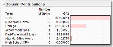
If you ever happen to have a large data set and you’re not sure where to start looking, build a tree on the data set and look at the Column Contributions. (To do this, click the red arrow for the Partition window and then select Column Contributions.) In the Column Contributions box, right-click anywhere in the SS column (or G^2 column, whichever one appears) and select Sort by Column.
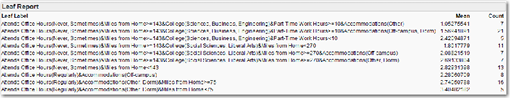
Another useful tool for interpreting large data sets is the Leaf Report. To see it, under the red triangle in the Partition window, select Leaf Report, which is shown in Figure 8.16. The top set of horizontal bar charts makes it very easy to see which leaves have high and low concentrations of the target variable. The bottom set of horizontal bar charts shows the counts for the various leaves. The splitting rules for each leaf also are shown. With a little practice, you ought to be able to read a Leaf Report almost as easily as you can read a tree.
Figure 8.16 Leaf Report
The primary drawback of trees is that they are a high-variance procedure; i.e., growing a tree on two similar data sets probably will not produce two similar trees. As an example of a low-variance procedure, if you run the same regression model on two different (but similar) samples, you will likely get similar results. I.e., both regressions will have roughly the same coefficients. In contrast, if you run the same tree on two different (but similar) samples, you will likely get quite different trees. The reason is that in a tree, an error in any one node does not stay in that node but, rather, is propagated down the tree. By this we mean that, if two variables (e.g., Variable A and Variable B) are close contenders for the first split, a small change in the data might affect which of those variables is chosen for the top slit. Splitting on Variable A may well produce a markedly different tree than splitting on Variable B. There are methods such as boosting and bagging to combat this, by growing multiple trees on the same data set and averaging them. But these methods are beyond the scope of this text.
References
Hastie, Trevor, Robert Tibshirani, and Jerome Friedman. (2009). The Elements of Statistical Learning: Data Mining, Inference, and Prediction. 2nd Ed. New York: Springer. 311.
Linoff, Gordon S., and Michael J. A. Berry. (2011). Data Mining Techniques: For Marketing, Sales, and Customer Relationship Management. 3rd ed. Indianapolis: Wiley Publishing, Inc., Chapter 7.
Tuffery, Stephane. (2011). Data Mining and Statistics for Decision Making. Chichester, West Sussex, UK: John Wiley & Sons. 329.
Exercises
1. Build a classification tree on the churn data set. Remember that you are trying to predict churn, so focus on nodes that have many churners. What useful insights can you make about customers who churn?
2. After building a tree on the churn data set, use the Column Contributions to determine which variables may be important. Could these variables be used to improve the Logistic Regression developed in Chapter Five?
3. Build a Regression Tree on the Masshousing.jmp data set to predict market value.