

Chapter 7
Cluster Analysis
Hierarchical Clustering
Using Clusters in Regression
K-means Clustering
K-means versus Hierarchical Clustering
References
Exercises
Figure 7.1 A Framework for Multivariate Analysis
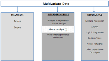
Cluster analysis is an exploratory multivariate technique designed to uncover natural groupings of the rows in a data set. If data are two-dimensional, it can be very easy to find groups that exist in the data; a scatterplot will suffice. When data have three, four, or more dimensions, how to find groups is not immediately obvious. As shown in Figure 7.1, cluster analysis is a technique where no dependence in any of the variables is required. The object of cluster analysis is to divide the data set into groups, where the observations within each group are relatively homogeneous, yet the groups are unlike each other.
A standard clustering application in the credit card industry is to segment its customers into groups based on the number of purchases made, whether balances are paid off every month, where the purchases are made, etc. In the cell-phone industry, clustering is used to identify customers who are likely to switch carriers. Grocery stores with loyalty-card programs cluster their customers based on the number, frequency, and types of purchases. After customers are segmented, advertising can be targeted. For example, there is no point in sending coupons for baby food to all the store’s customers, but sending the coupons to customers who have recently purchased diapers might be profitable. Indeed, coupons for premium baby food can be sent to customers who have recently purchased filet mignon, and coupons for discount baby food can be sent to customers who have recently purchased hamburger.
A recent cluster analysis of 1000 credit card customers from a commercial bank in Shanghai identified three clusters (i.e., market segments). The analysis described them as follows (Ying and Yuanuan, 2010):
1. First Class: married, between 30 and 45 years old, above average salaries with long credit histories and good credit records.
2. Second Class: single, under 30, fashionable, no savings and good credit records, and tend to carry credit card balances over to the next month.
3. Third Class: single or married, 30-45, average to below-average incomes with good credit records.
Each cluster was then analyzed in terms of contribution to the company’s profitability and associated risk of default, and an appropriate marketing strategy was designed for each group.
The book Scoring Points by Humby, Hunt, and Phillips (2007) tells the story of how the company Tesco used clustering and other data mining techniques to rise to prominence in the British grocery industry. After much analysis, Tesco determined that its customers could be grouped into 14 clusters. For example, one cluster always purchased the cheapest commodity in any category; Tesco named them “shoppers on a budget.” Another cluster contained customers with high incomes but little free time, and they purchased high-end, ready-to-eat food.
Thirteen of the groups had interpretable clusters, but the buying patterns of the fourteenth group, which purchased large amounts of microwavable food, didn’t make sense initially. After much investigation, it was determined that this fourteenth group actually comprised two groups that the clustering algorithm had assigned to a single cluster: young people in group houses who did not know how to cook (so bought lots of microwavable food) and families with traditional tastes who just happened to like microwavable food. The two otherwise disparate groups had been clustered together based on their propensity to purchase microwavable food. But the single purchase pattern had been motivated by the unmet needs of two different sets of customers.
Two morals are evident. First, clustering is not a purely data-driven exercise. It requires careful statistical analysis and interpretation by an industry business expert to produce good clusters. Second, many iterations may be needed to achieve the goal of producing good clusters, and some of these iterations may require field-testing. In this chapter, we present two important clustering algorithms: hierarchical clustering and k-means clustering. Clustering is not a purely statistical exercise, and a good use of the method requires knowledge of statistics and of the characteristics of the business problem and the industry.
Hierarchical Clustering
The specific form of hierarchical clustering used in JMP is called an agglomerative algorithm. At the start of the algorithm, each observation is considered as its own cluster. The distance between each cluster and all other clusters is computed, and the nearest clusters are merged. If there are n observations, this process is repeated n-1 times until there is only one large cluster. Visually, this process is represented by a tree-like figure called a dendrogram. Inspecting the dendrogram allows the user to make a judicious choice about the number of clusters to use. Sometimes an analyst will want to perform k-means clustering–which requires that the number of clusters be specified–but have no idea of how many clusters are in the data. Perhaps the analysts want to name the clusters based on a k-means clustering. In such a situation, one remedy is to perform hierarchical clustering first in order to determine the number of clusters. Then k-means clustering is performed.
Except at the very first step when each observation is its own cluster, clusters are not individual observations/subjects/customers, but collections of observations/subjects/customers. There are many ways to calculate the distance between two clusters. Figure 7.2 shows four methods of measuring the distance between two clusters. An additional method, which is not amenable to graphical depiction, is Ward’s method, which is based on minimizing the information loss that occurs when two clusters are joined.
The various methods of measuring distance tend to produce different types of clusters. Average linkage is biased toward producing clusters with the same variance. Single linkage imposes no constraint on the shape of clusters, and makes it easy to combine two clumps of observations that other methods might leave separate. Hence, single linkage has a tendency toward what is called “chaining,” and can produce long and irregularly shaped clusters. Complete linkage is biased toward producing clusters with similar diameters. The centroid method is more robust to outliers than other methods, while Ward’s method is biased toward producing clusters with the same number of observations.
Figure 7.2 Ways to Measure Distance between Two Clusters
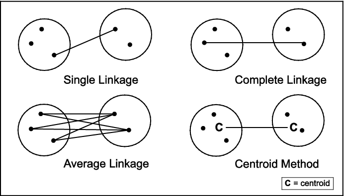
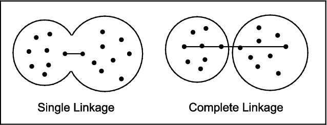
Figure 7.3 shows how single linkage can lead to combining clusters that produce long strings, while complete linkage can keep them separate. The horizontal lines indicate the distance computed by each method. By the single linkage method, the left and right groups are very close together and, hence, are combined into a single cluster. In contrast, by the complete linkage method, the two groups are far apart and are kept as separate clusters.
Figure 7.3 The Different Effects of Single and Complete Linkage
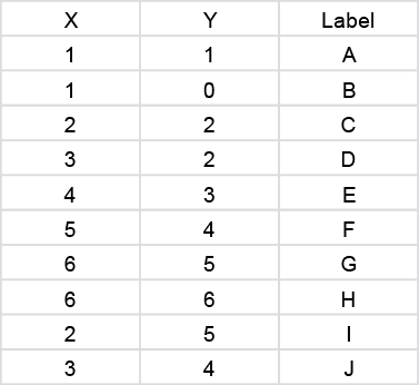
To get a feeling for how hierarchical clustering works, consider the toy data set in Table 7.1 and in the file Toy-cluster.jmp.
Table 7.1 Toy Data Set for Illustrating Hierarchical Clustering
To perform hierarchical clustering with complete linkage on the Toy-cluster.jmp data table:
1. Select Analyze→Multivariate Methods→Cluster.
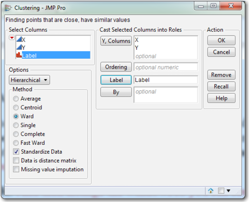
2. From the Fit Model dialog box, select both X and Y and click Y, Columns. Also, click Label. Since the units of measurement can affect the results, make sure that Standardize Data is checked. Under Options, select Hierarchical and Ward (see Figure 7.4).
3. Click OK.
Figure 7.4 The Clustering Dialog Box
The clustering output includes a dendrogram similar to Figure 7.5. Click the red triangle to the left of Hierarchical Clustering and click Color Clusters and Mark Clusters. Next, notice the two diamonds, one at the top and one at the bottom of the dendrogram. Click one of them, and the number 2 should appear. The 2 is the current number of clusters, and you can see how the observations are broken out. Click one of the diamonds again and drag it all the way to the left where you have each observation, alone, in its individual cluster. Now arrange the JMP windows so that you can see both the data table and the dendrogram. Slowly drag the diamond to the right and watch how the clusters change as well as the corresponding colors and symbols. Figure 7.6 is a scatterplot of the 10 observations in the Toy data set.
Figure 7.5 Dendogram of the Toy Data Set
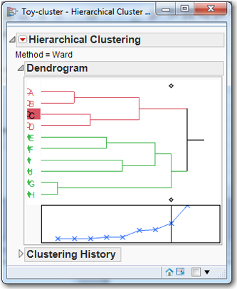
Figure 7.6 Scatterplot of the Toy Data Set
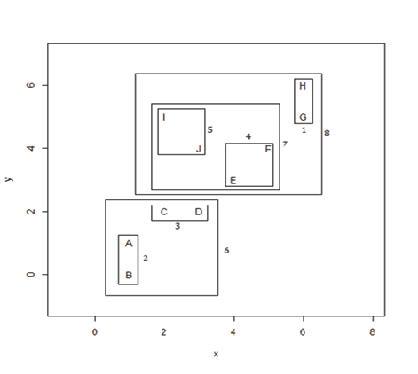
Looking at the scatterplot in Figure 7.6, the clusters are numbered in the order in which they were created, following the steps below. Click the arrow to the left of Clustering History. When you move the diamond from left to right, the dendrogram and the clustering history can be read as follows:
STEP 1: H and G are paired to form a cluster.
STEP 2: A and B are paired to form a cluster.
STEP 3: C and D are paired to form a cluster.
STEP 4: E and F are paired to form a cluster.
STEP 5: I and J are paired to form a cluster.
STEP 6: The AB and CD clusters are joined.
STEP 7: The EF and IJ clusters are combined.
STEP 8: HG is added to the EFIJ cluster.
STEP 9: The ABCD and EFIJGH clusters are combined.
The clustering process is more difficult to imagine in higher dimensions, but the idea is the same.
The fundamental question when applying any clustering technique, and hierarchical clustering is no exception, is “What is the best number of clusters?” There is no target variable and no a priori knowledge of which customer belongs to which group, so there is no gold standard by which we can determine whether any particular classification of observations into groups is successful or not. Sometimes it is enough simply to recognize that a particular classification has produced groups that are interesting or useful in some sense or another. In the absence of such compelling anecdotal justifications, one common method is to use the scree plot beneath the dendrogram to gain some insight into what the number of cluster might be. The ordinate (y-axis) is the distance that was bridged in order to join the clusters, and a natural break in this distance produces a change in the slope of the line (often described as an “elbow”) that suggests an appropriate number of clusters. At the bottom of the box in Figure 7.5 is a small scree plot with a line of x’s. Each x represents the level of clustering at each step. Since there are 10 observations, there are 10 x’s. The elbow appears to be around 2 or 3 clusters, so 2 or 3 clusters might be appropriate for these data.
Let us now apply these principles to a data set, Thompson’s “1975 Public Utility Data Set” (Johnson and Wichern, 2002). The data set is small enough so that all the observations can be comprehended and rich enough so that it provides useful results; it is a favorite for exhibiting clustering methods. Table 7.2 shows the Public Utility Data found in PublicUtilities.jmp, which has eight numeric variables that will be used for clustering: coverage, the fixed-charge coverage ratio; return, the rate of return on capital; cost, cost per kilowatt hour; load, the annual load factor; peak, the peak kilowatt hour growth; sales, in kilowatt hours per year; nuclear, the percent of power generation by nuclear plants; and fuel, the total fuel costs. “Company” is a label for each observation; it indicates the company name.
Table 7.2 Thompson’s 1975 Public Utility Data Set
|
Coverage |
Return |
Cost |
Load |
Peak |
Sales |
Nuclear |
Fuel |
Company |
|
1.06 |
9.20 |
151 |
54.4 |
1.6 |
9077 |
0 |
0.63 |
Arizona Public |
|
0.89 |
10.3 |
202 |
57.9 |
2.2 |
5088 |
25.3 |
1.555 |
Boston Edison |
|
1.43 |
15.4 |
113 |
53 |
3.4 |
9212 |
0 |
1.058 |
Central Louisiana |
|
1.02 |
11.2 |
168 |
56 |
0.3 |
6423 |
34.3 |
0.7 |
Commonwealth Edison |
|
1.49 |
8.8 |
192 |
51.2 |
1 |
3300 |
15.6 |
2.044 |
Consolidated Edison |
|
1.32 |
13.5 |
111 |
60 |
-2.2 |
11127 |
22.5 |
1.241 |
Florida Power & Light |
|
1.22 |
12.2 |
175 |
67.6 |
2.2 |
7642 |
0 |
1.652 |
Hawaiian Electric |
|
1.1 |
9.2 |
245 |
57 |
3.3 |
13082 |
0 |
0.309 |
Idaho Power |
|
1.34 |
13 |
168 |
60.4 |
7.2 |
8406 |
0 |
0.862 |
Kentucky Utilities |
|
1.12 |
12.4 |
197 |
53 |
2.7 |
6455 |
39.2 |
0.623 |
Madison Gas |
|
0.75 |
7.5 |
173 |
51.5 |
6.5 |
17441 |
0 |
0.768 |
Nevada Power |
|
1.13 |
10.9 |
178 |
62 |
3.7 |
6154 |
0 |
1.897 |
New England Electric |
|
1.15 |
12.7 |
199 |
53.7 |
6.4 |
7179 |
50.2 |
0.527 |
Northern States Power |
|
1.09 |
12 |
96 |
49.8 |
1.4 |
9673 |
0 |
0.588 |
Oklahoma Gas |
|
0.96 |
7.6 |
164 |
62.2 |
-0.1 |
6468 |
0.9 |
1.4 |
Pacific Gas |
|
1.16 |
9.9 |
252 |
56 |
9.2 |
15991 |
0 |
0.62 |
Puget Sound Power |
|
0.76 |
6.4 |
136 |
61.9 |
9 |
5714 |
8.3 |
1.92 |
San Diego Gas |
|
1.05 |
12.6 |
150 |
56.7 |
2.7 |
10140 |
0 |
1.108 |
The Southern Co. |
|
1.16 |
11.7 |
104 |
54 |
-2.1 |
13507 |
0 |
0.636 |
Texas Utilities |
|
1.2 |
11.8 |
148 |
59.9 |
3.5 |
7287 |
41.1 |
0.702 |
Wisconsin Electric |
|
1.04 |
8.6 |
204 |
61 |
3.5 |
6650 |
0 |
2.116 |
United Illuminating |
|
1.07 |
9.3 |
174 |
54.3 |
5.9 |
10093 |
26.6 |
1.306 |
Virginia Electric |
To perform hierarchical clustering on the Public Utility Data Set, open the PublicUtilities.jmp file:
1. Select Analyze→Multivariate Methods→Cluster.
2. From the Clustering dialog box, select Coverage, Return, Cost, Load, Peak, Sales, Nuclear, and Fuel and click Y, Columns. Also, select Company and click Label. Since the units of measurement can affect the results, make sure that Standardize Data is checked. Under Options, choose Hierarchical and Ward.
3. Click OK.
4. In the Hierarchical Clustering output, click the red triangle and click Color Clusters and Mark Clusters.
Figure 7.7 Hierarchical Clustering of the Public Utility Data Set
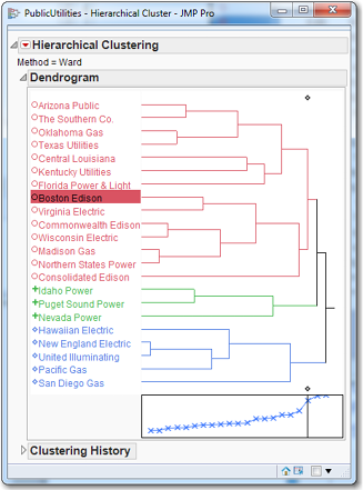
The results are shown in Figure 7.7. The vertical line in the box goes through the third (from the right) x, which indicates that three clusters might be a good choice. The first cluster is Arizona Public through Consolidated Edison (14 firms); the second cluster is Idaho, Puget Sound, and Nevada (three firms); and the third cluster is Hawaiian through San Diego (five firms). We can move the vertical line and look at the different clusters. It appears that clusters of size 3, 4, 5 or 6 would be “best.” For now, let us suppose the Ward’s method with 5 clusters suffices. Move the vertical line so that it produces five clusters. Let’s produce a report/profile of this “5-cluster solution. ” In practice, we may well produce similar reports for the 3-, 4-, and 6-cluster solutions also, for review by a subject-matter expert who could assist us in determining the appropriate number of clusters.
To create a column in the worksheet that indicates each firm’s cluster, click the red triangle and click Save Clusters. To help us interpret the clusters, we will produce a table of means for each cluster:
1. In the data table, select Tables→Summary. Select Coverage, Return, Cost, Load, Peak, Sales, Nuclear, and Fuel, click the Statistics box, and select Mean. Next, select the variable Cluster and click Group.
2. Click OK. The output contains far too many decimal places. To remedy this, select all the columns. Then select Cols→Column Info. Under Format, select Fixed Dec and then change Dec from 0 to 2 for each variable. Click OK.
The output presented is shown in Table 7.3, shown below.
Table 7.3 Cluster Means for Five Clusters
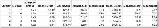
To understand a data set via clustering, it can be useful to try to identify the clusters by looking at summary statistics. In the present case, we can readily identify all the clusters: Cluster 1 is highest return; Cluster 2 is highest nuclear; Cluster 3 is the singleton; Cluster 4 is highest cost; and Cluster 5 is highest load. Here we have been able to characterize each cluster by appealing to a single variable. But often it will be necessary to use two or more variables to characterize a cluster. Additionally, we recognize that we have clustered based on standardized variables and identified them using the original variables. Sometimes it may be necessary to refer to the summary statistics of the standardized variables to be able to identify the clusters.
Using Clusters in Regression
In Problem 6 of the Chapter 4 exercises, the problem was to run a regression on the PublicUtilities data using sales as a dependent variable and Coverage, Return, Cost, Load, Peak, Sales, Nuclear, and Fuel as independent variables. The model had a R2 of 59.3%. Not too high, and the adjusted R2 is only 38.9%. What if we add the nominal variable Clusters to the regression model? The model improves significantly with a R2 of 88.3%, and the adjusted R2 is only 75.5%. But now we have 12 parameters to estimate (8 numeric variables and 4 dummy variables) and only 22 observations. This high R2 is perhaps a case of overfitting. Overfitting occurs when the analyst includes too many parameters and therefore fits the random noise rather than the underlying structure; this concept is discussed in more detail in Chapter 10. Nevertheless, if you run the multiple regression with only the Cluster variable (thus, 4 dummy variables), the R2 is 83.6% and the adjusted R2 is 79.8%. We have dropped the 8 numeric variables from the regression, and the R2 only dropped from 88.3% to 83.6%. This strongly suggests that the clusters contain much of the information that is in the 8 numeric variables. Using a well-chosen cluster variable in regression can prove to be very useful.
K-means Clustering
While hierarchical clustering allows examination of several clustering solutions in one dendrogram, it has two significant drawbacks when applied to large data sets. First, it is computationally intensive and can have long run times. Second, the dendrogram can become large and unintelligible when the number of observations is even moderately large.
One of the oldest and most popular methods for finding groups in multivariate data is the k-means clustering algorithm, which has five steps:
1. Choose k, the number of clusters.
2. Guess at the multivariate means of the k clusters. If there are ten variables, each cluster will be associated with ten means, one for each variable. Very often this collection of means is called a centroid. JMP will perform this guessing with the assistance of a random number generator, which is a mathematical formula that produces random numbers upon demand. It is much easier for the computer to create these guesses than for the user to create them by hand.
3. For each observation, calculate the distance from that observation to each of the k centroids, and assign that observation to the closest cluster (i.e., the closet centroid).
4. After all the observations have been assigned to one and only one cluster, calculate the new centroid for each cluster using the observations that have been assigned to that cluster. The cluster centroids “drift” toward areas of high density, where there are many observations.
5. If the new centroids are very different from the old centroids, the centroids have drifted. So return to Step 3. If the new centroids and the old centroids are the same so that additional iterations will not change the centroids, then the algorithm terminates.
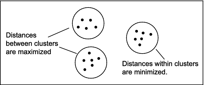
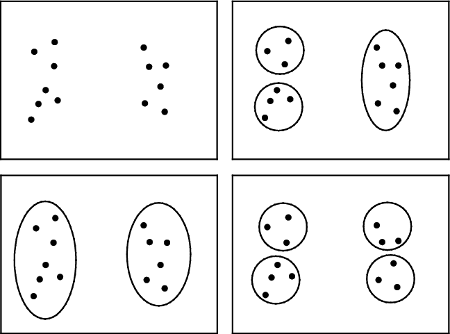
The effect of the k-means algorithm is to minimize the differences within each group, and to maximize the differences between groups, as shown in Figure 7.8.
Figure 7.8 The Function of k-means Clustering
A primary advantage of the k-means clustering algorithm is that it has low complexity. By this we mean that its execution time is proportional to the number of observations, so it can be applied to large data sets. By contrast, when you use an algorithm with high complexity, doubling the size of the data set may increase the execution time by a factor of four or more. Hence, algorithms with high complexity are not desirable for use with large data sets.
A primary disadvantage of the algorithm is that its result, the final determination of which observations belong to which cluster, can depend on the initial guess (as in Step 1 above). As a consequence, if group stability is an important consideration for the problem at hand, it is sometimes advisable to run the algorithm more than once to make sure that the groups do not change appreciably from one run to another. All academics advise multiple runs with different starting centroids, but practitioners rarely do this, though they should. However, they have to be aware of two things: (1) comparing solutions from different starting points can be tedious, and the analyst will often end up observing, “this observation was put in cluster 1 on the old output, and now it is put in cluster 5 on the new output—I think”; and (2) doing this will add to the project time.
If the data were completely dependent, there would be a single cluster. If the data were completely independent, there would be as many clusters as there are observations. Almost always the true number of clusters is somewhere between these extremes, and the analyst’s job is to find that number. If there is, in truth, only one cluster, but k is chosen to be five, the algorithm will impose five clusters on a data set that consists of only a single cluster, and the results will be unstable. Every time the algorithm is run, a completely different set of clusters will be found. Similarly, if there are really 20 clusters and k is chosen for the number of clusters, the results will again be unstable.
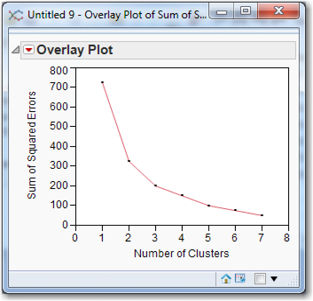
After the algorithm has successfully terminated, each observation is assigned to a cluster, each cluster has a centroid, and each observation has a distance from the centroid. The distance of each observation from the centroid of its cluster is calculated. Square them, and sum them all to obtain the sum of squared errors (SSE) for that cluster solution. When this quantity is computed for various numbers of clusters, it is traditional to plot the SSE and to choose the number of clusters that minimizes the sum of squared errors. For example, in Figure 7.9, the value of k that minimizes the sum of squared errors is four.
Figure 7.9 U-shaped SSE plot for Choosing the Number of Clusters
There is no automated procedure for producing a graph such as that in Figure 7.9. Every time the clustering algorithm is run, the user has to write down the sum of squared errors, perhaps entering both the sum of squared errors and the number of clusters in appropriately labeled columns in a JMP data table. Then you select Graph→Overlay Plot, and select the sum of squared errors as Y and the number of clusters as X. Click OK to produce a plot of points. To draw a line through the points, in the overlay plot window, click the red arrow and select Connect Thru Missing.
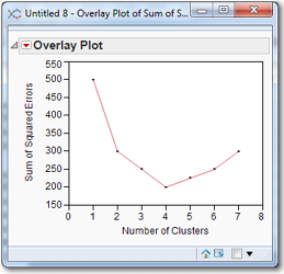
As shown in Figure 7.10, it is not always the case that the SSE will take on a U-shape for increasing number of clusters. Sometimes the SSE decreases continuously as the number of clusters increases. In such a situation, choosing the number of clusters that minimizes the SSE would produce an inordinately large number of clusters. In this situation, the graph of SSE versus the number of clusters is called a scree plot. Often there is a natural break where the distance jumps up suddenly. These breaks suggest natural cutting points to determine the number of clusters. The “best” number of clusters is typically chosen at or near this “elbow” of the curve. The elbow suggests which clusters should be profiled and reviewed with the subject-matter expert. Based on Figure 7.10, the number of clusters would probably be 3, but 2 or 4 would also be possibilities. Choosing the “best” number of clusters is as much an art form as it is a science. Sometimes a particular number of clusters produces a particularly interesting or useful result; in such a case, SSE can probably be ignored.
Figure 7.10 A Scree Plot for Choosing the Number of Clusters
The difference between two and three or three and four clusters (indeed between any pair of partitions of the data set) is not always statistically obvious. The fact is that it can be difficult to decide on the number of clusters. Yet this is a very important decision, because the proper number of clusters can be of great business importance. In Figure 7.11, it is hard to say whether the data set has two, three, or four clusters. A pragmatic approach is necessary in this situation: choose the number of clusters that produces useful clusters.
Once k has been chosen and clusters have been determined, the centroids (multivariate) means of the clusters can be used to give descriptions (and descriptive names) to each cluster/segment. For example, a credit card company might observe that in one cluster, the customers charge large balances and pay them off every month. This cluster might be called “transactors.” Another cluster may occasionally make a large purchase and then pay the balance down over time; they might be “convenience users.” A third cluster would be customers who always have a large balance and roll it over every month, incurring high interest fees; they could be called “revolvers” since they use the credit card as a form of revolving debt. There would, of course, be other clusters, and perhaps not all of them would have identifiable characteristics that lead to names. The idea, however, should be clear.
Figure 7.11 How Many Clusters in the Data Set?
To perform k-means clustering on the PublicUtilities data set open JMP and load PublicUtilities.jmp:
1. Select Analyze→Multivariate Methods→Cluster.
2. From the Clustering dialog box, select Coverage, Return, Cost, Load, Peak, Sales, Nuclear, and Fuel (click Coverage, hold down the Shift key, and click Fuel) and click Y, Columns. Also, select Company and click Label.
3. Click the Options drop-down menu and change Hierarchical to Kmeans. Now, the k-means algorithm is sensitive to the units in which the variables are measured. If we have three variables (length weight, and value), we will get one set of clusters if the units of measurement are inches, pounds, and dollars, and (probably) a radically different set of clusters if the units of measurement are feet, ounces, and cents. To avoid this problem, make sure the box for “Columns Scaled Individually” is checked. The box for “Johnson Transform” is another approach to dealing with this problem that will balance skewed variables or bring outliers closer to the rest of the data; do not check this box.
4. Click OK.
A new pop-up box similar to Figure 7.12 appears. The Methodmenu indicates K-Means Clustering and the number of clusters is 3. But we will change the number of clusters shortly. (Normal Mixtures, Robust Normal Mixtures, and Self Organizing Map are other clustering methods about which you can read in the online user-guide and with which you may wish to experiment. To access this document, from the JMP Home Window, select Help→Books→Modeling and Multivariate Methods and consult Chapter 20 on “Clustering.”)
Suppose we wanted more than 3 clusters. Then you would change the number of clusters to 5. The interested reader can consult the online help files to learn about “Single Step,” “Use within-cluster std deviations,” and “Shift distances using sampling rates.” But do not check these boxes until you have read about these methods. The JMP input box should look like Figure 7.12. Click Go to perform k-means clustering. The output is shown in Figure 7.13.
Figure 7.12 KMeans Dialog Box
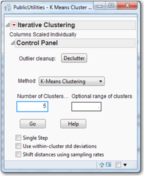
Figure 7.13 Output of k-means Clustering with Five Clusters
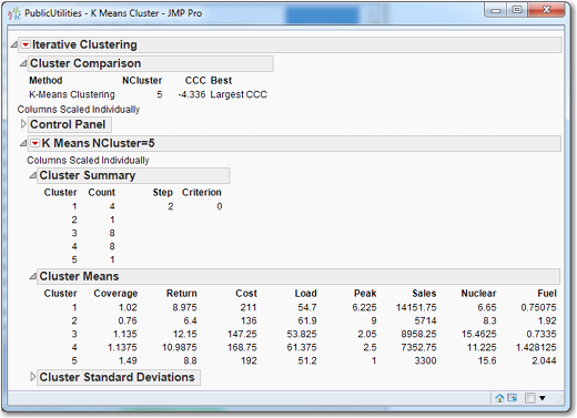
Under Cluster Summary in Figure 7.13, we can see that clusters 2 and 5 have a single observation; perhaps 5 clusters with the k-means is too coarse of a breakdown. So, let’s rerun the k-means analysis with 3 clusters:
1. In the K Means Cluster dialog box, click the triangle next to the K Means NCluster=5 panel to collapse those results.
2. Click the triangle next to Control Panel to expand it, and change Number of Clusters to 3.
3. Click Go. The output will look like Figure 7.14.
Figure 7.14 Output of k-means Clustering with Three Clusters
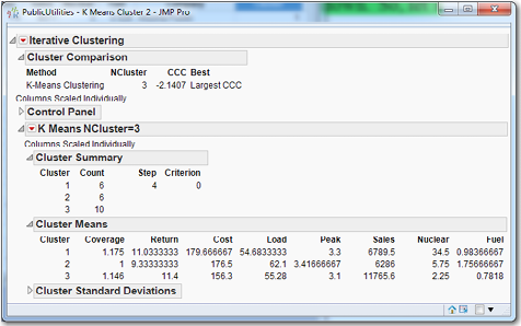
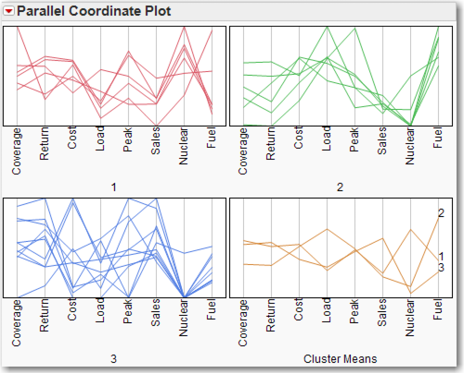
Optionally, click on the red triangle next to K Means NCluster=3 and click Parallel Coord Plots. This command sequence creates plots of the variable means within each cluster, as shown in Figure 7.15. Parallel coordinate plots may be helpful in the interpretation of the clusters. This is a fast way to create a “profile” of the clusters, and can be of great use to a subject-matter expert. From Figure 7.15, we can see that Cluster 1 is the “high nuclear” group; this can be confirmed by referring to the actual data in Figure 7.14. For an excellent and brief introduction to parallel coordinate plots, see Few (2006).
Figure 7.15 Parallel Coordinate Plots for k=3 Clusters
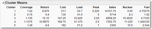
Under Cluster Summary, the program identifies three clusters with six, six, and ten companies in each. Using the numbers under Cluster Means, we can identify Cluster 1 as the “high nuclear” cluster and Cluster 3 as the “high sales” cluster. Nothing really stands out about Cluster 2, but perhaps it might not be too much of a stretch to refer to it as the “high load” or “high fuel” cluster. Since we are going to try other values of k before leaving this screen, we should calculate the SSE for this partition of the data set:
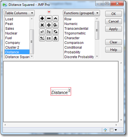
4. Click the red triangle next to K Means NCluster = 3 and click Save Clusters. Two new columns will appear on the right of the data table. Cluster indicates the cluster to which each company has been assigned. Distance gives the distance of each observation from the centroid of its cluster. We need to square all these distances and sum them to calculate the SSE.
5. From the top menu select Cols→New Column. For Column Name, enter Distance Squared. Go to the bottom of the dialog box, click Column Properties and select Formula. The Formula Editor appears, and on the left select the variable Distance. You may have to scroll down to find it. Distance will appear in the formula box. In the middle of the dialog box, are several operator buttons. Click the operator button xy and then type the number 2, if necessary (the number 2 might already be there). See Figure 7.16.
Figure 7.16 Formula Editor for Creating Distance Squared
6. Click OK. The original New Column dialog box is still present, so click OK in it. The variable Distance Squared has been created, and we now need its sum.
7. On the data table menu, select Analyze→Distribution. Click Distance Squared and then click Y, Columns.
8. In the Distribution window, click the red arrow next to Summary Statistics (which is beneath Quantiles, which, in turn, is beneath the histogram/boxplot). Click Customize Summary Statistics and check the box for Sum. Click OK. Sum is now displayed along with the other summary statistics, and is seen to be 2075.1125. (Alternatively, on the top menu, click Tables→Summary. The Summary dialog box appears. From the list of Select Columns, click Distance Squared. Click the drop-down arrow next to Statistics and click Sum. Click OK.)
With the same number of clusters, the members of clusters will most likely differ from the Hierarchical Clustering and the k-means clustering. As a result, this procedure of producing the SSE using the k-means clustering should be performed for k = 4, 5, and 6. This iterative process can be facilitated by clicking the right arrow next to the Control Panel in the Iterative Clustering output and entering 4 in the Number of Clusters field and 6 in the Optional range of clusters field. When both of these boxes have numbers, the former is really the lower limit of the number of clusters desired, and the latter is really the upper limit of the number of clusters desired. Be careful not to check the boxes on the second screen if you want to reproduce the numbers below. The SSE for the different cluster sizes are listed in Table 7.4. By inspection, we see that a plot of k versus SSE would not be a scree plot, but instead would be u-shaped with a minimum for k = 5.
Table 7.4 SSE for Various Values of k
|
K |
3 |
4 |
5 |
6 |
|
SSE |
2075.11 |
2105.49 |
1743.93 |
1900.59 |
Back to the k-means with 5 clusters, as we stated before, there are two singletons, which can be considered outliers that belong in no cluster. The clusters are given in Table 7.5.
Since clusters 2 and 5 are singletons that may be considered outliers, we need only try to interpret cluster 1, 3, and 4. The cluster means are given in Figure 7.17. Cluster 1 could be highest cost, and cluster 3 could be highest nuclear. Cluster 4 does not immediately stand out for any one variable, but might accurately be described as high (but not highest) load and high fuel.
As might be deduced from this simple example and examining it using hierarchical clustering and k-means clustering, if the data set is large with numerous variables, the prospect of searching for k is daunting. But that is the analyst’s task: to find a good number for k.
Table 7.5 Five Clusters for the Public Utility Data
|
Cluster 1 (4) |
Idaho Power, Nevada Power, Puget Sound Electric, Virginia Electric |
|
Cluster 2 (1) |
San Diego Gas |
|
Cluster 3 (8) |
Arizona Public, Central Louisiana, Commonwealth Edison, Madison Gas, Northern States Power, Oklahoma Gas, The Southern Co., Texas Utilities |
|
Cluster 4 (8) |
Boston Edison, Florida Power & Light, Hawaiian Electric, Kentucky Utilities, New England Electric, Pacific Gas, Wisconsin Electric, United Illuminating |
|
Cluster 5 (1) |
Consolidated Edison |
Figure 7.17 Cluster Means for Five Clusters Using k-means
After we have performed a cluster analysis, one of our possible next tasks is to score new observations. In this case, scoring means assigning new observation to existing clusters without rerunning the clustering algorithm. Suppose another public utility, named “Western Montana,” is brought to our attention, and it has the following data: coverage = 1; return =5; cost = 150; load = 65; peak = 5; sales = 6000; nuclear = 0; and fuel = 1. We would like to know to which cluster it belongs. So to score this new observation:
1. Rerun k-means clustering with 5 clusters.
2. This time, instead of saving the clusters, save the cluster formula. From the red triangle on K Means NCluster=5, select Save Cluster Formula. Go to the data table, which has 22 rows, right-click in the 23rd row, and select Add Rows. For How many rows to add, enter 1.
3. Click OK.
Enter the data for Western Montana in the appropriate cells in the data table. When you type the last datum in fuel and then click in the next cell to enter the company name, a value will appear in the 23rd cell of the Cluster Formula column: 2. According to the formula created by the k-means clustering algorithm, the company Western Montana should be placed in the second cluster. We have scored this new observation.
K-means versus Hierarchical Clustering
The final solution to the k-means algorithm can depend critically on the initial guess for the k-means. For this reason, it is recommended that k-means be run several times, and these several answers should be compared. Hopefully, a consistent pattern will emerge from the several solutions, and one of them can be chosen as representative of the many solutions. In contrast, for hierarchical clustering, the solution for k clusters depends on the solution for k+1 clusters, and this solution will not change when the algorithm is run again on the same data set.
Usually, it is a good idea to run both algorithms and compare their outputs. Standard bases to choose between the methods are interpretability and usefulness. Does one method produce clusters that are more interesting or easier to interpret? Does the problem at hand lend itself to finding small groups with unusual patterns? Often one method will be preferable on these bases, and the choice is easy.
References
Few, S. (2006). “Multivariate Analysis Using Parallel Coordinates.” Manuscript, www.perceptualedge.com.
Humby, C., T. Hunt, and T. Phillips. (2007). Scoring Points: How Tesco Continues to Win Customer Loyalty. 2nd Ed. Philadelphia: Kogan Page.
Johnson, R. A., and D. W. Wichern. (2002). Applied Multivariate Statistical Analysis. 5th Ed. Upper Saddle River, NJ: Prentice Hall.
Ying, L., and W. Yuanuan. (2010). “Application of clustering on credit card customer segmentation based on AHP.” International Conference on Logistic Systems and Intelligence Management, Vol. 3, 1869−1873.
Exercises
1. Use hierarchical clustering on the Public Utilities data set. Make sure to use the company name as a label. Use all six methods (e.g., Average, Centroid, Ward, Single, Complete, and Fast Ward), and run each with the data standardized. How many clusters does each algorithm produce?
2. Repeat exercise 1, this time with the data not standardized. How does this affect the results?
3. Use hierarchical clustering on the Freshmen1.jmp data set. How many clusters are there? Use this number to perform a k-means clustering, (Make sure to try several choices k near the one indicated by hierarchical clustering.) Note that k-means will not permit ordinal data. Based on the means of the clusters for the final choice of k, try to name each of the clusters.
4. Use k-means clustering on the churn data set. Try to name the clusters.