

Chapter 6
Principal Components Analysis
Principal Component
Dimension Reduction
Discovering Structure in The Data
Exercises
Figure 6.1 A Framework for Multivariate Analysis
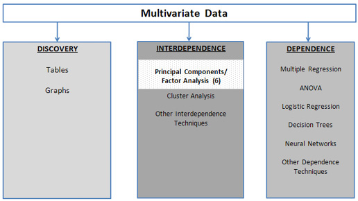
Principal Component Analysis (PCA) is an exploratory multivariate technique with two overall objectives. One objective is “dimension reduction”— i.e., to turn a collection of, say, 100 variables into a collection of 10 variables that retain almost all the information that was contained in the original 100 variables. The other objective is to discover the structure in the relationships between the variables. As shown in Figure 6.1, PCA is a technique that does not require a dependent variable.
PCA analyzes the structure of the interrelationships (correlations) among the variables by defining a set of common underlying dimensions called components or factors. PCA achieves this goal by eliminating unnecessary correlations between variables. To the extent that two variables are correlated, there are really three sources of variation: variation unique to the first variable, variation unique to the second variable, and variations common to the two variables. The method of PCA transforms the two variables into uncorrelated variables (with no common variation) that still preserve two sources of unique variation so that the total variation in the two variables remains the same.
To see how this works, let’s examine a small data table toyprincomp.jmp, which contains the three variables, x, y, and z. Before performing the PCA, let’s first examine the correlations and scatterplot matrix. To produce them:
Select Analyze→Multivariate Methods→Multivariate. For the Select Columns option in the Multivariate and Correlations dialog box, click X, hold down the shift key, and click Y to select all three variables. Click Y,Columns, and all the variables will appear in the white box to the right of Y, Columns. Click OK.
As shown in Figure 6.2, the correlation matrix and corresponding scatterplot matrix will be generated. There appear to be several strong correlations among all the variables.
Figure 6.2 Correlations and Scatterplot Matrix for the toyprincomp.xls Data Set
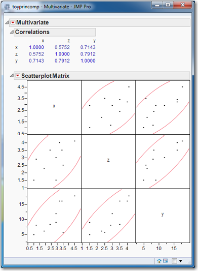
We will treat x and z as a pair of variables on which to apply PCA; we’ll reserve y for use as a dependent variable for running regressions. Since we have two variables, x and z, we will create two principal components.
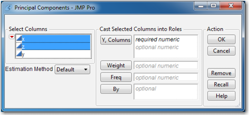
Open toyprincomp.xls in JMP. Click Analyze→Multivariate Methods→Principal Components. In the Principal Components dialog box, click x, hold down the shift key, and click z to select both variables. Then click Y, Columns as shown in Figure 6.3. Click OK.
Figure 6.3 Principal Components Dialog Box
Three principal component summary plots, as in Figure 6.4, will appear. These plots show how the principal components explain the variation in the data. The left-most graph is a listing and bar chart of the eigenvalue and percentage of variation accounted for by each principal component. (In this case, with only two principal components, the graph is not too informative.)
Figure 6.4 Principal Components Summary Plots
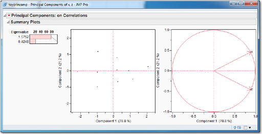
The first eigenvalue, 1.5752, is much larger than the second eigenvalue, 0.4248. This suggests that the first principal component, Prin1, is much more important (in terms of explaining the variation in the pair of variables) than the second principal component, Prin2. Additionally, the bar for the percentage of variation accounted for by Prin1 is about 80%. (As we can see in the other two plots, Prin1 accounted for 78.8% and Prin2 accounted for 21.2%.)
The second graph is a scatter plot of the two principal components; this is called a Score Plot. Notice that the scatter is approximately flat, indicating a lack of correlation between the principal components. A correlation between the principal components would be indicated by a scatter with a positive or negative slope.
The third graph is called a Loadings Plot, and it shows the contribution made to each principal component (the principal components are the axes of the graph) by the original variables (which are the directed points on the graph). In this case, reading from the plot, we see that x and z each contribute about 0.90 to Prin1, while x contributes about a positive 0.50 to Prin2 and z contributes about a negative 0.50 to Prin2. This graph is not particularly useful when there are only two variables. When there are many variables, it is possible to see which variables group together in the principal component space; examples of this will be presented in a later section.
Linear combinations of x and z have been formed into Prin1 and Prin2. To show that Prin1 and Prin2 represent the same overall correlation as x and z, we use the dependent variable y and run two regressions: First regress y on x and z. Then regress y on Prin1 and Prin2. (The variables Prin1 and Prin2 can be created by clicking the red triangle, clicking Save Principal Components, and then entering 2 as the number of components to save. Click OK.) Both regressions have the exact same R2 and Root Mean Square Error (or se as shown in Table 6.1).
To see the true value of the principal components method, now run a regression of y on Prin1, excluding Prin2. We get almost the same R2 (which is slightly lower as shown in Table 6.1), which implies that the predicted y values from both models are essentially the same. We also see a drop in the Root Mean Square Error, which implies a tighter prediction interval. If our interest is not in interpreting coefficients but simply in predicting by use of principal components, we get practically the same prediction with a tighter prediction interval. The attraction of PCA is obvious.
Table 6.1 Regression Results
|
R2 |
Root Mean Square Error (se) |
|
|
y|x, z |
0.726336 |
2.811032 |
|
y| Prin1, Prin2 |
0.726336 |
2.811032 |
|
y| Prin1 |
0.719376 |
2.662706 |
Principal Component
The method of principal components or PCA works by transforming a set of k correlated variables into a set of k uncorrelated variables that are called, not coincidentally, principal components or simply components. The first principal component (Prin1) is a linear combination of the original variables:
Prin1 = w11x1 + w12x2+w13x3+…+w1kxk
Prin1 accounts for the most variation in the data set. The second principal component is uncorrelated with the first principal component, and accounts for the second-most variation in the data set. Similarly, Prin3 is uncorrelated with Prin1 and Prin2 and accounts for the third-most variation in the data set. The general form for the ith principal component is
Prin(i) = wi1x1 + wi2x2+wi3x3+…+wikxk
where wi1 is the weight of the first variable in the ith principal component.
(Note: A related multivariate technique is factor analysis. Although superficially quite similar, the techniques are quite different, and have different purposes. First, the PCA approach accounts for all the variance, common and unique; factor analysis analyzes only common variance. Further, with PCA, each principal component is viewed as a weighted combination of input variables. On the other hand, with factor analysis, each input variable is viewed as a weighted combination of some underlying theoretical construct. In sum, the principal components method is just a transformation of the data to a new set of variables and is useful for prediction; factor analysis is a model for the data that seeks to explain the data.)
The weights wij are computed by a mathematical method called eigenvalue analysis that is applied to the correlation matrix of the original data set. This is equivalent to standardizing each variable by subtracting its mean and dividing by its standard deviation. This standardization is important, lest results depend on the units of measurement. For example, if one of the variables is dollars, measuring that variable in cents or thousands of dollars will produce completely different sets of principal components. The eigenvalue analysis of the correlation matrix of k variables produces k eigenvalues, and for each eigenvalue there is an eigenvector of k elements. For example, the k elements of the first eigenvector are w11, w12, w13 …, w1k.
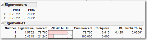
To see how these weights work, let’s continue with the toyprincomp.jmp data set. Click the red triangle next to Principal Components and click Eigenvectors. Added to the principal component report will be the eigenvectors as shown in Figure 6.5. Accordingly, the equations for Prin1 and Prin2 are
Prin1 = 0.70711 x + 0.70711 z
Prin2 = 0.70711 x - 0.70711 z
Now, again click the red triangle next to Principal Components, but this time click Eigenvalues. The eigenvalues are displayed as shown in Figure 6.5. Observe that Prin1 accounts for 78.76% of the variation in the data, because its eigenvalue (1.5752) is 0.7876 of the sum of all the eigenvalues (1.5752+0.4248 =2). The fact that the sum of the eigenvalues equals two is not a coincidence. Remember that the variables are standardized, so each variable has a variance equal to one. Therefore, the sum of the standardized variances equals the number of variables, in this case, two.
Figure 6.5 Eigenvectors and Eigenvalues for the toyprincomp.jmp Data Set
Finally, we can verify that the principal components, Prin1 and Prin2, are uncorrelated by computing the correlation matrix for the principal components. We can generate the correlation matrix by selecting Analyze→Multivariate Methods→Multivariate; select Prin1 and Prin2 and click OK. The correlation matrix clearly shows that the correlation between Prin1 and Prin2 equals zero.
Dimension Reduction
One of the main objectives of PCA is to reduce the information contained in all the original variables into a smaller set of components with a minimum loss of information. So, the question is how do we determine how many components should be considered. To answer this question, let’s look at another data set, princomp.jmp, which has 12 independent variables, x1 through x12; a single dependent variable, y; and 100 observations. As we did earlier in this chapter with the toyprincomp.jmp data set, first generate the correlation matrix and scatterplot matrix:
Select Analyze→Multivariate Methods→Multivariate. For the Select Columns option in the Multivariate and Correlations dialog box, click x1, hold down the shift key, and click x12 to select all twelve x variables. Click Y,Columns, and all the variables will appear in the white box to the right of Y, Columns. Click OK.
It is rather hard to make sense of this correlation matrix and the associated scatterplots, so let’s try another way to see this information.
Click the red triangle next to Multivariate. Select Pairwise Correlations. Scroll to the bottom of the screen to see a table listing of the pairwise correlations. Right-click in the table and select Sort by Column. Select Signif Prob and check the box for Ascending. Click OK.
You should observe most of the correlations are rather low with four correlations in the 60% range and several variables simply uncorrelated. The correlations for about half the correlations are significant, indicated by an asterisk in the Signif Prob column, while about half the correlations are insignificant.
Next, let’s perform the PCA on the variables x1 through x12:
Select Analyze→Multivariate Methods→Principal Components. In the Principal Components dialog box, click x1, hold down the shift key, and click x12. Then click Y, Columns and click OK. Click the red triangle and click Eigenvalues. Again, click the red triangle and click Scree Plot.
Figure 6.6 displays the Scree Plot and eigenvalues. Examining the Scree Plot, it appears that there may be an “elbow” at 2 or 3 or 4 principal components. When we examine the histogram of eigenvalues, it appears that the first three principal components account for about 60% of the variation in the data, and the first four principal components might account for about 68% of the variation. How many principal components should we select? There are three primary methods for choosing this number, and any one of them can be satisfactory. (No one is necessarily better than any of the others in all situations, so selecting the number of principal components is an art form.)
Figure 6.6 Scree Plot and Eigenvalues for x1 to x12 from the princomp.jmp Data Set
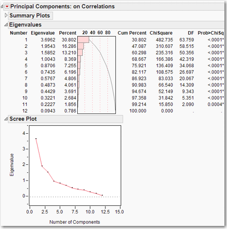
METHOD ONE: Look for an “elbow” in the scree plot of eigenvalues. This method will be covered in detail in Chapter 7, so our treatment here is brief. In our princomp.jmp data set, there is a clear elbow at 3, which suggests keeping the first three principal components.
METHOD TWO: How many eigenvalues are greater than one? Each principal component accounts for a proportion of variation related to its corresponding eigenvalue, and the sum of the eigenvalues equals the variance in the data set. Any principal component with an eigenvalue greater than one is contributing more than its share to the variance. Those principal components associated with eigenvalues that are less than one are not accounting for their share of the variation in the data. This suggests that we should retain principal components associated with eigenvalues greater than one. It is important not to be too strict with this rule. For example, if the fourth eigenvalue equals 1.01 and the fifth eigenvalue equals 0.99, it would be silly to use the first four principal components, because the fifth principal component makes practically the same contribution as the fourth principal component. This method is especially useful if there is no clear elbow in the scree plot. In our princomp.jmp example, we would choose 4 components.
METHOD THREE: Accounting for a specified proportion of the variation. This can be used two ways. First, the researcher can desire to account for at least, say, 70% or 80% of the variation, and retain enough principal components to achieve this goal. Second, the researcher can keep any principal component that accounts for more than, say, 5% or 10% of the total variation. For our princomp.jmp example, let us choose to explain at least 70% of the variation. We would then choose five principal components because four principal components only account for 68.667% of the variation.
Let’s see what difference each of these methods makes with this data set. First, if we run a regression of y on all 12 x variables (i.e., x1 to x12), the R2 is 0.834434. The R2 when we regress y on three, four, and five principal components is listed in Table 6.2. The difference in R2 between three and four principal components is more than 4% (and the maximum R2 is 100%), while the difference in R2 between four and five is a negligible 0.001637. This suggests that four might be a good number of principal components to retain. The predictions that we get from keeping four or five principal components will be practically the same.
Table 6.2 Regression Results
|
R2 |
|
|
y|x1, x2, . . ., x12 |
0.834434 |
|
y| Princomp1 through Princomp3 |
0.723898 |
|
y| Princomp1 through Princomp4 |
0.766565 |
|
y| Princomp1 through Princomp5 |
0.768202 |
Discovering Structure in the Data
In addition to dimension reduction, PCA can also be used to gain insight into the structure of the data set in two ways. First, the factor loadings can be used to plot the variables in the principal components space (this is the “Loading Plot”), and it is sometimes possible to see which variables are “close” to each other in the principal components space. Second, the principal component scores can be plotted for each observation (this is the “Score Plot”), and aberrant observations or small, unusual clusters might be noted. In this section, we consider both of these uses of PCA. We first use a data set of track and field records, in which the results are very clean and easy to interpret. We then use a real-world economic data set where the results are messier and more typical of the results obtained in practice.
The olymp88sas.jmp data set contains decathlon results for 34 contestants in the 1988 Summer Olympics in Seoul. In the decathlon, each contestant competes in 10 events, and an athlete’s performance in each event makes a contribution to the final score; the contestant with the highest score wins.
First, as we have done before, generate the correlation matrix and scatterplot matrix: Select Analyze→Multivariate Methods→Multivariate. Select all the variables, click Y, Columns, and click OK. In the red triangle next to Multivariate, click Pairwise Correlations. Right-click in the table of pairwise correlations, select Sort by Column select Signif Pro, check the Ascending Box, and click OK. You should observe most of the correlations are rather significant with only a couple of correlations less than (absolute value, that is) 0.15.
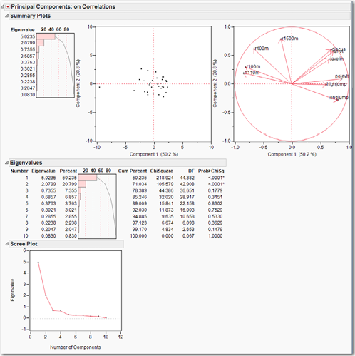
Next, let’s perform the PCA on this data set, but be sure to exclude “score”. Why? Because “score” is a combination of all the other variables! After running the PCA, in the red triangle next to Principal Components, click Eigenvalues and Scree Plot. Figure 6.7 displays the PCA summary plots, eigenvalues, and Scree Plot for the data set. The bar chart of the eigenvalues indicates that two principal components dominate the data set, contributing 70% of the variability. The Score Plot shows that almost all the observations cluster near the origin of the space defined by the first two principal components, but there is a noticeable outlier on the far left. Clicking on this observation reveals that it is observation 34, the contestant with the worst score. Examine the score column further. First, realize that the observations were sorted from highest to lowest score. Next, notice that the difference between any two successive contestants’ scores is usually less than 50, and occasionally one or two hundred points. Contestant 34, however, finished 1568 points behind contestant 33; contestant 34 certainly is an outlier.
Back to the PCA output and Figure 6.7, we can see in the Loading Plot how neatly the variables cluster into three groups. In the upper left quadrant are the races, in the upper right quadrant are the throwing events, and along the right side of the x-axis are the jumping events. With economic data, structures are rarely so well-defined and easily recognizable, as we shall see next.
Figure 6.7 PCA Summary Plots, Eigenvalues, and Scree Plot for the olymp88sas.jmp Data Set
The Stategdp2008.jmp data set contains state gross domestic product (GDP) for each state and the District of Columbia for the year 2008 in billions of dollars. Each state’s total GDP is broken down into twenty categories of state GDP, with total GDP given for each state in the second column and the total for the United States and each category given in the top row.
First, generate the correlation matrix and scatterplot matrix. The correlation matrix of the data set shows that the variables are highly correlated, with many correlations exceeding 0.9. This makes sense, because the data are measured in dollars and states with large economies.
For example, California, Texas, and New York tend to have large values for each of the categories, and small states tend to have small values for each of the categories. The fact that the data set is highly correlated suggests that the data set may have only one principal component. We encourage the reader to see this by running a PCA on the data set. Select all the numeric variables except total. Why? Try it both ways and see what happens.
The Scree plot shows that the first eigenvalue accounts for practically all of the variation; this confirms our earlier suspicion. Notice how the score plot shows almost all of the observations clustered at the origin, with a single observation on the x-axis near the value of 30. Click on that observation. What mistake have we made?
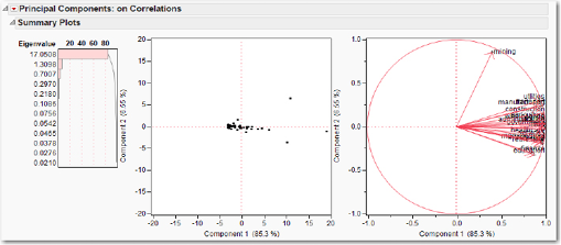
We included the “US” observation in the analysis, which we should not have done. To exclude this row from the analysis, on the JMP data table, in the list of row numbers in the first column (with the observation numbers), right-click on the first observation 1 and click Exclude/Unexclude. A red circle with a line through it should appear next to the row number. Now re-run the PCA, and the output will look like Figure 6.8. From the bar chart of the eigenvalues, we can see that the first eigenvalue dominates, but that a second eigenvalue might also be relevant. In the score plot, click on each of the three right-most data points to see that they represent NY, TX, and CA. This plot just shows us what we already know: that these are the three largest state economies. In the factor loadings plot, all the variables except mining are clustered together.
Figure 6.8 PCA Summary Plots for the StateGDP2008.jmp Data Set
To obtain a more informative plot, it might be more useful to express the data in proportional form, to show what proportion each category constitutes of the state’s total GDP. For example, the proportion of Alaska’s (AK) state GDP by agriculture is 2.368/170.14 = 0.0139. Let’s now perform the analysis again using the StateGDP2008percent.jmp data set that has the relative proportions. Examine the correlation matrix of the data set; another way of producing the correlation matrix is to run the PCA. Then click the red triangle and click Correlations. Besides the main diagonal, which has to be all ones, there are no large correlations. We can expect to find a few important principal components, not just one. Indeed, as can be seen in Figure 6.9, the bar chart of the eigenvalues shows that the first two principal components account for barely 40% of the variation. In the lower left quadrant of the score plot, we find two observations that belong to Alaska and Wyoming, which are very negative on both the first and second principal components. Referring to the data table, we see that only two states have a proportion for mining that exceeds 20%; those two are Alaska and Wyoming. If we identify the other four observations that fall farthest from the origin in this quadrant, we find them to be LA, WV, NM, and OK, the states that derive a large proportion of GDP from mining activities. In the lower right corner, is a single observation DC that gets 32% of its GDP from government.
Figure 6.9 PCA Summary Plots for the StateGDP2008percent.jmp Data Set
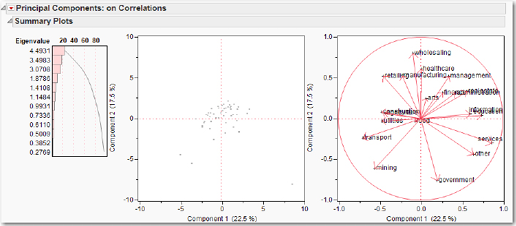
When there are only two or three important principal components, analyzing the loading plots involves looking at only 1 or perhaps 3 plots (in the former case, the first and second principal components; in the latter case, plots of first versus second, second versus third, and first versus third are necessary). For more than two important principal components, examining all the possible principal component plots becomes problematic. Nonetheless, for expository purposes let us look at the loadings plot. We see in the lower left quadrant that “transport” and “mining” both are negatively correlated with both the first and second principal components. In the lower right quadrant, “other” is negatively correlated with the second principal component but positively correlated with the first principal component, as are “services” and “government.”
While this chapter has included two examples to illustrate the use of PCA for exploring the structure of a data set, it is important to keep in mind that the primary use of PCA in multivariate analysis and data mining is data reduction, that is, reducing several variables to a few. This concept will be explored further in the exercises.
Exercises
1. Use the PublicUtilities.jmp data set. Run a regression to predict return using all the other variables. Run a PCA and use only a few principal components to predict return (remember not to include return in the variables on which the PCA is conducted).
2. Use the MassHousing.jmp data set. Run a regression to predict market value (mvalue) using all the other variables. Run a PCA and use only a few principal components to predict mvalue (remember not to include mvalue in the variables on which the PCA is conducted).