
Investigating Multivariate Continuous Data
Numerical quantities focus on expected values, graphical summaries on unexpected values.
John Tukey
Summary
Chapter 6 discusses parallel coordinate plots for studying many continuous variables simultaneously.
6.1 Introduction
Scatterplots are superb for looking at bivariate data, but they are not so effective for exploring in higher dimensions. Matrices of scatterplots are pretty good, but do not really convey what multivariate structure there might be in the data, even with interactive linking. Dimension reduction methods (principal component analysis, factor analysis, or multidimensional scaling) have their supporters, and like all graphics-related approaches can provide insights when they are appropriate for the dataset in hand. Their disadvantage is that they approximate the data, and it is difficult to assess how good the approximations are. Rotating plots, which dynamically rotate through two-dimensional projections, are a particularly flexible dimension reduction approach. They are attractive and can uncover interesting information when combined with projection pursuit indices, but are really a specialist tool.
In recent years, parallel coordinate plots have become popular for multivariate continuous data. They were discussed in depth by Inselberg, and their geometry is covered in detail in his book [Inselberg, 2009]. Wegman was the first to suggest their use for data analysis [Wegman, 1990]. Chapter 1 of [Hartigan, 1975] talks about profile plots, a very similar idea, which was inhibited in practice at the time by the computing power available. It is interesting to look at Hartigan's plots and be impressed both by what he achieved then and by how far graphics have come since.
6.2 What is a parallel coordinate plot (pcp)?
data(food, package="MMST")
names(food) <- c("Fat", "Food.energy", "Carbohyd", "Protein",
"Cholest", "Wt", "Satur.Fat")
ggparcoord(data = food, columns = c(1:7), scale="uniminmax") +
xlab("") + ylab("")
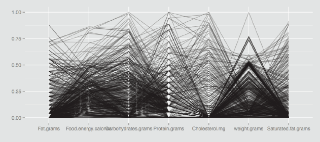
With a scatterplot, the x and y axes are perpendicular to one another. In a parallel coordinate plot all axes are parallel to one another. Each variable has its own individual vertical axis (or alternatively all the axes are horizontal) and the axis is usually scaled from the minimum to the maximum case values for the variable, so that the full range of each axis is used. The values of each case on adjacent axes are joined by lines, so that a polygonal line across all axes defines a case. Hartigan called these lines ‘profiles', and that is a good way of thinking of them. Figure 6.1 shows a pcp of the seven variables of the food dataset from the MMST package.

A parallel coordinate plot of the seven variables in the food dataset from the MMST package. There are outliers and all the distributions look skewed to the right, because most of the lines are packed into the foot of the plot. Setting scale="uniminmax" means that each variable is scaled individually from its minimum to its maximum.
The food dataset has 961 cases. The variables all look skewed to the right, as there are more lines at the bottom of the plot than at the top. One case is an extreme value on several of the variables (the line starting top left). There appears to be a small subgroup with similar sets of highish values (the group of lines close together across the first five variables).
Izenman's textbook [Izenman and Sommer, 1988] suggests dividing each food value by the serving weight of the food and Figure 6.2 shows the corresponding parallel coordinate plot (without the weight variable, of course). There are now a couple of distinct groups at high levels of the fat by weight variable. The protein by weight and the cholesterol by weight variables each have an extreme outlier.
food1 <- food/food$Wt
ggparcoord(data = food1, columns=c(1:5, 7),
scale="uniminmax", alphaLines=0.2) +
xlab("") + ylab("")

A parallel coordinate plot of the six variables in the food dataset divided by the variable weight.grams, the weight of a serving. The transformed carbohydrates variable is no longer skew and there are some distinct groups with high fat levels. Individual outliers can be seen on cholesterol and protein and a small group on saturated fat. The alpha-blending parameter alphaLines (§6.7) has been used to make the plot easier to read. Each case is plotted with a weight of 0.2, so that fully black lines represent at least 5 cases.
Parallel coordinate plots can include axes for categorical variables as well, where all cases for a particular category are assigned the same numerical value. It is advisable to avoid drawing the axes for categorical variables beside one another, as then many lines are drawn on top of one another and it is difficult to see structure.
Functions for drawing pcp's
There are several functions for pcp's in R and ggparcoord is the one primarily used in this chapter. It has a lot of options, both for what is displayed and how it is displayed, which is a good thing, because there are a lot of possible ways of drawing pcp's and these can have a big impact on what you see. As always, different people have different preferences and it is sensible to experiment a little to find out what works best for you. Just settling for the defaults is a flawed strategy, particularly when there are so many alternatives offered, but you do have to put in the work to find out what the options do and how the resulting displays should be interpreted.
Other functions listed in Table 6.1 include parcoord, which offers basic functionality including colouring, and cparcoord in gclus is a modified version of it, as is pcp. The function parallel.ade offers a scaling alternative and so does ipcp in iplots, which has the additional advantage of being interactive.
pcp functions in R
function |
package |
|---|---|
ggparcoord |
GGally |
parcoord |
MASS |
cparcoord |
gclus |
pcp |
PairViz |
parallelplot |
lattice |
parallel.ade |
epade |
ipcp |
iplots |
... |
. . . |
In fact, parallel coordinate plots really need to be interactive to be fully effective. Highlighting cases which are of interest on one axis and seeing where they appear on the other axes instantaneously is a simple and intuitive process. Specifying an appropriate condition to define the group of interest and redrawing the plot each time is laborious. Reordering axes on the fly is more effective than writing out the necessary function and drawing the plot again. A good strategy is to use a tool like ipcp initially to ascertain what information is of interest and how you want to display it, and then draw the chosen plot using your favourite static pcp function.
6.3 Features you can see with parallel coordinate plots
[Wegman, 1990] suggested that it is possible to identify many different multivariate features in parallel coordinate plots. This can be true in particular applications, but in general the claim is too optimistic. What is definitely true is that having identified outliers, correlations, or clusters with analytic approaches, parallel coordinate plots are very useful for checking the results.
Parallel coordinate plots give quick overviews of univariate distributions for several variables at once: whether they are skew, whether there are outliers, whether there are gaps or concentrations of data (all of these can be seen in Figures 6.1 and 6.2). Bivariate associations between adjacent variables can sometimes be seen and occasionally some multivariate structures, such as groups of cases with very similar values across a number of variables or cases which are outliers on more than one variable (as in Figure 6.1). These patterns are best checked and investigated further by colouring the group of interest. Figure 6.3 shows an example for the food dataset, drawn horizontally this time using coord_flip. Note that the cases have been reordered to ensure that the selected cases are drawn last, so that those lines are on top.
food1 <- within(food1,
fatX <- factor(ifelse(Fat > 0.75, 1, 0)))
ggparcoord(data = food1[order(food1$fatX),],
columns=c(1:5, 7), groupColumn="fatX",
scale="uniminmax") + xlab("") + ylab("") +
theme(legend.position = "none") + coord_flip()

A parallel coordinate plot of the six variables in the food dataset divided by serving weight. The two subgroups with high values of fat per serving have been selected using the derived variable fatX. As expected, some of these cases have the highest values for saturated fat. This is another version of Figure 6.2.
Wegman and others have suggested riffling through sufficient reorderings of the axes to observe all possible adjacencies. In a similar vein, [Hurley and Oldford, 2010] proposed adding extra copies of axes to include all the adjacencies. If your main aim is to look for bivariate associations, then you are better off with scatterplots. There is an example in Figure 6.2 where it looks as if the transformed carbohydrates and protein variables may be negatively correlated because of the lines crossing to form an ‘X' shape. In fact the correlation is only -0.087, although the relationship between the variables is worth looking at for other reasons, as Figure 6.4 shows.
ggplot(food1, aes(Protein, Carbohyd)) + geom_point()

A scatterplot of carbohydrate and protein values standardised by serving weight. Most of the points have low protein values, and there are quite a few foods with either no protein or no carbohydrates. The apparent diagonal boundary is determined by foods composed of almost only protein and carbohydrates.
Fisher's iris dataset has been used so often as an example for so many statistical approaches, including in this book, because it makes for such an excellent illustration. In a pcp of the data in Figure 6.5 you can see how clearly the setosa species is separated from the other two species on the petal measurements, how it is lower on three of the measurements, but higher on Sepal.Width, where there is also a setosa outlier, how the two petal measurements almost separate the other two species, and how additionally there are two unusual virginica values on Sepal.Width.
ggparcoord(iris, columns=1:4, groupColumn="Species")
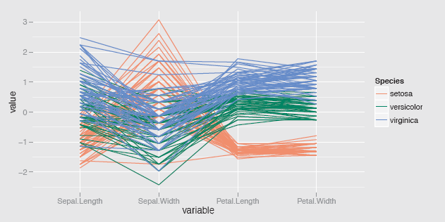
A parallel coordinate plot of the four variables in the iris dataset coloured by species and using the ggparcoord default scaling, standardising by the mean and standard deviation. The petal measurements separate the groups well and there is evidence of cases which are a little different from the rest of their species.
There is no guarantee that a pcp will reveal interesting information about a dataset or indeed any information. That applies to all graphics. What can be said is that when graphics can be drawn so quickly and easily it is worth checking them out to see what information they do reveal.
6.4 Interpreting clustering results
Cluster analysis is a popular data analysis tool, although most of the methods have little statistical basis and results are judged more by what users want to do with them than by any statistical approach. Even if some well-separated clusters are obtained, you still need to find a way of describing them and that means working out for which variables or groups of variables they differ from one another and how. A productive first step is to compare the clusters graphically with a parallel coordinate plot in which the clusters are given different colours.
Figure 6.6 is a pcp of the USArrests dataset from 1973, coloured by the three clusters found with an average link clustering, the first example on the hclust help page. The Assault variable separates the clusters, and the reason becomes obvious if you draw the same plot with the option scale=“globalminmax”, which puts all the variables on a common scale: Assault has a much higher range of values than the other three variables, so it dominates the multivariate distance calculations.
hcav <- hclust(dist(USArrests), method="ave")
clu3 <- cutree(hcav, k=3)
clus <- factor(clu3)
usa1 <- cbind(USArrests, clus)
ggparcoord(usa1, columns=1:4, groupColumn="clus",
scale="uniminmax", mapping = aes(size = 1)) +
xlab("") + ylab("") +
theme(legend.position = "none")

A parallel coordinate plot of the USArrests dataset. The three clusters found with an average linkage clustering have been coloured. The clusters are defined by the Assault variable, as can be seen by the clear separation of the three colours on that variable. The size parameter has been used to make the lines thicker.
A clustering using the variables more equally could be carried out using dist(scale(USArrests)) in hclust, as Figure 6.7 shows. The Assault variable still separates the clusters fairly clearly on its own, but now there are only two main clusters, not three, as one cluster is a state on its own. Because the dataset is small, you can list the cluster members or draw a dendrogram with plot(hcav2) to identify the outlying state as Alaska.
hcav2 <- hclust(dist(scale(USArrests)), method="ave") clu32 <- cutree(hcav2, k=3)
clus2 <- factor(clu32)
usa2 <- cbind(USArrests, clus2)
ggparcoord(usa2, columns=1:4, groupColumn="clus2",
scale="uniminmax", mapping = aes(size = 1)) +
xlab("") + ylab("") +
theme(legend.position = "none")

A parallel coordinate plot of the USArrests dataset drawn using scaled variables and average linkage clustering. The three cluster solution is now more of a two cluster solution with one outlying case (which turned out to be Alaska).
Most applications in practice are not this simple and there is an extensive range of additional clustering approaches as well as alternative distance measures that might be used instead. The key point to remember is that whatever clustering method you use it is valuable to explore the results you obtain graphically rather than just accepting them without any further investigation.
6.5 Parallel coordinate plots and time series
Time series are a special kind of data and demand special treatment. There is plenty of support in R for analysing and displaying time series, outlined in the relevant Task View, TimeSeries [Hyndman, 2013]. Interestingly, some time series can also be plotted as pcp's. Since this sheds light on both pcp's and time series, it is worth looking at briefly.
If data are recorded at regular intervals, multiple series can be displayed simultaneously in a pcp with each axis being one of the time points. Even if the data are recorded irregularly, a pcp can still be used, provided that all series have been recorded at the same times, although you have to bear in mind the distortion of the time axis when interpreting any resulting patterns. As data are usually recorded every day, every month, or every year, this is not often an issue. What is an issue is that the time points have to be in the columns and the series in the rows, which either requires a transposition of the data, or, if there are different sets of series, some data reorganisation. This can be seen in the code needed for Figure 6.8, where reshape's melting and casting have been used. Note that it is essential in plotting time series to use a common scaling for all axes (hence the choice of the scale option) and that you cannot change the order of the axes because the time ordering is given. In the parcoord default implementation any series with any missing values are completely excluded.
Figure 6.8 shows an example of acres of corn planted in states of the United States over the past 150 years or so. The sharp rise for five states in the 19th century, the dips at the time of the Depression in the 1930s and in the early 1980s, and various unusual individual patterns are all visible. Identifying the individual states is not so easy, using an interactive tool like ipcp in iplots is better for that. It turns out that Kansas was one of the early ‘big' states but declined erratically; Nebraska had the steepest fall, but also some large increases; Iowa and Illinois were always ‘big'.

A pcp of the acres of corn planted by US states from 1866 to 2011 from the nass.corn dataset in the agridat package. Only the states with more than 250,000 acres planted in 2011 and no missing values are included. Setting scale="globalminmax" means the same scaling is used for all variables. Several interesting patterns can be seen, as discussed in the text.
Colours were assigned by default alphabetically, which is why Iowa and Illinois look alike. No legend was included to allow more space for the display. This is typical for initial exploratory graphics, first check to see if there is anything worth studying in more detail, then invest time in improving the plot.
Plotting many time series together gives a rapid overview, highlighting general trends (if there are any) and picking out series which follow different patterns to the rest. As always there is no guarantee that a particular graphic will provide immediate information, perhaps there are no notable features to be found. What can be guaranteed is that being able to draw a range of plots quickly is an effective way of gaining first insights into a dataset.
library(reshape2);(nass.corn, package="agridat")
c1 <-melt(nass.corn, id=c("year", "state"))
c1 <-within(c1, StateV <- interaction(state, variable)); c2 <- dcast(c1, StateV~year)
ggparcoord(subset(c2[1:48,], c2[1:48,147]> 250000), columns=2:147, groupColumn="StateV",
scale="globalminmax") +xlab("Year") +ylab("Acres") +
scale_x_discrete(breaks=seq(1865, 2015, 10)) + theme(legend.position = "none")
A possible advantage of the pcp view is that it is trivial to switch to a cross-sectional view. Have a look at Figure 6.9, where the only changes to the ggparcoord function for Figure 6.8 are the addition of boxplots and the use of alpha-blending to downplay the lines. It is now possible to see that two of the states were individual high outliers almost every year. The long-term trend for the states as a group, represented by the median, can be seen, which is not readily possible in Figure 6.8. The years where many states planted lower numbers of acres are also easier to pick out. Cross-sectional views are useful when we are interested in the distributions of values at particular time points and enable us to make rough judgements as to when individual series may be considered as outliers compared to the rest or not.

A parallel boxplot of the nass.corn data as specified Figure 6.8. The median trend of the number of acres planted by state can be seen. It is also observable that two states (Iowa and Illinois) are outliers almost every year
The cross-sectional view is also useful for aligning series in different ways (cf. §6.7). Parallel coordinate plots may not be the best option for displaying time series, but they are often a pretty good one. The time series examples illustrate how the number of axes can be very high and yet pcp's can still convey useful information.
ggparcoord(subset(c2[1:48,], c2[1:48,147]> 250000), columns=2:147, groupColumn="StateV",
scale="globalminmax", boxplot=TRUE, alphaLines=0.5) + xlab("Year") + ylab("Acres") +
scale_x_discrete(breaks=seq(1865, 2015, 10)) + theme(legend.position = "none")
6.6 Parallel coordinate plots for indices
Index values are weighted combinations of the values of their components. Stock market indices are used to represent performances of groups of shares and the consumer price index summarises prices across a wide range of products. Both of these indices are time series, and an obvious graphic display is to overlay the index series in bold on top of the series for the separate components. If a pcp is used for this, then the axes are time points and the cases are the components. Alternatively, indices can be constructed in the same way for different individuals and these individuals can be compared by the single index value and additionally by the component values for each one. In this situation a pcp can be drawn with one axis for the index itself and separate axes for each of the components. The cases are then the individuals and the polygonal lines are their profiles.
The dataset uniranks in the package GDAdata is an example of this kind of data. 120 universities in the UK were ranked using a combination of eight criteria [Guardian, 2013]. The AverageTeachingScore is the overall index and the criteria are the components. Figure 6.10 is a pcp of the data with the variable StudentStaffRatio inverted to a staff:student ratio, so that higher values mean a higher overall score for the university. The vertical axis scale has been removed, since it just goes from the minimum to the maximum for each variable, and there might be a temptation to interpret a (0,1) scale.

A pcp of the uniranks dataset from the GDAdata package. Three poorly performing universities had at least one missing value on one of the variables and have been excluded. There are a number of outliers and some of the measures are skew.
A number of features can be seen. High values on the first axis, the index, are mostly associated with high values on the other variables, although not necessarily strongly, and there are clear exceptions (for instance, the third-ranked university has a relatively low value for NSSTeaching). The gaps for the three NSS variables reflect limited numbers of possible values for those variables. The up and down pattern for the last few variables is probably due to their being skewed in different directions rather than to any negative association. There are several cases which seem extreme compared to the others on single variables, and there appear to be some bivariate outliers as well, where individual lines go against the trend between two axes.
Plots of this kind are most effective when some individuals or groups are identified by colour. This works best interactively, when selections can be made directly on the graphic and redrawing occurs immediately. With static graphics you need to define a variable to specify the selection you want. If the selection is data-driven, for instance depending on what you see in a first plot, then coding is necessary. If you are interested in predefined groups it is easier and one option could be a trellis display of pcp's. Figure 6.11 shows an example where one of the groups of universities has been picked out.
data(uniranks, package="GDAdata")
names(uniranks)[c(5, 6, 8, 10, 11, 13)] <- c("AvTeach", "NSSTeach", "SpendperSt", "Careers",
"VAddScore", "NSSFeedb")
uniranks1 <- within(uniranks, StaffStu <- 1/(StudentStaffRatio))
ggparcoord(uniranks1, columns=c(5:8, 10:14), scale="uniminmax", alphaLines=1/3) +
xlab("") + ylab("") + theme(axis.ticks.y = element_blank(), axis.text.y = element_blank())

The uniranks dataset with the Russell group selected in red. These universities scored well in general, although not on NSSFeedback. The code shows that a new variable specifying the Russell group universities was derived and then used to sort the cases (the first order). The order of the variables (columns) was specified by the second order.
The Russell group is made up of 24 of the top UK universities. In Figure 6.11 they have been coloured red to highlight them. The order of the axes has also been changed, based on what the variables represent, so that it now starts with EntryTarif and ends with CareerProspects. On all variables bar one, NSSFeedback, the Russell group have good scores. There is one high-ranking university (St. Andrews, 4th), which is not a member of the Russell group and one, Exeter, with a relatively poor staff:student ratio.
uniranks2 <- within(uniranks1,
Rus <- ifelse(UniGroup=="Russell", "Russell", "not"))
ggparcoord(uniranks2[order(uniranks2$Rus, decreasing=TRUE),],
columns=c(5:8, 10:14),
order=c(5,12,8,9,14,6,13,7,11,10),253
groupColumn="Rus", scale="uniminmax") +
xlab("") + ylab("") +
theme(legend.position = "none",
axis.ticks.y = element_blank(),
axis.text.y = element_blank()) +
scale_colour_manual(values = c("red","grey"))
6.7 Options for parallel coordinate plots
When the pcp is interactive, so that cases can be selected and highlighted, then more information can be uncovered. With static graphics it is necessary to use drawing options in various combinations to get at the information.
Alignment
Instead of aligning the variables by their minimum and maximum values, they can be aligned by their mean or median with a corresponding adjustment to the minimum and maximum limits. This permits comparing the variability across variables better. A particularly instructive example arises in plotting the detailed results from the Tour de France cycle race. A selection of parallel coordinate plots has been used for this on the ‘Statistical graphics and more' blog ([Theus, 2013]) for a number of years to present the Tour de France results.
The median time for any stage will represent the time taken by the main bunch of riders, the peloton. This gives a sensible standard against which to judge each rider's performance. On the other hand, it is also informative to align each stage to the time taken by the overall winner of the Tour, as it is immediately apparent on which stages other riders gained time on him. ggparcoord provides an option for specifying alignment, although only in conjunction with individual scaling of the axes (scale="center" or "centerObs"). This means that for a comparison of variabilities on a common scale, you have to transform the data first by subtracting the centering statistic.
The following code shows an example for the nass.corn dataset from §6.5 aligning to the mean:
mz <- as.data.frame(apply(c2[1:48,2:147], 2,
function(x) x - mean(x,na.rm=TRUE)))
StateV <- c2[1:48,1]
mzA <- as.data.frame(cbind(StateV, mz))
ggparcoord(mzA, columns=2:147, scale="globalminmax",
groupColumn="StateV") +
xlab("Year") + ylab("Acres") +
scale_x_discrete(breaks=seq(1865, 2015, 10)) +
theme(legend.position = "none")
Scaling
Whenever you want to compare measurements of different kinds you have to find some way of putting them on an equivalent scale. This also arises with other multivariate displays (as will be discussed in §8.3) and with time series (§11.3). There is a surprising number of alternative standardisations you can use and it is as well to think carefully about which one is most appropriate. At any rate, you should always make clear which one you have used, if you present displays to others, and you should equally always check what has been used when interpreting graphics prepared by someone else.
The traditional default scaling for pcp axes depends on the respective minimum and maximum values for each variable. In effect, the vertical scale is drawn from 0 (minimum) to 1 (maximum). (Note that this is not the default scaling used by ggparcoord, which uses the standardised scaling mentioned below.) The basic transformation for case i of variable j is
yij=xij−minixijmaxixij−minixij
It is not obligatory to scale the variables individually, and if all variables have equivalent measurement scales it may make sense to put them on a common scale. This would apply if you had exam marks for students for several different subjects. You could then scale all the axes from 0 to 100 (if those were the possible minima and maxima) or from a suitable rounded figure below the minimum across all exams to a rounded figure above the maximum across all exams.
Another approach is to standardise each variable, using either the standard deviation or the IQR (interquartile range), a robust measure of variability. For instance,
zij=xij−ˉxjsd(xj)
Figure 6.12 displays four different scalings for the body dataset from the gclus package. (The variable names have been abbreviated to prevent text overlapping.) Each plot emphasises different aspects and each has a correspondingly different vertical scale.

Four pcp’s of the 24 measurements for the 507 men and women in the body dataset, each with a different scaling. Top left, the data for each variable have been standardised; top right, each variable has been transformed to a min-max scale individually; lower left, the variables have all been transformed to the same min-max scale; and in the lower right panel the variables have been standardised individually and centred on their medians. Interpretations are discussed in the text.
In the top left panel the outliers on individual variables are picked out. In the top right panel the outliers are still visible and you can see different distributional shapes. In the lower left panel the different value ranges of the variables are emphasised and you get some idea of what scales there are and which variables have similar scales. The display in the lower right panel suggests some possible clusters and offers a different view of the outliers.
data(body, package="gclus")
body1 <- body
names(body1) <- abbreviate(names(body), 2)
names(body1)[c(4:5, 11:13, 19:21)]
c("CDp", "CD", "Ch", "Ws", "Ab", "Cl", "An", "Wr")
a1 <- ggparcoord(body1, columns=1:24, alphaLines=0.1) +
xlab("") + ylab("")
a2 <- ggparcoord(body1, columns=1:24, scale="uniminmax",
alphaLines=0.1) + xlab("") + ylab("")
a3 <- ggparcoord(body1, columns=1:24,
scale="globalminmax", alphaLines=0.1) +
xlab("") + ylab("")
a4 <- ggparcoord(body1, columns=1:24, scale="center",
scaleSummary="median", alphaLines=0.1) +
xlab("") + ylab("")
grid.arrange(a1, a2, a3, a4)
Outliers
If a variable has outliers, then the rest of the data has to be squeezed into a small section of the variable's axis. Graphics are not robust against univariate outliers. If a form of common scaling is used for a pcp, then this effect is even more restrictive, as one variable with outliers affects the scale for all. While a pcp of the raw data emphasises the outliers, you may want to redraw the plot without them. The code for three alternatives is given below: removing the cases with any outliers, trimming all outlier values to the chosen limits, restricting the plot to the chosen limits.
This code uses the outer fences of boxplots to define outliers, which means they have to be further away from the hinges than three times the IQR. You could use any limits you prefer (and can justify). In each case a function is written to transform the data and applied to the variables to be plotted. Only the first display is shown.
- Remove the cases with outliers (Figure 6.13)
With 7 variables from the food dataset, this resulted in 260 of the 961 cases being excluded, reflecting just how skew the data are. Without the outliers, you can observe regular gaps on the axes for both the fat and protein variables, suggesting a limited discrete range of possible values. Given the large number of cases excluded, it would be unwise to draw too many conclusions. This approach works better when there are only a few outliers to be excluded.
fc <- function(xv) {
bu <- boxplot(xv, plot=FALSE)$stats[5]
cxv <- ifelse(xv > bu, NA, xv)
bl <- boxplot(xv, plot=FALSE)$stats[1]
cxv <- ifelse(cxv < bl, NA, cxv)}
data(food, package="MMST")
rxfood <- as.data.frame(apply(food,2,fc))
ggparcoord(data = rxfood, columns = c(1:7),
scale="uniminmax", missing="exclude",alphaLines=0.3) + xlab("") + ylab("")
- Trim all outliers to the chosen limits
fb <- function(xv) {
bu <- boxplot(xv, plot=FALSE)$stats[5]
rxv <- ifelse(xv > bu, bu, xv)
bl <- boxplot(xv, plot=FALSE)$stats[1]
rxv <- ifelse(rxv < bl, bl, rxv)}
data(food, package="MMST")
rfood <- as.data.frame(apply(food,2,fb))
ggparcoord(data = rfood, columns = c(1:7),
scale="uniminmax", alphaLines=0.3)This plot includes all the cases, but 260 of them have been trimmed to the outer hinges of at least one of the variables. It is top-heavy at the outer limits when there are lots of outliers and all the outliers at each end of a variable are plotted together.
- Restrict the plot to the chosen limits
fd <- function(xv) {
bu <- boxplot(xv, plot=FALSE)$stats[5]
bl <- boxplot(xv, plot=FALSE)$stats[1]
dxv <- (xv - bl)/(bu - bl)}data(food, package="MMST")
rofood <- as.data.frame(apply(food,2,fd))
ggparcoord(data = rofood, columns = c(1:7)) +
coord_cartesian(ylim=c(0,1))
Lines going off the top and bottom of the plot are connections to outliers outside the range of the plot. For this dataset, with so many outliers, it is not an effective display.
Each of the three approaches defines cases as outliers, which are outlying on at least one of the variables. The more variables there are, the larger the number of cases which may be regarded as outliers. Cases which are multivariate outliers, but not univariate outliers, are not excluded, because they do not affect the plot scales.
As always when dealing with outliers, these are subjective decisions that need to be considered with care. A further alternative would be to transform the variables with outliers. Sometimes a log transformation can be helpful, although you have to watch for negative values and there may still be outliers even after a transformation. You can see this in Figure 6.2, where an attempt was made to standardise the variables using the serving weight variable. Note that a linear transformation of a variable has no effect on its display in a default pcp, but could affect its display if outliers are taken account of in some way.
Variable order
Any multivariate display is affected by the order of the variables, and default alphabetic orders can be less than informative. In Figure 6.11, the order was manually specified to better match the progression of students through the university. ggparcoord has an option, order, offering a variety of data-driven alternatives, all of which use scale-free statistics. One approach is to order the axes by the F statistics from analyses of variance based on a grouping variable.
body1$Gn <- factor(body1$Gn)
ggparcoord(body1, columns=1:24, scale="uniminmax",
alphaLines=0.4, groupColumn="Gn",
order="allClass") + xlab("") + ylab("") +
theme(legend.position = "none",
axis.ticks.y = element_blank(),
axis.text.y = element_blank())
In Figure 6.14 the cases of the body dataset have been ordered and coloured by gender, while the variables have been ordered by F statistics. This static image shows that the variables on the left discriminate clearly between men and women (the men always having higher values) and that there are some outliers, such as the woman with very high values on four variables in a row or the man with the smallest measurement on An (ankle girth). It suffers badly from overplotting for the variables where the genders overlap. Two graphics would be better, one for women with men in grey in the background and one for men with women in grey in the background. A trellis plot would draw only the men in one plot and only the women in the other. Plotting the other gender in the background maintains context and simplifies keeping the scales the same. Figure 6.15 shows the results. It is necessary to order the cases to have the selected group plotted on top. The colours have been chosen to agree with the colours used in Figure 6.14.

The body dataset with variable axes ordered by differences between the genders as measured by F statistics. Women are in red. Forearm and shoulder measurements have the highest F values.
a <- ggparcoord(body1[order(body1$Gn),], columns=c(1:24),
groupColumn="Gn", order="allClass",
scale="uniminmax") + xlab("") + ylab("") +
theme(legend.position = "none",
axis.ticks.y = element_blank(),
axis.text.y = element_blank()) +
scale_colour_manual(values = c("grey","#00BFC4"))
b <- ggparcoord(body1[order(body1$Gn, decreasing=TRUE),],
columns=c(1:24), groupColumn="Gn", order="allClass",
scale="uniminmax") + xlab("") + ylab("") +
theme(legend.position = "none",
axis.ticks.y = element_blank(),
axis.text.y = element_blank()) +
scale_colour_manual(values = c("#F8766D","grey"))
grid.arrange(a,b)

pcp’s of the body dataset for men (above) and women (below) with the cases for the other gender drawn in grey in the background. Compare with Figure 6.14, where overplotting is an issue, particularly for the variables to the right. Outliers by sex are now much more apparent.
m2 <- apply(body[, 1:24], 2, median, na.rm=TRUE)
m2a <- order(m2)
ggparcoord(data = select(body, -Gender), alphaLines=0.3,
scale="globalminmax", order=m2a) + coord_flip()
If you want to sort the variables by a statistic, such as the mean, the IQR, or the maximum, which is not scale-free, you have to specify the order yourself. Figure 6.16 shows an example using the body dataset again, sorting by the median of the raw data and presenting all variables on the same scale.

A pcp of the body dataset with the variables sorted by their median values. All variables are on the same scale. In general the variability increases with higher values, especially for the top few variables. The variable in the middle with relatively high variability is Age (which is a different kind of measurement).
If the sorting should only be done on a statistic for a particular subset of the cases, use the appropriate subset in the calculation of the statistic. The following code has been modified to use only the subset for which Age < 30 in specifying the order:
m3 <- apply(body1[body1$Ag < 30, 1:24], 2, median, na.rm=TRUE)
You will then probably want to emphasise the subset used for sorting using colour (cf. §6.7 below).
These sortings are not scale-free and have been carried out on the original data. This is fine if the original variables have comparable scales, but not always advisable otherwise. To sort on comparable scales, you have to convert the data yourself first as in §6.7 or, if the transformation you want is one of the options available in ggparcoord, use that function to do the work.
For instance, in Figure 6.17 the code orders the pcp axes by the maximum value of the variables standardised by subtracting the mean and dividing by the standard deviation. First of all a pcp of the variables in default order is prepared with that transformation. Then the transformed data are extracted from the plot using a reshape2 function and ordered. Finally, the pcp with the desired ordering is produced.
B1 <- ggparcoord(data = body1, columns=c(1:24), scale="std")
B2 <- acast(B1$data[,c(1,3,4)], .ID ~ variable)
m4 <- apply(B2, 2, max, na.rm=TRUE)
m4r <- order(m4)
ggparcoord(data = body1, alphaLines=0.3,
columns=c(1:24), scale="std", order=m4r)

A pcp of the body dataset with the variables sorted by their maximum values after standardisation by mean and standard deviation. Possible outliers are easier to see, particularly the case that is outlying on the two rightmost variables.
Sorting is a surprisingly powerful tool for data analysis, whether you sort variables or cases or both. Ideally, it should be easier to do for parallel coordinate plots. That would mean presenting a limited range of alternatives in a simple structure and might not cover all the options we would like to have. This is a topic that deserves further thought.
Formatting
Formatting includes another raft of choices and only some are listed here. Mundane decisions like the choice of window size, labelling the axes, or where to put a legend, can all affect what you can see in a display. While this is true for any graphic, it is more important for pcp's, which sometimes need all the window width they can get.
Type of display The standard pcp represents cases by polygonal lines. The individual points can be plotted on each axis with the option showPoints=TRUE. This is useful for datasets with few cases; otherwise it only increases the clutter in an already densely packed display. Another option is to plot boxplots for each variable with boxplot=TRUE. This can give a feel for the distributions of the variables, especially when there is a large number of cases. Alpha-blending, discussed below, can be used to hide the lines completely or to downplay the lines enough for the boxplots to stand out, while still enabling the lines to convey useful information (cf. Figure 6.9). If the lines are hidden completely, the plot looks like a collection of individual boxplots, just as you might get from drawing boxplots of one variable for different subsets of a dataset. In a pcp boxplot, each case appears in each boxplot, while in a boxplot by subset, each case generally appears only once in the whole plot.
Missings The default in ggparcoord is to exclude cases with any missings. That can lead to too many cases being dropped. Other options are to impute missing values. Omitting profile sections for which one end point is missing is not currently possible. As ggparcoord decides which cases to exclude after scales are calculated, not before, a case not shown may have determined the scale used.
Aspect ratio Parallel coordinate plots are best drawn wide and moderately high. The appropriate window size depends on the number of variables plotted and the structure of the data. As usual, it is worthwhile experimenting interactively with a few different sizes to see what information is revealed.
Orientation Drawing pcp's horizontally rather than vertically offers the advantage of writing variable names horizontally one above the other, so that no problems arise with overlapping text. An example was shown in Figure 6.3. It is more common to draw pcp's vertically.
Lines Lines can be reformatted in several ways. In principle, their thickness can be varied. In practice, given the large number of lines, they should always be very thin. The most important formatting effects are colour and alpha-blending.
Colour Lines can be coloured in groups by a factor variable or on a continuous shading scale by a numeric variable. Figure 6.18 shows examples of both. In the upper plot, a new binary variable was created to label the 16 Boston areas having the maximum medv value of 50 as ‘High', and the lines are coloured accordingly. In the lower plot, the lines are coloured according to the case values of medv, the median housing value for each area. The cases in the upper plot are ordered to ensure that the group of interest is drawn last.
data(Boston, package="MASS")
Boston1 <- within(Boston,
hmedv <- factor(ifelse(medv == 50,"Top", "Rest")))
Boston1 <- within(Boston1, mlevel 7- ifelse(medv==50,1,0.1))
Boston1 <- within(Boston1, medv1 <- medv)
a <- ggparcoord(data = Boston1[order(Boston1$hmedv),],
columns=c(1:14), groupColumn="hmedv",
scale="uniminmax", alphaLines="mlevel",
mapping = aes(size = 1)) + xlab("") + ylab("") +
theme(axis.ticks.y = element_blank(),
axis.text.y = element_blank())
b <- ggparcoord(data = Boston1, columns=c(1:14),
groupColumn="medv1", scale="uniminmax") +
xlab("") + ylab("") +
theme(axis.ticks.y = element_blank(),
axis.text.y = element_blank())
grid.arrange(a,b)

Plots of the Boston dataset with cases coloured by the variable medv, the median home value. In the upper plot, the 16 cases with a value of 50 have been coloured differently and drawn last, so that none of the other 490 cases in the dataset are drawn on top of them. The other cases have been downplayed by using alphablending, and all cases have been drawn with a thicker line to help the selected group stand out better. The group differs a little from the rest, but perhaps not as clearly as might have been thought beforehand. In the lower plot, the cases are shaded by their value on the variable medv, an interesting idea technically, although not one that seems to work well for this application.
Alpha-blending Parallel coordinate plots suffer from overplotting. If you display ten variables for 5,000 cases, then you need 50,000 points and 45,000 line segments. Alpha-blending can be used to lessen the problem, although how much it succeeds in solving it depends on the dataset and on what information is contained in it. The option alphaLines in ggparcoord can be used, as we have seen already in Figure 6.2 and Figure 6.10.
To make some groups stand out more than others, ggparcoord offers the possibility of applying a user-specified variable in which the level of alpha-blending can be set for each case individually. Figure 6.19 shows a pcp of the Boston dataset in which the 132 cases with the maximum value of rad have been coloured differently and the other cases have been drawn with an alpha-blending value of 0.1. The order of the variables has also been changed using the ggparcoord option order.
Boston1 <- Boston1 %>% mutate(
arad = factor(ifelse(rad < max(rad), 0, 1)),
aLevel = ifelse(rad < max(rad), 0.1, 1))
ggparcoord(data = Boston1, columns=c(1:14),
scale="uniminmax", groupColumn= "arad",
alphaLines="aLevel", order="allClass") +
xlab("") + ylab("") +
theme(legend.position = "none",
axis.ticks.y = element_blank(),
axis.text.y = element_blank())

A pcp of the Boston dataset. The cases with the highest value of rad (index of accessibility to radial highways), have been given a different colour and the remaining cases have been de-emphasised using alpha-blending. The order of the variables has been changed to accentuate the differences between the two groups of cases. Interestingly, the five variables in which the max(rad) cases all have the same value, rad, tax, ptratio, zn, and indus, are not placed together. They also have lower values for dis, higher values for crim, tend to have higher values for age, and, with a few exceptions, have lower values for medv.
6.8 Modelling and testing for multivariate continuous data
- Outliers
As discussed several times in the book, there are no fully satisfactory ways of testing for outliers and you need to consider the individual cases or try some robust approach. If cases are outliers on several variables at once, then that is some evidence for viewing them with suspicion. Interactive graphics are the best approach here, as the order of variables in a pcp determines whether you can recognise such outliers.
- Regular gaps in the distribution of a variable
Regular gaps can be due to a measurement feature. For instance, if decathlon performance data are plotted, both the high jump and pole vault events will have gaps, since only certain performances are possible.
- Clusters of cases
Occasionally certain groups of cases stand out as having very similar values across a set of variables. This might be tested by comparing that group's means with the rest or by comparing the multivariate distance of the group from the rest.
- Separated groups
Sometimes there are clearly separated groups on particular variables. Whether this means anything depends on the values those cases take on other variables, especially categorical ones. Linear models can be useful in assessing the features.
6.9 Parallel coordinate plots and comparing model results
With the computing power that is available nowadays it is becoming more and more common to consider large numbers of models in an analysis. If many different models are fitted to a dataset, it can be a complex matter to compare all the results. Model fitting statistics such as AIC offer a quick filtering mechanism, but are not informative enough for in-depth comparisons. A number of visualisation approaches have been proposed including using a range of parallel coordinate plots to aid the comparisons [Unwin et al., 2003]. Apart from plotting the raw data variables, they suggest plotting the t statistics for comparable parameter estimates with one axis per parameter, and plotting the residuals both by model and by case.
Main points
- Parallel coordinate plots are a powerful multivariate display, showing all continuous variables at once (e.g., Figures 6.1 and 6.10).
- There are many pcp display options in addition to the usual formatting options applicable to other graphics: the choice of variables, the order of variables, what scaling is used, and how the axes are aligned (§6.7).Choosing good options is important. Figures 6.14 and 6.19 give examples.
- pcp's are helpful for exploring and evaluating the results of analyses such as discriminant or cluster analyses (cf. Figure 6.6). They are also useful for checking multivariate outliers, which will be further discussed in §9.3.
- pcp's are an alternative means for presenting multiple regularly spaced time series and offer the option of a cross-sectional view of the series (§6.5 and Figure 6.9).
- pcp's are informative for displaying indices and their component parts together (§6.6).
- You may need to draw several pcp's to uncover the different features in a dataset and other graphics will be useful as well (e.g., the various displays of the food dataset in Figures 6.1 to 6.4).
Exercises
- Swiss
The dataset swiss contains a standardized fertility measure and various socioeconomic indicators for each of 47 French-speaking provinces of Switzerland in about 1888. It was already used in Exercise 6 in Chapter 1.
- (a) Draw a parallel coordinate plot of all six variables.
- (b) Are there any cases that might be outliers on one or more variables?
- (c) What can you say about the distribution of the variable Catholic?
- (d) Construct a new variable with values ‘High' for all provinces with more than 80% Catholics and ‘Lower' for the rest. Draw a pcp coloured by the groups of the new variable. How would you describe the provinces with a high level of Catholics?
- Pottery
The package HSAUR2 includes a dataset on the chemical composition of Romano-British pottery, pottery, with 45 cases and 10 variables.
- (a) Draw a pcp of the nine composition variables. What features can you see?
- (b) Make a new variable with the cases with low values on MgO. How are these cases different from the rest on the other variables?
- (c) Colour your original pcp using the site information, kiln. Which kilns can be easily distinguished from the others using which variables?
- Olive oils
The olive oils dataset was introduced in Exercise 8 of Chapter 5.
- (a) Draw a default parallel coordinate plot and describe the various features you can see.
- (b) Draw the same plot and additionally colour the oils by the region they come from. What additional information can you find?
- (c) Discuss which features of the dataset are easier to see with a pcp and which are easier to see with a scatterplot matrix.
- Cars
The dataset Cars93 was introduced in §5.4. Draw a pcp of the nine variables Price, MPG.city, MPG.highway, Horsepower, RPM, Length, Width, Turn.circle, and Weight.
- (a) What conclusions would you draw from your plot?
- (b) What plot would you draw to compare US cars with non-US cars on these variables? What does the plot tell you about the differences between US cars and the others?
- (c) Is a pcp with unimax scaling informative? Try colouring it by the factor variable Cylinder to gain additional insight.
- Bodyfat
The dataset bodyfat is available in the MMST package. It provides estimates of the percentage of body fat of 252 men, determined by underwater weighing, and body circumference measurements. The dataset is used as a multiple regression example to see if body fat percentage can be predicted using the other measurements. Draw a parallel coordinate plot for the dataset.
- (a) Are there any outliers? What can you say about them?
- (b) Can you deduce anything about the height variable?
- (c) What can you say about the relationship between the first two variables, density and bodyfat?
- (d) Do you think the ordering of the variables is sensible? What alternative orderings might be informative?
- Exam marks
In the package SMPracticals, there is a dataset mathmarks with the marks out of 100 in five subjects for 88 students. The dataset is fairly old, first appearing in the statistical literature in [Mardia et al., 1979] and it was used in an example at the end of §5.6. It is interesting to note that all students had marks in all subjects. Possibly students who missed an exam were excluded.
- (a) Explore the dataset using pcp's. What information can you uncover and which pcp would you use to present your results to others?
- (b) Apparently the first two exams (mechanics and vectors) were closed book, while the other three were open book. Draw a pcp with boxplots to see if there is evidence that the students got lower marks on closed-book exams. Is it useful to superimpose the polygonal lines (possibly using alpha-blending) or not?
- Wine
The wine dataset can be found in the packages gclus, MMST, pgmm, and rattle. They took the data from the UCI Machine Learning Repository [Bache and Lichman, 2013]. The original source is an Italian software package [Forina et al., 1988]. The version in pgmm has about twice as many variables as the others, and the version in MMST includes the names of the three classes of wine, rather than the numeric coding that the other versions use.
- (a) Use pcp's to investigate how well the variables separate these classes.
- (b) Are there any outliers?
- (c) Is there evidence of subgroups within the classes?
- Boston housing
Carry out a cluster analysis of the Boston data using Ward's methods (method=ward.D2) on standardised variables and choose the four cluster solution. You could present your results in a number of ways:
- (a) with a single pcp of the variables with the case profiles coloured by cluster;
- (b) with several pcp's, one for each set of cluster cases (at the time of writing this will not work with ggparcoord if all the cases in a cluster have the same value on a variable when a default or uniminmax scaling is used);
- (c) with several pcp's, one for each set of cluster cases and with the remaining cases plotted in the background.
What are the advantages and disadvantages of the three alternatives? What plot or group of plots would you choose for displaying your clustering results?
- Intermission
Jackson Pollock's Convergence is in the Albright-Knox Art Gallery in Buffalo, New York. What can you see in this picture?