
Chapter 13
Some Notes on Graphics with R
Those are my principles, and if you don't like them... well, I have others.
Groucho Marx
Summary
Chapter 13 discusses using R for graphics and passes on some individual pieces of information that have been helpful for examples in the book.
13.1 Graphics systems in R
There are many different ways of achieving the same goals in R and you have to decide for yourself which works best for you. This may depend on flexibility, speed, elegance, or ease of use. The standard R graphics are called base graphics and were written to match the graphics available in S. They offer extensive control over the look of the displays. This makes them very flexible and suitable for presentation purposes. S graphics were advanced for their time, but computing has moved on considerably since then in both hardware and software terms. An alternative graphics system, grid graphics, implemented in the package grid, is described in [Murrell, 2011]. This provides a systematic underlying structure and increases user control further. Both of the popular packages ggplot2 and lattice make use of grid.
R is like a spoken language, in that there are a huge number of ideas you can express and there are multiple ways of doing that. In graphics terms this means that there are many different displays available and often several alternative ways of drawing them. For graphics examples you can peruse the R Graphical Manual (rgm3.lab.nig.ac.jp/RGM/), which collects R graphics that developers and users have drawn and the code written to produce them. As for all the different ways of drawing particular plots, just think of the various histogram and scatterplot matrix possibilities. There is a task view for graphics, [Lewin-Koh, 2013], which lists many packages and gives a helpful overview. In this book the package ggplot2 has mostly been used.
13.2 Loading datasets and packages for graphical analysis
Some datasets are supplied in the package datasets and are directly available. Others are supplied as parts of packages and you have to have the package installed to get the dataset. The dataset can then usually be loaded using
data(datasetName, package = "package_name")
Naming the package ensures that you get the dataset you want. The same dataset can be contained in more than one package in different formats and yet the identical name. And in some cases quite different datasets have identical names in different packages (e.g., movies and barley). Note that it is not necessary to load a package with library(package name) to make a dataset in the package available. Loading a package unnecessarily can have the potentially irritating side-effect of having functions unintentionally (and confusingly) overwritten.
In a similar way, some functions in different packages have the same name, although they do quite different things. To avoid loading a complete package you can use package::function. This was done in the code for Figure 9.1, since the function was only needed for that single example. Had the package mi been loaded, it would have automatically loaded arm, which in its turn would have loaded MASS. There could then be a confusion between the functions select in MASS and in dplyr. This kind of problem is becoming less frequent as packages ‘import’ other packages rather than ‘depend’ on them.
Graphics may require the correction of values in datasets, the calculation of new variables, or a restructuring of the data. R can handle as many datasets simultaneously as you wish, so it is essential to keep track of a dataset as changes are made. The best approach is to make all changes in R code and give the resulting dataset(s) new name(s). It is best to keep close tabs on which dataset or subset you are currently working with.
The examples in this book have been run using the package versions available at the end of 2014. Code chunks affected by subsequent changes in packages will be updated accordingly on the book's webpage, rosuda.org/GDA.
13.3 Graphics conventions in statistics
In drawing graphics it is important to be aware of the conventions and standards that are used. Not all will agree on these and additionally, as the classical phrase elegantly expresses it, the exception proves the rule. Nevertheless, most of the following are generally accepted and have been used without comment in the book. If something about a graphic surprises you, then perhaps you will find the explanation here.
- In a scatterplot of causally related variables the dependent variable is drawn on the vertical axis and the explanatory variable on the horizontal axis.
- Numbers increase to the right and up.
- The x-axis crosses the y-axis at y=0. When it doesn't, this should be made clear.
- Scales are linear, and when they are not this should be emphasised.
- Time is usually drawn on the horizontal axis, progressing from left to right.
- Graphics are always drawn to show all the data. If some cases are out of range, this should be explicitly stated.
- Aspect ratios (the relationship of the height of a graphic to its width) should be chosen to make the slope of lines of interest about 45°, an idea first discussed thoroughly in [Cleveland et al., 1988].
- Points usually represent individual cases and areas represent counts or weights.
- Vertical bars represent frequencies of continuous variables when there are no gaps between them, and frequencies of categorical variables when there are.
- Distinct colours are used to represent groups, while shading or continuous spectra are used to represent scales.
13.4 What is a graphic anyway?
In this book graphics are visual displays of data, summarising information about datasets. A graphic may show information about only one variable or about several and groups of simple graphics together are often more effective than a single complex graphic. Some graphics are easier to interpret and understand than others.
Most people are more ready to look at a graphic and try to understand it than to look at numbers or statistical output and try to understand that. However, it is probably also true that while people will tell you all too willingly that they do not understand statistics and cannot do simple maths, they will not tell you that they do not understand a graphic. Alan Fletcher makes a similar point in his stimulating book, “The Art of Looking Sideways” [Fletcher, 2001], where he remarks that people will say they have no ear for music, but will never admit to not being able to appreciate paintings. It is always a good idea to discuss graphics with others and to find out what they see and you do not—and vice versa.
There are many different graphic types used in data analysis: histograms, barcharts, dotplots, boxplots, scatterplots, and so on. Each type represents the data for one or more variables from a dataset in a graphical form. Sometimes each case is represented individually (as in a scatterplot), sometimes areas represent groups of cases (as in a barchart or a histogram).
When interpreting any graphic you have to make sure you understand how the plot has been defined and which data are shown. In general the plot types have standard definitions, which everyone follows, even if there are some exceptions. Several different definitions of boxplots are in use and however much we may feel that the classic Tukey definition is the one to use, we have to be aware that others may think otherwise.
It is tempting to think of graphics as just their graphics part, but there is much more to them than that. There are several components to a graphic above and beyond the graphical form itself:
Title There could be a title describing the graphic or directing your attention to some information in the graphic.
Caption The caption should explain what is shown, possibly also giving the data source. Captions should be detailed enough that the graphic can pretty well stand on its own. Longer is usually better than shorter. A picture may be worth a thousand words, but you need at least some words to describe and explain it.
Labels Well-labelled axes with understandable variable names (and, where appropriate, the units the data are measured in) make it easier to concentrate on the graphic, as there is no need to search for the information elsewhere.
Scales Uncluttered scales with nicely chosen numerical divisions that have meaning for the data help readers understand the orders of magnitude of the data on display.
Legend If there are different groups in the display with different colours or shapes, then a legend is valuable for defining them.
Annotations If a particular feature is to be highlighted, such as an outlier or a gap in the data, then an annotation can be added on the plot itself.
Accompanying text Graphics should always be discussed in the accompanying text or at the very least referred to. This provides an opportunity to comment on particular features in more detail and to add supplementary details. Ideally this text and the graphic should be close together. (Making sure this happens in a book is more difficult than you would think!)
Some of this applies more to presentation graphics than to exploratory graphics. Analysts exploring data will have much of the information at their fingertips and not need these details, they are looking for overall structure not exact numbers. Where the additional components do become relevant is when you discover an interesting piece of information and want to save it. The swift graphic that gave you the idea to-day may look a bit of a mystery in two weeks' time. Information that has been unearthed should be cleaned up and summarised and proper presentation graphics prepared, including most, if not all, of the components listed above. References to books with advice on drawing presentation graphics are given in §2.1, while [Unwin, 2008] is one of many articles that attempt to provide a summary of pertinent advice.
13.5 Options for all graphics
There is an astonishing number of different types of graphics you can draw for displaying data. Each also offers a broad range of individual options that can be chosen to modify its display even more. Amongst all this variety, there are options that apply equally to every graphic that should always be kept in mind.
Window size and shape
Size Plots look different at different sizes. Very small plots can be too cramped to be easy to see and extremely large plots can be difficult to digest. Often the same display leaves a different impression at different sizes. When comparing graphics of the same type it is imperative to plot them in the same size of display.
With presentation graphics there can be restrictions because of page size for printing or because of webpage structure if the graphics are displayed on the web. With exploratory graphics there is no reason for not experimenting with a range of sizes to ensure that you can find the best view for a plot. The sizes of displays in this book have been chosen to convey the information in the plots, while attempting to ensure that any text associated with the plots is on the same or the facing page. They have also been restricted by the size of the pages.
Aspect ratio Plots look more polished when they have a sensible aspect ratio, the ratio of the height to the width of a plot. They are also easier to interpret. Histograms which are broad and flat look squashed as if someone has trodden on them. If they are tall and thin, it is surprisingly difficult to judge the distributional shape. Both are actually unusual in practice, so try it yourself. If the histogram looks good to you in a default window, try it in a window which is twice as wide, but half as high, and in a window which is half as wide, but twice as high. One is too wide, one is too tall, and one may be just about right.
With boxplots it is another matter. One of their main advantages is their efficient use of space, a boxplot should be narrow and tall. Unfortunately many users of R seem to just use the default window shape, which results in wide, squat boxplots. Everyone is entitled to draw whatever plots they like in the privacy of their own analyses, but it is extraordinary how many of these boxes make it into print. Two wide boxplots side by side are not as easy to compare as two of appropriate width and they just do not look nice. A satisfactory solution is often to plot them horizontally rather than vertically.
With scatterplots it is usually best to use a square display, although sometimes other forms are better. If you crush one of the axes by reducing either the horizontal or vertical axis to almost nothing, you almost get a one-dimensional dotplot. Occasionally that can be useful (and quicker than drawing a new dotplot). A fine graphical example of the importance of getting the aspect ratio right can be found in a Doonesbury cartoon (http://doonesbury.slate.com/strip/archive/2013/09/10).
Scales
Scaling Designing scales is difficult. Ideally you want sufficient discrimination, but not too much. You want to cover the full range of the data, and use rounded interpretable values. R uses the pretty algorithm designed for S [Becker et al., 1988] and in general it works impressively well and you can usually rely on the default choices. Several other algorithms have been suggested and can be found in the package labeling.
The way the pretty algorithm is implemented in base graphics has a curious sideeffect, which you might call “walking the plank”. To avoid drawing labels outside the range of the data (thereby increasing the size of the plot), while at the same time keeping ‘pretty’ values for the labels, the highest and lowest labels may not cover the full data range. This is a good idea, but what is not such a good idea is that the axes are only drawn as far as the final labels. Histogram bars to the far right can look as if they are falling off the edge or “walking the plank”.
Common scaling for comparisons If two or more graphics are to be compared, it is essential to use common scaling, i.e., the same scaling for all. This includes the window size being the same if the plots are in different windows. Ensuring that windows are the same size can be achieved by using the default window size or by drawing new windows of a specific size using the height and width parameters. And, naturally, you should align the plots so that the comparisons you want to make are direct. Alignment is easier if carried out by R for you within a window, rather than trying to align separate plot windows by eye yourself.
Ensuring that scales are the same needs some preparatory work to check the value ranges for the axes, either by carrying out some initial test plotting or by doing the necessary calculations. For count and density scales, the vertical axes, the range needed can depend on binwidths (histograms) or bandwidths (density estimates). Precalculation of plot objects may be necessary. For categorical variables it means ensuring that the categories are in the same order in each plot and possibly adding one or more categories with zero counts to some of the variables to be compared. Test plotting is quick and can be informative in other ways, so that fits in with an exploratory approach. Calculations are useful for presentation graphics.
Scale limits The same plots look different with different scale limits. Sometimes there is good reason to include zero, even though it may be far from the data, sometimes not. Individual outliers can distort scales, leading to a lot of empty space and crowding most of the data into a small area.
Plots may be drawn in a box without a horizontal axis at zero. This can be misleading if readers think the lower boundary of the box is the zero line. It is advisable in such cases to add a faint grid line at zero.
Text
Labelling (abbreviations) Variable and category names can be informative and quite long. The need for Fortran's restriction to variable names that had at most six characters belongs to the distant past. This means that labelling for some plots suffers from overlapping text, as there is no way you can fit exorbitantly long names together for a barchart with many categories or for a parallel coordinate plot with many variables.
There are two solutions. The first is to create new variable names or new category names with appropriate abbreviations yourself. In both cases it is sensible to make a copy of the original dataset and make the changes in the copy. The second solution is to use R's abbreviate function. This works from left to right removing spaces and vowels until it reaches the allowed length, providing that no duplicates result. Again it is best to create a new dataset with the abbreviations. abbreviate is a considerable help, but does not work well on non-English names. Some manual adjusting afterwards may be worthwhile.
Font sizes The way the labellings of plots and other graphics texts look on screen and the way they look in print can be quite different. A lot depends on the original size of the plot and how it is changed for the printed page. This is something that is important for presentation graphics. It is at worst an irritant for exploratory graphics if the labels are too small to read or if they are so large that they overlap with each other or interfere with the rest of the graphic.
Annotations With presentation graphics it is sometimes a good idea to explicitly draw attention to a particular feature of a plot and use some form of annotation, adding some text and perhaps an arrow pointing to the feature. For best results it may be necessary to perfect the plot with specialist graphics software. Otherwise you can use some of the functions in base graphics, annotate in ggplot2 or write your own function with grid. For exploratory graphics annotation is not necessary.
Colour and appearance
Colour Colour is a difficult topic for a wide variety of reasons. Fortunately there are several R packages that offer help. Two in particular are worth mentioning. RColorBrewer provides the colour palettes recommended by ColorBrewer [Brewer, 2013] for thematic maps. With colorspace you can map between different colour spaces including the recommended HCL [Zeileis et al., 2009]. There is also a good package vignette for colorspace. If colour is used, it is obviously best if possible colour blindness of viewers of the graphics is taken into account. Unfortunately default colour selections for some packages could be better, so you have to check.
One of the palettes used in this book is the colour blind one from the package ggthemes and another is from the ggplot2 package based on palettes recommended by ColorBrewer [Brewer, 2013]. Palettes can be set at the start of a session. If you use R's default colour settings your displays will look different.
Colour is a powerful tool that should be used with care. Robert Simmon has written an attractive series of short web essays called “The Subtleties of Color” [Simmon, 2014], which offers some thought-provoking ideas on the topic. The best colour graphics are informative and tasteful. Anything less than the best can look kludgy and even be misleading (and you may well feel that this applies to some examples in the book).
‘Themes’ Not all plots look the same in this book, as they have been drawn with different R functions and packages. If you stick to one package, such as ggplot2, you can get a consistent look to your plots. You can specify ‘themes’ to ensure that the non-data parts of your plots are all in the same style and colour. I included the colourblind palette from ggthemes as part of the grey theme and also made the plot.background the same grey as the panel.background.
You have to specify the data parts of the plots separately, either with a general function at the beginning of a session or for each plot individually. For instance, I find the default black bars for barcharts and histograms too strong and set the default bar colour at the start of a session to achieve a standard grey colour, while ensuring that the borders of the bars can still be seen.
update_geom_defaults("bar",
list(fill = I("grey70"), colour = I("grey40")))
13.6 Some R graphics advice and coding tips
A number of issues come up again and again in superficially different, but actually similar situations. The same principles generally apply, and this section comments on a few of them.
To get a new graphics window
(This assumes you are working with software which permits more than one graphics window. The popular RStudio interface basically only allows one.) The function dev.new() opens a default window whose size will depend on the R you are using. The units used, pixels, inches, or cms, can depend on your settings as well. When you want a bigger window than the default, or one with a particular aspect ratio, then specify the height and width:
dev.new(height=900, width=800)
Giving an exact size is useful when graphics suffer from overplotting in a default window, which can often happen with multivariate graphics, when you want to ensure that all windows in a group have the same non-default size, or when you are preparing graphics for a report or presentation.
Resizing windows
Sometimes the default window size is inappropriate for a graphic (e.g., text which overlaps in a small window will be fine in a larger one) or the aspect ratio makes the plot look wrong (e.g., overly wide boxplots). Rather than trying to predict the right height and width in advance it is simpler to just drag the window and choose the best size and aspect ratio by eye. You can then find out the size of the active window using dev.size(”px”) or dev.size(”in”).
Default plots
One of R's strengths is the broad range of control options that most functions give users. It must be off-putting for beginners to look at the help for drawing a histogram, surely a simple task, and to wonder what on earth they have got themselves into, facing such a long list of options. Fortunately the complementary strength is that R's defaults are generally good. You can use hist(x) and get a reasonable plot and plot(foo) is useful for a wide range of objects foo, even if disappointing for a single numeric vector and not often helpful for a dataset. Not all of the defaults are as good as they could be, but that is hardly an issue when it is relatively easy to fix it yourself. You do not need to beware of defaults, but you do need to be wary of them.
Points in scatterplots or in other point plots
Scatterplot points are plotted as open circles by default in base graphics. For small datasets this is a matter of taste, for larger datasets it can look confusing (opinions may differ). Using one of the options pch=16,19,20 in the plot function gives filled circles.
When scatterplots suffer from overplotting because of multiple cases with exactly the same values, various options have been suggested: special symbols to represent the numbers of cases as in sunflower plots (this is only reasonable for medium-sized datasets and the resulting graphics are still difficult to decode); jittering where small random values are added to the coordinates of the points to separate them (this can work, again only for datasets that are not really large); alpha-blending (where the shading of the points depends on how many there are); and hexagonal binning with shading. Zooming in to areas of particular interest can be valuable too. No approach is perfect and it is advisable to look at a range of plots and consider incorporating density estimates.
Printing graphics
The way graphics look on screen and the way they look printed from a saved file may be rather different, so you need to check. This can apply to colour, fonts, and spacing.
Multiple windows
Unlike some other systems, R requires you to open a new graphics window every time you draw a new plot, if you want to still keep existing plots. Its default behaviour is to draw a new graphic in the currently active graphics window. This can be irritating, and you have to get used to it. It is usually safest to always draw a new window, as you can lose track of which is the current active window. The code dev.new() has been taken for granted in much of the book.
This works differently for the RStudio interface, where you can use x11() instead, if you have access to an X Server, but that does take you out of RStudio. You then have some plots in X11 and some in RStudio. Within RStudio you do not overwrite old plots when you draw new ones, which is good, but it does not encourage you to see more than one plot at once, which is not so good. You can always flip through previously drawn graphics or, with sufficient advance planning, draw several in the same window.
Drawing several independent plots in one window
To draw a table of plots in base graphics, use par(mfrow=c(n,m)), which splits up the window into n rows and m columns. More complex layouts can be produced using layout. If you use a package based on grid, producing grobs, as ggplot2 does, you can use the function grid.arrange from the gridExtra package to get a row and column layout. For more flexibility, you can combine arrangeGrob with grid.arrange, as was shown in Figure 12.2.
Figure 13.1 gives a simple example with two smaller plots above and one bigger plot below. First the plots are prepared as individual grobs and then the window to display the plots is set up. Observe how the grobs are nested and how the bigger plot is allocated more space.

Three histograms of the variable carat from the diamonds dataset drawn together with different binwidths. The first plot suggests a coarse skew distribution. The second plot suggests there may be some favoured values. The third plot reveals the curious pattern of a number of skew distributions aligned together one after the other. The explanation is probably that rounded values of carat like 0.3, 0.5, 1, 1.2 are favoured with no diamonds of slightly smaller sizes being offered for sale and progressively fewer larger ones till the next rounded value is reached.
If you want to use some of the useful graphics for categorical data in vcd you face the additional problem that while vcd is based on grid (like ggplot2 and lattice), it uses an earlier version and does not produce the appropriate graphics objects (grobs). Even combining only vcd plots is hard work.
The two graphics systems in R, graphics and grid, do not mix well. There is a package gridBase, which in the words of its author, Paul Murrell, “can be used, in some situations, with a little care, to overcome this inherent incompatibility” [Murrell, 2011].
p0 <- ggplot(diamonds, aes(x=carat)) + ylab("")
p1 <- p0 + geom_bar(binwidth=1)
p2 <- p0 + geom_bar(binwidth=0.1)
p3 <- p0 + geom_bar(binwidth=0.01)
grid.arrange(arrangeGrob(p1, p2, ncol=2), p3, nrow=2)
Naming objects
- Give new objects new names
If you drop, combine, or reorder levels in a categorical variable, it is best to create new variables with new names. Otherwise simple mistakes can lead to nasty errors. This applies to new objects of all kinds, but it is particularly easy to run into trouble with levels.
- Naming new variables
Keep new variables associated with the data frame they are derived from.
iris <- within(iris, area <- Petal.Width*Petal.Length)will modify the existing data frame, iris, by adding an additional column, area, yielding a new version, also called iris, in the global environment. (Note that you must use the <- operator for assignment here; you cannot use =.) Whereas
area <- with(iris, area <- Petal.Width*Petal.Length)will generate a separate new variable, area, in the global environment using the columns of the data frame iris.
- Give plot objects names
Functions like hist(x) plot the histogram in the current active window and h1 <- hist(x); plot(h1) does the same, but now you can access some of the components, e.g., h1$counts. Unfortunately, you cannot always access all you want. hist does not give you the binwidth directly, you have to calculate it from with(h1, breaks[2]-breaks[1]). This assumes that you know the bins are of equal size (highly recommended, only mathematical statisticians think of non-equal binsizes and they don't analyse real data very often) or that you have checked if h1$equidist is true. At a pinch you could use
binw <- with(h1, if(equidist) breaks[2]-breaks[1])Naming density estimates is particularly useful for getting at the bandwidth used.
Reordering categories for a barchart (and ordering in general)
The default ordering of categories is alphabetical. By redefining the levels attribute of a categorical variable you can change the order. To avoid confusion (and the possibility of mistakes) it is best to define a new variable. Here is a reordering of the car type variable by mean weight for the Cars93 dataset in the MASS package:
data(Cars93, package="MASS")
Cars93 <- within(Cars93, TypeWt <- reorder(Type, Weight, mean))
You could achieve the same ordering by specifying the new variable's levels directly
Cars93 <- within(Cars93,
Type1 <- factor(Type, levels=c("Small", "Sporty",
"Compact", "Midsize", "Large", "Van")))
Compare the level orderings with
with(Cars93, table(TypeWt, Type1))
The value of choosing a good ordering can be seen in plots like Figure 13.2.
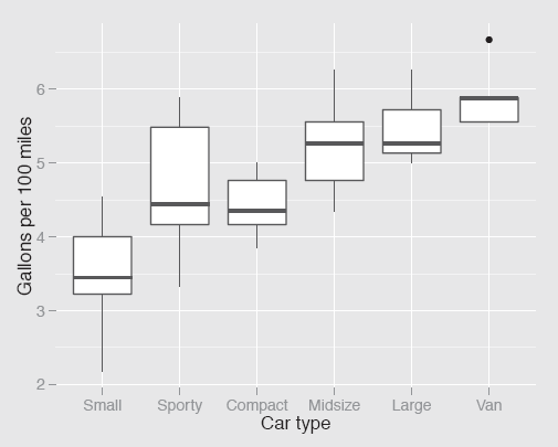
Fuel consumption by type of car ordered by average car weight. (It would look even better if the Sporty and Compact groups were switched.)
ggplot(Cars93, aes(TypeWt,100/MPG.city)) + geom_boxplot() +
ylab("Gallons per 100 miles") + xlab("Car type")
The replacement function levels can also be used to combine categories by repeating a value.
Cars93 <- within(Cars93, {
Type3 <- Type
levels(Type3) <- c("Small", "Large", "Midsize",
"Small", "Sporty", "Large")
})
Ordering can be useful for sorting cases (which can be important in overlaying one plot on another as in Figures 6.3 and 6.11), for sorting categories (for instance in the bottom two plots in Figure 4.1 or in the doubledecker plot in Figure 7.9), for sorting variables (as in Figures 6.11 and 6.15, cf. §6.7), and in drawing conditional plots like trellis displays.
The important functions are order for producing an ordered vector of case indices and reorder for ordering the levels of a factor. The functions sort and rank apply to single vectors. With sort you can order the vector and with rank get the ranks.
Reshaping datasets and graphics
Datasets frequently have to be restructured for particular graphics. As usual with R there are often several ways to achieve the same effects. In this book the packages reshape2, tidyr, and dplyr have been used, and they do require a certain amount of study to understand how they work. Both reshape2 with its melting and casting functions and tidyr with its related gathering and spreading functions seem to need particular effort, but are well worth it. It must be pointed out, however, that it seems likely that the newer package tidyr will supersede reshape2. One big advantage of this group of packages is the ability to chain operations together (as was done, for instance, in the preparatory code for Figure 9.6).
Graphics themselves can be manipulated in several ways and facetting is a valuable general option for constructing small multiples of ggplot objects. The option coord_flip() is a handy way of transposing a ggplot display.
Missing values
Functions do not all deal with missing values the same way. For instance, compare what you get with mean(X1) to what you get for the mean with summary(X1), when X1 is a variable with at least one missing value. If a plot does not work as you expect, then missing values could be the reason and you may have to set a plot function option or restructure your dataset accordingly.
Using the code and finding out about function options
This book is about the why of graphics not the how. There are a number of fine publications on how to draw graphics with R, so the emphasis here is different and there are occasionally fewer explanations of code details than some readers might like. If you need more information, R's help pages for functions are a good first place to look, although some are much better than others. Sometimes you find explanations and examples of a function's use covering the options available in comprehensive detail, sometimes not. Some packages have excellent vignettes, others not. If you need additional assistance, then the next step would be to type your query into your favourite search engine and that may well supply a solution to your problem.
13.7 Other graphics
This book has discussed analysing data graphically with some standard types of graphic. Perhaps it could have been called “The Seven Basic Plots”, except that title has already been taken for discussing different kinds of plots by another book [Booker, 2004]. It is important to know the graphics you use well, so that you have experience in interpreting and understanding what they show. That is why the book has concentrated on only a few graphic types. The range of different patterns that can arise with them is surprising, and graphics can be very informative when you know what patterns to look for and what features might be revealed.
Of course, there are many other graphics, which you can consider and which might be especially useful for revealing particular information in certain datasets. Each of us may favour specific graphics forms over others but we should all be prepared to acknowledge that it is the information revealed, which is most important, not the graphic used.
The same principles apply to working with these additional graphics as have been discussed throughout the book. Amongst other things you should try many different variations of the plots, both in the options and the formatting, use more than one plot, ensure you have made informative comparisons—and not expect to find a single ‘best’ display. And if you present your plot to others bear in mind that they may not be as familiar with that type of graphic as you are.
Most of the graphics can be found in one or more packages in R in one form or another, and the Graphics Task View offers a convenient overview [Lewin-Koh, 2013]. You might draw: added variable plots, association plots, bagplots, Bangdiwala's agreement plots, barnest graphics, beanplots, beeswarm plots, bikini charts, biplots, Bland-Altman plots, bubble plots, bumps charts, centipede plots, coplots, corrgrams, cotab plots, coxcombs, dendrograms, Dickens' plots, donut plots, downfall plots, fan plots, forest plots, fourfold plots, funnel plots, hanging rootograms, hive plots, icicle plots, intersection plots, Kaplan-Meier plots, kite charts, L'Abbe plots, ladder plots, mountain plots, navel charts, Ord plots, pictograms, polarAnnulus plots, profile plots, pyramid plots, radar plots, ring diagrams, rose diagrams, Sankey diagrams, scree plots, sieve diagrams, silhouette plots, skyline plots, spaghetti plots, sparklines, speedometer charts, spider plots, spiecharts, stream graphs, sunflower plots, Taylor diagrams, ternary diagrams, tetris plots, thickening plots, tile plots, towel plots, trace plots, treemaps, triplets, violin plots, waffle plots, waterfall plots, ... to name but a few.
Apologies if your favourite plot is not included, no slight is intended. Apologies also that a couple of names that are not plots at all have also sneaked into the list, but now I can't remember which ones they are...
13.8 Large datasets
‘Big Data’ is a much discussed term nowadays and refers to datasets that are too large for common or garden software, whatever that implies at the time of the discussion and depending on what you want to do with the data. Some methods of analysis will work for pretty well any size of dataset and others are much more limited—just think of hierarchical clustering for example.
Even large datasets that can quite comfortably be analysed on a modern laptop bring special complications with them. From a statistical point of view, there are two problem areas. On the one hand, large numbers of variables lead to large numbers of tests, so that many are bound to be significant. On the other hand, large numbers of cases mean that even small effects will be declared significant in individual tests, although they may not be of practical importance.
There is another issue which lessens the relevance of these two, large datasets tend to be heterogeneous rather than homogeneous. Preliminary work may have to be done in selecting variables of interest and determining the subset of cases to use in an analysis before any testing is done, and the resulting dataset(s) may be much smaller. And if the dataset is still very large in the number of cases, it is worth taking advantage of the classical properties of statistical samples: there is no need to analyse the whole dataset, as its aggregate properties will be just as apparent in a random sample. To be on the safe side, we can either use fairly large samples or repeat an analysis with several different samples. This approach is fine for what you might call global properties of a dataset, but will not work for local ones such as unusual small groups.
There are some properties of large datasets that raise particular issues for graphics [Unwin et al., 2006]. There are almost certain to be some outliers, perhaps errors, on many variables and this distorts the scaling of initial plots, as we have seen for instance in Figures 3.11 and 9.8. Nominal variables may have so many categories that they need to be grouped to make displays informative [Eick and Karr, 2002]. In general there will be more of everything, more points, more bars, more lines, and plots need to be drawn larger. Zooming in becomes a useful tool and should be accompanied by an overall unzoomed view (a bird's-eye view) so that context is not lost.
Large datasets bring advantages too. You can examine ideas in much greater detail and check for more complex structures. If a hypothesis is developed on one part of the data, it may possibly be checked on another. If that cannot be done, it may still be feasible to explore the likely consequences of the idea and test it on other variables from the dataset not yet used in the analysis.
The final point to make about working with large datasets is also a graphical one: if there is a major effect, you should be able to draw a display that shows it.
13.9 Perfecting graphics
The emphasis in this book is on using graphics for data analysis, for exploring data rather than for formally presenting data. This means that it is important to be able to draw graphics quickly and flexibly, not having to worry about dotting the last i or crossing the last t of any displays. This demands reliable defaults for scales, legends, colour, aspect ratio, and all the other properties of graphics. In general R is good at that and even if it does not quite match up to your requirements in all respects, you can still prepare your own default versions of the graphics types you use most often to use instead.
If you have to present graphics in a publication, you may have to be much more concerned with details: the fonts used, the precise colours, the placing of legends, supplementary annotations and so on. It is possible to specify everything you need in R, it is just that sometimes it takes rather a lot of code and some juggling with the options. There is every reason to prepare as perfect a graphic as you can, once you know which graphic you want and provided you have the time. Getting a display just right for presentation is a different mode of working to carrying out analyses of data and it is probably best to keep the two activities separate. Ideally neither design issues nor computing problems should interfere with the analysis process.
For exploratory work the aim should be to produce flexible and informative graphics, looking at many useful, if unpolished, graphics, to get an overall picture, rather than concentrating on one elegant graphic that may not reveal the full story. To paraphrase John Tukey: Better to draw several approximate graphics saying something about the right question than to draw one precise graphic relating to the wrong question.