
Setting the Scene
‘What is the use of a book’, thought Alice, without pictures or conversations?’
Lewis Carroll
1.1 Graphics in action
The code for producing Figure 1.1 is:
library(ggplot2); library(ggthemes)
data(SpeedSki, package = "GDAdata")
ggplot(SpeedSki, aes(x=Speed, fill=Sex)) + xlim(160, 220) +
geom_histogram(binwidth=2.5) + xlab("Speed (km/hr)") +
facet_wrap(~Sex, ncol=1) + ylab("") +
theme(legend.position="none")

Histograms of speeds reached at the 2011 World Speed Skiing Championships. Source: www.fis-ski.com. There were more male competitors than females, yet the fastest group of females were almost as fast as the fastest group of males. The female competitors were all either fast or (relatively) slow—or were they?
The 2011 World Speed Skiing Championships were held at Verbier in Switzerland. Figure 1.1 shows histograms of the speeds reached by the 12 female and 79 male competitors. As well as emphasising that there were many more competitors in the men’s competition than in the women’s, the plots show that the fastest person was a man and that a woman was slowest. What is surprising (and more interesting) is that the fastest women were almost as fast as the fastest men and that there were two distinct groups of women, the fast ones and the slow ones. There also appear to be two groups of men, although the gap between them is not so large. All of this information is easy to see in the plots and would not be readily apparent from statistical summaries of the data.
A little more investigation reveals the reason for the groupings: There are actually three different events, Speed One, Speed Downhill, and Speed Downhill Junior. Figure 1.2 shows the histograms of speed by event and gender. We can see that Speed One is the fastest event (competitors have special equipment), that no women took part in the Downhill, and that there was little variation in speed amongst the Juniors.

Histograms of speeds in the 2011 World Speed Skiing Championships by event and gender. There was no Speed Downhill for women. The few women taking part in the fastest event, Speed One, did very well, beating most of the men.
The reason for the two female groups is now clear: They took part in two different events. The distribution of the men’s speeds is affected by the inclusion of speeds for the Downhill event and by the greater numbers of men who competed. It is interesting that there is little variation in speed amongst the 7 women who competed in the Speed One event, compared to that of the 39 men who took part. The women were faster than most of the men.
The code for the plots takes a little getting used to. On the one hand the information would still have been visible with less coding, although perhaps not so clearly. Setting sensible scale limits, specifying meaningful binwidths, and aligning graphics whose distributions you want to compare one above the other with the same size and scales all help.
On the other hand, the plots might have benefitted from more coding to make them look better: adding a title, choosing different colours, or specifying different tick marks and labelling. That is more a matter of taste. This book is about data analysis, primarily exploratory analysis, rather than presentation, so the amount of coding is reduced. Sometimes defaults are removed (like the legends) to reduce unnecessary clutter.
The Speed Skiing example illustrates a number of issues that will recur throughout the book. Graphics are effective ways of summarising and conveying information. You need to think carefully about how to interpret a graphic. Context is important and you often have to gather additional background information. Drawing several graphics is a lot better than just drawing one.
ggplot(SpeedSki, aes(Speed, fill=Sex)) +
geom_histogram(binwidth=2.5) + xlab("Speed (km/hr)") +
ylab("") + facet_grid(Sex~Event) +
theme(legend.position="none")
1.2 Introduction
There is no complex theory about graphics. In fact there is not much theory at all, and so the topic is not covered in depth in books or lectures. Once the various graphics forms have been described, the textbooks can pass on to supposedly more difficult topics such as proving the central limit theorem or the asymptotic normality of maximum likelihood estimates.
The evidence of how graphics are used in practice suggests that they need more attention than a cursory introduction backed up by a few examples. If we do not have a theory which can be passed on to others about how to design and interpret informative graphics, then we need to help them develop the necessary skills using a range of instructive examples. It is surprising (and sometimes shocking) how casually graphics may be employed, more as decoration than as information, more for reasons of routine than for reasons of communication.
It is worthwhile, as always, to check what the justly famous John Tukey has to say. In his paper [Tukey, 1993] he summarised what he described as the true purpose of graphic display in four statements:
- Graphics are for the qualitative/descriptive—conceivably the semiquantitative—never for the carefully quantitative (tables do that better).
- Graphics are for comparison—comparison of one kind or another—not for access to individual amounts.
- Graphics are for impact—interocular impact if possible, swinging-finger impact if that is the best one can do, or impact for the unexpected as a minimum—but almost never for something that has to be worked at hard to be perceived.
- Finally, graphics should report the results of careful data analysis—rather than be an attempt to replace it. (Exploration—to guide data analysis—can make essential interim use of graphics, but unless we are describing the exploration process rather than its results, the final graphic should build on the data analysis rather than the reverse.)
These are all excellent points, although the last one implies he is emphasising graphics displays for presentation. It is notable that Tukey writes of ‘the final graphic’ as if there might only be one. In practice he commonly used more than one.
Data analysis is a complex topic. Conclusions are seldom clear-cut, and there are often several alternative competing explanations. Graphics are part of the data analysis process; both the choice of graphics displays and how they are viewed can have an important influence on any conclusions drawn. The subject matter of the study will also affect how any graphics are interpreted. A positively correlated collection of points in a scatterplot may be taken as evidence of a useful association (e.g., income as a function of years of experience) or as evidence of insufficient agreement (e.g., where two methods of measuring the same quantity are compared). In the first case an outlier may be unusual, but nevertheless perfectly plausible, while in the second it may be a clear indication of a faulty measurement.
To appreciate how much can be revealed by even the simplest graphics, it is useful to think of all the different forms a graphic might take and what they might tell you about the data. Consider a barchart showing the frequencies of the three categories of a variable:
- The bars could all be the same height (as you might expect in a scientific study with three groups).
- The bars might have slightly different heights (possibly suggesting some missing values in a scientific study).
- One of the bars might be very small, suggesting that that category is either rare (a particular illness perhaps) or not particularly relevant (support for a minor political party).
- The bars might not follow an anticipated pattern (sales in different regions or the numbers of people with various qualifications applying for a job).
- ...
There is literally no limit to the number of possibilities once you take into account the different settings the data may have come from. This means that you need to gain experience in looking at graphics to learn to appreciate what they can and cannot show.
As with all statistical investigations it is not only necessary to identify potential conclusions, there has to be enough evidence to support the conclusions. Traditionally this has meant carrying out statistical tests. Unfortunately there are distinct limits to testing. A lot of insights cannot easily be directly tested (Does that outlying cluster of points really form a distinctive group? Is that distribution bimodal?) and even those that can be require restrictive assumptions for the tests to be valid. Additionally there is the issue of multiple testing. None of this should inhibit us from testing when we can, and occasionally a visually tentative result can be shown to have such a convincingly small p-value that no amount of concerns about assumptions can cast much doubt on the result. The interplay of graphics with testing and modelling is effective because the two approaches complement each other so well. The only downside is that while it is usually feasible to find a graphic which tells you something about the results of a test, it is not always possible to find a test which can help you assess a feature you have discovered in a graphic.
1.3 What is Graphical Data Analysis (GDA)?
It is simplest to see what GDA can do by looking at a few examples. These examples are all just initial looks at the datasets to give the flavour of GDA, not complete analyses. In each case we will draw graphical displays of a dataset to reveal some of the information in the data. Graphics are good for showing structure and for communicating results. They are generally easier to interpret than tables (which are good for providing exact values) or statistical reports (which are good for giving estimates and formal comparisons) and convey more qualitative information.
For each example more than one graphic has been drawn. In general it is always better to draw many graphics, offering many different views, to ensure you get as much information out of a dataset as you can. This is part of the open-ended nature of GDA; it is a process, in which you pursue multiple ideas in parallel, just as any investigative process should be. As a result, a graphical data analysis of these examples in practice would involve drawing a lot more graphics, checking to see if there are other features of interest, comparing different versions of various graphics to see which ones work best, and finally settling on a group of graphics to summarise the analysis.
Drawing graphical displays of data is not about selecting the one best graphic, it is about selecting the best set of graphics. In the past drawing graphics required extensive effort and producing one graphic by hand took a lot of time, so it made sense to draw only a few. Nowadays we can draw graphics very quickly, many of the basic options are sensibly chosen by software defaults, and the overall quality is extremely high. It is still a good idea to be selective about which graphics you keep and especially about which graphics you show to others, but the main aim is to uncover information and there is every reason to draw more graphics rather than fewer when doing GDA.
With presentation graphics you prepare one graphic for many potential viewers. You need experience in deciding which graphic to present and expertise in how to draw it well. With GDA you prepare many graphics for one viewer, yourself, and your aim is to uncover the information hidden in the data. You need expertise in choosing a set of informative graphics and experience in interpreting graphics.
The Iris dataset
The dataset contains information on three species of iris. There are 50 plants for each species and measurements in cms for four attributes of each of the 150 plants. Originally the dataset was used by Fisher to illustrate linear discriminant analysis [Fisher, 1936]. (It has been used for all manner of other analyses since.) Figure 1.3 shows a default histogram of petal length, one of the four attributes. There appear to be two clearly different groups in the dataset.
ggplot(iris, aes(Petal.Length)) + geom_histogram()

A histogram of petal lengths from Fisher’s iris dataset. The data divide into two distinct groups.
We can look at a plot of the two petal attributes together, petal length and petal width. Figure 1.4 shows that there is a very strong relationship between these two attributes, providing further convincing evidence of at least two distinct groups of flowers. The colouring by species shows that the lower group are all setosa, that the upper group is made up of both versicolor and virginica flowers, and that these two groups are moderately well separated by their petal measurements.

A scatterplot of petal lengths and petal widths from Fisher’s iris dataset with the flowers coloured by species. The two variables are highly correlated and separate setosa clearly from the other two species. The colours used do not reflect the real colours of the species, which are all fairly similar.
The iris dataset is so well known that many readers will be familiar with this information. Imagine, however, that you wanted to present this information to someone who did not already know it. Are there better ways than simple graphics?
library(ggthemes)
ggplot(iris, aes(Petal.Length, Petal.Width, color=Species)) +
geom_point() + theme(legend.position="bottom") +
scale_colour_colorblind()
Student Admissions at UC Berkeley dataset
The data concern applications to graduate school at Berkeley for the six largest departments in 1973 classified by admission and sex. One of the reasons to study the data was to see whether there was any gender bias in the admission of students. Figure 1.5 shows separate barcharts for the three variables (department, gender, and whether admitted or not).
library(gridExtra)
ucba <– as.data.frame(UCBAdmissions)
a <– ggplot(ucba, aes(Dept)) + geom_bar(aes(weight=Freq))
b <– ggplot(ucba, aes(Gender)) + geom_bar(aes(weight=Freq))
c <– ggplot(ucba, aes(Admit)) + geom_bar(aes(weight=Freq))
grid.arrange(a, b, c, nrow=1, widths=c(7,3,3))

Numbers of applicants for Berkeley graduate programmes in 1973 for the six biggest departments. The departments had different numbers of applicants. Overall more males applied than females and fewer applicants were admitted than rejected.
It is immediately apparent that different numbers applied to the departments, ranging from about 600 to 900, that there were more male applicants than female ones, and that more applicants were rejected than admitted. None of this is exactly rocket science and all these comments could equally well have been derived from summary statistics (with the additional benefit of knowing that the reported range of departmental applicant numbers was actually from 584 to 933).
Graphics make these points directly and give an overview that is easier to remember than sets of numbers. Graphics are good for qualitative conclusions and often that is what is primarily wanted. Of course, precise numbers may be useful as well, and the two approaches complement one another.
The ordering of the departments is alphabetic, based on the coding used, and other orderings may be more informative. The widths of the plots were controlled to avoid wide bars, a common issue with default charts. The vertical scales might also have been made equal for all three charts (they are close for the last two by chance) to reflect that they display the same cases. Then the differences between the departments would have been downplayed.
The main aim of the study was to examine the acceptance and rejection rates by gender. For the six departments taken together the acceptance rate for females was just over 30% and for males just under 45%, suggesting that there may have been discrimination against females. Results by department are shown in Figure 1.6, where the widths of the bars are proportional to the numbers in the respective groups.. In four of the six departments females had a higher rate of acceptance. This is an example of Simpson’s paradox.
library(vcd)
ucb <– data.frame(UCBAdmissions)
ucb <– within(ucb, Accept <–
factor(Admit, levels=c("Rejected", "Admitted")))
doubledecker(xtabs(Freq~ Dept + Gender + Accept, data = ucb),
gp = gpar(fill = c("grey90", "steelblue")))
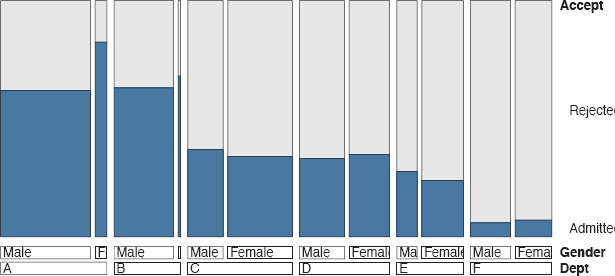
Acceptance rates at Berkeley by department and gender. Overall males were more likely to be accepted, but four of the six departments were more favourable to females. A doubledecker plot has been used to show the numbers of each gender applying to the departments. Relatively fewer females applied to departments A and B, while relatively fewer males applied to departments C and E.
Pima Indians diabetes dataset
This dataset has been used often in the machine learning literature and it can be found on the web in the excellent UCI library of machine learning datasets [Bache and Lichman, 2013]. The version from R used here, Pima.tr2 in the MASS package, is a training dataset of size 300 with zero values recorded as NA’s (a standard missing value code). There are six continuous variables and default histograms are shown for all of them in Figure 1.7.

Histograms of the six continuous variables in Pima.tr2. There are a few possible outlying values. Two of the variables have skew distributions.
The distributions of three variables (plasma glucose, blood pressure, and body mass index) look roughly symmetric. The variable skin thickness has at least one outlier and the diabetes pedigree function distribution is skew, possibly with outliers. The age histogram shows that most women were young with an age distribution like half of a classical age pyramid.
data(Pima.tr2, package="MASS")
h1 <– ggplot(Pima.tr2, aes(glu)) + geom_histogram()
h2 <– ggplot(Pima.tr2, aes(bp)) + geom_histogram()
h3 <– ggplot(Pima.tr2, aes(skin)) + geom_histogram()
h4 <– ggplot(Pima.tr2, aes(bmi)) + geom_histogram()
h5 <– ggplot(Pima.tr2, aes(ped)) + geom_histogram()
h6 <– ggplot(Pima.tr2, aes(age)) + geom_histogram()
grid.arrange (h1, h2, h3, h4, h5, h6, nrow=2)
Rather than drawing a lot of histograms to get an impression of the variables, it takes up less space to draw boxplots. Since R automatically uses the same scale for all boxplots in a window, they have to be standardised in some way first and this can be achieved using the scale function. Figure 1.8 shows the result with the outliers coloured in red for emphasis.
library(dplyr)
PimaV <– select(Pima.tr2, glu:age)
par(mar=c(3.1, 4.1, 1.1, 2.1))
boxplot(scale(PimaV), pch=16, outcol="red")

Scaled boxplots of the six continuous variables in a version of the Pima Indians dataset in R. A couple of big outliers are picked out, as is a low outlier on bp (blood pressure). The distributions of the last two variables, ped (diabetes pedigree) and age, are skewed to the right.
There are several outliers (including a couple of extreme ones) and boxplots are better for showing that than histograms. The last two variables are clearly not symmetric. Two facts should be borne in mind: The boxplots are not to be compared with one another, drawing them all together in one plot is primarily a time and space saving exercise. The scaling just transforms each variable to have a mean of zero with a standard deviation of one and nothing more, so the same points are identified as outliers as would be in the equivalent unscaled plots. This display tells us a little about the shapes of the distributions, but not much, and nothing about the missing values in the data, a potentially important feature. Of course, the histograms told us nothing about the missing values either. Plots for missing values are discussed in §9.2.
The two sets of displays, histograms and boxplots, have given us a lot of information about the variables in the dataset. A scatterplot matrix, as in Figure 1.9, tells us even more.

A scatterplot matrix of the six continuous variables for the same Pima Indians dataset. Only one of the scatterplots shows a strong association (bmi and skin). The two extreme outlying values, one skin and one ped measurement, make it harder to see what is going on, as there is less space left for the bulk of the data.
We can see that only two variables are strongly associated, bmi and skin, and that that association would be even better were it not for the outlying skin thickness measurement. All of this is valuable information, which helps us to understand the kind of data we are dealing with.
library(GGally)
ggpairs(PimaV, diag=list(continuous=’density’),
axisLabels=’show’)
GDA in context
GDA does not stand on its own. As has already been said (and should probably be repeated several times more), any result found graphically should be checked with statistical methods, if at all possible. Graphics are commonly used to check statistical results (residual plots being the classic example) and statistics should be used to check graphical results. You might say that seeing is believing, but testing is convincing.
Graphics are for revealing structure rather than details, for highlighting big differences rather than identifying subtle distinctions. Edwards, Lindman and Savage wrote of the interocular traumatic test; you know what the data mean when the conclusion hits you between the eyes [Edwards et al., 1963]. They were referring to statistical analyses in general, but it is particularly relevant for graphics. Their article continued: “The interocular traumatic test is simple, commands general agreement, and is often applicable; well-conducted experiments often come out that way. But the enthusiast’s interocular trauma may be the skeptic’s random error. A little arithmetic to verify the extent of the trauma can yield great peace of mind for little cost.”
Approximate figures suffice for appreciating structure, there is no need to provide meticulous accuracy. If, however, exact values are needed—and they often are—then tables are more useful. Graphics and tables should not be seen as competitors, they complement one another. With printed reports sometimes difficult choices have to be made about whether to include a graphic or a table. With electronic reports the question becomes how to include both gracefully and effectively.
Graphical Data Analysis is obviously appropriate for observational data where the standard statistical assumptions that are needed for model building may not hold. It can also be valuable for analysing experimental data. There may be patterns by time or other factors that were not expected. In medical studies, the balance of control and treatment groups has to be checked.
This book concentrates on exploratory graphics, using graphics to explore datasets to discover information. Experience gained in looking at and interpreting exploratory graphics will be valuable for looking at all kinds of graphics associated with statistics, including diagnostic graphics (for checking models) and presentation graphics (for displaying results).
The importance of data analysis in general is sometimes underplayed, because there is little formal theory and because the results that are found may appear obvious in retrospect. Effective graphical analysis makes things seem obvious, the effort involved in making the graphical analysis effective is not so obvious. In his poem “Adam’s Curse” W. B. Yeats wrote of the amount of work that went into getting a line of poetry right:
Yet if it does not seem a moment’s thought,
Our stitching and unstitching has been naught.
That is an appropriate analogy here.
1.4 Using this book, the R code in it, and the book’s webpage
A graphic is more than just a picture and every display in the book should convey some information about the dataset it portrays. There should be some description of what you can see accompanying every graphic. In order to ensure that all discussions of graphics are either on the same page as the graphic itself or on the opposite page, gaps have been left on some pages. This is intentional, as however irritating gaps may be, it always seems more irritating having to turn pages backwards and forwards to flip between displays and descriptions.
Like anything else, using graphics effectively is mostly a matter of practice. Study and criticise the examples. Test out the code yourself—it is all available on the book’s webpage, rosuda.org/GDA. You can experiment with it while you are reading the book, just copy and paste the code into R. Vary the size and aspect ratio of your graphics, vary the scaling and formatting, vary the colours used. Draw lots of graphics, see what you get, and decide what is most effective for you in making it easy to recognise information.
Work through the exercises at the ends of the chapters. All these exercises use datasets available in R or in one of the packages associated with R. There are no purely technical exercises, they all require consideration of the context involved. The goal is not just to draw graphics successfully, but to interpret the resulting displays and deduce information about the data. Some exercises are more open-ended than others and you should not expect definitive answers to all of them. The best approach is to try several versions of each graphic and to work with sets of graphics of different types, not just with individual ones. Doing the exercises is highly recommended—to become experienced in carrying out Graphical Data Analysis, you need to gain experience in looking at graphics.
There are far too many R packages to load them all. It makes sense to ask readers to load the packages that are used more often in the book instead of repeatedly referring to them in the text. Please ensure you have the following packages loaded:
ggplot2 for graphics based on ideas from “The Grammar of Graphics”. Most of the book’s graphics use these ideas.
gridExtra for arranging graphics drawn with ggplot2.
ggthemes for its colour blind palette.
dplyr for advanced and transparent data manipulation capabilities.
GGally for additional graphics in ggplot2 form, including parallel coordinate plots.
vcd for a range of graphics for categorical data.
extracat for multivariate categorical data graphics and for missing value patterns.
Some of these packages load further packages via a namespace. To check the state of your R session you can use the function sessionInfo().
Loading packages in advance will mean that the functions in these packages can be immediately used, and that any datasets supplied with the packages are to hand. For datasets in other packages there are two cases to consider. With LazyData packages datasets can be accessed without loading the package, as long as you have the package installed. With (most) other installed packages a data statement is needed, an R function for making a dataset available. To avoid repetition, datasets are generally only loaded once in each chapter.
Many graphics are improved by an appropriate choice of window size, informative labelling, sensible scaling, good positioning (for instance in multiple graphics displays) and other details, which are more about presentation than the graphic itself and may require much more code than you might expect. This book is about exploratory graphics so the code is mainly restricted to the graphics essentials.
You may find some graphics too small (or too big). If so, redraw them yourself and experiment to find what looks best to you. Space and design restrictions in a printed book can hamper displays. For some of the graphics the code includes adjustments to improve the look of the default versions. Graphics for exploration are usually only on display temporarily, while graphics for presentation, especially in print, are more permanent. Nevertheless a little enhancing helps to avoid occasional displeasing elements in exploratory graphics. It is often a matter of taste and you should develop your own style of graphics for your own use. For presenting to others you need to think of their needs and expectations as well. Some general advice on coding graphics in R is given in Chapter 13.
Code listings for every plot are given in the book and on the book’s webpage for downloading. The code is not explained in detail, so if an option choice puzzles you, check the help file for the function, especially the examples there. With R there are always several ways of achieving the same goal and you may find you would have done things differently. The end result is the important thing.
Graphical functions in R can offer very many options and working out what effects they have, especially in combination, can be complicated. It would be nice to be able to say that all functions follow the same rules with similarly defined parameters. Languages are rarely consistent like that, and R is no exception.
No formal statistical analyses are carried out in this text, as there are already many fine books covering statistical modelling. A list of suggested references is given at the end of Chapter 2 and there are a few remarks at the end of each chapter. Readers are encouraged to look for statistical methods to complement their graphical analyses. You should be able to find the tools to do so in R and its many packages. There is often a number of ways offered to carry out particular analyses, each with its own advantages (and possibly disadvantages), so no recommendations are made here.
The final exercises in each chapter are labelled “Intermission” and are intended to be a break and a distraction. Perhaps they would have been better labelled “And now for something completely different”. At any rate, I hope they lead you to some interesting visual discoveries and to developing your visual skills in many other directions.
Main points
- Graphical Data Analysis uses graphics to display and interpret data to reveal the information in a dataset. It is an exploratory tool rather than a confirmatory one.
- Simple plots can reveal useful information about datasets.
Figure 1.1 showed a surprising feature of the Speed Skiiing Championships and Figure 1.2 explained it. Figure 1.3 showed the two groups of flowers with quite different petal lengths. Figure 1.5 showed that more males than females applied to the Berkeley graduate program. Figure 1.8 showed that there are some extreme outliers in the Pima Indians dataset. - Scales and formatting of plots are important.
Using the same scales for the two histograms in Figure 1.1 and aligning them above one another is essential for conveying the information in the plots effectively. Figure 1.3 is an informative histogram for the iris variable, as we can see that there are two groups and the distributions of lengths within them. Bar-charts with different numbers of categories, but from the same dataset, have different default scales and so care is necessary with interpretations across plots (Figure 1.5). Comparing distribution forms for differently scaled variables needs some standardisation first (Figure 1.8). - Different plots give different views of the data.
While Figure 1.3 displays the distribution of petal lengths in the iris dataset, Figure 1.4 shows the close relationship between petal length and petal width. Figure 1.7 shows the distribution shapes of the Pima Indian variables and Figure 1.8 emphasises outliers. Figure 1.9 shows that only two of the variables in the dataset appear to be strongly related.
Exercises
More detailed information on the datasets is available on their help pages in R.
- Iris
How would you describe this histogram of sepal width?
ggplot(iris, aes(Sepal.Width)) +geom_histogram(binwidth=0.1) - Pima Indians
Summarise what this barchart shows:
ggplot(Pima.tr2, aes(type)) + geom_bar() - Pima Indians
Why is the upper left of this plot of numbers of pregnancies against age empty?
ggplot(Pima.tr2, aes(age,npreg)) + geom_point() - Estimating the speed of light
There are 100 estimates of the speed of light made by Michelson in 1879, composed of 5 groups of 20 experiments each (dataset michelson in the MASS package).
- (a) What plot would you draw for showing the distribution of all the values together? What conclusions would you draw?
- (b) What plots might be useful for comparing the estimates from the 5 different experiments? Do the results from the 5 experiments look similar?
- Titanic
The liner Titanic sank on its maiden voyage in 1912 with great loss of life. The dataset is provided in R as a table. Convert this table into a data frame using data.frame(Titanic).
- (a) What plot would you draw for showing the distribution of all the values together? What conclusions would you draw?
- (b) Draw a graphic to show the number sailing in each class. What order of variable categories did you choose and why? Are you surprised by the different class sizes?
- (c) Draw graphics for the other three categorical variables. How good do you think these data are? Why are there not more detailed data on the ages of those sailing? Even if the age variable information (young and old) was accurate, is this variable likely to be very useful in any modelling?
- Swiss
The dataset swiss contains a standardized fertility measure and various socioeconomic indicators for each of 47 French-speaking provinces of Switzerland in about 1888.
- (a) What plot would you draw for showing the distribution of all the values together? What conclusions would you draw?
- (b) Draw graphics for each variable. What can you conclude from the distributions concerning their form and possible outliers?
- (c) Draw a scatterplot of Fertility against % Catholic. Which kind of areas have the lowest fertility rates?
- (d) What sort of relationship is there between the variables Education and Agriculture?
- Painters
The dataset painters in package MASS contains assessments of 54 classical painters on four characteristics: composition, drawing, colour, and expression. The scores are due to the eighteenth century art critic de Piles.
- (a) What plot would you draw for showing the distribution of all the values together? What conclusions would you draw?
- (b) Draw a display to compare the distributions of the four assessments. Is it necessary to scale the variables first? What information might you lose, if you did? What comments would you make on the distributions individually and as a set?
- (c) What would you expect the association between the scores for drawing and those for colour to be? Draw a scatterplot and discuss what the display shows in relation to your expectations.
- Old Faithful
The dataset faithful contains data on the time between eruptions and the duration of the eruption for the Old Faithful geyser in Yellowstone National Park, USA.
- (a) Draw histograms of the variable eruptions using the functions hist and ggplot (from the package ggplot2). Which histogram do you prefer and why? ggplot produces a warning, suggesting you choose your own binwidth. What binwidth would you choose to convey all the information you want to convey in a clear manner? Would a boxplot be a good alternative here?
- (b) Draw a scatterplot of the two variables using either plot or ggplot. How would you summarise the information in the plot?
- Intermission
Van Dyck’s Charles I, King of England, from Three Angles belongs to the Royal Collection in Windsor Castle. What is gained from having more than one view of the King?