
Looking for Structure: Dependency Relationships and Associations
'The world is full of obvious things which nobody by any chance ever observes.'
Sherlock Holmes (in Sir A. Conan Doyle's The Hound of the Baskervilles)
Summary
Chapter 5 is about examining how pairs of continuous variables are related.
5.1 Introduction
Drawing scatterplots is one of the first things statisticians do when looking at datasets. Scatterplots can reveal structure that is not readily apparent from summary statistics or from models, and they are relatively easy to understand and present. They are the basis of the Gapminder displays [Rosling, 2013] used so effectively by Hans Rosling to draw attention to patterns of world development.
The major role of scatterplots lies in revealing associations between variables, not just linear associations, but any kind of association. Scatterplots are also useful for identifying outliers and for spotting distributional features. However, marginal distributions cannot always be clearly seen from scatterplots, so this book recommends you always take a look at the univariate distributions briefly as well.
Over ten thousand athletes competed in the London Summer Olympics of 2012. Figure 5.1 shows a scatterplot of Weight against Height from the dataset oly12 in the package VGAMdata. Note that 1346 of the 10,384 athletes in the dataset are not displayed in the plot because one or other of the two measurements is missing. The expected relationship between weight and height can be clearly seen, although it is a little obscured by some outliers, which distort the scales, and drawing a second plot with tighter limits would show the bulk of the data better. There is evidence of discretisation in the height measurements (notice the parallel vertical lines) and the same effect would be visible for the weight measurements but for the outliers. Given the large number of points, there is also a lot of overplotting, and most of the points in the middle of the plot represent more than one case (there are 57 athletes who are 1.7m in height and weigh 60kg). You can alleviate the problem using alpha-blending, giving each point a weight equal to the parameter alpha in geom_point, although outliers are then less easy to see.
data(oly12, package="VGAMdata")
ggplot(oly12, aes(Height, Weight)) + geom_point() +
ggtitle("Athletes at the London Olympics 2012")

A scatterplot of weight against height for the athletes at the London Olympics 2012. You can see that weight increases with height. There are several outliers which affect the scales.
5.2 What features might be visible in scatterplots?
Features that might be found in a scatterplot include
Causal relationships (linear and nonlinear) One variable may have a direct influence on another in some way. For example, people with more experience tend to get paid more. It is standard to put the dependent variable on the vertical axis. Sometimes initial ideas are misleading and X is more sensibly seen as depending on Y and not the other way round.
Associations Variables may be associated with one another without being directly causally related. Children get good marks in English and in Maths because they are intelligent, not because ability in one subject is the reason for the ability in the other.
Outliers or groups of outliers Cases can be outliers in two dimensions without being outliers in either dimension separately. Taller people are generally heavier, but there may be people of moderate height who are so heavy or light for their height that they stand out in comparison with the rest of the population.
Clusters Sometimes there are groups of cases which are separate from the rest of the data. In a scatterplot of the two petal measurements for Fisher's iris dataset, Figure 1.4, you can see that the setosa flowers have much lower values than the other two varieties.
Gaps Occasionally, particular combinations of values do not occur. Movies which are rated highly are rated often, but movies which few people like are seldom rated, so in a plot of average rating against number of ratings the bottom right of the plot is empty, Figure 5.7.
Barriers Some combinations of values may not be possible. No one can have more years of experience than their age, and a plot of the two variables will have a linear boundary, which should not be crossed.
Conditional relationship Sometimes the relationship between two variables is better summarised by a conditional description than by a function. A plot of income against age is likely to differ before and after retirement age.
The following two sections show a range of different scatterplots for a number of different applications.
5.3 Looking at pairs of continuous variables
The evils of drink?
Karl Pearson investigated the influence of drink on various aspects of family life at the beginning of the twentieth century. The dataset DrinksWages is in the collection of historic datasets made available in the package HistData. Figure 5.2 shows a scatterplot of wage (average weekly wage in shillings) plotted against drinks/n (the proportion of drinkers) for 70 different trades. There is no apparent relationship.
data(DrinksWages, package="HistData")
ggplot(DrinksWages, aes(drinks/n, wage)) + geom_point() +
xlab("Proportion of drinkers") + xlim(0,1) + ylim(0,40)

A scatterplot of average wages against proportion of drinkers for all 70 trades in Pearson’s DrinksWages dataset in the HistData package. There are a surprising number of trades where either all workers are drinkers or none are.
It is perhaps initially surprising that some trades have 100% drinkers and some 100% non-drinkers. A look at the distribution of numbers in the study by trade (or indeed a table) explains why, as you can check for yourself using one of these alternatives:
with(DrinksWages, hist(n, breaks=0:max(n)))
with(DrinksWages, table(n))
Of the 70 trades, over a third (26) have only 1 or 2 members in the survey. The biggest group with 100% drinkers (7 drinkers) turns out to be the chimney sweeps and the biggest temperance group the gasworkers (5 non-drinkers):
with(DrinksWages, max(n[drinks==0]))
with(DrinksWages, trade[drinks==0 & n==max(n[drinks==0])])
with(DrinksWages, max(n[sober==0]))
with(DrinksWages, trade[sober==0 & n==max(n[sober==0])])
Excluding the smaller trades (say, all with less than five) gives Figure 5.3. There is no particular pattern and certainly no evidence of drink being associated with lower average wages. (Whether this is the best way to investigate this question is another matter.) Note that the scales in Figures 5.2 and 5.3 have been explicitly made equal to keep them comparable.
bigDW <- filter(DrinksWages, n > 4)
ggplot(bigDW, aes(drinks/n, wage)) + geom_point() +
xlab("Proportion of drinkers") + xlim(0,1) + ylim(0,40)

A scatterplot of average wages against proportion of drinkers for all trades with a group size of more than 4. There is no obvious relationship between the two.
Old Faithful
The Old Faithful geyser in Yellowstone National Park in Wyoming is a famous tourist attraction. The dataset geyser in MASS provides 299 observations of the duration of eruptions and the time to the next eruption. Figure 5.4 plots the data.
data(geyser, package="MASS")
ggplot(geyser, aes(duration, waiting)) + geom_point()

A scatterplot of the waiting time to the next eruption vs. the duration of the current eruption for the Old Faithful geyser in Yellowstone National Park. After an eruption of short duration, you have to wait longer for the next one.
A short duration implies a long waiting time until the next eruption, while a long duration can imply a short or long waiting time. There maybe 3 clusters and possibly a couple of outlying values, but there is also a suggestion of rounded values for the eruption durations (note the numbers of durations of 2 and 4 minutes). To assess the possibility of clustering, consider a density estimate. Figure 5.5 displays contours of a bivariate density estimate supporting the idea of there being three clusters.

The same scatterplot with bivariate density estimate contours. There is evidence of three concentrations of data, two univariate outliers (one eruption with low duration and one with a high waiting time until the next eruption), and one bivariate outlier.
Contour plots of density estimates show equal levels of the estimated density function, but are not associated with probabilities. Using the hdrcde package you can estimate highest density regions, the smallest areas not including specified proportions of the distribution. Figure 5.6 displays the geyser data in this way for the proportions 1%,5%,50%,75%. This suggests pretty much the same outliers as before, but does not support the three concentrations conclusion as strongly.

Another version of the scatterplot, but now with highest density regions based on a bivariate density estimate. There is less evidence of three data concentrations than in the previous plot and there is a slightly different set of possible outliers.
The original source of this dataset is not given on the R Help page. The age of the dataset and the apparently rounded values suggest that better quality data might be obtainable now. The Wikipedia page on Old Faithful is not consistent with these data at all [Wikipedia, 2013]:
With a margin of error of 10 minutes, Old Faithful will erupt 65 minutes after an eruption lasting less than 2.5 minutes or 91 minutes after an eruption lasting more than 2.5 minutes.
ggplot(geyser, aes(duration, waiting)) + geom_point() +
geom_density2d()
library(hdrcde)
par(mar=c(3.1, 4.1, 1.1, 2.1))
with(geyser, hdr.boxplot.2d(duration, waiting,
show.points=TRUE, prob=c(0.01,0.05,0.5,0.75)))
Movie ratings
The distribution of movie lengths in the dataset movies from ggplot2 was discussed in §3.3. Here we are going to look at two other variables, rating (average IMDb user rating) and votes (number of people who rated the movie), using a scatterplot.
ggplot(movies, aes(votes, rating)) + geom_point() + ylim(1,10)
Figure 5.7 shows the somewhat unexpected result. The scatterplot almost takes the form of a small letter ‘r'. There are many insights that can be gained from this plot:
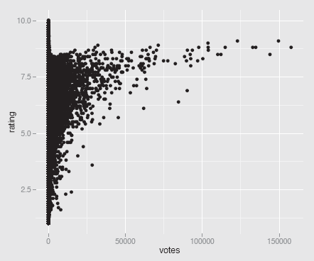
A scatterplot of the average ratings of films by the number of people who voted, from the dataset movies. Films rated very often have higher average ratings, but the highest ratings are achieved by films that are rated far less often.
- There are no films with lots of votes and a low average rating.
- For films with more than a small number of votes, the average rating increases with the number of votes.
- No film with lots of votes has an average rating close to the maximum possible. There almost seems to be a barrier, which cannot be crossed.
- A few films with a high number of votes, over 50,000, look like outliers. They have a distinctly lower rating than other films with similar numbers of votes.
- Films with a low number of votes may have any average rating from the lowest to the highest.
- The only films with very high average ratings are films with relatively few votes. Scatterplots can reveal a lot of information.
5.4 Adding models: lines and smooths
People are good at spotting patterns that are not really there (and are doubtless also good at missing some patterns that really are there). If you think there is a linear causal relationship between the two variables in a scatterplot, it makes sense to fit a model and to add it to the display.
Cars and mpg
The dataset Cars93 from MASS contains 27 pieces of information for 93 cars. The data were collected around twenty years ago [Lock, 1993]. Plotting MPG.city against Weight clearly shows a nonlinear relationship, as fuel economy decreases with weight quite quickly initially and then more slowly (Figure 5.8).
data(Cars93, package="MASS")
ggplot(Cars93, aes(Weight, MPG.city)) + geom_point() +
geom_smooth(colour="green") + ylim(0,50)

A scatterplot of MPG.city against Weight for the Cars93 dataset. A smooth has been overlaid. Heavier cars get progressively fewer miles to the gallon. The car weighing about 2350 pounds with a relatively high mpg was the Honda Civic. The y axis has been drawn from 0 to emphasise the lower limit of the mpg value.
Pearson heights
Figure 5.9 shows the fathers and sons height data of Pearson (already discussed in Section 3.3) with the best linear fit added, together with a 95% pointwise confidence interval. The y = x diagonal has been drawn for comparative purposes.
data(father.son, package="UsingR")
ggplot(father.son, aes(fheight, sheight)) + geom_point() +
geom_smooth(method="lm", colour="red") +
geom_abline(slope=1, intercept=0)
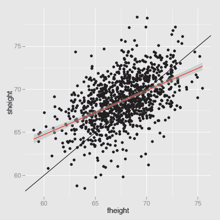
A scatterplot of sons’ heights against fathers’ heights from the dataset father.son. The best fit regression line has a slope of just over 0.5, as can be seen by comparison with the line y = x. The height of a man is influenced by the height of his father, but there is a lot of unexplained variability (the correlation is almost exactly 0.5).
Figure 5.9 illustrates regression to the mean. Tall fathers have sons who are tall, but on average not as tall as their fathers. Small fathers have sons who are small, but on average not as small as their fathers. The fit of the model can be examined with
data(father.son, package="UsingR")
m1 <- lm(sheight~fheight, father.son)
summary(m1)
par(mfrow=c(2,2))
plot(m1)
To explore further whether a non-linear model might be warranted, you could fit a smoother or plot a smoother and the best fit regression line together. For these data, a linear model is fine, since the two curves are practically identical, as you can see in Figure 5.10.
data(father.son, package="UsingR")
ggplot(father.son, aes(fheight, sheight)) + geom_point() +
geom_smooth(method="lm", colour="red", se=FALSE) +
stat_smooth()

A scatterplot of sons’ heights against fathers’ heights with both a linear regression line and a smoother overlaid. The two models are in close agreement and the line lies inside the confidence interval of the smooth. A lot of unexplained variability remains.
Adding a line or a smooth (or both) makes modelling explicit. When you look at a graphic you employ implicit models in judging what you see and it is good to formalise these where possible. With something like heights of fathers and sons you might expect some kind of positive association and judge how the plot looks with that image in mind. In other situations, perhaps when the same plot includes both males and females, you might expect to see signs of there being two groups. Prior expectations can be based on context and existing knowledge. Once you have seen a plot, the data themselves influence what features you study and how you judge them. Subjective impressions can supply valuable insights, but need to be confirmed by checking with other views of the data and with objective testing, where possible.
5.5 Comparing groups within scatterplots
The Olympic athletes' dataset shown in Figure 5.1 suffered from overplotting, which is one good reason for adjusting the scatterplot when displaying the data. Either overlaid density estimates or alpha-blending might be used, but given the structure of the data, where we can expect height and weight to differ by the sex of the athletes and their sport, a better approach would be to split up the data by possible explanatory variables. For instance, the following code plots a scatterplot for the females above one for the males:
ggplot(oly12, aes(Height, Weight)) +
geom_point(size = 1) + facet_wrap(~Sex, ncol=1)
There are 42 sports listed in the dataset and plotting all the scatterplots together gives Figure 5.11. Although each plot is quite small, you can still easily identify a number of features. For some sports, all athletes are missing at least one of the values (e.g., boxing, gymnastics) and for others, there are very few athletes. Where there are enough data points, the association between height and weight generally holds well, apart from some outliers. It is noticeable that the relationship is less good for athletics, where a large number of very different events have all been grouped together. With judo and wrestling, the relationship is also weaker, possibly because of the range of different weight classes in these sports.

Scatterplots of weight by height for the different types of sport at the London Olympics. Data are missing for some sports. The association between weight and height looks linear for most sports. The names have been limited to a maximum of 12 characters using the abbreviate function.
Whenever you split up a dataset in this way it is important to have all the plots the same size with the same scales for comparative purposes. This is handled automatically with facetting in ggplot2 or within lattice. However, it is also useful to organise the plots, so that the comparisons of most interest are easiest to make. Sometimes having certain plots in the same row is best, sometimes having them in the same column. And often it will make sense to pick out particular subsets and make a plot just with them. If you want to compare the height and weight scatterplots for judo, weightlifting, and wrestling, then create the subset first and plot accordingly, e.g.
oly12JWW <- filter(oly12, Sport %in%
c("Judo", "Weightlifting", "Wrestling"))
ggplot(oly12JWW, aes(Height, Weight)) +
geom_point(size = 1) + facet_wrap(~Sport) +
ggtitle("Weight and Height by Sport")
oly12S <- within(oly12, Sport <- abbreviate(Sport, 12))
ggplot(oly12S, aes(Height, Weight)) +
geom_point(size = 1) + facet_wrap(~Sport) +
ggtitle("Weight and Height by Sport")
5.6 Scatterplot matrices for looking at many pairs of variables
Scatterplot matrices (sploms) are tables of scatterplots with each variable plotted against all of the others. They give excellent initial overviews of the relationships between continuous variables in datasets with small numbers of variables.
There are many different ways of drawing sploms. You can have different options of what is plotted on the diagonal or of what is plotted above or below the diagonal. Since the plots above are just flipped versions of the ones below, some analysts prefer to provide statistical information or other displays in the other half of a splom. You can restrict sploms to continuous variables or provide additional types of plot for including categorical variables. If you plot histograms or density estimates down the diagonal, then the scatterplot matrix gives you an overview of the one-dimensional distributions as well.
Crime in the U.S.
The dataset crime.us from the VGAMdata package includes the absolute crime figures and the crime rates by population for the fifty U.S. states in 2009. Figure 5.12 shows a splom of the rates for seven kinds of crime (the dataset also includes rates for the four crimes of violence together and the three property crimes together). It also shows density estimates for the variables down the diagonal. Whatever preconceived notions we might have of how the rates might be related to one another, the splom provides a first, quick summary of the associations between the variables, both through the graphics and through the correlation coefficients.

A scatterplot matrix of the 7 crime rates in the crime.us dataset. Some rates are positively associated, others not. The crime of rape is least associated with the others.
The scales have not been drawn for two reasons. They overlap with the variable names and they are too small to read easily on a graphic this size (larger versions work better if you want to see the scales). It is important to remember that the rate levels are quite different for different crimes. State murder rates in this dataset go up to almost 12 per 100,000 population, whereas larceny rates go up to just over 2700 per 100,000 population.
The rates for most crimes seem positively associated, some more strongly than others (e.g., murder and burglary), and the rate of rape is not associated much with any of the other crime rates. The larceny rate is not closely associated with the four violent crime rates. There are a few outliers, which stand out more in some plots than others, such as the two states with high rates of motor vehicle theft in the scatterplot with larceny (California and Nevada). As the dataset only has 50 cases, you cannot read too much into the shape of the graphics or the correlation coefficients. It is still instructive to compare each plot with its correlation to see how they compare. The different sizes of the State populations should also be taken into account. Alaska, North Dakota, Vermont, and Wyoming are each treated as having equal weight with California, even though their populations are less than 2% of California's.
data(crime.us, package="VGAMdata")
crime.usR <- crime.us
names(crime.usR) <- gsub("*Rate", "", names(crime.usR))
names(crime.usR)[19:20] <- c("Larceny", "MotorVTheft")
ggpairs(crime.usR[, c(13:16, 18:20)],
title="Crime rates in the USA",
diag=list(continuous='density’), axisLabels='none’)
Swiss banknotes
The dataset bank from the gclus package includes six measurements on each of 100 genuine Swiss banknotes and 100 forged notes. The dataset was used extensively in a fine multivariate statistics textbook [Flury and Riedwyl, 1988].
library(car)
data(bank, package="gclus")
par(mar=c(1.1, 1.1, 1.1, 1.1))
spm(select(bank, Length:Diagonal), pch=c(16, 16),
dagonal="histogram", smoother=FALSE,
reg.line=FALSE, groups=bank$Status)
A splom of the variables is shown in Figure 5.13. Left and Right are strongly positively correlated. There is evidence of negative association amongst the last three variables (Bottom, Top, and Diagonal) and there are also suggestions that the genuine and counterfeit notes can be distinguished using those variables. The scatterplot for Bottom and Top is particularly interesting, as the overall association is slightly positive, while the two possible subgroups each have a negative association between the two variables. The default display for the spm function from car includes smoothers with confidence bands, linear regression lines in the scatterplots, and density estimates on the diagonal. It also uses open circles for the points. All this makes for a fairly cluttered display, so other options have been chosen here.

A scatterplot matrix of the Swiss banknotes dataset with the forged notes coloured in red. In some of the scatterplots the groups of notes are well separated.Some variables are associated, some not. There are a few possible outliers, not all of them forgeries.
Functions for drawing sploms
In R you can choose between the functions listed in Table 5.1 and probably there are other alternatives too. Some of these are faster than others.
Splom functions in R
function |
package |
|---|---|
plot |
|
pairs |
|
spm |
car |
cpairs |
gclus |
splom |
lattice |
ggpairs |
GGally |
gpairs |
gpairs |
pairs.mod |
SMPracticals |
pairscor.fnc |
languageR |
... |
... |
Each of the functions offers different versions. In particular, some can cope with categorical variables and some cannot. In this chapter we have looked at some simple scatterplot matrices involving just continuous variables (and only a few of them at that). If you want to look at more elaborate sploms with more variables, take a look at the examples on the help pages of some of the functions, for instance:
- cpairs with panels coloured by level of correlation
library(gclus)
judge.cor <- cor(USJudgeRatings)
judge.color <- dmat.color(judge.cor)
cpairs(USJudgeRatings, panel.colors=judge.color,
pch=".", gap=.5)
library(gpairs)
data(Leaves)
gpairs(Leaves[1:10], lower.pars=list(scatter='loess’))
- pairs.mod with standard scatterplots as well as scatterplots of partial residuals
library(SMPracticals)
data(mathmarks)
pairs.mod(mathmarks)
Sploms take up a lot of space. A splom for m variables includes m(m—1) scatterplots and m diagonal elements. Even if only the upper triangle of plots is drawn, you still need m rows and m columns for m variables. This makes sploms ineffective for large numbers of variables, especially when there are many cases, as each individual plot can only be drawn fairly small. Nevertheless, for a quick overview, perhaps for deciding which of a number of scatterplots to look into in more detail, they can be very useful.
5.7 Scatterplot options
- Point size
Very small points can hardly be seen and very large points overlap each other and make the plot look like a collection of clumps. Making points a little larger can be useful for emphasising outliers; making points a little smaller can be useful for distinguishing groups of points. Occasionally, particular point sizes can lead to undesirable visual effects, especially if the data are gridded with parallel strips of points close together.
Point size can also be used to represent the value of a continuous non-negative variable. When the basic symbol is a circle, then this gives a bubble chart. It can be quite useful for smallish datasets without too much overlapping and is used in Gapminder's displays of global development data [Rosling, 2013].
Symbols for points
The current default in R for scatterplots is to use open circles. As attentive readers will have gathered, I prefer small filled circles. You should use what you think conveys information best for you.
When a dataset is small and made up of different groups, it is helpful to be able to tell the groups apart in a scatterplot. An old solution is to draw the members of each group with a different symbol. This can work if the points do not overlap and if the symbols are easy to identify. Mostly it does not, and colour is more effective anyway. With large datasets, using different symbols looks cluttered and messy, so a set of scatterplots, one for each group, as in a trellis display, works better.
Alpha-blending
A partial solution to overplotting problems is to use alpha-blending. Each point is given a weight between 0 and 1 and where several points overlap, the resulting area is drawn correspondingly darker (in fact more opaque). For instance, if α = 0.1, then any area with ten or more points has the maximum darkness. The effect is to emphasise areas of higher density and downplay areas of lesser density, so that outliers cannot be seen so easily. Using no alpha-blending (equivalent to α = 1) can leave the bulk of the data for a large dataset looking like a solid indistinguishable mass. Alpha-blending works better interactively, when you can explore a range of alpha values quickly to see what information is shown at different levels.
Colouring points
Colour is often used to distinguish points by groups. If the data are fairly well separated (whatever that means in practice), this is helpful. You always have to bear in mind that when there are points on top of one another, the visible colour is the colour of the last point drawn. So if there are three colours, red, green, and blue, the plot may look different if drawn in that order (maybe lots of blue), than if drawn in the reverse order (maybe lots of red).
If you think an interesting structure is evident in a coloured scatterplot, then it is worthwhile drawing a trellis plot of scatterplots by group. Although coloured scatterplots may have disadvantages, it is often easier to identify a possible group structure there than in a trellis plot and it is always good to check.
When colour is used to highlight particular points, it is usually drawn last and hence on top. The same cautionary advice applies here as for colouring by groups.
Splom options
The many options available for sploms were referred to in §5.6. You can display statistics instead of half of the scatterplots, add models to scatterplots, or show marginal information on the diagonal.
5.8 Modelling and testing for relationships between variables
- Correlation
If you calculate a correlation coefficient, you should always draw a scatterplot to learn what the coefficient might mean. Correlation coefficients measure linear association and it is a rare scatterplot where that is all you can see. By the same token, if you draw a scatterplot and see a linear association, it is a good idea to calculate the correlation coefficient to measure just what level of correlation you have in front of you (cf. [Cleveland et al., 1982]).
Correlation coefficients are sometimes accompanied by p-values in publications and the null hypothesis tested always seems to be H0 : ρ = 0. Fisher showed long ago in 1915 that there is a good approximation for testing null hypotheses of correlation coefficients being equal to more interesting and informative values than 0, but this is seldom done. Pity.
- Regression
Given a presumed causal relationship between the y-variable and the x-variable of a scatterplot, regression may be used to fit a model. It can be helpful to overlay the model on a scatterplot of the data, to add confidence bands for the fit, or to add predictive intervals for possible new points.
- Smoothing
If no analytic model is proposed for Y as a function of X, then a nonlinear smoother can be tried. loess (local weighted regression) is an interesting approach and is used in some situations in R as a default, for instance in plots of model objects. Recently spline functions have been used more, partly because they have better statistical properties and because it is easier to draw confidence bands for them.
- Bivariate density estimation
kde2d from MASS, kde from ks, or bkde2d from KernSmooth may be used. The highest density region package hdrcde is also an interesting possibility. As with univariate density estimation, there is no testing of the estimates produced, a curious gap in theory.
- Outliers
Points which are outliers in scatterplots may be outliers on one of the two dimensions individually or purely bivariate outliers. Deciding whether a point is a bivariate outlier or whether several points in a group are outliers is tricky. Density estimators are one approach, but they can be problematic because of either masking or swamping.
Main points
- Scatterplots can take many different forms and provide a lot of information about the relationship between two variables (cf. §5.2). Look again at the movies scatterplot in Figure 5.7.
- Adding lines or smooths to scatterplots is easy and often provides valuable guidance, as can be seen in Figure 5.9, where the relationship between sons' and fathers' heights is difficult to assess from the scatterplot alone.
- Trellis displays are very effective for comparing scatterplots by subgroup, especially when the groups overlap (cf. Figure 5.11).
- Sploms are excellent for giving a quick overview of a few variables. For example, Figure 5.12 summarises the U.S. crime rates dataset well.
Exercises
- Movie ratings
In Figure 5.7, there were a number of films with very high average ratings but few votes.
- (a) How does the scatterplot look if you exclude all films with fewer than 100 votes?
- (b) What about excluding all films with an average rating greater than 9? In the latter case, you would exclude at least one film with a lot of votes. What limit would you choose and why?
- Meta analysis
The results of 70 studies on thrombolytic therapy after acute myocardial infarction are reported in the Olkin95 datatset from the meta package.
- (a) Draw a scatterplot of the number of observations in each experimental group (n.e) against the corresponding number of observations in each control group (n.c). How would you summarise the plot?
- (b) Over half of the studies involve fewer than 100 patients in each group. If you restrict the scatterplot to this range, do you gain additional information?
- Zuni
The zuni dataset from the package lawstat was introduced in Exercise 5 in Chapter 3.
- (a) Plot a scatterplot of average revenue per pupil (Revenue) against the corresponding number of pupils (Mem). What information can you gather from the plot?
- (b) The distribution of the number of pupils is skew with one large outlier. How does the scatterplot look if you plot Revenue against the log of the number of pupils? What additional information have you discovered, if any? Is there any point in logging average revenue per pupil as well?
- Pearson heights
Pearsons' height data for fathers and sons were considered in Sections 3.3 and 5.4.
- (a) Draw a scatterplot of the heights. Are there any cases you would regard as outliers?
- (b) Draw a plot including both points and highest density regions. Which cases would be regarded as outliers under this model, do you think?
- (c) Fit a linear model to the data and a loess smooth and plot your results. Is a nonlinear model necessary?
- Bank discrimination
A subset of Roberts' bank sex discrimination dataset from 1979 is available in the package Sleuth2 under the name case1202. Consider the three variables measured in months, Senior (seniority), Age, and Exper (work experience prior to joining the bank).
- (a) Are there any notable features in the scatterplot matrix of the three variables? Can you explain them?
- (b) Why do the scatterplots involving seniority not have the structure of the scatterplot of experience against age?
- Cars
In Figure 5.8, MPG.city was plotted against Weight. In many countries, fuel performance is measured in litres per 100 km rather than in miles per gallon, in effect the inverse criterion. If you plot 1/MPG.City against Horsepower, do you get a linear relationship? Which cars would you describe as outliers now?
- Leaves
The leafshape dataset in the DAAG package includes three measurements on each leaf (length, width, petiole) and the logarithms of the three measurements.
- (a) Draw sploms for the two sets of three variables. What conclusions would you draw from each set? Which do you find more useful?
- (b) Redraw the sploms, colouring the cases by the variable arch, describing the type of leaf architecture. What additional structure can you see?
- Olive oils from Italy
The olive oils dataset is well known and can be found in several packages, for instance as olives in extracat. The original source for the data is the paper [Forina et al., 1983].
- (a) Draw a scatterplot matrix of the eight continuous variables. Which of the fatty acids are strongly positively associated and which strongly negatively associated?
- (b) Are there outliers or other features worth mentioning?
- Boston housing
The Boston dataset was introduced in Chapter 3.
- (a) Draw a splom of all the continuous variables (i.e., all except the variable chas). Which variables are positively associated with medv, the median home value?
- (b) Several of the scatterplots involving the variable crim, the per capita crime rate, have an unusual form, where higher values of crim only occur for one particular value of the other variable. How would you explain this?
- (c) There are many different scatterplot forms in the display. Pick out five and describe how you would interpret them.
- Hertzsprung-Russell
The Hertzsprung-Russell diagram is a famous scatterplot of the relationship between the absolute magnitudes of stars and their effective temperatures and is over one hundred years old. Although examples of the plot can be found all over the place, it is surprisingly difficult to find the data underlying them. There is a dataset of 47 cases, starsCYG, in the package robustbase, but that is really too small. The dataset HRstars with 6220 stars in package GDAdata is from the Yale Trigonometric Parallax Dataset and was downloaded from [Mihos, 2005].
- (a) Plot Y against X. How does your plot differ from the plots you find on the web, for instance from a Google search for images of the HertzsprungRussell diagram?
- (b) The plots seem to use different numbers of stars. Are some more likely to be used than others?
- (c) You can colour and annotate your plot using techniques described in Chapter 13. What would you suggest?
- Intermission
The painting La Grande Jatte by Georges Seurat hangs in the Art Insitute of Chicago, a classic of putting dots together to form an overall impression. Do you think the artist intended his painting only to be viewed from a distance?