
Graphics for Time Series
The Government are very keen on amassing statistics—they collect them, add them, raise them to the nth power, take the cube root and prepare wonderful diagrams.
Josiah Stamp
Summary
Chapter 11 discusses drawing graphics for displaying the information in time series.
11.1 Introduction
Graphic displays are excellent for showing time series data and they are used extensively. Several of Playfair’s graphics are of time series, and his displays of Balance of Trade data are well known [Playfair, 2005]. An example was shown in Figure 10.6. Economic and financial data are obvious applications for time series, but weather data, sports performances, and sales results all involve time series data too.
Graphics are particularly helpful for studying several time series at once. If each of a set of series can be transformed to a common scale, then they can all be plotted on the same display and it is possible to compare trends, changes in levels, and other features. If series show a common pattern for only part of the time period displayed, then that will be visible in the graphic while it may not be apparent in a statistical summary of the data.
Two entertaining and surprisingly informative time series graphics applications are Name Voyager [Wattenberg, 2005], which displays patterns of choice of baby names in the United States over the last 130 years, and Ngram Viewer [Google, 2010], which allows you to examine how word and phrase use developed over time in books. Much more can be found on visualising time in Graham Wills’s book of the same name [Wills, 2012].
11.2 Graphics for a single time series
Consider the average number of goals scored per game in each of the first 46 seasons of the German Bundesliga from 1963/64 to 2008/09. In the first two seasons there were only 16 teams instead of 18, and in 1991/92 there were 20 teams. For that one year two extra teams were included to allow teams from the former East Germany to join. The averages can be calculated by aggregating the goals reported by team in the dataset Bundesliga in vcd and then dividing by the number of games. To display these data, there are several decisions to be made:
Symbol Should the data be represented by points and/or lines or by bars?
Scale What scale should be used for the y-axis, from what minimum level to what maximum level? Including zero on the y-axis, which is often rightly recommended in other circumstances, conveys the level of goals scored, but variability and possible trends may be shown less well.
Aspect ratio The look of a time series display is affected strongly by the aspect ratio, that is the length of the y-axis to the length of the horizontal time axis. The temptation to make a series appear flat (lengthen the time axis) or steep (shorten the time axis) should probably be resisted. [Cleveland and McGill, 1987] recommends choosing an aspect ratio that has the slopes of interest in the display at an angle of 45°. You just have to decide what the slopes of interest might be.
Trend Should a trend estimate in form of a smoother be added to the display? And, if so, which smoother should you use?
Gaps If the series is regular, how should gaps in the data be represented? Gaps could be time points when values were not recorded for some reason or they could be periods where there were no data to record, for instance holidays when shops are shut.
And there are additional, less critical, but still important decisions, such as the labelling of the time axis, the use of colour, and annotations referring to events at particular times.
Figure 11.1 shows the goals data using points and lines, a vertical scale slightly larger than the minimum and maximum, an aspect ratio with width twice height and including a spline smoother with pointwise 95% confidence intervals. The time axis is labelled by the first year of each season, i.e., the average goals per game for season 1970/71 are plotted at t = 1970. The plot shows that the average was up near 3.5 in the 1970s and early 1980s, then declined to under 3.0 and has been fairly constant since. There is no evidence that the introduction in 1995 of three points for a win instead of two made any difference to the numbers of goals scored.
data(Bundesliga, package="vcd")
goals <- Bundesliga %>% group_by(Year) %>%
summarise(hg=sum(HomeGoals), ag=sum(AwayGoals),
ng=n(), avg=(hg+ag)/ng)
library(mgcv)
ggplot(goals, aes(Year, avg)) + geom_point() + geom_line() +
stat_smooth(method = "gam", formula = y ~ s(x)) +
ylim(2,4) + xlab("") + ylab("") +
ggtitle("Bundesliga goals per game by year")
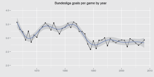
A time series of the average number of goals scored in the German Bundesliga over the first 46 seasons from 1963/64 to 2008/09 with a gam smoother added. There were 16 teams in the first two seasons and 20 in season 1991/92; otherwise there were always 18 teams. The average number of goals scored has been fairly stable since 1990, but at a lower level than in earlier years.
Graphing the series for the average home goals and average away goals separately (Figure 11.2) reveals the interesting fact that the variation depended mainly on the numbers of home goals scored.
ggplot(goals) + geom_line(aes(Year, hg/ng), colour="red") +
geom_line(aes(Year, ag/ng), colour="blue") +
ylim(0.5, 2.5) + xlab("") + ylab("")

library(zoo)
data(GermanUnemployment, package="AER")
ge <- as.zoo(GermanUnemployment)
autoplot(ge$unadjusted) + xlab("") + ylab("")
The Bundesliga dataset is an ordinary dataframe, but many time series datasets in R are provided in special time series classes, like the German quarterly unemployment data in the AER package. You can just use a default plot function or, alternatively, you can use the zoo package. It offers functions to convert other time series classes to its zoo class and an autoplot function to produce ggplot objects that can then be amended with other ggplot2 options. This has been done in Figure 11.3 for (West) German unemployment data. The series shows a regular seasonal pattern and some relatively sharp changes in level between periods of fairly steady unemployment levels. The comparable unemployment rate in 2014, some 20 years later, is a little over 6%.

Unadjusted quarterly (West) German unemployment rates from 1961 to just after the unification of the two Germanies. Unemployment was very low in the 1960s and early 1970s, apart from a short spell at a higher level in 1967. There were distinct jumps in unemployment in the mid 1970s and in the early 1980s due to the oil crises of 1973 and 1979. Unemployment was declining at the end of the series from the high levels of the mid to late 1980s. The series shows a strong seasonal pattern with higher levels in winter than in summer.
11.3 Multiple series
Various situations can arise when you have multiple time series, and they may need to be treated in different ways. You can have related series for the same population, such as death rates from different causes, and these can be plotted together or separately. You can have the same series for different subgroups, such as overall death rates for men and women, and they might be plotted together in a single display or individually in a trellis display. You can have series on quite different scales for the same population, for instance various economic indicators for a country, and these can be plotted in a single display with some kind of scale standardisation or each in their own window with their own individual scale.
Related series for the same population
The dataset Nightingale in HistData includes numbers of deaths in each month and monthly annualised hospital death rates for three different causes of death for the British Army in the Crimean War, from April 1854 to March 1856. The annualised rates have been calculated by multiplying the deaths in a month by 12 and dividing by the Army strength that month. Figure 11.4 shows the three rate series plotted together and it is obvious that deaths from disease dominate and that the winter of 1854/55 was a very bad time. That winter included the first half of the Siege of Sevastopol and the Charge of the Light Brigade at the end of October 1854. To put the numbers in context, 156 members of the Light Brigade died at the Charge [Wikipedia, 2014], while 503 members of the Army died in hospital from disease in that October—and that was one of the months with a relatively low death rate from disease!
data(Nightingale, package="HistData")
ggplot(Nightingale, aes(Date)) +
geom_line(aes(y=Disease.rate)) +
geom_point(aes(y=Disease.rate), size=2) +
geom_line(aes(y=Wounds.rate), size=1.3, col="red", linetype="dashed") +
geom_line(aes(y=Other.rate), size=1.3, col="blue",
linetype="dotted") + ylab("Death rates")

Annualised monthly hospital death rates per 1,000 in the British Army from disease (black line and points), wounds (red dashed line), and other causes (blue dotted line) in two years of the Crimean War, 1854-1856.
Instead of drawing each time series individually, there is an alternative approach, which can be more efficient. You first construct a new ‘long’ dataset of three variables: the time values needed, the values of the different time series all in one variable, and a grouping variable of the time series labels. The following code would produce a similar plot to Figure 11.4. The first line ‘melts’ the new dataset and the second part uses the grouping variable to draw the time series. There is no particular saving for this plot, but there would be if you wanted to display more series together.
library(reshape2)
Night2 <- melt(Nightingale, id.vars="Date",
measure.vars=c("Disease.rate", "Wounds.rate", "Other.rate"),
variable.name="NightV", value.name="Nightx")
ggplot(Night2, aes(Date, Nightx,
colour=NightV, group=NightV)) + geom_line() + ylab("")
Same series for different subgroups
You can have time series of the same variable for several countries, giving time series that can be analysed together on the same scale, for instance GDP. Then you would have to decide if it is the total GDP‘s that are of interest (so the figures for the United States swamp those of many smaller countries), or GDP related to population size. An example was given in Figure 6.8 for the corn yields in the US by state over time. It is obviously sensible to study the bigger states first, but patterns over time for smaller states cannot be seen. More than one plot is needed, possibly an additional one for only the smaller states or one for each state separately using individual scaling.
Series with different scales
There may be several different time series for the same country: GDP and, say, imports, exports, and unemployment levels. Comparing patterns of movement in these series on the same graphic means finding some way to plot different variables on a common scale. One year can be chosen as a baseline and given a value of 100 with other years’ values being transformed accordingly. That is often done with share prices and other financial variables. Alternatively, all series can be standardised by their respective means and standard deviations. This has the advantage of keeping series’ levels and variabilities comparable but the disadvantage of changing with every additional time point.
Figure 11.5 shows an example of starting series off at the common value of 100. The data are the daily closing share prices in 2013 for four computing companies: Apple, Google, IBM, and Microsoft. The data were downloaded from Google Finance using the package FinCal. For this plot the vertical scale limits have been determined by default, using the overall minimum and maximum of the four series. Scale limits and the aspect ratio influence the look of time series a lot and it is usually worth experimenting with other alternatives. Apple started the year badly, but recovered to its original value. Google and Microsoft did very well. IBM started all right and then fell away and ended up about 10% down. Note the two sharp falls (Apple in January, Microsoft in the summer) and one steep rise (Google in the autumn).

Closing share prices for four US computing companies in 2013. Each share price was set to 100 at the start of the year and the other prices transformed accordingly. Investing at the beginning of 2013, it would have been best to buy Google and Microsoft. Different conclusions would be drawn with other starting points.
A time series may have to be transformed to make it comparable with other series, as here, or even to make it more comparable with itself. Many monetary time series, such as salary levels or indeed GDP, are usually adjusted to take account of inflation.
library(FinCal); library(reshape2)
sh13 <- get.ohlcs.google(symbols=c("AAPL","GOOG","IBM","MSFT"),
start="2013-01-01",end="2013-12-31")
SH13 <- with(sh13, data.frame(date = as.Date(AAPL$date),
Apple = AAPL$close,
Google = GOOG$close,
IBM = IBM$close,
Microsoft = MSFT$close))
SH13a <- lapply(select(SH13, -date), function(x) 100*x/x[1])
SH13a <- cbind(date = SH13$date, as.data.frame(SH13a))
SH13am <- melt(SH13a, id="date", variable.name="share",
value.name="price")
ggplot(SH13am, aes(date, y=price, colour=share,
group=share)) + geom_line() + xlab("") + ylab("") +
theme(legend.position="bottom") +
theme(legend.title=element_blank())
One plot versus many
Displaying multiple series on the same plot works well if there are few crossings and if the individual series have low variability. Figure 11.4 is effective for showing the high death rates due to disease, but it would be less good for comparing the two series of death rates due to wounds and other causes. The four share price series in Figure 11.5 can be kept separate fairly easily, especially thanks to the use of colour. Figure 6.8 is also good at providing an overall picture, but does not represent series for individual states well. When there are many series, then a trellis plot could be used, with one panel for each series, possibly with the other series displayed with alpha-blending in the background, as was used in Figure 10.14.
The collection of datasets hydroSIMN in the package nsRFA includes the annual flows of 47 hydrometric stations in Piemonte and Valle d’Aosta. The data cover 65 years from 1921 to 1985, although only one series is complete and some are recorded for just a few years. Figure 11.6 shows all the series in one display. There appear to be some common features, such as the peaks in 1960 and 1962, and a few series seem to be partially grouped by colour. The hydrometric station code was made a factor so that more than one colour would be used, and the colours were assigned sequentially according to the numeric code. Stations with similar codes are generally close together spatially, which could explain the possible patterns.
data(hydroSIMN, package="nsRFA")
annualflows <- within(annualflows, cod <- factor(cod))
ggplot(annualflows, aes(anno, dato, group=cod, colour=cod)) +
geom_line() + xlab("") + ylab("") + theme(legend.position="none")

Annual flows for 47 hydrometric stations in Piemonte and Valle d’Aosta in Italy. There are common peaks, and stations that are spatially close are likely to have similar patterns. An accompanying map of where the stations are located would be very helpful.
Figure 11.7 displays the individual series. It is now much easier to see particular patterns and when data are available for each station. As well as indicating the differing levels and variability of series, the individual plots reveal the patterns over time better and suggest some possible outliers, for instance the first and last values for station 3.
ggplot(annualflows,
aes(anno, dato, group=cod, colour=cod)) +
geom_line() + xlab("") + ylab("") +
facet_wrap(~cod) + theme(legend.position="none")

Annual flows for 47 hydrometric stations in Piemonte and Valle d’Aosta in Italy drawn individually. The changes over time are easier to see than in Figure 11.6 and individual patterns are clearer.
11.4 Special features of time series
Data definitions
Time series datasets differ from other datasets because of their dependence on time. The data have a given order and individual values are not independent of one another. In the simplest form there is a sequence of measurements of a single variable equally spaced in time, for example the annual GDP of a country. Even for this apparently straightforward situation it may be misleading to say “simplest”. The definition of GDP might have changed over time, the value of money certainly has due to inflation, and the country itself might have changed. German data before and after 1990 can only be compared with caution, due to the reunification of the former East and West Germany.
In standard statistical analyses it is reasonable to assume that all data are defined similarly and are therefore directly comparable. That is not something that can be automatically assumed for time series. Unemployment statistics provide an interesting example, as the definition of who is unemployed varies across countries and is changed quite frequently within countries. The definition of unemployment in the United Kingdom changed over twenty times in the period from 1979 to 1993 when Margaret Thatcher was prime minister ([Gregg, 1994]). The change almost always resulted in a decline in the number of unemployed. The one change in definition in the other direction had actually been decided by the previous Labour government and only came into operation during Thatcher’s premiership.
Length of time series
Time series can be short, for example, the annual sales of a new smart phone model, or long, for example the temperature values recorded every minute at a weather station over many years. Sometimes the short-term details of long series can obscure long-term trends, sometimes they are of particular interest. Plotting series on different time scales can be informative and for some financial time series such as exchange rates you could plot each minute, each day, each month, or each year. When you plot values for longer periods, there is a choice of what to plot for each period. You could take the final value, a value from the middle of the period, an average value, perhaps even a weighted average of some kind. Alternatively you could plot some kind of smooth. There are many possibilities.
Regular and irregular time series
In §6.5 parallel coordinate plots were used to plot regular time series, i.e., time series which are recorded at equally spaced time points. Hourly data, daily data, yearly data are often of this kind, but there are many series which are not. A history of a patient’s temperature or blood pressure will rarely be based on a sequence of equally spaced time points. Political opinion polls are more frequent near elections than at other times. Sometimes treating the time points as equally spaced can be acceptable, often definitely not.
Plotting the time scale of an irregular time series accurately is important, and this is a situation where packages which handle times and dates correctly are a valuable help, especially as they allow you to plot several series with quite different time points on the same display. For example, a doctor might want to compare series of readings for different patients over a year, although he saw them at different times and different numbers of occasions.
With irregularly spaced series you cannot really speak of missing values and it is usual to just join successive time values. With regular series, it is a different matter. Missing values can then be awkward: should you leave a gap or simply join the points before and after with a straight line?
A related issue is time units that are thought of as the same, but are actually different, like months. February is always shorter than all other months of the year. Even the same months in successive years can be of different lengths. Retail sales could be some 3% higher for this month compared to the same month last year, because there was one extra shopping day.
Time series of different kinds of variables
Most time series are assumed to be of continuous variables, although you can also have time series of nominal variables (for instance, a person’s state of health or each year’s most popular fashion colour) or of discrete variables.
One of the most famous datasets in statistics is von Bortkiewicz’s dataset on deaths from horsekicks in corps of the Prussian army. It is usually used to illustrate the Poisson distribution, as in §4.5, but the numbers of deaths are given over 20 consecutive years, so the data can also be viewed as a set of 14 time series, one for each corps. Figure 11.8 shows the total deaths each year. A barchart has been used to reflect the fact that the data are sums, single values for each year. The initial rise in deaths could be due to chance, better reporting, or larger corps sizes. The relevant data on corps sizes does not seem to be reported anywhere, despite the dataset being used in so many statistical textbooks.
data(VonBort, package="vcd")
horses <- VonBort %>% group_by(year) %>%
summarise(totalDeaths=sum(deaths))
ggplot(horses, aes(year, totalDeaths)) +
geom_bar(stat="identity") + ylim(0,20)
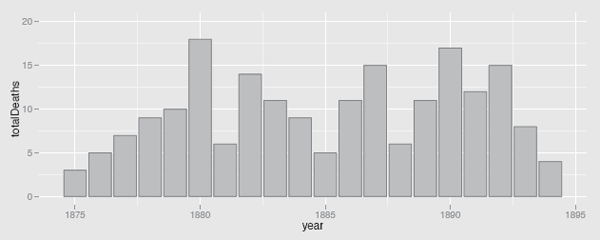
The number of soldiers killed by horse kicks in 14 corps of the Prussian army over 20 years at the end of the nineteenth century.
Outliers
Outliers in time series can be different from outliers for other kinds of datasets. They are not necessarily extreme values for the whole series, just unusual in relation to the pattern round them. A high temperature value in winter can be in the middle of the distribution of values for the whole year and yet still look way out of line for that time of year. The famous lynx dataset (Figure 11.9) offers an interesting example. (Functions from the zoo package have been used as the dataset is a time series object of class ts.)

A time series of the number of lynx trapped on the Mackenzie River in Canada. There appear to be two kinds of cycles.
Should the two lower values in 1914 and 1915 be regarded as outliers, where something different was happening? The fact that this coincides with World War I makes it tempting to look for some kind of connection. Unusual values like that are easy to spot, although others may prove more difficult. Distances of points from curves are judged by the shortest line which can be drawn from the point to the curve. For time series, you have to assess the vertical distance between the point and the curve and this is hard to do for steeply rising or falling curves.
data(lynx)
library(zoo)
autoplot(as.zoo(lynx)) + geom_point()
Individual extreme values can influence scales and make the rest of a plot uninformative. This applies to time series just as much as to histograms, scatterplots, and parallel coordinate plots. However, scales for time series are unusual in that they are more likely to be influenced by values not included in the plot. If you display only the last couple of years of the exchange rate between the dollar and the euro, you may still want to let the vertical axis scale reflect the full history of the exchange rate since 2002.
The usual principle applies that it is best to draw several displays, zooming in to inspect details that may otherwise be hidden and zooming out to see the overall context.
Forecasting
There are two main reasons for studying time series: to try to understand the patterns of the past and to try to forecast the future. There are a number of alternative ways of displaying forecasts and it is good practice to make clear where the data end and the forecast begins, possibly using a change of background shading, a gap, or a dotted line into the future. Any forecast based on a model should include prediction intervals and including them in the display also emphasises where forecasts begin.
Figure 11.10 shows a two year forecast of the German unemployment data from Figure 11.3 using an exponential smoothing state space model. Detailed information and alternative forecasting models can be found in Rob Hyndman’s forecast package.

A forecast of (West) German unemployment for the years 1992 and 1993, based on the data from the previous 30 years. Prediction intervals of 80% and 90% are shown.
As forecasts reach further into the future, the prediction intervals get wider and wider, which can make it tempting to use narrower ones. This temptation should be resisted. It is a sad truth that no matter how wide forecast intervals are, they may not be wide enough.
library(forecast)
par(las=1, mar=c(3.1, 4.1, 1.1, 2.1))
fit <- ets(ge$unadjusted)
plot(forecast(fit), main="")
Seeing patterns
It is remarkable how ready people are to see patterns in time series and to overlook features that are inconsistent with the supposed patterns. When series are plotted together, it is surprising, and even somewhat disturbing, how often people see causal relationships that may at best be associations due to other factors or just to the passage of time itself. And if you look at enough series, there are bound to be some that have something in common.
Yule gave an early warning example, the association between standardised mortality rates and the proportion of Church of England marriages over 46 years ([Yule, 1926]). Despite this, [Coen et al., 1969] reported amongst other results that they had found that the production of motor cars in the United Kingdom (seasonally adjusted) led the United States S&P stock market index by six quarters.
It would be tedious to list all the various issues to watch out for with time series, but it is well to remember that there are many.
11.5 Alternative graphics for time series
The best way to display time series is usually with lines joining the individual values. Only plotting the points can work as long as the variability around any trend is low. When a time series is short and what is being reported is a sequence of statistics rather than a continuous measurement, barcharts can be a good alternative. Figure 11.8 gives an example.
Parallel coordinate plots display regular time series well and can be readily used for plotting multiple series (§6.5). Their particular advantage lies in allowing you to inspect distributions of values across series at individual time points using boxplots.
When data are recorded daily and there are expected to be strong calendar effects, calendar plots can be a useful display. They are drawn just like a calendar, showing the twelve separate months and the weekly structure of the year. The rectangle for each day is coloured according to the value of the variable being displayed, so they are like a heatmap. Calendar plots pick out patterns in the weekly and monthly structure well, so they are good for checking the effects of weekends or special dates. As they use a colour scale, they work best when differences are large. The openair package offers a calendar plot and examples with ggplot2 can be found on the web.
The association between two time series can be studied by plotting the two series together or by drawing a scatterplot, plotting one series against the other. That is what Yule did for the example mentioned in the last section [Yule, 1926].
11.6 R classes and packages for time series
Time and date variables require special treatment. Hours, minutes and seconds need to be handled properly, as do months, changes from winter to summer time and back, leap years, and time zones. R provides several packages which deal with these issues, for instance lubridate, and the time series task view [Hyndman, 2013] is a good reference. A number of packages offer special time series classes and the time series task view is again the best source for information. There are tools to convert time series objects from one class to another, as in the package zoo, to facilitate using different classes and the xts package offers a single general class covering all.
Plotting tools in time series packages are particularly useful for labelling the time axis appropriately, something which can be a difficult and frustrating task if carried out from scratch. The website [TimelyPortfolio, 2013] gives a short historical summary of time series plotting possibilities in R together with an example of the same financial series plotted by the various packages discussed.
11.7 Modelling and testing time series
- Single time series with regularly spaced time points
Time series models generally assume equally spaced intervals between data points. Early on, attempts were made to decompose time series into four components: trend, seasonal, cyclical, and residual. Later on came the ARIMA models (autoregressive integrated moving average) promulgated by Box and Jenkins. With increasing interest in financial time series have come GARCH models (generalised autoregressive conditional heteroscedasticity) and developments from them. And so it goes on, with everyone seeking the holy grail that will enable them to forecast the future successfully (and profitably). - Short, irregular time series
Time series model fitting generally requires a lot of data. When series are both short and irregular, some kind of smoothing is a possible option. Figure 11.1 shows an approach using spline smooths, which has the advantage of providing confidence intervals as well. - Multivariate time series
Modelling of time series has concentrated on single time series. Modelling several time series together is a complex problem and progress has been slow. [Tsay, 2014] gives a thorough overview.
Main points
- There are many different factors to bear in mind when drawing and interpreting time series (§11.2).
- Single time series plots can show a lot of information (e.g., Figure 11.3).
- Multiple series can be drawn in a single display to make comparisons easy (Figures 11.4 and 11.5).
- Dates and times have tricky properties and it is best to take advantage of packages that can deal with them (§11.6).
- Time series are a different kind of data and need to be treated specially. The data are not i.i.d. variables. Graphics are good for irregular time series and for displaying multiple time series. Models have difficulties with both. (§11.4)
Exercises
More detailed information for the datasets is available on their help pages in R.
- Air miles
The dataset airmiles is a time series of the miles flown annually by commercial airlines in the US from 1937 to 1960.
- (a) Before plotting the graph, think about what shape you would expect it to have. Plot the series and comment on the differences between what you get and your expectations.
- (b) Which aspect ratio conveys the information you find in the series best?
- (c) Do you think the graph looks better as a line graph (as suggested on the R help page for the dataset) or with points as well?
- (d) Might plotting a transformation help you to look more closely at the early years or would zooming in be sufficient?
- Beveridge Wheat Price Index
The Beveridge index of wheat prices covers almost four hundred years of European history from 1500 to 1869 and is available in the dataset bev in tseries.
- (a) Plot the series and explain why you have decided to plot it in that way.
- (b) Are there any particular features in the series which stand out? How would you summarise the information in the series in words?
- (c) Many important historical events took place over this time period, including the Thirty Years’ War, the English Civil War, and the Napoleonic Wars. Is there any evidence of any of these having an effect on the index?
- Goals in soccer games
The Bundesliga dataset was used in §11.2.
- (a) Plot graphs of the rates of home and away goals per game over the seasons in the same plot. What limits do you recommend for the vertical scale?
- (b) Other possibilities for studying the home and away goal rates per game include plotting the differences or ratios over time and drawing a scatterplot of one rate against another. Is there any information in these graphics that is shown better by one than the others?
- (c) Can you find equivalent data for the top soccer league in your own country and are there similar patterns over the years?
- Male and female births
Important early demographic analyses were carried out on English data from the seventeenth century. The Arbuthnot dataset in the HistData package includes data on the numbers of male and female christenings in London from 1629 to 1710.
- (a) Plot the number of male christenings over time. Which features stand out?
- (b) Why do you think there was a low level of christenings from around the mid-1640’s to 1660?
- (c) Two low outliers stand out, in 1666, presumably because of the Great Fire of London and the plague the previous year, and in 1704. A possible explanation for the 1704 outlier is given on the R help page for the dataset. Compare the data values for 1674 and 1704 to check the explanation.
- Goals in soccer games (again)
Consider the numbers of goals scored by each team.
- (a) How would you plot the annual average goals per home game for each team in the Bundesliga over the 46 seasons in the dataset? Would you choose a single graphic or a trellis display? Only one team has been a member of the Bundesliga ever since it started, Hamburg. How do you think the time series of teams with incomplete records should be displayed?
- (b) You could compare the annual home and away scoring rates of particular teams by plotting the two time series on the same display or by drawing a scatterplot of one variable against the other. Using the two teams Hamburg and Bayern Munich, comment on which display you think is better. Do the displays provide different kinds of information?
- Deaths by horsekick
Plot separate displays for each of the 14 corps in the von Bortkiewicz dataset (VonBort in vcd).
- (a) Do any of the patterns stand out as different?
- (b) 11 of the 14 corps had no deaths in the first year (1875). Could this be worth looking into?
- Economics data
The package ggplot2 includes a dataset of five US economic indicators recorded monthly over about 40 years, economics.
- (a) If you plot all five series in one display, is it better to standardise them all at a common value initially or to align them at their means and divide by their standard deviations? What information is shown in the two displays?
- (b) Alternatively you could plot each series separately with its own scale. Do these displays provide additional information and is there any information that was shown in the displays of all series together that is not so easy to see here?
- Australian rain
The dataset bomregions in the DAAG package includes seven regional time series of annual rain in Australia and one time series averaged over the country.
- (a) Can all seven regional series be plotted in one display or are individual displays more informative?
- (b) Are there any outliers in the series and do they affect the scales used adversely?
- (c) Is there any evidence of trend in the series? Are there cyclical effects?
- Tree rings
The package dplR includes several tree ring datasets, including ca533. There are 34 series of measurements covering 1358 years in all from 626 to 1983. Note that no time variable is given, just the information that the data were recorded annually. The actual time range can be found from NOAA’s tree ring database website.
- (a) Plot all 34 series in separate displays. Are there any common features?
- (b) There are at least two series with much higher maxima than the others. Compare a display excluding these series, but still retaining the same scaling for all the plots, with a display where each series is plotted with its own scale. What are the advantages and disadvantages of the two approaches?
- Intermission
Salvador Dali’s painting The Persistence of Memory is in the New York Museum of Modern Art. Do you think the distorted clocks could be interpreted as alternative models of time series?